Hello CVS fans and welcome to my first post for 2023!
Over the past few weeks I did a little Christmas scrapping and pulled out the ‘Merry and Bright’ collection which I still have a decent amount of in my stash. I love the pop of pink in this collection which doesn’t make it so ‘traditional.’ Here is a look at my page..
To start my page, I used this cut file from Paige Evans, and backed it with a bunch of the patterned papers, also using some gold glitter paper…..to me, gold screams Christmas and I love it! I think this cutfile was perfect for this photo of my twins and their elf.
Around my photo, I used some Ephemera pieces and tucked some florals in my cutfile… layers make my heart happy.
To add some separation between the cutfile and the star background paper, I added some distress oxide… I like the glow this provides to my page. I then added some of the word phrases from the Accessory sticker sheet under my photo.
I hope if you have this collection in your stash that you have been inspired to pull it out…or even the Joyful collection…another gorgeous collection.
Hope your 2023 is off to a good start..thanks for stopping by
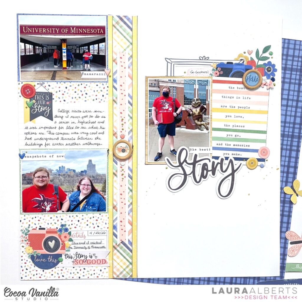
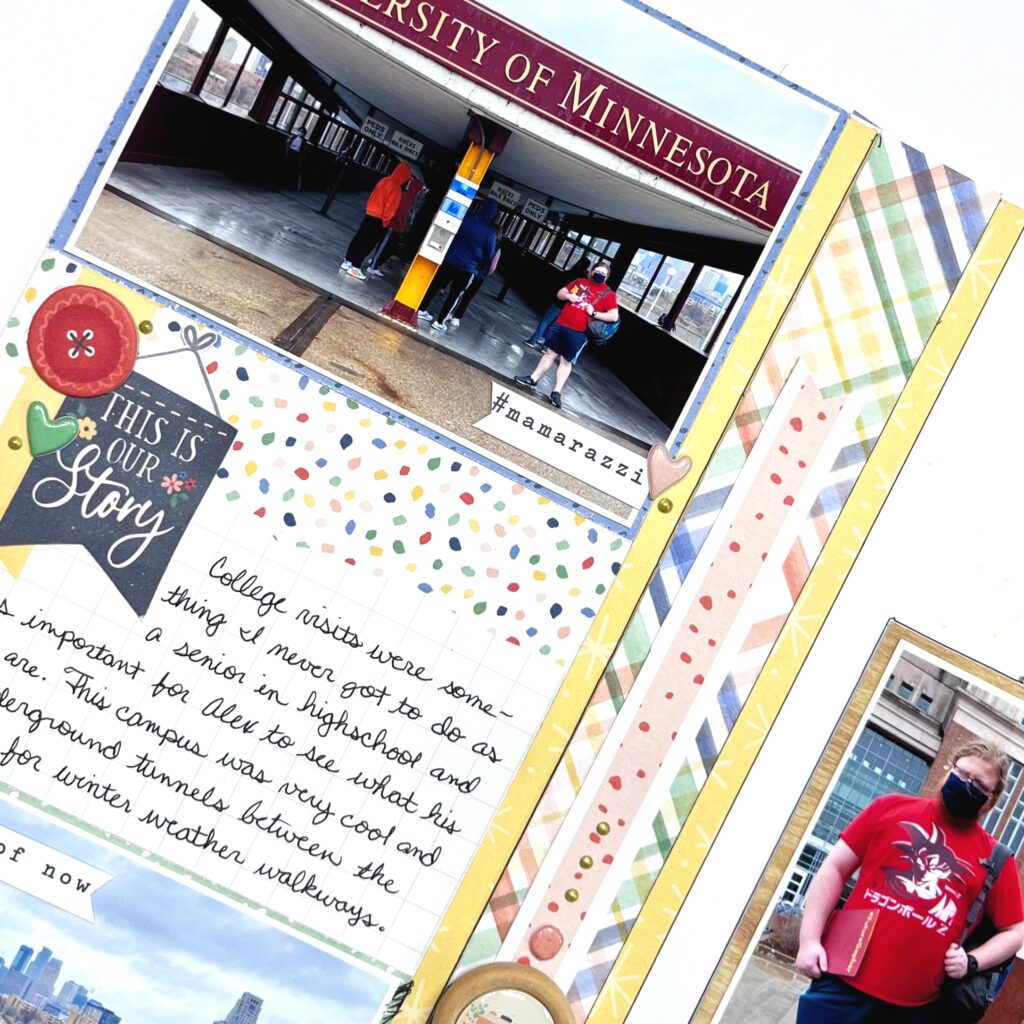
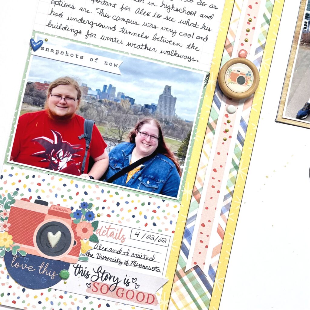
Hey y’all! Laura Alberts back again with a fun layout of my son’s university tour! I thought the colors in these photos were perfect for Storyteller and they worked really well together. I chose a column design because I had two landscape 3×4 photos and 1 portrait 3×4 photo. I find splitting up the two formats a little easier to scrap. The left-hand column has 4 journaling cards stacked one right after another, 2 to back my photos and 2 for journaling spots.
A multi-layered strip down the center gives the two columns defined areas and gives me a place for a little extra embellishing in the middle. I especially love these wood buttons with the epoxy in the middle! Such a fun way to add more dimension and texture to the page. On top and bottom of that button are round puffy stickers, then a few Nuvo drops for interest. At the bottom of this page, I collaged stickers and ephemera to make an embellishment cluster.
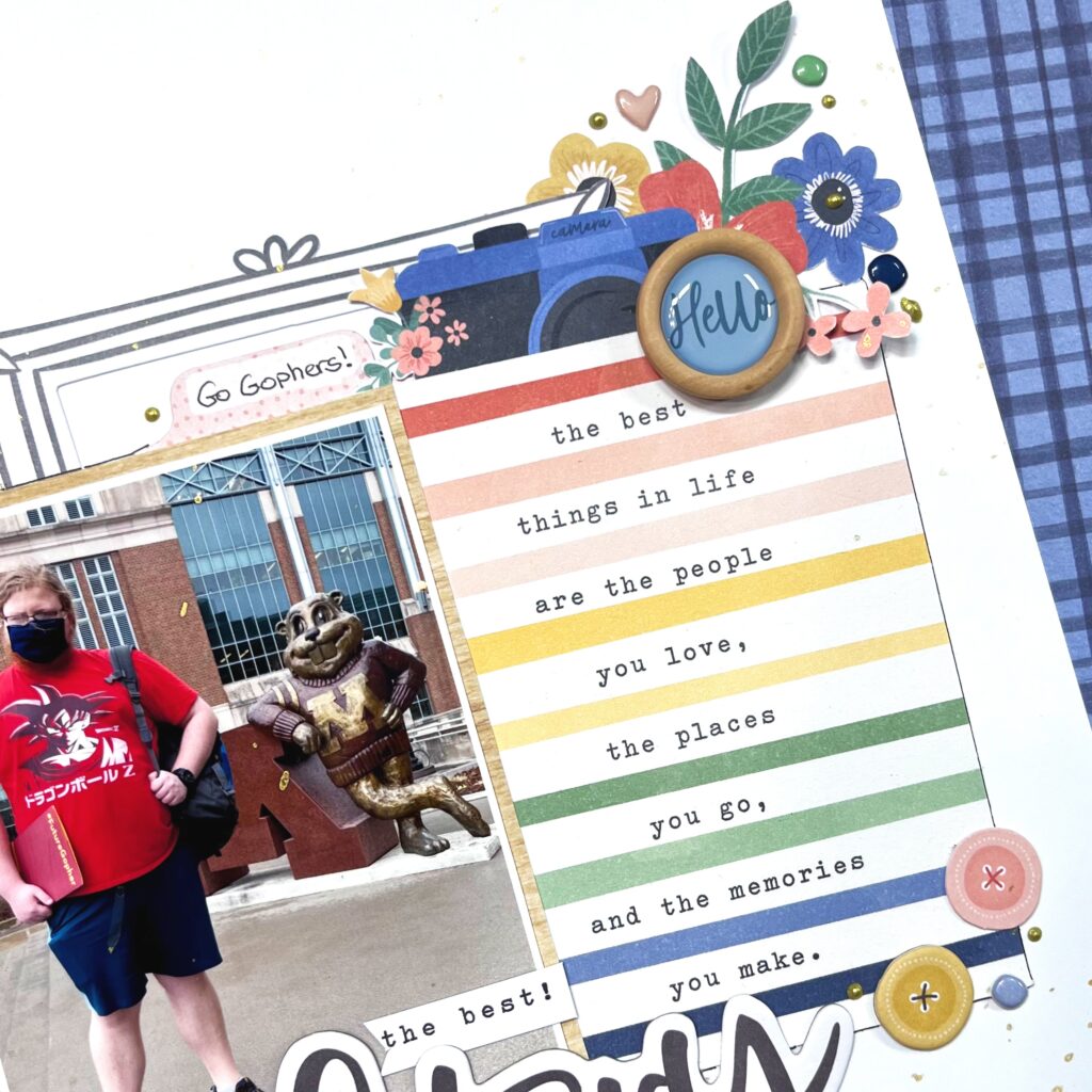
On the right side of the page, I combined this fun journaling card and my portrait photo for a mini-layout within a layout! This half of a frame tucked behind my photo reminded me of some of the architecture at the university and also created a landing place to build my cluster of embellishments on top of too. All in all, I used five journaling cards on this layout.
I hope this layout gives you inspiration for using your journaling cards on a layout to create a grid or just to add a little extra color! Be sure to check out the process video below to see how “The Best Story” came together!
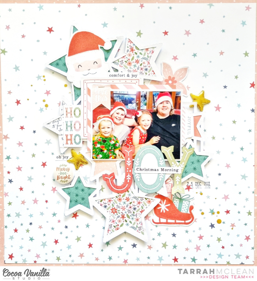
It’s Tarrah back today to share a new scrapbook layout featuring the gorgeous Merry and Bright collection!
I just love creating Christmas layouts, what about you? I still have lots of the Merry and Bright collection and I also love to stash bust so I really enjoyed creating this layout!
I started by choosing my background paper – opting for the Star Bright paper. I then cut out a cut file from white cardstock. The cut file is from CUT to YOU and is called Stars Squared. Once the cut file was cut out, I struggled with the placement and design of my page so I cut up the cut file into separate pieces so I could place pieces of it where I wanted to. Do you ever do this? I do this a lot if I am struggling to like how a cut file looks on my page. There are no rules to say you have to use a cut file the way it was intended!
I backed all the stars of the cut file with papers from the Merry and Bright A5 paper stack, once it was all backed, I then placed foam adhesive to the underside of the cut file and adhered the cut file to the ‘Star Bright’ paper.
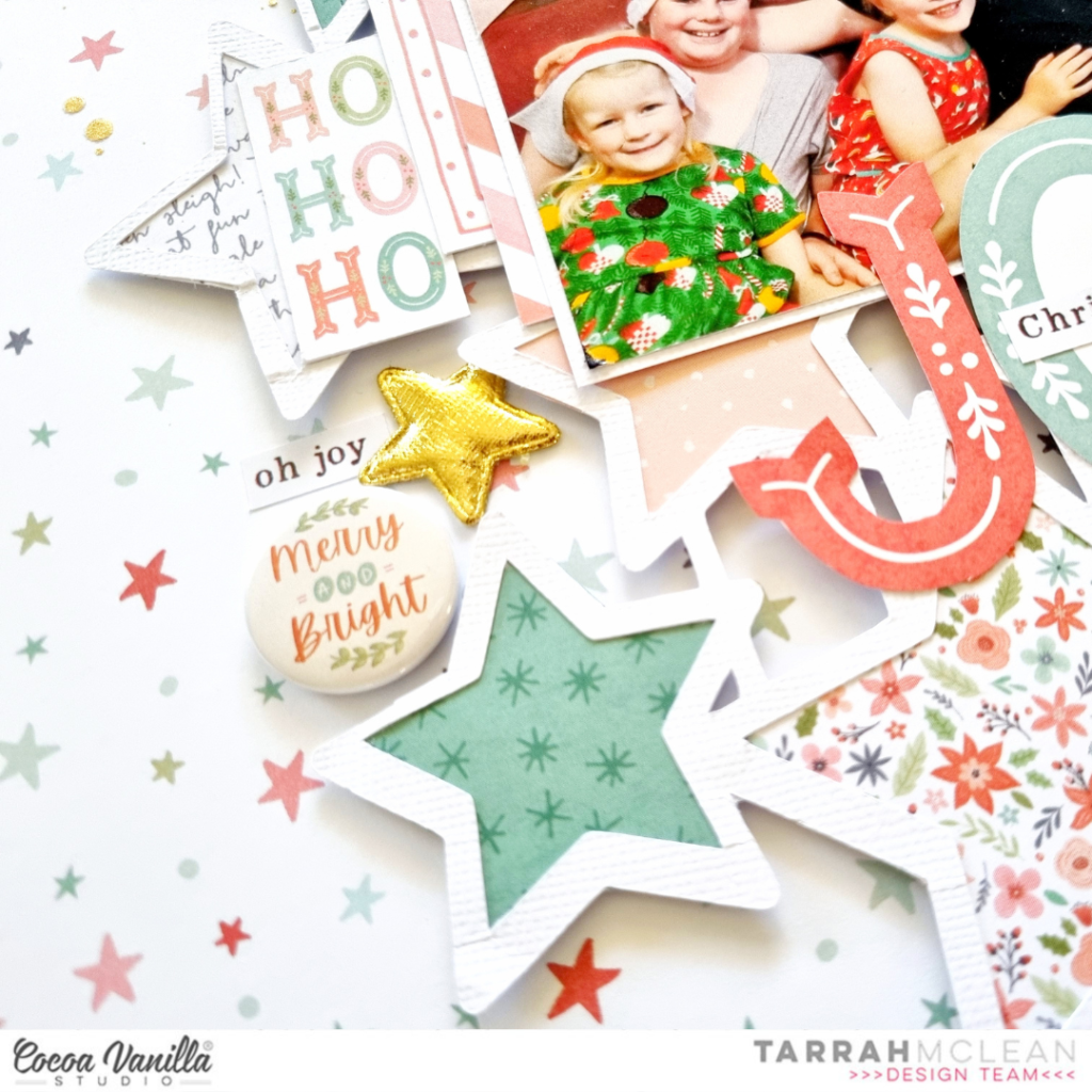
The photo I am documenting today was taken just this last Christmas of my 2 sons and my 2 beautiful nieces! My nieces were able to be here from England for this Christmas! It was wonderful to have them and it was the first Christmas we have had together with them! A very special memory to document. I layered one of the pocket cards and a cardstock frame from the ephemera pack under the photo and adhered it overlapping the cut file, in the centre of my layout. I also stapled a banner sticker from the accessory sticker sheet to the top left corner of the photo. My title is made up of a phrase sticker from the accessory sticker sheetoverlapping the word ‘Joy’ fussy cut out from the Season’s Greeting paper. It certainly was Christmas Morning Joy in our household!
To the left of the photo I also placed the Ho Ho Ho die-cut from the ephemera pack, a gorgeous flair button, a phrase sticker and a gold puffy star. In the top left I also placed that super cute Santa face die-cut from the ephemera pack and to balance that with the bottom right corner, I placed the sleigh, also from the ephemera pack.
To finish my layout, I added a few smaller embellishments like small die-cuts, stickers, another gold puffy star and completely finished the page with stamping the date stamp and sprinkling some gold Heidi shine. Once I had finished my layout, I then auditioned some papers to go behind the Star Bright one to act as a ‘frame’. I decided on the ‘B’ side of the ‘Joy to the World’ paper. I trimmed down the ‘Star Bright’ paper and adhered it to the ‘Joy to the World’ paper.
Thank you so much for stopping by the Cocoa Vanilla blog today! I hope you enjoyed reading about how I created my layout as much as I enjoyed creating it.
Do you have the Merry & Bright collection? I encourage you to pull it out and create some pretty things with it!
Hello everyone! It’s Anna here and today I will surprise you with my project, as I didn’t make another layout! I know! How unusual of me :) I recently watched live where fellow scrapbooker was showing how to make gatefold cards and I wanted to try making one or two. Even after so many years in crafty world I still have so many things to learn. Cards are my weak point for sure as I do not make them often. However, they are great little projects to try out new products or just play when the mojo is low. I reached for my well loved “Storyteller” collection to make my cards.
At first they look like a normal, rectangular cards but magic happens when you remove the belly band. Sides of the card unfold, revealing the inner part. You can make classical version with two rectangles on the front, or use your shape dies to make a window! This is exactly what I did here. Each card has a different shape used for the front panel – circle and heart. It’s important that the shape you use for the opening is symmetrical when you fold it in half.
I used colorful cardstock for my card bases in red and dusty pink colors. “Storyteller” collection is so colorful that you can easily match some cardstock to it. With the pink card, I left the cardstock visible adding only a small, navy circle around the opening cut out with A5 Paper Stack patter paper. Red card has a cute hearts patter paper in the front called “Oh my heart“. I matches the “i love you” phrase perfectly.
Gatefold cards like to open up themselves so it’s good to add some sort of belly band to keep them closed and flat. My red card has a band made with pattern paper and embellished with bits and pieces from Ephemera Pack. Pink one is closed with just a piece of acetate as I didn’t want to cover the composition. Inside of the card, visible in the window, is decorated with Foam Title Stickers. Each card got a different inscription. You can also use stamps inside or replace words with flowers or some other graphic.
Front covers of my cards are decorated with flowers from Floral Ephemera pack – one of my most belowed products in every CVS collection! They are so versatile and easy to use! I also added few butterflies from Ephemera Pack (I trimmed the white outline with my scissors) and super cute Puffy Stickers – hearts and dots. The best feature of gatefold cards is that you can showcase them on the shelf easily as they stand alone.
They are so easy to make when you learn the process and they look stunning. You can easily make a christmas version and I will probably try to create few. And how do you like them? Have you tried this card form before? You can find plenty of tutorials on YouTube for them. Just tyle gatefold card tutorial and many variations will show up.
That is all for today! Thank you so much for stopping by and see in in December! Can you believe it’s only month until christmas?
It’s Kel here today, back sharing a page for you using the ‘No Limits’ collection, and you may be surprised to find I have created quite a mixed media back ground which isnt typically my thing….not because I dont like it, but because I worry that I will mess it up! So here is my version of mess .. but with control!
To start my page, I grabbed a 12 x 12 brick stencil and used 4 different shades of blue with my distress oxides through the stencil, working my way from lightest to darkest down my page. When that was done, I decided I wanted the bricks to look a bit more textural, so I added water with a paintbrush over the bricks (again, I was in control… LOL), and added a bit of stamping to some of the bricks as well! Next I cut all the bricks out leaving a small white border then popped them onto black cardstock to really make them pop! In this picture you can see the cool effect water has with oxide ink…
I also added some of the bricks onto foam so they looked more dimensional…
I backed my photos on a bunch of the patterned papers and distressed the edges to help lift my photo from the page. The main embellishments I used were stars.. some from the die cut pack, some chipboard, and some I fussy cut from the patterned paper.
For my title, I wanted to use the word die cuts as I love how bold they are, and I needed something that was going to stand out from the background….love them!
That’s it for me today, I hope you found some inspiration and enjoyed my share.
It’s Tarrah McLean back with you and today I am sharing a Christmas themed scrapbook layout with you featuring the gorgeous Merry and Bright collection from Cocoa Vanilla Studio. Do you like scrapbooking Christmas? I absolutely love it and would scrapbook using Christmas collections all year if I could!
I started my layout with a white cardstock base and decided to document a Snapchat photo of myself taken last Christmas Day, it goes perfectly with the Merry & Bright collection. I pulled out one of the frames from the ephemera pack and adhered it to my photo, I then added craft foam to the underneath of the photo. Before I adhered the photo to the white cardstock, I trimmed a piece of the woodgrain paper from the A5 paper stackand layered and adhered it underneath the photo, adhering the photo down on top.
I built my entire layout around the photo in the centre, choosing to leave lots of white space on this page. I tucked in some florals from the ephemera packon either side of the photo, bending the edges of the leaves and flowers to create some shadows on my page. On top of the floral cluster on the right, I adhered a gorgeous flair button on top and also added a heart from the ephemera packalso. Above the photo, I adhered the ‘Merry’ tab and from the accessory stickers, I placed the banner with the star in the top right of my photo.
At the bottom of my photo, I placed the ‘Merry Christmas’ sticker from the accessory sticker sheet and this became my title for the page also. I also placed the rectangle journal spot sticker under the title sticker. Once I was happy with the centre cluster that is the main focus of my layout, I started to add some details to the top and bottom of the page. I cut out a strip of the pink, red and white stripe paper for both the top and bottom, I also scalloped the edge of a piece of the green check paper and adhered that piece at the top. I added some ephemera pieces, a banner sticker and one of the gorgeous gold stars also.
On the bottom edge, I added some more ephemera pieces and another gorgeous gold star also. Some of the smaller and last details I added were the small phrase stickers, the date stamp and splattered some gold Heidi Shine around my page also. I love how the gold Heidi shine looks against the white and also how some of it has landed on the holly leaves as well. Once I was happy with my final layout on the white cardstock, I then trimmed down the white cardstock and adhered it to the coral 12′ x 12′ patterned paper from the collection.
Thank you so much for stopping by the Cocoa Vanilla blog today! I hope you enjoyed reading about how I created my layout as much as I enjoyed creating it.
Do you have the Merry & Bright collection? I encourage you to pull it out and create some pretty things with it!
Wishing you all a very Merry Christmas and a safe, happy and healthy new year.
Hey y’all! Laura Alberts here again with a fun boy layout using a Throwback Thursday collection…Boys Rule! I adore this collection and the mix of colors and patterns that make it so versatile to use! Scrapping these photos of my oldest getting his driver’s license was so much fun! I paired a Paige Evans’ cut file called ‘Travel Words’ with the bright bold colors in the A5 paper pad.
To give the cut file a bit of pop, I layered it on top of the gorgeous gray background in this collection. I added a word phrase in front of each of the O’s in the long title. My photos on the other hand are the star of the show! I made sure to layer a few frames around the perimeter of my layout. Love this look!
I kept my embellishing fairly simple on this one because the large title doesn’t need it! A few small clusters around my photos that utilize ephemera pieces.
I hope this layout inspires you to give cut files a go, if you haven’t already, and then break out your paper frames! Be sure to check out the video below to see how Go Fly came together!
Hi Cocoa Vanilla Studio friends! Danni here with a layout featuring our newest collection Storyteller plus a little of an older favourite – the Sunkissed collection. Although these collections are quite different, the pops of bright yellow in both make it really easy to combine the two. They pair beautifully with the yellow shirt my daughter is wearing in my photo!
To begin this layout, I started with a sheet of plain white cardstock and the Brighter Days 12×12 patterned paper. I cut two strips from the patterned paper, one thick and one narrow, then distressed the edges. I adhered both strips to either side of the white cardstock.
Next I matted my photo. To do this I used a combination of the A5 paper stacks from both collections, plus a bright yellow 3×4 double-sided card from Sunkissed. I distressed and tore some of the paper edges for some extra texture, then added the photo over the thicker strip of patterned paper.
For my title I decided the sparkly glitter foam titles from Sunkissed were perfect, so I added ‘sweet days’ right below my photo. I also added a small banner text piece from the die cut ephemera pack in this space. I also used a few of the glitter hearts from the foam titles around my layout to bring in more sparkle!
The floral ephemera from these collections pair really well, especially the blue and yellow tones. I created three floral clusters around my layout; two either side of my photo and one to the left side of the page. I added in a couple of pieces from the die cut ephemera from both collections as well.
For some finishing touches, I added in a couple of the brushstroke effect clear stickers from Sunkissed, plus a few puffy stickers and some tiny word strips from the accessory stickers. I stamped the date with grey ink on one of the ephemera pieces, then added a small sprinkling of ink splatters around my ephemera clusters.
I was surprised with how easy it was to integrate these two very different collections, and I’m in love with the result! Such a bright, happy layout. I hope you enjoyed joining me today. Happy scrapping!
Hello crafty Friends. For the couple of days we will be focusing on combining old and new CVS collections as an inspiration for you and here is what I have come up witth. The newest Cocoa Vanilla line is beautiful “Storyteller”, which I am sure you are already familiar with. It’s saturated colors and very versatile theme are perfect for all sorts of projects. I was thinking of other collection that has similar color palette and “Hello sunshine” was the first one that came in my mind. It’s probably because I am a big fun of all summer themed lines :). They are always so colorful and fun. Combining “Storyteller” and “Hello sunshine” is the perfect idea as I am running really low on papers from the old line and as they are no longer in stock, I am stuck with leftovers only. Every new collection that shares similar vibe is a chance for me use up those leftovers and let this well loved line shine once again.
As I mentioned before, I am running low on pattern papers from “Hello sunshine” collection. But who can blame me? They were fantastic. That’s why I am more than happy to use this pattern “Brighter days” with colorful stripes from “Storyteller” line as a base of my project. It’s quite bold but with a cluster of four pictures it was toned down a bit. With blue nad navy on the bottom it kind of looks like landscape during the sunset. This page is about enjoying the lake so I decided to use this pattern this way exactly.
Next step was to add my photos. They are all the same size and they take a lot of background space. I glued them down in the middle of my background leaving a little bit of space on the left and right for some embellishing and on the top and the bottom for my title. We had so much fun renting water bike during our last vacation in French Jura and swimming around the lake. Kids were jumping to the crystal clear water, we were taking turns with pedaling – it was such a fantastic, family time, worth a whole page.
After using “Storyteller” paper as a layout base, it was time to embellish it with some bits and pieces from “Hello sunshine”. I have a digital version of this line but I was too lazy to print anything so I focused of whatever I have left in the ephemera pack. I also fussy cut some flowers from one of the papers. I arranged those bits and pieces on both sides of the photos adding few stickers from 6*12 sticker sheet.
With all the embellishing done, I was ready to add a title. Once again I reached for my everlasting pile of alpha stickers, that once were part of CVS collections. I used two different colors – yellow on the bottom as it contrasted well with navy and navy on the top as it contrasted orange better. I am running out of some letters so I needed to make E from an F. It’s totally possible and I do that a lot. If you need more tips or missing alpha latters here they are. Use V turned upside down as an A (just add a piece of other unsed letter in the middle), turn F into E with an estra strip of other sticker. Cut a piece of T, turn it upside down and make L of it. If you need Y, take X and cut out on the the bottom “arms”. Turn G into C by trimming part of it. Use W instead of M or the other way around.
After adding the title, I circled back to my “Storyteller” embellishments and added few puffy hearts here and there and three epoxy buttons. They look like taken from the same line! I just love those lucky coincidences!
That it all for today my Friends. Thank you so much for staying with me through the whole post. Don’t forget to come back to see what collections other DT girls will me “marrying together”. See you in two weeks.
How lovely of you to visit the Cocoa Vanilla blog today I love to see you here. For this boy themed layout I really wanted to work with the fantastic collection “No Limits”
This photo of my son is from quite a few years ago but the colors and his cute little face fit this collection wonderfully well. For this layout I was inspired by a sketch by Lottie Loves Paper that I found on Pinterest. I love using a sketch. It can give you just that creative push you need at that moment.
I took a 12×12 white cardstock paper and choose six of my fave design papers form the “No Limits” collection. I cut out six 3-inch circles and provide the edges of the circles with a stitch edge. I choose white sewing thread and use my sewing machine. Then I cut a half circle in the circles and fold them over. See picture…..
As also shown on the sketch, I am stitching a grid pattern on my layout. I choose dark blue sewing thread for the grid design. The dark blue is also reflected in the title as in the photo.
I cut two larger circles from the patterned paper and stitch the edges with white sewing thread. I also cut my son’s picture into a circle and place the circles on top of each other.
I fussy cut several stars from the pattern paper and created a cluster of stars on the top right and bottom left of the layout. In this way, I create a diagonal design.
The awesome bold and cool words from the die-cut titles are perfect to use for a title. The title for this layout will be ” Hello Cool Kid” under the die-cut title I fold some extra dark blue sewing thread.
I complete the title with some extra word strips that I added with a black line by using my fine liner.
I placed a few extra embellishments like wooden buttons, puffy stickers and cardstock embellishments to decorate my boys layout. Finally I give my layout some white gesso splatters. And for a little more color I add some dark blue splashes. I choose the color Distress Oxide “faded jeans” I love ink and gesso splatters on my projects. It looks festive and creative and I love that so much!
I hope I’ve given you some fun and cool ideas and that it can also be helpful for you as well to use a sketch sometimes. Love to see you next time on the blog and social with a new scrapbook project! Can’t wait to see your beautiful scrapbook inspiration on the Cocoa Vanilla FB groep! Happy creating and I wish you a fun and crafty day friends!