The Best Story | Storyteller Collection | Laura Alberts
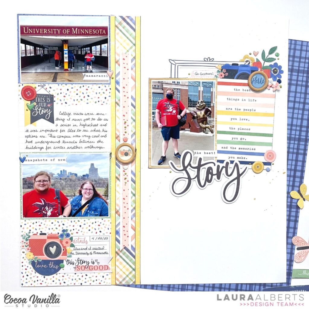
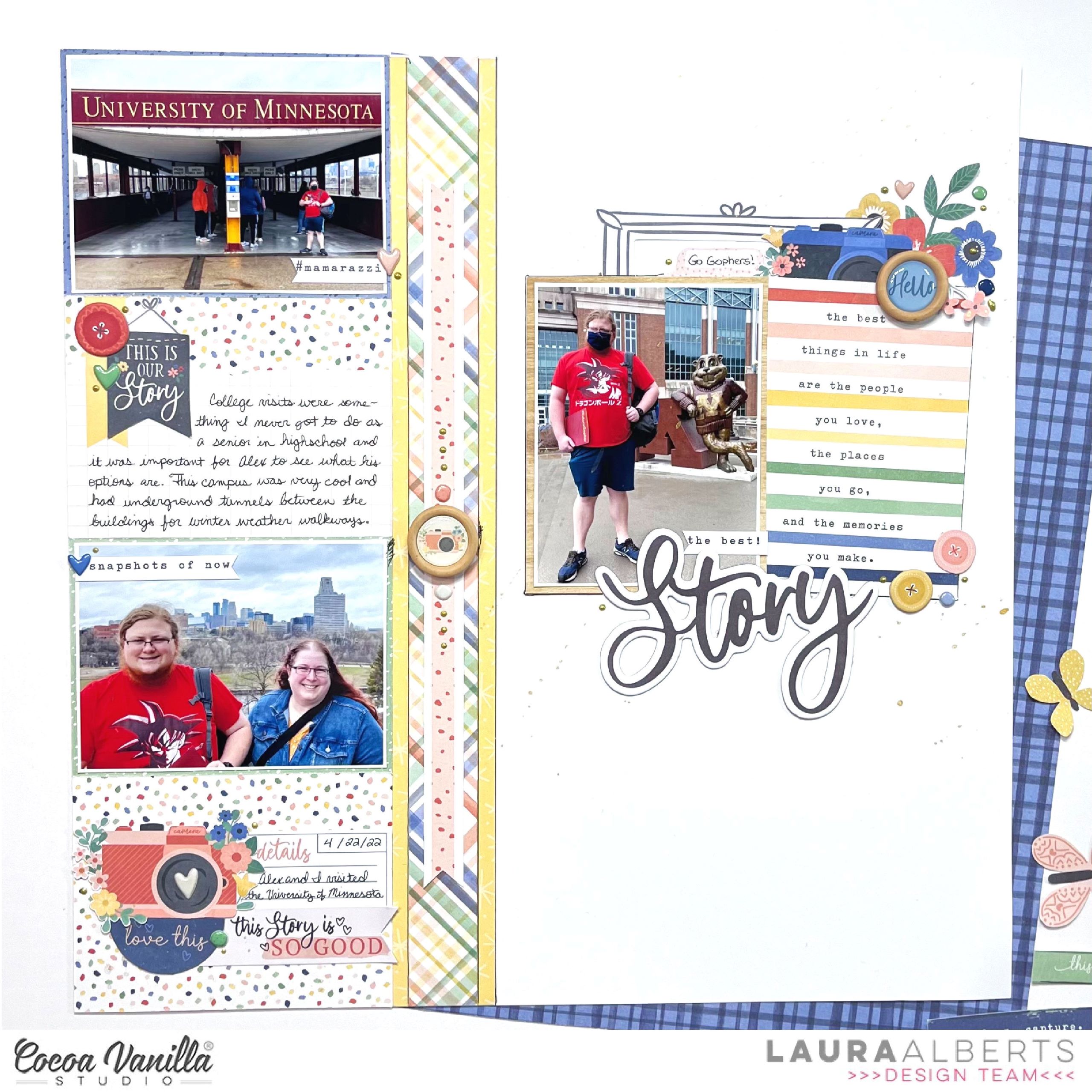
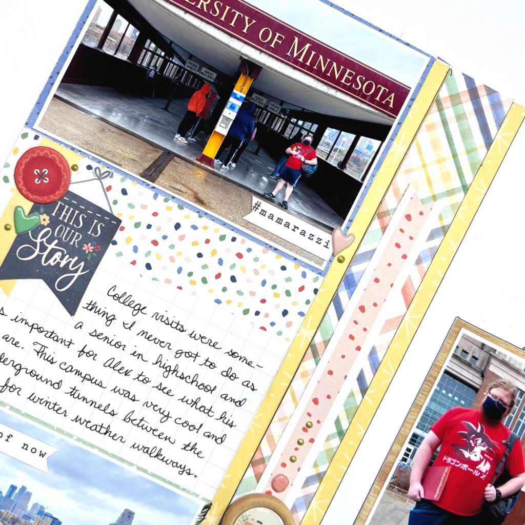
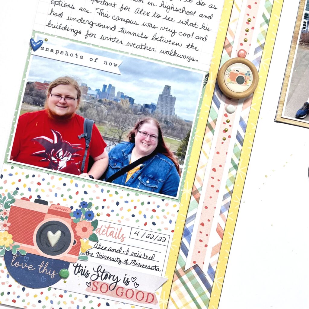
Hey y’all! Laura Alberts back again with a fun layout of my son’s university tour! I thought the colors in these photos were perfect for Storyteller and they worked really well together. I chose a column design because I had two landscape 3×4 photos and 1 portrait 3×4 photo. I find splitting up the two formats a little easier to scrap. The left-hand column has 4 journaling cards stacked one right after another, 2 to back my photos and 2 for journaling spots.
A multi-layered strip down the center gives the two columns defined areas and gives me a place for a little extra embellishing in the middle. I especially love these wood buttons with the epoxy in the middle! Such a fun way to add more dimension and texture to the page. On top and bottom of that button are round puffy stickers, then a few Nuvo drops for interest. At the bottom of this page, I collaged stickers and ephemera to make an embellishment cluster.
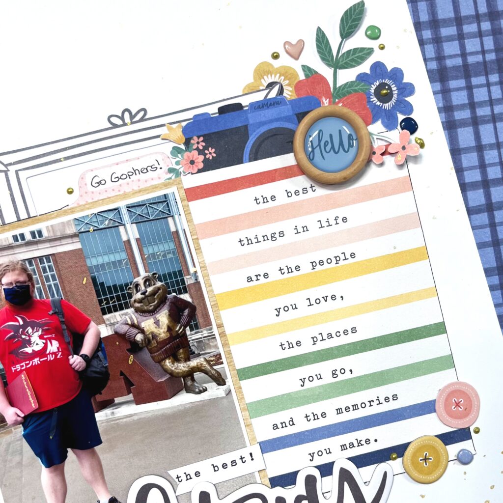
On the right side of the page, I combined this fun journaling card and my portrait photo for a mini-layout within a layout! This half of a frame tucked behind my photo reminded me of some of the architecture at the university and also created a landing place to build my cluster of embellishments on top of too. All in all, I used five journaling cards on this layout.
I hope this layout gives you inspiration for using your journaling cards on a layout to create a grid or just to add a little extra color! Be sure to check out the process video below to see how “The Best Story” came together!

