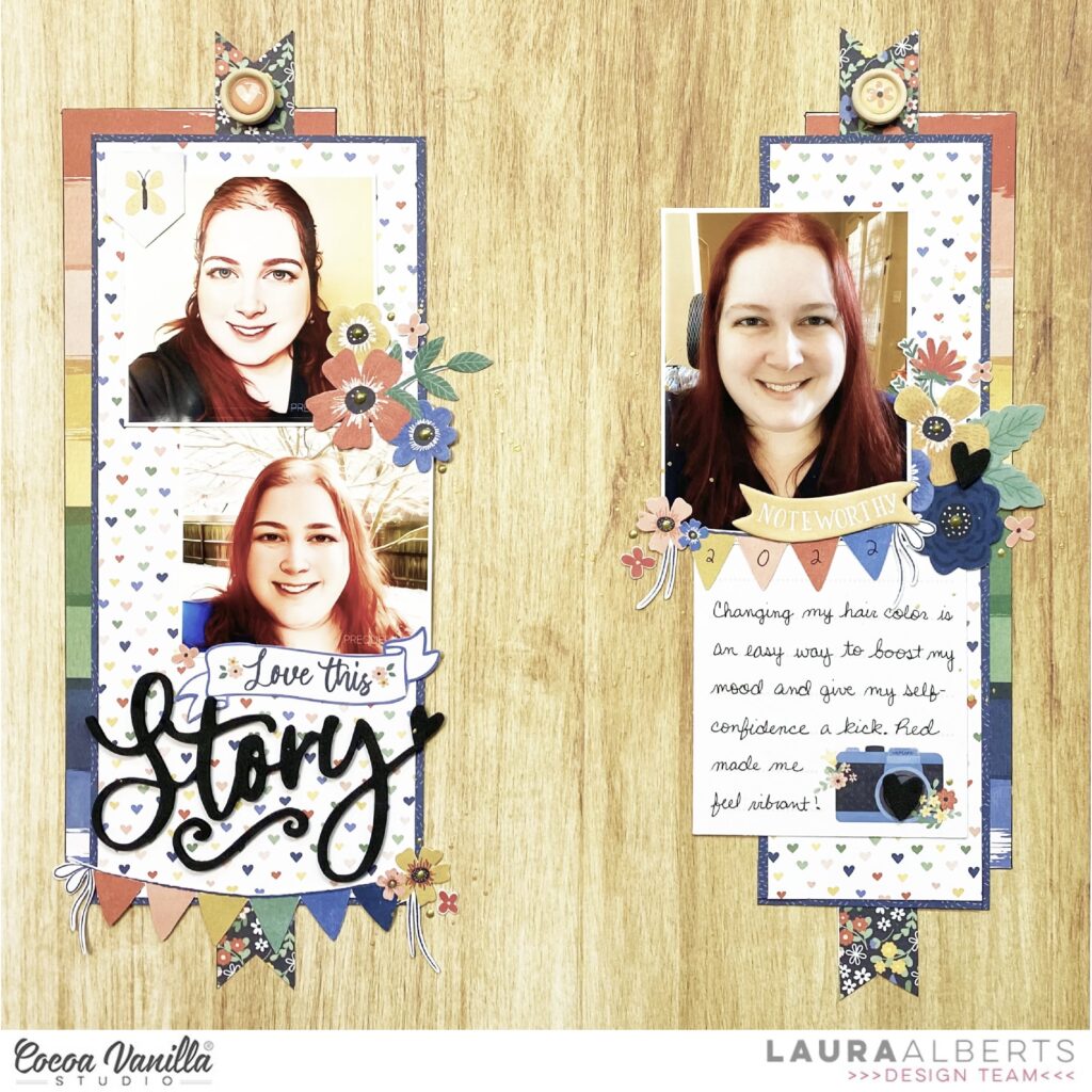
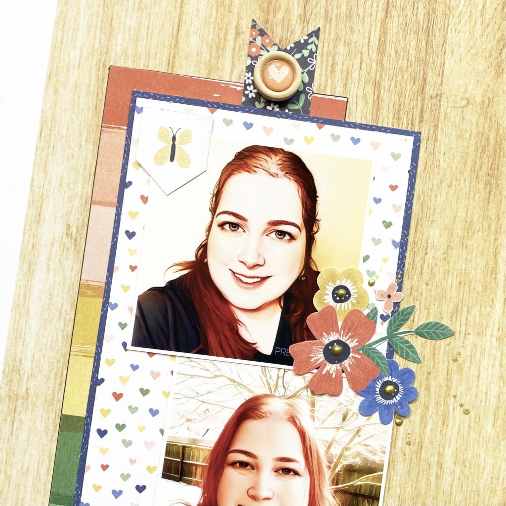
Hey y’all! Laura Alberts back again with a fun column style layout featuring the gorgeous new Storyteller collection! I am completely in love with this one! The stunning color scheme and all of the tiny details are just perfection. Scrapping a handful of fun selfies for this layout, I opted for two columns on either side of the page. Using the Cross It Off woodgrain paper for the background really helps these photos a pop off the page. Then, I pulled in three papers from the A5 paper stack for my columns, as well as a floral strip from the Story Time cut-apart paper.
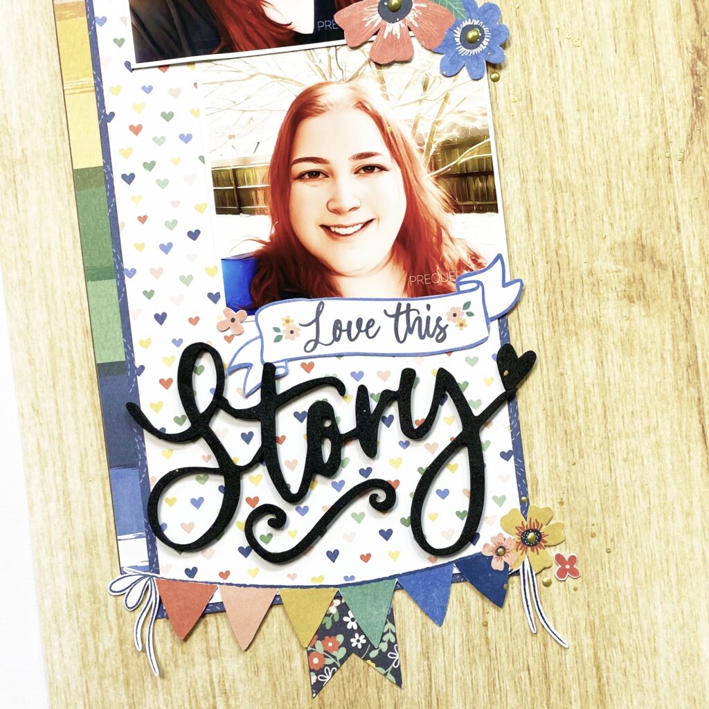
I stacked two 3×3″ photos together on the left column and then added a mixed title below them. The ‘Love this’ is from the icon ephemera pack and then ‘Story’ is a foam title. Along with a floral cluster between the two photos, I added a banner along the bottom of the column. One of my favorite details on this page is the tiny flowers I fussy cut and added around my clusters and title.
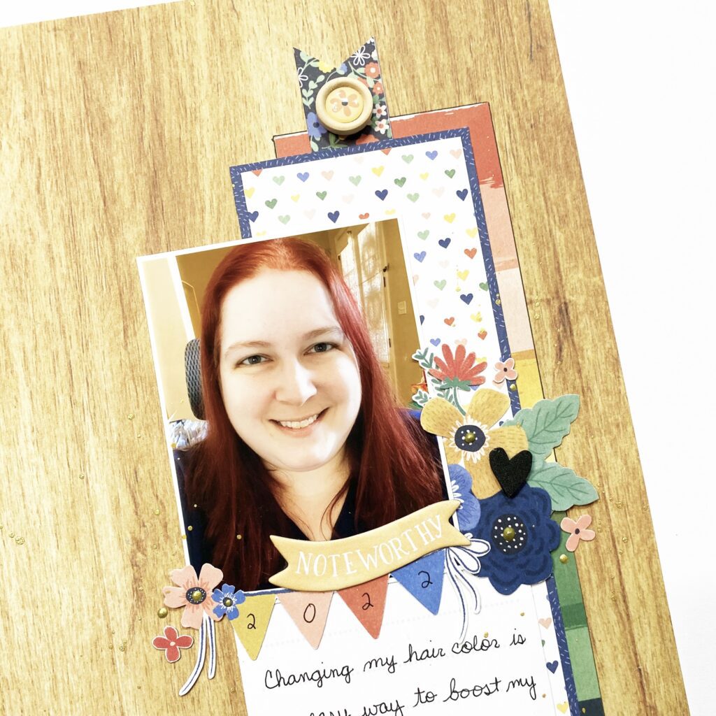
On the right column, I combined a 3×4″ photo and a 3×4″ journaling card to mimic the stacked design on the left. Tucking in a floral cluster between them and then adding a banner gave it the perfect, simple touch it needed. The wood buttons made the best little accents at the top of my columns, giving the impression that they are pinned to this woodgrain paper. Such a fun detail!
I hope this layout gave you some inspiration to incorporate a variety of different-sized photos into your layout! If you’d like to see how ‘Love This Story’ came together, check out the process video below!
Hi everyone, new product is always so inspiring and today I’m thrilled to share my first layout made with the amazing and gorgeous Storyteller collection!! I’m sure I’ve said this before, but the first cut into a new collection is always the hardest for me, and Storyteller was no exception. I looked at my Instagram feed and saw that the child to get a layout next was Brielle. She turned 8 in April and I decided to create her birthday photo page.
I started this layout by fussy cutting lots of clusters and single flowers from Spring Fling. I just love fussy cutting, and I especially love the look that the extra time and care to cut creates. I used my Envelope Punch to create an envelope from Little Love, which is one of my favourite papers in the collection because I adore the navy and small hearts! I embellished it with the flowers, an Accessory Sticker and a Chipboard Sticker. The “8” is from my stash.
I created my watercolour background with a navy distress oxide ink, followed by gold shimmer mouse through a stencil. I just love how it turned out! The packaging technique is a perfect mixed media look when you want something a little random and not too perfect! The butterflies in this collection are adorable, and the butterfly below is from the Chipboard Stickers.
I used one of the Pocket Cards tucked into the envelope because I loved the sentiment, and I loved the fun design feature it added! I distressed the edges of the card and machine stitched around the outside. It was fun to embellish too!
I layered my photo over the envelope and then added more fussy cut flowers, an Accessory Sticker and a Wood Button. I backed my photo with two layers of the same pink paper from the A5 Paper Stack, and of course I distressed the edges!
I created my title with a word from the Foam Titles, they just make it so easy! I added a distressed and machine stitched piece of Brighter Days to add some interest at the bottom of my page, and to write my journaling.
Thanks for looking! I hope I’ve inspired you to create with Storyteller!
HI All, its Michelle back here today with a new layout share featuring out BRAND NEW Storyteller Collection. Such a stunningly beautiful collection full of feminine patterns and oh so many sweet florals. And, if you know me well enough, you would absolutely be right in thinking that I jumped straight into the fussy cutting of ALL the florals before I even started the layout.
I thought it was time that this sweet little furry face made another appearance on the blog. Firstly because she’s just so stinkin cute, but also due to the lack of decent photos I’m getting from a certain 11 year old in my household haha.
To create the layout I grabbed the SPRING FLING and OH MY HEART papers and cut giant triangles (from the reverse side patterns) to overlap the majority of the bottom of the white cardstock background, adding machine stitching down the lightly distressed edges. I chose these two designs as they complimented each other well, and worked perfectly as a base for the giant clusters of fussy cut florals to stand out
I used the green pattern paper from the A5 paper stack to create layers under the black and white photo. Rather than using 1 full piece, I cut them into different sized shapes and layered randomly together before adhering to the layout using pieces of foam sheet for a little extra dimension.
I created a long line of floral clusters sprouting out from either end of the photo stack in a diagonal line using fussy cut pieces from both the 12×12 and A5 version of the SPRING FLING paper
I also added some fussy cut butterflies (FLY AWAY) , puffy stickers, accessory stickers and ephemera pieces to create added interest within the clusters.
I added more florals, ephemera, puffy and accessory stickers to fill up the open white space at the top of the layout
And lastly the title, using the awesome foam title stickers. So many title combinations to be made from one very versatile set, definitely an item to add to cart if you are purchasing this collection.
Here’s a closer look at all the pretty florals under the photo. You can see I’ve also added the usual sprinkle of gold ink to finish it all off.
And one final look at the whole layout
Well thats all from me today, thanks so much for stopping by. I hope you’ve enjoyed seeing the first creation I’ve made using our BRAND NEW Collection – Storyteller. Cant wait to see what you all create with it too
It’s Sophie here and I’ve got a new layout to share!!
I used the beautiful These Days collection for my page today and decided to go with stripes!
I used a thick white cardstock for my background and cut a few strips of the Family Ties paper in several different lengths. I placed them below my photo, machine stitched on them with white thread and also added small teared pieces of velum on each of them for more interest. I think it also adds softness to the page.
Hey Hey! It’s Michelle here today with a new layout share for you all using a technique that I’ve used a few times in the past, one that is quite time consuming, but looks pretty awesome once complete. I’ve also dipped into more of the No Limits Collection while I’m patiently awaiting the new Storyteller collection to arrive on my doorstep.
This layout was definitely a labour of love, weaving tiny little strips of paper together to create 1 large pattern overloaded background, but the end result was well worth it! Documenting a fun moment shared between Leila and 2 of her cousins late last year when we were able to get together to celebrate her 11th birthday. Still cant believe we’re halfway to 12 now.
I had a rough idea of how this layout was going to come together, so I started off by marking out a section on white cardstock where the weaved strips were going to sit, then adhered a couple of weaved pieces in place towards the bottom to create a starting point that wouldn’t slip out while building the piece up. I’ve used papers from both the A5 paper stack and 12×12 papers and continued to weave the strips all the way to the top, adding tiny drops of glue here and there along the edges to keep it all straight. This process took a couple of hours to perfect to get the right balance of colours and patterns throughout the piece. Once complete I added the extra white cardstock pieces over the top and sewed them down to hold the weaved piece in place.
Next I added the photo stack, layered with contrasting blue pattern papers with clusters of fun pieces either side.
To the right side I’ve mixed multiple pieces from the ephemera pack along with fussy cut stars from the Nebula pattern paper. Most are adhered with foam tape to lift them up and create dimension. We all know that I can’t create a layout without adding a tonne of foam tape for dimension, I just cant help it lol
To the left I’ve added more fussy cut stars and ephemera pieces, both scattered and tucked into the layers of the photo stack. I’ve used so many stars in my last few layouts that I’m surprised I’ve still got plenty left.
I created a mixed font title using the AWESOME word from the Die Cut Titles pack and an edited version of the ‘Born to Be’ banner from the accessory sticker sheet.
Last bundle of goodness grouped together on the bottom right section of the layout using a bunch more stars, ephemera pieces and a chipboard sticker piece to complete the group.
I gave the whole layout a sprinkle of black ink then called it done. Here’s another look at the final layout…
Really happy with the end result, creating something magical to document a sweet little moment between some pretty awesome cousins.
Well thats all from me today, thank you so much for stopping by. Be sure to share your creations with me when you try out the fun technique of paper weaving, I think it was kind of therapeutic in the end lol
It’s Sophie on the blog today with a new layout to share !
I used the Sunkissed collection for this bright and colorful page !
I used a thick white cardstock for the background and applied dry ink on a stencil from my stash with a brush.
I layered two pieces of patterned papers from the A5 paper stack behind my black and white photo, and cut a big envelope with a metal die to insert a tag cut out of the Good Vibrations paper for my journaling.
I fussy cut beautiful florals from the Growing Wild paper to decorate around the photo and cut out cute little clouds from the Just Chillin’ paper that I placed above the photo.
I used a 3×4 card for my title and added a few Accessory Stickers as the finishing touch.
Here are more close-ups:
Ahhh Summer…! There isn’t a better collection than Sunkissed to highlight those beautiful memories!
Hey y’all! Laura Alberts here again with a fun multi-photo layout featuring the gorgeous new No Limits collection. This layout has a combination grid and column design, with two photos gridded into the Latitude pattern paper on the left and one photo showcased on the right. I loved including pocket cards on this layout too! One I used for a journaling spot, one behind to the photo on the right side and one in the center of the grid on the left. Such a great way to add a little extra detailing!
My clusters on the grid are pretty simple, so that the photos still remain the focus. A simple arrow with a circle, star, and word phrase on the top photo. An arrow with a hand sign and star on the bottom photo. In addition, a chipboard word phrase across the center of the pocket card made for a fun detail. Something a little unexpected.
The center of the layout is certainly the ‘star’! This photo was taken in the middle of my son’s explanation of what he was holding (the dipstick). I wanted to showcase the skills he’s learned over the years in his personal albums and this seemed like a perfect series of photos to include. My journaling is hand-written, a detail that I personally love to see on layouts! To finish off my center section, I tucked ephemera stars behind the photo and sprinkled puffy stickers and ephemera stars around the edges. A bit of nuvo and gold ink splatter as a final touch.
I hope this layout inspires you to take a new look at your multi-photo layouts! Thanks for stopping by!
Hello Friends. We all love Cocoa Vanilla for their masculine collections, right? Zoe is a master of designing them and she never disappoints with each new line. They are very versatile and can be used not only for boys or men photos and I am a proof of that. I am a mom of two girls and a beagle boy and I use those lines to scrapbook my puppy photos mostly. But, from time to time, I put my girls on the display too. They are way less cute than a puppy but I need to be fair with dividing my scrappy attention :) I framed their photo using new “No limits” collection and it turned out great.
I was inspired by the pack of title die cuts that comes with this collection and wanted to use as many as possible on one page. That’s why I printed by photo big and square to be frames by the words. I also changed it’s colors to black and white and it will better fit the vibe of “No limits”.
My layout base is made out of “Spark” paper. It has very light and calm pattern in the middle and fun, mixed media like frame on the edges. I also fussy cut some stars from “Nebula” paper. I love patterns like this – with elements big enough to be cut. It helps to stretch your collection way further than a pack of ephemera pieces.
With a photo glued flat in the middle of the page, I started arranging the words around it. It was tricky to find right combinations – they needed to fit on the side of the square and make some sense as a phrase. Each word is glued down with a layer of foam tape for more dimension. I also added some fussy cut starts in the composition.
If you have some empty spaces left – don’t worry. You can fill them with stickers, ephemera pieces or other elements. I reached for cardboard stickers mostly, as they add great texture to every project. You can also spot few wooden buttons (my big love!). Big words look great accompanied by small phrases in different font so I added few word strips from stickers sheet. I finished my project by adding few super cute puffy stars here and there as a stronger color accents.
That is all for today. I hope I inspired you to use those die cut titles. You can arrange longer title with them, use single words and I even fussy cut single letters to make totally new words with them! Sky is the limit here.
Thank you so much for stopping by and see you in June! Let’s hope I will have some project made with brand new line to share with you.
Hey Everyone! It’s Michelle back here today with another instalment of our regular ‘Throwback Thursday’ theme. I dipped into the remnants of my Legendary Collection stash for this layout to document my awesome nephews recent birthday. This kid is such a rad rockstar, he absolutely deserves to shine bright on the Cocoa Vanilla Studio blog!
Our little family have recently been struck down with the dreaded ‘spicy cough’ as some may call it, and during one of the many days that I didn’t move much from bed I ended up fussy cutting an entire sheet of stars from the ALL STAR 12×12 paper in the Legendary Collection. A lot of tiny scraps of paper left in the bed and a fully cramped hand but I’m absolutely thrilled with the end result, a vision that came together in my head while sick in bed a few days prior.
To create the layout I started with a star shape clip art found easily in a google search, resized in Silhouette studio so that it filled as much of the 12×12 background paper as possible and cut it out on white cardstock. I separated the large star shape from the negative outer edge piece without tearing any edges and kept both pieces for future steps. Next I created the star outline that overlays the top of the pattern stars, this was done with a simple cut, paste and resize of the original star shape to create the outline piece. Again, both pieces separated once cut and sat to the side.
Now it was time for the fun part. I used the larger star piece from the original cut to add all the different coloured and sized stars using both foam tape and glue adhesive for different heights of dimension. This took a couple of hours to get it all right to ensure both colours and sizes were evenly distributed. Once this step was complete I was able to assemble the layers to make the background pop.
To get the layers exactly right I started with a fresh sheet of white cardstock on the very bottom, on top of this I added the negative outer edge piece of cardstock from the first cut adhered flat on top. This helped to assist with the correct placement of the bright stars piece which was added straight after. The final ‘layer’ to this star spangled sanga was the second negative outer edge cardstock piece which I lined up with the first and adhered using foam tape to create shadow lines and dimension down into the star pieces, if thats what you would call it. Lastly I added the star outline piece over all the layers, rotated around so that it sits different to the pieces below it and adhered with more foam tape for a little extra pop off the page.
I added the sweet photo of my super cool nephew to the left of centre and layered complimenting pattern papers underneath with the addition of a sticker and ephemera piece tucked in for good measure. I printed the photo in black and white to avoid any colour clashing, as there was a lot of similar colours in both.
Under the photo I added the mixed font title, made using the word EPIC from a 3×4 card on the EPIC TALES paper and some of my most favourite white alphas that I’ve stitched into place, finished off with a mini cluster of fussy cut stars
Over on the top right of the layout I added another little cluster of stars along with some ephemera pieces and a word sticker from the accessory stickersheet
and in the bottom right side of the star I added a note about the photo and even more fussy cut stars.
Here’s a final look at the layout with all its brightly coloured stars and a splattering of black ink. I really enjoyed creating this layout using the LegendaryCollection. It’s certainly fun creating things that are different to the usual pretty florals that I tend to be drawn to. Plus the fussy cutting of the stars felt quite therapeutic and was a good little activity to make the day pass quicker while stuck in iso.
Well thats all from me today, thanks so much for stopping by! I hope this layout has inspired you in some way to get a little creative with fussy cutting, as theres so many papers within the Cocoa Vanilla Studio Collections that are perfect for chopping up and recreating with. I hope to see some of your creations shared within our Community Group real soon.
Hi everyone, it’s Sue Plumb here to share another design team project with you. For today’s post I was tasked with scraplifting the amazingly talented Sophie Delorme, which was simultaneously exciting, but terrifying. It’s no secret I have a huge scrappy crush on Sophie’s work, so to be asked to scraplift one of her layouts was no easy feat. How would I ever choose? Or do it justice? In the end, I chose a stunning autumnal themed layout that she created a few months ago using the ‘These Days’ collection.
Here is Sophie’s layout…
And here is my take on it using the ‘Happiness’ collection…
I have to admit, the clincher that made me choose this particular layout of Sophie’s was the butterflies. And I couldn’t help but reach for the collection with my all-time favourite Cocoa Vanilla butterflies – ‘Happiness’. I think I will actually cry the day I use my last scraps of this collection.
Sophie and I have daughters that are very close in age, so just like Sophie did for her layout, I wanted to document a photo of my gorgeous girl too. Due to her position, where she was facing towards the left side of the photo I chose to mirror the design so I could position my photo closer to the left edge of the page and having her facing inwards. (Tip: always position your photos so the main subject is facing towards the larger space on your page.)
Just like Sophie’s original, I added torn paper along the bottom edge of the page; and instead of the Pocket Cards that she had used across the middle, I used pieces of patterned paper cut to size. I chose the piece with the two large butterflies and hello beautiful on it to act as my title card, which was cut from the cut apart paper. On top of the the heart paper I added some of the phrase stickers from the Accessory Sticker sheet, which I had mounted onto some pink paper to give them a little definition against the background.
From the torn paper along the bottom edge, I added fussy cut flowers spilling out and winding their way up along the right edge of the photo. these were layered to give them depth and I used foam tape under the one on the corner of the photo for even more dimension. I couldn’t help but add a little frayed gauze for some texture too.
The only item I used on my page that wasn’t from the ‘Happiness’ collection, was the small wood button that was actually from the ‘Sunkissed’ collection. ‘Happiness’ did not have wood buttons, and as Sophie had used one on her page I wanted to include one too. I also wanted to add a couple of embellishments to my photo, so I chose a small heart flag and a phrase banner from the Die Cut Ephemera pack.
I substituted the journalling from Sophie’s layout with a couple of paint swatch stickers from the Clear Sticker sheet and I like the mixed media touch they gave the page. The star of the embellishment show however, was the glorious burst of fussy cut butterflies spilling upwards from the title card. I bent their wings up from the page to give them dimension and a sense of movement. The final touch was some small splatters of navy mist (because I couldn’t have my layout too clean, could I?)
If you would like to see how I put it all together, you can watch my process video here:
Thanks for stopping by today, I’ll be back with another project again soon. Until then, happy scrapping!