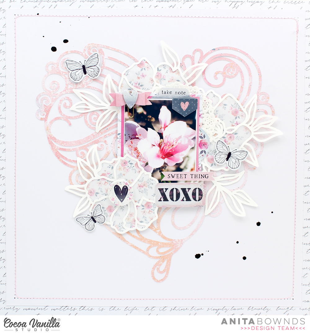
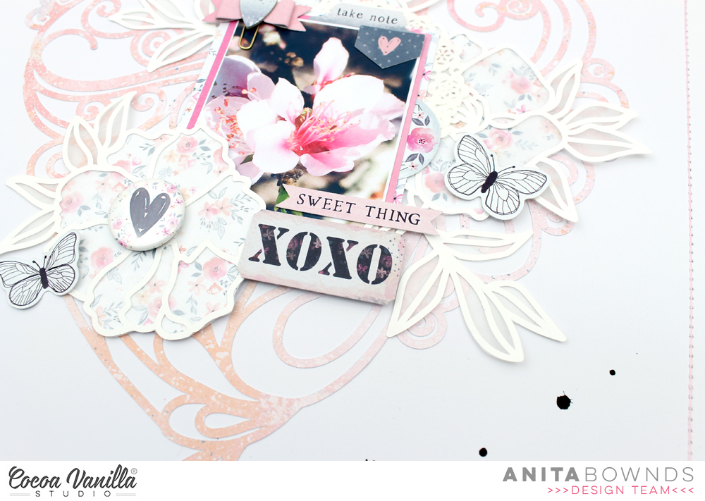
Hello crafty friends and welcome to another blog post. Today, I am playing with the lovely Unforgettable collection as well as some fun cut files from Cut To You!
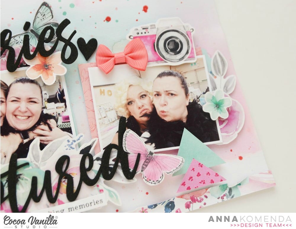
I started my layout by choosing four 6×8 papers and cutting out these layered butterflies that I attached using my Tiny Attacher. After cutting and assembling the butterflies, I used my circle punch hoard to punch out photos of my darling friend, Charlotte as well as circle photo mats. I thought it would be fun to play with a different shape on this layout. While I had my cutting machine on, I cut out these branches with a cut file from the Cut To You shop that you can get for free!
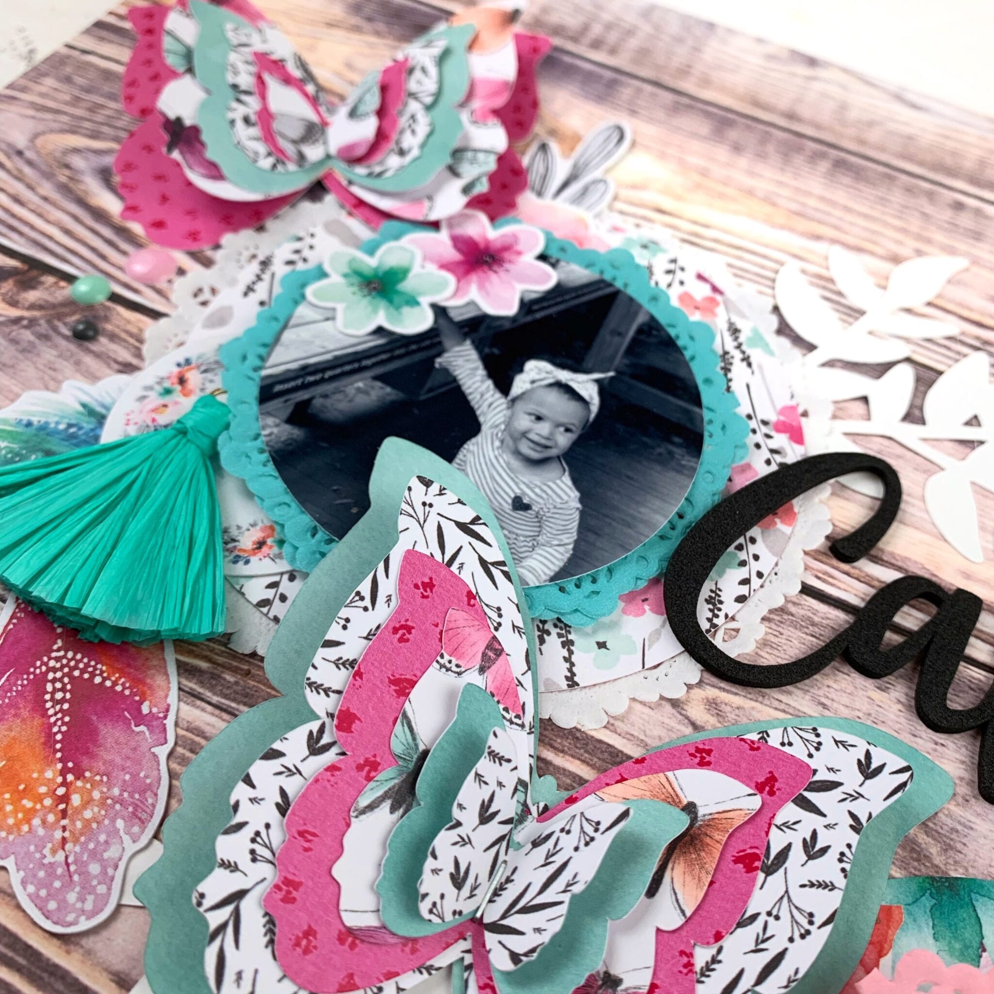
I decided to keep embellishing around my photos pretty light as I knew that I had the larger butterflies as well as the branch elements. I chose to use some doilies for texture and add a few bits and pieces from the ephemera pack to add some color and texture. I also added a tassel and a bow to each of my photos to add more texture and visual interest to my background.
After creating my embellishment and photo clusters, I glued the circles as well as the branches to my background. I chose this woodgrain paper because I love a good woodgrain pattern and I thought it would go really well with the florals I chose for my layout. After adhering the photos and the branches, I worked on arranging the butterflies around the page. My title came from the foam titles pack and I added some enamel dots around the page for some added interest and the icing on the cake.
That’s all I have for you today, crafty friends! I hope you enjoyed this layout and are tempted to give the Unforgettable collection a try.
Hello Cocoa Vanilla family, and welcome to my first layout featuring the super lovely Unforgettable collection! Every time Zoe releases something new, I’m convinced this new collection is my favorite one and then she manages to shock and impress me once again. Unforgettable is me in a collection with all the lush florals, pinks, aquas and neutrals. I’m officially obsessed.
For this layout, I decided to scrap a photo of one of my very good friends and I. I started by picking a more neutral paper and this lovely tone on tone pink paper and layered the two together. I love the look of distressed edges so I tore the pink paper to give the ruffled edges and glued it down on top of the white paper. Next, I worked on matting my photo using the 6×8 paper stack – the 6×8 paper pads tend to be my favorite product in a collection besides the ephemera pack because there is so much use you can get out of smaller papers and patterns.
After matting my photo, I worked on creating my embellishment cluster. I knew I wanted that large floral element to shine so I popped it up on foam dots and then used a bunch of other elements from the ephemera pack to embellish my photo, layering them underneath the picture. I propped up the smaller flowers and butterfly on foam dots as well to give some further dimension to the layout so everything wasn’t on the same plane and this is one of my favorite techniques to add height and interest to pages.
After gluing down the massive complex that was my photo and embellishment cluster, I reached for the foam title stickers to create my title. Since the black was so stark against all the soft colors in the background, I added a few of the black foam hearts around my photo to carry the black across the layout. Next, I created the small cluster in the bottom left corner using the accessory stickers and a few elements from the ephemera pack. A few enamel dots across the page finished the layout off and I am so happy with the overall flow and look of the page!
I hope you enjoyed this layout and I hope you give this collection a try! Till next time, keep it crafty friends.
Hello Cocoa Vanilla fans. It’s Anna here with my first project created with brand new “Unforgettable” collection. Do I have to tell you how much I love this line? Flowers, pink, blue, butterflies and amazing embellishments are a perfect match with my style. And the name??? I knew I have to use pictures from my trip to Australia on this page because it was trully UNFORGETTABLE adventure. I have few photos with girls from CVS team taken during Creative Escape event in Coffs Harbour.
I used white cardstock as a base of my layout and colored it lightly with pink and blue watercolors. Next step was to mat my photos with pieces of pattern papers from 6*8 paper stack. I love that pages in this paper stack are not glued together. You can easily grab one and they don’t have glue on the upper edge.
I placed ephemera pieces under and on the photos creating few layers. New foam title stickers are amazing and so easy to use. I made a title within few seconds.
I felt that the upper side of my page is too empty so I hand cut few triangles and arranged them pointing into the pictures, helping to focus on the bottom part of the layout. Here are few more detailed pictures:
There are so many amazing memories hidden on those photographs and I feel so grateful that I had an opportunity to meet Raquel, Michelle and Zoe.
And you? What you will scrapbook with new “Unforgettable” collection?
Thank you for stopping by and see you in two weeks.
Hello Cocoa Vanilla family, and welcome back to another blog post! For this week’s project, I’m playing with the lush pastels and warm neutrals of the More Than Words collection and I’m scrapping a photo of one of my very good friends and her daughter.
I love how spontaneous and fun summer can be, and this photo was on a very spur of the moment trip to the zoo with my friend. She quite literally hit me with her stroller as they were walking a few weeks ago and inevitably, I tagged along on their outing. This picture, and many others, was a result of that outing.
For this layout, I knew I wanted to play with texture. I’m down to the very last of my stash for this collection so I knew that I wanted to make the patterns of the paper pad shine and work with a few embellishments to make an impactful layout. I began by punching squares from seven patterned papers and arranging them in a sort of bricklaying fashion across the top and bottom of a piece of white cardstock. I then used some basic white crepe paper to add some more texture to the rows and followed that with some trim I had in my stash that I grabbed from my local fabric store. I then rolled and distressed the paper rows so they wouldn’t lay perfectly flat because I needed a bit of mess in my pages.
Next, I worked on the photo. I used the remnants of the papers I used for my paper squares to create a layered photo mat and then grabbed some mini doilies from my stash, also to add texture and more color to the page. The only ephemera I have left from this collection was the vellum die cut pack, so I used some floral elements from that pack to add some interest around the photo, and I really love how it softened the picture and added a new texture to the page.
For my title, I used one of the chipboard stickers from the collection coupled with some gold thickers from my stash to carry the gold theme from the trim to the rest of the layout. I finished the page with a cluster in the upper left corner of pieces from the accessory sticker sheet that I mounted on foam dots to add some height to that element.
I hope you enjoyed this layout and were inspired to look at elements in your stash in a completely different way. It was fun to take something that’s not a conventional scrapbooking element like crepe paper and trim and work it into a layout – and I hope you give it a try. Till next time, keep it crafty friends.
Gwen with you on the blog today and I’m crazy crazy excited to be using the beautiful new ‘Unforgettable’ collection! Seriously, this collection is just divine! I actually get quite nervous working with a new collection, I want to be sure I do it justice. I imagine how much work Zoe has put into designing it and I don’t want to let her down. I have to say though, this one was so so easy to work with straight away, I’m already calling it a real contender as my favourite of all time.
I began the page with some fussy cutting, as I mentioned, I do sometimes struggle knowing where to start with oh so many pretty choices, so a bit of fussy cutting is a great way to ease myself into it. I fussy cut out the four butterflies from the ‘Pretty Bits’ pattern paper. I then decided on my photo and went to the ‘6×8 inch paper stack’ and mounted it with the bright pink pattern ‘Unscripted’.
Next, I decided to use a plain white cardstock for my base but wanted to add some colour. I’ve taken a stencil and added some watercolour spray. Once dry, I’ve chosen a cut file, this one from CUT to YOU for my title. Yes, there are the most divine foam title stickers in the collection, but I’m currently hoarding those! Again, I’ve used the paper stack to alternate pattern papers to back each letter. I love that for this collection the papers are not glued together into a pad, they are all individual sheets so it is super easy to pull them all out to audition each design before you commit to anything.
Once my cut file was all backed and looking lovely, I’ve position onto my background with some foam tape. Now it was time to look through all of the pretty embellishments.
I’ve started with the Ephemera pack, which has 65 pieces, including florals and butterflies and banners and auditioned EVERYTHING, it is all so so nice! As well as the ‘Bows and Tassles’ pack, there was no way I wasn’t going to include a bow on this first page! I’ve also matched the ‘Enamel dots’ from the collection with the pop of the pink in the pattern paper.
I thought it best to lock in the position of my large fussy cut butterflies first and then work in the smaller elements. I did end up with just the three for this page. I did find a matching butterfly from the ephemera pack which was the perfect fit as it was quite a bit smaller than the others.
I’ve added in some florals to the left and right of my photo as well as a pretty little cluster of banners and florals above the right-hand side of my photo. I find this gives the eye three places to rest as it moves around the page and really rounds out the design. Lastly, I added in the bow and the enamel dots and called it done.
Thanks for popping by today to see my latest project, the first of many with this new collection. It is shipping now and I know many retailers have pre-orders available, so if you don’t have any on order yet, get onto that, it’s even prettier in real life!
Hi crafty friends Anita here with you today sharing a floral layout using the midnight collection.
I always love this time of the year when the flowers are in bloom and the butterflies are flying about our garden full of life …for my layout I wanted the design to be light and shabby chic looking ..
I started off my cutting out a cut file from Paige Evans heart swirl from moonlight and then adhering it onto white cardstock that I trimmed down to add a border around it using the B side moonlight
I then wanted to add this beautiful floral cut file from Paige Evans poppies I had on my desk so I decided to back it with glassine paper then backed again on to the floral pattern paper from the midnight 6×8 paper pad to give it a lighter look
I backed my 3×4 photo on pattered paper from the midnight 6×8 and shine bright and adhered both photo and floral cut file down at the same time then using the ephemera and accessory stickers I added them around my photo and background
I die cut a mini bow from the 6×8 paper pad and then added a chipboard heart to the middle to add to a paper clip
Then to finish off my layout I flicked black mist and added machine stitching around the border.
Hello Cocoa Vanilla family, and welcome back to the blog! This week, my assignment was to play with a sketch from Page Maps and it was an interesting assignment because sketches and I generally do not get along. I think sketches are a double edged sword – they are literally the very definition of bittersweet. For a newer scrapbooker or even if you just need a bit of inspiration, they are a godsend, especially if you don’t know where to start. However, I always feel like I’m struggling to get all of the things on the page and the layout feels constrained instead of a free expression of creativity like scrapbooking normally is for me. So what I decided to do for this layout was pick a few elements from the sketch that I liked and work them into my overall design.
Here is the Page Maps sketch from October 2018 that we were working with.
I love paper layers, so I kept that aspect, as well as the big circle element, and to challenge myself, I decided to work with horizontal photos, which is something I never do. With all of the my bits and pieces sorted out, I pulled out the Happiness collection and decided to scrap a photo of my sister and her husband at their baby shower this summer.
Before I did anything else, I distressed the edges of the sheets and layered my papers for my background so I had an idea of how much white space I had to play with. I then used some watercolor paints to paint a series of concentric circle like shapes. They are definitely more oval than circular, but I painted them in shades of blue and green. Next, I matted my photos – I printed them in 3×2 so considerably smaller than the sketch was calling for – using papers from the 6×8 patterned paper pad.
After arranging my photos on my background, I worked on embellishing. This week, I used the ephemera pack, as well as a flair button, the cardstock stickers and the clear sticker packs. I aimed for a more monochromatic layout, which was challenging in itself because my layouts tend to be very pink and floral and this was my first time attempting a more “masculine” layout and I restricted myself to blues, greens, and butterflies. While I was creating the clusters around the photos, I also created the cluster in the top left corner as the sketch had a bit of paper layered in the upper corner and this is very much my speed.
Next, I went to work on my title. I knew I wanted a bigger, more whimsical font to spell out the baby’s name, and since the shower colors were blue and gold, I used this old pack of gold thickers that I had in my stash. To finish my title, I added the word “hello” from the cardstock title pack, and embellished with a combination of stickers and ephemera hearts. The gold looked a bit out of place since there was nothing else metallic on the layout so I pulled out my trusty color shine in gold and added some splatter to add some sparkle and shine to the layout.
That’s all I have for you today, guys! It was a bit of an experience making this sketch my own but once I got into the groove of things, it became much smoother to hit the ground running and to do things that made this layout my own. I hope you found inspiration here and you try to create something using this sketch today. Till next time, keep it crafty friends.
Sue Plumb here today to share my latest design team project with you. I am sure you have all seen the stunning new ‘Unforgettable’ collection that was revealed over the weekend? Such a beautiful range, I can’t wait to get my hands on it! Until then, I am still busying myself with the ‘Happiness’ collection, which I used to create this page.
I began my layout with the gorgeous floral print of the Meadow paper, which I wanted to use as a base. I then cut a piece of white cardstock down to 10×10″ and adhered it over the top, which left a 1″ border around the sides.
I then set about creating some layers in the centre of my page where my photos were going to be placed. I started with a piece of wood grain print paper from the 6×8″ paper pad; which I layered with a piece cut from the Frame of Mind paper; then topped it off with a yellow painted stripe cut from the Radiant paper from the More Than Words collection.
Once I had worked out exactly where my photos were going to be placed, I also added a scrap of the Expressive paper (that I had previously used to cut some hearts from); and a tag from the Die Cut Ephemera pack tucked in above my photos.
To embellish my page I started with a die cut flower pot and a rosette, which I placed on either side of my photos; along with a small tab that I added onto my layers above.
For my page title, I used the word lovely (also from the ephemera pack), which I adhered using foam tape to pop it up from the page. I paired this with the you are small phrase sticker from the Accessory Sticker sheet. To help ground my title, I also added a floral frame from the ephemera pack, which I tucked in behind.
I couldn’t resist adding some butterflies, so I fussy cut a handful of different coloured ones from the Bright & Beautiful paper and placed them in the top left and bottom right corners of my page to give a sense of movement through my design. I then added an extra one alongside my photos to provide the final point for my “butterfly triangle”.
I finished off my page with the stay colourful banner along the bottom edge, a few hearts from the Clear Sticker set and some small splatters of pink and yellow mist.
That’s all from me today. I hope I have inspired you to pull out your stash and get creative too. (Besides, you need to make room for the new ‘Unforgettable’ collection anyway, right?!) If you haven’t entered for your chance to win the entire ‘Unforgettable’ collection yet, then hurry – there are only two days left to enter! You can head to the giveaway post HERE
Hello Cocoa Vanilla family and welcome back to another blog post!
I am so excited to be playing with Midnight again for this one. I’ve been playing around with using one of the premodern cut-file backgrounds but I never really took the leap because they’re so beautiful and I was afraid I would ruin it. Well, today I decided to throw all that self doubt out the window and make something with that large circle element.
I decided to scrap a photo of my teammates and I. These women have been life changing for me since the day I met them and we really are a family, so this was a perfect photo to work with. I also opted to print it in color instead of in black and white because I knew the soft tones in the Midnight collection would work with all the colors we’re wearing in the photo.
I created a huge photo mat using three papers from the 6×8 patterned paper book, and just layered my photo over and over until I ran out of paper. Then, which is a bit unusual for for, I stuck my title down to my photo. Normally, my title is the last element I put down on a layout but I knew I wanted it directly on the picture so I just went for it. Next, I used a combination of the ephemera pack, cardstock stickers and clear stickers to embellish the space around my photo. I propped my photo up on kid’s fun foam and then stuck the embellishments around it. One of my favorite things to do on a layout that is as soft as this one is to play with dimension, so I love propping some elements on the page higher than others. I think it adds visual interest and texture to the page. Also, combining different textures in the elements used, like mixing cardstock, chipboard, and clear stickers adds interest and fun to the page.
After I created my main element, I decided to make a counterbalance to kind of even the page out. On the opposite corner, I used the same embellishments to create a kind of cluster that just adds a bit more interest to the page. I aimed for a nice diagonal line because that’s my preferred style for pages like this, especially with the large circle element in the background. I finished the layout off with some cardstock and clear heart stickers, propping some up on foam dots and leaving some level on the page. I wanted one more bit of dimension, so I added a flair button to the right side of the layout, played around with adding another, and quit while I was ahead. I’ll never be accused of being a neat and tidy scrapbooker, but I think that’s part of my charm.
That’s all I have for you today, friends! I hope you found inspiration here to stop hoarding a favored supply, to pull out your patterned paper and photos, and make something fun today. Till next time, keep it crafty friends.