Hello everyone! It’s Kylie back with you all with another layout featuring the SUNKISSED collection. I wanted to create a layout fairly simplistic, centred around my photo of a fun Summer’s Day. Whilst I love working with cut files and mixed media, for this layout I wanted to work solely with the beauty of the collection and it’s stunning colour palette.
The FEELING FINE paper is one of my favourites and the perfect back drop against a white background. I added a one inch strip to the bottom of some white cardstock and a 6 inch strip to the top. I cut out the rainbow border from the FUN IN THE SUN paper to add over the join through the middle of my page.
My photo was trimmed down to 5.75″x 3.75″ so that I could add a bright pink mat card cut to 6″x 4″.This gave it the perfect amount of frame showing behind. From the floral die cut pack I layered several blooms around my photo for balance. Some were added with foam adhesive squares so that they had a dimensional appeal.
I used one of the 3″x 4″pocket cards as a title for my page. It was adhered to some more of the FELLING FINE paper on the reverse side and cut into a tag. More of the die cuts were also added surrounding the tag as well as a string tie.
To complete my page I added a second title using the clear stickers. I love the burst of colour these have over white and almost look seamless.
I hope my layout today has you feeling all Summery and a little inspired for your own creative time.
It’s Tarrah back with you and today I have a new layout to share featuring the gorgeous Sunkissed collection! This collection is so bright and happy! There are lots of cute ice cream icons in this collection and I knew I had the perfect photos to scrap of my eldest son when he was 5 years old eating an enormous ice cream!
My layout was definitely inspired by those ice cream icons, I knew I wanted to use the pocket card as part of the design. I began by taking a piece of the orange ombre paper from the A5 paper stack and building most of the design on top of this paper. As I used a white cardstock background, I needed a bright colour to help give all the elements a lift. I also added some strips of the Sunny Days 12′ x 12′ paper to the top and bottom of the layout.
As my photos are small, I was able to add 3 to the page, I used craft foam underneath the photos to pop them up off the page. I just love the expressions on his face eating the ice cream! To add some interest, I took some more of the papers from the A5 paper stack and punched the edges with a scallop border punch, I then tucked these into the top and bottom and the left edge of the orange ombre A5 paper. I pulled lots of pieces from the die-cut ephemera pack including the banner, the large ice cream die-cut, a rainbow, a couple of pennant banners and some hearts. I added these around my photos and to help with the design of the layout.
I also had to add a foam gold glitter title and some hearts in the same too. I love how the gold gives the layout some extra oomph! To embellish further, I created some small clusters of embellishments around the page adding some clear stickers, a wood epoxy button, puffy stickers and accessory stickers too! I pretty much added one of everything to the page lol! I typed some journalling onto some scrap pieces of cardstock and then cut them into strips. I am really liking journalling strips right now!
Thank you so much for stopping by the Cocoa Vanilla blog today! I hope you enjoyed my layout as much as I enjoyed creating it?!
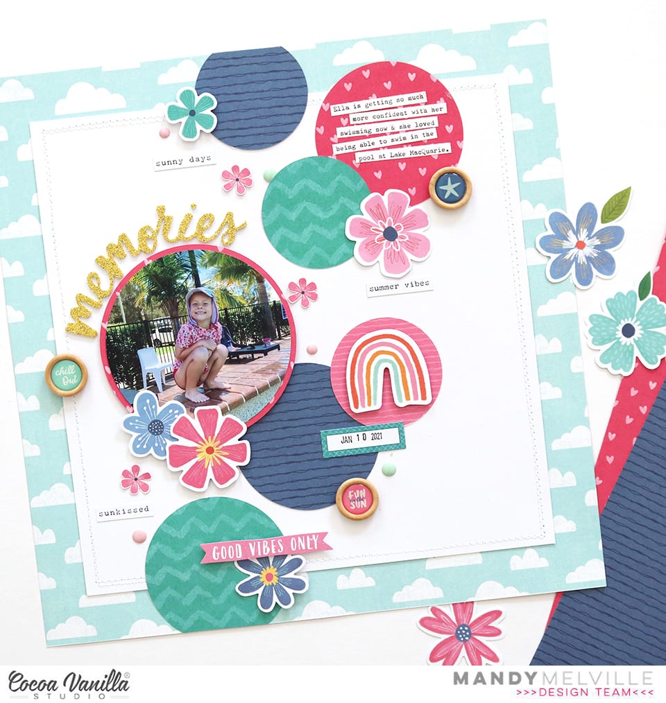
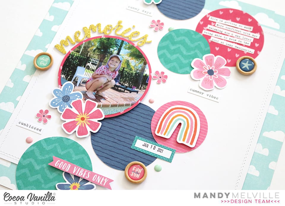
Mandy here with you today to share a new layout using the gorgeous Sunkissed collection! This week on the blog our design team are creating projects featuring either circles or squares. I have to admit that usually I would be more comfortable creating with squares, so that’s what I initially planned to use for my project. But I decided to challenge myself to use circles instead, and I’m so glad I did because it was a lot of fun!
I documented a cute photo of my youngest daughter Eleanor at the pool when we were on holidays in January.
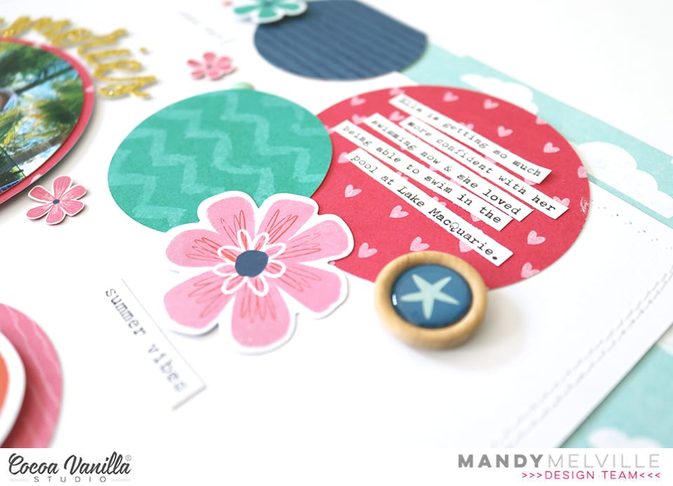
I started my layout off by trimming my white cardstock background down to 10 inches, and matting it on the Just Chillin patterned paper. I also added some machine stitching around the edge of the white cardstock to give the page some additional texture. I then went ahead cutting various size circles out of the Sunny Days, Feelin Fine, and Bright Side patterned papers. There are so many gorgeous colours in this collection, but for this layout I decided to keep my colour palette to the teal, pink and blue. For this reason, I chose to use the more subtle b-sides of the papers to allow me to feature those three particular colours. Once I’d cut out my circles, I arranged them on the page so that they flowed from the top to the bottom, with some overlapping.
To continue with the circle theme I decided to cut my photo into a circle as well (I don’t remember the last time I did this!). I matted it with the Feelin Fine patterned paper and added some craft foam underneath it to help it to really pop off the page! I embellished around the photo with some flowers from the Floral Ephemera pack, and then added my title around the top of the photo using one of the gorgeous Glitter Foam Title Stickers.
I adhered my typed journaling to the pink circle at the top of the page. I also added another Floral Ephemera piece to this cluster, as well as one of the fun Wood Epoxy Buttons. I love that the wood buttons add another circular element to the layout!
I created another point of interest on my layout to the right of my photo. I embellished these circles with a beautiful die cut rainbow, a label from the Accessory Sticker sheet, and another Wood Epoxy Button.
The final little cluster of embellishments is at the bottom of the page on the teal circle. Here I chose to add a blue flower from the Floral Ephemera pack, as well as a little die cut banner. You’ll notice that I kept my embellishing to the same colour combination that I chose for my patterned papers, focusing on the pinks, blues and teals in the collection.
Around my photo, I added three little flowers that I fussy cut out of the Growing Wild patterned paper. The visual triangle that this creates helps to direct the viewers eye towards the photo. To finish the layout off, I added a few little phrase stickers from the Accessory Stickers, and lastly I sprinkled around some Unforgettable enamel dots.
Thanks so much for joining me here on the blog today! Make sure you pop by each day this week to check out what our other design team members are creating for the circles and squares theme!
Hey everyone, it’s Raquel here with you today sharing my latest layout featuring the bright and beautiful Sunkissed collection with you.
This layout is featuring my fave paper in the collection ‘Bright side’. As soon as I saw this paper I knew that I wanted to create a layout that features the rainbow design from the paper. It has taken me many layouts using this collection to finally decide on a layout design that featured it.
The subject of my layout is my kiddies at Summer on our vacation. I have been able to create and document a number of our summer memories thanks to Sunkissed. The pocket cards were the perfect size to mat my photos and I was able to choose complimentary colours to the colours I’ve used from the rainbow. I printed the photos using my portable photo printer and adhered them matted to the page with a foam adhesive.
The rainbow was fussy cut from the patterned paper I decided to only feature three of the rainbow colours on this layout. I tacked them to my page lightly and secured them with machine stitching.
To the left of the photo I have embellished the page using a mix of ephemera, puffy stickers and floral ephemera pieces. I also used some of the gold foam hearts to match in with the title. The wood buttons were a nice finishing touch to the clusters of embellishments on the page.
I used similar embellishment choices to the right side of my photos also.
The gold foam stickers make the perfect feature title for a layout. Summer days worked perfectly on this layout and with these photos. Instead of my usual typewritten journaling I have used the mini word stickers on the Accessory sheet to sum up some thoughts from our day.
When adhering embellishments to the page I have used a combination of glue dots, liquid adhesive and foam adhesive.
The white card stock base was adhered to the ‘Summer lights’ paper on a slight angle to provide visual interest. I also machine stitched around the edges for further texture.
I hope this layout has inspired you today to get creating with this beautiful collection.
Hello scrappy people! It’s Anna here with my newest page made with gorgeous “Sunkissed” collection. This time I used this line to scrapbook some travel related photos from our trip to Carnac menhirs. It was really hot day and there was almost no shadow on the site. Really hard conditions to appreciate neolithic stones but we managed to survive :) “Sunkissed” is filled with summer related items mostly but you can use for more travel vibe pages too. I benefited from colorful paper patterns by backing the cut file filled with words about travelling. With such a colorful bakcground, you didn’t need much of embellishing!
I started with putting my digital die cutting machine in use after few months of break. I forgot how fun is it to incorporate this kind of elements into the pages. Backing the words with various pattern papers like: “Growing wild“, “Sunny days“, “Just chillin“, “Fun in the sun“, “Feelin fine“, “Bright side” and paper stack went pretty quick. Harder part was deciding where I want my photos to be places. Whole paper is filled with titles so I knew I need to cover some of them.
I managed to squeeze the photos on top of one bigger word having the rest of them visible and easy to read. I added few smaller elements from ephemera pack around the pictures, with a small individual title on top of them. As this is more travel than summer themed page I only picked more generic ones, skipping beach items and exotic drinks :)
I filled empty spots between the words using clear stickers like colorful arrows and paint strokes. They work perfectly with white background. I also added few puffy stickers here and there and my favorite wooden buttons. Colorful pattern papers are the main star of the page and I didn’t want to overshadow them.
I just love the final result and possibilities “Sunkissed” collection gives. I love squeezing out as much as possible from the papers themselves and those simple and fun patters are just perfect. White background makes them really pop.
I am sure it’s not my last word when it comes to this amazing, colorful collection. I still have so many ideas! Thank you so much for stopping by and see you in June!
Hello friends. It’s Kylie here with a new and fun Summery themed layout to share. I wanted to create a page design with loads of colour, colour, and more COLOUR! The new SUNKISSED collection was of course perfect for what I had in mind. I’m still smitten with all those florals and bright colours that feature in this range and I love how the colours really pop over a white background, which is what I selected for this layout.
For my background I chose the GROWING WILD paper. I trimmed a 1cm edge off each side of white cardstock which was adhered centred over the top to form a colourful border. Using my Silhouette I cut three scalloped circles using a simple cut file from the Silhouette files, all at different sizes. These were then layered over each other using foam adhesive squares, so that they had a little space in between each layer for adding embellishments.
Using the Floral Ephemera, I tucked neat little clusters of blooms in between each layer of the circles. I made sure to mirror each cluster to give an overall even balance to my layout. My photos were printed at 3″x 4″ and 2.75″x 2″ in colour before I adhered them layered over each other to the right of my scalloped circles. Summer themed die cuts from the Ephemera pack were then added in support of my theme.
To complete my page I added some of the gorgeous gold glitter phrase stickers as a title. I adhered them following the curve of my circles to the left of my photos. They’re so sparkly!!
Thanks so much for stopping by the blog today. I hope my layout has given you a little inspiration for your own creating. Take care!
Hey Hey! It’s Michelle here with a new layout share inspired by the May Monthly Challenge Board. This board for May – Slice of Summer – designed by Gwen, is full of bright rainbow colours with a fruity kick. I could have gone in so many directions for this layout, but in the end this is where I ended up….
Inspired by the rainbow paint, circular fruit bowl and the bright rainbow colours of the glassware from one amazing Mood Board! I’ve used the awesome Sunkissed Collection for its bright colours and summery floral patterns.
I started with the Summer Sun cut file from CUT to YOU (designed by Gwen) and cut only the outer piece of the design on white cardstock. I added vellum to the rays as I new I would be layering the cut file piece over some form of ink splatters.
Using the inner circle as a rough guide in the middle of a fresh piece of white cardstock, I added splatters of bright inks in rainbow circular order using the plastic packaging technique and sprinkled splatters using the straw out of the spray bottle. This was so fun to create, and a shame that I covered so much of it up with all those florals!
Once the background was dry and the cut file was stuck down I added the photo. A black and white snap from the last Cocoa Vanilla Studio Creative Escape Retreat in 2019 when all was right in the world and we could travel carefree. I layered the photo with pieces of pattern paper from the A5 paper stack ( Feelin’ FIne and the blue version of that awesome Leopard print pattern from Growing Wild). I tucked in a tag from the Fun in the Sun paper and sticker from the Accessory Stickers sheet.
To the left of the photo I created one massive floral cluster using my beloved fussy cut florals from the Growing Wild paper and a banner from the Fun in the Sun paper. I layered these with different forms of adhesive tapes to give the flowers dimension. I also added a wood button and puffy heart to finish of the mix
Above the photo I created a second cluster using similar florals and items to the other cluster. I do this on all my layouts to give them a cohesive look
Lastly I added a title using the awesome GOLD Glitter words and a sticker from the accessory sheet and then finished it off with spatters of gold ink.
Well friends, that’s all from me today. Thanks so much for stopping by! Be sure to get your entries into the album in our CVS Community Facebook Group. We love seeing how you all interpret the boards each month and the Sunkissed collection is perfect for this board!
It’s Tarrah back with you and today I am sharing a layout inspired by the awesome Grab 5 challenge from interNational Scrapbook Day set by fellow designer Michelle Stokes. I created my layout with the gorgeous new Sunkissed collection and documented a beautiful photo of my eldest niece.
The Grab 5 challenge needed to include:
Patterned Papers
Stitching
Something Gold
Stickers
Ink splatters/sprinkle
Patterned papers – I used a patterned paper as the background at the back of my page, the wreath is cut out from patterned paper and there is also patterned paper behind my photo. Stitching – I have stitched the wreath down with machine stitching. Something Gold is the foam gold glitter hearts. Stickers – I have added accessory stickers, puffy stickers and clear stickers and Ink Splatters I have added in gold.
I took theFeeling Fine patterned paper and cut out the gorgeous wreath from the Happiness set of free cut files. I love how the pink side of the Feeling Fine paper pops against the white of the cardstock. I then machine stitched the wreath and took a pack of the stunning floral ephemera and arranged lots of these around the wreath, I bent up some of the leaves and florals for some dimension. I trimmed down the cardstock to measure roughly 11′ x 11′ and matted the cardstock to another piece of the Feeling Fine patterned paper.
The Love You title is a cut file from the freeUnforgettable set, I cut this one out from white cardstock and then hand painted the just the bottom section with some watercolour paints. I placed my photo and the layers over to the right of the wreath and added the title to the bottom left corner of the photo. I popped the title up using foam dots, I love the dimension the title gives on my page. Some of the embellishments I added to this layout include some stickers, some heart die-cuts and some gold foam hearts.
I added some journalling to one of the cards from the Fun in the Sun paper I then tucked it into the left side of the photo. Lastly I added some sprinkles of gold Heidi shine and stamped the date stamp of the date the photo was taken.