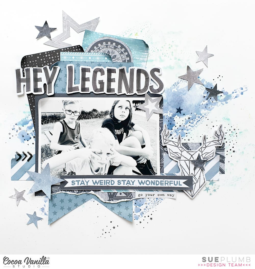
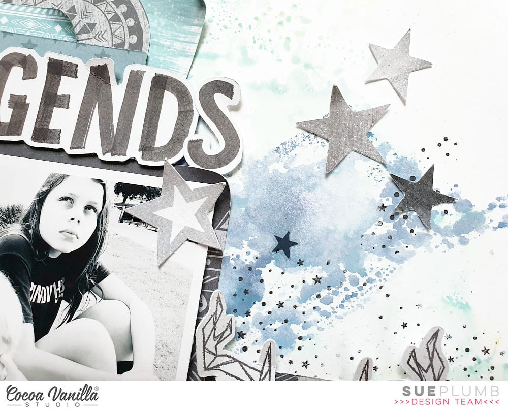
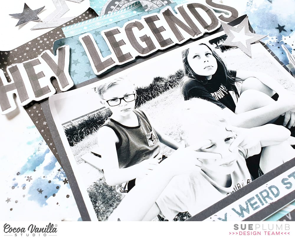
Hi everyone! It’s Sue Plumb here to share my latest design team project with you featuring the awesome new ‘Legendary’ collection. For this layout I decided to document a photo of my three kids doing what they do best – being weirdos! (I wouldn’t have them any other way.) I also decided to work with a very limited colour palette – focusing on the black / blue / grey tones from the collection, as I thought it would work well with my black and white photo.
I began by creating a mixed media background on a sheet of white cardstock, using two blue inks to add some subtle colour to my page. I also added some stamping using black ink and a stamp with tiny stars. Once the background was completely dry I then moved on to adding some papery layers.
I first cut a piece of the star print pattern from the Offbeat paper into a vertical banner shape to act as the anchor point for my layers. Next, I created a mat for my photo using a piece of the Explorer paper and placed it on top of the banner with my photo stuck on top. I then added a couple of horizontal strips that I cut from the Explorer and Total Legend papers and tucked them in behind.
Above my photo I added some extra pieces of paper tucked in behind the top of the banner which were also cut from the Total Legend paper. I also added the circular piece that I fussy cut from the centre of the mandala in the middle of the Explorer paper.
I also added two words from the Die Cut Titles pack to form my title Hey Legends (I actually cut the “s” from another word to make the word Legends) and popped them up using some foam tape.
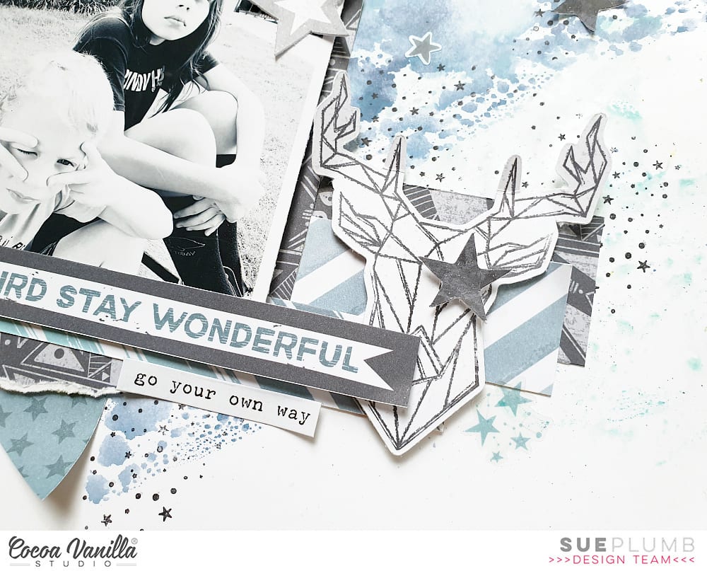
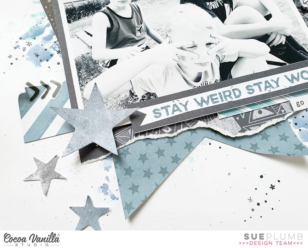
To the right of my photo I created a small cluster using the geo deer from the Die Cut Ephemera pack, with a small star on top (again using foam tape for dimension). Along the bottom edge of my photo I added the stay weird stay wonderful quote from the Epic Tales paper, with the go your own way quote from the Accessory Sticker sheet below it.
To finish off, I added some small black chevrons to the left of my photo from the Clear Sticker sheet; then a good scattering of stars from the Die Cut Ephemera pack. I am so happy with how this one came together and I absolutely love the colour combo of all those cool tones.
That’s all from me today – until next time, happy scrapping!
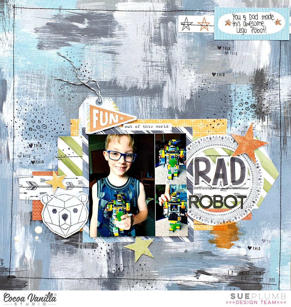
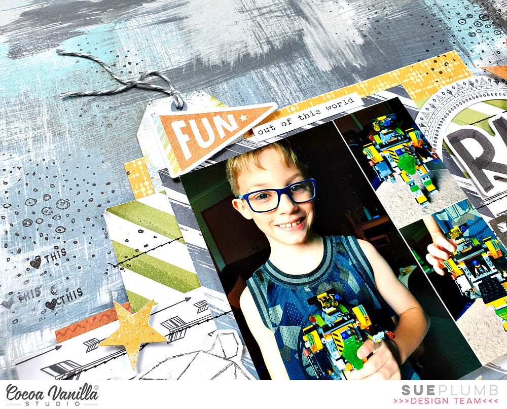
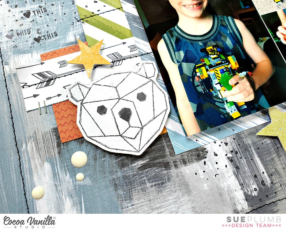
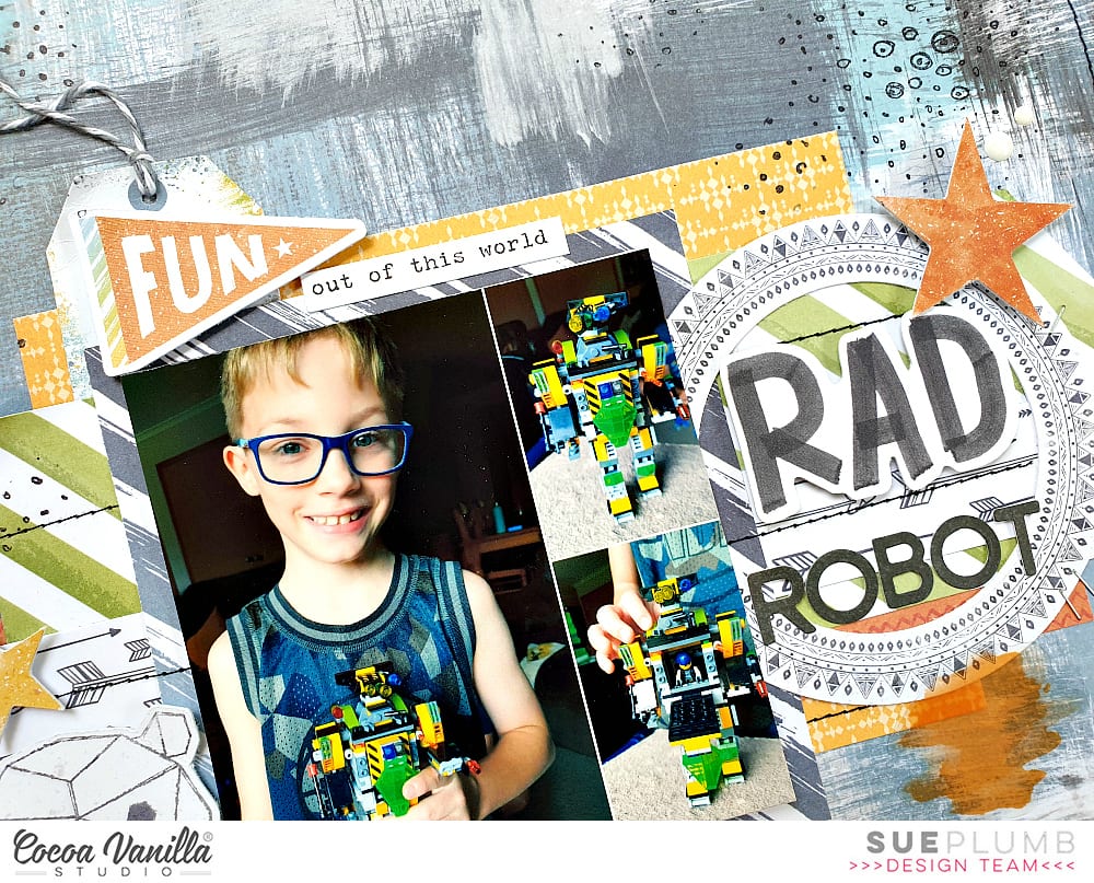
Sue Plumb here to share another design team project using the brand new ‘Legendary’ collection with you. Today I am sharing a 12×12″ layout I created to document some photos of one of my boys and the awesome Lego robot he made with his dad. Building Lego is one of the activities they really enjoy doing together and I love seeing what they come up with. I couldn’t resist snapping some shots of this robot, it was very impressive!
I began my layout with the reverse side of the Brave Heart paper which features a fabulous painty style pattern. I then stacked a variety of pieces taken from the Wild One; One Way; and Explorer papers to define the focal area of my page and form a mat for my photo. These were topped with the strip featuring black and white arrows that was cut from the Total Legend cut apart paper.
Once the papers were in place, I added some lines of black machine stitching to help define the horizontal structure of the stack and also add some extra visual interest. I also added a rough stitched border around the outer edge of the page to help connect the background with the foreground, before adding my photo on top of the paper stack.
Now it was time to turn up the fun factor by adding some embellishments. (I usually have trouble deciding which pieces to use when I receive a new collection, as there are always so many to choose from.)
I began to the left of my photo, creating a small cluster using the die cut geo bear and a star from the Die Cut Ephemera pack, as well as a few Enamel Dots.
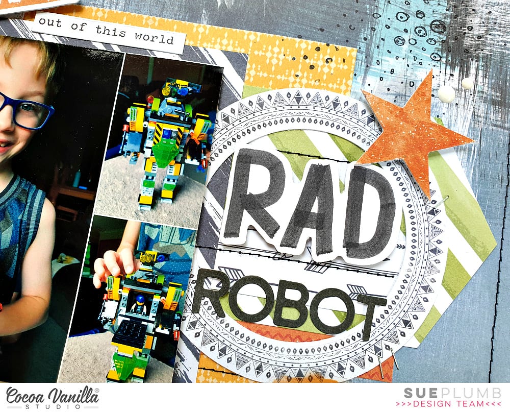
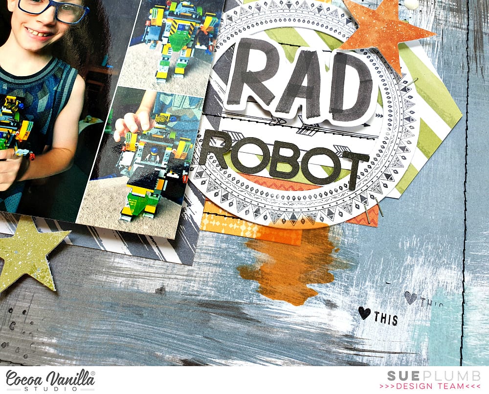
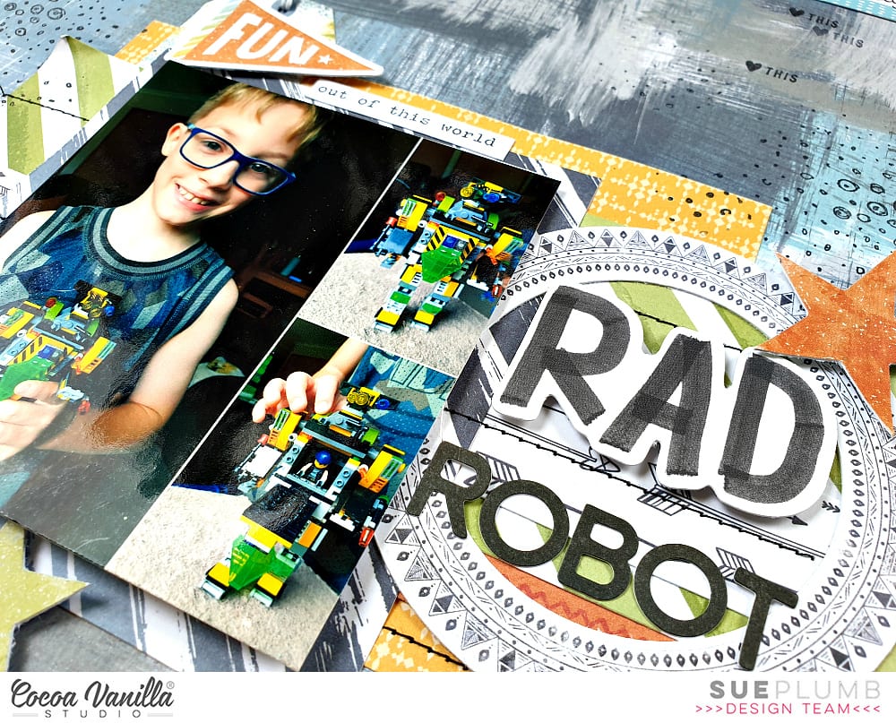
To the right of my photo I created my title cluster using the round frame and another star from the ephemera pack; the word RAD from the Die Cut Titles; a few enamel dots; and some small alphabet stickers I had left from the Made of Awesome collection. For an little extra pop of colour I also added the orange paint splat from the Clear Sticker set.
I created a third small cluster (because – visual triangle and rule of threes!) above my photo using the tag and phrase stickers from the Accessory Sticker sheet; with the small die cut flag layered over the top. I brought further balance to my page (and my mind) by adding an extra die cut star below my photo, which completed my secondary visual triangle.
I also created a small cluster for my journalling at the top of the page to counteract the fact that my page was so “bottom heavy”. The label and the strip of stars both came from the Epic Tales cut apart paper. I then finished off my layout with some black stamping using texture and phrase stamps and a few well placed tiny staples.
Thanks for stopping by today so I could share this with you. I am so enjoying creating with this new collection and I hope I have inspired you to get creative too.
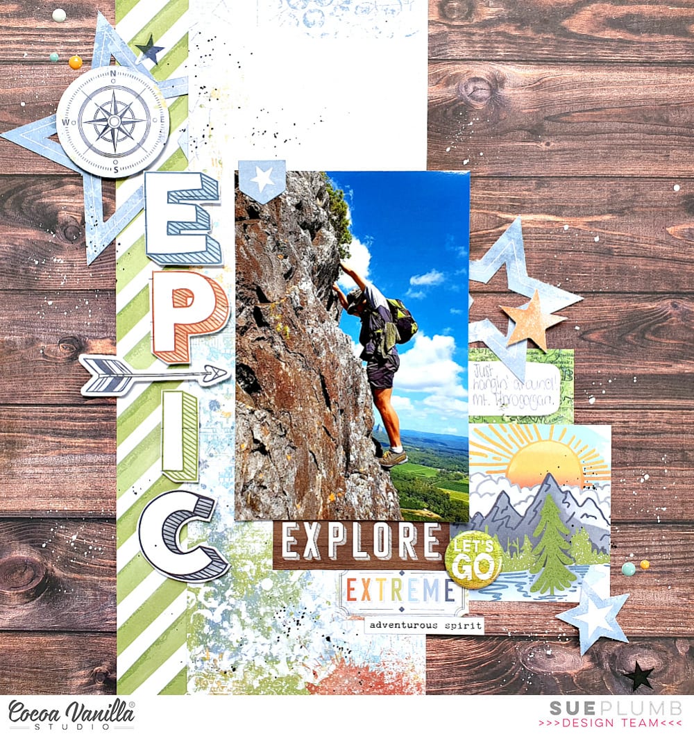
Sue Plumb here today to share my latest design team project with you, and my very first using the brand new ‘Legendary’ collection. It’s no secret that I love creating boy pages, so to finally have this amazing collection in my hands was very exciting. This range is fabulous for scrapping boys of all ages, so to prove it I thought I would kick off with a layout I created of my hubby (who really is just an overgrown boy! hehe)
I knew immediately which photo I wanted to use – an awesome shot of my husband hanging off the side of a mountain that was taken by his best mate when they were climbing one day.
So I started my page with the gorgeous wood grain on the reverse side of the Outdoors Type paper, to tie in with the colour of the rock face. I then added a vertical strip of the mixed media style Offbeat paper; and a strip of the Explorer paper alongside it. (This provided me with a strong vertical base on which to mount my portrait oriented photo.)
I then began building a diagonal line of embellishments that would provide flow and help draw the viewer’s eye through the photo. Starting in the top left corner, I added a large star from the Die Cut Ephemera pack, which I topped with the die cut compass using foam tape. I also added a small star sticker from the Clear Sticker pack and a sprinkling of Enamel Dots.
I continued the diagonal line of embellishments to the right of my photo using a couple more die cut stars from the ephemera pack and a journal spot from the cut apart Epic Tales paper.
I added a large cluster of items under and around the bottom right corner of my photo, using the mountain scene and the woodgrain explore label (both from the cut apart paper) and the extreme label from the ephemera pack. I topped these pieces with the let’s goFlair Button; added the adventurous spirit phrase sticker from the Accessory Sticker sheet; and another die cut star and more enamel dots.
Next, I created a vertical title to run down the left side of my photo, by fussy cutting the word EPIC from the cut apart paper; and adding an arrow from the ephemera pack amongst the middle of the letters. (I popped all of these elements up slightly from the page using foam tape to provide extra dimension.)
To finish off, I added some tiny splatters of black and white ink and I was done! I am super happy with how this layout turned out (and had so much fun I had to create another page with the range immediately, but you will have to wait for that one, sorry!)
Stay tuned to see what else the design team have created with this range, or pop over to our Facebook Community Group to share your layouts with us – we love to see them.
Hi everyone! Sue Plumb here to share my latest design team project with you. Today I am sharing a baby girl mini album I created using the super pretty ‘Midnight’ collection. (You may recall that I made one of these a few months ago for one of my sons using the ‘Boys Rule’ collection – you can see that post HERE) As it usually goes when you have more than one child, you can’t do something for one without doing it for another, hence I am back today with this album created for my daughter.
I began this mini album with an unbranded 6 ring pink planner I purchased from eBay. This planner came completely empty, and unlike the last planner I used (which was from Kmart), this one features a magnetic clasp to close it, rather than the elastic band. I also used an adjustable 6 hole punch (also purchased from eBay) that I set up to fit the rings in the planner.
I used pieces from most of the patterned papers from the collection, cutting a variety of sizes and shapes to use for the pages. I then punched each one with the hole punch, ensuring they were not all aligned the same so that they would sit at varying heights within the album. I also added some additional decorative detail to some of the pages using an assortment of border punches.
I created “tip-ins” for some of the pages using patterned paper adhered with washi tape. This allows you to extend on the amount of space you have on a page to add extra photos or journalling, or even hide journalling underneath, just like I did with my daughter’s birth story above.
Remember you don’t always need a photo on each page – it adds extra interest to an album to intersperse purely decorative pages, or pages that simply feature a sentiment throughout, such as the page featuring fussy cut flowers from the Bloom & Grow paper and a Die Cut Title word above.
Another way to help anchor photos into an album and ensure they appear as a cohesive part of the page design, rather than just stuck over the top, is to add embellishments that overlap part of the photos. Alternatively, don’t be afraid to use an entire photo as a page in itself and punch directly through the photo. (Matte photos tend to work better for this, rather than glossy.)
To continue to provide variety throughout the album, try turning some of the elements vertically on the page; or have a horizontal page opposite a vertical one. (It also adds an extra level of interactivity to have people rotate the album to look at them.)
A great way to include a series of photos is to print them as a photo strip and fold them accordion style with a tab sticker to pull it out with…
The photos fold out and then fold neatly back into the album, only taking up the same amount of space as one photo.
Create small pockets from scrap pieces of paper to hold journal tags. For a final interactive element, I uploaded a video taken during the drive home from the hospital with my daughter to my YouTube channel (set as private) and then created a QR code for it. This allows it to be scanned by a QR code reader on a phone that links to the video and plays it. (My children LOVE these!)
There is much more to this album than I could show here. If you would like a look at the entire album, I have a flip through below:
Thanks so much for stopping by today. Until next time, happy scrapping!
Sue Plumb here today to share a pretty page with you featuring the ‘Unforgettable’ collection. This layout was actually created for a class I taught at the December Workshop Wonders event at The Crafty Chain in Brisbane. I had great fun with the ladies in my class, and loved seeing all the different variations of this page as people put their own spin on it.
I used white cardstock as the base for this layout, then layered assorted size pieces of the Pretty Bits and Natural Beauty papers horizontally over the top. I love using these cut apart papers, as they are an easy and cost-effective way of adding a variety of patterns to the page. Some of the pieces were also distressed to add texture and dimension to the page.
Once all the background strips were in place I cut a large circle from the Lacewing paper, topping it with another piece from the Pretty Bits paper, before adding my photo on top. (This snapshot was taken at the Cocoa Vanilla retreat and features Zoe, myself and some of the girls from the team – it’s awesome to be able to be all together in person like this.) I used some scrap cardboard between the layers to add dimension, and also some messy cotton for texture.
To embellish my page I used a variety of pieces from the Die Cut Ephemera pack, sticking with the neutral and warm tones of my chosen palette. (This also meant there were plenty of bits left over in the pack for participants to use in another project – it’s always nice to be able to take home extras from a class kit, don’t you think?)
For my page title, I used the word lovely from the ‘Bohemian Dream’ Chipboard Titles. Again, using only one word from the pack meant everyone had extras to take home – yay! I decided to leave the title plain white so it matched with my background, but I did encourage everyone in class to alter them if they wanted to, so some people chose to ink / stamp / paint theirs to suit their page.
To finish off, I added my handwritten journalling and then splattered a few coloured inks around the page – because I always love a little bit of mess! (Sorry for your table and window after everyone had finished this step Alison & Shelley!)
Thanks so much for stopping by today so I could share this with you. Until next time, happy scrapping!
Hi everyone! I hope this finds you well and that your year has been off to a great start. I am currently a little ragged around the edges being 5 weeks deep into school holidays but the finish line is in sight! Next week my daughter will be starting her first year of high school, and my sons are both going into grade two. With this big transition for my daughter right around the corner, I thought it was the perfect time to document a photo of her and her friends that was taken at her primary school graduation last month. I paired it with the beautiful ‘Happiness’ collection, which was a great match for this group of gorgeous girls. (That’s my girl in the blue.)
For my layout, I began with the blue watercolour pattern on the B-side of the Good Vibes paper as my page base. Next, I took the oh-so-pretty So Fresh paper and fussy cut the beautiful wreath design from it. I then added some foam mounting tape to the back and positioned it on my page (without yet sticking it down).
I then matted my photo with the pink B-side of the Expressive paper before adhering it to the background sheet, then added the mounted wreath over the top. I bent the edges of the wreath up slightly from the page in some places to add extra dimension.
Above the photo, I added a small tab and some leaves from the Die Cut Ephemera pack to create a small cluster. For my title I used the words best friends from the Die Cut Titles pack, highlighting it with the row of chevrons sticker from the Clear Sticker set.
To help frame my photo and bring some extra balance to the page, I arranged a couple of phrase stickers from the Accessory Sticker sheet and the time to shine banner piece from the Die Cut Ephemera pack to create a visual triangle. I also added some extra leaves to the outer edges of the wreath by tucking in a few from the ephemera pack.
At this point I thought that my wreath felt a little “disconnected” from the background, so I drew some inspiration from my former team member Amanda, and doodled some extra leaves around the wreath using a fine white paint pen. I also added a little extra prettiness by using some tiny paper flowers from my stash, which I placed randomly around the wreath.
I finished up by creating another “visual triangle” – this time using butterflies fussy cut from the Bright & Beautiful paper. (You probably already know how much I LOVE butterflies!)
I am so happy with how this pretty page turned out, and am pleased to report it has already found a very special home. It was popped into a frame and gifted to one of the girls in the photo for her recent birthday.
That’s all from me today, thanks for stopping by so I could share this with you. Until next time, happy scrapping!
Hi everyone, and welcome 2020! I am so happy to be here with my first project of the new year for you. Today I am continuing on with our Holidays & Vacations theme, and sharing a layout I created using a combination of the ‘Boys Rule’ and ‘Midnight’ collections. I know what you are thinking – a bit of a strange mix of collections, right? Despite the very obvious differences between the two, they did work together surprisingly well and were a perfect compliment for the colours in my photo.
For my layout I decided to document a photo that was taken at the Cocoa Vanilla retreat that was held last May. Scrap retreats are definitely one of my favourite kinds of holidays – besides spending time with great friends, you get to enjoy a change of scenery, have a break from your everyday responsibilities, AND you get to create! What’s not to love about that?!
I started my layout with ‘Boys Rule’, with a sheet of Star Fall as my base,which I topped with piece of white cardstock, cut slightly smaller than the paper, to leave a narrow border around the edge. I then added four blocks of paper to my background using pieces of the Messed Up; Expressionist and Straight & Narrow papers. I distressed each of the blocks by scrunching and then flattening them back out; then ran them horizontally on my page to compliment the landscape orientation of my photo.
With my background complete, I then added some scrap cardboard to the back of my photo and decided on its placement on the page. I chose the beautiful floral print Bloom & Grow paper from the ‘Midnight’ collection to begin embellishing my layout, fussy cutting several pieces to tuck in around my photo to frame it.
With the flowers in place I then added the little banner that said the best from the ‘Boys Rule’ Chipboard Pieces pack, and a small black and white butterfly sticker from the ‘Midnight’ Accessory Stickers; placing both near my top floral cluster.
I created a small cluster below my photo by combining another fussy cut floral piece with a small leafy branch and heart, both from the ‘Midnight’ Die Cut Ephemera pack. In my cluster to the left of my photo, I also added the shine bright flair button from the ‘Midnight’ Flair Buttons set.
For my page title, I used the words happy and moments from the ‘Midnight’ Chipboard Pieces pack; and then I finished off my layout by typing up my journalling and applying it in strips (again tying into the horizontal theme) near the bottom of the page.
That’s all from me today. I hope you are enjoying our Holidays & Vacations focus and that you are perhaps feeling inspired to document some of your own holiday moments. Stay tuned for more inspiration from the team for this theme!
Hi everyone! It’s hard to believe we are mere days away from Christmas isn’t it? I hope your preparations are going well and that you don’t have too much left to do.
Today is my turn to share some of my favourite projects that I created during 2019. I am starting off with a layout that features the stunning ‘Happiness’ collection that was released earlier this year. I adore this range, with all its bright colours and beautiful florals. This page also features a photo of myself and a few of my crafty peeps that was taken at a retreat, bringing back some fun memories too.
This layout was actually inspired by a page from my fellow team member Gwen, as part of a “scraplift” theme that we did earlier in the year, and I love how it turned out! I even got my scissors out for some fussy cutting for this page, because those flowers were just begging to be cut out! One of my other favourite things from this collection is definitely the Clear Stickers – especially all the “painty” style ones!
You probably already know that as a mum of twin boys that I am partial to a good boy page; so for my next favourite, I couldn’t go past this mixed media layout of my dynamic duo using an old favourite – the ‘Totally Rad’ collection from 2016. I actually created this one whilst I was at the Cocoa Vanilla retreat, and besides the end result, I think I also love it because I created it whilst I was so relaxed and in such good company. (Seriously, if you have never been to a retreat before, make sure you put it on your bucket list!)
Despite the fact that this collection is no longer available, there is good news for fans of this range that may have missed getting their hands on it. This collection was recently released as a digital range, which you can purchase to print and cut at home! It includes all the papers (which are easy to print A4 size on a normal home printer); all the cool elements, and Zoe has even included three A4 sized ready to print PDFs, so you just have to print them off and cut them out. You can find the bundle in store HERE
My final favourite layout from this year also featured one of our older collections – ‘Life is Beautiful’ and a photo of my daughter and one of her best friends. This range was released waaay back in 2015, and to date it still remains a firm favourite of mine. The colour palette is just SO fresh and pretty, with the navy, aqua and apricot colour combination.
This layout is also a favourite of mine because it features butterflies. (And anyone who has seen my tattoo will already know how much I love butterflies.) I created these large layered butterflies using cut files from Cut to You, which I coloured with Distress Oxides, backed with some of my precious patterned paper scraps, then topped with butterfly stickers from the Accessory Sticker sheet. Combined with fussy cut florals and just enough ink splatters, it makes my creative heart happy. (This range is also now available as a digital collection and you can find it HERE)
Finally, I have to give a mention my other favourite project from this year that wasn’t a layout at all. It was the mini album that I created recently using the ‘Boys Rule’ collection for one of my sons to document the time following his premature birth. This one invoked all kinds of memories as I put it together (both good and bad) and truly was a labour of love.
You find my post with all the details of the album HERE or watch my flip through of the album below.
That’s all from me today, wishing you & your families a very merry Christmas! I hope you get a chance to spend quality time with the people you love most, and make plenty of happy memories to document later. XX
Sue Plumb here to share a recent mixed media layout I created using the gorgeous ‘Unforgettable’ collection and a photo of my children that I took while I was shopping with them a few years ago.
I started this page by creating a mixed media background on some white cardstock. I used pink ink to create a watercolour style background, before adding some stamping and coloured texture paste through a stencil in a few spots on my page. I also added some blue watercolour splatters over the top for some extra interest.
Next, I fussy cut the wreath from the beautiful Garland paper, adding foam tape underneath the floral section to pop it up from the page, before sticking it down on top of my background. (You can see how I bent the edges up from the page to add extra dimension.)
I then added some pieces of paper cut from the B sides of the Gloriousand Sprightly papers as a mat for my photo, which I stuck down on top.
Alongside my photo, I added the quote “we don’t remember the days, we remember moments” from the scaled down version of the Story Teller paper from the 6×8″ Paper Stack to act as my page title. I was especially drawn to use this quote for this layout, as in the early days of having twins life seemed to pass by in such a blur. Going shopping with the kids and having two sitting in the trolley and one perched on the end like in the photo is something I will always remember though.
On top of the quote card I added the cute camera Flair Button and popped a couple of Enamel Dots nearby.
Now it was time to embellish my wreath. I used a variety of flowers from the Die Cut Ephemera pack, which I stuck down on top of the wreath using foam tape to provide further dimension. I also added 3 bows from the Tassels and Bows pack; and a few small phrase stickers from the Accessory Stickersheet.
I finished off my layout by adding more Enamel Dots; a die cut butterfly; and then a few hand-stitched crosses using embroidery thread.
That’s all from me today, I hope I have inspired you to create something pretty too. Until next time, happy scrapping!
Hi everyone! It’s Sue Plumb here to share my latest design team project with you and it’s one that is pretty special to me.
Today is World Prematurity Day – a globally recognised day that is aimed at increasing awareness of preterm births, as well as highlighting some of the challenges that are often faced by these babies and their families. Each year approximately 1 in 10 babies are born prematurely, including all three of my children. My post today is for all those babies born too soon.
For my project I decided to create the first in a series of mini albums for my children to document the time following their births. (It has taken me over 7 years to get around to tackling the photos of my boys and all the memories that come with them, so please bear with me for the long post today.)
I began my mini album with the fabulous ‘Boys Rule’ collection and a small 6 ring planner that I purchased from Kmart. (These make perfect mini album covers once everything is removed from the inside.) After choosing the patterned papers I was going to work with, I cut them into a variety of sizes to form the pages of my album.
I used an adjustable 6 hole punch (purchased via eBay) to punch holes on each of the pages, and then used white hole reinforcement stickers (from my local newsagency) to help protect the holes from becoming damaged through handling.
On some of the pages I added extra interest by using border punches to create decorative edges. This, combined with the variety of different page sizes, placements and patterns throughout, is what gives the album so much character.
If you are planning on giving something like this a go, be sure to mix things up as much as you can! Don’t feel like all your pages have to run vertically – a horizontal page thrown in here and there not only adds extra interest but makes the album more interactive as it is turned to be read.
Depending on the theme of your album, you will find that some pages require no more than a photo and some simple embellishments; whilst others may have lots of journaling and very little room for embellishments.
For the sake of continuity across my album, I printed most of my photos in black and white with a few colour feature shots added in. I printed them in a variety of sizes and orientations as well.
Don’t be afraid to add embellishments such as stickers or journaling directly over part of your photos, or to include pages that have no photo at all and are simply decorative. You can even punch directly through photos and use them as a page in your album.
One of the other benefits of making your pages different sizes is being able to get a “sneak peek” at what is coming on the next page. This adds to to the anticipation as you leaf through the album.
To further enhance the cohesion across the album, I typed all my journaling on my computer. When putting each page together I began with photo/s and journaling placement first before deciding on embellishments.
For an extra bit of fun, add some interactive elements such as tip-ins, pockets, or pull out tags. You can see how I used one of the small cards from the Die Cut Ephemera pack with a couple of pieces of washi tape to form a tip-in (fold out flap) to include my journaling underneath.
One of my tips for putting together each page in an album is that whilst I approach each page individually, I am also mindful of what is on the facing page. You can see how I carried across the same colours in the spread below. (Working with the same collection throughout the album helps enormously.)
The only other embellishment I included in my album were a few stickers from the ‘Love Always’ Accessory Sticker sheet, as it had a few more love-filled and generic phrases that suited some of my photos.
Another way to mix things up with your photos is to create a collage or include a series of shots taken close together. (And let’s face it, who doesn’t take 20 shots when you are trying to get the perfect one?!)
I know I have included a LOT of photos in this post, but sometimes the best way to explain things is to show them, right?
My final tip if you are going to create something similar in a planner cover or album, is to not forget about the extra pockets that are built into the cover. I made some small tags to tuck into the front of my album and added some extra photos, and in the larger pocket I included a letter to my son with some of the details about his birth story.
If you are interested in seeing a few more details of my album I have filmed a flip through of the entire thing so you can see how it all looks together:
Thanks so much for sticking with me through my long post today. I do hope I have inspired you to try creating something like this yourself. It could make an ideal Christmas gift for a loved one, or just something for yourself to treasure.