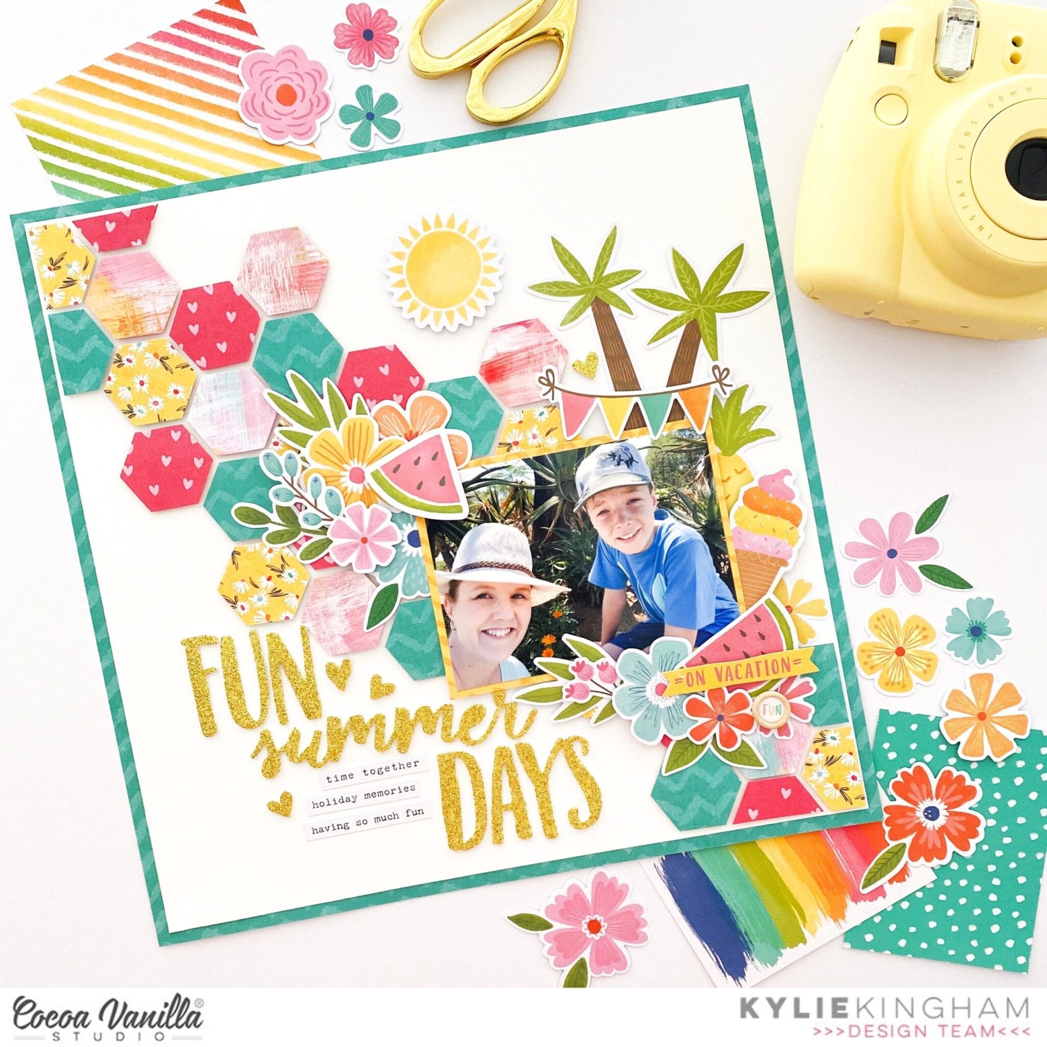
Hello Cocoa Vanilla fans! It’s Kylie back with you today and I’m so excited because I am sharing my first layout created with the all new ‘Sunkissed’ collection. This range has a fun ‘Summer’ vibe to it with lots of bright coloured elements.
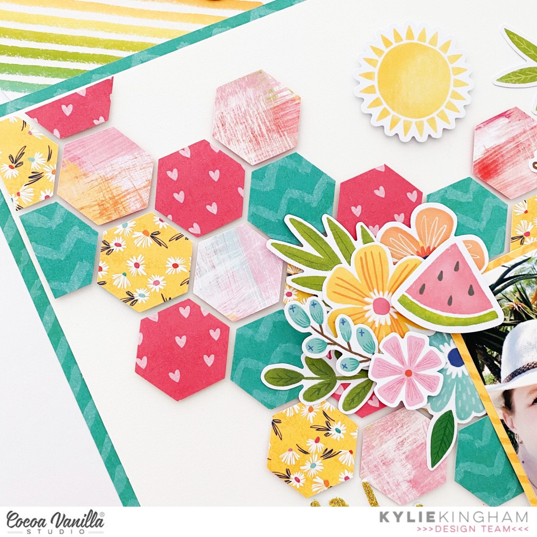
I had some fun holiday snaps to scrapbook from a Tropical holiday we had a few years ago. I laugh at my sons face in this photo as coming from a cold climate his face says it all when you are trying to adjust to heat and humidity! The palm tree and fruit die cuts were going to be the perfect accents for this memory. I decided to work with a white background which had half a centimetre trimmed off each side and was adhered over the SUNNY DAYS paper to act as a border for my layout. Using a simple hexagon craft punch from my craft stash, I punch several shapes from various paper to be able to create a fun background.Each hexagon was adhered in place using foam squares and were positioned cascading across my background.
The theme for my layout today was ‘Sparkle and Shine’ which I was able to add to my page thanks to the gold and very glittery foam title stickers. As soon as I saw these it was love at first sight! I was able to construct a fitting title for my page and add it below my photo.
Floral elements were layered on opposite corners of my photo as well as several other icon die cuts as well. How cute are those palm trees?? I made sure to use more foam adhesive squares on some to raise them up a little to produce a nice dimension for my page.
Once completed I loved the colour in this page. The simple hexagon shapes really pop in the background against the white.
Thanks so much for stopping by the blog today. I hope my layout inspires you a little to scrapbook some of your favourite Summer memories.
It’s Tarrah back with you and today I am very excited to be sharing my first scrapbook layout featuring the AMAZING, brand new Sunkissed collection! Wow this collection has everything you could imagine when you think of Summer. It is stunning and is perfect for not only Summer projects but everyday projects too!
I decided to cut the gorgeous Good Vibrations paper using a Sunburst design cut file by CUT to YOU. I love how this turned out! I adhered the entire cut file lightly to a plain white cardstock background, I then pulled up the positive piece so that it left the large pieces of the sunburst design. I can use the skinny positive piece of the cut file on another project another time. I added some craft foam underneath the bursts also to give the layout some dimension. I also curled the edges of the paper using my fingertips to add some extra texture.
The photo I am documenting is one of myself and some scrappy friends dressed up for the Hawaiian themed dress up night at the 2018 Cocoa Vanilla retreat held in Coffs Harbour. It was so much fun and we looked the part with our grass skirts and headbands! It also helped that we picked the cute bridge to pose on! Under my photo I layered one of the 3′ x 4′ cards, an accessory sticker and a frame from the die-cut ephemera pack. I used lots of goodies from the die-cut ephemera pack on this layout! It was one of those cases where I did not know when to stop!
I am so excited to have puffy stickers and the wood epoxy beads back in this collection! I added 3 of the wood beads amongst some of the die-cuts and near to my photo to help draw the eye towards the photo. Below my photo I added one of the glitter foam titles, this was the perfect title for my page. I also added 2 small glitter foam hearts in strategic spots to create a triangle design on my page. This is an important design element when creating a layout and I like to try and accomplish this each time I create a layout. The phrase/word stickers from the Accessory sticker sheet are the perfect last minute addition. I added a few of these to help tell the story and enhance my design. Lastly I stamped the date stamp to document the date the photo was taken.
I hope you enjoyed my first layout created with the amazing Sunkissed collection! Make sure you check out your local store or your favourite online store for this collection! You absolutely NEED this in your life! Its stunning! Also keep an eye out for BEAUTIFUL projects coming up by my fellow design team members!
It’s Sophie on the blog today sharing a layout created with the gorgeous DayDream Collection.
I took out my heart punches today and created numerous hearts in various patterned papers from the collection. I made a machine stitch with matching thread on the bigger hearts and bent the edges a little bit.
I used a white cardstock as my base for the design backed with a soft blue cardstock. I did a few zig zag stitches around the edges of the white cardstock.
I teared a strip of the beautiful Sweet Serinity paper that I put on the bottom of the page to ground the photo and the myriad of hearts.
I scattered the hearts around my photo in a “Rainbow” order, the darker shades of hearts on the bottom and the lighter ones on the top.
I also used the beautiful DayDream Sequins that I adhered around the hearts. I made sure to use matching colors between the sequins and the hearts.
Finally, I sticked down a few words stickers, added a beautiful Flair, my journaling and stamped the date.
I love the very soft feel of the overall look of this page. Two simple heart punches can go a long way !! And it allows to use many different patterned papers on a layout without making it look too busy.
Hi Cocoa Vanilla Studio fans! I hope you are all ready for some tropical, summer-inspired projects coming your way because the new Sunkissed collection hit my doorstep just a few days ago! I live in the subtropics, so this collection is absolutely perfect to scrap my family memories most of the year round. Today is extra special because myself and the amazingly talented Anita Bownds are doing a scraplift swap and I get to go first (you will see her scraplift a layout of mine soon!).
It was pretty tough choosing a layout to lift because I love so many of Anita’s projects. I decided on a cutfile layout because this is an element that we both tend to use quite often, and it also makes a page come together very easily. There were several I loved but, in the end, I decided on this lovely bicycle page because I knew I had pics of my son’s first ever public bike ride that I had yet to document.
The beauty of scraplifting another artist is that the decision-making and design is already taken care of for you. I chose a similar cutfile by COAPA Cutfiles and cut it on white cardstock, then went ahead and backed it with patterned papers from the A5 Paper Stack and Summer Lights 12×12 patterned paper.
I chose the Just Chillin’ 12×12 patterned paper for the background, as I liked the cloud pattern and the pale blue colour. I matted the photo with some of the A5 paper stack papers I had already used to back the cutfile, to create a nice separation between the photo and the background paper.
For my title I continued with the ‘Summer’ theme of the original layout with the Foam Title Stickers¸ however I changed the second half of the title from ‘Fun’ to ‘Days’ so that I could use one of the Clear Stickers that fit just perfectly in the space.
I went ahead and used the Floral Ephemera to build floral clusters in the top left and bottom right of the layout as in the original layout. I tried to get a good balance of the colours and include some bits of foliage to finish out the clusters. I also added some tiny floral sprigs to the basket of the bike from the floral ephemera – so sweet!
Anita’s layout featured lots of sweet tiny flowers scattered around the page, and this is where I deviated slightly – I couldn’t resist the sweet tiny hearts in the Clear Stickers so I added a sprinkling of those where the tiny flowers were placed. I also completely adore the Puffy Stickers though, so quite a few of the tiny puffy flowers made it onto the page as well!
Some more personal touches I included were adding a bunting die cut from the die cut ephemera to the bike, plus a scattering of tiny word phrases from the accessory stickers in three places around the layout (I can never resist these!).
I really hope I did this scraplift justice. I am super happy with how it turned out and I had so much fun creating with the amazing new Sunkissed collection. I hope you enjoyed joining me today, there is a process video linked below if you would like to watch too. Happy scrapping!
Hello Cocoa Vanilla fans. It’s Anna here with my newest page. As I am living on the other side of the world (comparing to Australia), I am still waiting for my parcel with brand new “Sunkissed” collection to arrive. In the mean time I still have a chance to play with pretty “Daydream” and there are few ideas I wanted to try with it. Inspiration for this page came to me from well… box of dog food. You never know the mysterious ways mojo travels :D
It had this rosette, that best dogs on the show get, on the packaging and I thought it would be fun to make big rosette on the page too. One thing led to another and I was already scoring few pieces of “Stepping stones” paper, combining then in one larger piece. I also used a border punch to add some decorative edge. When rosette was finished I started looking for a good background paper. I was going to reach for just white cardstock to make rosette shine but, by the lucky coincidence, it turned out it matches perfectly the paper with wreath called “Daisy days“. You can still see pieces of flowers and leaves peeking from behind.
Making the rosette took me a while so I knew I don’t want to cover it too much. I fussy cut some flower clusters from “Garden variety” paper and arranged them under my photo. I added few elements from the sticker sheet, like rainbow, tab and a title. I also cut out some butterflies from “Aflutter” paper. I know, I know… I am a fussy cutting freak :D
To make sure the rosette will stay glued to the paper, I used hot glue gun. It’s the best solution for this kind of elements, especially with rosette as it wants to bounce back to the tube shape. I also used hot glue to glue down flowers and other elements on the top of the rosette too. This way I am sure layout will be in good condition for years of storing it vertically.
This time I haven’t used any ephemera pieces (as I am running low on them already) and I tried to squeeze out as much as I can from the papers themselves. It always makes me so happy and relaxing to spend my time with scissors, watch YouTube and just cut. I like to do it in advance so when the mojo strikes, I am ready with all the elements.
That is all for today. I hope my next project will be made with super colorful and pretty “Sunkissed” line. I can’t wait to play with it. See you in two weeks <3
Hello, hello Cocoa Vanilla fans. It’s Kylie back with you today on the blog with some scrappy inspiration for you all. My design team assignment for today was to scrap-lift a design from the Cocoa Vanilla Community Facebook group. I actually chose a design by fellow DT member Raquel Bowman to scrap-lift. I was really drawn to her design which you can see below, followed by my scrap-lifted completed works.
As you can see by my page I have adapted the ‘Merry and Bright’ collection for my layout even though it is a Christmas themed range. When I was working with this stunning collection at the end of last year, I was totally obsessed with it and also found many of the paper elements and die cuts could be easily adapted into a non-Christmas themed project! I was really excited to try this and was super happy with the finished result! The centrepiece of this page is a lovely cut file which has been designed by Cut To You! I selected papers featuring neutral themed designs and prints to back each ‘pie’ section before adhering it over my background papers. The ‘Jingle All The Way’ paper was used as the border piece of my page. Even though it featured some holly shaped leaves, you really couldn’t pick those out once I had added the‘Seasons Greetings’ paper over the top.
The ‘Seasons Greetings’ paper had 1 cm trimmed off each side and a machine stitched border added before adhering it over the top of the floral.
My photo was printed to a smaller scale of 3″x 4″ and adhered over the top of the cut file using foam adhesive squares. From here I was able to add lots of different floral elements from the die cut pack. I made sure to cover any Holly leaves or remove them from the flower first.
To complete my page I added a large title using the foam title stickers from the ‘Unforgettable’ collection which balanced my page nicely. I also added a button flair which featured a sweet double heart print and matched my theme.
So that you can see exactly how my page came together, I have also filmed a short process video-
Thanks so much for stopping by the blog today. I hope you have enjoyed seeing my scrap-lifted layout and that you may even be tempted to try a non Christmas themed project with the Merry & Bright collection too!
It’s Tarrah back with you today to share a new layout featuring the stunning Happiness collection! My assignment for today was to scrap lift a layout from the Cocoa Vanilla Community on Facebook. Scroll down to see the gorgeous layout I chose to lift!
The layout above is my scrap lift of this gorgeous layout below created by Niki Rowland! I just love the colours and how everything was centred underneath and around her photo on the page. Niki used the stunning Daydream collectionon her layout while I chose to use the Happiness collection as there are similar elements in both collections.
I love how Niki used so many titles from the Daydream title pack, I chose to use 1 title however I added a few coloured rainbow cut files ( an old cut file from The Cut Shoppe) to balance and replicate Niki’s title placement. She also added small rainbow embellishments so the cut files I chose to use were a perfect addition to my page.
The photo I am documenting is of my eldest niece – she is wearing a cute rainbow dress, the photo was my inspiration for this page with the colours and theme I was going for. To make the photo stand out from the colourful background, I added a small piece of the navy paper under my photo. As I don’t really do a lot of mixed media and Niki has done a little on her page, I opted to use the gorgeous water colour clear stickers from the Happiness collection, I love how these add a little subtle colour without the mess and having to wait for things to dry! (I am so impatient!) You can see I did add a little sprinkling of gold Heidi Shine, that’s about as messy as I get!
When it was time to embellish my layout, I simply went with a tone on tone look. I arranged the rainbow cut files how I liked them and then added similar coloured small embellishments close to the colour of the rainbow. If you look at Niki’s layout, she did a similar thing. You can see in the above photo that I placed an orange clear sticker under the orange rainbow, fussy cut an orange butterfly and adhered it with a small orange flower. I did this for all the colours on my page. I also added some green sequins like Niki did and a pink and white stripe bow from an older Cocoa Vanilla collection. I trimmed down the white cardstock so that I could add the navy 12′ x 12′ paper as a mat to the entire layout. I do this quite often if I use a plain white cardstock background in the beginning.
I hope you enjoyed seeing my take on Niki’s beautiful layout today. Be sure to check out the Facebook Community group for amazing inspiration from fellow crafters. Share your projects in there too!
Hi everyone! It’s Sue here today,and I can’t even begin to tell you just how excited I am to share my very first layout with the brand new ‘Sunkissed’ collection. I have to admit, I had another project already prepared to share here today, but after this landed on my doorstep on Friday afternoon, I just COULD NOT WAIT to use it! Let me tell you, the colours in this collection are nothing short of amazing! It’s everything my colour-loving heart could have possibly wanted.
Here is my layout “Sweet Recharge”, (aptly titled, as it features a photo of my kids that I took when we went out one day for milkshakes at a local cafe)…
I began my layout with the gorgeous warm ombre print on the B side of the Summer Lightspaper as my background. As I was dealing with strong, bright colour to start with, I decided to dry brush some white acrylic paint to define the focal area of my page. This would help provide some separation between the background colour and the colours of the papers I was going to use.
I then took a sheet of the rainbow striped Good Vibrations paper and cut a piece from the area that had the warm tones on it. I layered this with a piece of the rainbow print of the Sunny Dayspaper; then topped it with the polka dot print from the A5 paper stack. (This print is exclusive to the paper stack, and does not appear in the 12×12″ papers.) I also tucked in a small piece of the animal print from the reverse of the Growing Wild paper, then added a paper doily, some frayed gauze for soft texture, and my photo placed on top.
When it came to embellishing my layout, I really was spoiled for choice. This collection has sooo many delicious embellishments to choose from, and I just wanted to use them all! I started with flowers. First, a couple of floral pieces that I fussy cut from the Growing Wildpaper, which is the signature floral from the range. I tucked these pieces in around my photo (one to the right, the other below). I then started a third cluster using some flowers from the new Floral Ephemera pack, which I placed up in the top left corner of my photo. (This formed the “visual triangle” around my photo.)
Also included in this small cluster was the so happy tab, and a cute watermelon sticker (both from the Accessory Sticker sheet) on the corner of my photo; a sweet little flower from the Puffy Sticker sheet; and one of the Wood Buttons. I also placed a phrase sticker from the Accessory Sticker sheet nearby. Above my photo I tucked in a label that was fussy cut from theFun in the Sun cut apart paper, which I wrote my journalling on.
I padded out my remaining two clusters with more flowers and leaves from the Floral Ephemera pack, bending up some of the petals and leaf tips for added dimension. Down at the bottom of my layout I added a cute little garland from the Die Cut Ephemera pack and another couple of phrases from the Accessory Sticker sheet. (One of which I actually used as part of the title.)
The main part of my title came from the new Glitter Foam Title stickers which are really pretty and sparkly. (And if you know anything about my love-hate relationship with glitter, you would know how happy I am to say they did not shed all over my desk!) I finished off my title with one of the cute Puffy Stickers.
Finally, I added a few little heart Clear Stickers; and splattered around some black and white ink. I absolutely love how this page came together and am crushing all the gorgeous colours in this collection! I hope you are feeling inspired and planning on adding this collection to your stash too!
If you would like to watch this one come together, you can watch my process video here:
Thanks so much for stopping by so I could share this with you. Until next time, happy scrapping! X
It’s Sophie here with a grid design layout to share, this time with the lovely “Unforgettable” collection !
The beautiful “Story Teller” patterned paper was my starting point, as I was inspired by the black pocket card on it for my title. That’s what gave me the idea to create a grid.
I separated my layout in four quadrants and stitched a vertical and a horizontal line that crossed in the center of the page with aqua thread to divide my grid. I then applied watercolors in tones that matched my color scheme on each of the four quadrants.
I placed my photo, printed in black and white, on the upper left quadrant. I added many layers behind it; tissue paper, adhesive foam, “Forgive me not” and “Pretty bits” patterned papers. I used a Die Cut Ephemera “Living the Dream” next to my photo and added a beautiful Flair Button.
On the upper right, I added adhesive foam behind the Pocket Card and aqua cardstock. I decorated this section with two beautiful Ephemera labels and butterflies.
On the left lower quadrant, I selected two pieces of patterned papers: “Sprightly” and “Pretty Bits” and attached them with pink baker’s twine together. I added Ephemeras, Enamel Dots and a sticker from the Accessory Stickers.
On the last section of the grid, I used the “Sprightly” and the “Forgive Me Not” papers as my base. I cut out a part of the “Storyteller” paper to write down my journaling and embellished it with flowers, Stickers and Emanel Dots.
Lastly, I created a little floral cluster on the base of the grid, tying everything together. Some of the leaves in the cluster were created with watercolor and fussy cut out of whatercolor paper.
Here are a few other close-ups:
I love the result. Working to decorate one section at a time in a grid design is so fun ! It’s also a great way to use many different patterned papers and embellishments without making it look too busy.
For “Throwback Thursday,” I decided to use an old photo and an older collection! This photo of my matron of honor and the best man from my wedding is one that I knew More Than Words would be perfect for, the lovely mix of pinks, yellows, and pale blues are just lovely. I started with a long column of journaling on the left side because I knew I wanted to document why these two people are so special to my husband and I.
I wanted to use the chipboard words for my title because they added a bit of texture and dimension to the layout and nestled in the “remember this” ephemera piece just above them. As usual, I fussy cut the white borders off of all the flowers to get a nice cohesive look when they’re clustered together. I really enjoy fussy cutting and find it incredibly relaxing!
This larger cluster was a combination of an old cut file from the Silhouette store that I’ve had sitting on my desk for ages and the floral ephemera. I started by cutting off the smaller florals that would otherwise be hidden under the photo, backed the open areas with patterned paper, and layered in leaves and florals. Adding touches of gold Nuvo to the centers of the florals and as trails behind the butterflies gives a lovely bit of deal.
I also created a sketch based on this layout to show how all of the layers fit together and make it easier for your to recreate the design if you’d like to!
I hope this story-based layout inspires you to add a bit of extra journaling to your pages too! To see how the “Happy & Sweet” layout came together, check out the process video below!