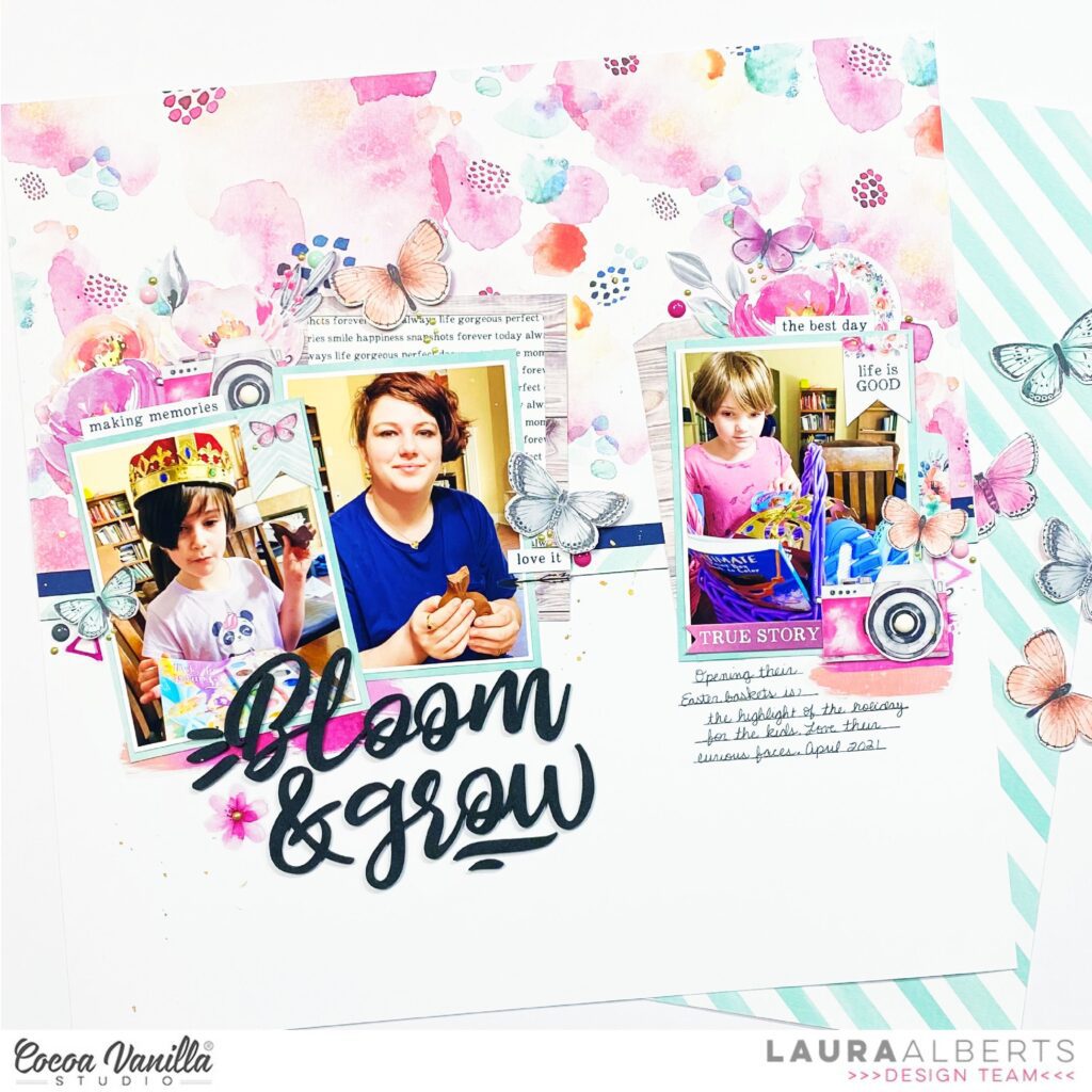
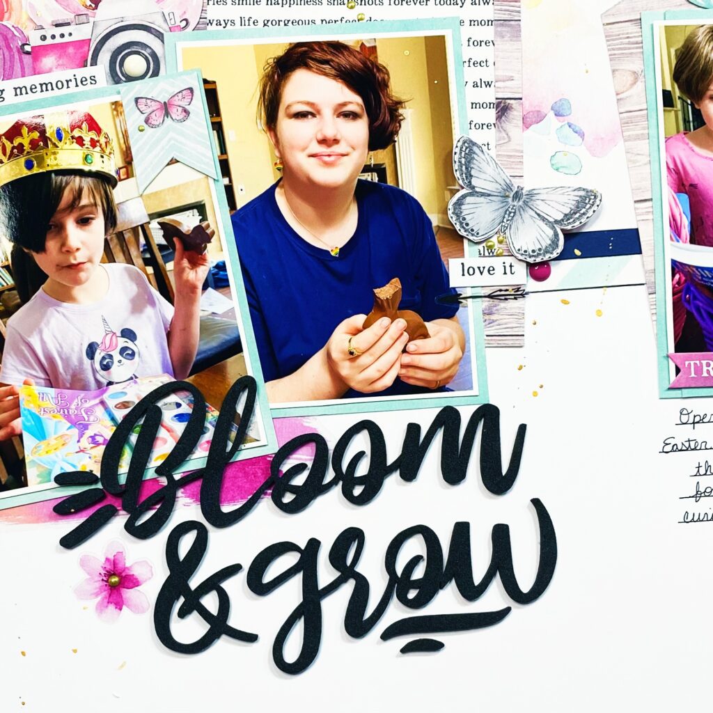
Hey y’all! Laura Alberts back again with an Easter layout using the gorgeous Unforgettable collection! These sweet pictures of my daughters opening their Easter baskets were just perfect for this colour scheme. I split my photos into two clusters along the horizontal line of my background. I used a the frame from the ephemera pack and backed it with paper from the A5 paper stack, then tucked it behind one of the photos. Adding florals and a camera to finish off this cluster, then a few butterflies for movement.
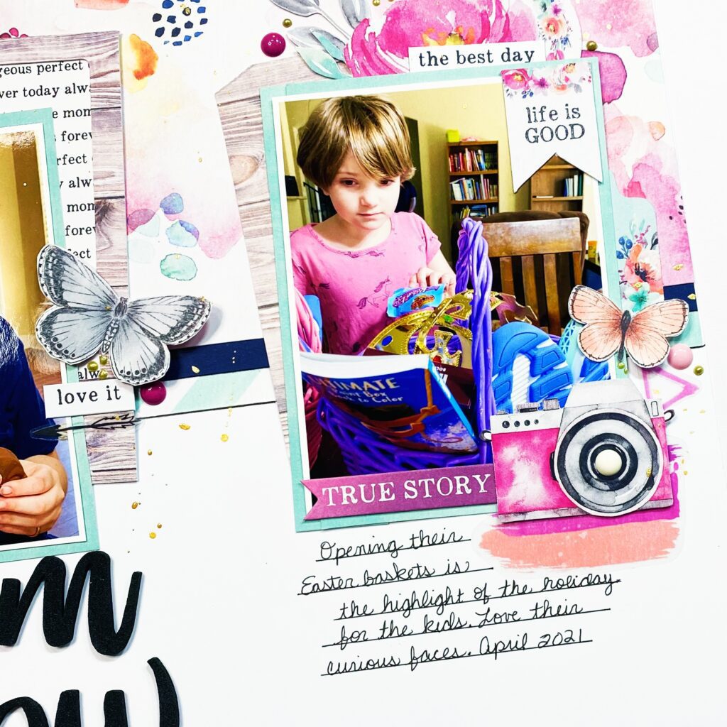
On the right side, I added a cut-apart piece and clustered floral and ephemera circle behind that photo. Along the side, I added a tab, camera, and butterfly, as well as clear stickers to create a base layer under the other pieces. I love the mixed media style clear stickers for just this kind of accent.
I love these foam titles and just had to use ‘Bloom & Grow’ for this layout. It was the perfect sentiment for my darling girls who are growing like weeds! Layering the clear stickers gives the appearance of depth behind the title and photos.
I hope this layout inspires you to play with clear stickers in your layering, they can provide excellent bases for clusters! If you’d like to see how Bloom & Grow came together, check out the process video below:
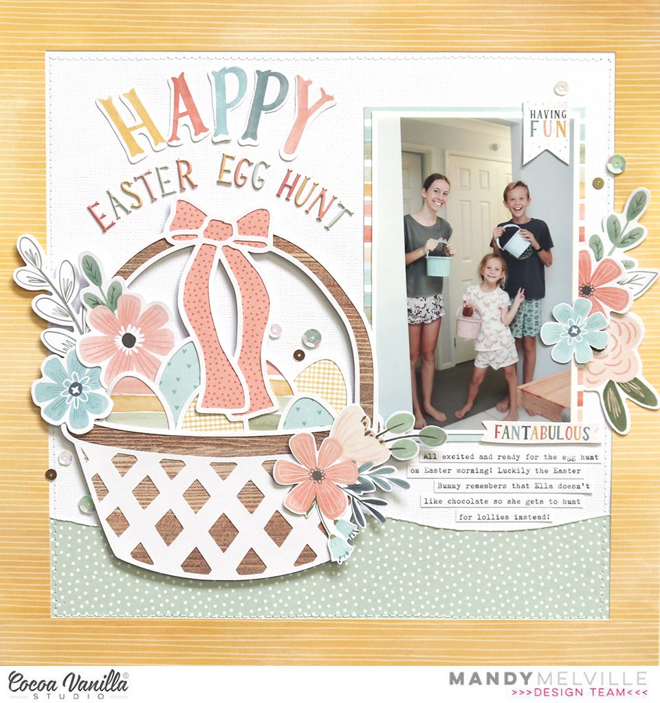
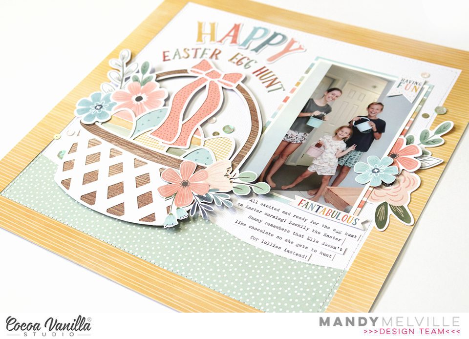
Mandy here today to share an Easter themed layout with you! I used a combination of two of my favourite collections for this page… These Daysand Daydream. These collections work beautifully together, and the soft pastel colours in both collections were perfect for an Easter themed layout. I documented a photo of my kids from last Easter, all ready for their Easter Egg Hunt!
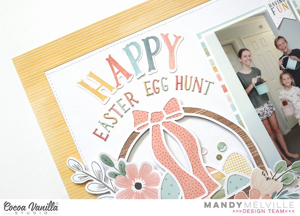
I started my layout off with a sheet of white cardstock as my background, and then cut a 2 1/2 inch wide strip of the green These Days Family Tiespaper to layer across the bottom of the page. I cut the top edge of the paper in a wavy line to make it look a bit like a grassy mound for my Easter basket to sit. Next I cut a 1 inch wide border out of the yellow Daydream Sun Shower paper, and layered that over the top of the background. I added some machine stitching around the page, just inside the yellow border, to give the page some additional texture.
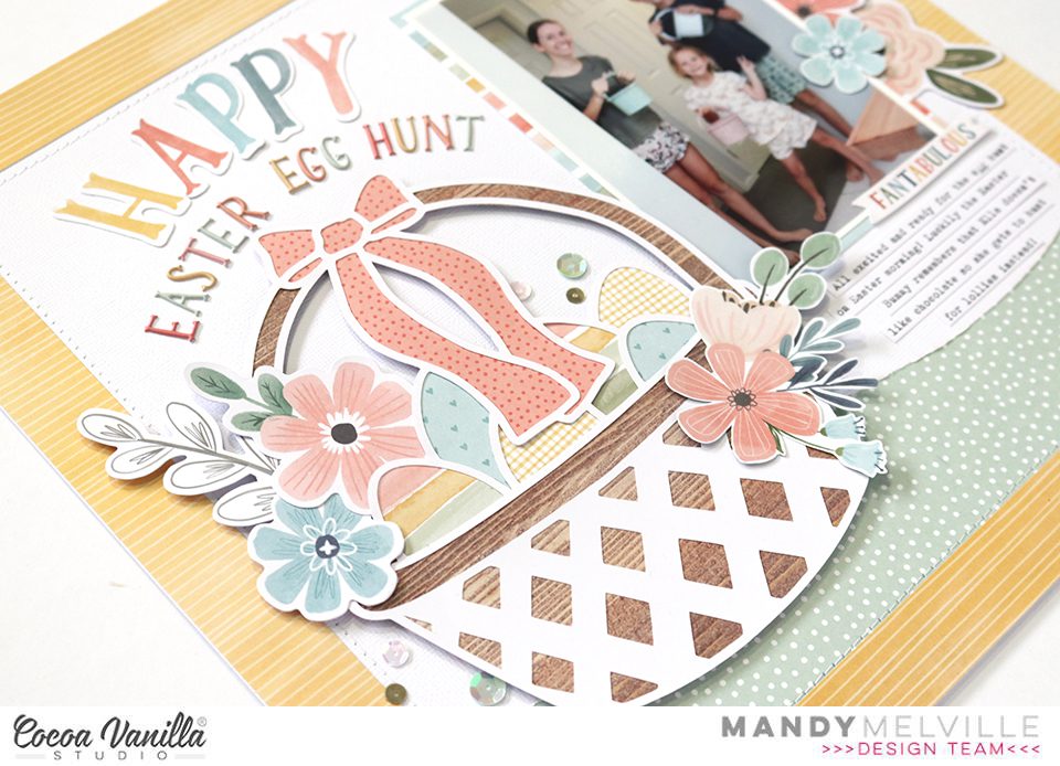
For my Easter basket I used a cut file from The Cut Shoppe. I cut it out of white cardstock and backed it with patterned papers from the These Days A5 Paper Stack. I also embellished in and around the basket with flowers from the Daydream Die Cut Ephemerapack, as well as some floral clusters that were fussy cut out of the Daydream Garden Variety paper. The basket was adhered using craft foam for added dimension.
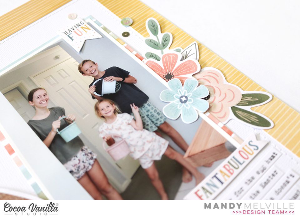
Next I matted my photo with the These Days Family Tiespaper and adhered it to the the right of the Easter basket. I added a little banner from the Daydream Accessory Stickers to the top right hand corner of the photo, and then created another floral cluster to the right of the photo using flowers and leaves from the Daydream Die Cut Ephemerapack.
For my title I used the ‘Happy’ Die Cut word from the Daydream collection combined with Mini Puffy Alpha Stickers from the These Days collection. I love all those pretty colours in the alpha stickers, and that sweet font! I arranged my title in a curve to follow the shape of the handle on the basket.
To finish the layout off I added some typed journaling strips underneath the photo, and I sprinkled around some sequins from the Daydream Sequins and Flowers pack.
Thanks so much for stopping by today! I hope you all have a very Happy Easter!
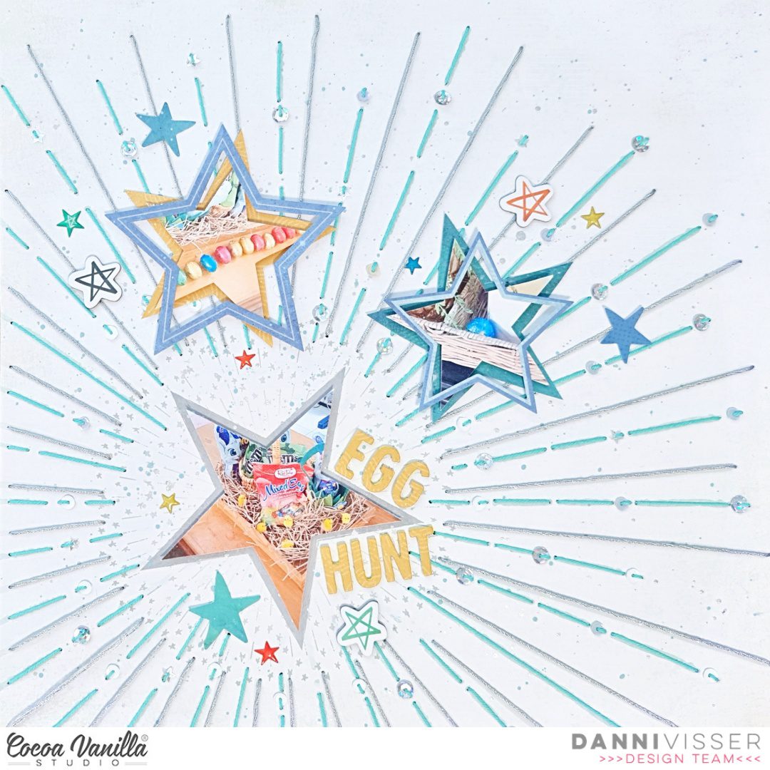
Hi Cocoa Vanilla fans! Danni here with an Easter themed layout using the incredible No Limits collection. This collection may not be traditionally themed towards tEaster, but with a little creativity you can challenge yourself to create a gorgeous holiday layout!
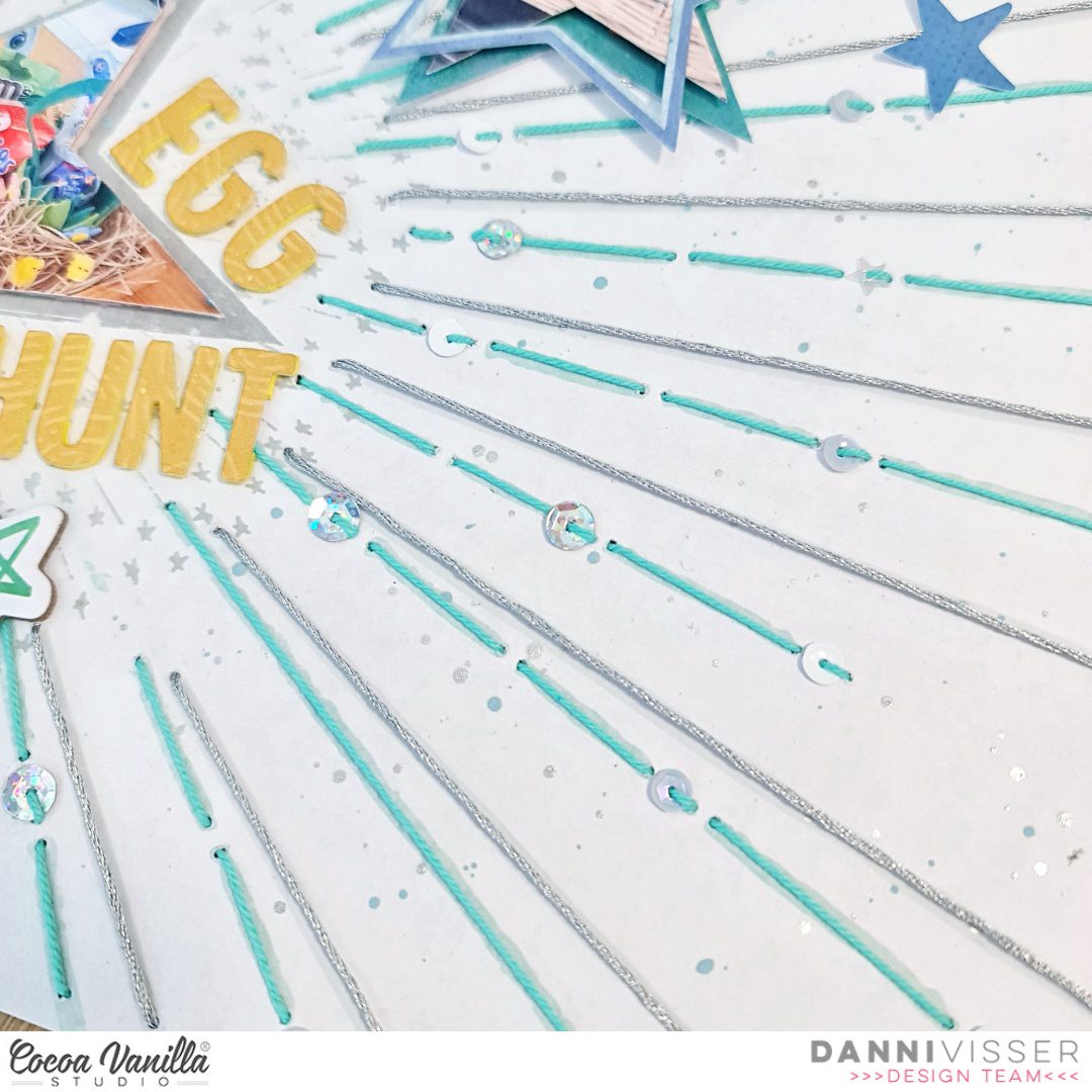
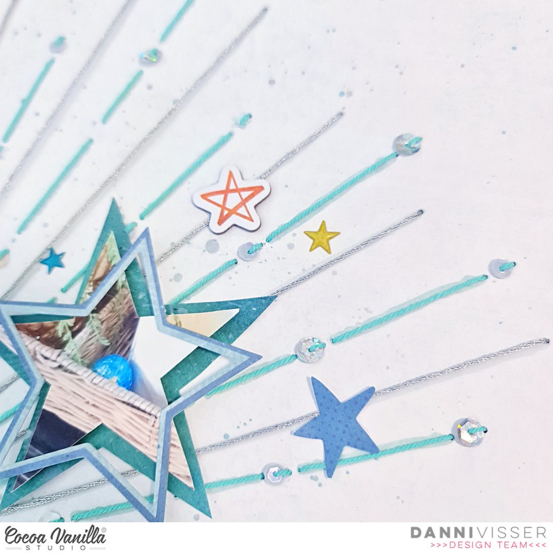
For this one I took inspiration from the exploding star pattern on Big Bang 12×12 patterned paper and decided to add some sparkle using hand stitching. I pierced holes following the starburst pattern on the paper, then threaded them using a running stitch with some teal and metallic silver embroidery thread, adding sparkly sequins into the stitching as I went. I added some further interest by adding some ink splatters in soft blue and metallic silver to match the thread I used previously.
Stars are a great universal shape that can be used for pretty much any kind of layout. I took it one step further and cut my three photos into star shapes, placing one of them within the star shape on the patterned paper and the other two backed using the A5 paper stack patterned papers. I also added dimensional foam to give them added height.
For my title I wanted to add something small as my layout was already quite busy, so I took the yellow paper from the A5 paper stack and a small alphabet die set to custom make a small title. I used the same die set and yellow craft foam to create a foam backing for each of the letters, then glued them to the paper letters for a DIY dimensional alpha title. Super easy and effective!
To further embellish my photos I added some larger star outline shapes from the die cut ephemera and layered them over my two smaller photos, rotating them slightly for an interesting layered effect. To finish off the layouts, I added some small stars from the chipboard stickers, followed by some small die cut ephemera stars and finally a couple of puffy sticker stars. I scattered these around each of my star-shape photos for extra detail and visual interest.
I hope you enjoyed this non-traditional take on an Easter layout. I’m in love with all the stars and the extra sparkly details. You can watch the layout come together in the process video on the Cocoa Vanilla Studio YouTube channel linked below. Have a wonderful Easter and happy scrapping!
Hello Friends! Welcome on Throwback Thursday kind of a post. This time I get a pleasure to rediscover one of the older Cocoa Vanilla collections. You know I love them all and I love coming back to them, combining bits and pieces and pattern papers. This time however I focused on one line only and I pulled out “Sunkissed”. It was hidden for the period of winter but it’s time for the big comeback of vivid colors and summer motifs! I pulled out two most expensive photos in my mamarazzi career and scrapbook them with little mixed media vibe. If you wonder why they are the most expensive, let me only tell you that I was convinced my new smartphone is waterproof… It wasn’t. At least I got those photos, right? :D
I started with sheet of watercolor paper as my background. I knew I wanted to use water so I had to be sure to use the proper base paper. Next step was to apply some clear gel medium through stencil with circles in different sizes. They are going to mimic the air bubbles in water. Gel medium is transparent and shiny when it’s dry and it’s also color resistant. Just make sure you dried it well before moving to next step.
I picked three Distress Oxide inks in “Mermaid lagoon”, “Broken china” and “Peacock feathers” colors and tap them all over the background and sprayed everything with clear water. Colors mixed with water well and started floating on the surface. I dried the background with the heat gun removing excess of water with paper towel. When everything was dry, I took a blending brush and applied some ink through the stencil in random spots. The background was done!
I was ready to start building my composition. My pictures didn’t have any white outline so I back them with some pattern papers to make them pop from the background. I used “Bright side” and “Sunny days” for this purpose. Idea for this page was to create an underwater scene so I kept it very monochromatic, in all shades of blue. I also cut out circles in various sizes using the same pattern papers adding few scraps from A5 Paper Stack.
Few bits and pieces from Ephemera Pack serve as an embellishments scattered around the photos. I also added my beloved Wooden Buttons and Puffy Stickers here and there. They are the best finishing elements. I was almost done with my page, when I noticed I also got some transparent stickers left so I added few of them in the background using mostly blue ones. They work best on light backgrounds, like the one I have in my page.
And that’s it! Simple, right? My favorite type of layout. That is all for today. Thank you so much for stopping by and I we will see each other in two weeks! I already created fun page with “No limits” collection for you!
Hello Paperlovers, How nice to see you again on the Cocoa Vanilla blog today. It’s Josefine here with a new mixed media layout. This time I worked with the super cool and beautiful boys collection “No limits” I think this is such a great collection. The cool look and the cool colors can’t get enough of it.
I first started with the mixed media background and used the following colors of Distress Oxide, “broken china” and “prize ribbon” I took a cleaning sponge and cut a piece from it. I wet the sponge and placed a little ink from both colors on a piece of plastic. I pick up the ink with the sponge and apply it in a stamping way on the white background.
I take a text clear stamp and stamp small prints of the stamp on my mixed media background. The ink I used is “broken china”
I used a cut file with stars and choose a cut file from Cut to You calls “Star Cluster” I cut the cut file from orange pattern paper and placed the cut file on my mixed media background. I stitched Some stars I with blue sewing thread and put it on top of the cut file for a lovely 3D effect.
For this boys layout I used a number of pocket page cards. I picked out a few for the right colors and cropped them and then placed them behind the photo. In between the pocketpage cards, I stick some tabs, stars and die-cuts. Lovely all these layers.
I fussy cut several stars from the beautiful pattern paper and placed them in different spots on top of the cut file. Some of the stars I provide with a blue stitch border of blue sewing thread and on top of the stars a few word strips.
I made two clusters of die-cuts, stars, wooden buttons and tickets on both sides of the photo. For the title, I used the awesome large die-cut titles. The title for this layout is “You’re the best Cool Kid”
Now it’s time to do some splattering on the layout with both colors of distress oxide and also some white splattering with the gesso. I mix the gesso with a little bit of water so I can splatter more easily with my brush. I hope you got some fun and creative ideas from my blog today and enjoy getting started with this beautiful collection. I hope to see you again next time with a new project. Have a happy and creative day friends! XoXo, Jo
Hello there CV fans! It’s Kylie with you again today with a very colourful layout to share featuring the new ‘No Limits’ collection. I am always experimenting with ways to incorporate lots of different papers into my page designs. (Perhaps that comes from my inability to choose just one favourite paper!) I decided to create a background feature with ‘panel’ strips of paper for the layout I am sharing with you today.
I chose the ‘NEBULA’ paper as my background and I cut down a white sheet of cardstock to measure 10″x 9.5″. Next I trimmed several strips of various papers to measure 1.5″x 9″. I then laid every strip across the white panel, making sure to adjust the position of each so that they were all evenly space. I wanted to have a nice even edge of white showing around each piece. When I was happy with how it looked I adhered everything down with double sided tape. Once complete I adhere the whole piece to the background paper, lined up neatly next to the right side edge.
As some of you may know from my previous paper adventures, I love working with BIG titles. I wanted to include two big titles in my page design so first created a mat for my photo. Since my photo was 6″x 4″ I trimmed my photo mat to measure 6.25″x 4.25″ which gave a lovely neat border. I adhered the photo to my page with foam adhesives squares and adhered my first title over my photo from the ephemera pack. To create layers and dimension I tucked some more of the ephemera pieces behind the photo and added a few with more foam adhesive squares. (I think the rocket ships in this collection are some of my favourite decorative pieces!)
To keep my page balanced I added the second title to the base of the photo using the title die cut pack. I also added some of the typed phrases from the sticker sheet below it. To finish my page I added just a few more stars from the ephemera pack.
Thanks friends for stopping by the blog today. I hope my layout has given you a little inspiration to perhaps try something new with your own scrapbooking.
It’s Tarrah back with you to share a new layout featuring the No Limits A5 paper stack and the No Limits 3′ x 4′ pocket cards! These products are such a great part of the No Limits collection! They are perfect for layering, punching shapes from and backing cut files too. This collection is so versatile and its perfect for not only boy projects but travel and even girly projects too!
I decided on a monochromatic colour scheme for this layout as so many of the elements in the No Limits collection went perfectly with the photo of my son having fun in the pool. I chose the Universal paperas the background paper as it reminded me of bubbles and was perfect to go with the photo of my son in the pool. I trimmed this paper down slightly and backed it onto the ‘B’ side of the Stardust paper. I took my black journal pen and freehand drew a border around the outside. I cut out some different sized strips from the A5 paper stack and layered them in a vertical manner to the left, I also took 5 of the 3′ x 4′ journal cards layering them under the paper strips, I added the ‘You’re The Best’ one to the right hand side of the layout, this card became the title of the layout.
I adhered my photo on the left using foam tape to add some dimension to the layout and took some of the chipboard frames and also layered these under the photo. I cut out 2 phrases and adhered these to the photo. I also layered one of the thin chipboard frames under the title card on the right. When I create layouts I always start with the larger elements on my page first like the papers, title and photo. I then add smaller layers and embellishments and finish with the smallest things at the end. Once the chipboard was placed, I then took some ephemera and accessory stickers also in the monochromatic colour scheme and added these as layers under the photo and paper layers.
As my photo and most of the detail is on the left of the layout, I wanted to balance the layout by adding similar elements on the right of the layout. I was able to replicate the photo by adding the 3′ x 4′ journal card and I tucked in some layers just the same as I did on the right. I didn’t tuck any papers on this side so that it did not look too overdone. I tucked in mainly ephemera and accessory stickers.
Some of the smallest embellishments I added last were the chipboard arrows, by placing these opposite to each other, they give a sense of movement on the layout. I also took some of the super cute puffy stickers, choosing some of the blue and grey ones and added some around my layout. I like how these also help replicate bubbles and go perfectly with the theme of my layout. Lastly I stamped the date stamp and sprinkled a little bit of black mist on my page.
Thank you so much for stopping by the Cocoa Vanilla blog today! I hope you enjoyed my layout as much as I enjoyed creating it?! Make sure you keep an eye out for the awesome No Limits collection in your local scrapbook store and it should also be hitting the Cocoa Vanilla online store soon as well.
I used the No Limits collection. I decided to do a little bit of mixed media on the gorgeous “Stardust” paper that I used for my background.
I cut a cut file from Just Nick Studio and used it as a stencil to apply white acrylic paint on the center of the page. I also added white splatters.
I mounted a beautiful black and white photo of my son studying with our dog on tissue paper, foam adhesive and a few layers of patterned papers chosen from the A5 Paper Stack.
I used another Just Nick Studio cut file for my title. I used the yellow A5 paper to create the inner parts of the letters, machine stitched on them and popped them up with foam dots instead of backing the cut file with them. It creates a more dynamic title and I love the result!
I embellished around the photo with elements from the Die Cut Ephemera pack, the Puffy Stickers, the Chipboard Stickers and two Wood Buttons.
I handwrote my journaling on a die cut and placed it next to the photo.
Hello Beautiful Friends,
Lina here today on the blog and YouTube channel featuring a layout I created using the These Days collection and the very colourful and inspirational mood board for the month.
You’ll be able to click HERE to be taken to YouTube to watch the process video for this layout.
The mood board this month is filled with lots of brightly coloured and fun Spring and Easter goodness. I drew my inspiration from all the colour and florals. I just could not resist! And using the These Days collection to create was just perfect in my opinion.
I started with a white sheet of cardstock and used my Silhouette Cameo to cut a circle in the middle that roughly measured 8×8 inches. Then I adhered my white cardstock to the lovely butter yellow gingham paper called Home Grown. The combination of the yellow gingham and the white cardstock made this background feel so light and airy. I then cut a circle frame with the patterned paper, Family Ties, to anchor the circle and give it more weight.
Next, I went to town and used alllll the florals, foliage, and butterflies. Using the Floral Ephemera, I created a (semi) frame around the circle to create somewhat of a wreath effect.
I (carefully) arranged my florals around my frame being extra generous on both the right and left sides. I finished off the layering with lots of foliage and butterflies that just add extra dimension. I also took this opportunity to add metallic gold thread behind my popped up photograph for a different type of texture.
For my title, I used the Foam Title Stickers and chose the words happy and together… voila`! My title easily came together, easy peasy! I also added some Wood Buttons and adorned the frame with teeny tiny hearts from the Puffy Stickers.
I had lots of fun creating this layout because of how bright and colourful the mood board is. It really out me in the mood for Spring and beautiful weather. I hope you’ll use the inspiration yourself and show us what you create with it.
Mandy here today to share a new layout featuring the AMAZING new No Limits collection! One of the things that I love about this collection is it’s versatility for scrapbooking boys of all ages. I’ve already used it to document a photo of my hubby, and photos of my teenage son, so for today’s layout I decided to pull out some photos of when my son was just one year old! I hadn’t yet documented these photos and I knew that they would work perfectly with this collection!
I wanted this layout to feature lots of the gorgeous colours and patterns from the collection, so I decided to cut up strips of patterned paper and layer them onto my background. I used a combination of papers from the A5 Paper Stack, as well as the Universal, Spark, and Latitude 12 x12 papers. I used a border punch on the yellow Latitude paper and tucked that into the layers for some extra interest. Once I had the strips of paper adhered to my white cardstock background, I took the layout to my sewing machine and added some machine stitching through some of the strips. I then trimmed the background down to 11 1/2 inches and matted it on the yellow Latitude paper.
Once I had my background done, I added my two photos at the top of the page, above the patterned paper strips. I matted them with papers from the A5 Paper Stack and then adhered them with craft foam for added dimension.
To the left of the photos I created a cluster of embellishments using star die cuts, a little banner, and a chipboard arrow. To add interest to the cluster I tucked the larger star underneath the photo, and adhered the smaller one on top. The chipboard embellishment helps to add dimension to the cluster.
I added a second cluster on the right hand side of the page, and included similar elements such as a die cut star, a chipboard banner, and a little phrase sticker. Repeating elements like this in your embellishment clusters helps the page to feel balanced and cohesive.
I added my title at the bottom of the page using the Die Cut Titles from the collection. I used the words ‘Cool Kid’ as my title, which I think worked perfectly for this page! It not only describes my son’s ‘cool’ personality, but also references the fact that he ‘cooling’ off in the kiddie pool. I adhered the title using foam tape to help it to really pop off the page.
I finished my layout off by sprinkling around some little circles (these were the negative punch outs from the border punch that I’d already used on this page), as well as a few puffy stickers, to look like splashes of water on the page.
Thanks so much for joining me here on the blog today! I hope that you’ve found some inspiration from my layout. I look forward to sharing again later in the month.


 For my title, I used the Foam Title Stickers and chose the words happy and together… voila`! My title easily came together, easy peasy! I also added some Wood Buttons and adorned the frame with teeny tiny hearts from the Puffy Stickers.


