It’s Sophie here and I have something fun to share with you!
Today is a scraplift swap !
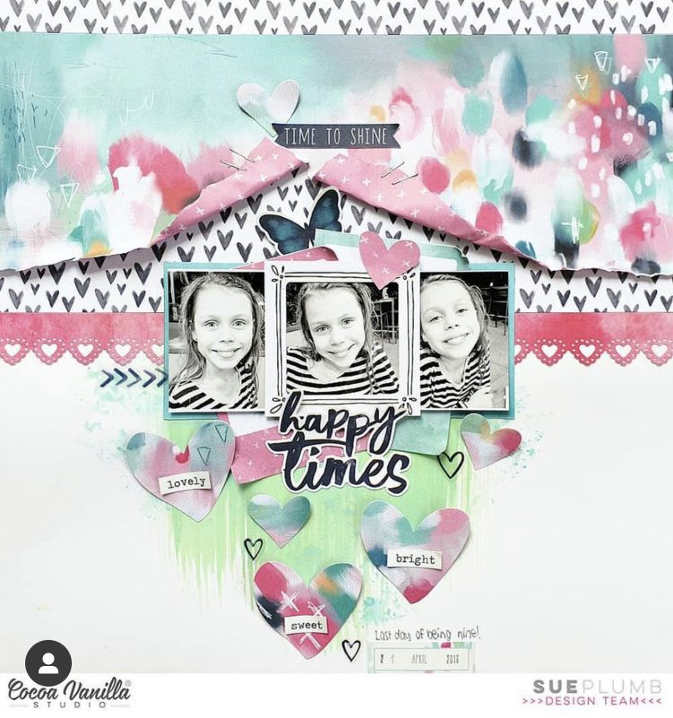
I had to pick a layout from the lovely and talented Sue Plumb and scraplift it! Ohhh there were so many GORGEOUS ones to choose from…!
Here is her page:
And here is mine:
I used the beautiful These Days collection for my page. I started with a white background and added a little bit of mixed media (I used Distress Oxides) on the lower portion of the page, where my title was going to be.
I used three layers of patterned papers, just like she did, teared the central part of the upper layer and tied it to the page with a few stitches. I also hand stitched on the top of the page.
I centered three colored photos of Sabrina and Farine, mounted on tissue paper and foam adhesive, and tucked a few frames from the embellishment pack under them.
My title is a combination of the Mini Puffy Alphabet pack and letter dies from my stash.
Finally, I created a floral cluster around the photos and titles, instead of hearts, added a few butterflies and a Wood Button, and handwrote my journaling.
Here are more close-ups:
That’s a pretty faithful scraplift from the original, isn’t it? Even though the end-result, with another color scheme and collection, turns out quite different…! That’s the beauty of scraplifting !!
I hope this was inspiring for you and that you like our pages!
Good morning everyone and welcome back to the CVS blog.
For today’s layout I thought I would pull out the ‘These Days’ collection from my stash and create a more feminine page to share with you.
I had an idea of wanting to create a design with multiple photos on my page and I managed to squeeze 18 photos on….. I have never done this before and am really happy with the result.
I decided to print off a bunch of photos of my husband with myself and all of the kids. To keep the page from getting too busy I decided to print my pictures in black and white.
I wanted to create a focal point for my title to sit on so I cut out a globe cut file and used papers from the A5 paper stack to back it.
To fill out the globe I cut out a heap of the florals from the ‘Homegrown’ paper and some of the houses from the ‘Neighbourhood’ paper. For the florals, instead of sticking them flat to the page, I simply used my hands to bend the petals slightly then glued the centres down. I finished the clusters off with some of the hearts from the ‘Clear Stickers’ and some of the word phrases from the ‘Accessory Sticker Sheet.’
Hey y’all! Laura Alberts back again with a fun summer layout using the gorgeous Sunkissed collection! I love multiple photo layouts, so this month’s multiple photo focus was definitely my jam! I think these three 3×4 inch photos that beautifully illustrate my oldest son’s friendship with my brother. Love how the vibrant colors in Sunkissed perfectly capture the playful mood of these photos! Using a rainbow strip from the Fun in the Sun paper, along with some fussy cut flags, I created a fun L-design in the top left corner of this layout, which created a lovely border for my grid of photos.
I particularly love this large cluster on the right where I layered a fussy cut floral cluster from the Growing Wild paper behind a rainbow and ticket from the ephemera pack. It’s such a fun corner cluster that accents the main focal image perfectly. The labels in this collection are so perfect for tucking a little bit of journaling anywhere on the layout too!
As a finishing touch, I dug into the glitter foam titles for this ‘happy’ and then added hearts to my other two clusters to tie in the beautiful gold tone around the page. The little starfish seemed like a lovely accompaniment in front of it! A little bit of splatter and Nuvo around my clusters finished this one off! Such a fun layout.
I hope this layout inspires you to try a multiple photo layout, as well as look at the cut apart papers as opportunities for extra embellishments! If you’d like to see how Welcome to Paradise came together, be sure to watch the process video below.
Mandy here today to share a new layout with you. This week on the blog it’s all about different ways of featuring your photos. When creating a layout I always try to make the photo/s the focus of the page. Sometimes I only need one photo to tell the story, and other times it’s important to include more, but either way, all of the other elements on a page are there to complement and support the photo and story. For today’s layout I wanted to include three photos – one with each of my kids on Mother’s Day, and I chose to use one of my all-time favourite collections, Daydream to document these photos.
I started this layout off with a sheet of the All Aflutter paper as my background. I trimmed it down to 11 inches square, added some machine stitching around the edge, and then matted it on the Happy Place paper. This framed the layout nicely, and helped to make all of the elements on the page feel contained.
Next I cut my title using my new little Cricut Joy (which my hubby surprised me with for Mother’s Day!). I chose one of the phrases available to download within the Cricut Design Space and cut the word ‘happy’ from the Over the Rainbow paper and ‘Mother’s Day’ from the Sun Shower paper. I then created an offset and cut this from white cardstock, which helped the title to really pop and stand out from the background. I also adhered my title using foam tape to give it some nice dimension and shadows.
I matted my 3×4 inch photos with various patterned papers from the 6×8 Inch Paper Stack, and then arranged them around the title, creating a visual triangle.
Next I created two floral clusters, one in the top left and the other above the photo in the bottom right. This helps to give a diagonal flow to the layout, drawing the viewer’s eye down the page and through the title and photos. I used various floral and leaf die cuts in the clusters, layering them up and adhering some with foam tape for extra dimension and interest.
I finished the page off with a couple of little moths/butterflies that I fussy cut out of one of the 6×8 papers, as well as a few little heart stickers. I also added my typed journaling next to the photo at the top of the page.
Thanks so much for joining me here on the blog today. I’ve hope that you’ve been inspired by how I’ve included multiple photos on my layout.
Hi Cocoa Vanilla fans! Danni here with a fun, bright layout featuring my two favourite little people and the incredible No Limits collection. This week the team were challenged to make a layout with multiple photos or shaped photos, so I decided to do both. I am really happy with how this one turned out, I hope you like it too!
One of the easiest ways to use shaped photos is to use a cutfile. I have had this star patterned one sitting in my stash for ages, so now was the perfect time to use it. It’s a combination cutfile/stitching template which gives an extra layer of detail and interest, but that’s completely optional.
I used the A5 paper stack, Eclipse 12×12 patterned paper and a couple of double-sided 3×4 cards to back all but two of the star shapes in the cutfile, which I saved for my photos. Just make sure to print the photos large enough so they will fit in the stars, then adhere the photos to the back of the cutfile and trim off the excess. My two littles were having a lovely time at the park this day, even though the weather was a bit gloomy!
Once my cutfile was backed I added some adhesive foam to the back of the stars to add dimension. For the stitching, I used the stitching template part of the cutfile to cut the stitching holes into The Big Bang 12×12 patterned paper, before stitching with embroidery thread using a chain-stitching technique. This can be quite time consuming, but I love all the extra texture this provides.
Once I had finished the stitching, I added some tiny delicate splatters of gold mist and white acrylic ink all around the outside of my stitched pattern. Then I adhered the cutfile down within the stitched pattern. Make sure to use a good amount of adhesive if you do something like this, as the backed cutfile is quite heavy.
For the title I decided to use the gorgeous ‘To the Moon and Back’ piece from the chipboard stickers and adhere it right in the centre of the largest star. I then did the same with two of the larger epoxy wood buttons and two of the other stars to add some more circular elements. To embellish, I added some more of the smaller chipboard pieces and layered them over the cutfile.
For finishing touches, I added lots of chipboard sticker and puffy sticker stars all around the outside of the layout, followed by three tiny word phrases from the accessory stickers. I love the contrast of the bright colours of this layout against the neutral woodgrain background. I hope you enjoyed joining me for this layout today. Take care and happy scrapping!
Hello crafty Friends. It’s Anna here with a page containing multiply photos. This is the assignment we were given this week and I was so happy to join. It was the perfect opportunity to make “all in one” type of scrapbook page, with a lot of small photos from one of our family trips. It’s something I love to do after each vacation. I pick about 10 photos I like the most and arrange them over the page. I, of course, make more pages with single photos to go more into details of each adventure and make a travel album, but this page is just a super fun reminder of all the great fun we had.
This time I scrapbooked our last year one week vacation in french Jura. It was kind of an accident we ended up there but we felt in love with the landscape, food and people and we are coming back this year too!
I used colorful “No limits” collection to make my page. It was inspired by the paper called “Eclipse”, that is also my page base. I decided to place each photo in different 3*4 square. Before I did that, I wanted to “get rid” of some rectangles that were too colorful or in a wrong color. I reached for Pocket Cards and picked few in the colors I wanted to add to my page. I used them to cover all the 3*4 rectangles I wanted to hide. Pocket Cards are not only for project lifers! They can be a super cute base for mini album, used as dividers in bigger albums or as a journaling spots on layouts. Very versatile product!
After my grid was finished, It was time to place my photos. They are all in the same size and have white frame. However, some rectangles we also white-ish and my pictures tend to blend with them. That’s why I backed some of them with pieces of orange “Spark” and yellow “Latitude” papers.
Each photo is backed with a one layer of cardboard to add more dimension to the page. This is my go to technique for every single page. I just can’t make anything flat :) With all the photos glued down it was time for embellishing the page. I tried to find as many stickers and ephemera pieces as possible, that would match travel theme of my layout. There is a great globe in Chipboard Stickers sheet, that I placed on one of the cards. I also picked few more thick stickers to add to my page.
Stars, small phrases and arrows come from Ephemera Pack – the most versatile product ever! With so many elements to choose from, you can make many, many projects with just one pack. I also used YEAH word from Die Cut Titles becasue I needed something to fill the empty space above the photo. Not all elements have to have a deeper meaning, right? I also used a word strips from Accesory Stickers sheet and three super cute wooden buttons.
I managed to use all the embellishments from “No limits” collection but one! I love the story this layout carries and love every single photo, even if it doesn’t look like taken by proffesional artist. There are so many great feelings poured into this page and this is always the most important part of scrapbooking for me.
I hope I inspired you to make a multiply photo layout, because I know it may be hard to arrange so many pictures. Grid is always a great idea in this case.
Thank you so much for staying with me and see you in two weeks.
Hey Hello Paperlovers, Welcome to the Cocoa Vanilla Studio blog today! It’s Josefine here with new scrapbook Inspiration for you. I certainly can’t get enough of this amazing collection “No Limits” The colors in this collection inspire me. This layout is quite simple and easy to make and I am happy with the result. I choose a sweet photo of my son when he was a little younger. I cut out the photo in a circle. I used my circle cutter from We R Memory keepers. I cut out two more circles from the beautiful patterned paper. I stitch the edges with brown sewing thread by using my sewing machine.
I draw a circle in the center of the layout and with Distress Oxide I created a mixed media background. I used a background stamp that looks like a splatter and stamp several times with the distress oxide in a circle on the background.I mixed the ink with water to create a watercolor look. With a thin round brush I splatter with the ink on the mixed media background. I really love the effect of splatters on my layout. The colors I used are “faded Jeans” and “Stormy sky”
I placed the patterns design paper circles in the center of the mixed media background and the photo on top. I used 3D tape so I can easily slide the stars between the paper layers.
I fussy cut several stars from the pattern paper “Nebula” from the No Limits collection. I attached the stars with 3D tape. I like the way the stars. stand out a little from the background. I mix the white gesso with water and with a thin brush I make white gesso splatters on my layout. The little puffy stars are adorable and great to combine on this layout.
I wanted some extra ink splatter on my layout and used both colors “faded jeans” and “Stormy sky” distress oxides. For the title “Boys will be Boys” I used leftovers from different alpha sets from my own stash. I kind of kept the colors in the title that are also reflected in the stars. I love the playful effect.
I hope I was able to inspire you with this Boys will be Boys layout and I want to thank you for visiting the blog today and hope to see you again next time with a new project with the beautiful collections designed by Cocoa Vanilla Studio!
Wishing you a crafty day friends!
XoXo, Jo
Hello Cocoa Vanilla fans! It’s Kylie with you again with another layout I created to share with you all. This pandemic has been difficult for everyone and especially for families who have been unable to travel to see each other. My layout today documents a happy reunion and I knew the ‘No Limits’ collection would be perfect to use. I wanted lots of colour on my page, so I used a backed ‘Colour-wheel’ cut file from CUT TO YOU as a focal point. This allowed me to use a wide variety of papers.
I’m not going to lie. The orange side of the SPARKS paper is probably my most favourite. I seemed to of used it in every layout I have created so far! It’s just the most perfect shade! To begin this layout I trimmed it to 11.5″x 11.5″ and adhered it centred over the top of the BIG BANG paper. It was then sat aside whilst I cut out my cut file. Originally the cut file design was a full circle. I decided to cut away a pie section to allow for a small ‘nook’ if you like, to position my photos in. I did this very carefully with my scissors, before using the A5 paper pack to back the remaining piece.
With the cut file backed, I then added some adhesive foam squares to the back of it and adhered it centred on my page. I’ve used two different photos that I printed to 3″x 4″ in size. Each were backed with a pocket card for a burst of extra colour. These were adhered into place and I added a cluster of the die cuts to support the photos and to provide a nice overall balance.
It was at this point I felt the background needed something extra so I decided to add a small scattering of stars from the die cut pack, chipboard stickers and puffy stickers. To complete my page I chose a title phrase using the title die cuts, which was adhered in place above my photos.
Sophie on the blog today with this new layout created with the No Limits collection!
I used a black and white photo of my son Gabriel holding our new puppy on the very first day that we got her.
I used a white cardstock for my background and teared a big chunk of the No Limits Nebula patterned paper that I placed on the left side of the page.
I added tissue paper and foam adhesive behind the photo and placed a layer of the colorful No Limits Latitude paper on the left side of it.
I selected a cut file from the Silhouette Studio store, cut the title directly on the white cardstock, backed the letters with two yellow 3×4 cards and hand stitched around the Paw Print. I also created a little shaker with that paw print. It’s such a beautiful addition to the page!
I wrote my journaling on another 3×4 card, added two subtitles “Out of this world” and “One of a kind” fussy cut out of the No Limits Universal paper and stamped the date.
I decorated around the photo in a diagonal design with a few hearts punched out of different patterned papers, on which I added vellum hearts. I stitched the hearts in their center and curled up their edges. A simple but sophisticated way to embellish a page!
Finally, I added Wood Epoxy Buttons and puffy stickers here and there around the page for the finishing touch.
Here are more close-ups:
I love how it turned out!
I hope you like this page and find inspiration in it!


 I fussy cut several stars from the pattern paper “Nebula” from the No Limits collection. I attached the stars with 3D tape. I like the way the stars. stand out a little from the background. I mix the white gesso with water and with a thin brush I make white gesso splatters on my layout. The little puffy stars are adorable and great to combine on this layout.


