It’s Sophie with you today and I am thrilled to share my layout inspired by the May challenge!
The challenge this month is called “Flower Frenzy”: Using flowers as the main design element of a layout… The more the better…!
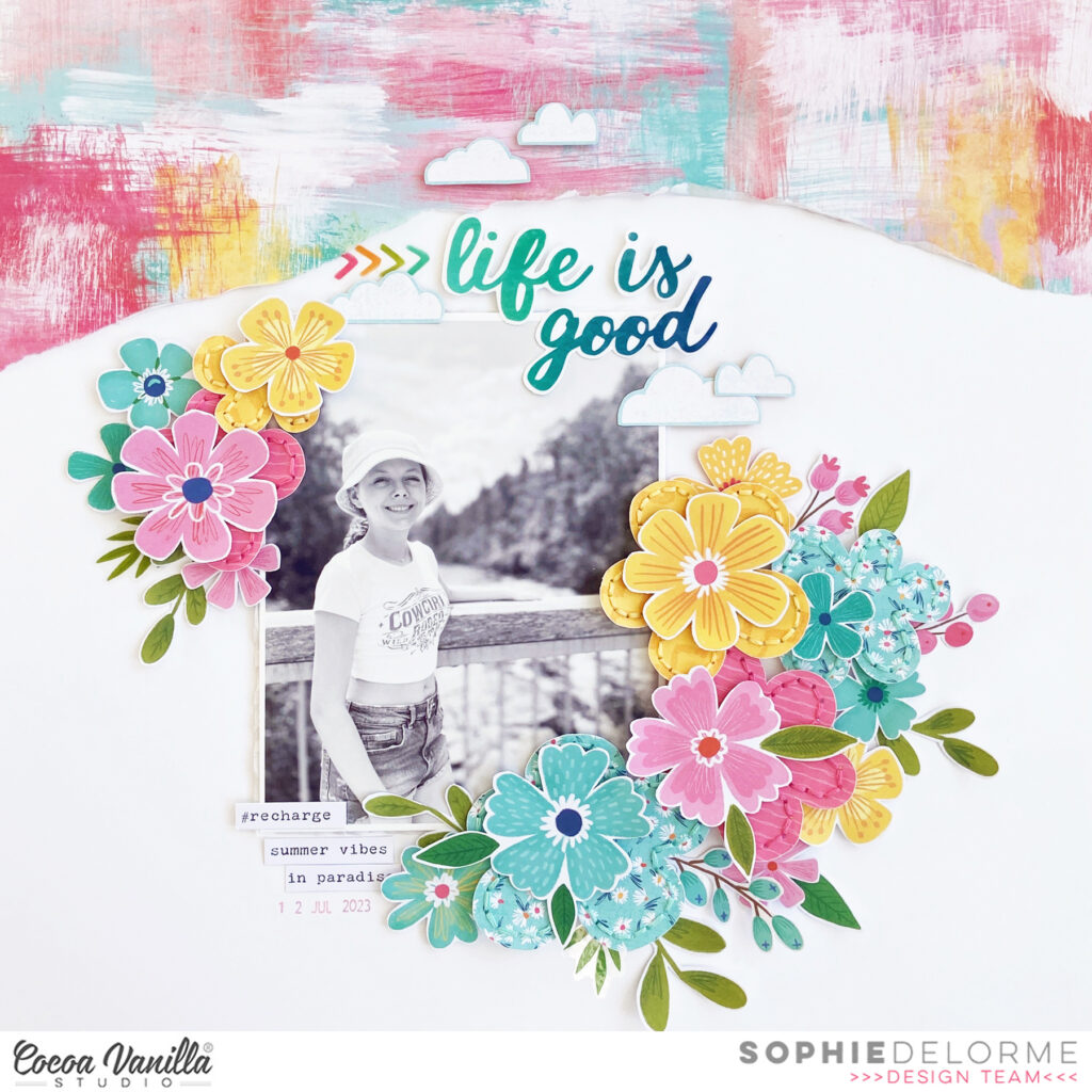
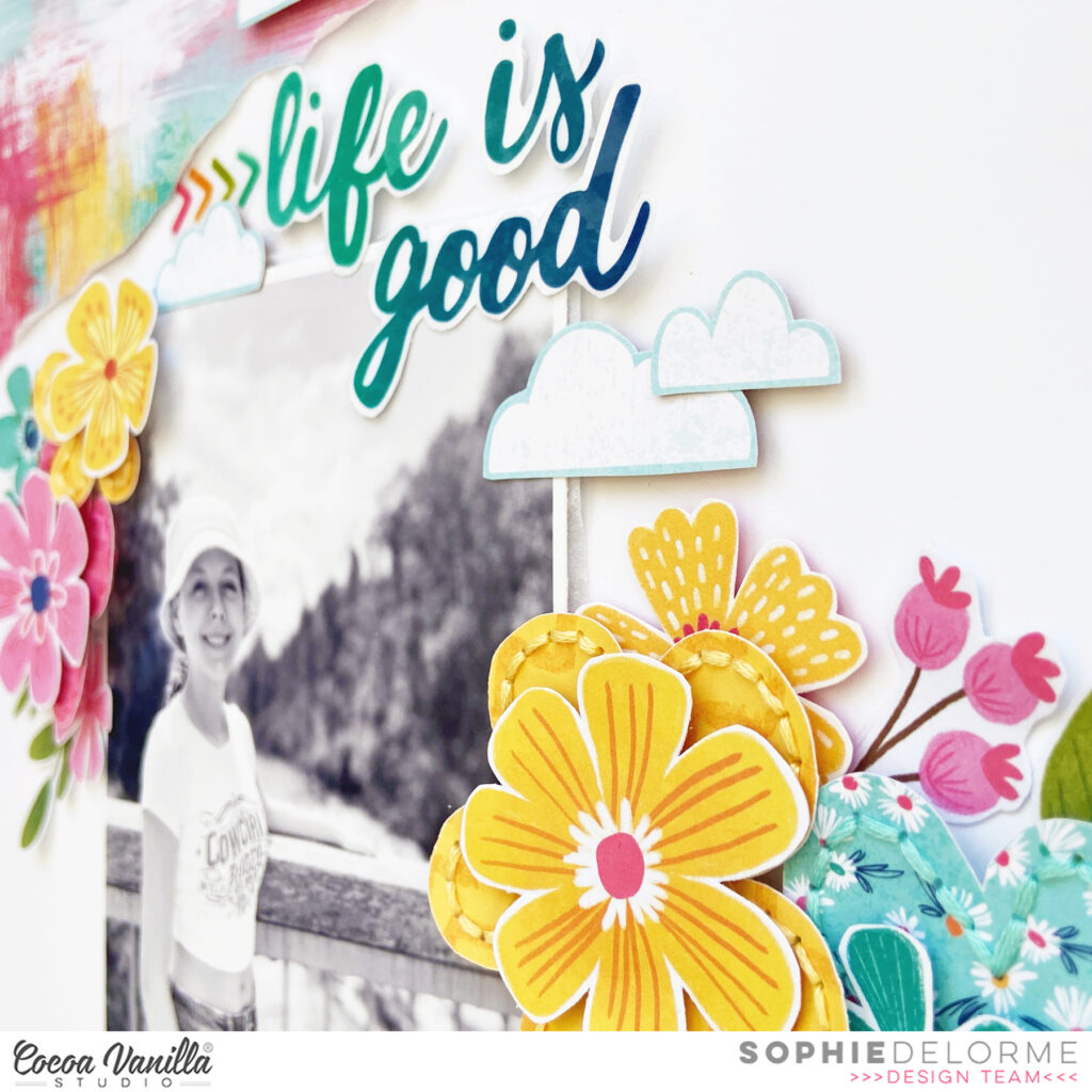
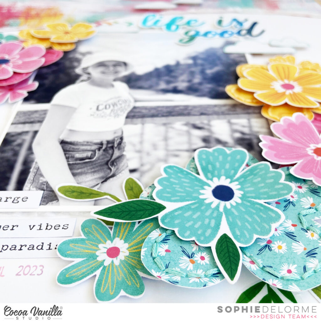
I used the Sunkissed collection for this colorful page and went with big floral clusters all around my black and white photo.
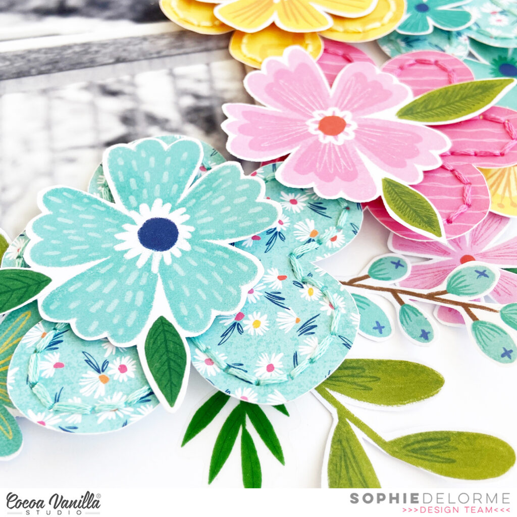
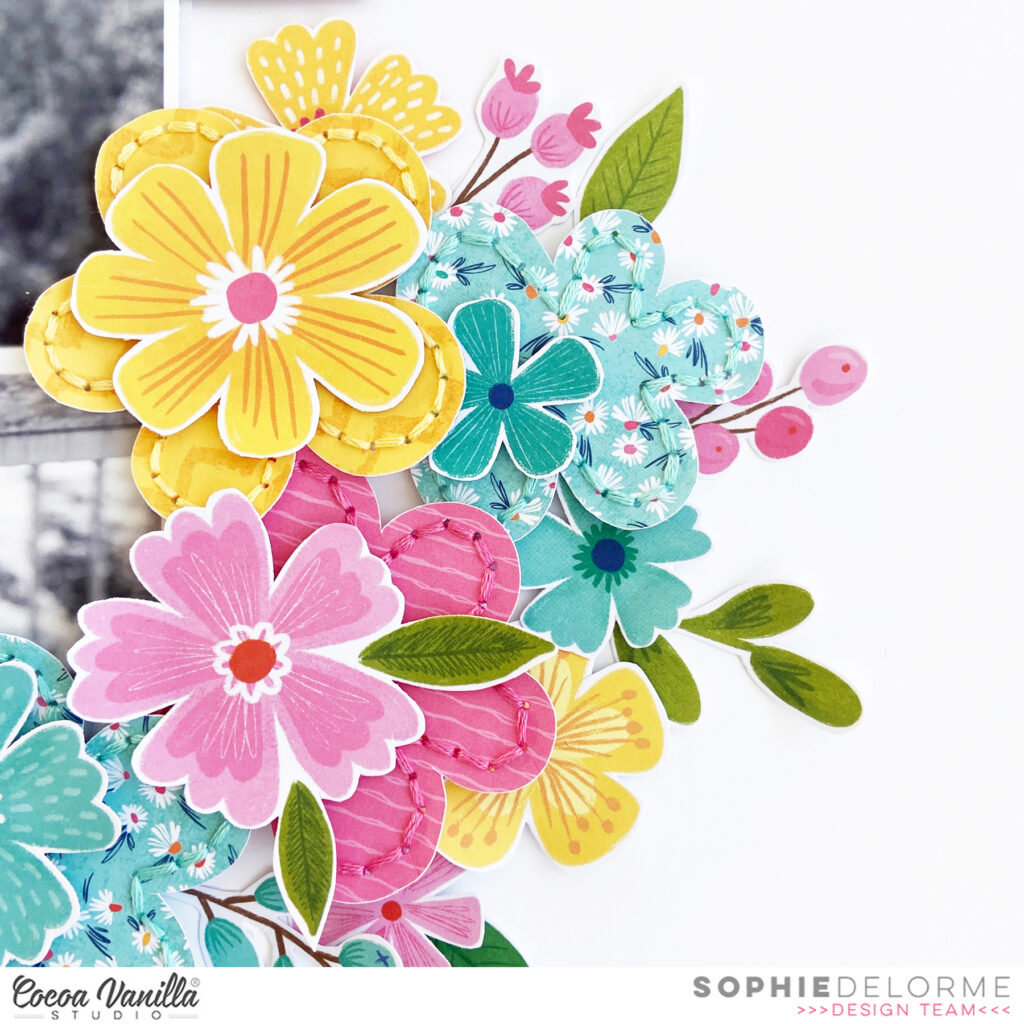
I drew a few flowers on three A5 patterned papers, cut them out and hand stitched on each petal. They served as a background for the flowers and leaves that are from the Sunkissed floral ephemera pack.It adds texture and depth to the clusters, and even though it’s very bold and colorful, it doesn’t compete with the black and white photo, that still stays the star of the page.
I teared a big chunk of the “Feelin’ Fine” paper and placed it on the upper part of the layout. I fussy cut a few clouds out of the “Just Chillin’” paper and used some Clear Stickers for my title.
Here are more close-ups:
It’s a very simple page with only beautiful florals as embellishments, and I love it!!
I hope you do too!!
You have the whole month of May to participate in this floral challenge. You can use any Cocoa Vanilla Studio collection, as they all have a huge amount of gorgeous flowers that can be used.
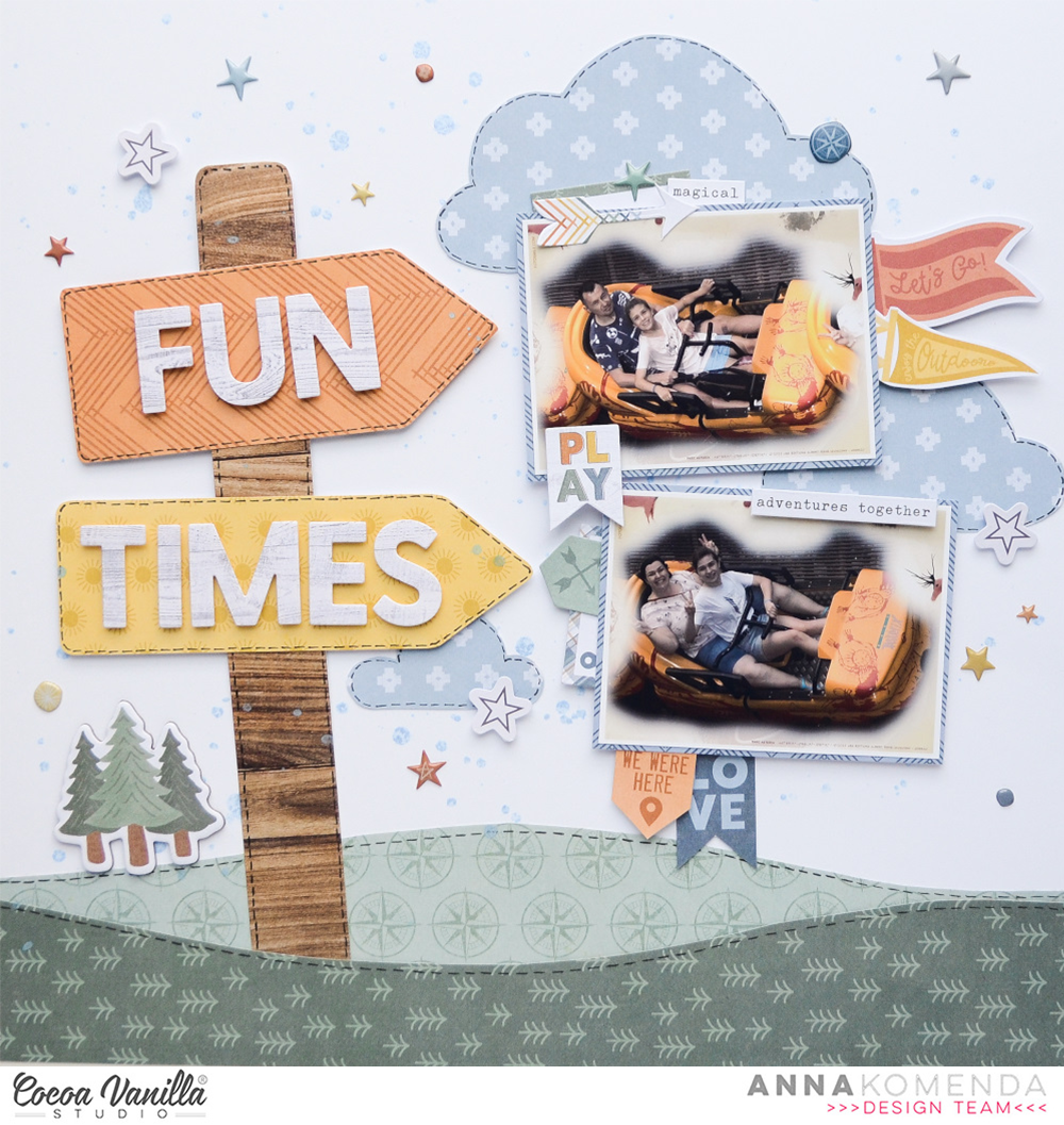
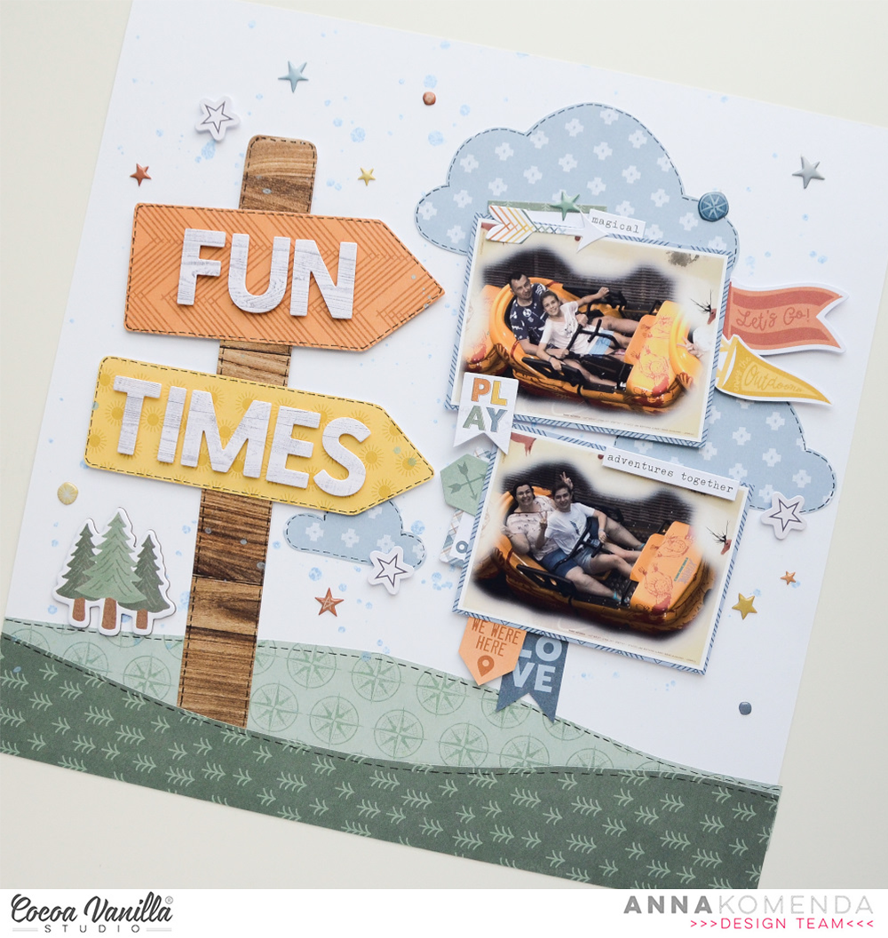
Welcome everyone. It’s Anna here with another page made with newest Cocoa Vanilla collection called “The great escape”. To be honest, I am more beach girl and trails, tents and campfires are not my first choice when it comes to spending free time. I do not have many photos from the wild to scrapbook with this line but it doesn’t stop me! Having fun has many shades. This time I picked two photos taken during one of the rides in theme park. Colors on them match “The great escape” perfectly.
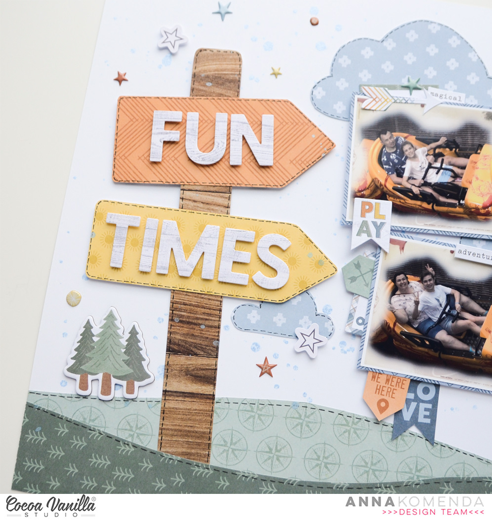
For this page I created a little scene with a guidepost. I was inspired by one of the ephemera pieces to make one. I started with splashing white cardstock with light blue mist. Next step was to create a ground for my sighpost using two papers with green patterns: “Journey” and “Direction“.
Wooden pattern on the sighpost is from the older “No limits” collection. Yellow one is a piece of “Horizon” paper and orange one is “Happy camper” paper. Words on the sigh are made with alpha die and “Starry night” pattern. White “sky” felt very empty so I added few whimsical clouds hand cut from “Adventurer” paper.
It was time to add photos. I backed each of them with a piece of blue pattern paper from A5 Paper Stack. As usual, I embelished the area around the photos using bits and pieces from Ephemera Pack, elements cut out from “Wild life” paper and stickers from Accessory Stickers sheet.
As always I finished my pages adding tiny Puffy Stickers. They are my favourite final accent.
How do you like my idea for a simple, handmade scene? You can change things up by adding more words to the pole, changing theme from landscape to beach or a city. It’s a really versatile type of design.
That is all for today. Thank you so much for spending your time with mee and see you in May!
Welcome to Cocoa Vanilla Studio’s blog, and how wonderful that you’re looking for new scrapbook inspiration. Today, I’ve created a new scrapbook layout using the amazing and colorful “Happy Days” collection designed by Cocoa Vanilla Studio. These vibrant colors really give your layout that summery feel. I love to use this photo of my daughter on the Beverly Hills boulevard and chose to use a cut file from the Cricut store, I absolutely love this Destination Icon. I thought it was quite fitting the theme.
I cut the file from the beautiful yellow patterned paper of the “Happy Days” collection and placed the photo in the open center. I stitched the edges with white thread, using my sewing machine. I positioned the Destination Icon in the center of the 12×12 white cardstock sheet, which I’m using as my base.
I created flower clusters on the bottom left and top right corners. I used the die-cut flower shapes but also fussy-cut some flowers from the matching patterned paper of the “Happy Days” collection. I also cut out some butterflies and placed them around the flower clusters. I selected some fun die-cut shapes like the flag and the camera and giving them a place among the flowers.
For the title, I used the elegant puffy titles from the “Great Escape” collection. The title I’ve chosen for this scrapbook layout is “Road trip to LA. I added some splatters with white gesso, which I mixed with water, and also splattered some of my yellow distress ink “Fossilized Amber.” around the flower clusters.
I hope I’ve been able to inspire you with this layout and look forward to seeing you again on the Cocoa Vanilla Studio blog next time. Have a wonderful and creative day.
Hey y’all! Laura Alberts here with a diagonal design using the stunning Heart & Home collection. I adored these frames and was excited to use them for my Thanksgiving photos with extended family. I started with a Bazzill navy cardstock and cut this lovely text patterned paper from corner to corner to layer on top.
Along the seam of the two papers, I stair-stepped my framed photos with the title ephemera in between to connect them. To fill the open corners, I added a combination of vellum and card stock ephemera flowers. Tiny, fussy cut flowers are sprinkled around the edges, along with Nuvo drops.
I added in a few bits from the cut-apart sheet and finished the layout off with these adorable puffy heart stickers and a sketchy border all the way around.
To see how “Our Family” came together, be sure to check out the process video below:
It’s Tarrah back with you and today I am sharing a new layout featuring the awesome Great Escape collection.
Last year I was lucky enough to go to Ayers Rock for work, this collection is absolutely perfect for my photo, the colours match so well!
Lately I have been creating layouts that mainly just use embellishments, with very little patterned paper added to my layout, this layout is one of these where I chose just 3 different papers however 2 of them were just small strips, 1 strip from the Adventurer paper and 1 from the Wild Life paper. My background paper is the Happy Camper paper. I created my layout on plain white cardstock and trimmed the plain cardstock down to measure 11′ x 11′, once trimmed, I adhered it to the Happy Camper paper. Next, I machine-stitched a border around the outside.
Next, I added my photo with a frame die-cut layered underneath, adhering it with some craft foam to add some dimension. On the left-hand side of the photo, I tucked in the tag from the Accessory sticker sheetand also another piece of paper from the Wild Life paper. I then added both of the strips of patterned papers to the bottom, placing them horizontally. At the top, I added some chipboard and another die-cut. I layered the banner sticker in the top right-hand corner of the photo too. On the right of the photo, I placed another of the stickers from the Accessory sticker sheet.
My title is one of the puffy title stickers, I placed this at the bottom of my photo. I placed some more chipboard pieces including the arrow on the left hand side and the road sign on the bottom left corner of the photo and the Let’s Go banner also from the chipboard pack. I also placed some of the puffy stars from the title pack around the layout. Lastly I added some of the phrase stickers from the Accessory sticker sheet to help tell the story, stamped the date stamp and sprinkled some black mist.
Thanks so much for stopping by the Cocoa Vanilla blog today! I hope you enjoyed reading about how I created my layout as much as I enjoyed creating it.
Welcome to Cocoa Vanilla Studio’s blog, and I’m thrilled to have you here for some new scrapbook inspiration featuring the amazing “Great Escape” collection.
In a few weeks, we’ll be jetting off to New York City! Yay… I can hardly wait to create beautiful family memories together in this iconic city. My canvas for today is a 12×12 white cardstock. I’ve used blue distress ink to create watercolor circles. Using a breakfast plate, I inked the edges with the blue distress ink and water. Then, flipping the plate over, I made various prints on the 12×12 white cardstock. The shade of blue distress ink I used is “faded jeans”.
Now, it’s time for some fussy cutting. I’ve selected a patterned paper with stars and cut out several stars from it. I layer three stars on top of each other and sew them together using a sewing machine, then individually place them in a circle on my layout. In the center of the stars, I place a puffy sticker.
The photo capturing the breathtaking view of New York City is placed in the center and embellished with a cardstock circle die-cut and a word sticker. For the title, I’ve used the beautiful black ornate word titles and created the title “Let’s Explore”, which is exactly what we’ll be doing in New York!
I add some blue splatters with the distress ink and also create white splatters using white gesso, applying them with a watercolor brush. I scatter a few small stars in different places among the larger stars for a playful effect.
I hope I’ve inspired you with this Scrapbook Layout and look forward to seeing you next time. Have a wonderful and creative day today!
Hey y’all! Laura Alberts back again with a lovely layout using the Heart & Home collection to scrap these photos documenting my newest obsession, crochet! The colors in this collection worked beautifully with the yarn that I used in the very first project I made. This blanket is a bit of a mess, but I learned so much!
I used a simple shelf design for this layout with two 6 inch strips of wood grain patterned paper for each base. This was a great design for using up scraps and hiding the rough edges behind my photos. All of the layers made this simple background interesting and fun! In addition, I used the vellum flowers that I fussy cut from the Heart & Home specialty paper to create clusters behind my photos.
The details of these clusters really help my layout shine! I especially love the tiny florals that I scattered around my clusters and titles. These are all fussy cut from the stunning patterned papers in this collection. I also outlined each of the paper layers with a black gel pen to give them a hint of shadow for a 3D look!
To see how “With Love” came together, check out the process video below:
It’s Tarrah back with you and today I am sharing a new layout inspired by the new April challenge to include a big rainbow as the main element on your layout. I decided to go with a non-traditional rainbow and created my own using various papers from the Boys Rule collection.
The new monthly challenge for April is to include a BIG rainbow as the main design element on your layout.
To help create the arches of the rainbow, I used various sized dinner plates and traced around the tops of them on the different patterned papers I chose from the Boys Rule collection. I chose these following papers from the Boys Rule collection: ‘Fun and Games’, ‘Straight and Narrow’, ‘Entitled’, ‘Expressionist’ and ‘Star Fall’. I then arranged them on a plain white cardstock background and adhered them down. I trimmed the white cardstock down to measure roughly 11′ x 11′ and adhered it to the ‘Boys Stuff’ patterned paper. I then machine-stitched each individual colour in the rainbow with matching thread.
At the base of the rainbow, I adhered a strip of the ‘Straight and Narrow’ paper horizontally to add another layer to my layout. I added craft foam underneath my photo and placed it over on the right side of my page, I layered the frame and journal spot from the ephemera pack tucked in on the left hand side of the photo, on top of the photo I added one of the banner stickers from the Accessory Sticker sheet. My title is from the chipboard pack, I love these words! I added the ‘You’ and ‘Are’ words at the top of the rainbow and the ‘Awesome’ word under the photo. Either side of the ‘Awesome’ word, I added the scalloped border sticker from the Clear Sticker sheet. Above the photo, I added one of the banner stickers from the Accessory Sticker sheet. I punched out some stars from the ‘Happy Go Lucky’ paperand then layered some of the star stickers over the top. I placed a few of these around my page.
Once I was happy with how the larger elements were placed on my layout, I started adding some smaller embellishments including more clear stickers, more accessory stickers and some more ephemera also. One of my signature features on my layouts is to stamp the date of when the photo was taken and this layout is no exception, I stamped the date stamp using some black ink.
I don’t often journal on my pages so I love the phrase and word stickers from the accessory sticker sheet. I add them to all of my Cocoa Vanilla layouts, where I can, to help tell the story. Boy layouts are one of my favourite projects to create and this one was so much fun to create! I really love how it turned out too. Make sure you create a layout and add a big rainbow element as your main design feature and share it with us by uploading it to the Cocoa Vanilla Studio Community Facebook page.
Thank you so much for stopping by the Cocoa Vanilla blog today! I hope you enjoyed reading about how I created my layout as much as I enjoyed creating it!
Hi everyone, it’s Sue Plumb here to share my latest design team project with you. Today I am sharing another layout using the fabulous ‘Great Escape’ collection that documents a photo of Zoe and I on our trip to the USA back in 2019. This pic was taken the day we went to the Grand Canyon, and it definitely rates as one of my favourite days EVER – I am so happy we got to share it together.
I started this page with a sheet of white cardstock and added some ‘Naples Yellow’ acrylic paint to it using a brayer. I chose this colour because of it was a lovely earthy yellow, and I knew it would work well with the other colours of the collection. I then chose a selection of patterned papers for my papery layers, including the green compass print from the Direction paper; the mustard yellow crosses from the A5 Paper Stack; and the orange chevron pattern from the Happy Camper paper. I distressed the edges of the green one to add some texture, before layering the other two on top.
Once the papers were in place I then added some frayed gauze before placing my photo on top of the layers. You can see how I cut the orange chevron print into an arrow shape to run behind my photo from left to right, which helps draw the viewer’s eye in and across the panoramic photo.
For my embellishments, I started by adding three main pieces around my photo – the compass on the left edge from the Die Cut Ephemera pack; the get outside and roam badge (also from the same pack) at the top; and the group of trees from the Chipboard Sticker sheet in the bottom right corner. These three pieces created my visual triangle around my photo and gave me anchor points to work from for the remainder of my embellishments. The other reason I started with these embellishments is because they were all larger pieces and it is always easier to get the biggest things on a page first.
The next piece I added was the ADVENTURE title from the Chipboard Sticker sheet. I knew I wanted to run this piece along the bottom edge of the photo because it is quite a long title and it mirrored the shape of my photo. With all those large elements in place it was then easy to go back and add a few extra embellishments to finish it off. I used the so much fun banner piece and a few stars from the Chipboard Sticker sheet, along with some tiny words and a label from the Accessory Sticker sheet.
I was determined not to over-embellish this page and detract from the photo, so I finished it off with only a few tiny black ink splatters and my handwritten journalling on the label.
I am loving creating with this collection so much, and I have another project with it in the works at the moment that I can’t wait to share! I’ll be back in two weeks with some more inspiration for you.
It’s Sophie here today with a new layout using the Great Escape collection!
When I saw this 3×4 card “The outdoors is calling” on the “Wild Life” paper, I knew exactly what photo to use and it was my starting point for the whole page!
I framed the photo and card on the wood grain “Starry Night” paper, framed everything on white cardstock and placed it on the “Star Gazing” paper.
I teared a big chunk of the “Adventurer” paper and placed it beneath the white rectangle, adding a fussy cut scalloped border from the “Wild Life” paper.
I hand stitched around the white rectangle and added a few cross stitches on the wood grain frame as well.
I used a label from the “Wild Life” paper to handwrite my date and placed Chipboard Stickers around my pocket card and photo to embellish the page.
Here are more close-ups:
This is a simple and more masculine page, and it makes the photo stand out so well!!