Hello Friends! Have you seen the newest products in CVS store? You should run there quickly because Zoe released digital versions of older Cocoa Vanilla collections! I am over the moon happy about it, because I really loved them and I was missing my favorite stuff. You can purchase both papers and elements and they are already prepared to be printed in A4 size PDF files! You will also get each element separately if you want to use them your way. I am an embellishment person so I use up my embellies faster than the papers. Being able to print more elements to work with my paper leftovers is so amazing. What is ever more amazing is that if you purchase those digital versions of CVS lines, you will help support victims of current Australia bushfires.
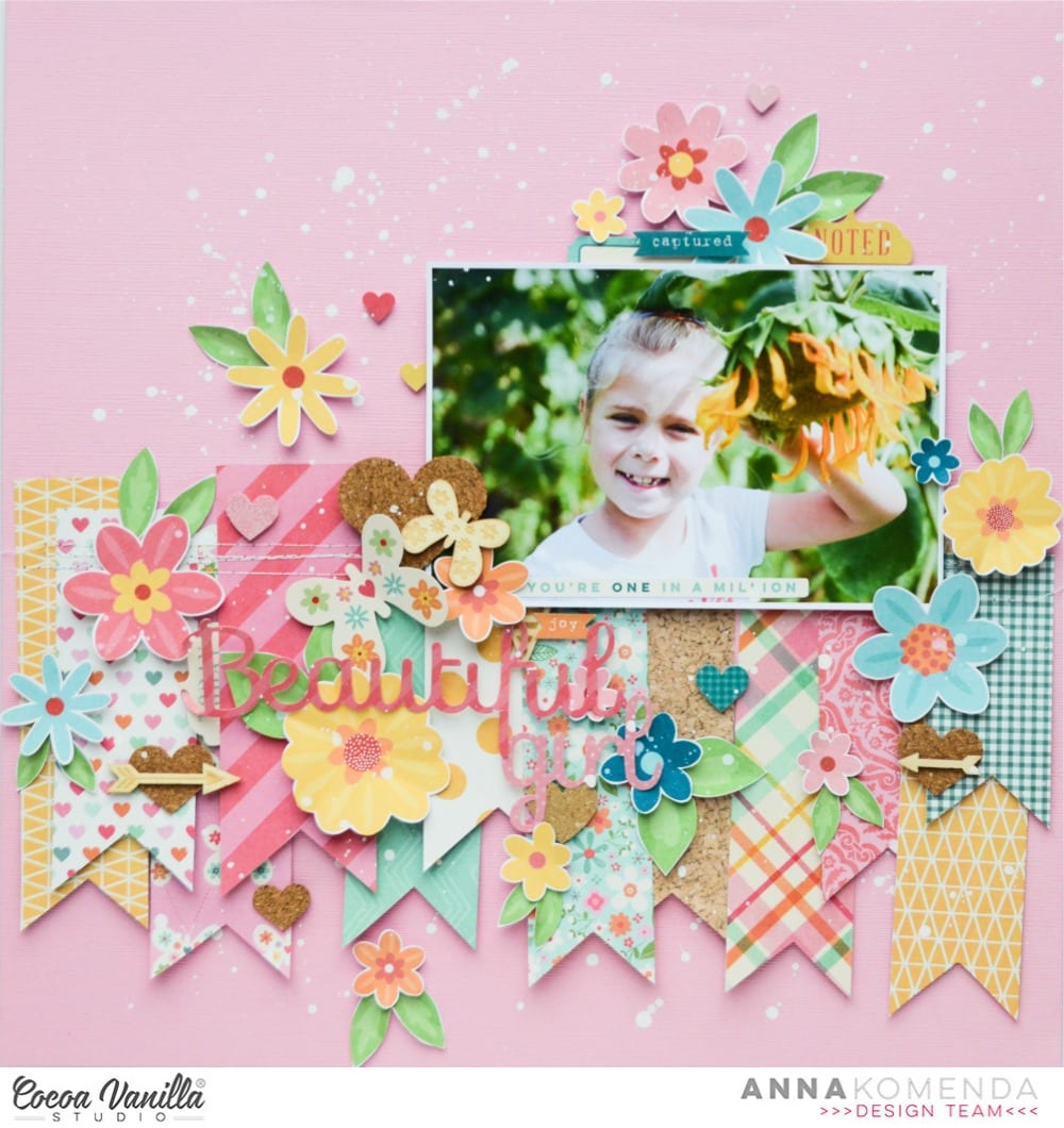
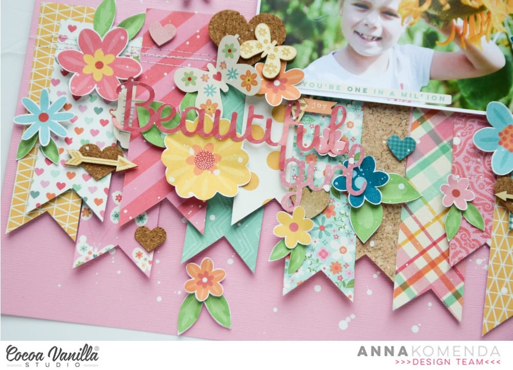
I am in CVS team from the very first DT call so I own every collection that was released. We started with two lines: “Sugar and Spice” and “Flying High”. Those two collections were the reason I fell in love with Cocoa Vanilla and I cherish them so much. Especially the girly “Sugar and Spice”. I am almost run out of embellishments but I still have some paper scraps left. That’s why I decided to purchase elements and print them in bunches. Flowers are always my favorite, that’s why I printed a whole sheet filled with them. You can make yourself some print and cut file in Silhouette software or, if you are OK with fussy cutting, just cut them by hand.
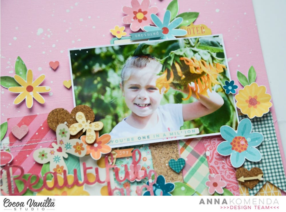
I used paper scraps to make several fishtail tags and arranged them over the pink cardstock. Second step was adding a picture of my daughter above them and fill the space with a lot of flowers.
“Sugar and and spice” line came with 12×12 sticker sheet, wood veneers pack and some cork hearts. I still got some of them left and I was so happy to be able to use them up. I mixed in them between the flowers creating colorful and very cheerful page.
I already purchased few more element packs from other collections and I can’t wait to use them in my projects. If you run out of papers, you can also print them at A4 size! Or, if you are lucky and have A3 printer, you can get full 12×12 papers. The best thing is that you will never run out of your favorite papers and embellishments!
Thank you for stopping by and see you in December.
It’s Tarrah McLean back with you on this Thursday! I hope all my fellow Aussie friends are all safe from these horrendous bush fires we are experiencing in our country at present?
Today I am sharing a layout for the Cut Files theme we have on all this week and being that its Thursday I was also given ‘Throwback Thursday’ where we create with an older collection. I decided to create a Christmas layout since it is fast approaching!I started my page by taking a sheet of white cardstock and adding a piece of vellum over the top to mute the white a little bit, as I had lots of the sequins left from the Tis The Season collection, I decided to add lots of them under the vellum to create a shaker pocket. Once I had added the sequins, I then machine stitched all the edges so that they wouldn’t fall out. I love how this turned out! I like that it adds another feature to my layout.
I took two of the 12 x 12 papers and cut some vertical strips from them and placed them down each side of the layout. then chose a gorgeous cut file title design by Cut To You and added some of the patterned papers behind each of the words. I added craft foam to the underneath and placed it in the centre of my page. I also popped up the photo of my sons on Christmas Day with craft foam so that it was at the same level as the title on my page. I love the shadows and dimension this creates on my page.
I then began to embellish my page using some of the accessory stickers (that are still available in the store) some of the die-cuts, wood veneers and of course a bitty bow and the tiny metal key! I only had 1 of the poinsettia flowers in the die-cut pack left so I added just the one to the very bottom of the title and layered the bow over the top. Lastly I added some of the enamel dots from the Tis The Season collection. Have you got any of the Tis The Season collection left? Pull it out and get creating with it! Its such a soft and gorgeous collection for Christmas photos.
Thank you so much for stopping by today! See you next time!
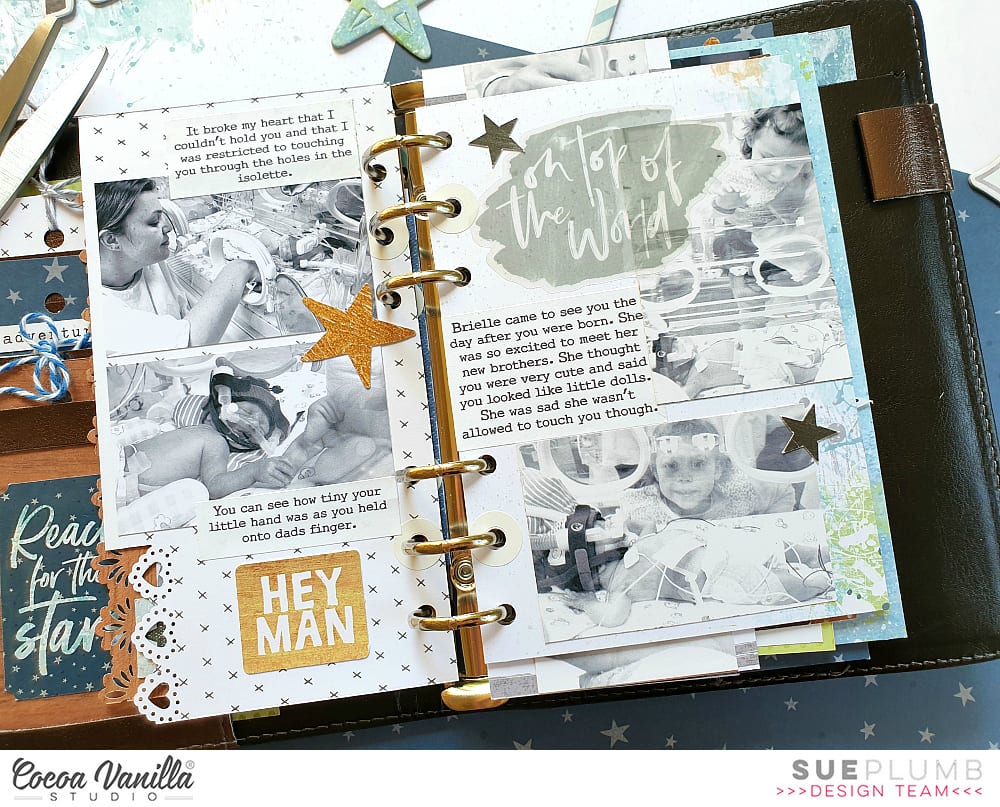
Hi everyone! It’s Sue Plumb here to share my latest design team project with you and it’s one that is pretty special to me.
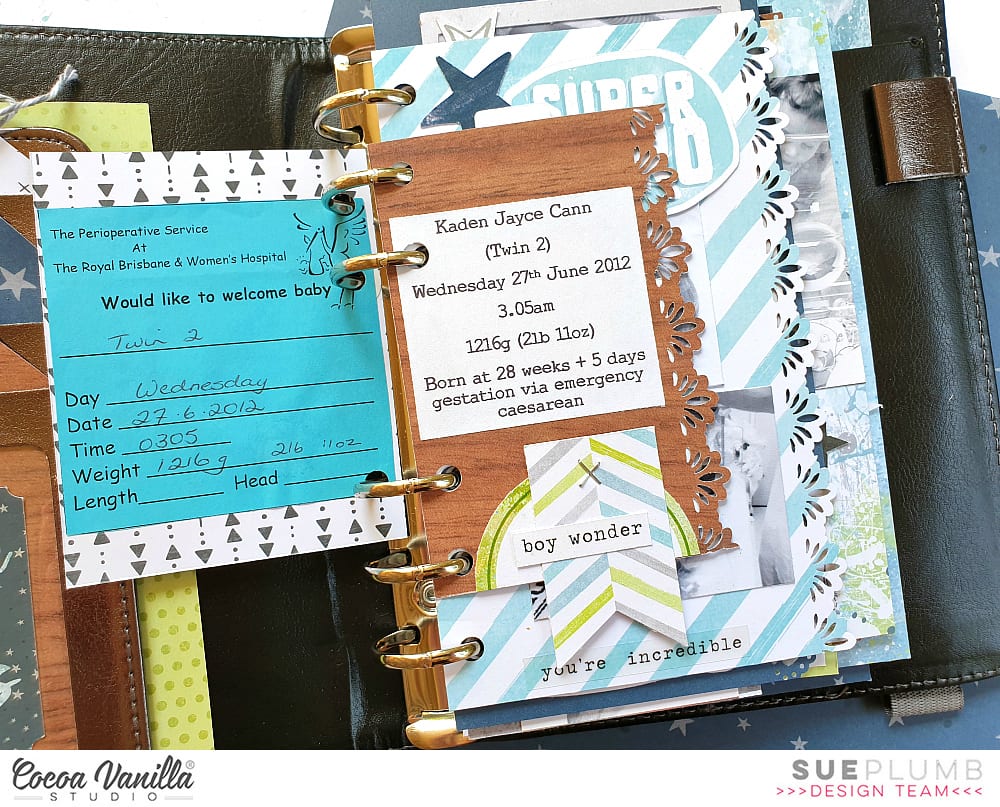
Today is World Prematurity Day – a globally recognised day that is aimed at increasing awareness of preterm births, as well as highlighting some of the challenges that are often faced by these babies and their families. Each year approximately 1 in 10 babies are born prematurely, including all three of my children. My post today is for all those babies born too soon.
For my project I decided to create the first in a series of mini albums for my children to document the time following their births. (It has taken me over 7 years to get around to tackling the photos of my boys and all the memories that come with them, so please bear with me for the long post today.)
I began my mini album with the fabulous ‘Boys Rule’ collection and a small 6 ring planner that I purchased from Kmart. (These make perfect mini album covers once everything is removed from the inside.) After choosing the patterned papers I was going to work with, I cut them into a variety of sizes to form the pages of my album.
I used an adjustable 6 hole punch (purchased via eBay) to punch holes on each of the pages, and then used white hole reinforcement stickers (from my local newsagency) to help protect the holes from becoming damaged through handling.
On some of the pages I added extra interest by using border punches to create decorative edges. This, combined with the variety of different page sizes, placements and patterns throughout, is what gives the album so much character.
If you are planning on giving something like this a go, be sure to mix things up as much as you can! Don’t feel like all your pages have to run vertically – a horizontal page thrown in here and there not only adds extra interest but makes the album more interactive as it is turned to be read.
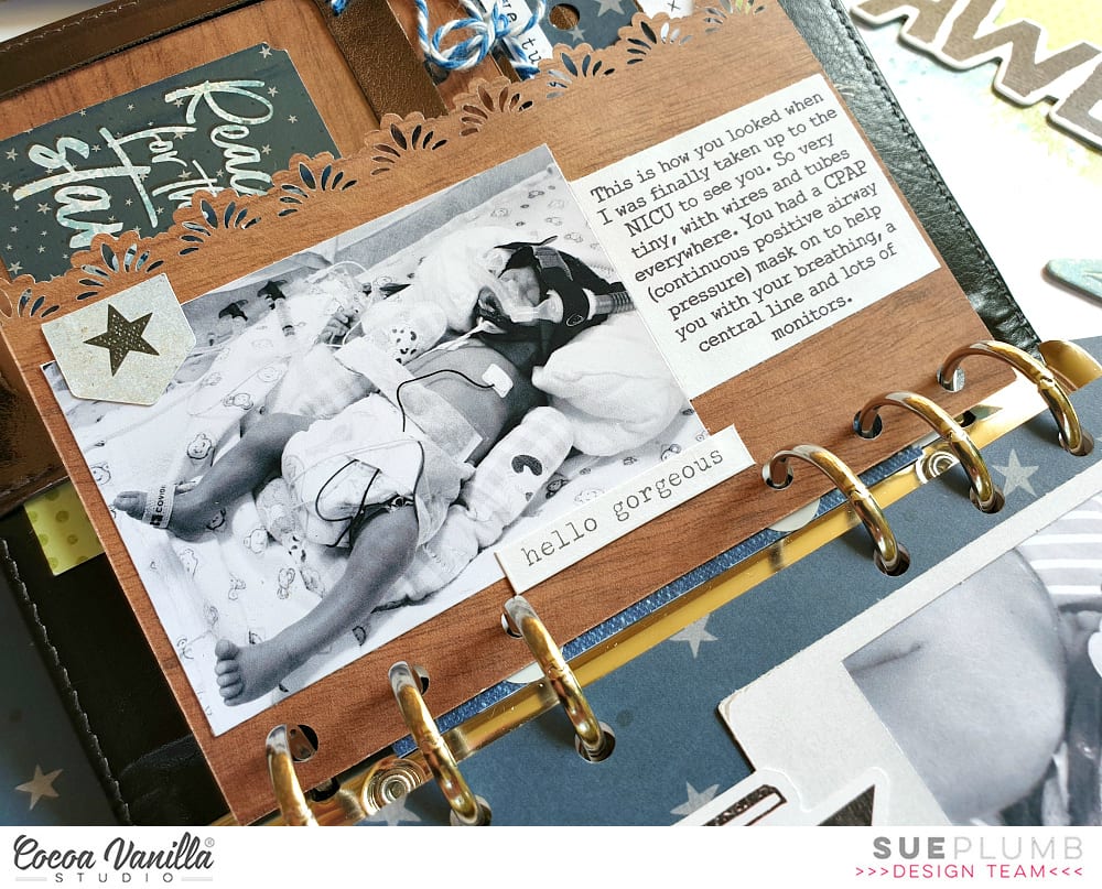
Depending on the theme of your album, you will find that some pages require no more than a photo and some simple embellishments; whilst others may have lots of journaling and very little room for embellishments.
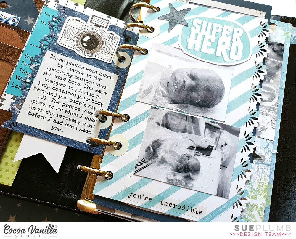
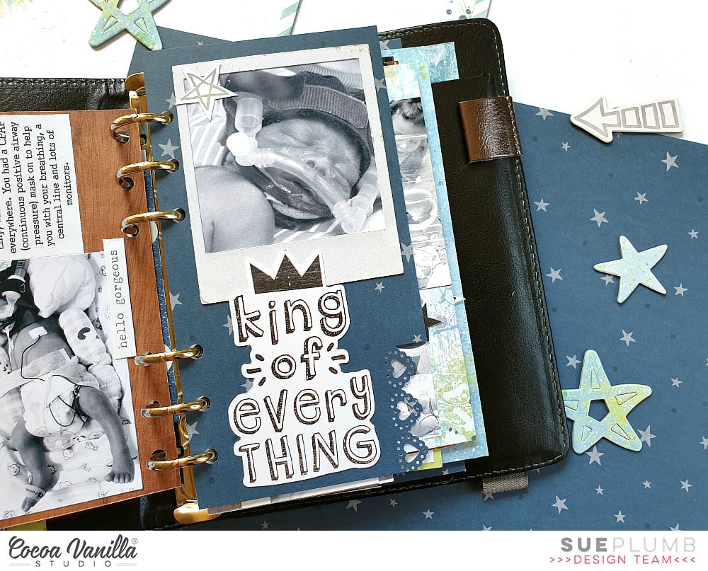
For the sake of continuity across my album, I printed most of my photos in black and white with a few colour feature shots added in. I printed them in a variety of sizes and orientations as well.
Don’t be afraid to add embellishments such as stickers or journaling directly over part of your photos, or to include pages that have no photo at all and are simply decorative. You can even punch directly through photos and use them as a page in your album.
One of the other benefits of making your pages different sizes is being able to get a “sneak peek” at what is coming on the next page. This adds to to the anticipation as you leaf through the album.
To further enhance the cohesion across the album, I typed all my journaling on my computer. When putting each page together I began with photo/s and journaling placement first before deciding on embellishments.
For an extra bit of fun, add some interactive elements such as tip-ins, pockets, or pull out tags. You can see how I used one of the small cards from the Die Cut Ephemera pack with a couple of pieces of washi tape to form a tip-in (fold out flap) to include my journaling underneath.
One of my tips for putting together each page in an album is that whilst I approach each page individually, I am also mindful of what is on the facing page. You can see how I carried across the same colours in the spread below. (Working with the same collection throughout the album helps enormously.)
The only other embellishment I included in my album were a few stickers from the ‘Love Always’ Accessory Sticker sheet, as it had a few more love-filled and generic phrases that suited some of my photos.
Another way to mix things up with your photos is to create a collage or include a series of shots taken close together. (And let’s face it, who doesn’t take 20 shots when you are trying to get the perfect one?!)
I know I have included a LOT of photos in this post, but sometimes the best way to explain things is to show them, right?
My final tip if you are going to create something similar in a planner cover or album, is to not forget about the extra pockets that are built into the cover. I made some small tags to tuck into the front of my album and added some extra photos, and in the larger pocket I included a letter to my son with some of the details about his birth story.
If you are interested in seeing a few more details of my album I have filmed a flip through of the entire thing so you can see how it all looks together:
Thanks so much for sticking with me through my long post today. I do hope I have inspired you to try creating something like this yourself. It could make an ideal Christmas gift for a loved one, or just something for yourself to treasure.
Hello CVS friends! It’s Anna here with my project created with no white background. It is a theme for this week – “White-out”. Each Cocoa Vanilla collection has plenty of amazing pattern papers to choose from so it was a real pleasure to play with them. I was going through my paper stack thinking of what line I should use this time and I was drawned to pretty colors of “Happiness”. You all know that I love colorful designs and ugly fall outside need some proper, colorful medicine to be scared away.
I started with cutting out my title using electronic diecutting machine. I did it twice in the same size using two different papers: “Good vibes” and “Botanical bliss“. I layered them creating kind of a shadow. I also added white false stitches around the top one using white pen. Pretty paper with navy hearts is perfect as a background paper. I added a thin layer of white acrylic paint to help my title pop a little bit more.
I placed my photo on one of the empty spots between the letters and embellished it with tickets and flowers from ephemera pack. I can never have enough of those amazing flowers added to this line. Pretty shape and watercolor look, combined with juicy colors are the perfect match.
Between the paper flowers I also mixed in some flowers from clear sticker sheet. Their colors are more intense and they look amazing on light background. Butterflies cut out from “Bright and beautiful” paper are great embellishment too. Fussy cutting is one of my favourite techniques. I finished embellishing by adding one of the flair buttons on top of the title. I needed some darker accent in this spot.
After I finished working with paper, I decided to add some more colors to the background. I know that usually we work in opposite order but I felt that this project is unfinished. I gently added some watercolor stains here and there with pink and green paint. It made my layout looking more cheerful and complete.
That is all for today. I love working with pattern paper as a base of my page as much as I like using white backgrounds. It’s a double joy :) Thank you for stopping by and see you in two weeks my friends.
Hey y’all! Guest Designer Laura Alberts back with a 9×12 layout using a patterned paper background!
I love this sweet cut file from my friend, Miranda Webber, and backed it with papers from the 6×8 paper pack. I tucked in tons of tiny flowers, clear heart stickers, and butterflies in a gentle cascade from top to bottom.
I wanted to keep the title small on this one so that it didn’t stand out too much on this already busy background, so I just focused on one phrase, “The best things in life are free,” which is certainly true and very applicable to this photo of my daughter enjoying her perch on our back patio. I loved her dreamy expression and decided to make this layout just as dreamy to match!
I hope you enjoy this layout and find inspiration! If you would like to see how I created this layout, you can watch my process video on YouTube here: https://youtu.be/-ocEnSkR_6U
Thank you, Cocoa Vanilla Studio for the amazing opportunity to design for you!
It’s Tarrah back with you and today I am sharing a new layout featuring the gorgeous Unforgettable collection!
The colours in the Unforgettable collection are beautiful so I decided to showcase them all on this layout! I pulled out the 6′ x 8′ paper pad and starting using the papers to back a heart cut file available in The Cut Shoppe. Once the heart design was backed, I added craft foam underneath and adhered it to the black and white spot paper also from the Unforgettable collection. I decided to trim down the black and white spot paper so that I could add the grey chevron paper is a border right around the page. I trimmed this paper down slightly also so that I could add a black cardstock border also.I added my photo of my 2 beautiful nieces slightly to the right of the heart and added a couple pf layers underneath including a paper doily and some more of the 6′ x 8′ papers from the paper pad. I also added one of the tags from the die-cut pack to the left of the photo and I popped up the photo and paper layers to give even more dimension. I pulled out the ‘Hello’ foam title and added it to the bottom of my photo and added a flair button and a phrase die-cut on the left of the photo.The butterflies in this collection are beautiful, quite a few of those made it onto my page also. To further embellish, I added 2 of the black foam hearts, some die-cut hearts and florals, some enamel dots and some of the stickers from the accessory sheet.
Thank you so much for stopping by the Cocoa Vanilla blog today! I hope you are inspired to pull out your Unforgettable collection and create with it!
Hi everyone, it’s Sue here today popping in with a Throwback Thursday share with a difference. Today I am sharing a layout on behalf our beautiful boss lady, Zoe. Unfortunately Zoe doesn’t get to create as often as she would like to (because she is so busy keeping the Cocoa Vanilla wheels turning) but when she does get a chance to put a page together, her work is always stunning.
The layout I am sharing today was created by Zoe using the ‘Midnight’ collection, which she used to document a gorgeous photo from her and her hubby Marty’s wedding day.
The ‘Midnight’ collection is perfect for wedding photos as it features a soft colour palette; delicate florals; and lots of sweet sentiments. Zoe used the white-washed wood grain print of the Shine Bright paper as the base for her page, then added lots of luscious layers on top using a variety of other papers from the range.
For her page title she used the LOVE YOU words from the ‘Wild at Heart’ collection chipboard accent stickers (the chipboard stickers have now sold out, but you will find most items from the range are still available). She also used a few small chipboard heart stickers from the same sheet, but you could easily substitute die cut ephemera pieces adhered with foam tape to achieve the same effect.
Zoe is a master at creating layered embellishment clusters. Here you can see how she stacked a pair of sweet mason jars and a variety of floral pieces all from the ‘Midnight’ die cut ephemera pack alongside her photo. She used foam tape between the layers to help separate them and create dimension – so gorgeous!
If you missed purchasing the ‘Midnight’ collection, or perhaps your stash needs a top-up, you can find it in the Cocoa Vanilla Studio online store HERE
And thank you Zoe for allowing me to share your page today (I know I am not the only one who is a big fan of your work!) X
Hi scrappers! Danni here with another layout for you using the incredible Unforgettable collection. For this layout I gave in to my love of fussy cutting and mixed media – the butterflies were calling to me! I started with white cardstock primed with gesso and used a combination of pink and purple watercolours to create a swirled pattern. I included some shimmery paints and some gold spray ink to add some extra prettiness. I decided on a circle shape for my photo to continue with the shape of the watercolour on the page.
Next, I went to town with my fussy cutting scissors and cut up a storm! I fussy cut a bunch of the butterflies from both the 6×8 and 12×12 Lacewing papers and the large floral clusters and tiny flowers from 12×12 Glorious paper. I bent the butterflies in the centre to create dimension and glued them down in clusters around the watercolour swirl, making sure to just add glue to the centre and keep those wings popped up. They look like they could fly up off the page any second! I sprinkled the teeny tiny flowers in amongst the butterflies – they are so sweet.
I glued my fussy-cut florals in two main clusters either side of my photo, overlapping them to keep it looking natural and add lots of lovely layers. I finished off my floral clusters with some of the branches and flowers from the clear stickers to fill in any gaps. The clear stickers are great for this! The beautiful berry-coloured enamel dots were the perfect touch to round out my floral clusters.
For my title, of course I couldn’t go past the foam title words, but this time I decided to colour them. I used a mint acrylic paint for the base colour, then dry brushed over the top with dusty mauve to tie it in with the florals. I love how this turned out! The titles took the paint with no problems and look amazing.
The edges were looking a little plain and unfinished so I tore the page edges in three places, distressed them and layered the tiny floral pattern from the 6×8 paper pack behind so you can see the pattern peeking out. This is one of my favourite techniques to do on a white background layout.
For the final finishing touch, I added some glass bead gel on top of the watercolour swirl between the butterflies and around my photo. It dries clear and leaves a lovely subtle sparkle, especially on top of watercolour. It’s so much fun to play with different mediums and see the different effects you can achieve.
I hope you love this layout as much as I do! Thank you so much for joining me today, happy scrapping!
Hello Friends! It’s Anna here and it’s my turn to inspire you with a project created with Cocoa Vanilla Studio collections. This time I left the new “Happiness” line on the side and came back to a little bit older, but still amazing, “Midnight” collection. I am such a big fan of flowers added to this line and soft colors. Pretty combination of dark navy, pink and orange was so inspiring. I was in a mood for die cutting, and I didn’t mind some repetitive job to be done. I spend some time cutting out many hexagons out of “Sunset strip” paper. I knew I wanted to arrange them in the similar color order as they are on the original paper. This is the final result of my efforts:
Such a vivid combination of hexagons needed some calm background. That’s why I decided to use “Moonlight” paper as a base. White color and soft script font works great as a starting point of every colorful project. Each hexagon is mounted with a layer of foam adhesive to add extra dimension to my page.
Flowers cut out from “Sophisticated” paper are my favorite flowers ever. I love how sketchy and whimsical they look. They are quite easy to cut out too. I scattered them around the page. They created such a lovely embellishment clusters highlighting the feminine theme of this page.
Title of my layout is made with word from Die cut titles pack. This is such an amazing product, if you have problems with figuring out clever titles for your pages. I love the font, colors, everything about this product.
Final step of embellishing my page was adding bits and pieces from Ephemera pack and Chipboards pack. Just a little words and simple tabs. I didn’t want to cover too much of my pretty background. I also reached for older products – some glittery enamel dots from “Make a wish” and “Wild at heart” collections. They matched perfectly to this layout. I had so much fun playing with dies and paper creating unique background. Since I got my electronic die cutting machine, simple metal dies got neglected. Rediscovering them was very refreshing to my mojo.
Thank you for stopping by and see you in two weeks.
Hi everyone! It’s Sue Plumb here continuing on with our focus on traveler’s notebook pages. For today’s post I decided to create my first spread using the recently released, and oh-so-beautiful, ‘Unforgettable’ collection. I had a couple of photos of my sister and I that I printed in black and white, as I thought that despite being two separate pages, that they could work well side by side in my book.
I began with the 6×8″ Paper Stack, as these are the perfect sizes papers for my notebook inserts. I chose the scaled down version of the stunning butterfly Lacewing12×12″ paper for the base of my pages. I trimmed down my sheet into two pieces and placed one either side of the spine.
On the left side I then added a pink and white striped piece of paper cut from the Pretty Bits 12×12″ cut apart paper. I then adhered my photo and journalling on top. I then worked vertically from the top to the bottom to embellish my page.
At the top I used the our little moments sticker from the Accessory Stickers sheet; followed by the captured word cut from the Story Teller paper; the large butterfly fussy cut from the Pretty Bitspaper; and the small heart tab sticker from the Accessory Stickers sheet. I finished along the bottom of the page with the best things in life are free sticker and stamped the date.
I knew I needed to work in a vertical style again on the right page so that the two sides of my spread had cohesion across the design.
I started by adding the every photo has a story quote piece from the 6×8″ Paper Stack; followed by the wood grain piece from the Story Teller paper with my photo and journalling on top. Below that I added the take a photo it will last longer sticker from the Accessory Stickers sheet; then finished off with the cute pink camera from the Die Cut Ephemera pack.
For my second spread, I decided to work with the previously released ‘Happiness’ collection to document some photos of my boys and I on a day out together.
This time I was able to work with the spread as a whole, rather than two separate pages sharing a spread. I started with the 6×8″ Paper Pad, choosing the scaled down version of the Sprinkles paper as the base for my pages. I cut the sheet into two uneven pieces and placed them either side of the spine.
I then added my three photos and my journalling, which I stuck on top of a journal box cut from the Little Things paper. I also added the making memories quote card from the same paper.
Next, I added some floral pieces from the Die Cut Ephemera pack – cutting the largest piece in two and placing in on either side of the spine at the bottom of the page. I also used a couple of single flowers, which I tucked under the edges of my photos.
I then added two small phrase stickers from the Accessory Stickers sheet; and finished off with a few other elements from the ephemera pack – tickets, hearts and the title piece.
That’s all from me today, I hope I have inspired you to try some traveler’s notebook spreads if you haven’t already – it’s such a fun size to work in!

 I started my page by taking a sheet of white cardstock and adding a piece of vellum over the top to mute the white a little bit, as I had lots of the sequins left from the
  I took two of the 12 x 12 papers and cut some vertical strips from them and placed them down each side of the layout. then chose a gorgeous cut file title design by Cut To You and added some of the patterned papers behind each of the words. I added craft foam to the underneath and placed it in the centre of my page. I also popped up the photo of my sons on Christmas Day with craft foam so that it was at the same level as the title on my page. I love the shadows and dimension this creates on my page.
 I then began to embellish my page using some of the accessory stickers (that are still available in the store) some of the die-cuts, wood veneers and of course a bitty bow and the tiny metal key! I only had 1 of the poinsettia flowers in the die-cut pack left so I added just the one to the very bottom of the title and layered the bow over the top. Lastly I added some of the enamel dots from the Tis The Season collection.
  Have you got any of the
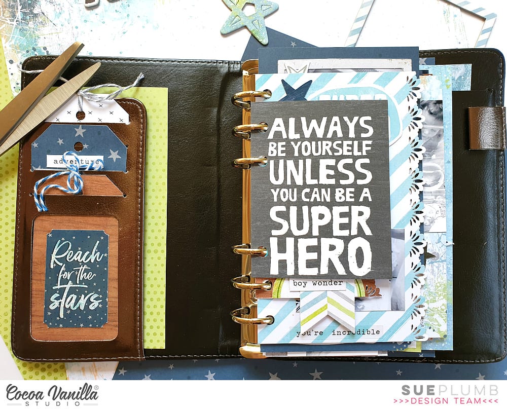


 Once the heart design was backed, I added craft foam underneath and adhered it to the black and white spot paper also from the Unforgettable collection. I decided to trim down the black and white spot paper so that I could add the grey chevron paper is a border right around the page. I trimmed this paper down slightly also so that I could add a black cardstock border also.
 I added my photo of my 2 beautiful nieces slightly to the right of the heart and added a couple pf layers underneath including a paper doily and some more of the 6′ x 8′ papers from the paper pad. I also added one of the tags from the die-cut pack to the left of the photo and I popped up the photo and paper layers to give even more dimension. I pulled out the ‘Hello’ foam title and added it to the bottom of my photo and added a flair button and a phrase die-cut on the left of the photo.
 The butterflies in this collection are beautiful, quite a few of those made it onto my page also. To further embellish, I added 2 of the black foam hearts, some die-cut hearts and florals, some enamel dots and some of the stickers from the accessory sheet.


