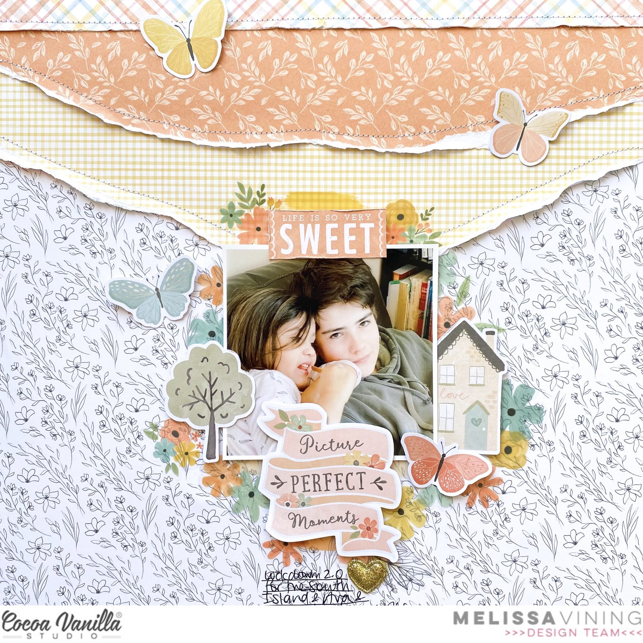
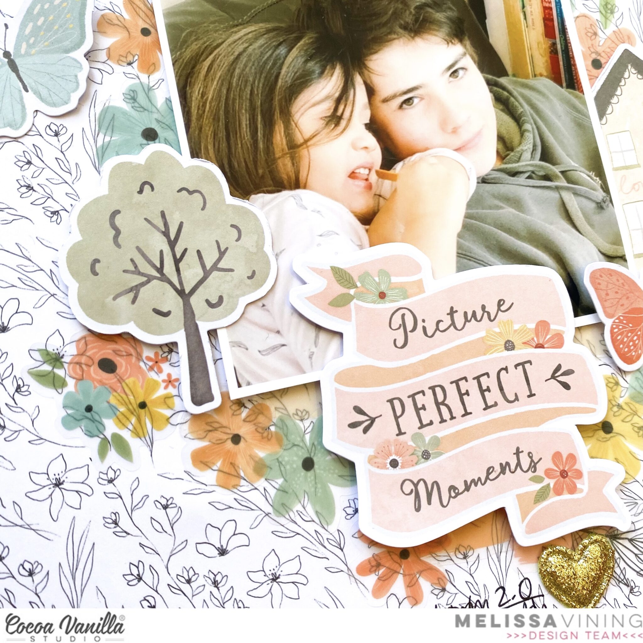
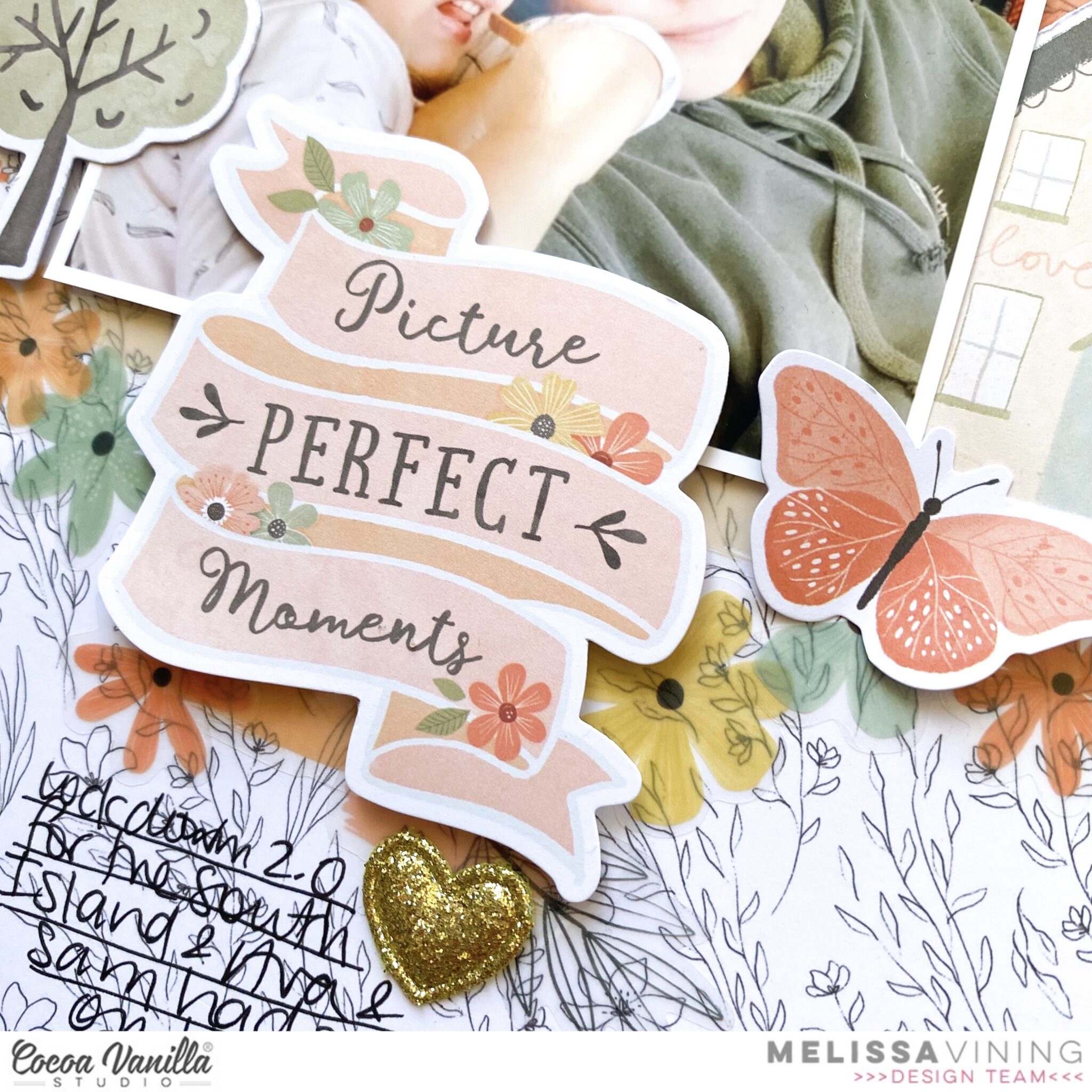
Hi everyone, It’s Melissa here and I’m so excited to be back sharing a new layout that I created with the gorgeous ‘These Days’ collection! Lately I’ve seen a trend of layouts created with a central cascading of elements. I decided to create my take on this trend with a photo of my oldest and youngest kids during our latest lockdown in August 2021.
I absolutely love the patterned paper “Neighbourhood”, the side that is white with black drawn flowers. I knew that I had to use it as my background.
For my paper layers I used a border strip from “The Good Life”, and torn strips of “Home Grown” and “Wall of Fame”. I machine stitched them to add extra texture. Next I adhered my photo on some craft foam for dimension.
I added lots of “Clear Stickers” to build mixed media type layers. I love how they are translucent.
I also added “Die Cut Ephemera” for extra embellishment on either sides of the photo, and I used the beautiful banner for my title. Of course I had to add a gold glitter “Puffy Heart”.
I hope you enjoyed my layout created with this gorgeous collection.
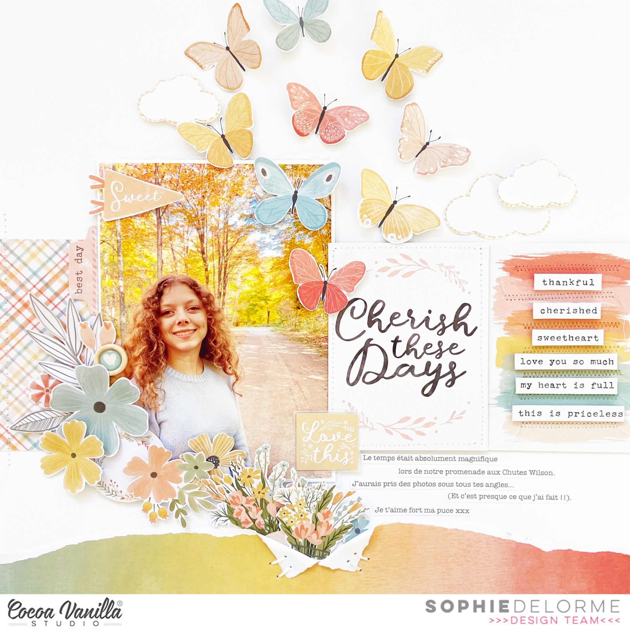
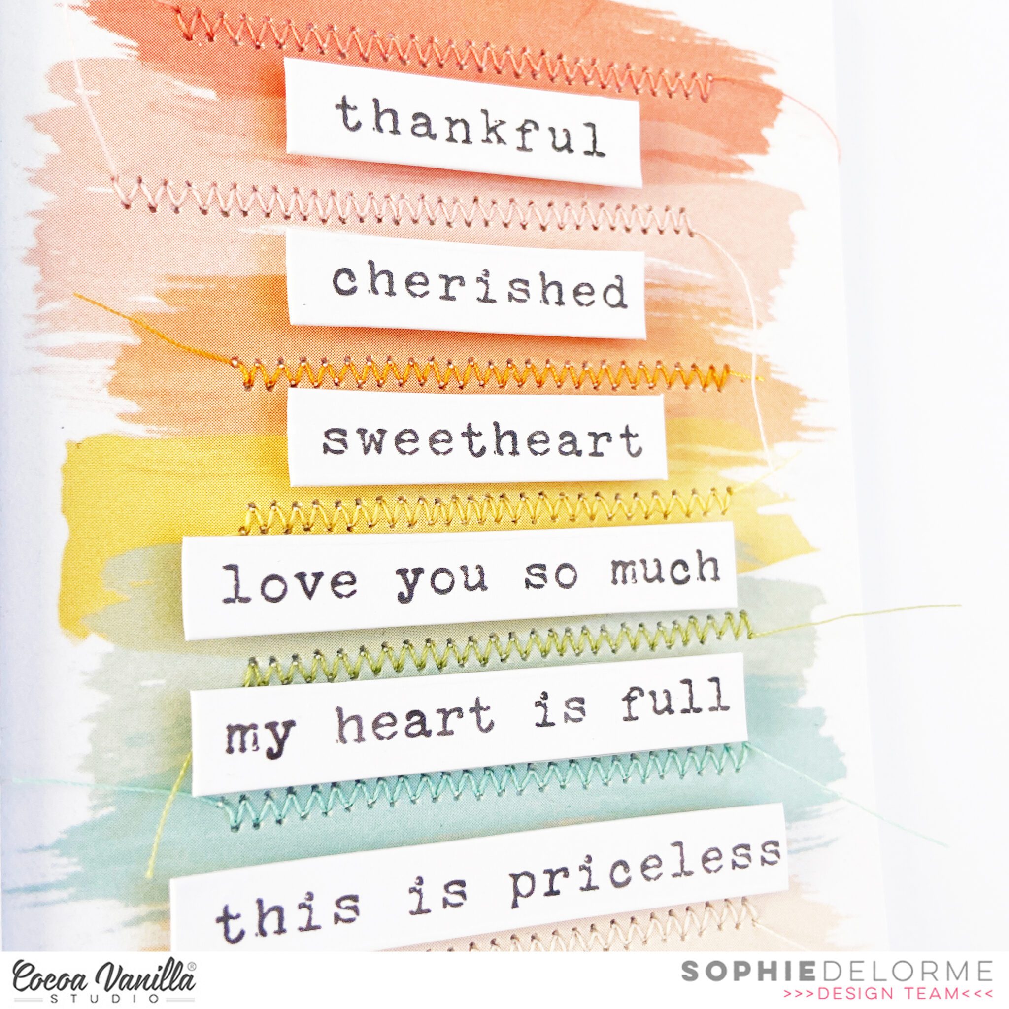
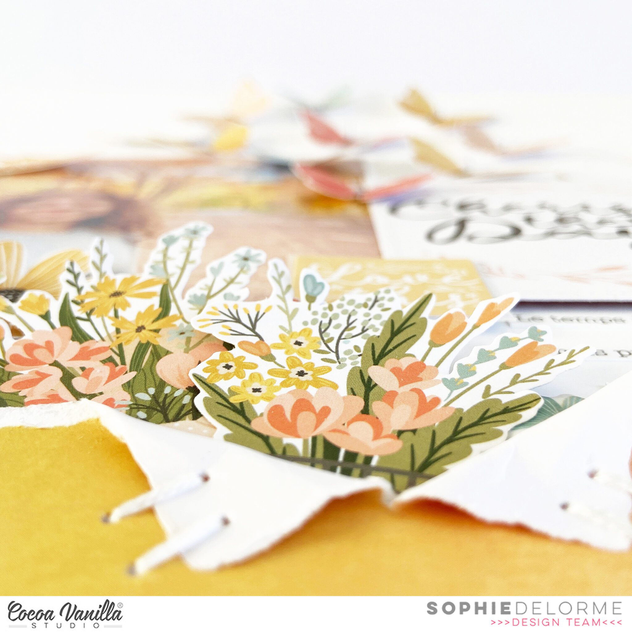
It’s Sophie on the blog with you and I am sharing a very colorful layout today created with the “These Days” collection !
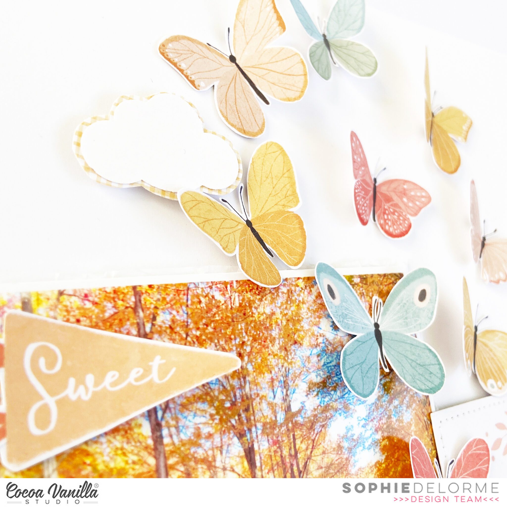
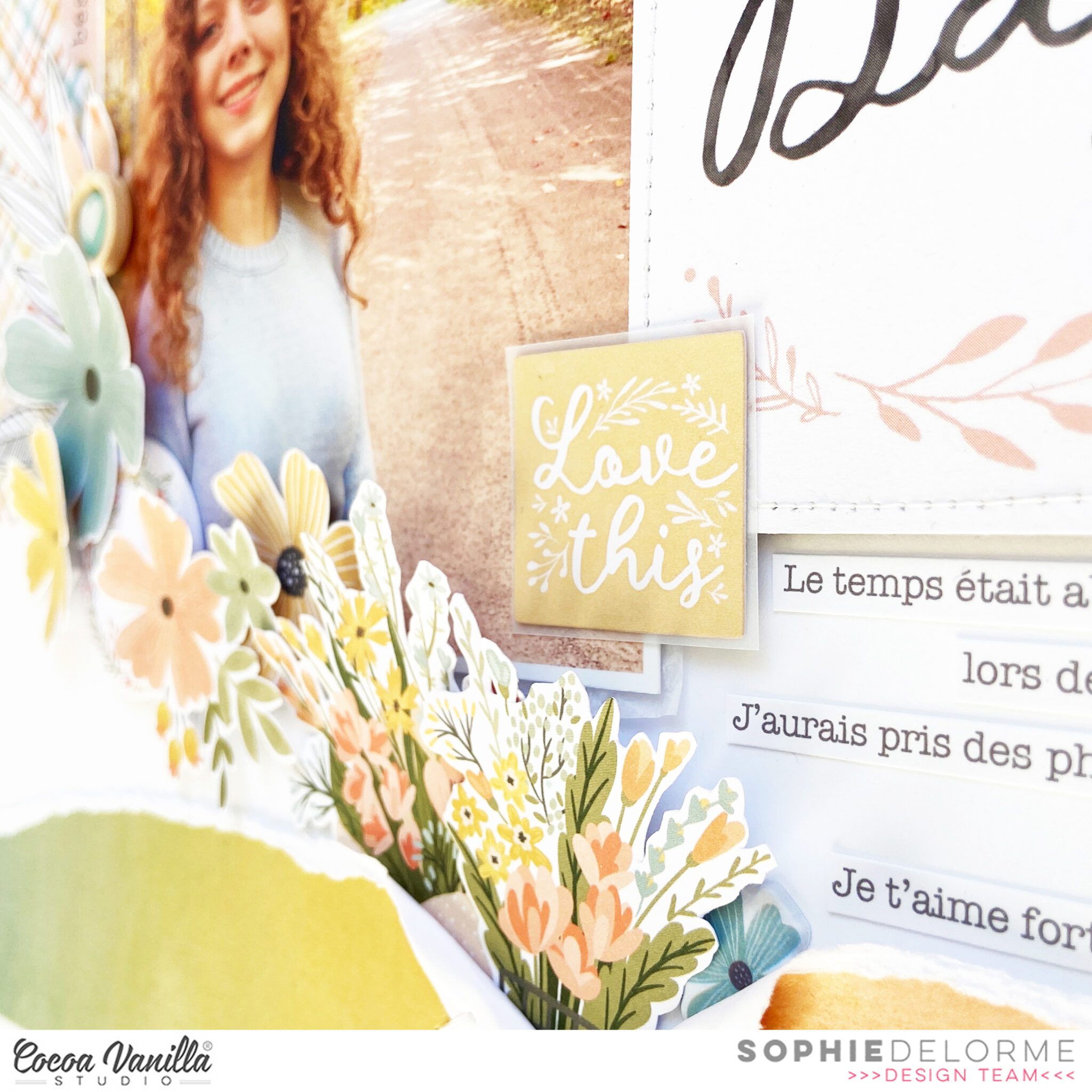
The “Daybreak” patterned paper from the collection was my starting point and it couldn’t more perfect for this Fall photo of Sabrina in the woods!
I teared a chunk of it and placed it on the base of a thick white cardstock to ground my layout.
I used 3 beautiful Pocket Cards that I arranged in a horizontal line on each side of my photo. I added stitching and adhesive foam on some of them for a little extra dimension and interest. On the rainbow pocket card, I added a few inspiring words taken from the Accessory Stickers sheet that I mounted on adhesive foam.
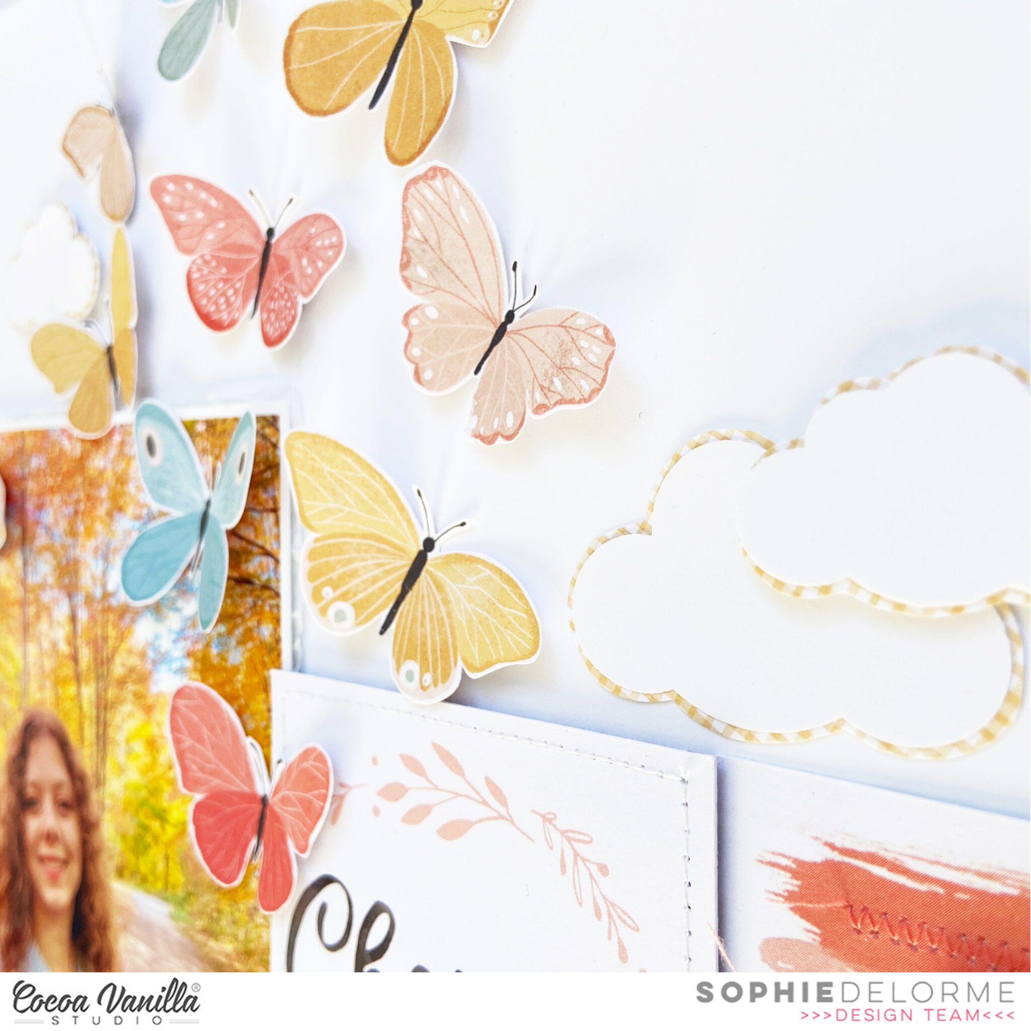
I added beautiful flowers and leaves from the Floral Ephemera pack and the Die Cut Ephemera pack on the bottom left of the photo and teared the “Daybreak” paper to tuck some flowers under there too.
I fussy cut numerous butterflies out of the “Take Flight” patterned paper and scattered them as if the were flying away from the woods in the photo. I also created a few clouds with white cardstock and the “Home Grown” patterned paper.
Finally, I created strips of typed journaling and added a beautiful Wood Button to my floral cluster.
Here are more close-ups:
I love the bright colors yet the autumnal feel to the page !
3 Pocket cards, a teared patterned paper, fussy cutting and a few Die cuts is all it takes to create a beautiful page !
Gwen on the blog today bringing you some fun Summer themed inspiration. My layout today features the beautiful bright ‘Sunkissed’ collection and I’m documenting a photo of my daughter on the beach at a recent family holiday. I was really keen to use the deep blue of the ‘Bright Side‘ pattern paper as my background for this one to draw out the blue in the ocean in my photo. I’ve teamed it with some of the pretty florals in the collection for a super fun bright and happy page.
To begin the layout, I’ve created a frame for my background using the ‘Sunny Days‘ pattern paper to layer onto of the ‘Bright Side‘ paper. I’ve also added a stitched border for extra detail.
Next, I’ve backed a cut file from CUT to YOU using the two ombre style pattern papers in the collection ‘Summer Lights‘ and ‘Good Vibrations’. I’ve used the floral ‘Growing Wild‘ paper in the rainbow section of the cut file as well as the pink exclusive pattern paper that is in the A5 paper stack. I’ve gone with the more subtle prints here because my background has stripes and I’m teaming it with the florals.
I’ve also used the ‘Good Vibrations’ pattern paper to create a photo mat and then raised my photo on foam for dimension. I’ve centred the back cut file on the page and now it’s time to add the pretty embellishments.
Starting with some fussy cut florals from the ‘Growing Wild‘ pattern paper, I’ve layered these both under and on top of the cut file. I’ve mixed these with die cut florals from the ‘Die Cut Ephemera Pack‘ for added layers and to build out the embellishment clusters. I also pulled out the fun thongs die cut to add to my page.
Next up, I’ve added in some elements from the ‘Accessory Sticker Sheet‘ including the round element at the top of the page that says ‘Fun in the Sun’. I’ve also included in my floral clusters some of the ‘Wooden Epoxy Buttons‘ and a cute pair of sunglasses from the ‘Puffy Sticker Sheet‘.
The tile for my page has come from the ‘Glitter Foam Title Stickers‘ I’ve combined the word ‘Summer’ and ‘Love’. As I’ve applied them to my page, I have bent them slightly to allow them to follow along the line of the rainbow. I’ve also added a couple of the sweet heart elements from this sheet to my clusters for an added little pop of sparkle. These were really easy to position and I love the dimension this adds to the page.
I finished up the page by adding in a few small fussy cut florals from the ‘Growing Wild’ pattern paper.
I’ve also made a YouTube process video for today’s page which you can watch here.
Hello lovely Cocoa Vanilla Studio fans! Danni here with an embroidery-inspired layout using a fun cutfile. I have not been doing much hand stitching recently and I had forgotten how much I enjoyed it. I have chosen to document an adorable photo of my daughter ready for kindy one morning.
I started with a cutfile by COAPA Cutfiles featuring a cute embroidery hoop and stitching holes for these overlapping hearts. I chose some embroidery threads in colours to complement the These Days collection and stitched them in a chain-link stitch. I cut the outside hoop of the cutfile in the woodgrain from Pretty Posies 12×12 patterned paper and adhered the two pieces together.
I popped the whole hoop up on dimensional foam and positioned it in the centre of Home Grown 12×12 patterned paper as my background. I punched a hole through the top of the hoop and threaded a pink ribbon through, to create the illusion that the hoop is hanging from the top of the page.
I matted my photo with the pink spotted paper from the A5 paper stack and positioned it to overlap the embroidery hoop. I love this photo of my daughter and the colours she was wearing matched the layout nicely, but the background was very cluttered and had lots of different colours. By removing the saturation from the background of the photo I was able to make sure the background didn’t clash with the layout without having to turn the whole photo black and white.
For embellishment I created a classic three clusters of florals around my photo and the outside of the cutfile. I used a combination of floral ephemera and the little flowers from the clear stickers to create these. I also tucked in some of the tiny black foam leaves from the foam title stickers. I also used to foam title stickers to create my title “So Sweet” curving around the edge of the cutfile. I positioned it diagonally across the page from my photo to create balance on the layout.
To continue with the hearts theme, I added three of the puffy gold glitter hearts that added a lovely touch of sparkle. I also included a sprinkling of the teeny tiny hearts from the puffy stickers around each of my embellishment clusters. As a final touch I added some splatters of white and yellow ink to finish off the layout.
I love how soft and pretty this ended up looking. I hope you enjoyed joining me. There is a process video on the Cocoa Vanilla Studio YouTube channel if you would like to watch the layout come together, linked below. Happy scrapping!
Hey y’all! Laura back again with a really sweet layout using what I call a ‘picture in picture’ design using the new These Days collection. This design features a smaller layout inside of a larger one and gives the impression of a frame or shadow box. The inside layout is 8 1/2 x 10 inches with a paper pieced wood grain border to frame it, then attached to the gorgeous heart background of The Good Life patterned paper. I also added one of the super cute wood buttons from this collection at the top to give the impression that it’s push-pinned on a wall.
I switched things up for myself with this one, moving the photos to the bottom of the page and the journaling to the top, which is quite opposite of my normal style. Along the beautiful green polka dot border, I added fussy cut houses from the cut apart side of The Good Life paper. Some of these little houses are raised on pop dots and others flat, for an impression of dimension. On the top right of my photos is a corner cluster that wraps around with a large and medium floral, plus a tab.
Each of my photos has a white border and a vellum photo mat to soften the layers.The title is actually fussy cut from one of the journaling cards included in the These Days collection and it fits perfectly between my two photos. By layering two of the ephemera floral clusters underneath of it, the title appears to burst out from the page. I’ve also fussy cut several of the tiny flowers from the pattern papers to use as scattering bits around my clusters.
I really love the way this rainbow stripe peeks out from the side of my photos and adds a bit more color to the overall layout. This bottom left photo features a horizontal cluster with more fussy cut florals from the stunning Home Grown patterned paper. As a finishing touch, I added gold Nuvo drops in the centers of some of my flowers and dotted around the outside of my clusters.
I hope this inspires you to look at your patterned papers and journaling cards a little differently and incorporate them in a big way on your projects too! To see how “Little Moments of Joy” came together, check out the process video below!
Hello Friends. it’s Anna here and it’s time for another Throwback Thursday. I recently dug up some older masculine collections from CVS and I decided I need to use them up finally. You know I usually am a bigger fun of flowers and pink so I still had plenty of papers and embellishments to play with. I went bold with this project, cutting into dozen of papers, using up to the last bit 5!!! sheets of 6*12 stickers and 3 sheets of transparent stickers! I am so proud of myself for putting those old goodies in good use. Ladies and gentlemen – I present you a big boy album with a mix of many CVS collections:
Can you name all of the lines I used here? I think I managed to squeeze in every single masculine collection that was ever released at Cocoa Vanilla. You can finds bits and pieces from: “Flying high”, “You rock”, “Boys rule”, Totally rad”, “Legendary” and “Made of awesome”. Most of them are no longer available in the store but “Flying hight”, “Made of awesome” and “Totally rad” were released as digital versions too! So you can print yourself as many papers and elements as you wish.
My album is sized 21*21 cm and it holds 5 pages inside. Each page has some flaps or pockets to hold many photos at 10*15 and 13*18 cm size. There is also plenty of room for a journaling and other keepsakes. I made everything from scratch starting from the cover. I used false leather with a wooden print to make album more durable. I mixed it with kraft cardstock that seemed to work better with all those patterns and colors.
Colorful papers are so joyful and fun – perfect for a little boy album. Even though they are from different collections, they still look good and cohesive together. I am not going to lie – I used so many 12*12 sheets here but I also managed to squeeze in many smaller paper scraps. However I was holding those papers for years and they totally deserved to shine and bring joy to someone.
I embellished my pages with a lot of various embellishments like ephemera pieces, 6*12 stickers, transparent stickers, chipboard stickers, washi strips, flair buttons, wooden elements and resin stars. All of them comes from the collections I listed previously. To be honest, many of them were stored in one bag together as a “boy stuff” that I can no longer tell which collection they belong to. It doesn’t matter though. I am just happy I managed to use up as many of them. It always feels so good to throw away used up sheet of stickers. Does it feel this way for you too?
Some of the pages are more “fancy” with shakers filled with sequins or transparent foil piece. They serve mostly decorative purposed but I can imagine it will be more fun for kids to browse through this kind of album. Hidden spots, pockets, magnets make the album more interactive.
Making this album took me few days for sure (much more hours than I planned) but it was such a great experience. It’s not filled with photos as it will be a gift for my friend and her little boy. I even added his name on the back of the cover.
I hope it will bring her joy and adding photos will be a great dive into memory lane. This is the essence of scrapbooking for me! Now it’s time for a girl version, don’t you think? I still have some of the boy collection left so I will be able to make few mini albums too. There is a chance you will see them here :)
Photos will not give justice to this album so I recorded a flip through video for you. You will be able to see all the flaps and pockets this way.
Thank you so much for stopping by and see you in November.
It’s Tarrah back with you today to share a new scrapbook layout incorporating creative journalling. I pulled out the gorgeous These Days collection as I love the Autumny feel this collection has, I documented a photo of my Mum and I.
I decided to incorporate my creative journalling by hiding it behind a cut file. The cut file I chose is from CUT to YOU. I cut out the smaller outline (solid piece to write the journalling on) of the design first and I then cut out the main design a bit bigger. I backed some different papers from the A5 paper stack behind the main design, I then adhered and made a crease on the left edge only so that the pumpkin opens up. I love how by looking at the main layout you can not tell that the pumpkin opens up.
I chose the small yellow gingham paper as my background paper however trimmed it down a little and backed it onto the beautiful wood grain paper. I then machine stitched around the entire outside edge to add some texture. To help open up the cut file, I added a tab sticker and some twine tied in a bow. I added baby powder to the bottom of the tab sticker to remove the stickiness of the sticker.
I adhered my photo in the bottom left corner of the cut file making sure there was no adhesive added to the section that needed to lift up. I also backed the Thankful part of the cut file with the wood grain A5 size paper and adhered it to the bottom of my photo using craft foam. To finish the title, I adhered the words For You using the super cute puffy alphabet stickers. I also placed a heart puffy in the centre of the words.
To embellish and enhance the story and design of my page, I took lots of die-cuts from the ephemera pack adhering many of these with craft foam, including the trees, the Family word and some of the florals too. Just above the Thankful title and above the tree on the right I added epoxy wood beads and lastly I added some phrase stickers from the Accessory sticker sheet.
I absolutely love the way my layout turned out and I hope you were inspired to have a go at some creative journalling too? Thanks so much for stopping by the Cocoa Vanilla blog today!
Hello crafty Friends. It’s Anna here and I have another page to share with you with beautiful “These days” collection. To be honest, I am in the process of making masculine album as an inspiration for you, but I underestimated the time needed to finish it. So layout it is this week and I will finish the album and share it as my next inspiration. This full of flowers page needed a serious date with my scissors :)
It started as a white sheet of paper, blue ink and a stencil. I applied really soft layer in the area I knew my flowers will end up. Next step was to add yellow splatters and wait until they are dry. In the meantime I was fussy cutting like crazy. All the flowers come from “Home grown” paper sheet. You may wonder why I didn’t use Flower pack instead. First, I wanted my flowers without the white outline. Second – I was being cheap here :) I would have to use at least one pack of them and it seemed like too much for one page. And they are in the category “too pretty to use”.
I also cut out some butterflies from “Take flight” paper to add to my composition. After all the flowers were ready, it all went pretty fast. I used foam squares to glue down the elements of my composition because you know I love dimension. I made my photo a party of the square frame and embellished it here and there with Ephemera pieces and Puffy stickers.
I wasn’t feeling creative for some unique title so I chose words from Title foam stickers. The font is so lovely and the quality is excellent. Black letters really pop from the background. As you can see, this page didn’t need much more than some flowers and butterflies and my embellishing was quite fast and easy here after all the flowers took their place.
My last step was to splash everything with blush mist and the page was done. I love squeezing out as much as I can from a simple paper sheet and this page is a perfect example. With a little bit of patience set of pattern papers can help you create fantastic projects. That’s why I always buy doubles for papers that can be fussy cut, like a flower or butterfly sheet. This way I use one as a simple pattern and second for cutting out pieces and I am not stuck with the dilemma – which side to use :)
That is all for today. Thank you so much for stopping by and fingers crossed I will finish my boy album in next two weeks :)
Today I am sharing a new layout created with the “These Days” collection !
I decided to highlight a sweet selfie of me and my dog on a big hike from a few weeks ago !
I started by using the beautiful “Neighbourhood” patterned paper as my base. I cut a white cardstock to make it an 11 inch square and centered it on my background paper.
Then, I folded the four corners of the cardstock and attached each corner with a brad from my stash. It adds a lovely dimension to the page and let the soft patterned paper show a little bit more.
I did a zigzag stitch on each non folded side on the cardstock.
I created an inner square with both the “Home Grown” and “Take Flight” patterned papers and stitched them in place.
I mounted my black and white photo on tissue paper and adhesive foam before placing it on the left side on the inner square.
I used the black Foam Title Stickers for my title. I created two clusters around my photo. One, on the right, with beautiful Die Cut Trees from the Die Cut Ephemera pack, the other on the left lower corner of the photo, with the Floral Ephemera pack.
I also added a few beautiful butterflies and other Die Cuts here and there around the page.
Finally, I created journaling strips and stamped the date.
Here are more close-ups:
I adore the soft look of the this collection ! It is so versatile !
I hope this layout could inspire you in some way !
Hey y’all! Laura back again with a layout inspired by the gorgeous October Mood Board. The color scheme was perfect for the These Days collection and these sweet florals and greenery reminded me of this cut file from Liz Longest Designs. It’s a very simple wreath that looks divine when dressed up with these floral ephemera pieces! I backed each of the leaves with a green floral paper from the A5 paper stack.
I separated out the colors of the flowers in the floral ephemera pack and stuck to the smaller ones for the wreath, balancing out the mix of colors around the page. Each of the flowers has a drop of Nuvo in the center to give it a little extra texture and sparkle! I used the small puffy alphas for my title, spelling out ‘My Sister My Friend’ right next to my top photo. These photos are of my twins and catching a rare moment of them being sweet to each other was definitely a scrapworthy moment!
I created four clusters on this layout around my photos. The top cluster has a fussy cut frame as a base, with a bit of fussy cut florals and floral ephemera laid on top. The sparkly gold cloth hearts are squeezed in too along with a puffy word phrase and heart. These details really make a tremendous difference to my clusters, giving them the finishing touches they needed.
Similarly, this cluster to the left of the bottom photo contains the same elements. This helps all of the clusters feel cohesive on the page. In addition to the Nuvo drops, I also splattered with gold ink spray around the floral clusters and the perimeter of the wreath for a whimsical look.
I hope this inspires you to look at your cut files a little differently and incorporate them in a big way on your projects too! To see how “My Sister My Friend” came together, check out the process video below!