memory keeping
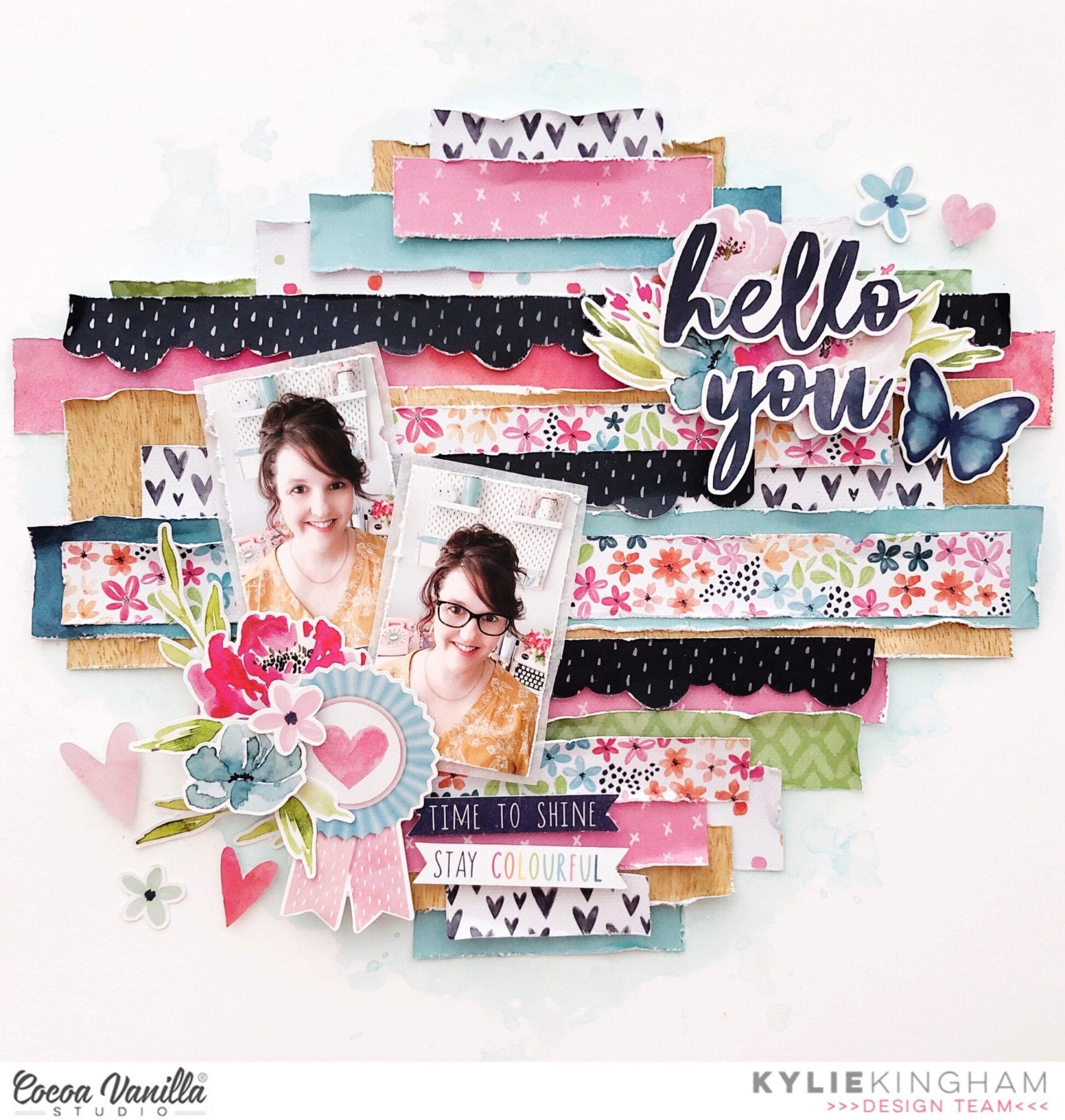
Hello You layout | Happiness collection | Kylie Kingham.
Hey friends! Thanks for stopping by the blog today. It’s Kylie back with you all with a new layout to share. My assignment for todays’ theme was to include texture! Texture can be added to a page layout in many ways, however I have chosen to keep things simple and use layered,distressed paper to build dimension and texture as a back drop to my photos. I chose the ‘HAPPINESS” collection as it has such a pretty colour palette of light and dark hues.
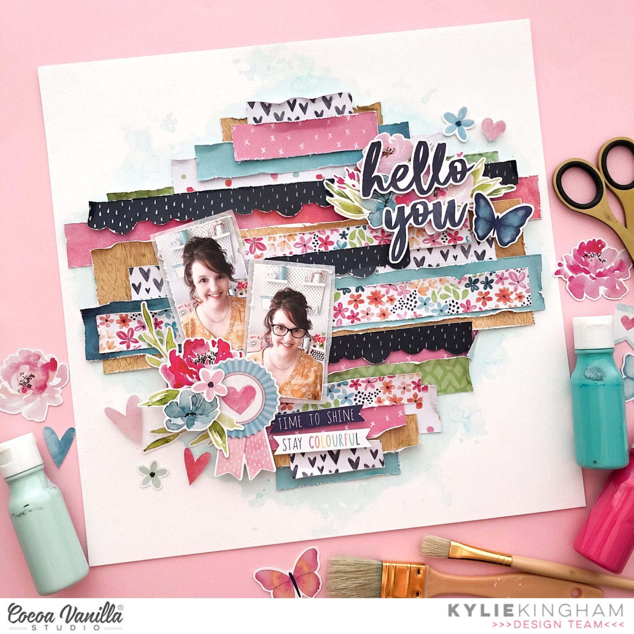
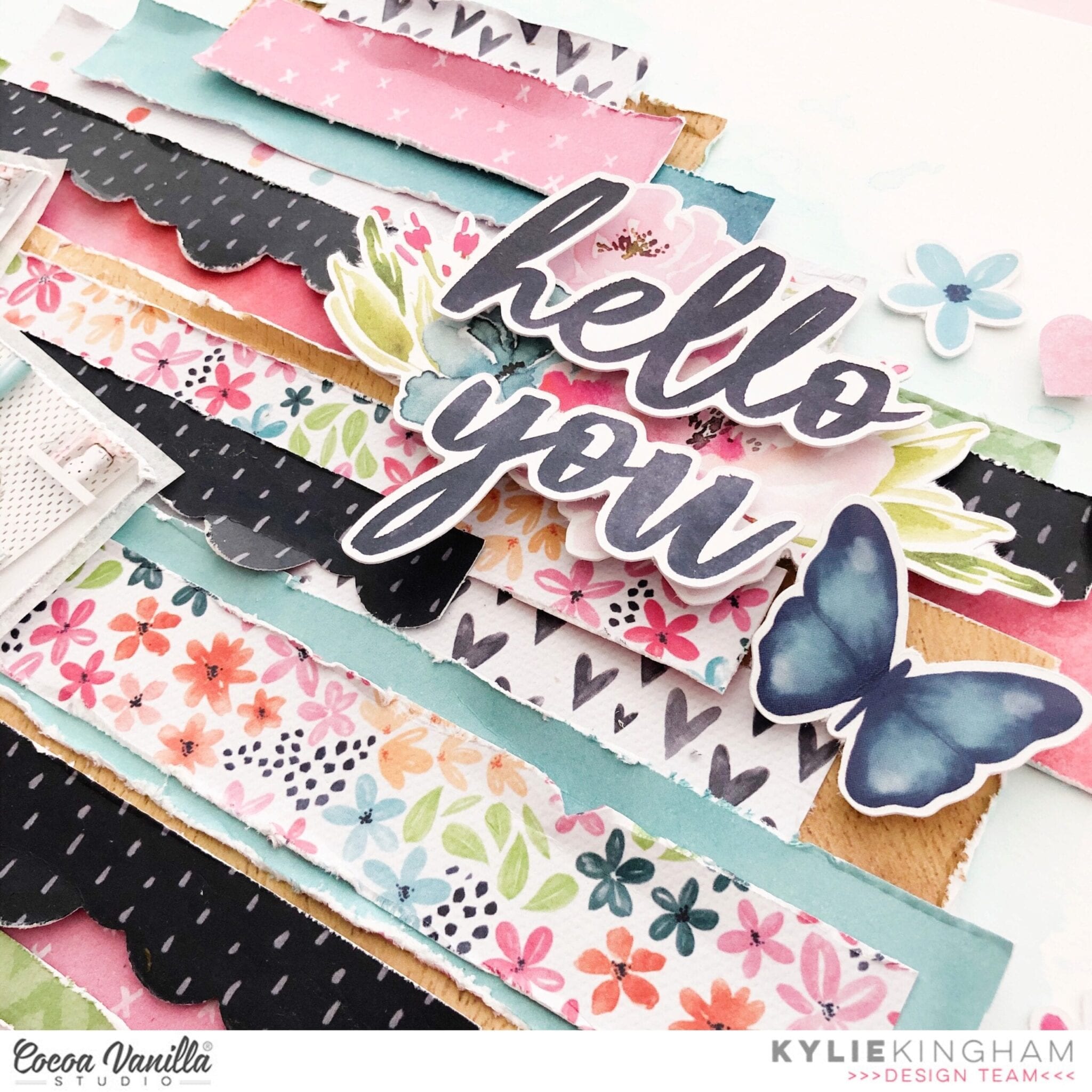
I chose a white background for my layout, and whilst the finished result shows a little water-colouring in the background, I didn’t actually add this until my page was finished.I trimmed down various papers to different widths and lengths, this was done by eye and no need for accuracy or measuring.I heavily distressed each edge of paper with my distress tool but if you don’t have a distress tool the blade of your scissors will achieve the same result.In places, some of the paper tore a little and this is OK! It all adds to the textured effect. After this step I began placement of each strip horizontally on the page. Some were tucked underneath some were layered over the top of others, I also added a few scalloped edges which I created with a craft punch.The longest strips of paper were placed throughout the centre of my page.
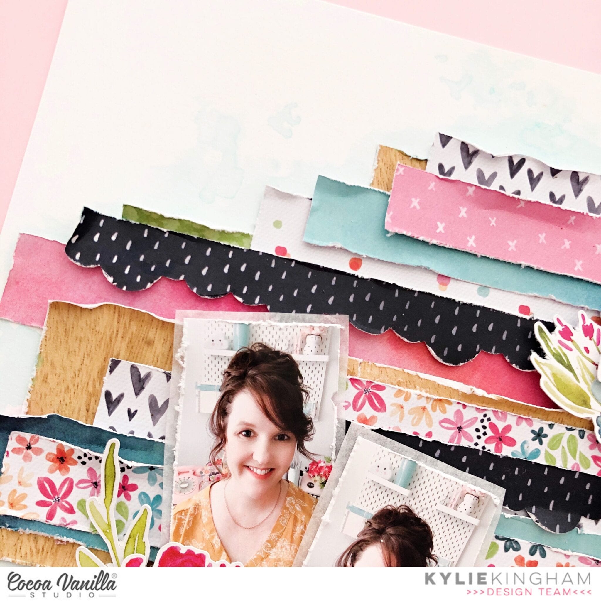
My photos were adhered to the page with some foam adhesive but first I backed them with some white tissue paper from my stash.Using some of the floral themed elements from the die cut pack I layered several around the photos for balance and a little more colour.Once these were all in place I took the time to curl the edges of the strips of paper a little more which you can see shows of that textural effect.
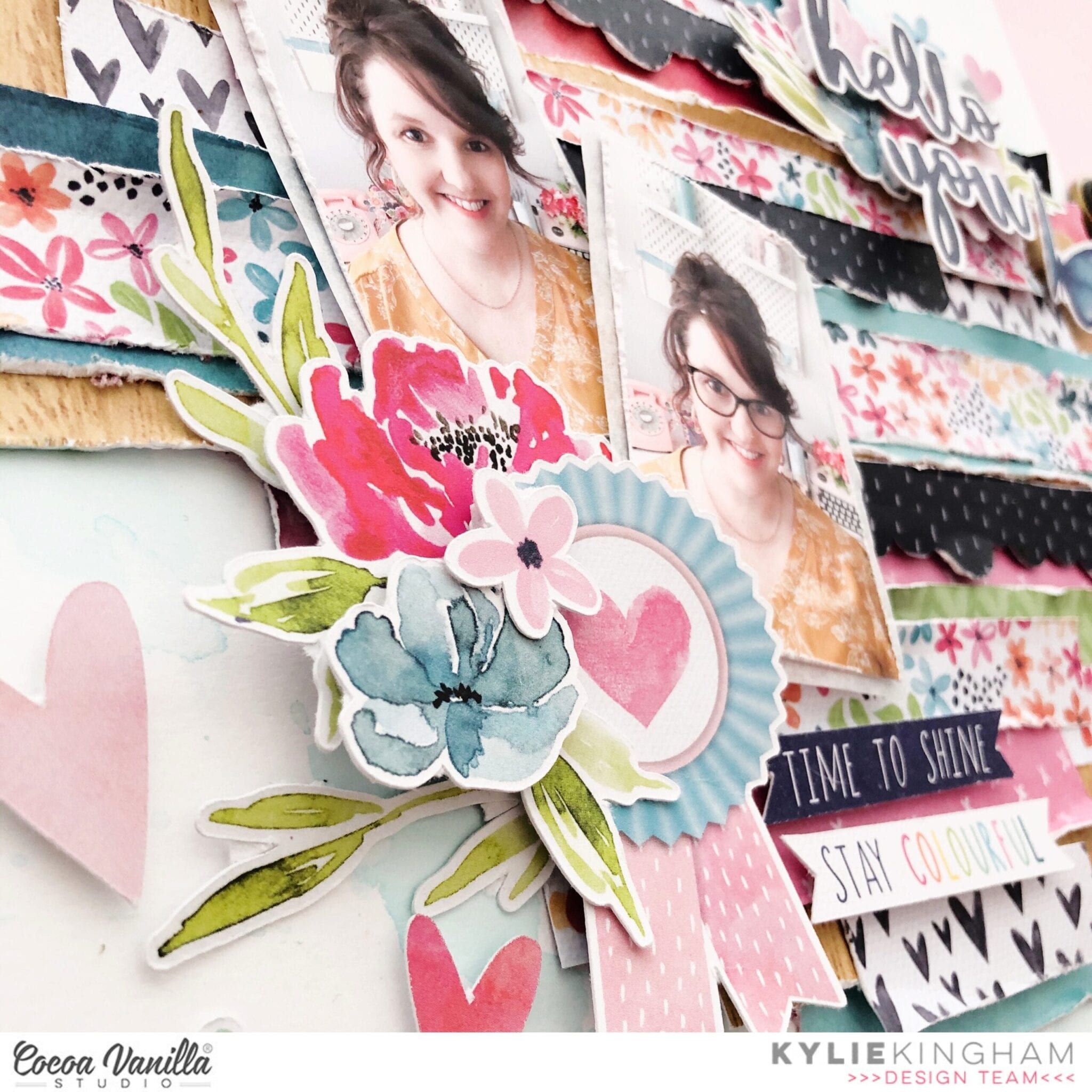
As I love large titles I chose a suitable few pieces from the word sentiments and added over another floral cluster, diagonally opposite my photos. By working with diagonal placement for your layout will help keep a level of balance.
Once my layout was complete I felt it needed a subtle amount of shading with water-colour. I delicately added some aqua toned diluted ink around my layout.Any excess was mopped up before it could dry too dark. Although this effect was subtle I felt it gave a nice finish to my page design.
Thanks so much for checking out my layout today. I hope you have enjoyed seeing this ‘textured’ technique and you give it a go too. This method is also a great way for using up any of those little paper strips and scraps you may have.
Until next time,
Kylie.
Happy Times | Happiness Collection | Laura Alberts

Hey y’all! Laura back again and this time to spread some Happiness! When I saw these two photos, the first thing that popped in my mind was to make a quilt pattern. Inspired by my lovely grandma, I cut several of the papers from the 6×8 paper pad with a 1 inch hexagon punch and then puzzled the pieces together to create a quilted flower effect. Such a fun design and so easy to make!

Once I punched all of the hexagons, I cut out small 1 inch square papers to use as a base and then taped each individual hexagon piece into a simple flower design. It doesn’t really matter which piece starts in the center, I changed up each of mine a little bit from the others. It’s a lot of fun to play with quilted designs!

To add a bit of movement along the page, I added fussy cut butterflies all throughout the quilted flowers and even created little Nuvo gold trails behind them, this gives the appearance of movement! Plus, I added clear stickers underneath clusters and butterflies to give it the appearance of depth. This works because the butterflies’ wings are popped up just a bit.

I hope this quilted floral layout inspired you to look at your patterned papers a little differently! It’s fun to see how you can use every little piece up in a new way. If you’d like to see the Happy Times layout come together, I have the entire process in the video below!
Happy | Happiness Collection | Danni Visser
Hi there! Danni here with a soft and subtle mixed media layout using the stunningly pretty Happiness collection. I still adore all the bright happy colours in this collection and I had so much fun dipping back into it. The colours were a perfect match for the blue floral dress I am wearing in this photo.

I started with the lovely Sprinkles 12×12 patterned paper as a background because it already has that mixed media effect . I applied some iridescent gel medium in a diagonal across my page; this is a really fun medium to play with that adds a beautiful pearlescent finish. While it was still wet, I added some colour with distress oxide ink pads and sprays in a variety of blue and pink shades, using both a paintbrush for splattering and spraying directly onto the paper.
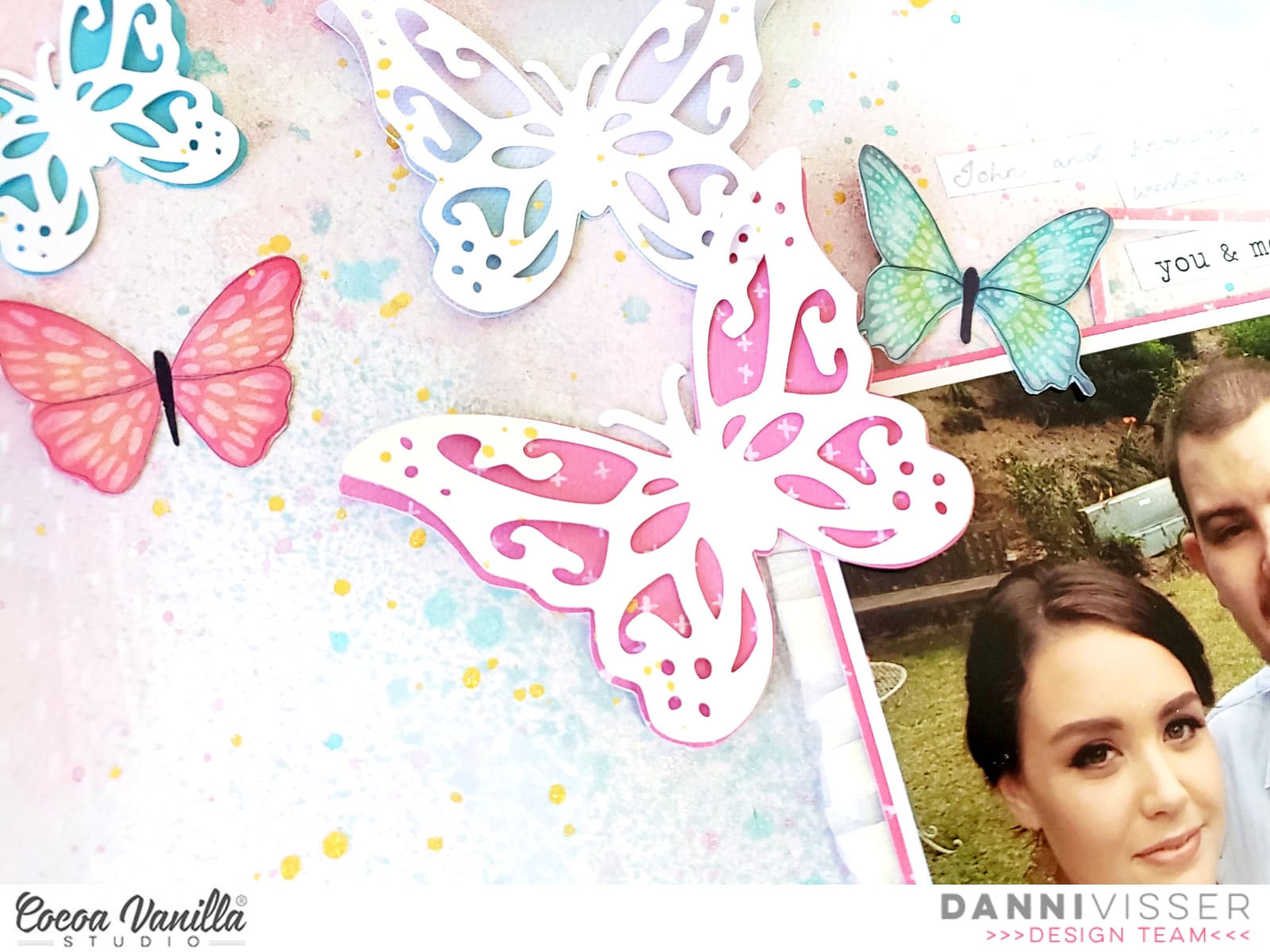
While that mixed media dried I took some butterfly die cuts I had lying around and traced them onto patterned papers, fussy cut those shapes out then glued them together along the centre of the butterfly body, leaving the rest of the shape free to add dimension.
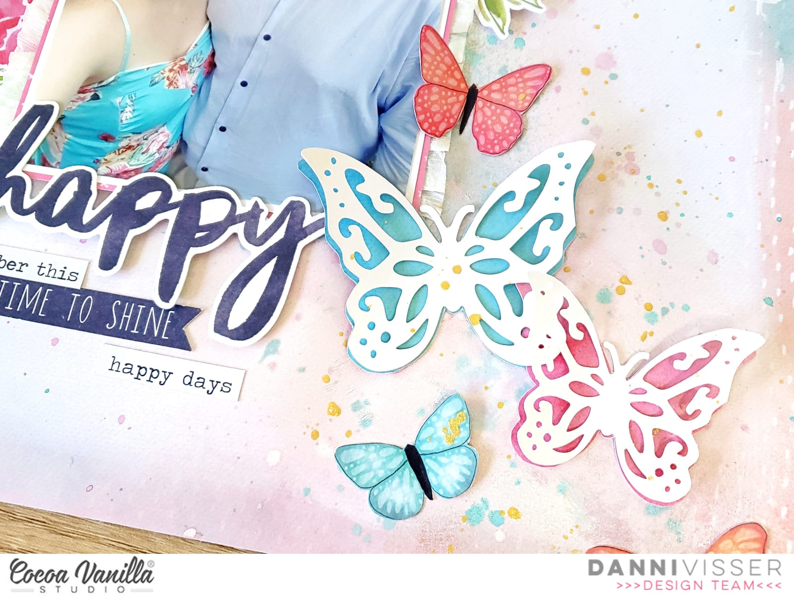
I backed my photo with patterned paper as well as some white crepe paper ruffle along the sides for lots of lovely texture. I popped my photo right in the centre of my page and added the butterflies along that diagonal line of the mixed media. I filled in the gaps with the beautiful little butterflies fussy cut from Bright & Beautiful 12×12 patterned paper, bending them in the middle and only gluing down the centre to make it seem as if they are flying off the page!
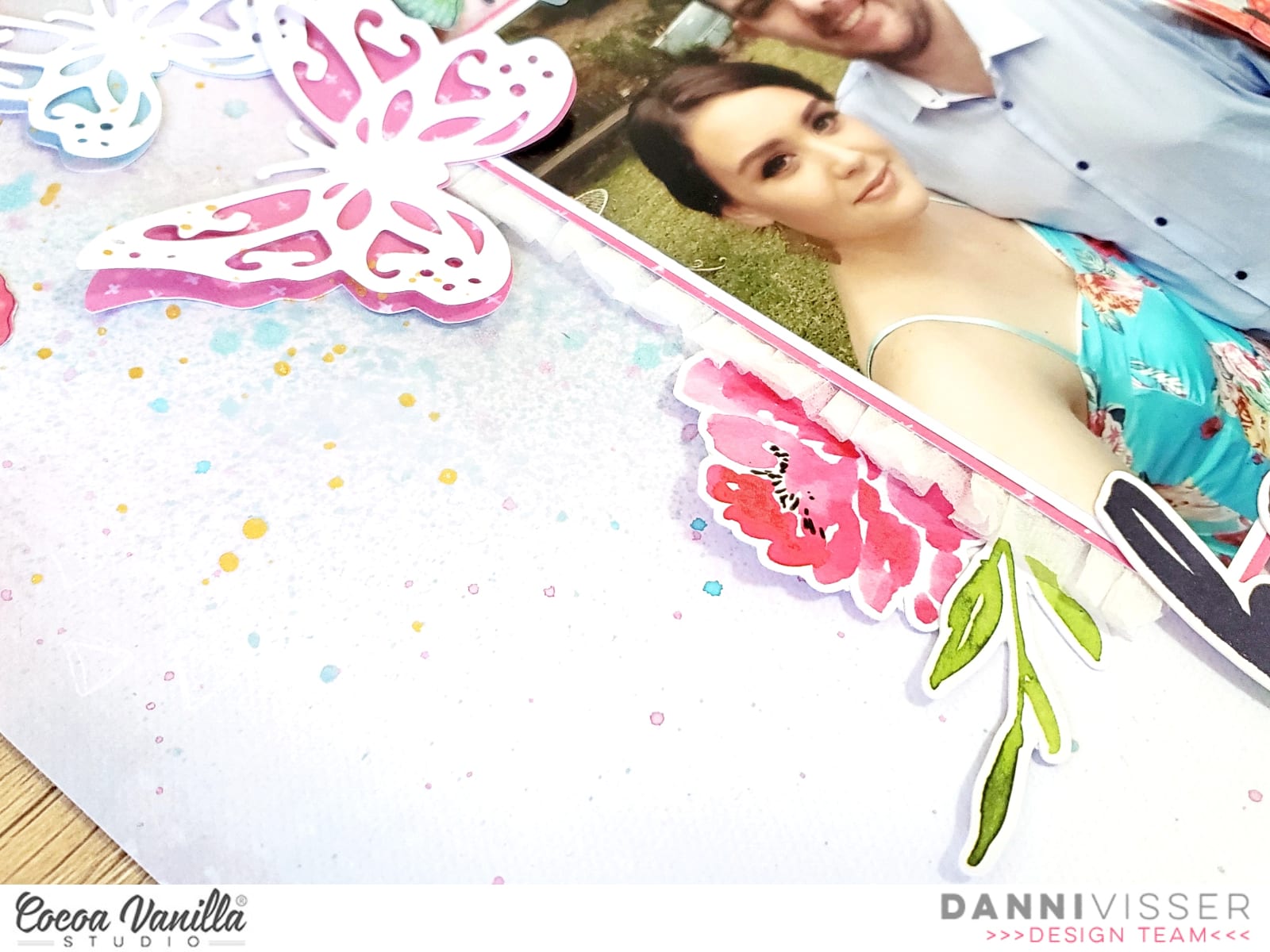
I added a few florals and leaves from the die cut ephemera either side of my photo and a simple “happy” title from the die cut titles. I adore the script font of these, it is just so pretty! I went ahead and added several tiny word phrases and another butterfly from the accessory stickers and added a few lines of simple journaling on strips of white cardstock above my photo.
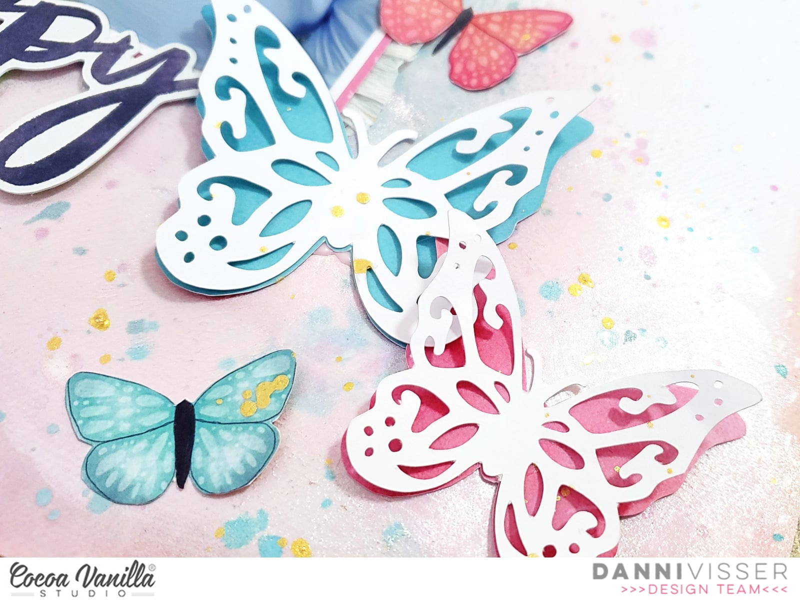
To finish off the layout I added a sprinkling of gold ink; you can never have too much sparkle in my opinion! There is a process video linked below if you would like to watch me talk through the process. Thank you so much for joining me today.
Happy scrapping!
Danni x
End of school year | Bohemian dream Layout | Anna Komenda
Hello Friends. It’s Anna here with my newest page. My challenge for this post was to use pattered paper for the background of my layout. And I have to tell you – I went bold with this one. I not only used one paper, I mixed 5 or 6 patterns, creating very colorful and busy page with “Bohemian dream” collection.
![]()
I started with soft “Dreamer” paper as a base for all those squares cut out from the various “Bohemian dream” papers. You can easily use smaller paper pads to cut them, like I did here. This is a perfect way to use up paper scraps too. Each of my squares is 2 inches big. I didn’t add glue close to the edges so I could bend them a little, adding dimension to the page.
![]()
To mix things a little bit I arranged my squares in a diamond shape. I did the same with the photos. I was a little bit of a challenge because you need to print them much bigger to be able to cut them into diamond shape too. Unless, having them tilted doesn’t bother you. I picked four photos of my daughters documenting the end of this very weird and unique school year. They we snapped in my living room because all the school events vere cancelled due to the COVID infections. This school year needed a separate page to document it for sure.
![]()
I decorated each square without the photo adding title and bits and pieces from ephemera pack. I also used up few flair buttons and cardboard stickers. I used up most of my “Bohemian dream” embellishments already so playing with paper was a great solution for me to keep the page busy.
![]()
Even though this page is busy, I love how it turned out. Love the texture and I will definitelly come back to this kind of design. If you don’t feel comfortable with mixing so many patters, you can use only one or two “calmer” papers and add texture by bending and tearing the edges. It will add a lot of interest to the background and make your photos pop.
I hope you like my idea of using up papers and replacing white background with pattern madness. Thank you for stopping by and see you in August.
XO Anna
You Captured | Unforgettable Collection | Melissa Vining
Hello again!! It’s Melissa here and I’m back today sharing a layout focussing on using a patterned paper background using the gorgeous Unforgettable collection! For this layout I made sure I selected a paper that wasn’t white based, because lets be honest – that would easy!! I also didn’t gravitate toward a woodgrain, which also would be easy for me! In order to not overwhelm myself, and to really focus on the paper I chose a neutral photo (without a lot of colours) and I printed it large because I adore this photo of Brielle dressed up in her bother’s stormtrooper costume. The patterned paper I used for my background is called Lacewing, and it is the B side of the gorgeous butterfly paper. I added some small splatters of water activated sparkly gold mist for a little bit of interest, but most of it got covered up!!
![]()
I backed my photo with Forget Me Not and made two triangles with a scrap of Unscripted from the 6×8 Paper Stack. Of course I had to distress all the edges of the paper! I used some leaf and flower cut files (designed by Anita for International Scrapbooking Day) that were left over from my scraplift layout. It was very satisfying to use them up on this layout!

I created two main embellishment clusters and once smaller one. I used lots of Die Cut Ephemera, the cut file flowers and leaves, and fussy cut butterflies from Lacewing. I always give butterflies more dimension by glueing them in the centre and popping up their wings with dimensional adhesive. Here’s a close up look at the butterflies on my top cluster.

For my small cluster I featured a Flair Button and another fussy cut butterfly. The “love this” flair button was perfect for my photo.

I also used the some of the Accessory Sticker phrases and a label which I lifted up on some craft foam for extra stability and dimension. I wrote my journaling on a label that I cut from Story Teller.

Two of the Foam Title Stickers were perfect for my title, and I used three of the foam hearts as embellishment around my page too. White Enamel Dots were my final touch!

I hope I’ve encouraged you to try using a patterned paper for a background. Cocoa Vanilla Studio collections have a wonderful mix of both bold and subtle patterns, and I find that the more subtle B sides work beautifully for backgrounds.
Thanks for looking!
Melissa xx
Memories layout | Love Always collection | Kylie Kingham.
Hello crafty friends! It’s Kylie back with you today, with a new layout for ‘Throwback Thursday’. I got to create a new page with a past collection and couldn’t resist working with the ‘Love Always’ range. The pastel tones and florals are so, so pretty and were perfect for my page design.

I chose the CLASS ACT paper as a background and added some torn border edges of both BOUQUET and FROLIC for some extra colour and texture. I really loved the ‘Memories’ cut file designed by Paige Evans, which I backed with a pink and black tonal theme from the collection. In place of the ‘O’ I added my photo.Once it was all in place I backed the cut file with some foam adhesive and adhered it to my page.


To create an even balance on my page I have added several clusters of die cuts. Some with foam adhesive to build a nice dimension.I was careful with their placement so that I didn’t cover over the cut file too much so that it couldn’t be read.Because I had adhered the cut file with foam adhesive, it allowed me to be able to tuck some of the embellishments in underneath.


To complete my page I added some smaller phrase die cuts below my photo. I loved the blend of pastel colour once it was finished!

Thanks so much for stopping by the blog today!
Until next time,
Kylie.
SWEET MEMORIES | WILD AT HEART | GWEN WRUCK
Hey Creatives! I hope you are all well. Gwen up on the blog with you today sharing and I’ve dug deep into my stash for this share, using the ‘Wild at Heart’ collection. I paired it with this happy snap of Miss C and myself which was taken a while back while we were just hanging out. I love these pics, so fun and so ‘us’ and they work so well with this sweet collection.

For this page, I was really inspired to use up some of the ‘Chipboard Frames’ from the collection. I had an unopened pack in my stash so pulled them out and set out a plan to layer them onto my page. I just mixed and matched them with my photo until I was happy. At this point nothing is stuck down, I just needed to get an idea of where everything was going to go.

Next, I went about backing my photo. For this, I’ve used the ‘Memento‘ paper and ‘Luscious’ paper, I’ve also added my signature stitching here. I’ve then gone ahead and recreated my design with the photo and the chipboard. Once I was happy with the position of everything, I’ve glued the frames to the photo (not the background) so that everything is in one piece and easy for me to move around.


Now it was time to work on my mixed media background. I’m going for a subtle look here and used some mixed media shimmery spray and the packaging technique, not fussing with it too much, just letting the spray drip a little and move around the page, then set it aside to dry. Once dry, I’ve added my photo and frame pieces on top.

Before sticking everything down, I’ve added in a large die-cut doily from the ‘Ephemera Pack’ to the right of my photo as well as a tag from this same pack, sticking out the top edge of my photo. My page is a central design so everything is working from the centre of the page outwards.

It was now time to embellish! I’ve started by fussy cutting out some of the elements from the ‘Fussy Cuts’ paper and pulling pieces from the ‘Ephemera Pack‘ and ‘Accessory Sticker Sheet’. Adding bits and pieces to the main structure of my page. I’ve also used a bow die in my Sizzix machine to create some fun paper bows and added these for dimension and interest. This is a great way to use up paper scraps if you have them.

Next, I’ve added in a flair button from the ‘Flair pack‘, some typed sentiments from the ‘Accessory Sticker Sheet’ and some ‘Enamel Dots’ in gold to add a pop of sparkle. These smaller elements help round out the page and finish it off so nicely.

I hope this page has inspired you to pull out your collection of ‘Wild at Heart‘ and get creating! It’s always great to stash bust a little before a brand new collection arrives! As always, be sure to share in the Cocoa Vanilla Studio community, we love seeing what you make :)
Until next time,
Gwen
xo
So Epic | Legendary Collection | Laura Alberts

Hey y’all! Laura here with a really fun take on this amazing mandala design on the Explorer paper from the Legendary Collection. I wanted to see if I could use both the inside and outside of this gorgeous design on two separate layouts! This idea has been floating around in my head for ages, so I decided to dive in and give it a go!

Once I finished fussy cutting out the mandala pattern inside, I pulled together two different sets of photos, one for a busy layout and one for a simple layout. I figured the contrast between the two designs would be a fun juxtaposition! For the first layout, I layered in plenty of scraps and even used the part of the orange One Way paper that wouldn’t show to mat my photos! Love when I can get the absolute most use out of my papers, especially the gorgeousness from Cocoa Vanilla.

I had quite a bit of journaling to add to these photos, so I ended up using three label stickers from the 6×12 accessory sticker sheet to create spots for the details around the page. Anime is a huge interest for two of my kids at the moment, so the opportunity to see people dressed as their favorite characters was a thrill! And this wild, layered background was the perfect backdrop for these photos, pulling the bright orange and blues in together. Adding in the very appropriate “So Epic” title and the little stream of stars around each of my two clusters was a fun way to finish it off!

For my second layout, I backed the frame of the mandala with the Epic Tales paper, then adding a border of the bright orange One Way paper to give that blue a pop of excitement! Using many of the circle elements in the ephemera pack, I backed a few with scraps and layered them in with my photos of a Scouts fishing trip. My goofy son’s silly antics are some of my favorite pictures to scrap and these were no different! I did have to take the design all the way to the edge on the right to cover up where I cut through to the mandala, but overall, I think it turned out pretty cool!

I hope this double layout from one pattern inspired you to look at your patterned papers a little differently! It’s fun to see how you can use every little piece up in a new way. If you’d like to see the So Epic layout come together, I have the entire process in the video below!
Hydra | Hello Summer Layout | Anna Komenda
Hello Cocoa Vanilla fans. It’s Anna here with my brand new, colorful page. I am sure I already mentioned it in my previous posts, that one of my favorite CVS collections so far is “Hello sunshine”. It’s an old line from few years back, but it has all the major factors I love in scrapbooking collection – colorful patters, summer themed motifs, pretty flowers and great variety of embellishments. It’s no longer available in paper version, but you can purchase a digital bundle and enjoy this line for forever :) The bundle contains of 12*12 papers and 164 elements, that are also grouped in three A4 sized PDF printable sheets – very easy to print and fussy cut. I still have some bits and pieces left from the paper version and I used them to make this page.
![]()
I started with a white paper with little, colorful triangles as my background. Next step was to cut paper with little word strips into pieces. If you have time, you can do this with whole sheet and put the rest of the strips into the ephemera pack for the further use.
![]()
I arranged those strips into a vertical column, that became the anchor of my composition. I placed two photos between them. They were taken during our one day trip to three, lovely greek islands near Athens – Hydra, Poros and Egina. Hydra was the first one, with amazing greek vibe, scenic harbour and little, old town surrounding the bay. We had only two hours to walk around but I enjoyed every second of it. Clear, blue sky and navy water are a perfect match for the colors of “Hello sunshine”.
![]()
Paper is and always will be my favorite scrappy item. Having only papers on hand you can still create very bold and detailed project. That’s why I love digital products so much. Fussy cutting is my friend and I always look for elements that I can cut out from paper to make my project even more unique.
I can’t wait to scrapbook more of my greek adventure on some other pages and albums. Summer projects are always my favorite to make. Thank you for stopping by and see you in two weeks. I have really fun page to share with you then.
XO Anna