Hi Cocoa Vanilla fans and welcome back to the blog!
Today I have put my Storyteller collection away and have pulled out the No Limitscollection to play with.
I am documenting some fun pictures of my husband and youngest son on a recent holiday to Bali when we went quad bike riding.
To start my page I used the woodgrain paper called “Big Bang” and tore it about three quarters of the way down to create some texture and added a strip of the “Eclipse” paper underneath it.
I decided I wanted to add some mixed media to my background so I pulled out a circular stencil with some silver texture paste and added some white ink splatters.
I placed my photos in the middle of the page and used some vellum to add another layer. Next, to add more colour and papers to my page, I used a cut file from Paper Issues to add more circular elements to my page… I love these!!!
For my title, I used the word ‘Adventure’ from the Die Cut Titles and the word ‘Fun’ from one of the ‘Pocket Cards‘.
Once this was done I felt like the bottom of my page was too white so I pulled out some circular stamps and added these with co-ordinating colours … love the effect!
To finish my page, I used different pieces from the ‘Die cut elements’ pack’ and some of the Chipboard pieces including the stars to scatter around the page.
I hope you enjoyed my page today and you found some inspiration to get your memories documented.
Good Day Friends,
Lina here on the blog today with an Autumnal layout I created using the fun Sunkissed collection and a photo of my eldest daughter, from this past weekend. I know Sunkissed is a summer themed collection, but I couldn’t resist it’s rich tones of yellow, orange, and pink. I think by looking at my layout, you’d never guess that the collection was geared towards summer. And, that’s the beauty of CVS collections, they’re just so full of fun and colour and that makes them versatile.
I began with a white piece of 12×12 cardstock and created a blended ink background in yellow, coral, and pink. I used water to then add droplets which then I dabbed off to create a reverse splatter as the water removes the ink where it’s placed.
I created the cutfile in Silhouette Studio using two different fonts, layering them and then cutting the background from white cardstock and the rest from papers from the A5 Paper Stack. The Paper stack is perfect for smaller tasks such as cut files or even matting of a photo. I popped up the cut file with dimensional foam and then placed it on my now dry background.
The photo is printed in colour and I feel like the shades and tones in the photo play nicely with the colour scheme I’ve used and do not “get lost” amongst all the colour I have already laid down. I matted my photo with papers form the A5 Paper Stack adding in the same pink, yellow and green.
Time for my favourite part…. the embellishing of the layout. I created a few clusters, one main, large one within the cutfile, a second cluster, mid sized to the left of the photo and lastly a smaller third one, to the right of the photo. I used florals from the Floral Ephemera and a few banners from the Die Cut Ephemera packages. Because I wanted this layout to have more of an autumnal vibe to it, I stayed away from the teal and blue that is included in this collection using soley the shades of orange, yellow, and pink with a pop of green. I also used some gold thread to create a nest for a small Wood Button to sit within. In doing this, I feel like I give the button a home. :P
Lastly, I used some gold ink spray and splattered paint in and around my layout. As always, this finishes off my layout and ties it all together. in my eyes, it similar to adding sprinkles on a cupcake… it’s just that little bit extra that completes your layout.
Thank you for joining me today on the blog and I hope you have a wonderful rest of your day!
xoLina
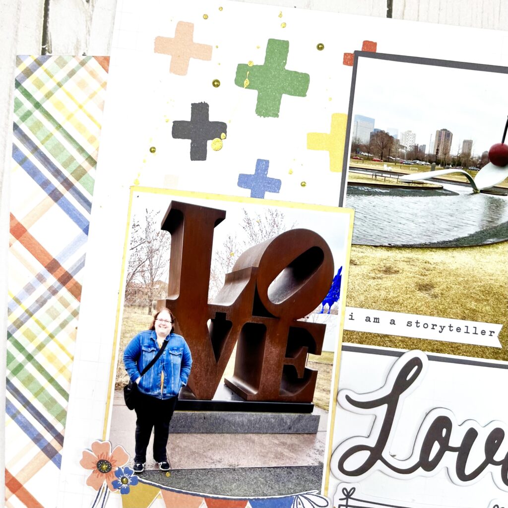
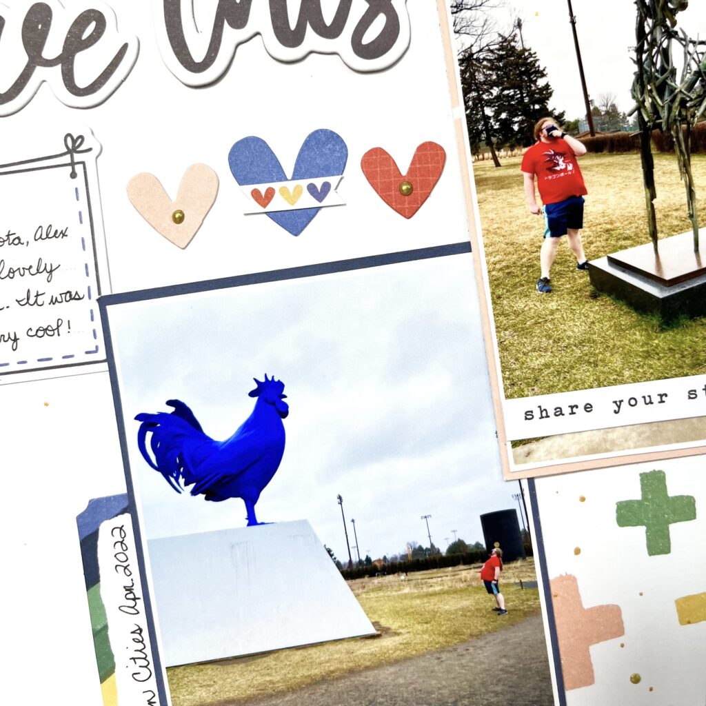
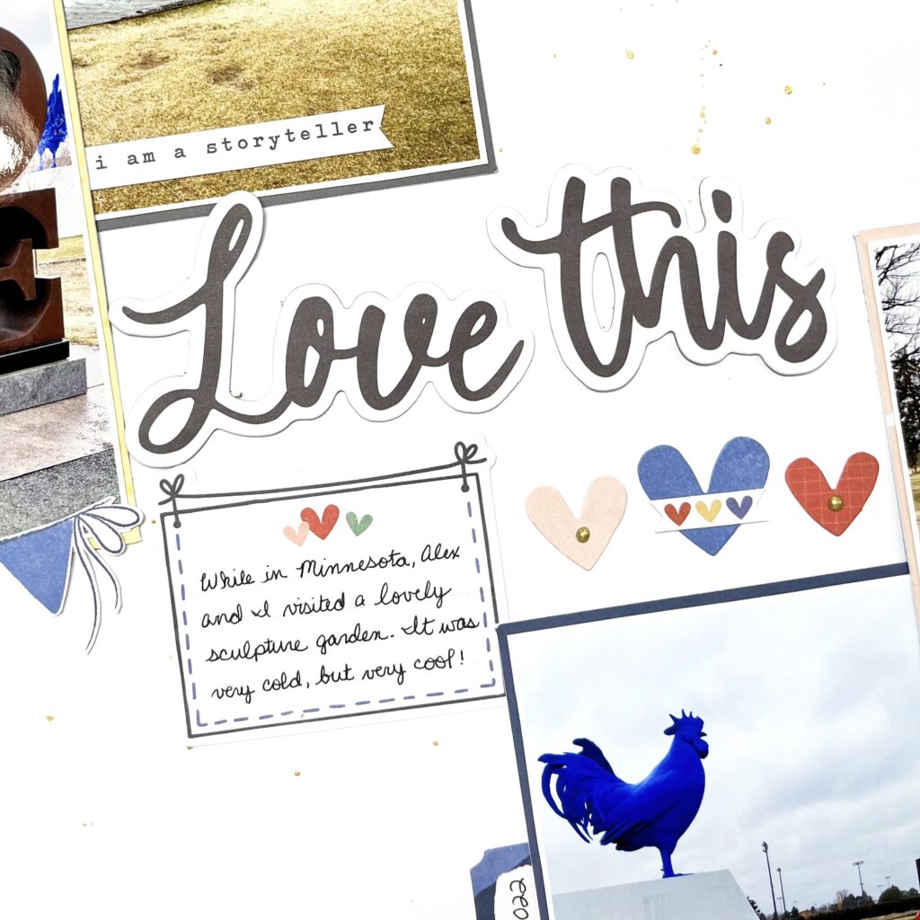
Hey y’all! Laura Alberts back again with a fun art sculpture inspired layout! Back in April, my son and I visited a beautiful sculpture garden in Twin Lakes, Minnesota, USA. It was such a fun, quirky place to explore art and experience sculpture in a new way. I decided to channel the quirky feel of the garden with this layout using the Storyteller collection! Using the Cross It Off patterned paper for my background, I built a diagonal layout with a really fun collage look. Loved squeezing four 3×4 inch photos on this one!
For my title, I used the Love This from the Chipboard stickers and then layered a journaling spot and hearts from the icon ephemera underneath. For the photos themselves, I kept the embellishing very simple, so that it didn’t become too busy! I set two photos in each of the cross-filled corners and layered them up with word phrases, a banner, and a label.
I really enjoyed playing with white space on this layout, leaving large areas to allow the eye to rest on the opposite corners and keeping a fairly tight cluster of embellishments in between my pairs of photos. This adds a lot of balance to the page and made for a clever place to add splatters as well!
I hope this layout inspires you to find ideas in the least likely of places! It’s such a fun design and captures the mood and feel of the garden really well! To see how ‘Love This’ came together, check out the process video below!
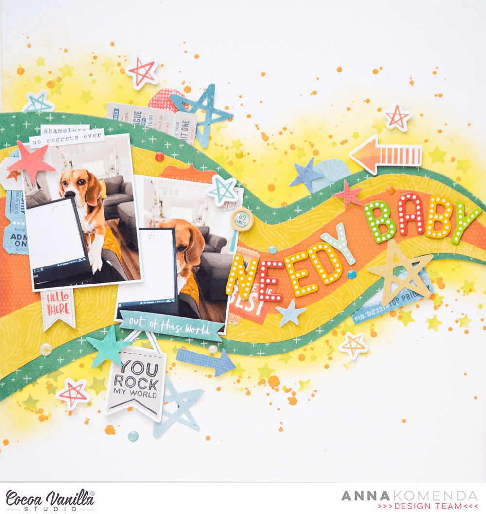
Hello Cocoa Vanilla fans. It’s Anna here with my newest page. I decided to put the new “Storyteller” collection away for a short while to use up my stash of older lines. They looked so sad and lonely in the box :) First, I need to add a disclosure and explain myself a bit. We got a new puppy over a year ago, and as my daughters are quite big and independent, I poured all my parental feelings into my poor dog. 99% of my phone photos are of my furry boy… Crazy pupparazzi – I know! So most of my pages are with my dog’s photos recently as those are almost the only pictures I get. Last time I shared with you his sleepy version mixed with “Storyteller” and today will be his needy version with a bit older “No limits” line. Masculine collection for a good boy!
Let me start with a back story of the photos. As I work from home, I have this big privilage to work from the cosy couch covered with soft blanket. My dog is always somewhere near as he is very social and coodependent (my fault…). He likes to be a star of the show, so when the attention is not on him, he is not the one who waits patiently. When my computer took his place, he decided it’s time to try to sneak into my laps. I snapped few photos of him checking which side would be the best to approach. He is very needy when it comes to attention hence the title of the page.
I had a little bit of trouble figuring out how I should scrapbook those photos. I didn’t want to repeat my usual patterns so insted of straight lines, I decided to add some funky waves. I picked three pattern papers: “Latitude“, “Spark” and “Nebula” and nested them together sketching a simple wave pattern, that would be wider on the one side and making thinner on the other. I started with the orange paper and drew and cut the wave. Then I glued it over the yellow paper, marked the lines with pencil and cut everything again. I repeat the same with the greenish one. My original idea was to put everything on “Stardust” paper as a background buy it was just too busy. I switched to white cardstock instead adding some mixed media layers.
I first marked when my paper layer will be, and then gently added some yellow ink using a brush, on the top and on the bottom. Then I used star stencil and lime green ink to add a layer of stars and finished everything with orange splatters. When everything was dry, I glued my wave on top and started embellishing. I picked some tickets and stars from ephemera pack and tucked them behind the photos and my wave. You can spot some stickers from 6*12 sheet too. Next step was to add a title using some Thickers from my stash, following the curve of the wave. Who said your titles have to be straight? Actually, I love keeping them messy and uneven!
Tiny enamel dots and stars were a perfect finishing touch along with wood epoxy button. I think this is the embellishment piece I use up the fastest in each CVS line. I just love them. The final result has a bit retro vibe I would say. Do you have similar feelings about it? I think I need to reach for wavy, handcut lines more often as they create very unique result.
That’s it for today! I really enjoyed making this layout and scrapbooking another photos of my puppy / son. He is my youngest baby, and you know how tempting it is to scrapbook baby photos, right? I can not promise my next page will be with people either…
Thank you so much for stopping by and see you in two weeks!
Hello everyone, it’s Kylie back with you all! Over the past few weeks on the blog the design team has been creating layouts following a sketch. A scrapbooking sketch provides a guide for the placement of photos, a title, journaling and embellishments for your layout. But it doesn’t mean that it’s set in stone. Based on your photos and scrapbook supplies, you may alter the sketch to fit your needs. There are lots of websites that can provide some wonderful sketches, however for my layout today I have created my own sketch for you. Whenever I find a sketch I want to create from, I usually like to print it out and place in a binder folder. That way I can create and recreate using the same sketch as many times as I like.
Sketches don’t necessarily provide measurements, however for my design I did provide the size I trimmed my photo. Sometimes that’s all you need to be able to bring all the other elements together into place. As I mentioned previously creating with a sketch plan doesn’t have to be followed ‘exactly’ – but in this case I did with my own layout. I thought the new ‘Storyteller’ collection would be perfect since I have a strong feature on blooms!
When scrapbooking, I like to co-ordinate the colours in my photo memories with the papers etc that I use. In this case I knew I wanted to include some lovely blue and yellow tones. I chose the reverse side of the SPRING FLING paper. It has a lovely watercolour effect to it in the most perfect shade of blue. From there I followed my sketch and layered several contrasting papers to include the fun LITTLE LOVE paper. For once I did not adhere any of the papers or my photo with foam squares. I kept everything flush except for the floral die cuts. These were layered with foam adhesive squares to really ‘pop’ and stand out from the page.For texture and pure cuteness I also added some of the wooden flairs.
What would a layout be without a big title?? This was secured snuggly next to my photo using the foam title stickers. My photo was trimmed down to a 5″ x 4″ size- mostly because I had a lot of open negative spacing I felt I could trim away. Once completed I also think this sketch would allow journal space too if you like.
I hope you will have some fun too creating with my sketch!
It’s Tarrah back with you and today I am sharing a new scrapbook layout featuring the STUNNING Storyteller collection. For this project, I had free choice to create whatever I wanted with no theme or anything. I chose to scrap lift one of my friend and fellow design team member Mandy Melville’s gorgeous layouts.
This is the layout I created using the gorgeous Storyteller collection, documenting a pretty photo of a beautiful rose from my Mum’s garden.
This is Mandy’s stunning layout below that she created using the beautiful More Than Words collection.
I decided on the Ditsy Daisy 12′ x 12′ patterned paper as my background paper and took a piece of plain white cardstock and trimmed this piece down to around 8′ x 10′, I then chose the ‘B’ side of the Spring Fling paper to mat under the white cardstock. Like Mandy did on her layout, I decided to machine stitch the white cardstock and the Spring Fling paper together and then I adhered it to the Ditsy Daisy paper. I love the look that machine stitching adds to a layout, I love the texture it gives the page and the extra detail it adds as well.
For the main element where my photo was placed, I created some paper layers underneath the photo using various papers from the A5 paper stack and also tucked in a pocket card for some extra colour and another layer. I did distress some of the papers here to add some texture and I adhered some down using craft foam for some dimension also. Here in the bottom right corner of the photo cluster I tucked in some of the beautiful flowers from the floral ephemera pack, added a banner sticker to the photo from the accessory sticker sheet and also placed a phrase die-cut from the ephemera pack.
On the left of the photo, I created a small floral cluster using some of the florals from the floral ephemera pack and I added a wood epoxy button here to the centre of one of the flowers. In the top right corner of the page. I added the cute banner die-cut piece from the ephemera pack using pop dot adhesive. I love the shadows and dimension this adds to my page. I also took the small frame with hearts die-cut from the ephemera pack and tucked this piece into the top of the photo layers. I like how this peeks out from the top.
I decided to place my title in a similar position to where Mandy had placed hers and also created another small embellishment cluster in the bottom left corner. My title is one of the gorgeous foam title sticker words and I also took a phrase sticker from the accessory sticker sheet and placed it the bottom of the title. You can see in my floral cluster in the bottom left corner that I have adhered some of the florals flat to the page and then I have adhered the red one with some dimensional adhesive, again I love the shadow this creates and the extra interest it brings to my page. I also like to bend the edges of the flowers and leaves to make them look a little more realistic. Some of the smaller details and final things I added to my page were the gorgeous heart puffy stickers and another cute wood epoxy button. The last thing was to stamp my date stamp which is something I always add to my layouts.
Thank you so much for stopping by the Cocoa Vanilla blog today! I love how my scrap lift layout of Mandy’s page turned out and I hope you enjoyed reading how I created it!
Make sure to keep an eye on the Cocoa Vanilla online store as the Storyteller collection should be in store really soon!
Good morning CVS fans, Kellie back on the blog today to share some more inspiration with you!
For todays project, I decided I wanted to use a cut file to showcase lots of the patterned paper in the gorgeous Storyteller collection. I wanted to record these two pics of me and my baby girl Penny (she is totally my girl in a house full of boys!). Here is my page…
I had this cutfile sitting in my craft room for quite some time, I ‘think’ it could be Paige Evans?! Anyhow I decided I wanted to create a ‘pretty’ page as I do scrap a lot of pics of my boys! How gorgeous are all these papers ?! I started with a blank piece of cardstock, added on some distress oxide and gold splatters.
Cutfiles are a great way to incorporate lots of different patterned paper if that is something you are wanting to achieve. The cutfile came as one piece but I decided to cut it in half and place it on each side of the page so my photos stayed central on the page and it draws your eyes in to the photos.
Next I backed my photos in 2 different patterned papers from the A5 paper stack and got embellishing around my photos. As you can see, I used a mix of just about everything….ephemera, pieces from the Accessory Sticker Sheet and chipboard.
I also thought it would be fun to use some of the wooden buttons to serve as centres for my flowers…
For my title, I used the word ‘Together’ from the foam title stickers, then popped some of the word phrases under it from the Accessory Sticker Sheet. Because the title is black, I also wanted to add some of the hearts from the tile pack to balance out the design.
I hope you have enjoyed my page today, I am happy with how it turned out. Please be sure to share your CVS creations over on our Facebook page, we would love to see what you are making.
Happy day friends, Lina, here today on the blog to share this layout I created with the ever so versatile, Storyteller collection. I documented a photo of my happy girl from this summer in a field of glorious yellow flowers. I just thought the background of the photo played so nicely with the yellow in this collection and so I played on that idea.
I began with a white piece of cardstock; I use a 120 lbs cardstock but you can use whatever you have on hand. I used a Distress Ink in yellow and a blending tool to add some colour to the top right hand corner and then a larger patch on the bottom left since that’s where my photo is going and I wanted to be able to still see yellow ink peaking through. I then matted the white cardstock onto the lovely background paper you see with all the hearts entitled, “Oh my Heart”.
Next, I matted my photo with pieces of card from the A5 Paper Stack with some papers that matched nicely. I popped my photo up with some dimensional foam for height. Following that, I added pieces from both the Die Cut Ephemera and the Floral Ephemera packets. I created a larger cluster of beautiful florals on the right side of my photo and created a nesting spot for my title.
My title is created with the Foam Title Stickers and reads “Happy Heart”, which perfectly describes my lovely girl. The black colour of the foam was perfect to anchor down my layout. On the left side of my photo, I added some gold thread purposely made to look messy. My photo is also adorned with a phrase from the Accessory Stickers sheet that reads, “Got the Shot”. The phrase works wonderfully with the photo and her peace sign holding pose. :)
In the top right hand corner of my layout where I had originally added yellow ink with the blending tool, I created an additional smaller cluster of embellishments to drawn the eye upwards and lighten up the heavy, bottom positioning of my layout. I added a cut label, and a lovely blue floral piece. I also took that opportunity to add a nest of gold thread and adhere a Wood Button that features a cute little yellow butterfly.
Lastly, I added some Puffy Stickers and some gold ink spray to finish of my layout and add that last bit of my style. This layout came together super easily, mainly because you just can’t create something hideous with the collection. It’s just such a lovely and happy collection and I see myself using every last piece of it.
Thanks for joining me today! Enjoy your day!
xoLina
Hey y’all! Laura Alberts here again with another t-ball layout using the gorgeous Storyteller collection. These fun photos of my daughter and my husband capture perfectly their bond. Sports aren’t really Olivia’s preferred activity, but she was more than happy to trail her Daddy around the ballfield. Love that these memories are preserved with this beautiful layout. Using this lovely sketch I created as a guide, I’m creating two clusters of photos and embellishments, connected by the title.
In the top cluster, I’ve added tags from cut apart in the A5 paper stack, with puffy circles in the holes. I’ve layered a frame to the right, peeking behind the photos and anchoring my title at the bottom. These sweet little butterflies are the perfect whimsical touch.
For my title, I pulled out an ephemera piece that perfectly nestles with this camera and a floral cluster to create a detailed connection between my two photos. I love the way the gold ink and Nuvo add a bit of texture and fun around the edges.
On the bottom photo, I’ve added a tab and a floral cluster with a chipboard banner, then tucked a journaling card behind it. This gives me a place to journal about the t-ball experience without taking away from the overall design. I especially love these little Nuvo butterfly trails, they add so much movement to the page!
I hope this sketch inspires you to try a new design! If you’d like to see this layout come together, check out the process video below!
Hello crafty people. It’s Anna here with another layout made with gorgeous “Storyteller” collection. This month we are playing with sketches and this is one of my first go – to things when my mojo is low. It wasn’t the case this time but I had tons of fun picking the right sketch for the job. I already had my photos printed so I knew I needed a sketch with two vertical photos in it and a spot for a bigger title. The task wasn’t easy and I went through many sketches to find the perfect one for me. Here it is:
It’s one of the Page Maps sketches that was used by Scrapbooks & Cards Today magazine for their Spring 2021 challenge. You may be surprised I chose 8*11 design as I always make my layouts 12*12. But who said you can’t alter your sketch? I not only changed the size of the background but I also flipped the sketch vertically making sort of mirror design with it.
Here is my finished project:
I kept my page very similar to the sketch, which is not always obvious in my case as I like to play with the design and keep my creative freedom. However, this time everything was going so smoothly, all the papers I chose were matching, all the embellishments were jumping on their places that I just kept going the way sketch led me. I started with the most perfect background paper called “Cross it off”. It’s very bright, all the middle part of the design is empty but it’s more than just a plain white cardstock. For the layers under the photo I used A5 Paper Stack so I didn’t have to cut whole 12*12 papers (and some of the patterns I chose are available only in the stack).
After glueing down my photos of the coziest beagle ever (yep, that’s my new blanket…) I followed the sketch and added some flower clusters in three areas. I used the ones from ephemera pack so I didn’t need to group the florals one by one. The laziest scrapbooker ever, I know. But why not to use simple solutions when Zoe already took time to put those flowers and leaves together? I also made a simple tag out of the pattern papers and added a string in natural color to it (exactly like the sketch shows).
I knew what the title of this page will be from the very beginning so I couldn’t use foam phrases that are included in this line (it’s a pity as they are simply stunning). I reached for alpha dies instead (they were already on my desk to the level of lazyness is still rising!) and I cut the letter out of the coral paper from paper stack. Before putting the letters down I added pieces of foam tape for more dimension. The title is the biggest change I made in following the sketch as it’s a bit smaller and doesn’t peak out behind the first layer of paper.
I finished everything by adding few buttons from ephemera pack and cute, little puffy hearts from puffy stickers set. I didn’t add any splatters which is usually my signature “cherry on top” step but I liked this page just the way it turned out. I must tell you, I finished it in 40!!! minutes. It’s like a personal best I think :) Following the sketch was so easy and liberating that I could switch off part of my brain responsible for overthinking.
I highly recommend you reaching out for sketch from time to time to step out from the well known path, try something new or just make things faster and easier for yourself. Thank you so much for staying with me today and I hope I inspired you a bit with my layout. See you soon in two weeks!


 I began with a white piece of cardstock; I use a 120 lbs cardstock but you can use whatever you have on hand. I used a Distress Ink in yellow and a blending tool to add some colour to the top right hand corner and then a larger patch on the bottom left since that’s where my photo is going and I wanted to be able to still see yellow ink peaking through. I then matted the white cardstock onto the lovely background paper you see with all the hearts entitled, “Oh my Heart”.
 Next, I matted my photo with pieces of card from the A5 Paper Stack with some papers that matched nicely. I popped my photo up with some dimensional foam for height. Following that, I added pieces from both the Die Cut Ephemera and the Floral Ephemera packets. I created a larger cluster of beautiful florals on the right side of my photo and created a nesting spot for my title.


