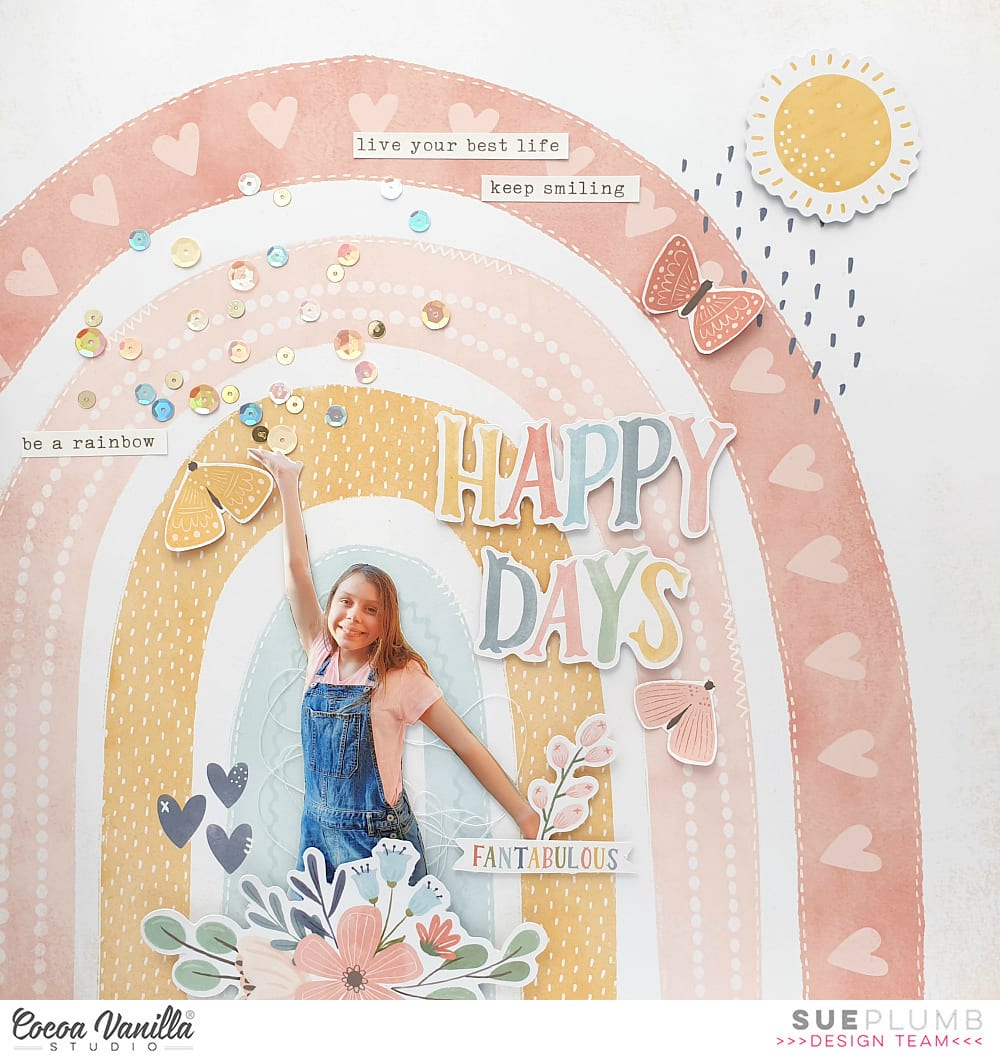
Hi everyone! It’s Sue Plumb here today to share my latest design team page with you. This layout is actually the very first page I created with the brand new ‘Daydream’ collection, even though I am only sharing it now. When I cracked open this collection to create, I couldn’t help myself but reach for the adorable Over the Rainbow paper first. (I think there are lots of people who did the same – including our design team!) You may recall seeing lots of rainbow themed layouts over the past week from our team as part of our rainbow theme, so I thought what better time to share this page and join in the fun!
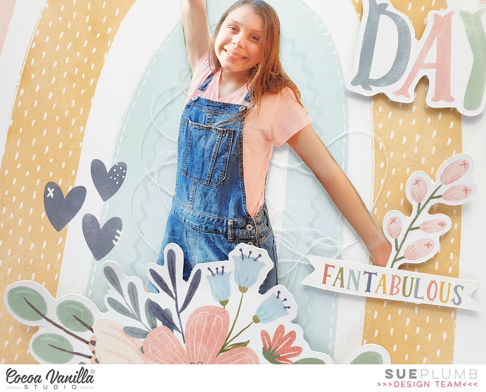
Now the funny thing about this layout, is I already knew I was going to make it before I even received the collection. (Very unlike me to plan a page ahead of time!) As soon as I saw Zoe’s reveal of this paper, I knew I wanted to use a silhouetted photo of my daughter standing under the rainbow (so I had her pose for the photo in advance).
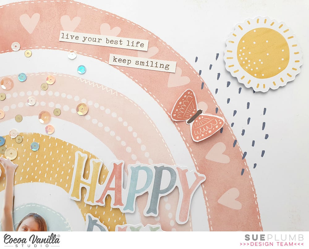
I started my layout by adding a little bit of extra detail to the paper. I used a fine tip white paint pen to add faux stitched detail along the edges of some of the rainbow arches, and then faux hand stitched details onto the blue hearts.
I then cut around my photo to get rid of all the background and placed some messy white cotton thread for soft texture where my photo was going to go. I used some scrap cardboard behind the photo to pop it up from the page.
Once I had the photo in place I added a floral piece from the Die Cut Ephemera pack along the bottom edge of the page so it looked as though she was springing from a bunch of flowers. I also added a small floral sprig and the fantabulous banner piece to cover her hand.
Now it was time to add some extra detail around my page. In keeping with the whimsical scene I was creating, I added the die cut sun from the ephemera pack in the top right corner of the page using some foam tape to pop it up. I also used the happy days words from the ephemera pack as my page title.
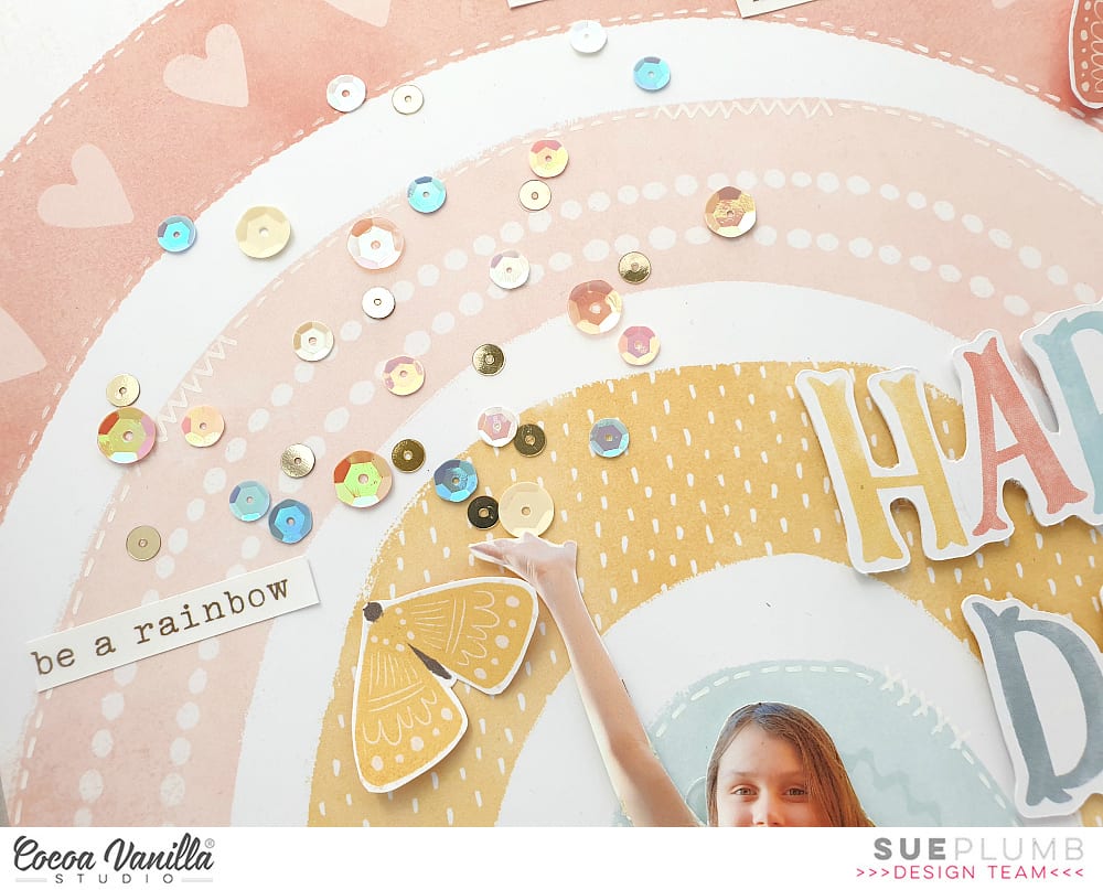
With my daughter’s pose of her hand being held joyfully in the air, I wanted to create a look as though she was scattering some fun / happiness / rainbow vibes, so I used a selection of sequins from the Sequins & Flowers pack and stuck them as though they were being thrown from her hand.
I also added three fussy cut butterflies from the All Aflutterpaper, placing them so they were on the coordinating coloured arch on the rainbow.
I finished off with a few happy phrase stickers from the Accessory Sticker sheet placed onto the rainbow and my page was done. This whimsical scene was unlike my usual style of page, but I really had fun creating it and I am happy I could bring my vision to life. (And my daughter absolutely loves it, which is the most important thing, right?!)
Thanks so much for stopping by so I could share this with you. If you haven’t managed to find the ‘Daydream’ collection yet because your favorite store sold out, rest assured that plenty of re-stocks have been shipped, so check with them to see if they have it coming.
Hi everyone! It’s Sue here to share my latest design team project with you. Today I am sharing a 12×12″ layout I created featuring the beautiful ‘Unforgettable’ collection and some recent photos of my daughter at the beach. As my daughter gets older (she’s now 12), I am finding it increasingly difficult to get photos of her, as she doesn’t enjoy posing for me as much as she used to. (Unless she is dressed up in a costume, but that’s a whole other story!) So you can imagine my delight when I managed to capture these photos of her, and I couldn’t wait to scrap them.
I chose to use the ‘Unforgettable’ collection because I just can’t pass up the chance to create something gorgeous and girly whenever I have the chance. I began my page with one of my favourite papers from the collection – the fabulous aqua diagonal stripe print on the reverse of the Sprightly paper. Instead of keeping the sheet as a whole, I decided to add some extra interest by cutting off a strip along the left edge and flipping it over to reveal the abstract watercolour pattern on the other side. Before re-joining the two, I also added a narrow strip of the Unscripted paper between them. I also distressed the edges of the joins slightly to add some extra texture.
With my page base constructed, it was then time to create a focal area for my layout. I layered several smaller pieces of paper (Sprightly; Garland; and Pretty Bits) to form a mat for my photos, adding some cardboard behind the left photo to lift it up a little higher than the other. Then it was time to play with some pretties!
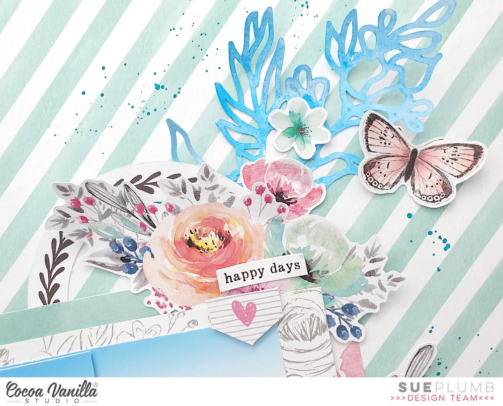
I decided on three main embellishment clusters placed in the bottom left, top right and bottom right corners of my photo mat. Beginning with the top right cluster, I used a die cut circular frame and a large floral piece from the Die Cut Ephemera pack as the anchors for the cluster. It was at this point that I realised I really needed to draw in the stunning blue colour of the water in my photos. Unfortunately, this colour didn’t feature in the collection so I had to come up with another solution. I found a small floral cut file called Flower Bunch (designed by Paige Evans) that I had cut previously, and coloured it using watercolour paints.
Once dry, I cut it into three pieces so that I could use a portion of it in each cluster. I tucked the largest of the three pieces in underneath the die cuts I had started my first cluster with. I then added two smaller die cut flowers; and a small tab and phrase from the Accessory Sticker sheet. I then finished the cluster with a beautiful die cut butterfly.
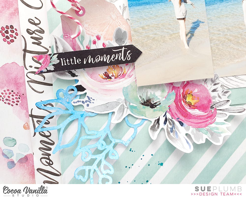
For my second cluster in the bottom left corner, I again used a large die cut floral piece from the ephemera pack combined with another section of the painted cut file. In behind the floral piece I tucked a pretty little tag (also from the ephemera pack), which I tied with a little twine. I then added the little moments labelled arrow, which I popped up with little foam tape to give it some dimension.
My third and final cluster was to be my title cluster. I had already picked out the living the dream die cut from the ephemera pack for my title piece (it was an easy choice – just look at that beach on a perfect Queensland winter day). I added another die cut flower and leafy branch, as well as the remainder of the painted cut file. I used foam tape under the title, which allowed me enough room to add a watercolour style Clear Sticker under the edge.
I finished off with a small die cut heart alongside my title cluster and then some tiny splatters of blue ink scattered around my page.
Thanks so much for stopping by today so I could share this with you. I hope I have inspired you to get some supplies out and create something pretty too. (Besides, we all need to make room for the new ‘Daydream’ collection coming soon, right?!)
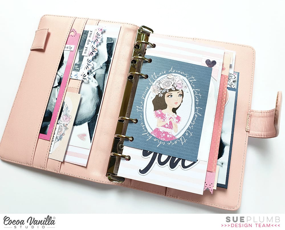
Hi everyone! Sue Plumb here to share my latest design team project with you. Today I am sharing a baby girl mini album I created using the super pretty ‘Midnight’ collection. (You may recall that I made one of these a few months ago for one of my sons using the ‘Boys Rule’ collection – you can see that post HERE) As it usually goes when you have more than one child, you can’t do something for one without doing it for another, hence I am back today with this album created for my daughter.
I began this mini album with an unbranded 6 ring pink planner I purchased from eBay. This planner came completely empty, and unlike the last planner I used (which was from Kmart), this one features a magnetic clasp to close it, rather than the elastic band. I also used an adjustable 6 hole punch (also purchased from eBay) that I set up to fit the rings in the planner.
I used pieces from most of the patterned papers from the collection, cutting a variety of sizes and shapes to use for the pages. I then punched each one with the hole punch, ensuring they were not all aligned the same so that they would sit at varying heights within the album. I also added some additional decorative detail to some of the pages using an assortment of border punches.
I created “tip-ins” for some of the pages using patterned paper adhered with washi tape. This allows you to extend on the amount of space you have on a page to add extra photos or journalling, or even hide journalling underneath, just like I did with my daughter’s birth story above.
Remember you don’t always need a photo on each page – it adds extra interest to an album to intersperse purely decorative pages, or pages that simply feature a sentiment throughout, such as the page featuring fussy cut flowers from the Bloom & Grow paper and a Die Cut Title word above.
Another way to help anchor photos into an album and ensure they appear as a cohesive part of the page design, rather than just stuck over the top, is to add embellishments that overlap part of the photos. Alternatively, don’t be afraid to use an entire photo as a page in itself and punch directly through the photo. (Matte photos tend to work better for this, rather than glossy.)
To continue to provide variety throughout the album, try turning some of the elements vertically on the page; or have a horizontal page opposite a vertical one. (It also adds an extra level of interactivity to have people rotate the album to look at them.)
A great way to include a series of photos is to print them as a photo strip and fold them accordion style with a tab sticker to pull it out with…
The photos fold out and then fold neatly back into the album, only taking up the same amount of space as one photo.
Create small pockets from scrap pieces of paper to hold journal tags. For a final interactive element, I uploaded a video taken during the drive home from the hospital with my daughter to my YouTube channel (set as private) and then created a QR code for it. This allows it to be scanned by a QR code reader on a phone that links to the video and plays it. (My children LOVE these!)
There is much more to this album than I could show here. If you would like a look at the entire album, I have a flip through below:
Thanks so much for stopping by today. Until next time, happy scrapping!
Hello Friends! It’s Anna here and it’s my turn to inspire you with a project created with Cocoa Vanilla Studio collections. This time I left the new “Happiness” line on the side and came back to a little bit older, but still amazing, “Midnight” collection. I am such a big fan of flowers added to this line and soft colors. Pretty combination of dark navy, pink and orange was so inspiring. I was in a mood for die cutting, and I didn’t mind some repetitive job to be done. I spend some time cutting out many hexagons out of “Sunset strip” paper. I knew I wanted to arrange them in the similar color order as they are on the original paper. This is the final result of my efforts:
Such a vivid combination of hexagons needed some calm background. That’s why I decided to use “Moonlight” paper as a base. White color and soft script font works great as a starting point of every colorful project. Each hexagon is mounted with a layer of foam adhesive to add extra dimension to my page.
Flowers cut out from “Sophisticated” paper are my favorite flowers ever. I love how sketchy and whimsical they look. They are quite easy to cut out too. I scattered them around the page. They created such a lovely embellishment clusters highlighting the feminine theme of this page.
Title of my layout is made with word from Die cut titles pack. This is such an amazing product, if you have problems with figuring out clever titles for your pages. I love the font, colors, everything about this product.
Final step of embellishing my page was adding bits and pieces from Ephemera pack and Chipboards pack. Just a little words and simple tabs. I didn’t want to cover too much of my pretty background. I also reached for older products – some glittery enamel dots from “Make a wish” and “Wild at heart” collections. They matched perfectly to this layout. I had so much fun playing with dies and paper creating unique background. Since I got my electronic die cutting machine, simple metal dies got neglected. Rediscovering them was very refreshing to my mojo.
Thank you for stopping by and see you in two weeks.
Hello crafty Friends. It’s Anna here with my newest page created with CVS goodies. I was cleaning my box with Cocoa Vanilla embellishments to make room for new line (how pretty is it, right? ) and I discovered the set of vellum pieces from “Bohemian dream” collection. It inspired me to use this line in my next project.
I also challenged myself to use up as many vellum pieces as possible. That is why I decided to use white background. Transparent vellum looks best on lightly colored papers. I arranged my composition in three rows adding machine stitching over the vellum flowers. Thanks to that I didn’t have to use a lot of glue, which doesn’t work well with vellum making it wave.
I enriched my composition adding bits and pieces from ephemera pack and few leftover chipboard stickers. I love this collection so much that I almost used it to bits.
I have a little tip for you for leftover ephemera pieces. If some elements are too big or you know you won’t use them the way they are, try to fussy cut elements from them like I did with few little birds. I cut them out from tickets and they became perfect, little embellishments.
I finished my composition adding few enamel dots from various collections, like those glittery ones from “Make a wish” line.
That is all for today. Thank you for stopping by and see you in two weeks.
Hello Friends! It’s Anna here with my project created for “Put a ring on it” theme week on the CVS blog. The new, amazing line has been revealed recently and I decided I need to make some space in my stash for new, pretty papers. I reached for the older lines and “Free spirit” one caught my eye. I was inspired by the color scheme and I decided to use it on my page. This collection is no longer avialable but you can easily replace it with some other, older but still pretty items from CVS. And you know what? You have a perfect opportunity to stock up on them becase there is a big sale happening on CVS site now!!! You have to check it out because what’s gone, it’s gone forever.
Because the theme of this week is all about circles, I decided to use a lof of them to build up my composition. I mixed several pattern papers in blue, pink and orange colors to cut my circles in different sizes. Before I glued them down, I used watercolor paints and painted circles on my white background paper. They are slightly bigger than the ones made of paper.
After my circles were done, I fussy cut some comic bubbles with words and hearts from one of the pattern papers and used them in my composition. I also added few bits and pieces from epherema pack. Wooden buttons are one of my favourite embellishments and I always tend to save them for later. I added few on them on the page too.
I finished my composition adding few enamel dots from various sets. I love how airy and delicate this page turned out. I must tell you I really love rediscovering older lines. I still want all the new stuff right after it appears in the shop but It feel so good to reach for older lines too. They all deserve to be loved.
Thank you for stopping by and see you in two weeks.
Sue Plumb here today to share my latest design team project with you. I am sure you have all seen the stunning new ‘Unforgettable’ collection that was revealed over the weekend? Such a beautiful range, I can’t wait to get my hands on it! Until then, I am still busying myself with the ‘Happiness’ collection, which I used to create this page.
I began my layout with the gorgeous floral print of the Meadow paper, which I wanted to use as a base. I then cut a piece of white cardstock down to 10×10″ and adhered it over the top, which left a 1″ border around the sides.
I then set about creating some layers in the centre of my page where my photos were going to be placed. I started with a piece of wood grain print paper from the 6×8″ paper pad; which I layered with a piece cut from the Frame of Mind paper; then topped it off with a yellow painted stripe cut from the Radiant paper from the More Than Words collection.
Once I had worked out exactly where my photos were going to be placed, I also added a scrap of the Expressive paper (that I had previously used to cut some hearts from); and a tag from the Die Cut Ephemera pack tucked in above my photos.
To embellish my page I started with a die cut flower pot and a rosette, which I placed on either side of my photos; along with a small tab that I added onto my layers above.
For my page title, I used the word lovely (also from the ephemera pack), which I adhered using foam tape to pop it up from the page. I paired this with the you are small phrase sticker from the Accessory Sticker sheet. To help ground my title, I also added a floral frame from the ephemera pack, which I tucked in behind.
I couldn’t resist adding some butterflies, so I fussy cut a handful of different coloured ones from the Bright & Beautiful paper and placed them in the top left and bottom right corners of my page to give a sense of movement through my design. I then added an extra one alongside my photos to provide the final point for my “butterfly triangle”.
I finished off my page with the stay colourful banner along the bottom edge, a few hearts from the Clear Sticker set and some small splatters of pink and yellow mist.
That’s all from me today. I hope I have inspired you to pull out your stash and get creative too. (Besides, you need to make room for the new ‘Unforgettable’ collection anyway, right?!) If you haven’t entered for your chance to win the entire ‘Unforgettable’ collection yet, then hurry – there are only two days left to enter! You can head to the giveaway post HERE
 I finished off with a few happy phrase stickers from the Accessory Sticker sheet placed onto the rainbow and my page was done. This whimsical scene was unlike my usual style of page, but I really had fun creating it and I am happy I could bring my vision to life. (And my daughter absolutely loves it, which is the most important thing, right?!)