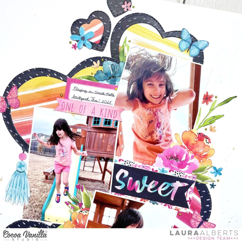
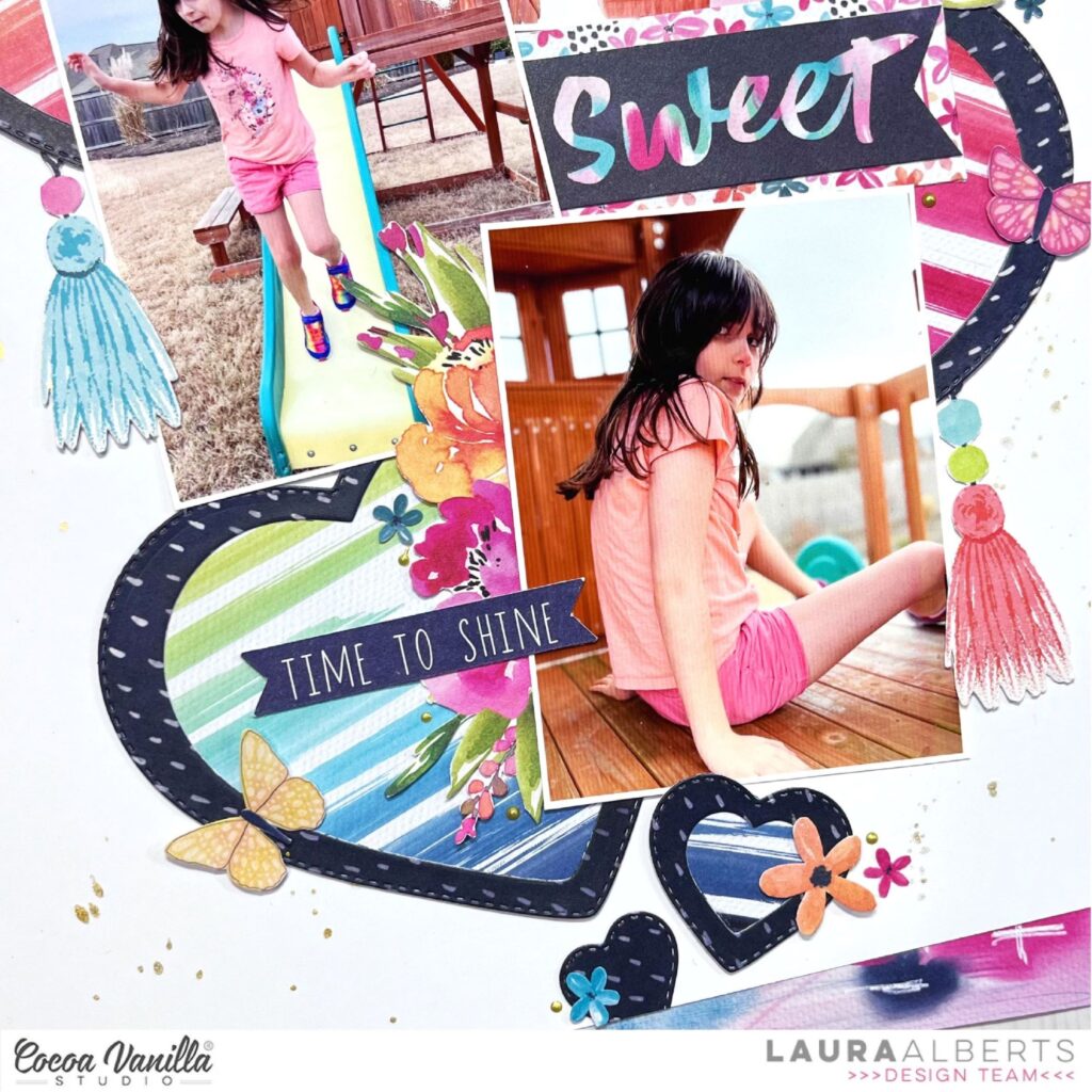
Hey y’all! Laura back again with a bright and cheerful layout using the stunning Happiness collection! I am completely enamored with the pairing of bright, bold colors with deep, dark neutrals like navy. This is one of those collections that makes me smile every single time I pull it out! Perfect for some fun in the sun, backyard playground photos.
For this background, I used a set of metal heart dies to create these fantastic heart shaped frames. I backed them with this stunning watercolor stripe patterned paper and layered them behind my photos in a vertical column. My photos are interspersed with stunning floral ephemera pieces, cut apart labels and words, as well as fussy cut shapes.
One of the highlights to this layout were these stunning tassels from the ephemera pack! Such a fun detail to hang from the heart-shaped frames. With a bit of Nuvo for a touch of gold detailing and gold ink spray to finish it off, this layout was done!
I hope this layout inspires you to dig out your older stash to have a play! Those collections from the past deserve some love too! To see how “Sweet” came together, check out my process video below:
Hello everyone. It’s Anna here with my newest layout. As I am waiting impatiently to dive into brand new and recently released new line called “Happy days”, I pulled out some older but still pretty collection from my stash called “These days”. If you do not have it yet, there are still plenty of elements available in CVS store and they have some crazy awesome prizes! So go quickly and grab it while you still can.
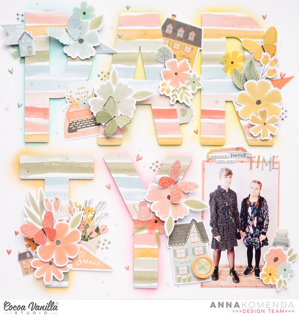
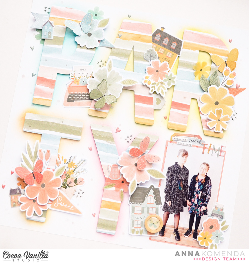
I scrapbooked picture I took the same day (totally fresh from the oven!) of my two girls getting ready for a birthday party. They are recently in the phase they both like dark (preferably black) colors so this mama is missing all the pink and pastel photos so much. That’s why using “These days” with it’s muted colors was a great choice.
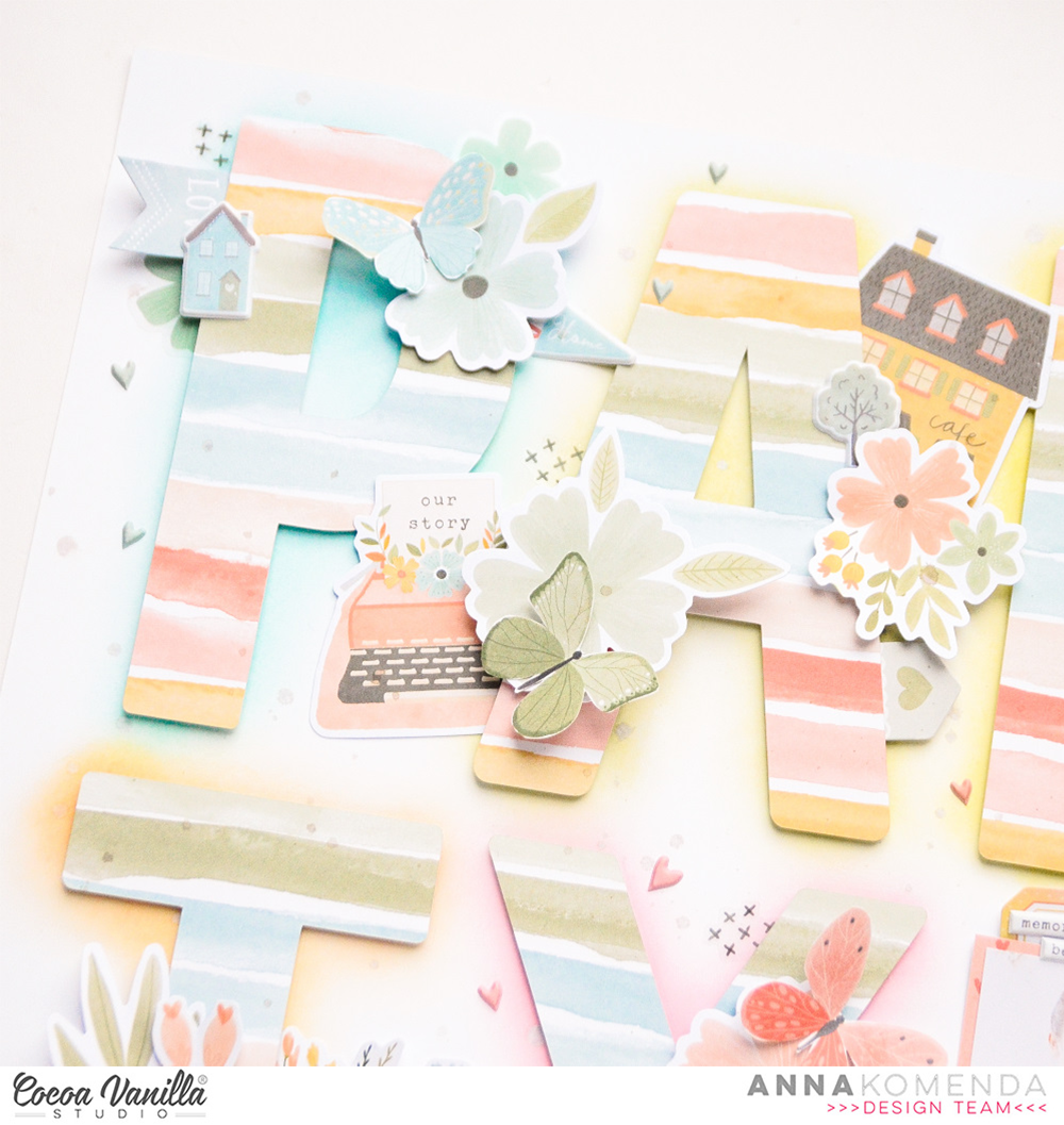
I started with cutting out big letters from a word PARTY with my digital die cutting machine using “Family ties” paper. This colorful pattern has all the colors present in this collection. I arranged my letters on the white cardstock and used my pencil to gently sketch an outlines of them.
Next step was chosing five different colors of Distress Inks and blending them under each letter stepping out ot the lines a little bit, to create sort of colorful shadow. The final result is very subtle, exaclty how I intended it to be. I still have plenty of flowers in my Floral Ephemera pack, so I picked a few adding them color on color (matching the inky shadow witht the flowers). Before I started glueing them down, I added a layer of foam tape under each letter for more dimension.
I love all the papers with elements that can be fussy cut from them, like flowers or butterflies. I always buy more than one paper and I can make myself plenty of extra ephemera pieces. It can strech your collection so much more. This was the case with beautiful “Take flight” paper filled with butterflies. I cut out few of them and added them on top of the letters. I also reached for Ephemera Pack and found more matching elements to tuck under the letters.
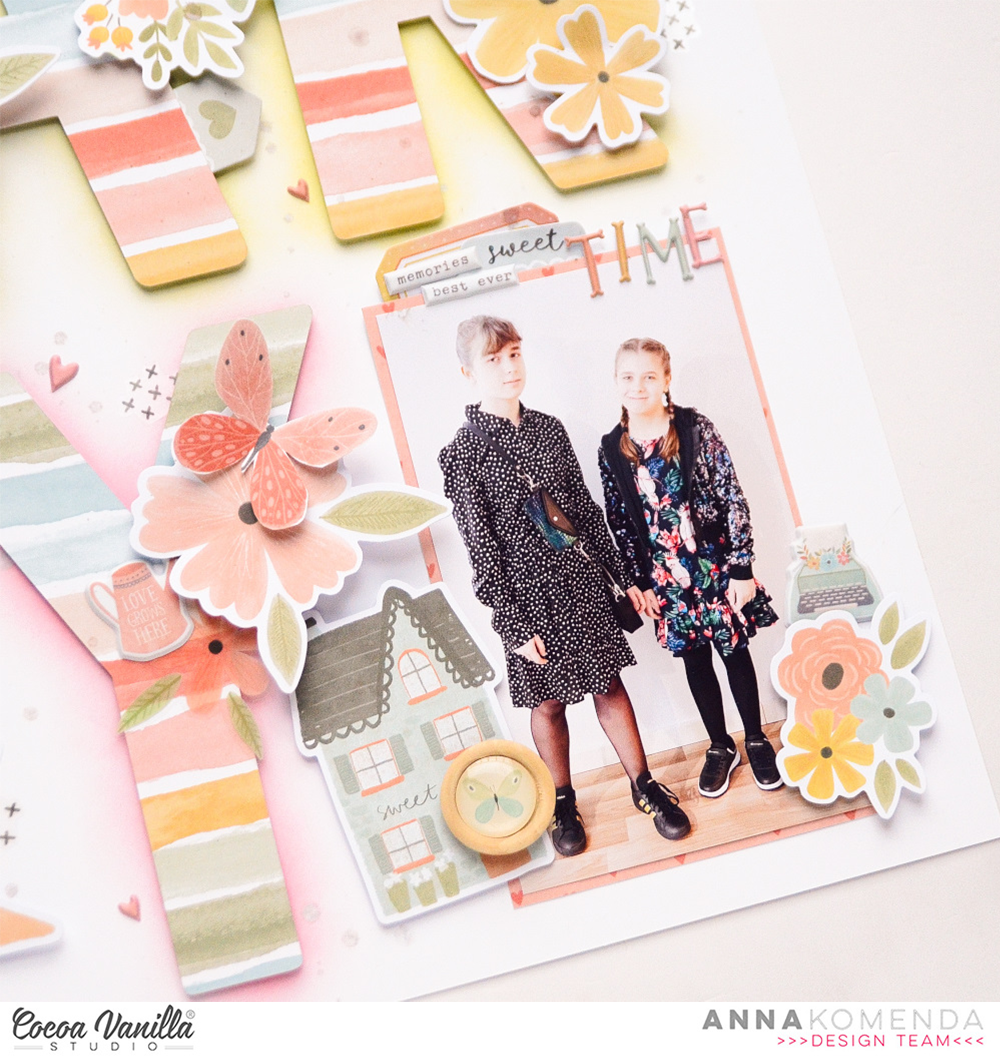
With my title almost done, it was time to finally add my photo. I had a perfect spot in the bottom left corner. Before glueing it down, I backed the picture with cute pattern paper with hearts called “Good life”. All I had to do was to add some smalled puffy stickers,clear stickers and 6*12 stickers here and there. I also finished my title adding word “time” using super cute puffy alpha stickers.
And voila! The page is done. Another memory scrapbooked! That is all for today. Don’t forget about the great discount on “These days” collection, that is waiting for you in CVS Shop! I am sure it’s not the last time I am reaching for this amazing line.
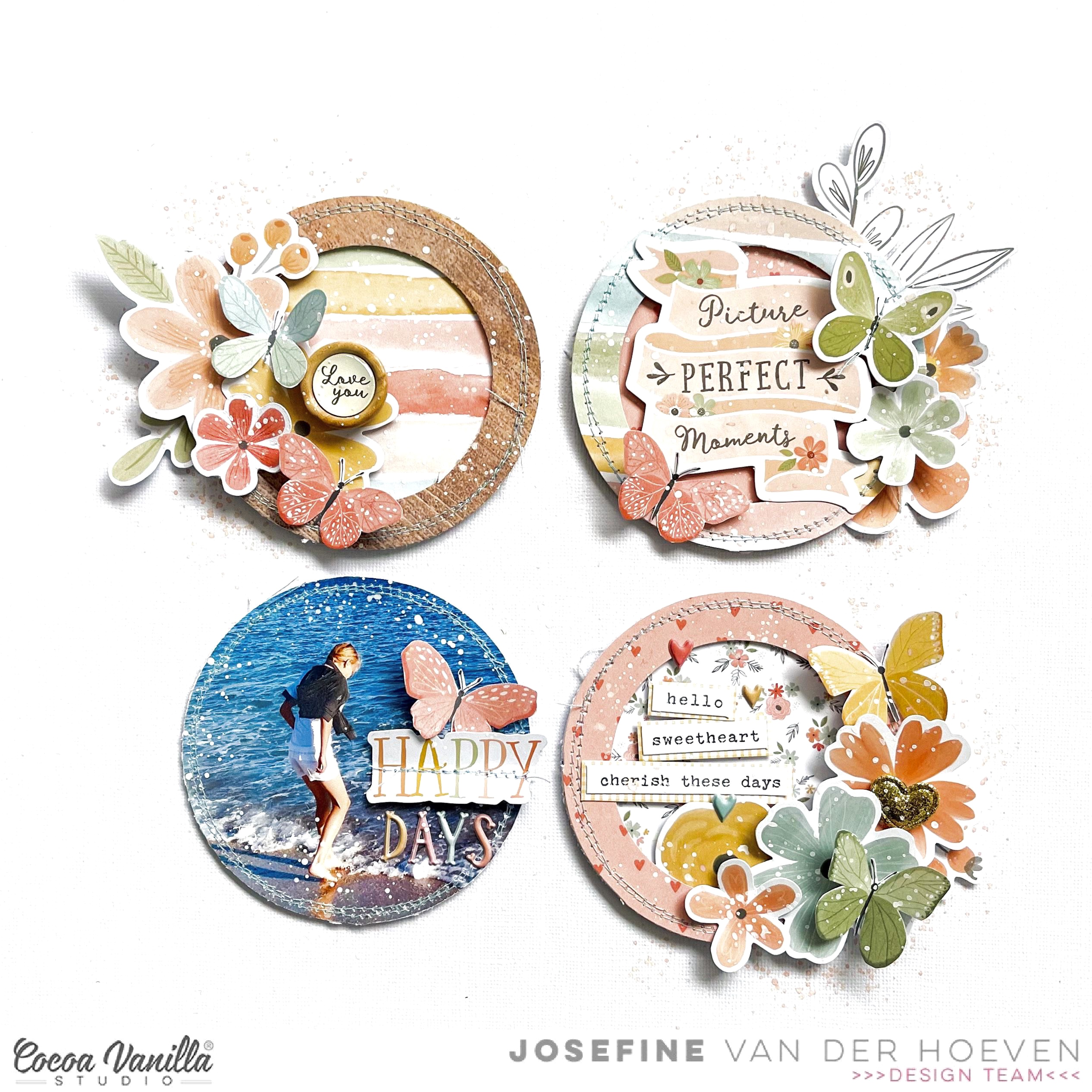
Hello Paperlovers, So happy to see you on the Cocoa Vanilla blog today! I chose the amazing collection “These Days” designed by of course Coco Vanilla Studio. I absolutely love the beautiful colors in this collection that fit perfectly to create a beach themed layout. With this blog I want to take you through my creative process…..
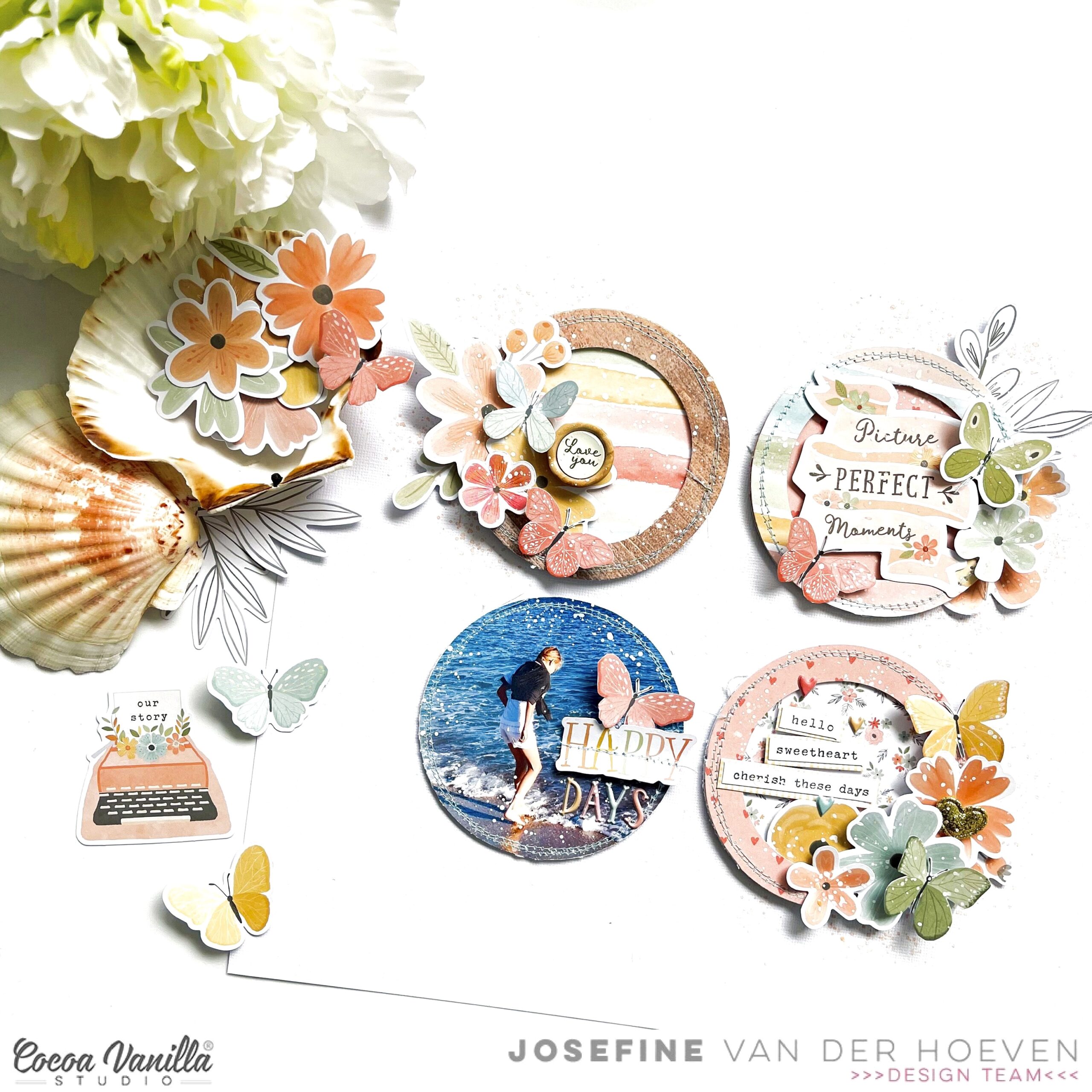
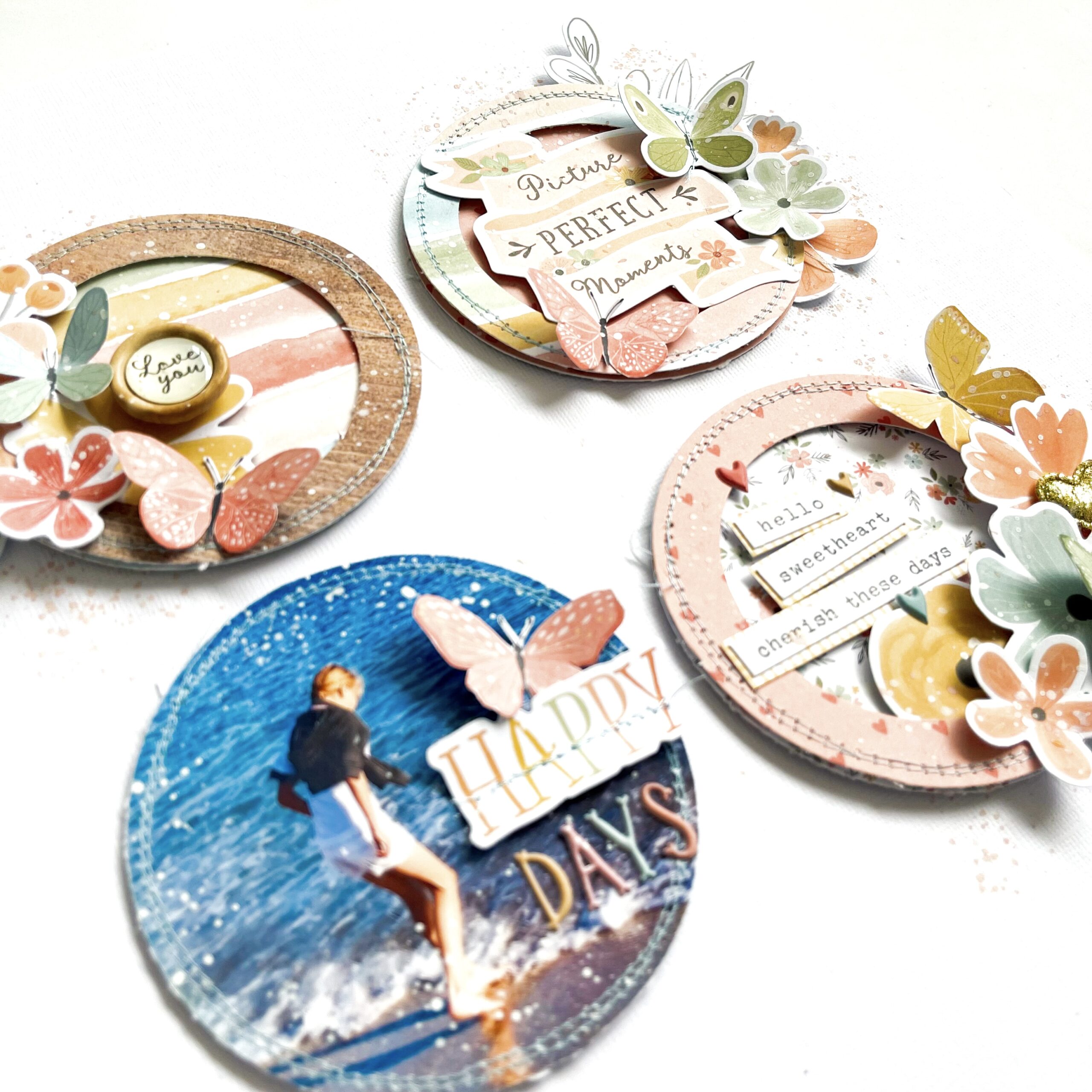
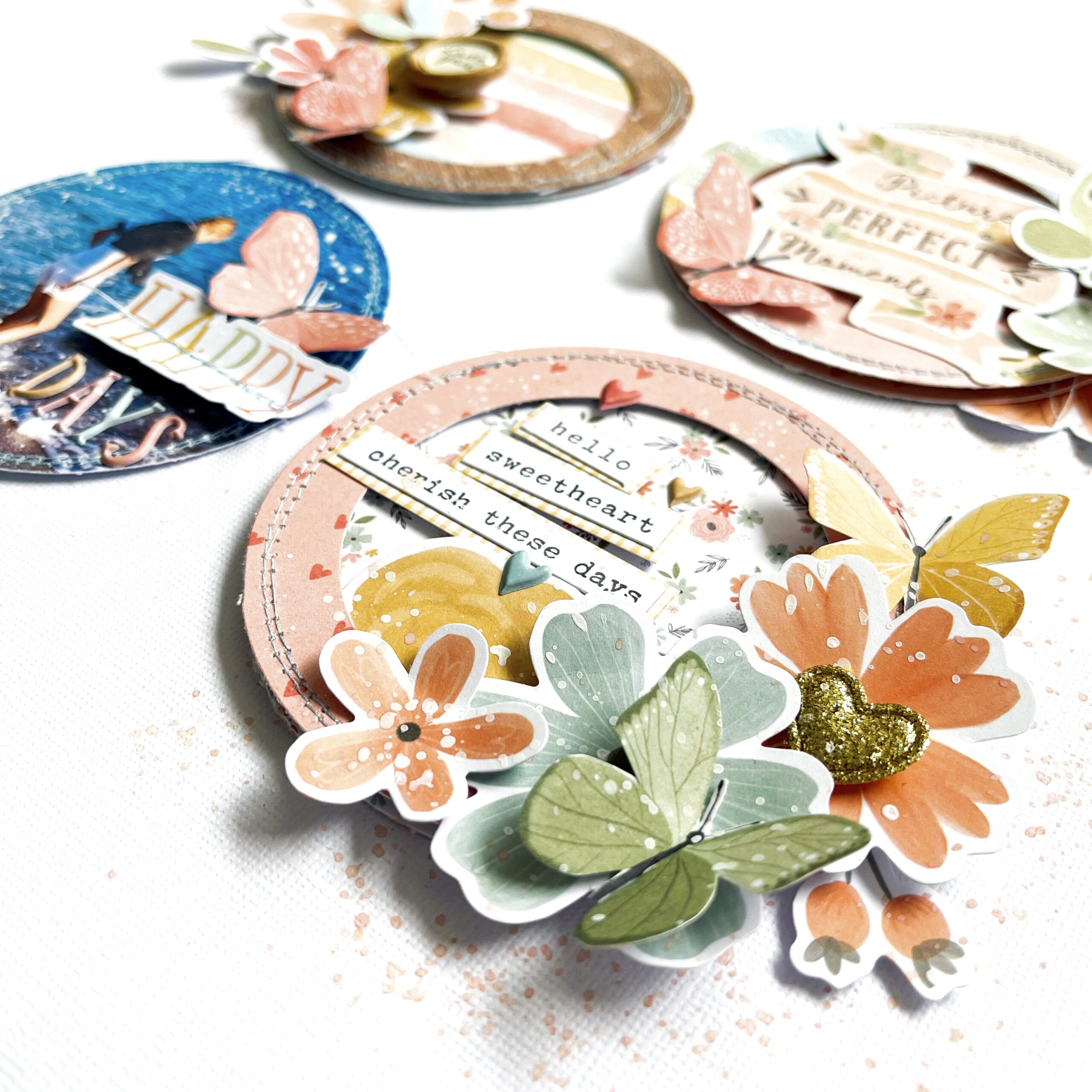
I started with a blank white cardstock sheet and took inspiration from cardmakers. Instead of one decorated circle, I place four in a grid pattern on my white cardstock sheet.I choose several pattern papers and cut out three circles. Then I cut out three circle edges. I add a light blue sewing stitch to these circle edges. I also provide the beach picture with a light blue sewing stitch.
I placed the circle edges with 3D tape on top of the pattern circles. This way I created more dimension and can slide the flower die-cuts between the layers much easier.
I love creating different layers with so many beautiful and different embellishments from this amazing collection. I choose different floral die-cuts, butterflies cut from patterned paper, wooden buttons, little cute gold colored heart and different word stickers. I absolutely love how the differents clusters turned out.
For the title “Happy Days” I used a shape die-cut along with the mini puffy alphabet. See the little title cluster on the photo. For a real beach vibe, I made a view white splatters with gesso. I mixed gesso with a little bit of water and I used a water color brush to splatter. I also made some light pink splatters using the Distress Oxide color “Saltwater taffy” I hope I was able to inspire you with this scrapbook layout and hope to see you on the blog next time. I wish you a happy and creative day. XoXo, Jo
There are Easter eggs and hot cross buns in the shop which means Easter is coming! I love creating for Easter, the colours, cute animals and an opportunity to gift your creations to others.
Today I am sharing a super cute Easter themed layout featuring my girl! Daydream collection is perfect for Easter themed paper creations don’t you think!
I firstly added a mixed media background choosing the blue/grey to add a contrast to my chosen papers. I next found a super cute bunny rabbit cut file from the Silhouette Design store. Instead of adding a pom pom to create the tail I decided to create a rosette to add extra dimension and visual interest. I also added some glitter to the rosettes for effect.
I cut a half rainbow from the journal cards paper which I tucked behind the smaller bunny and then added my photo over it. I matted my photo which is 3.5×3.5 inches, my photo is added with foam tape and finished off my adding a phrase sentiment tab from the Accessory Sticker sheet.
I found the perfect title for my layout from the Silhouette Design store, I did work out the placement before gluing anything down!
I fussy cut some butterflies from the 12×12 inch paper and added with foam tape except the yellow one which I tucked to the right of my photo.
Lastly I created a flower cluster under my larger bunny which add another contrast against the blue bunny, and to be honest every pretty layout needs flowers!
And there you have it, my first Easter project of 2023! This layout is a great way to use up smaller paper pieces and still create a fab layout.
As always, thank you for stopping by and see you later in the month where I will be sharing a BOY layout just to mix things up a bit!
Hello Paperlovers, And welcome to the Cocoa Vanilla blog. Today I have some new scrapbook. inspiration for you with the amazing collections “Daydream” and “These Days” These are the collections that make me love Cocoa Vanilla Studio so much! So beautiful, delicate and sweet.
I started with a piece of white cardstock. I cut the large black and white photo of my daughter into a circle. I choose a patterned paper from the “Daydream” collection and cut it into a slightly larger circle and place it behind the photo. Then I stitch the round border with light blue sewing thread.
For the butterflies, I used an older cutting template from Provocraft. Of course, you can use any butterfly cutting template you have in your stash. You can also use your electronic cutting machine to cut out a view butterflies. I choose different pattern papers from the “Daydream” and the “These Days” collection for the butterflies. (A small detail, I stitch the butterflies in the center with light blue sewing thread.)
I fussy cut several flowers from the patterned paper. Along with the butterflies, I create a two large clusters on each side. I use adhesive tape and 3D foam to create more dimension.Have you spotted the beautiful green fabric heart yet?
I cut a few extra butterflies from the pattern paper from the ” These Days” collection. I placed these cute little butterflies around the punched out butterflies.For the title, I used the mini puffy alphabet (These Days) and the die-cut Ephemera title (Daydream) I place the title between the two clusters below the photo. For an extra touch, I make splatters with white gesso and distress oxide (Saltwater taffy). I mix the white gesso with water and used a water color brush to apply the splatters to my layout.
I want to thank you for visiting the Cocoa Vanilla Studio blog today and I hope I have inspired you with this scrapbook layout. Hope to see you next time and have fun with the beautiful Cocoa Vanilla Studio collections.
XoXo, Jo
Hey Everyone it’s Michelle back with you today to share a super quick layout featuring the amazing Storyteller Collection. I’m still loving this collection with all its bright primary colours, perfect for documenting some first day of school photos that almost didn’t make it to print!
I knew I wanted to create something fast, simple and pretty all at the same time, and as we’re still in the month of ‘love’ I felt it needed to incorporate some kind of large heart design along with groups of pretty florals. The layout ended up being exactly what I was aiming for and will be a well cherished addition to Leila’s childhood albums for years to come.
I started off by finding a generic heart shape through google, and cutting the large shape out in the middle of some white cardstock using my silhouette. I adhered this piece to a second layer of white cardstock using foam sheets to give it some flat dimension.
I knew I’d be adding lots of colours to the layout in the way of floral clusters, so to avoid any pattern/ colour clashing I printed the photos of Leila in Black and White at just a smidge over 3x2inch size. I backed both photos with the woodgrain paper (Cross it Off) from the collection, added a couple of accessory stickers and adhered these pieces to the left of the heart using more foam sheeting to pop them up off the page a little.
The floral clusters came together so nicely but were probably the parts of the layout that took the longest. Fussy cutting is quite therapeutic, yet time consuming. I added a mix of ephemera pieces and accessory stickers to each of the groups to mix them up. The beautiful florals are from a mix of both the 12×12 and A5 version of the SpringFling paper.
I used a mix of adhesives for the clusters, mostly foam tape and glue dots for slight dimension.
There’s also a sneaky enamel heart within each cluster for a finishing touch within each group.
I created a mixed font title using the usual blend of both handwritten text and my beloved white alpha stickers, with the addition of machine stitching for extra detail and to keep them in place.
Here’s a closer look at how sweet these alphas are, lets all keep our fingers and toes crossed that they make an appearance back in the CVS store sometime in the future as they really are the best for creating titles with.
I added the usual gold ink splatters around the layout to finish it all off to, something I do to all layouts to make them feel complete.
Here’s one final look at the entire layout and all its white space goodness!
Well thats all from me today, thank you so much for stopping by to see another of my crafty creations using the StorytellerCollection. I hope you’re all still loving this collection as much as we all are, but I bet you’re all itching to see what the amazing Zoe comes up with next. Be sure to keep an eye on all our Social Media Channels for more scrappy inspiration from all the team here at Cocoa Vanilla Studio.
Hey y’all! Laura Alberts back again with my favorite Cocoa Vanilla collection of all time, Bohemian Dream! Everything about this collection makes me so happy. The mix of my favorite colors and those watercolor florals are just divine! For this layout, I had four 2×3 photos of my daughter exploring digital drawing and I wanted to create a vertical design.
For my title, I used a cut apart piece backed with navy cardstock to help it stand out. This perfectly encapsulates the creativity in our family and especially for my daughter. She is a brilliantly talented little girl and I love encouraging her to embrace it!
Alongside the right of the photos are tags made from cut aparts in the 6×6 paper pad and along the left are a number of vellum florals backed with white cardstock to really help them pop! Love the feathers peeking out from underneath my title to soften the edge of that cut apart piece.
I hope this layout inspires you to dig into your stash and find a collection that you love too! To see how “Embrace” came together, check out the process video below:
Hello crafty Friends! Almost each year I have a pleasure to inspire you on Valentine’s Day and this year is no different! I thought that instead of another layout, I will share with you three simple cards I made for my Valentines at home – hubby and two daughters. Each year I keep making cards for them adding few love words inside to show them my appreciation for each of them. I also add something sweet as a little bonus :) This year I decided to dive into older stash and found some papers and embellishments from “Midnight” collection. This line was an amazing combination of soft pink and coral with very dark and deep navy and purple. And those florals… They were so pretty and unique.
Each card has a similar composition with a little shaker in the middle, filled with sequins and some wood veneers from very ancient CVS collections (I still have a box full af them and I keep adding them here and there to many projects).
One of the cards is for my hubby and I made it darker than two others. It also doesn’t have any florals. I added little jars filled with hearts instead. One of them is from Ephemera Pack and one is taken from the 6*12 Stickers Sheet (yes, I still have those too :) – I am a hoarder). “Midnight” collection came with a set of Words Die Cuts but I already used up most of the love related words so I reached out to similar set from “Happiness” collection. It has similar font and similar color so it was a perfect match!
Second card is for my younger daughter and it also has shaker in the middle. If you look closely, you will notice that for my card bases I used a pattern paper. I am using my A5 Paper Pads for this purpose. Each card is sized 10*14 cm and it helps me use up some of the older papers! The good thing about those Paper Pads from CVS is that they are white on the back! Perfect for adding personal message inside the card. This time I added some flowers from Ephemera Pack trimming the whote outline first. This made them a little bit smaller and a better fit for the card. My card title is the only one made with “Midnight” Words Die Cuts. It was the only full phrase in love theme that I was able to create with it.
Last card is for my older daughter. I tried to keep it a little bit less “sweet” as she is teenager now, who prefers black over pink :). I couldn’t help myself and added few flowers, but they are a bit smaller than in the previous card. I made my shakers using a frame die with a cute scallop border. After die cutting the frame, I backed it with a piece of acetate and used foam strips to build volume. All I needed to do is to add some sequins inside and job was done!
Do you make your own Valentine’s Day cards? Or you do not like giving them? I know we need to show our love and appreciation each day, but it never hurts to highlight it even more on the Love Day!
Thank you so much for stopping by and see you in two weeks! Sending you all tons of love!
Hey y’all! Laura Alberts back again with a little bit of wedding inspiration using one of the older Cocoa Vanilla Studio collections in my stash, Midnight! I absolutely love the elegant designs and mix of dark navy with pink and purple in this collection, making it perfect for my wedding photos.
Using a large 6×8 photo on this layout filled most of the page, so I kept my embellishing simple with a long border of florals and chipboard hearts down the right side. Behind the florals, I added a few clear stickers to give a tiny bit of detailing to the layers. I tucked a black and white floral underneath the photo and added a layer of vellum to mat my photo.
On the bottom left, I created a journaling spot with a 3D effect by layering frames, a cut-apart piece and a tag. I love how this blends in beautifully with the floral paper in the background, but still adds a pop of interest to the left side of the page.
For the title, I used a die cut ephemera piece, layered it on top of a chipboard banner, then tucked a mixed media style clear sticker underneath. All of these layers give my title depth and dimension. My favorite part is always the Nuvo trails behind the butterflies!
I hope this layout gives you a little inspiration to use for your next formal event!
I decided to use a big black and white photo of my sweet Sabrina at the beach as the focus on the page. I layered it with tissue paper and foam adhesive, and placed it to the right of the page.
I used a cut file from JustNick Studio named “Travel often” for both my title and suitcases. I backed them with different patterned papers from the Sunkissed A5 paperpack.
I fussy cut beautiful florals from the “Growing Wild” paper and mixed them with floral die cuts arranged in clusters around the suitcases and title. I also added a lovely umbrella, a banner and a few fussy cut clouds to decorate the page.
I grounded everything on a teared piece of the “Just Chillin‘” paper.