Feelin’ Fine | Sunkissed collection | Sue Plumb
Hi everyone,
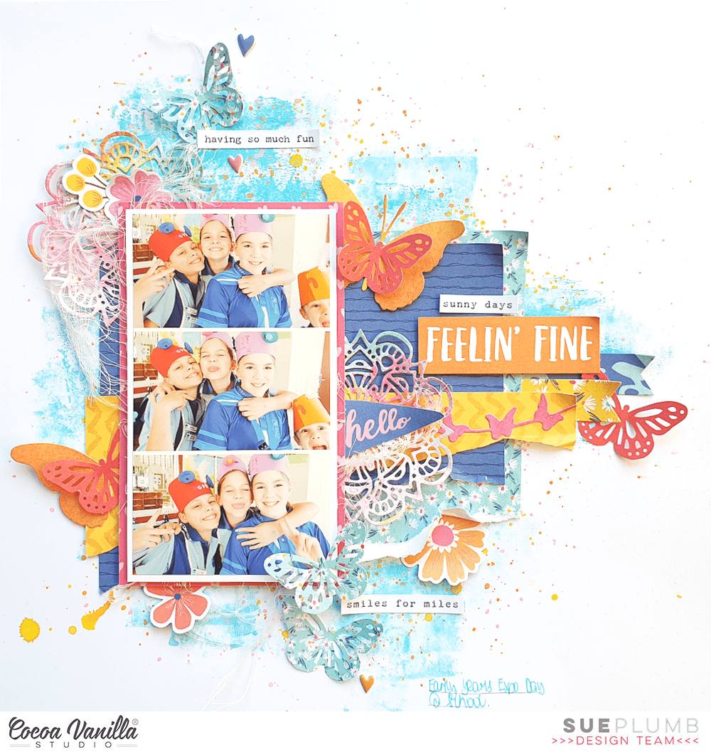
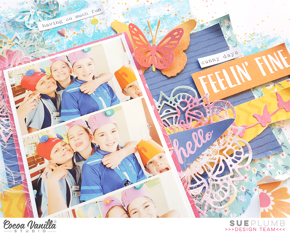
It’s Sue Plumb here to share my latest design team project with you. This week our team were challenged to pull out some dies or punches from our stash and use them in a project. It’s been a little while since I used my dies, so it was fun to dig through them and choose some to use. I had already decided to use the ‘Sunkissed’ collection, because I thought the beautiful bright colour palette would work well with this fun series of photos of my daughter and her friends.
I began my page with a sheet of 300gsm white cardstock. This cardstock is by House of Paper and is my absolute favourite to work with. It’s a great weight, takes mediums well, is a beautiful bright white, and it’s super smooth and silky to the touch. And the best part? It’s now available in the Cocoa Vanilla Studio store! (Also available in 250gsm for those who don’t want it quite as thick.) If you want to grab some and try it for yourself, you can find it in store HERE
I started by adding some colour to my background using a brayer and a sky blue acrylic paint. I also added pink, orange and yellow splatters of ink.
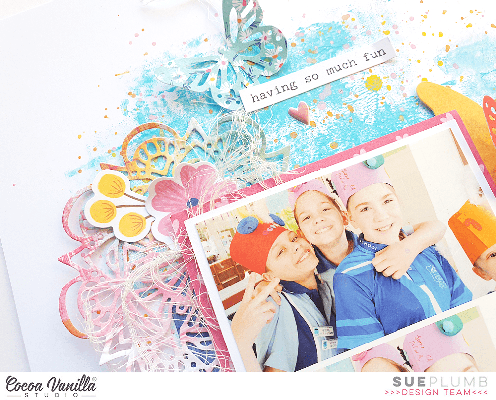
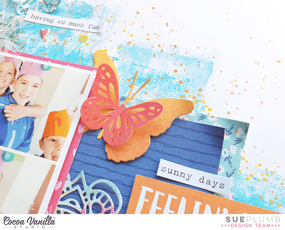
With the paint dry on my background, it was then time to start adding some paper layers. I chose the blue striped pattern from the Bright Side paper, and the blue tiny floral print from the A5 Paper Stack. (This paper is exclusive to the stack and not available in the 12×12″ size.) I also had a scrap of a yellow chevron print that I layered over the top. I matted my photo strip using the heart print from the Feelin’ Fine paper and added frayed gauze before sticking my photos down.
When it came to incorporating the dies into my project, I didn’t really consider exactly how I was going to use them before I cut them out. I just grabbed some small scraps of paper that I had left from previous projects and cut each of the different shapes from different patterns.
If you know my work, you would already know that I love using doilies on my layouts. So it should be no surprise that one of the dies I chose to use was a small doily design. I cut two of them using the Feelin’ Fine paper, and tucked them in under my photo mat at the top left corner and along the right edge. I also had a sweet little butterfly banner that I had cut, which I added on top of the yellow chevron paper.
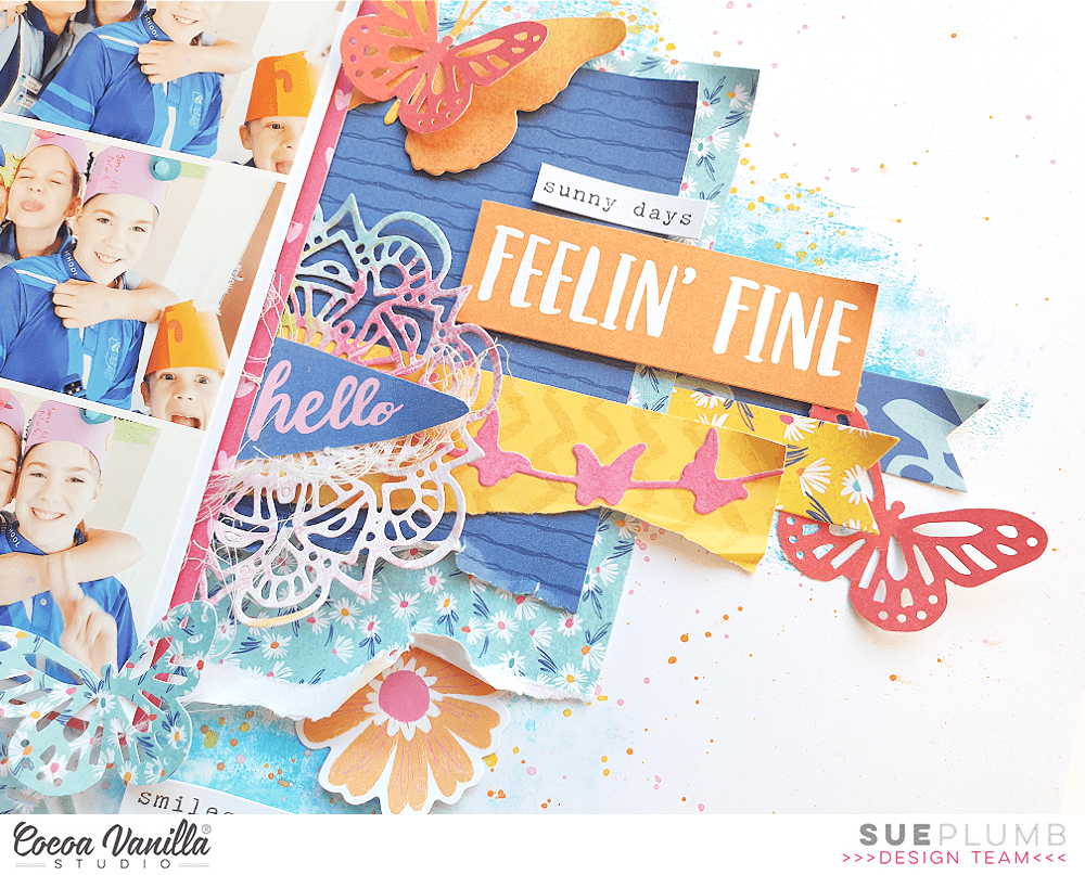
I had some large butterflies that I had cut using a die and the Summer Lights paper, which I layered with some punched butterflies using the same paper. I had also punched the same butterflies in the small blue floral paper, which I added at the top and bottom of my page.
On the right side of the layout, I tucked some die cut banners in under my layers and then placed my feelin’ fine title piece (fussy cut from the Fun in the Sun paper) popped up on some foam tape.

I added a few flowers from the Floral Ephemera pack, as well as a few phrase stickers from the Accessory Sticker sheet. I finished off with handwritten journalling and a few small hearts from the Puffy Sticker pack.
I love challenges like this that remind me to get out some of my under-used tools and put them to work. I ended up using four different dies for this page, as well as a punch, so I’d say that was mission accomplished! (And the best part was, I hardly used any extra embellishments because the dies, punch and papers did most of the work for me.)
If you would like to see exactly how this page came together, you can watch my process video here:
Thanks so much for stopping by today so I could share this with you. Until next time, happy scrapping!
 I fussy cut out the rainbow from the
  I next made three tropical flowers slightly varying in sizes. I used a cut file from the Silhouette design store. I used
  I added my 5×4 inch landscape photo with foam tape, tucking under the sun
  I created an embellishment cluster focusing on the drinks and fruits from the die cut pack and Puffy Stickers finishing off with some phrase sentiment die cuts. To avoid my layout looking ‘flat’ I added these elements with foam tape.
 Due to the colour overload I ensured there was enough negative space between embellishment clusters. I love creating layouts that have ‘no people’ photos and focusing on those little life pleasures which are just as important to document. Thank you for stopping by today!


 My photo is of my daughter at one of our gorgeous beaches in Western Australia. I used a swimsuit cut file from the Silhouette Design Store. I placed this on a slight angle of my page but only putting double sided tape in the middle of the swimsuit so I could tuck some


