Fall Days & Lattes | Heart & Home | Rachel Lowe
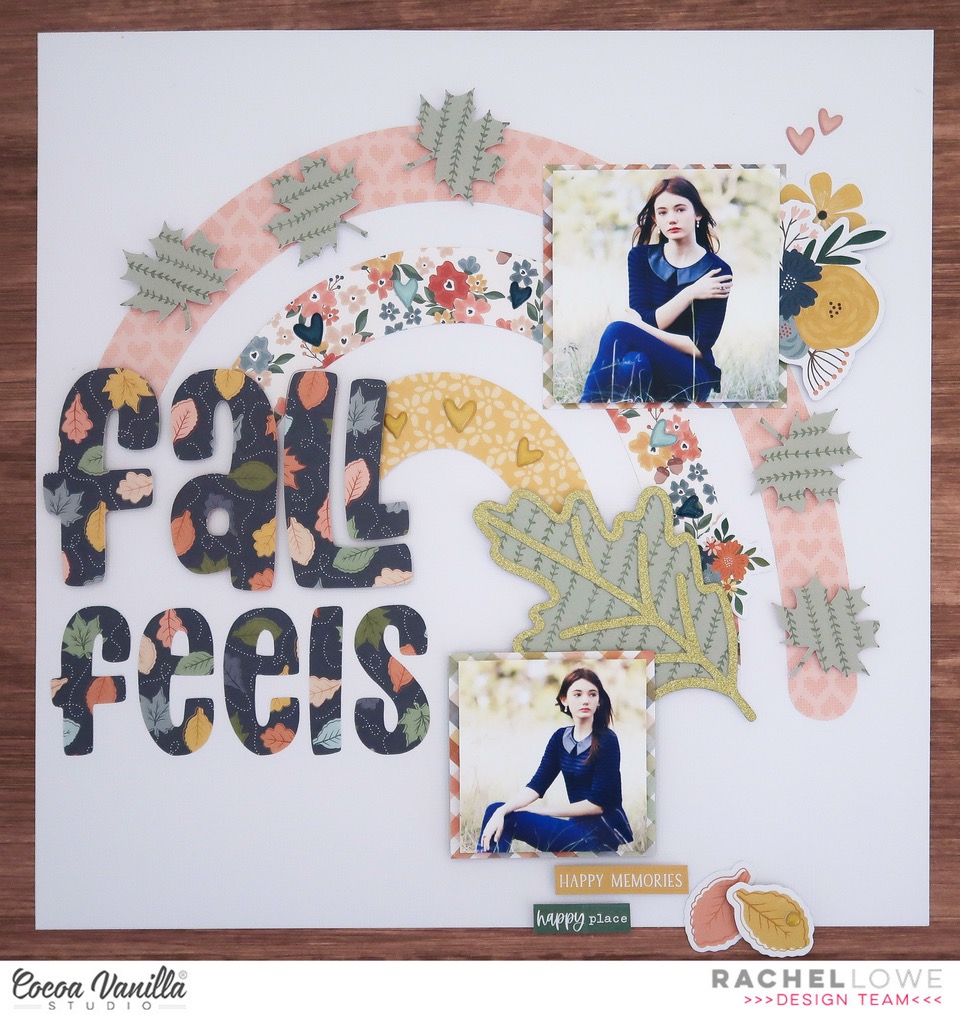
Hey CVS friends Rachel here! I decided to do a 8.5 x 11 inch layout just to mix things up and today I am sharing another Fall themed layout using Heart & Home collection. I personally prefer Mocha to Lattes but I think you get the idea.
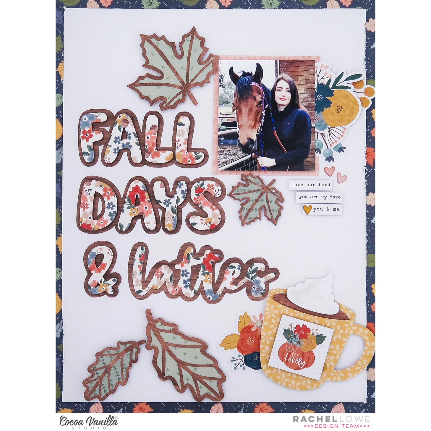
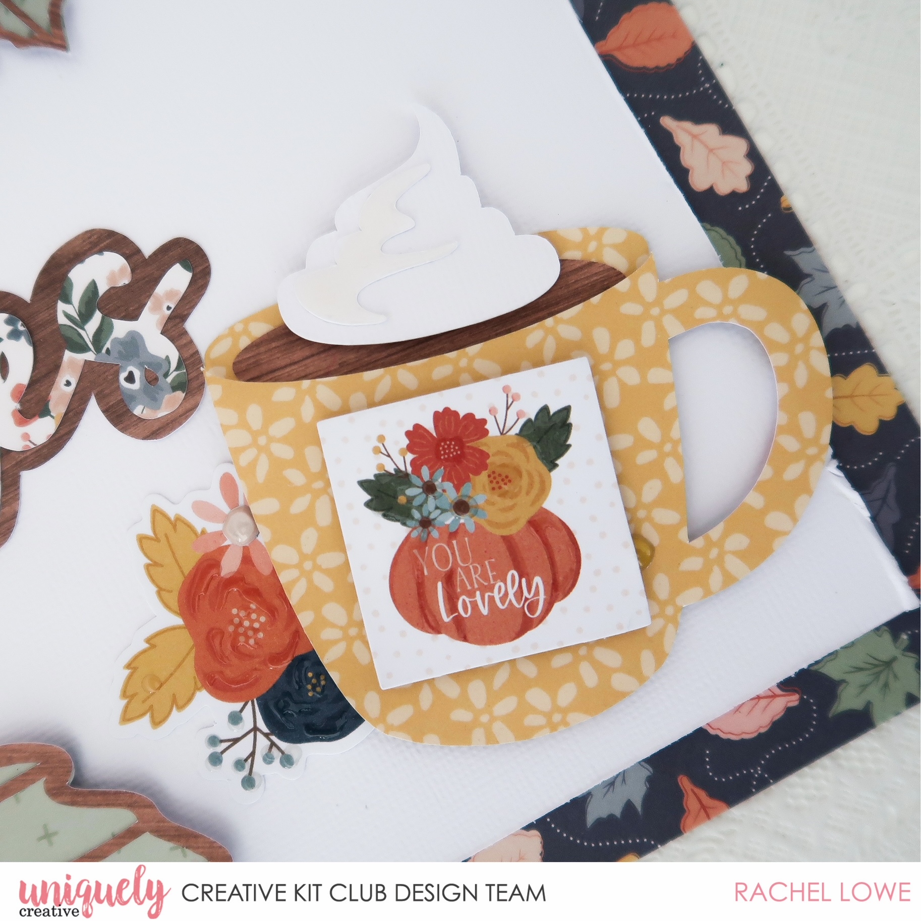
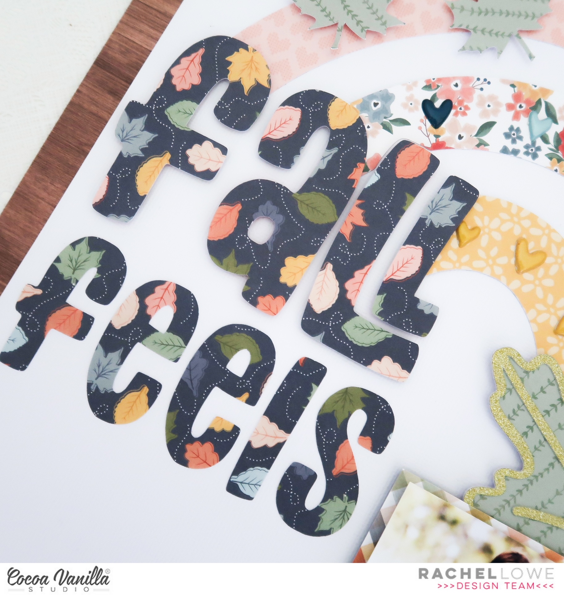
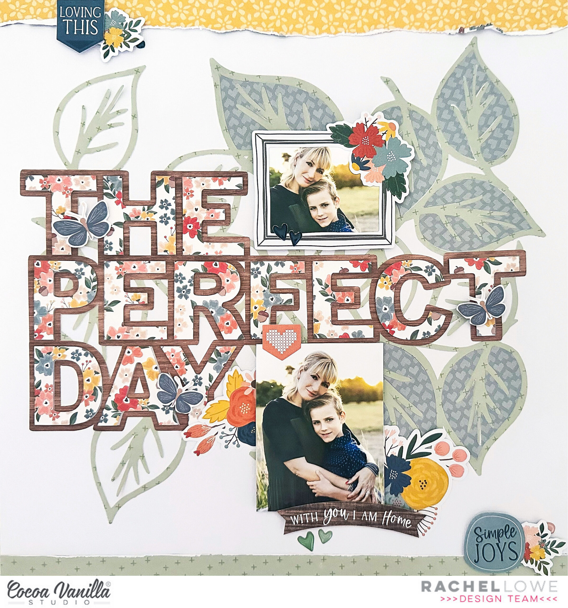
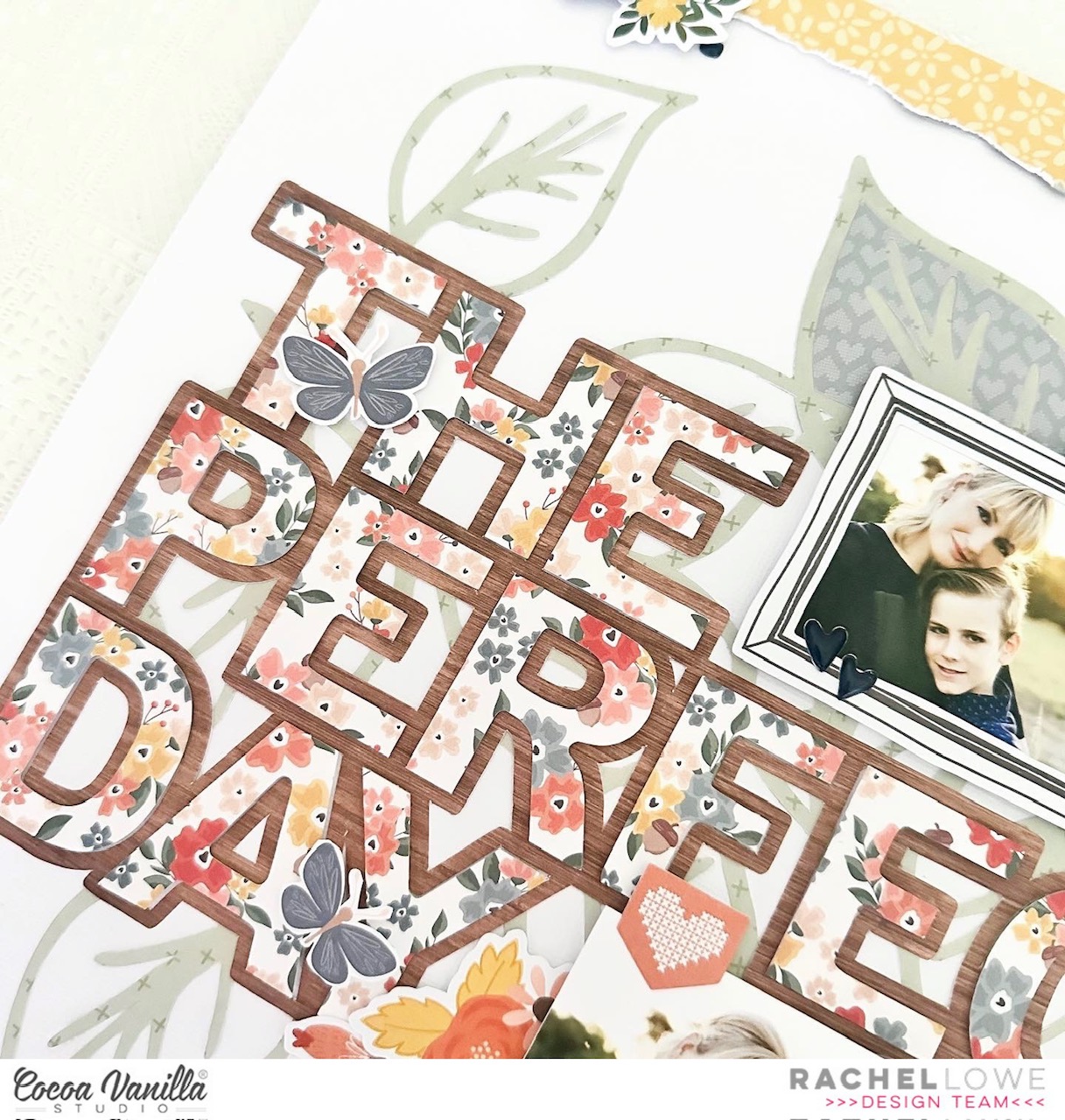
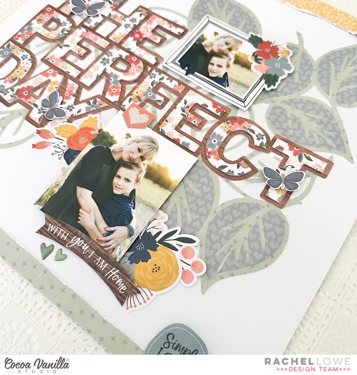
I found this fab cut file from the Silhouette Design store, isn’t the mug just too cute with the dollop of cream on top. I layered my title using the Framed paper woodgrain side and then adding the smaller font using the Golden Fields paper small floral print side. I added with foam tape to create dimension.
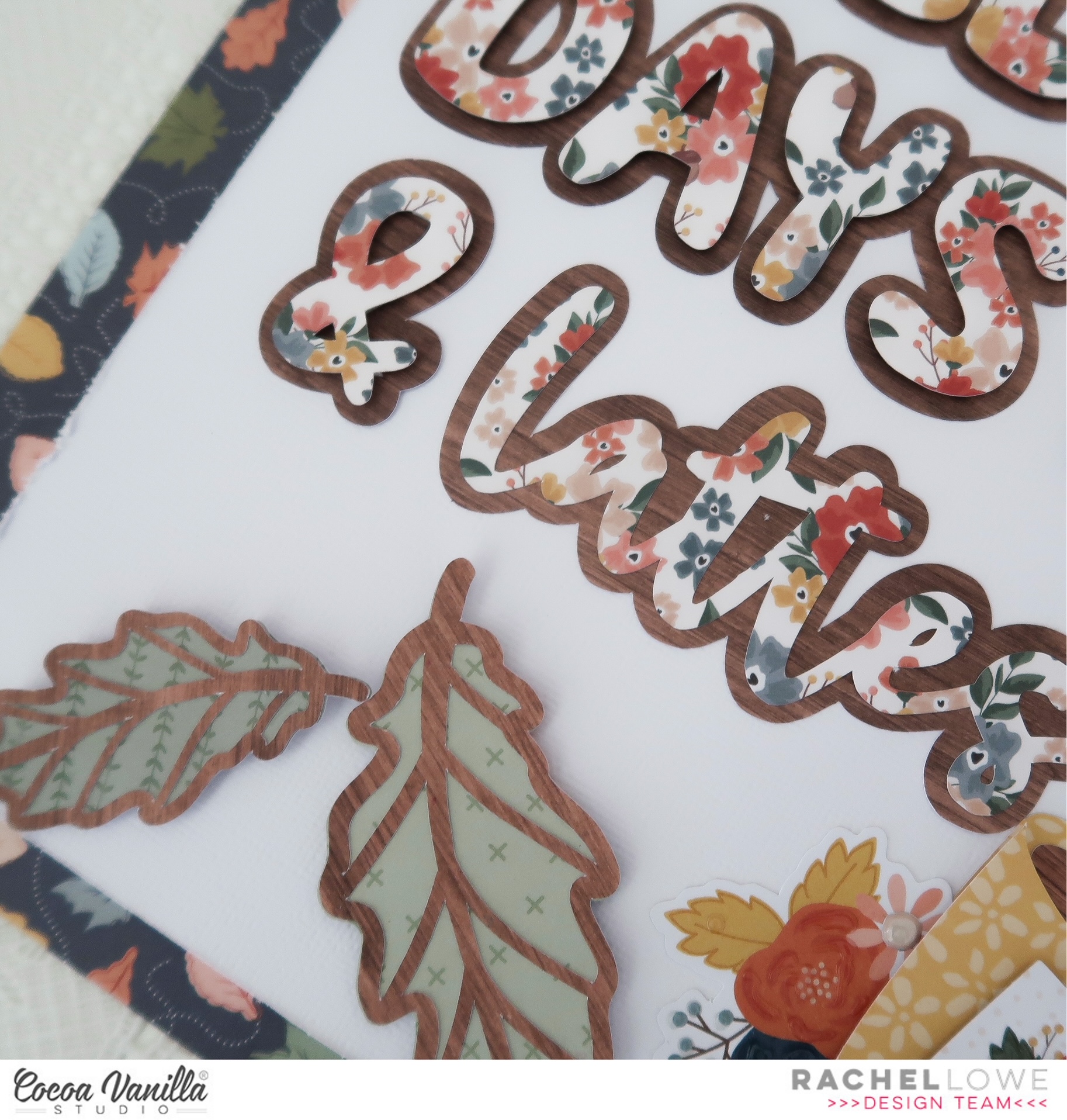
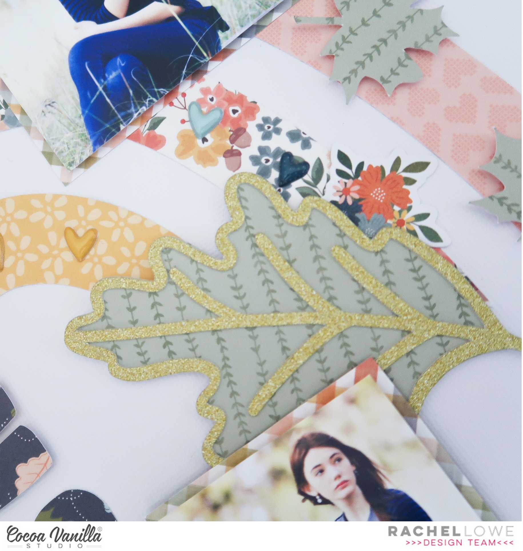
I cut the outline of the leaves using the Framed paper and agin woodgrain side. I paper pieced them with this green paper from the A5 paper pad, I save my 12×12 inch papers for larger projects and utilise the A5 size for smaller pieces.
I next created the mug using the woodgrain paper which mimics the colour of coffee (or mocha) and used a bright yellow paper from the A5 pad. I used white cardstock for the dollop of cream on top, I did add some Dimensional Magic gloss but my photos don’t show it well but it certainly created a great effect on the white cardstock. I added to my page with foam tape. To finish off I added a phrase sentiment from the Accessory Sticker sheet and added a small floral bunch from the Die Cut Ephemera pack. You will see here I also added some Puffy stickers to add contrast.
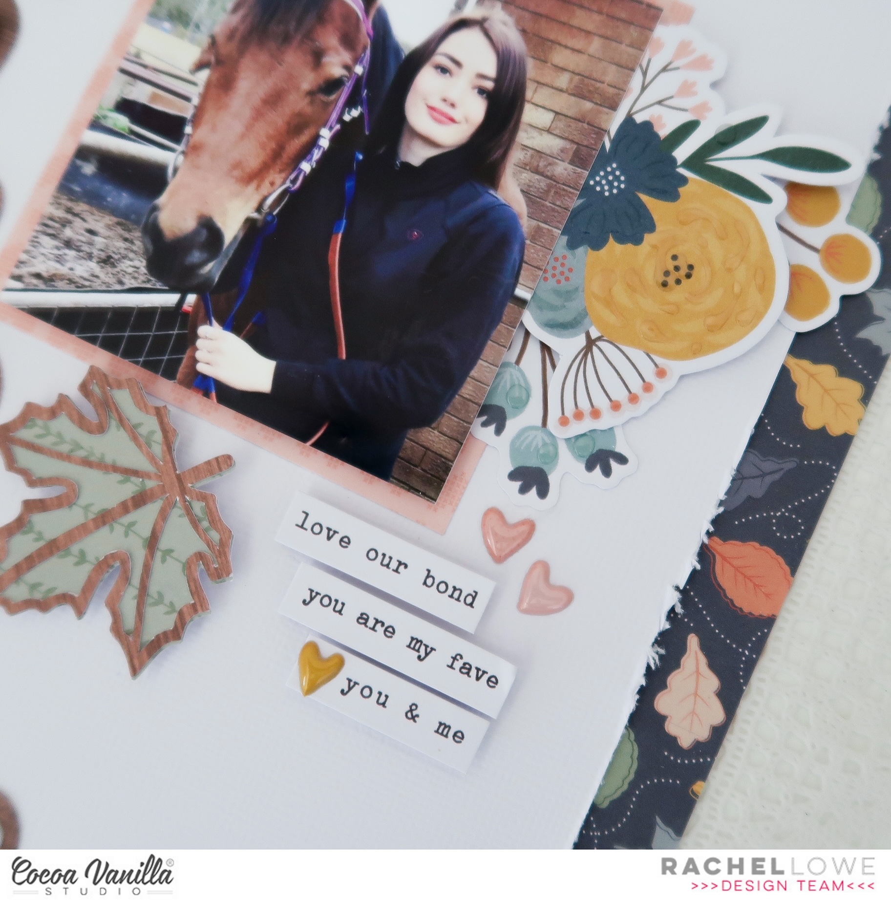
I added my 3×3 inch photo of my daughter with her horse which I matted and then added with foam tape. I tucked under another floral bloom, layering it by adding extra sprigs from the Floral Die Cut Ephemera pack. I used phrase sentiments from the Accessory Sticker sheet and finished off by adding some Puffy Stickers.
I chose to use a dark border to lift my layout and the Flurry paper was perfect!
This is a simple layout you could easily scrap lift. You could also add a larger photo or turn it into a 12×12 inch layout by enlarging the cut files and photo.
As always thank you for stopping by today.
Rachel X


