Epic | Legendary Collection | Melissa Vining
Hello everyone!! Its Melissa here and I’m so happy to be back with you again! Our theme is “Home is Where the Heart Is” and I decided to scrapbook a photo of the lake that is 5 minutes from my house that I regularly ride my mountain bike around, and I definitely consider it home as my area was even named after it! Legendary is the perfect collection for documenting outdoor photos and stories!
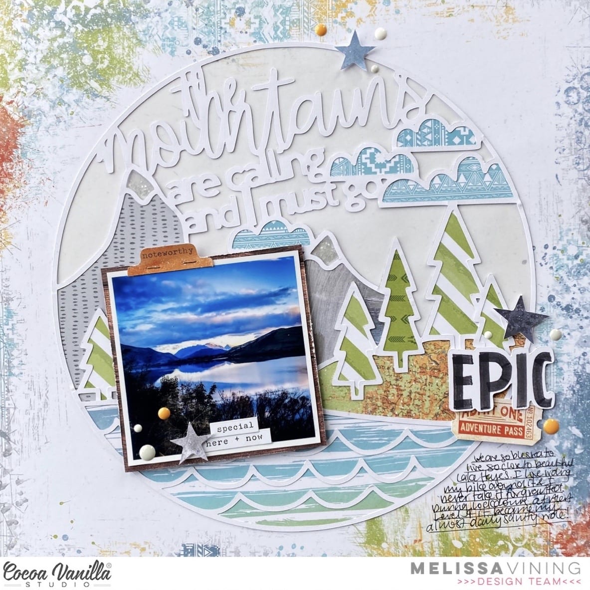
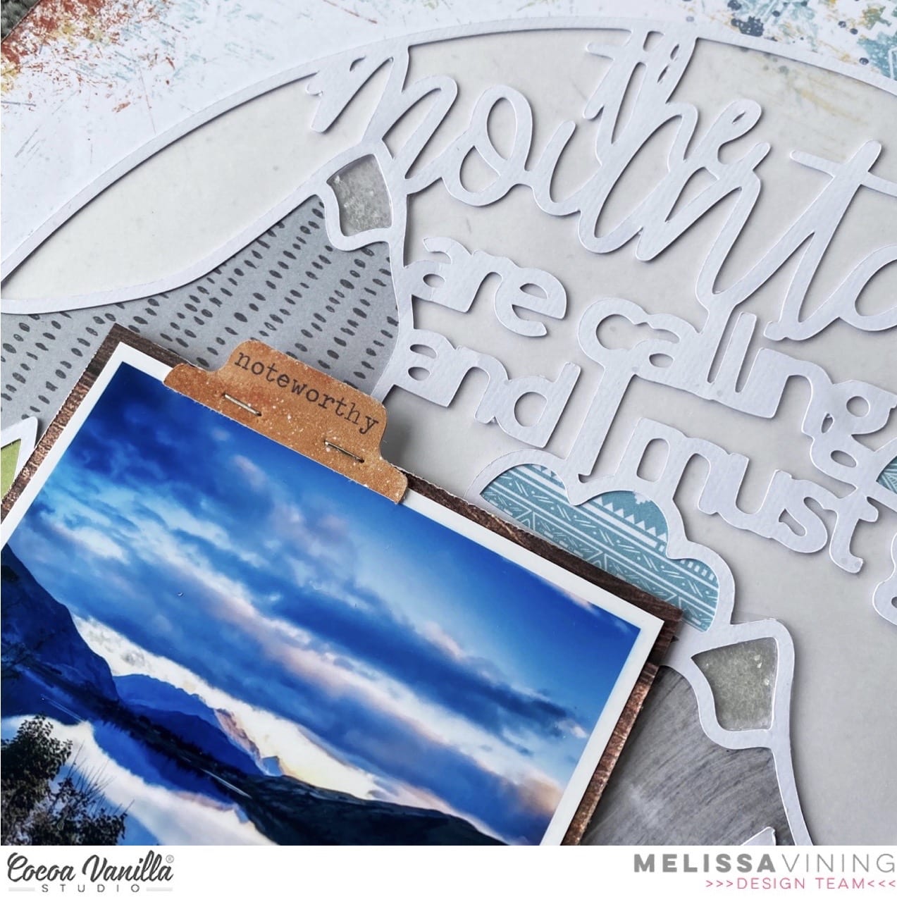
I live in Queenstown New Zealand, which is an alpine resort that has mountains and lakes. I chose a cut file from Paige Evans with a phrase that was perfect for a home layout because I literally live between a mountain range and a lake. I choose “OFFBEAT” for my background paper because its border features and mixed media look was perfect for the cut file and my photo. 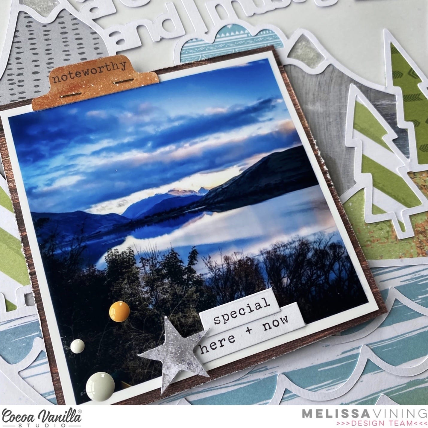
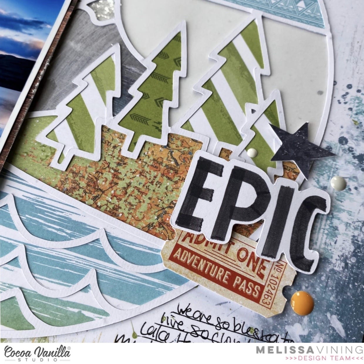
In order to back my cut file I selected patterned papers that suited the landscape theme of the page. The blue and white stripes of “WILD ONE” were perfect for the waves on the lake, for the trees I used “EXPLORER” and a green pattern that I cut from “TOTAL LEGEND” which includes lots of cut apart patterns. The map print on “OUTDOORS TYPE” was perfect for the grass, and I backed the mountains with “ALL STAR“, and “BRAVE HEART“. For the clouds I used “TOTAL LEGEND” which I orientated in two different ways for some visual difference. I made tiny shaker pockets with white glitter for the snowy caps of the mountains.
I kept my embellishment very simple because the cut file did so much of the work for me. I backed the large open part of the cut file behind the words on the cut file with velum. And for this reason I didn’t add any mixed media like splatters because I didn’t want to add too much extra detail. I embellished with stickers from the “ACCESSORY STICKERS“, and stars a ticket and a tab from the “DIE CUT EPHEMERA“. My title is from the “DIE CUT WORDS”.
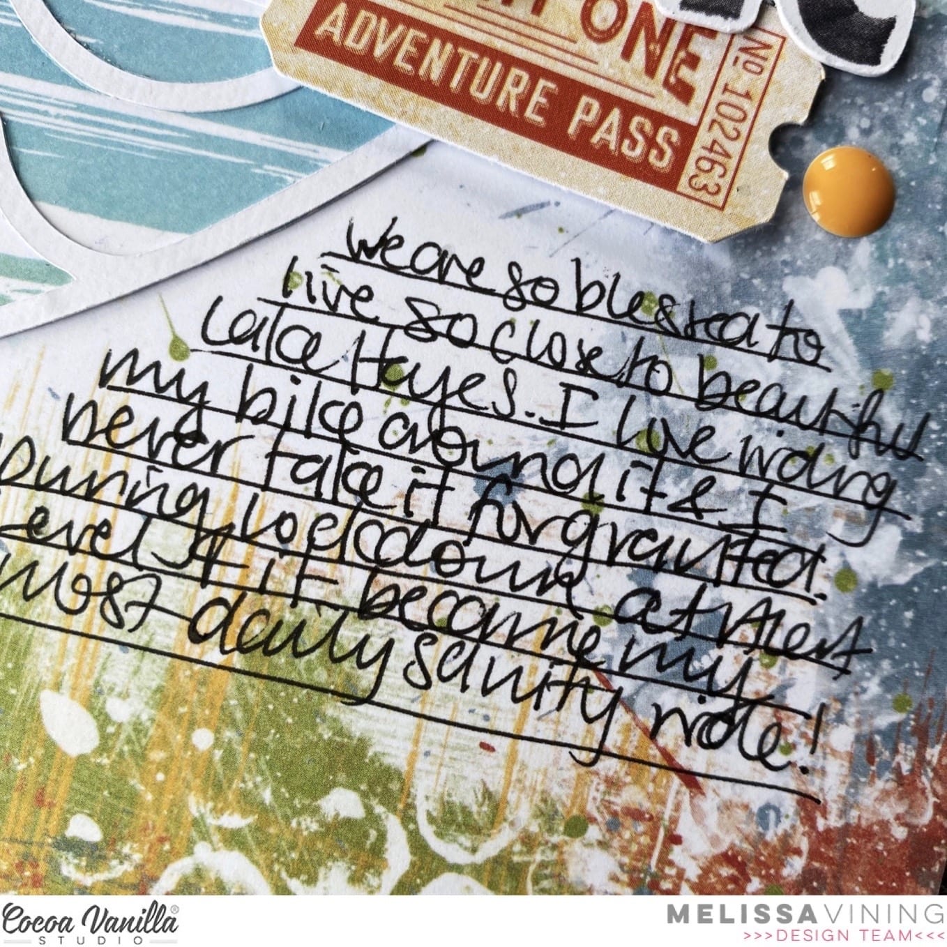
You can read my hand written journalling below, and my final touch were some “ENAMEL DOTS”.
I also made a process video, which you can watch below:
Have an awesome rest of your week!
Melissa xx

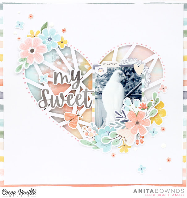
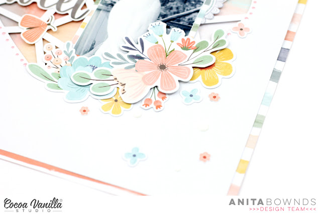
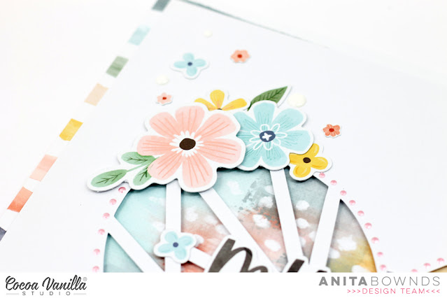


 I cut a piece of white cardstock to 10×10 inches. I added some turquoise paint brush strokes randomly across the page and splattered lightly with some black paint (this is as messy as I can get lol). I then added messy machine stitching in a turquoise colour. I also tore some of the white cardstock edges for texture.
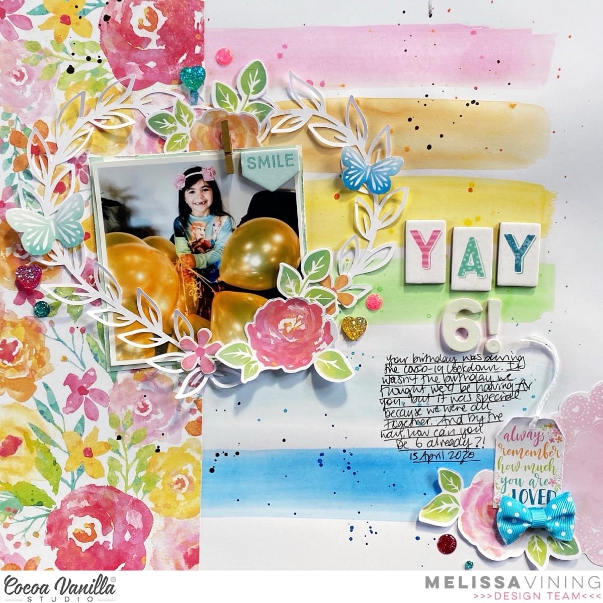
 I attached this to the stunning Abundant paper as a stunning border. I used two floral cut files from the Silhouette Design to add to the sides of my pages. I used another busy paper
  I love using the
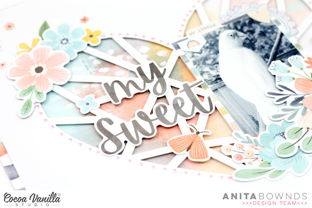
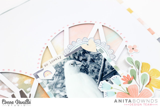
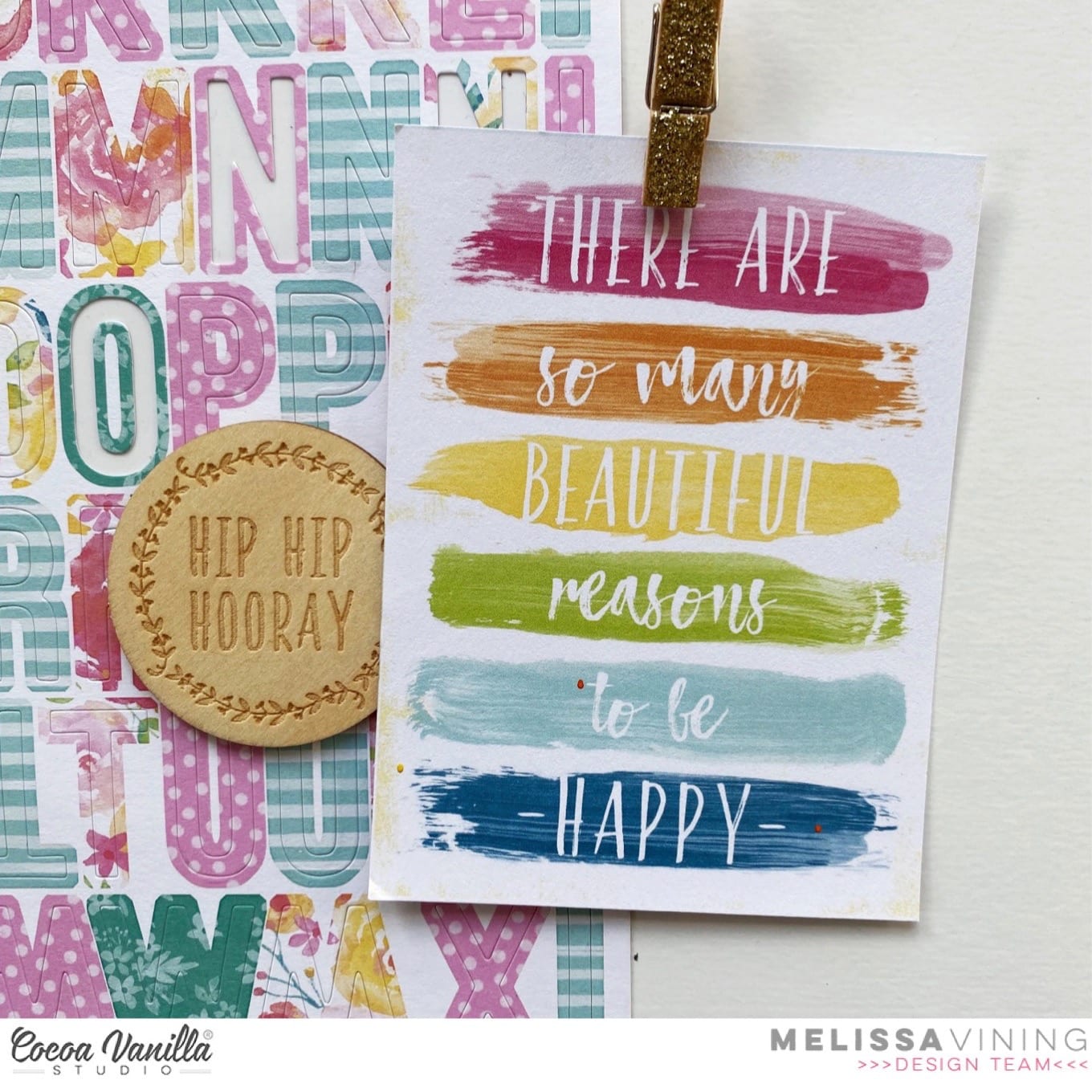
  I added my photo using s die cut frame and then added more florals to either side and finished off adding some phrase banners under my photo and not forgetting a gorgeous butterfly which I had to add because the colour was perfect! I also added my photo with foam tape which I always do when I am using a smaller photo so it has dimension.
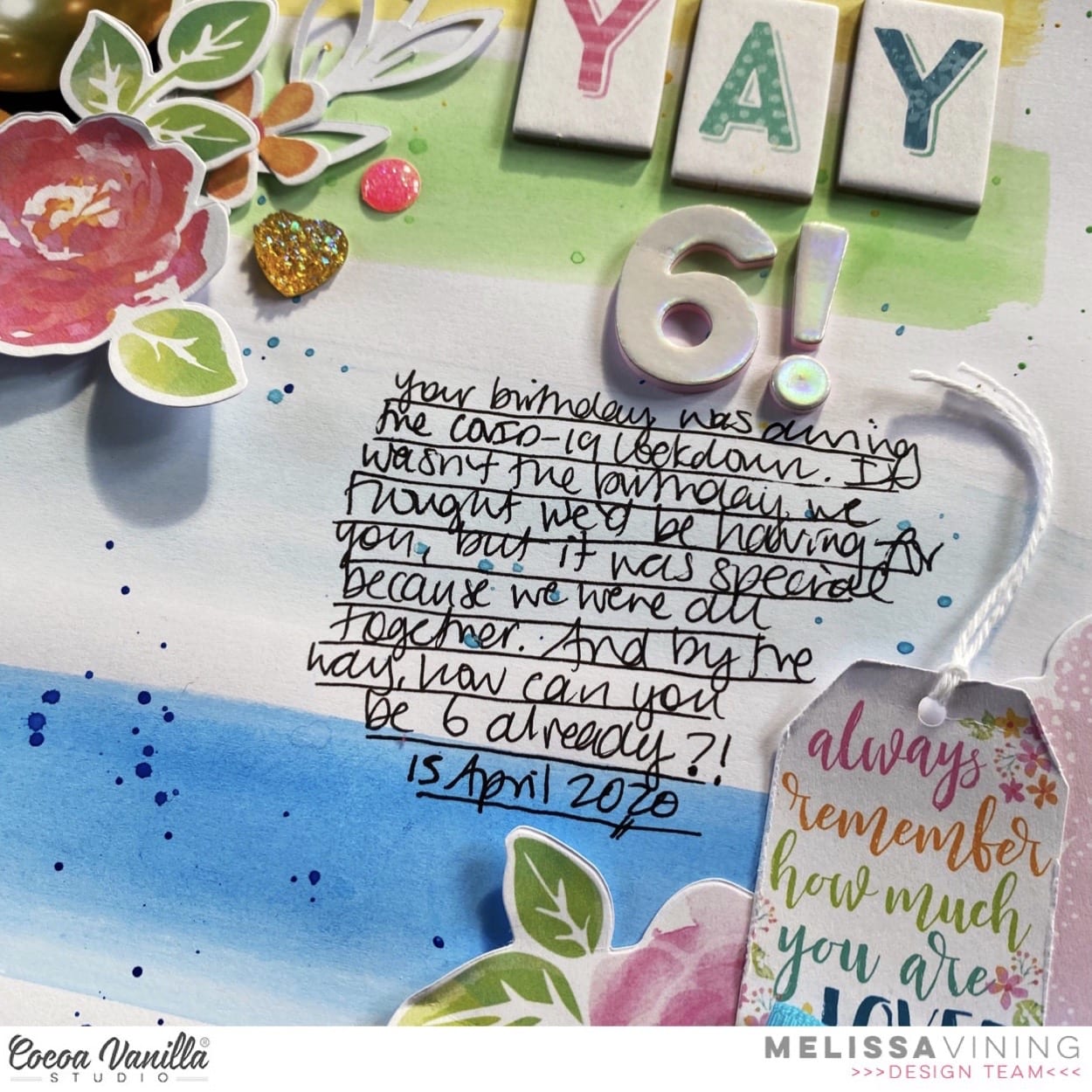
 Lastly I added my title using a die cut and accessory sticker words, I love the contrast between big and small in a title. I went back and added some enamel dots to add more texture.
 This layout would be perfect for a teenage girl themed layout, it’s modern, bright, bold and lots of fun!
 Thank you so much for stopping by today and I am so excited to share my first layout using the stunning Day Dream collection, so see you all soon. Happy creating.
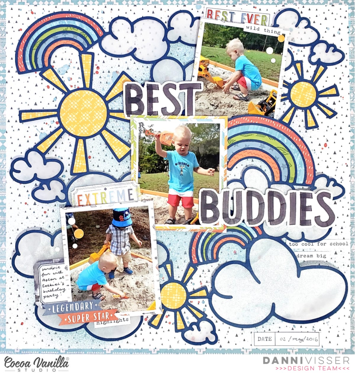
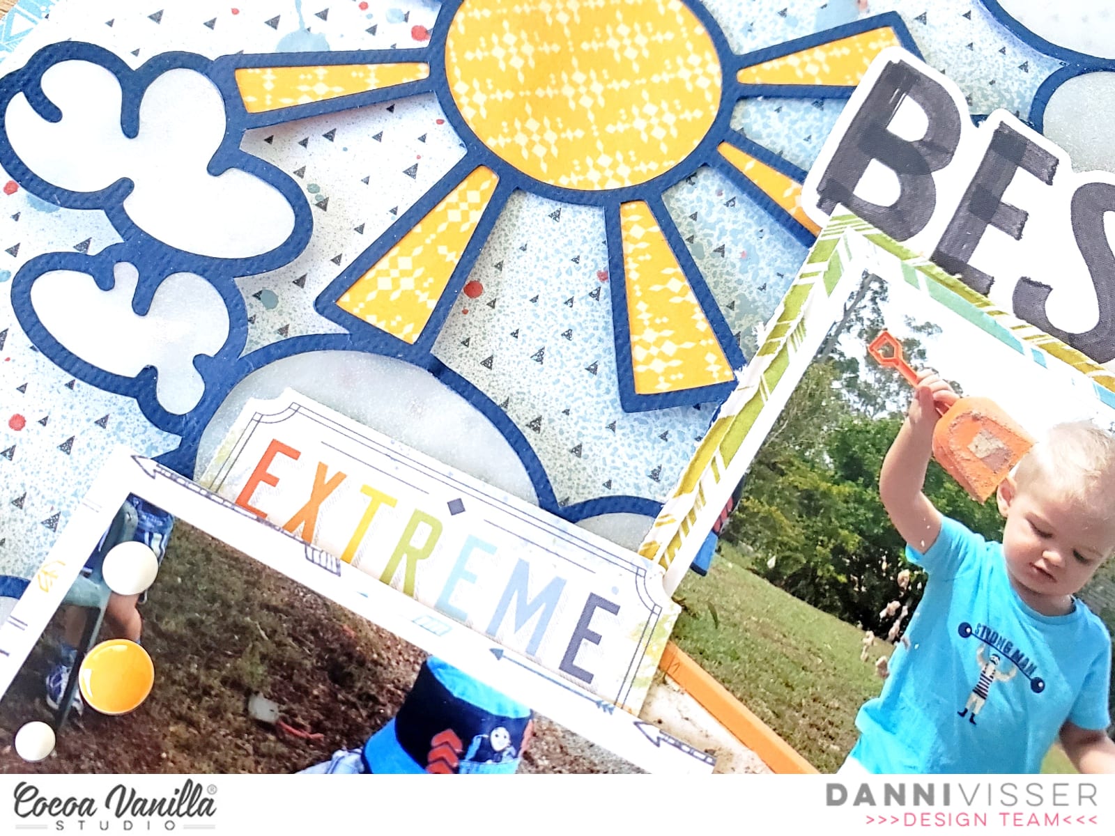

 Let’s talk about texture. If you are not a fan or experienced in mixed media how do you add texture to a layout? I focused on texture when creating this layout. Paper tearing is one way to add texture, and paper tearing also allows you to add elements under and over the tears which also adds more visual impact.
 Another way of adding texture is to sew on your layout, either by hand or using a sewing machine. I always add machine stitching to my layouts. Another technique with stitching is sewing over a strip of paper and then tearing the paper away from the stitching.
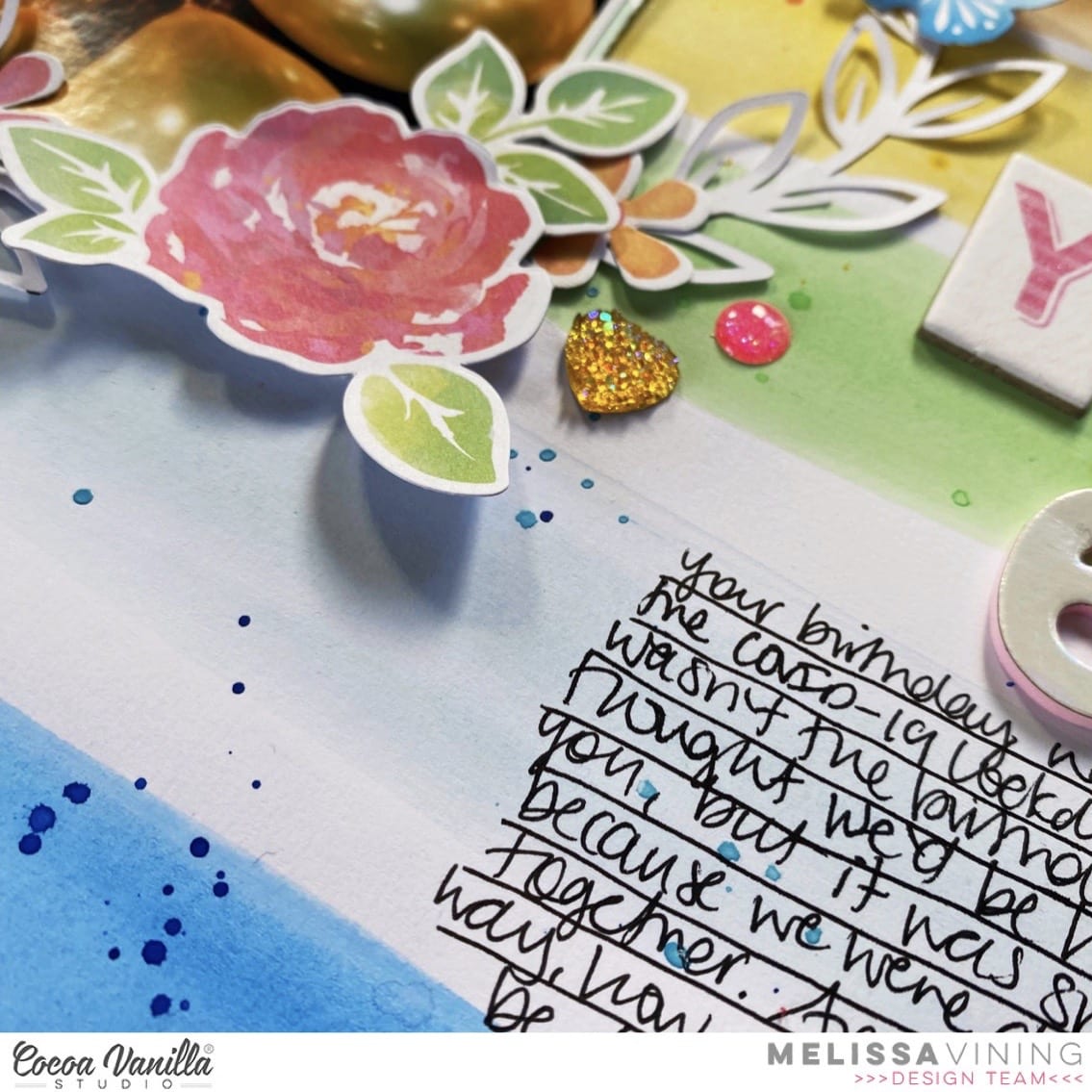
 Paper layers, dimension (ie foam tape to attach some elements and enamel dots) and a light spray of paint (here I have used black) all add texture to a layout.
 Recently I have dusted off my embossing folders and started to add texture to papers and elements using various embossing folders. So my 2020 did not look ‘flat’ I embossed with a polka dot folder and added dimension fluid dots which I also added over my title also.
 I really enjoyed putting this layout together focusing on textures! I also wanted to scrap a part of the Covid 19 journey that I am involved in, because memory keepers is what we are.