Hi y’all! Guest Designer Laura Alberts back again! I was honored to be asked if I could create a couple more layouts with Unforgettable, so of course I agreed with enthusiasm! This layout is a mixed media floral explosion, one of my favorite styles. These photos of my darling girls swinging at our local park is a vision of happiness because the swings are their favorite! I wanted to capture some of that happiness with this layout.
I began with Dylusions paint in Rose Quartz and swatched a large area to frame my photos. This bold pink is a leap for joy! It exudes the happiness these girls have when swinging, but also I love how perfectly it coordinates with the Unforgettable collection too! I added florals cut from the Garland paper and Unforgettable cut file leaves from the back of that paper underneath of the photos. Then, I sprinkled butterflies all around to add a bit of whimsy and fun!
I hope you find this layout inspiring! It was so much fun to dive back into this stunning collection and find new ways to use it. One of the many reasons I love Cocoa Vanilla Studio’s collections is that they are so versatile. I can scrap photos of any theme and type with these collections, how easy it all comes together when you love the products you’re playing with, am I right?
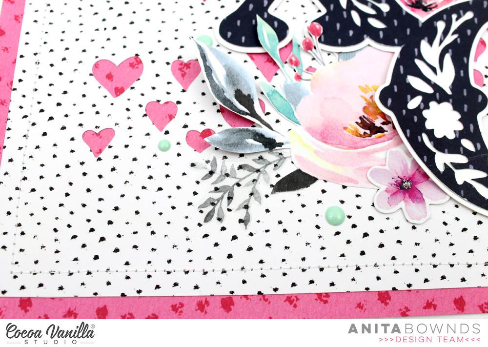
Hi crafty friends, Anita here with you today sharing a love layout full of floral’s using fussy cut flowers and die cuts flowers from unforgettable (do you like fussy cutting?) I think it’s one of those things that’s just relaxes me while I watch a show …I’m totally hooked on prodigal son tv show at the moment.. and yep I’m one of those peeps who totally love’s crime shows!!.. well anyway back to my layout..
I started off by using story teller as my base of my layout and I wanted to have hearts popping in the background so I used a cut file from Paige Evans’s wonky hearts background and cut it out with my cameo in the center of the patterned paper so I could trim the paper down to add unscripted behind it and have a pink border as well. Then I machine stitched around the edges to add a extra textured border.
Next using a paper from happiness botanical bliss I used another cut file for my title from Paige Evans’s XOXO and I wanted to back it with white cardstock so I offset the design to add another layer behind to make it a bit stronger and to pop that floral design.
I matted my photo on papers from pretty bits and add stickers from the accessory stickers around my photo and in the layers. I then fussing cut flowers from patterned paper glorious to tuck underneath the my title
And using flowers from the ephemera die cuts I tucked them underneath the edges of the title and scattered them around adding little flowers on top of my cut file title
I used the mint enamel dots to add extra colour around the flowers and tucked a few clear stickers in the flower clusters and to finish off I used some glitter glue to add a few little dots inside the tiny flowers.
I hope I’ve given you some floral inspiration today..
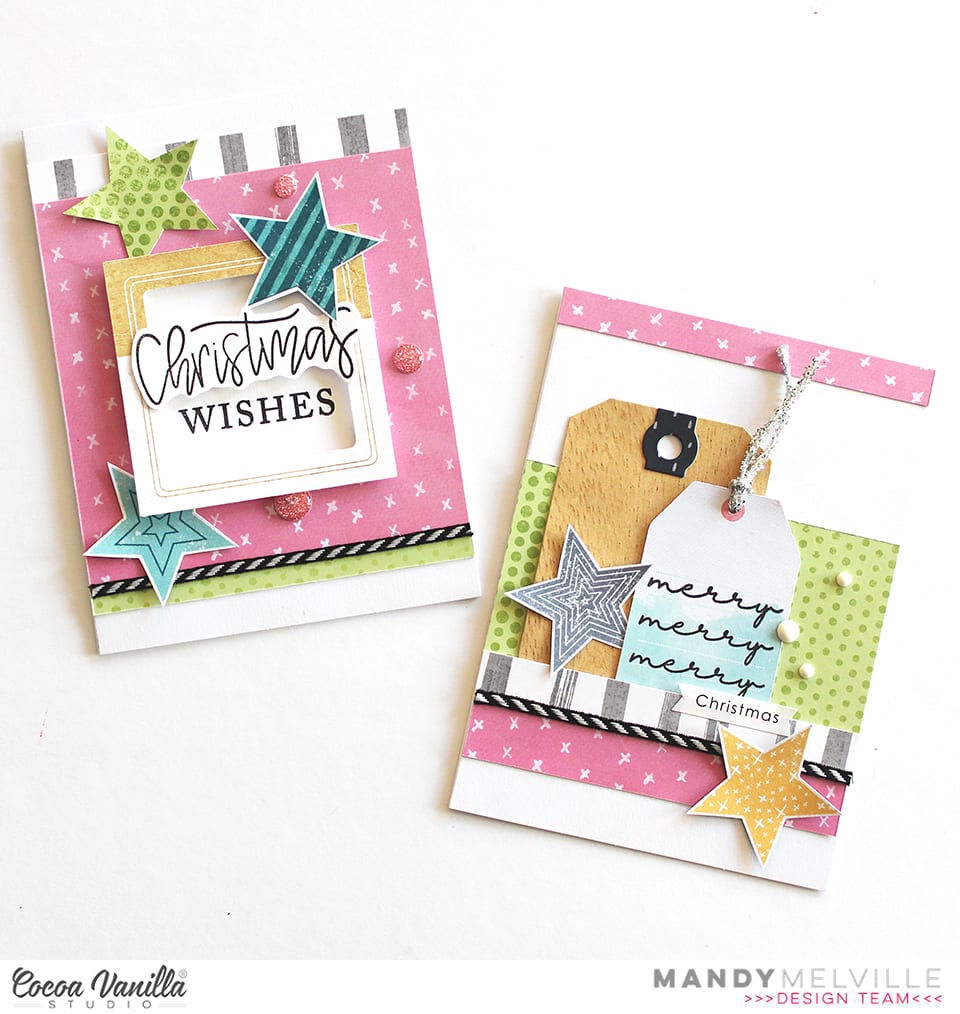
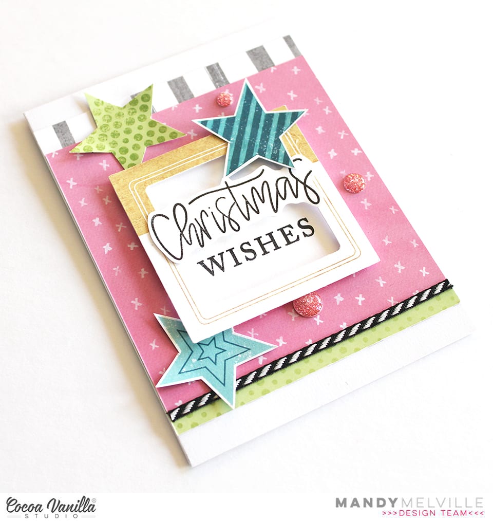
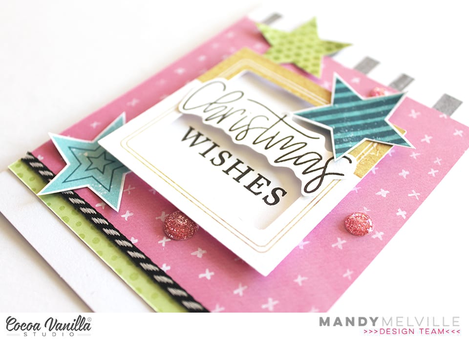
Mandy here with you today to share a set of Christmas cards that I created using a combination of Cocoa Vanilla Studio collections! I chose a fresh and pretty colour scheme of pink, aqua, and lime, with a touch of grey and woodgrain. I then pulled together some products from the Happiness, Boys Rule, and You Rock collections to create my cards. I’m going to show you that it’s super easy to create Christmas themed projects even if you don’t have a Christmas collection. Plus I think the Cocoa Vanilla products are gorgeous and are perfect for using for any occasion / theme!
For my first card, I started by adding a piece of the beautiful pink Expressive paper from the Happiness collection to the middle of the card. I also used the Straight & Narrow paper from the Boys Rule collection, and tucked the grey stripe side under the top edge of the pink paper, and the lime green side under the bottom edge. I then adhered a die cut frame from the Boys Rule Miscellany pack to the card using foam tape for added dimension. I used some Christmas stamps from my stash to add a sentiment inside the frame.
To embellish the card I fussy cut a couple of stars out of the You Rock Starshine patterned paper, and then I also traced one onto the Boys Rule Straight & Narrow paper and hand cut it out. I think the stars help to give it a Chrismasy feel! To finish the card off, I added a few Wild at Heart sparkly enamel dots.
For my next card, I used the same patterned papers, and this time I layered them in strips across the front of the card. I only adhered the edges of the grey stripe paper as I wanted to tuck a couple of tags in behind this strip. The smaller tag is from the Happiness die cut ephemerapack, and I stamped the phrase ‘merry merry merry’ onto this one. The larger tag I created using a metal die from stash and the Bright & Beautiful woodgrain patterned paper, also from the Happiness collection.
Once again I finished this card off with a couple of fussy cut stars from the You Rock Starshine patterned paper, and some enamel dots from the More than Words collection.
I love how these cards turned out using non-Christmas themed collections, and I can’t wait to hand them out to some special friends during the Christmas season!
Thanks so much for joining me here on the blog today. I hope that you enjoyed taking a look at my cards!
Guest Designer Laura Alberts back again with a layout focused on the story aspect of the Unforgettable collection. I really loved this cut-apart piece with the phrase, “Every photo has a story” and made it the title of my project. This photo definitely has a story to tell, so it was perfect for this 9×12 sized layout. This photo of my impish daughter covered in paint is a pretty wild story, for sure! I include as many of these stories as possible in my albums because my kids love to read them. Imagine having such a wonderful collection of your childhood memories to enjoy as an adult!
The second cut-apart saying, “Life doesn’t have to be perfect to be beautiful” was such a fitting addition to this picture, I had to use it too! The top of the layout features the Natural Beauty paper that adds movement to the background, while the floral cluster softens the linear look.
My goal was to use flair, so two do appear on this layout, but I saw an opportunity to add tassels and took it! I absolutely love these tassels, such a lovely way to finish off a floral cluster.
I have greatly enjoyed my time as a guest designer for Cocoa Vanilla Studio and hope I have inspired you to create! If you would like to see how I created this layout, you can watch my process video on YouTube here: https://youtu.be/CZ-wV8oIfaQ
Thank you, Cocoa Vanilla Studio for the amazing opportunity to design for you!
Hi Scrappy friends its Michelle back today with a new layout share. This one features the beautiful Unforgettable collection, a cut file from CUT to YOU and a couple crazy photos of this little family of mine. Love how it turned out, and it all came together so quick!
To begin I resized the cut file in Silhouette studio, backed the seperate words using 2 pattern papers (both sides of Sprightly) from the 6×8 paper stack then adhered to the centre of the page using foam tape. Next I added the photos that were printed slightly smaller than 3×4 size and layered with a couple more pattern papers (reverse sides of Unscripted and Garland) from the 6×8 paper stack. I cut the main white cardstock backing down in size so that I could mount in onto the beautiful floral pattern paper Glorious for even more colour.
I used 1 large floral ephemera piece, that I cut in half, to create clusters of embellishments to the top left and bottom right of the cut file. I also added a couple extra florals and hearts from both the ephemera and clear sticker pack.
On each photo I’ve added a heart that was left over from a previous layout I created using the awesome wreath of hearts in our FREE Cut file set. Theres also a couple more ephemera pieces and stickers tucked into the layers beneath the photo.
Lastly I added a couple of enamel dots and a splattering of gold ink and called it done. A nice quick layout thanks to that massive cut file title.
Well thats all from me today, be sure to stop by the Community group on facebook to chat all things Cocoa Vanilla Studio. And don’t forget to use the hashtag #cocoavanillastudio when sharing your creations on instagram and Pinterest.
Thanks so much for stopping by! Until next time, happy scrapping..
It’s Tarrah McLean back with you on this Thursday! I hope all my fellow Aussie friends are all safe from these horrendous bush fires we are experiencing in our country at present?
Today I am sharing a layout for the Cut Files theme we have on all this week and being that its Thursday I was also given ‘Throwback Thursday’ where we create with an older collection. I decided to create a Christmas layout since it is fast approaching!I started my page by taking a sheet of white cardstock and adding a piece of vellum over the top to mute the white a little bit, as I had lots of the sequins left from the Tis The Season collection, I decided to add lots of them under the vellum to create a shaker pocket. Once I had added the sequins, I then machine stitched all the edges so that they wouldn’t fall out. I love how this turned out! I like that it adds another feature to my layout.
I took two of the 12 x 12 papers and cut some vertical strips from them and placed them down each side of the layout. then chose a gorgeous cut file title design by Cut To You and added some of the patterned papers behind each of the words. I added craft foam to the underneath and placed it in the centre of my page. I also popped up the photo of my sons on Christmas Day with craft foam so that it was at the same level as the title on my page. I love the shadows and dimension this creates on my page.
I then began to embellish my page using some of the accessory stickers (that are still available in the store) some of the die-cuts, wood veneers and of course a bitty bow and the tiny metal key! I only had 1 of the poinsettia flowers in the die-cut pack left so I added just the one to the very bottom of the title and layered the bow over the top. Lastly I added some of the enamel dots from the Tis The Season collection. Have you got any of the Tis The Season collection left? Pull it out and get creating with it! Its such a soft and gorgeous collection for Christmas photos.
Thank you so much for stopping by today! See you next time!
Hello Cocoa Vanilla friends, and welcome back to cutfile week! I am not a pro when it comes to using cut files but I have a few tips and supplies to make them a bit more accessible. I’m scrapping a selfie this week that I took on my 29th birthday and I’m using the Happiness collection as well as a cut file from the Cut To You shop for Cocoa Vanilla.
I started but cutting the florals on white cardstock and cutting an offset piece on vellum. I knew I wanted a more abstract look rather than perfect backing, and I knew I wanted to make my own backing paper using watercolor paper and Distress Oxides and the vellum would be perfect to mask any imperfections. I can’t take any credit for this idea – I borrowed it from my friend, Laura Wonsik. So for tip number 1: get to know your design software. I’ve had a Silhouette for years and I’m just learning all of its features like offsetting and print and cut. Watch some YouTube videos and give yourself time to play before you actually sit down to make your project.
After cutting my elements and making my watercolor backgrounds, I traced the floral pieces, roughly cut it and adhered it to my cut file. This brings me to tip number 2: gather supplies. For cutfiles, a sharp pencil for tracing, a fine tipped pair of scissors, a fine tipped glue bottle and some clear vellum safe adhesive will go a long way. My fussy cut scissors are from EK Tools and I keep my glue in an 18 gauge Fineline bottle.
Once my cut file elements were ready, the rest of the layout was easy to assemble. I ripped off some patterned paper to add some interest to my background, matted my photo with some papers from the 6×8 paper pad, and embellished using the die cut ephemera and the cardstock stickers. My title came from the cardstock title pack and I popped a few elements up on foam to add some dimension to the page.
That’s it for me this week! I hope you found some inspiration here as well as some tips to demystify the cutting machine. Till next time, keep it crafty friends.
Hi everyone! It’s Sue Plumb here to share my latest design team project with you and it’s one that is pretty special to me.
Today is World Prematurity Day – a globally recognised day that is aimed at increasing awareness of preterm births, as well as highlighting some of the challenges that are often faced by these babies and their families. Each year approximately 1 in 10 babies are born prematurely, including all three of my children. My post today is for all those babies born too soon.
For my project I decided to create the first in a series of mini albums for my children to document the time following their births. (It has taken me over 7 years to get around to tackling the photos of my boys and all the memories that come with them, so please bear with me for the long post today.)
I began my mini album with the fabulous ‘Boys Rule’ collection and a small 6 ring planner that I purchased from Kmart. (These make perfect mini album covers once everything is removed from the inside.) After choosing the patterned papers I was going to work with, I cut them into a variety of sizes to form the pages of my album.
I used an adjustable 6 hole punch (purchased via eBay) to punch holes on each of the pages, and then used white hole reinforcement stickers (from my local newsagency) to help protect the holes from becoming damaged through handling.
On some of the pages I added extra interest by using border punches to create decorative edges. This, combined with the variety of different page sizes, placements and patterns throughout, is what gives the album so much character.
If you are planning on giving something like this a go, be sure to mix things up as much as you can! Don’t feel like all your pages have to run vertically – a horizontal page thrown in here and there not only adds extra interest but makes the album more interactive as it is turned to be read.
Depending on the theme of your album, you will find that some pages require no more than a photo and some simple embellishments; whilst others may have lots of journaling and very little room for embellishments.
For the sake of continuity across my album, I printed most of my photos in black and white with a few colour feature shots added in. I printed them in a variety of sizes and orientations as well.
Don’t be afraid to add embellishments such as stickers or journaling directly over part of your photos, or to include pages that have no photo at all and are simply decorative. You can even punch directly through photos and use them as a page in your album.
One of the other benefits of making your pages different sizes is being able to get a “sneak peek” at what is coming on the next page. This adds to to the anticipation as you leaf through the album.
To further enhance the cohesion across the album, I typed all my journaling on my computer. When putting each page together I began with photo/s and journaling placement first before deciding on embellishments.
For an extra bit of fun, add some interactive elements such as tip-ins, pockets, or pull out tags. You can see how I used one of the small cards from the Die Cut Ephemera pack with a couple of pieces of washi tape to form a tip-in (fold out flap) to include my journaling underneath.
One of my tips for putting together each page in an album is that whilst I approach each page individually, I am also mindful of what is on the facing page. You can see how I carried across the same colours in the spread below. (Working with the same collection throughout the album helps enormously.)
The only other embellishment I included in my album were a few stickers from the ‘Love Always’ Accessory Sticker sheet, as it had a few more love-filled and generic phrases that suited some of my photos.
Another way to mix things up with your photos is to create a collage or include a series of shots taken close together. (And let’s face it, who doesn’t take 20 shots when you are trying to get the perfect one?!)
I know I have included a LOT of photos in this post, but sometimes the best way to explain things is to show them, right?
My final tip if you are going to create something similar in a planner cover or album, is to not forget about the extra pockets that are built into the cover. I made some small tags to tuck into the front of my album and added some extra photos, and in the larger pocket I included a letter to my son with some of the details about his birth story.
If you are interested in seeing a few more details of my album I have filmed a flip through of the entire thing so you can see how it all looks together:
Thanks so much for sticking with me through my long post today. I do hope I have inspired you to try creating something like this yourself. It could make an ideal Christmas gift for a loved one, or just something for yourself to treasure.
Mandy here today to share my take on the ‘white out’ theme, using the gorgeous Unforgettable collection. I use white cardstock A LOT for my backgrounds, so I really enjoyed the challenge to use a patterned paper instead. I documented a photo of my two girls, taken at Eleanor’s 5th birthday party last weekend. They were both dressed up for the party, as Eleanor chose to have a ‘magical’ theme, and the colours in their outfits matched perfectly to the gorgeous peach and purple tones in the Unforgettable collection! (Not intentional, but definitely a happy coincidence!)
I decided on using the reverse side of the Lacewing patterned paper as my background. I love the beautiful peachy colour of that paper, and the tone on tone sketchy flowers! I then added an 8 inch strip of the Story Teller patterned paper (reverse side) across the middle section of the background. I’m not sure if that was cheating just a little bit, because it’s still white, but it really helped all of the elements on the page to stand out, and it also gives the viewer’s eye a place to rest amongst all of that colour. Plus it’s still a patterned paper, so technically I didn’t cheat right?! I also trimmed down a piece from the Pretty Bits paper to tuck under the top and bottom edges of the white patterned paper.
Next I fussy cut a few floral clusters out of the Glorious patterned paper and then layered them across the layout to create one long cluster. How gorgeous are the florals in this collection?! I also tucked a few extra die cut leaves into the cluster where I felt like it needed a little something more to help it feel balanced. When I adhered the floral clusters and die cuts, I added glue only to the middle, so that the leaves would lift off the page, giving it some nice dimension.
For my title, I used the words ‘Shine Bright’ from the Foam Title Stickers pack. I love the contrast that the black title adds to the page, and I think it’s a perfect sentiment for my girls!
I matted my photo with the reverse side of the Unscripted patterned paper, and then tucked it in above the floral cluster. I also added a couple of die cut butterflies around the layout, as well as a larger one that I cut out of the Pretty Bits patterned paper. To finish the layout off, I scattered some enamel dots around the page.
Thanks so much for joining me here today! I hope that you’ve been inspired by my layout!
Hello CVS friends! It’s Anna here with my project created with no white background. It is a theme for this week – “White-out”. Each Cocoa Vanilla collection has plenty of amazing pattern papers to choose from so it was a real pleasure to play with them. I was going through my paper stack thinking of what line I should use this time and I was drawned to pretty colors of “Happiness”. You all know that I love colorful designs and ugly fall outside need some proper, colorful medicine to be scared away.
I started with cutting out my title using electronic diecutting machine. I did it twice in the same size using two different papers: “Good vibes” and “Botanical bliss“. I layered them creating kind of a shadow. I also added white false stitches around the top one using white pen. Pretty paper with navy hearts is perfect as a background paper. I added a thin layer of white acrylic paint to help my title pop a little bit more.
I placed my photo on one of the empty spots between the letters and embellished it with tickets and flowers from ephemera pack. I can never have enough of those amazing flowers added to this line. Pretty shape and watercolor look, combined with juicy colors are the perfect match.
Between the paper flowers I also mixed in some flowers from clear sticker sheet. Their colors are more intense and they look amazing on light background. Butterflies cut out from “Bright and beautiful” paper are great embellishment too. Fussy cutting is one of my favourite techniques. I finished embellishing by adding one of the flair buttons on top of the title. I needed some darker accent in this spot.
After I finished working with paper, I decided to add some more colors to the background. I know that usually we work in opposite order but I felt that this project is unfinished. I gently added some watercolor stains here and there with pink and green paint. It made my layout looking more cheerful and complete.
That is all for today. I love working with pattern paper as a base of my page as much as I like using white backgrounds. It’s a double joy :) Thank you for stopping by and see you in two weeks my friends.


 I started my page by taking a sheet of white cardstock and adding a piece of vellum over the top to mute the white a little bit, as I had lots of the sequins left from the
  I took two of the 12 x 12 papers and cut some vertical strips from them and placed them down each side of the layout. then chose a gorgeous cut file title design by Cut To You and added some of the patterned papers behind each of the words. I added craft foam to the underneath and placed it in the centre of my page. I also popped up the photo of my sons on Christmas Day with craft foam so that it was at the same level as the title on my page. I love the shadows and dimension this creates on my page.
 I then began to embellish my page using some of the accessory stickers (that are still available in the store) some of the die-cuts, wood veneers and of course a bitty bow and the tiny metal key! I only had 1 of the poinsettia flowers in the die-cut pack left so I added just the one to the very bottom of the title and layered the bow over the top. Lastly I added some of the enamel dots from the Tis The Season collection.
  Have you got any of the


