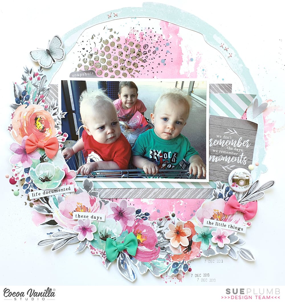
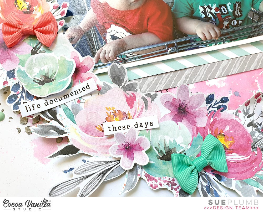
Sue Plumb here to share a recent mixed media layout I created using the gorgeous ‘Unforgettable’ collection and a photo of my children that I took while I was shopping with them a few years ago.
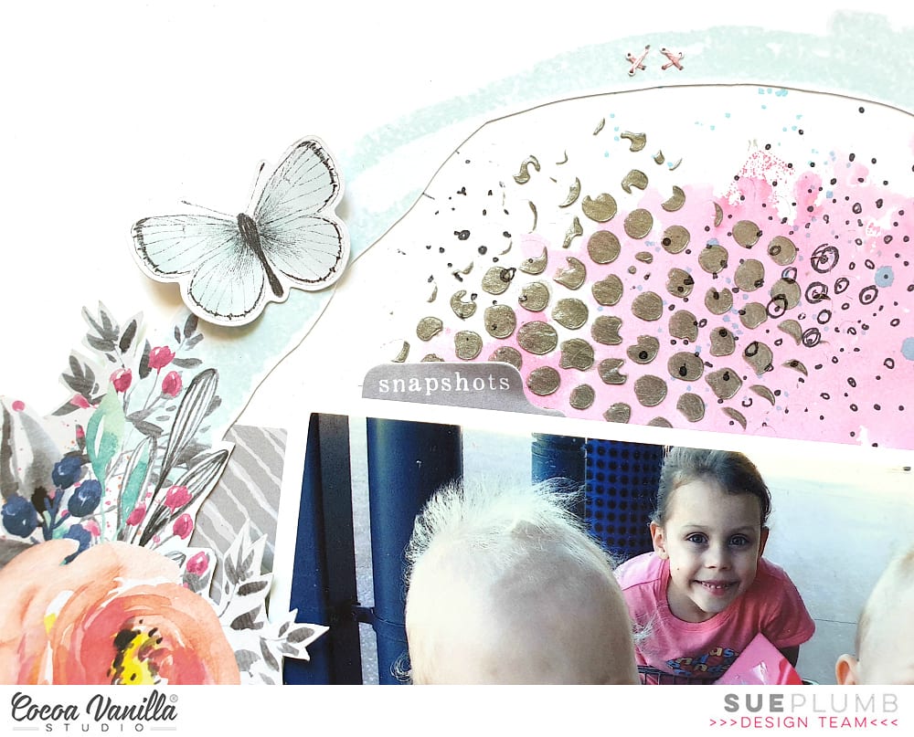
I started this page by creating a mixed media background on some white cardstock. I used pink ink to create a watercolour style background, before adding some stamping and coloured texture paste through a stencil in a few spots on my page. I also added some blue watercolour splatters over the top for some extra interest.
Next, I fussy cut the wreath from the beautiful Garland paper, adding foam tape underneath the floral section to pop it up from the page, before sticking it down on top of my background. (You can see how I bent the edges up from the page to add extra dimension.)
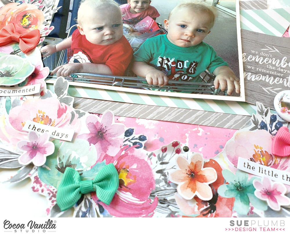
I then added some pieces of paper cut from the B sides of the Gloriousand Sprightly papers as a mat for my photo, which I stuck down on top.
Alongside my photo, I added the quote “we don’t remember the days, we remember moments” from the scaled down version of the Story Teller paper from the 6×8″ Paper Stack to act as my page title. I was especially drawn to use this quote for this layout, as in the early days of having twins life seemed to pass by in such a blur. Going shopping with the kids and having two sitting in the trolley and one perched on the end like in the photo is something I will always remember though.
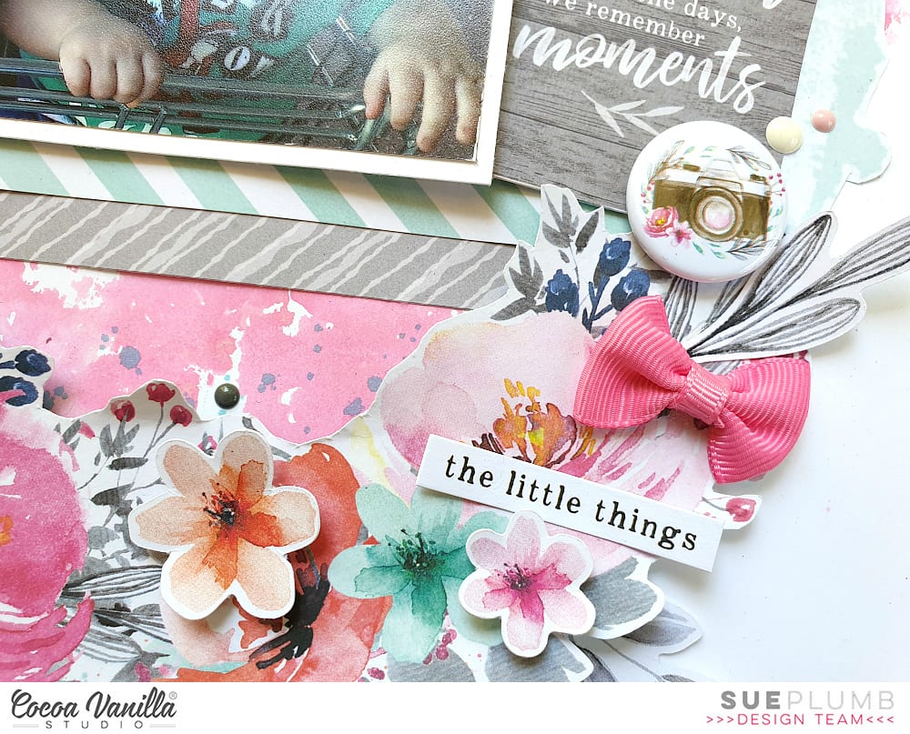
On top of the quote card I added the cute camera Flair Button and popped a couple of Enamel Dots nearby.
Now it was time to embellish my wreath. I used a variety of flowers from the Die Cut Ephemera pack, which I stuck down on top of the wreath using foam tape to provide further dimension. I also added 3 bows from the Tassels and Bows pack; and a few small phrase stickers from the Accessory Stickersheet.
I finished off my layout by adding more Enamel Dots; a die cut butterfly; and then a few hand-stitched crosses using embroidery thread.
That’s all from me today, I hope I have inspired you to create something pretty too. Until next time, happy scrapping!
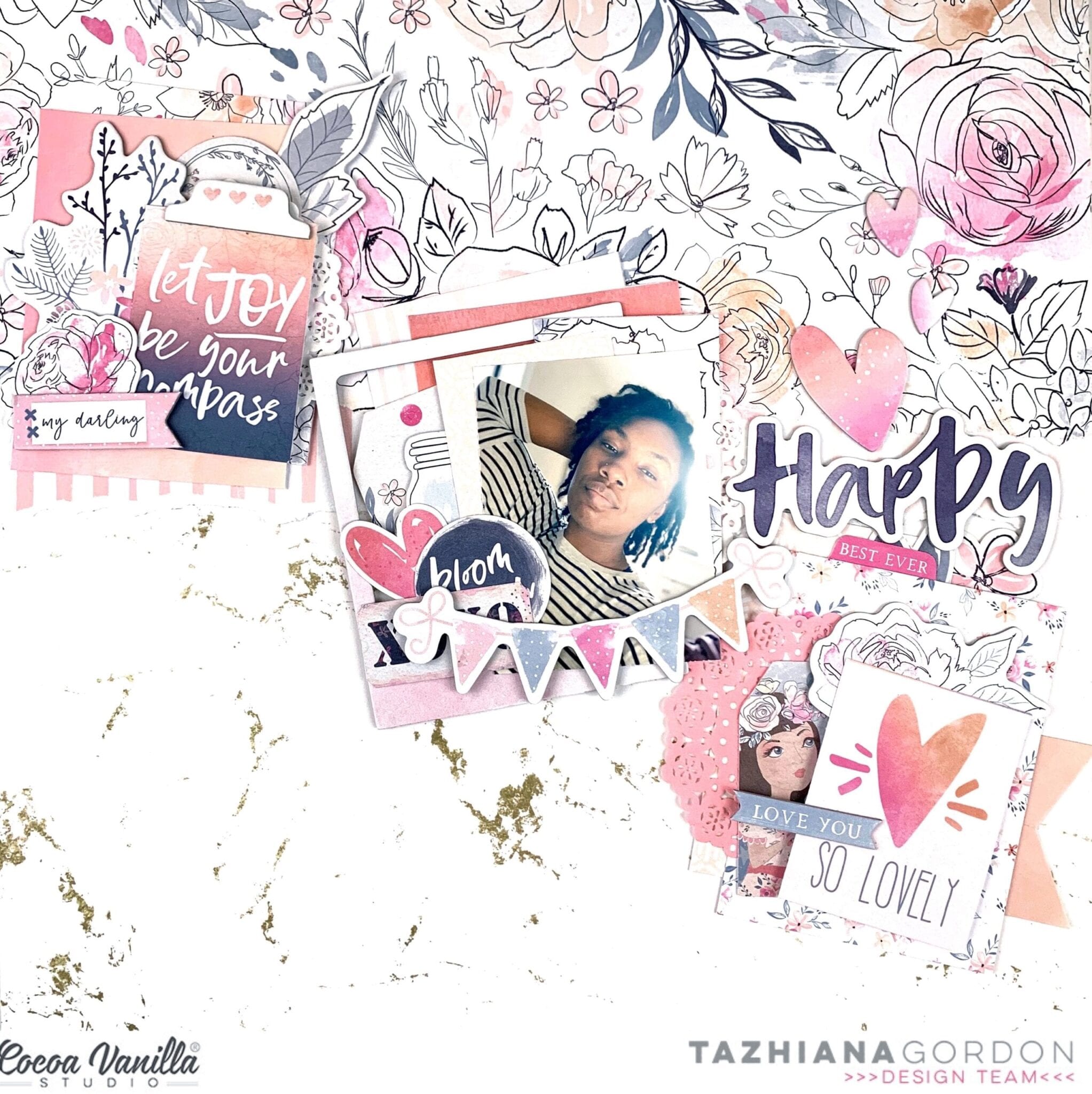
Hello Cocoa Vanilla friends and welcome back to the blog for a new project! I’ve been on a crazy December Daily kick so it was kind of nice to switch gears and relax those Christmas muscles and make something fun with the Midnight collection.
I know I’ve said this before but the Midnight collection has me all over it with the color palette so I figured I would scrap a recent selfie I took with my new phone while exploring portrait mode! I really like how this layout came out and it is an EXCELLENT stash buster.
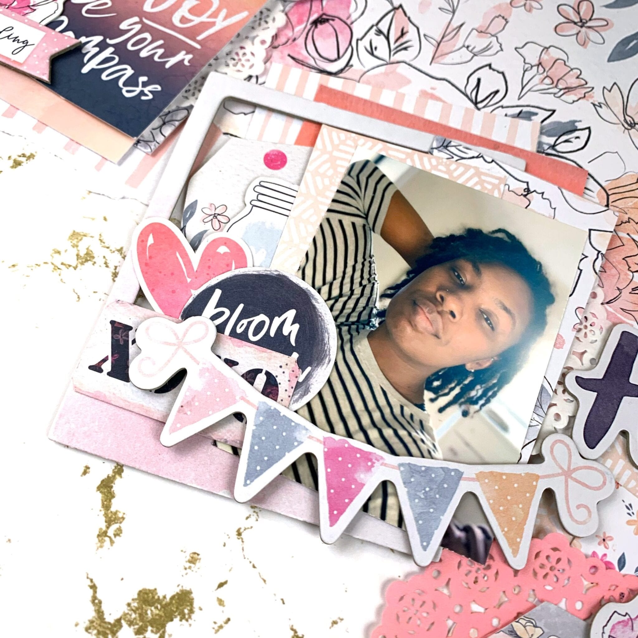
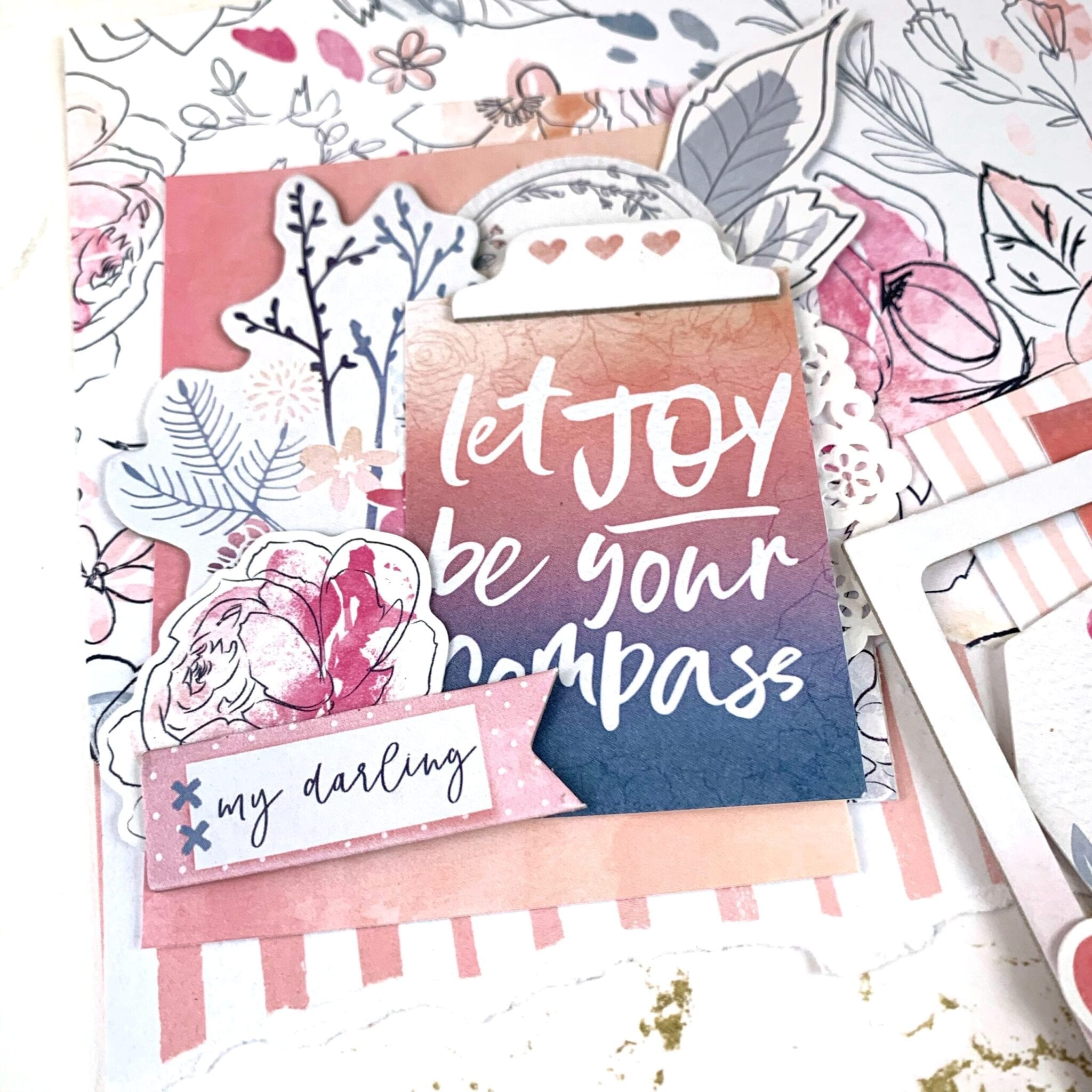
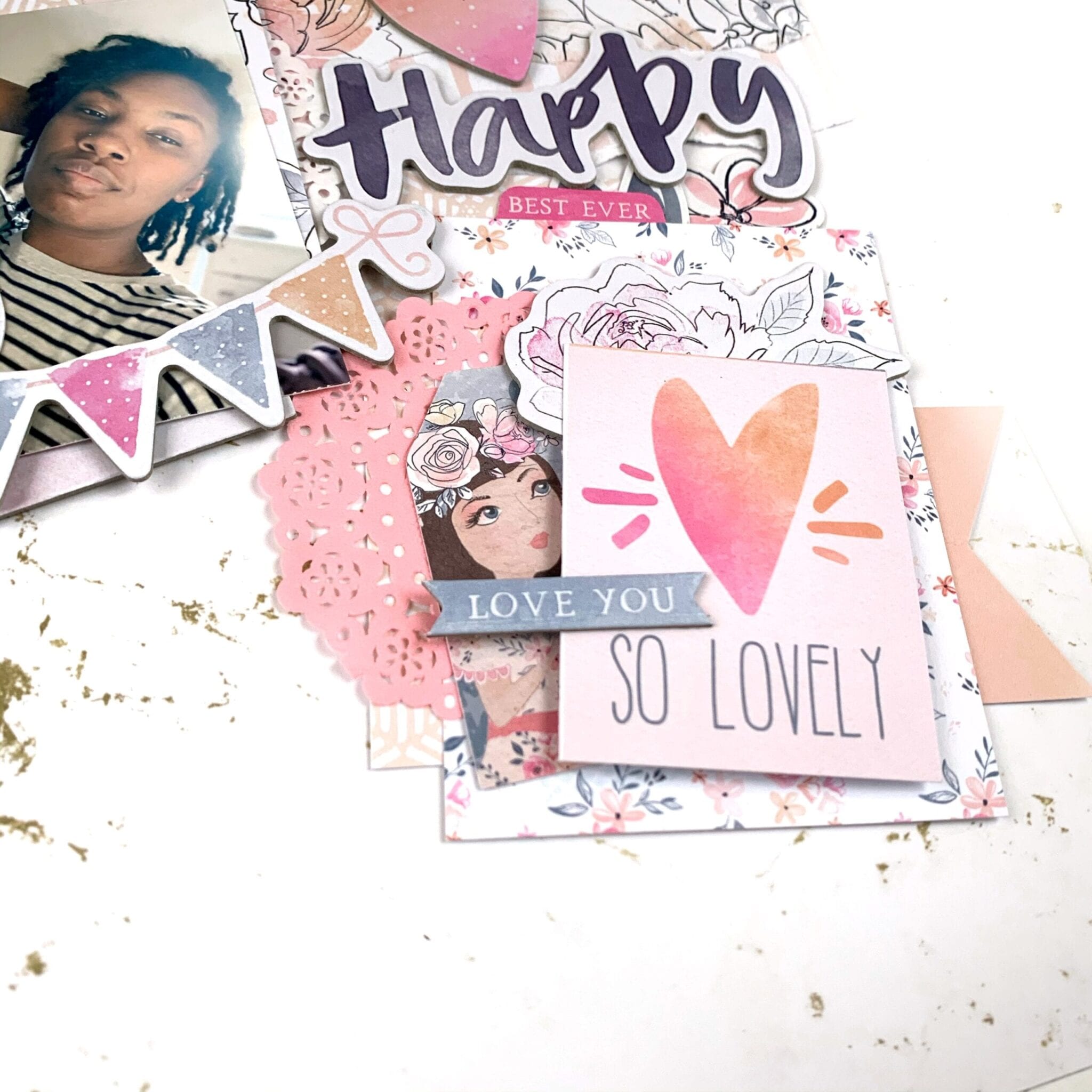
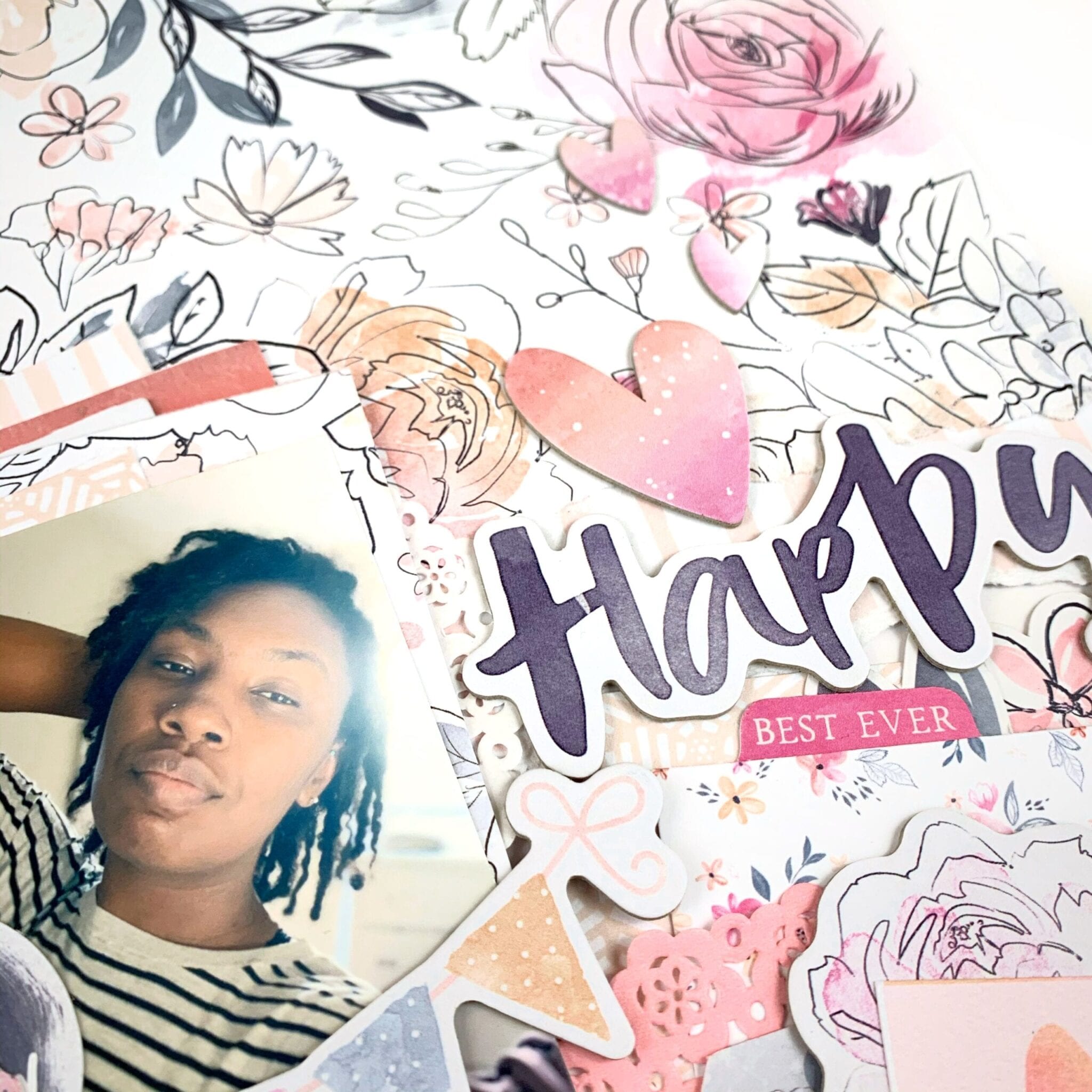
I started with 6 3x4inch pieces of patterned paper and literally pulled out all the embellishments I had left from the Midnight collection, including the chipboard set and the cardstock ephemera. I then set out to create three individual clusters – one for my photo and the other two to just feature some embellishing. I wish I had a rhyme or reason for why I did what I but it kind of just came together organically. I picked up bits, stuck them down, added foam stickers when I wanted some additional height and just had fun creating the clusters.
For my background, I actually used patterned paper! I know, incredibly shocking. I used the white and gold marble paper as my background and then layered two ripped pieces of paper from other sheets in the collection to add interest and texture since there was already a whole lot of texture in my embellishment clusters. I then attached my three clusters in a diagonal across the page. I love how they look against that marble paper.
To finish off the layout, I added the “Happy” chipboard piece to serve as my title even though this layout would have worked just fine without one and I added a few chipboard hearts. This layout was pretty easy to complete and such a fun process.
I hope you enjoyed my project and you give this technique a try. Seriously, pick it and stick it. That freedom to create is life changing. Till next time, keep it crafty friends.
Gwen up on the blog today with a new share and its a fun Christmas project featuring my husband, daughter and our ‘Elf on the Shelf’ Candy on holiday in 2017. You all know how I love Christmas so this page was a heap of fun to make!
For a bit of a challenge, I decided to create the project without any ‘Christmas’ themed supplies. I really just wanted to use some things I had on hand to show that you don’t need a Christmas collection to make a pretty Christmas page. I started with my favourite collection ‘Bohemian Dream‘. I felt the cool colours of this collection would translate really well and would be perfect or those who have a cooler Christmas season.
I then pulled this cut file from CUT to YOU called ‘Roses and Frames’ and went about backing it in a section of the papers. I’ve used ‘Dreamer‘ and ‘Abundant‘ for this. Next, I’ve added a photo mat to my pictures, also using the Abundant paper. In my usual style, I’ve raised these on foam and added a stitch detail to the edge. I really love how the black and white photos work for this page, especially once I added the silver elements.
I’ve then simply added my cut file and photos centring it all on my page. I then added a border around the page edge using the ‘Abstract‘ paper. I am really loving the grid style of this cut file.
At this stage, my page was looking good, I really just needed to add in some embellishments to finish it off. I’ve pulled from my stash some Thickers letters and spelt out the title ‘Christmas’. It was at this point that I decided to try and keep the layout very balanced which is why I’ve gone with half the title on the left, the other on the right.
I’ve continued with this balanced look for all of the embellishments, starting with two of the chipboard birds and two butterflies from the ‘Die Cut Ephemera‘ pack. I’ve also added some sentiments from this pack to both photos, I really love those little tab elements. Next, I’ve chosen some stickers from the ‘Accessory Sticker Sheet‘ which I’ve placed up on foam tape for added dimension and lastly added a sparkly silver fabric bow from my stash.
Thanks for popping by today to see my latest project, I hope it inspires you to get this collection out from your stash and try a Christmas project. If it does, be sure to pop it into the Cocoa Vanilla Studio facebook group, I love seeing what you make.
Mandy here with you today to share a set of Christmas cards that I created using a combination of Cocoa Vanilla Studio collections! I chose a fresh and pretty colour scheme of pink, aqua, and lime, with a touch of grey and woodgrain. I then pulled together some products from the Happiness, Boys Rule, and You Rock collections to create my cards. I’m going to show you that it’s super easy to create Christmas themed projects even if you don’t have a Christmas collection. Plus I think the Cocoa Vanilla products are gorgeous and are perfect for using for any occasion / theme!
For my first card, I started by adding a piece of the beautiful pink Expressive paper from the Happiness collection to the middle of the card. I also used the Straight & Narrow paper from the Boys Rule collection, and tucked the grey stripe side under the top edge of the pink paper, and the lime green side under the bottom edge. I then adhered a die cut frame from the Boys Rule Miscellany pack to the card using foam tape for added dimension. I used some Christmas stamps from my stash to add a sentiment inside the frame.
To embellish the card I fussy cut a couple of stars out of the You Rock Starshine patterned paper, and then I also traced one onto the Boys Rule Straight & Narrow paper and hand cut it out. I think the stars help to give it a Chrismasy feel! To finish the card off, I added a few Wild at Heart sparkly enamel dots.
For my next card, I used the same patterned papers, and this time I layered them in strips across the front of the card. I only adhered the edges of the grey stripe paper as I wanted to tuck a couple of tags in behind this strip. The smaller tag is from the Happiness die cut ephemerapack, and I stamped the phrase ‘merry merry merry’ onto this one. The larger tag I created using a metal die from stash and the Bright & Beautiful woodgrain patterned paper, also from the Happiness collection.
Once again I finished this card off with a couple of fussy cut stars from the You Rock Starshine patterned paper, and some enamel dots from the More than Words collection.
I love how these cards turned out using non-Christmas themed collections, and I can’t wait to hand them out to some special friends during the Christmas season!
Thanks so much for joining me here on the blog today. I hope that you enjoyed taking a look at my cards!
Hello Friends! Have you seen the newest products in CVS store? You should run there quickly because Zoe released digital versions of older Cocoa Vanilla collections! I am over the moon happy about it, because I really loved them and I was missing my favorite stuff. You can purchase both papers and elements and they are already prepared to be printed in A4 size PDF files! You will also get each element separately if you want to use them your way. I am an embellishment person so I use up my embellies faster than the papers. Being able to print more elements to work with my paper leftovers is so amazing. What is ever more amazing is that if you purchase those digital versions of CVS lines, you will help support victims of current Australia bushfires.
I am in CVS team from the very first DT call so I own every collection that was released. We started with two lines: “Sugar and Spice” and “Flying High”. Those two collections were the reason I fell in love with Cocoa Vanilla and I cherish them so much. Especially the girly “Sugar and Spice”. I am almost run out of embellishments but I still have some paper scraps left. That’s why I decided to purchase elements and print them in bunches. Flowers are always my favorite, that’s why I printed a whole sheet filled with them. You can make yourself some print and cut file in Silhouette software or, if you are OK with fussy cutting, just cut them by hand.
I used paper scraps to make several fishtail tags and arranged them over the pink cardstock. Second step was adding a picture of my daughter above them and fill the space with a lot of flowers.
“Sugar and and spice” line came with 12×12 sticker sheet, wood veneers pack and some cork hearts. I still got some of them left and I was so happy to be able to use them up. I mixed in them between the flowers creating colorful and very cheerful page.
I already purchased few more element packs from other collections and I can’t wait to use them in my projects. If you run out of papers, you can also print them at A4 size! Or, if you are lucky and have A3 printer, you can get full 12×12 papers. The best thing is that you will never run out of your favorite papers and embellishments!
Thank you for stopping by and see you in December.
Hi all Rachel here! As most of you know I LOVE cut files and use them on nearly all my layouts. Today I have a pretty layout that is fun to make and there is only one piece of 12×12 paper used. I have used the SPRIGHTLY paper to create these gorgeous flowers.
I chose a super pretty flower cut file from the Silhouette Design Store. I created three different sizes by re sizing to large, medium and small. I then used from 6 to 3 layers for each flower. This creates the effect of different flowers, different layers and sizes which adds dimension to your layout.
Before attaching my flowers I added some Unforgettable clear sticker paint strokes to provide a contrast. I also cut some leaf branches in white so I could tuck them under the flowers.I laid out my flowers and worked out where I was going to add some stamping. I have used the gorgeous Bohemian Dream stamp set. Once I had done all this I added my flowers to the left of my page.
I added my 4×4 inch photo tucking it slightly under the flowers to connect the elements. I added a bright pink paint brush stroke from the Unforgettable clear stickers under my photo to draw your eye to the photo.
I used the word Shine from the black foam title stickers and again added another bright pink paint stroke clear sticker before attaching to add contrast and draw the eye.
To finish off I added some butterflies from the Unforgettable die cut pack, adding a paint blotch clear sticker under the wings finished off with an enamel dot under the wing. I added several black hearts from the Unforgettable foam titles around my page.
When using a cut file such as a flower, and you want to use more than one, before you purchase another think of resizing and how many layers can be added or taken away, this way one cut file can look like several different ones.
Thanks for stopping by today and I hope my layout using one piece of paper and one cut file inspires you to get creative this week!
Hello Cocoa Vanilla friends, and welcome back to cutfile week! I am not a pro when it comes to using cut files but I have a few tips and supplies to make them a bit more accessible. I’m scrapping a selfie this week that I took on my 29th birthday and I’m using the Happiness collection as well as a cut file from the Cut To You shop for Cocoa Vanilla.
I started but cutting the florals on white cardstock and cutting an offset piece on vellum. I knew I wanted a more abstract look rather than perfect backing, and I knew I wanted to make my own backing paper using watercolor paper and Distress Oxides and the vellum would be perfect to mask any imperfections. I can’t take any credit for this idea – I borrowed it from my friend, Laura Wonsik. So for tip number 1: get to know your design software. I’ve had a Silhouette for years and I’m just learning all of its features like offsetting and print and cut. Watch some YouTube videos and give yourself time to play before you actually sit down to make your project.
After cutting my elements and making my watercolor backgrounds, I traced the floral pieces, roughly cut it and adhered it to my cut file. This brings me to tip number 2: gather supplies. For cutfiles, a sharp pencil for tracing, a fine tipped pair of scissors, a fine tipped glue bottle and some clear vellum safe adhesive will go a long way. My fussy cut scissors are from EK Tools and I keep my glue in an 18 gauge Fineline bottle.
Once my cut file elements were ready, the rest of the layout was easy to assemble. I ripped off some patterned paper to add some interest to my background, matted my photo with some papers from the 6×8 paper pad, and embellished using the die cut ephemera and the cardstock stickers. My title came from the cardstock title pack and I popped a few elements up on foam to add some dimension to the page.
That’s it for me this week! I hope you found some inspiration here as well as some tips to demystify the cutting machine. Till next time, keep it crafty friends.
Gwen with you on the blog today with a new share using the beautiful ‘Unforgettable’ collection. For this page, I’ve jumped out of my comfort zone again to scrap another picture of me, this one was taken on my birthday recently. I’m also sharing some extra tips and tricks for working with cut files!
Many of you will already know that I just love working with cut files on my pages. I love that they are super inexpensive and the designs really are limitless. It will be no surprise that once I had chosen a photo to work with for this page, I went to my extensive library. This file is from my cut file store CUT to YOU and I love that it helps me document this snapshot in time, my 43rd birthday. I’ve done a stack of journaling on the back talking about where I’m at right now in my life.
To begin the page, I started by backing the letters in the file. Tip #1 – If you have a limited supply of coordinating pattern papers, this is a fab way to use them up or make them stretch. You’d be surprised just how little you need to make a bold title like this one, AND you can mix and match all of your scraps amongst the letters for a really pretty look. Tip #2 – Pattern paper pads such as the one from this collection are perfect for backing cut files. The smaller print designs work so well with the small spaces within the files.
While we are talking about backing the letters… Tip #3 – I find it much easier when working with a small area in a cut file to glue the pattern paper to my cut file and then use fussy cutting scissors to cut it out. I find this way of backing the files the fastest for me, much faster than tracing each section and then cutting it out and then trying to position it back into the open space of the file.
Once my file was all backed and I was happy with it I went about backing my photo and thinking about the composition of my page. Tip #4 – It’s a good idea to use the software from your electronic die cutting machine to help you with the size and placement of the design on your page. I consider the layout of my page design when resizing the file so that once cut and you get to create it’s not too big or too small for your design idea.
I was now looking at the file and photo on my layout and it wasn’t quite popping off the page in a way I’d like so Tip #5 – I’ve added some foam tape to lift it off the page AND some soft watercolour behind the file to really help the white edges pop off the white background. I use both of these techniques a lot to help give the cut file definition on a white background.
It was now time to embellish the page, this bit is super easy and fun with the larger elements in place. For this, I’ve fussy cut out the large green butterfly element from the ‘Pretty Bits’ pattern paper and teamed it with two more smaller butterflies fussy cut from the ‘Lacewing’ pattern paper. I’ve also added in a pink butterfly from the ‘Ephemera Pack’.
To create a small cluster in the top right-hand corner of my page, I’ve combined elements from the ‘Accessory Sticker sheet’, enamel dots and a flair button. The larger floral die cut at the bottom of my photo is from the ‘Die Cut Ephemera’ pack. To finish the page off, I’ve added some typed sentiments from the ‘Accessory Sticker Sheet’ using more foam tape for dimension.
Thanks for popping by today to see my latest project, I hope you enjoyed the tips and tricks I’ve shared for working with cut files and that they inspire you to give working with them a go, they really are the best fun! If you haven’t checked out the latest collection ‘Unforgettable’ yet, you really must, it is DIVINE!
Hi everyone! It’s Sue Plumb here to share my latest design team project with you and it’s one that is pretty special to me.
Today is World Prematurity Day – a globally recognised day that is aimed at increasing awareness of preterm births, as well as highlighting some of the challenges that are often faced by these babies and their families. Each year approximately 1 in 10 babies are born prematurely, including all three of my children. My post today is for all those babies born too soon.
For my project I decided to create the first in a series of mini albums for my children to document the time following their births. (It has taken me over 7 years to get around to tackling the photos of my boys and all the memories that come with them, so please bear with me for the long post today.)
I began my mini album with the fabulous ‘Boys Rule’ collection and a small 6 ring planner that I purchased from Kmart. (These make perfect mini album covers once everything is removed from the inside.) After choosing the patterned papers I was going to work with, I cut them into a variety of sizes to form the pages of my album.
I used an adjustable 6 hole punch (purchased via eBay) to punch holes on each of the pages, and then used white hole reinforcement stickers (from my local newsagency) to help protect the holes from becoming damaged through handling.
On some of the pages I added extra interest by using border punches to create decorative edges. This, combined with the variety of different page sizes, placements and patterns throughout, is what gives the album so much character.
If you are planning on giving something like this a go, be sure to mix things up as much as you can! Don’t feel like all your pages have to run vertically – a horizontal page thrown in here and there not only adds extra interest but makes the album more interactive as it is turned to be read.
Depending on the theme of your album, you will find that some pages require no more than a photo and some simple embellishments; whilst others may have lots of journaling and very little room for embellishments.
For the sake of continuity across my album, I printed most of my photos in black and white with a few colour feature shots added in. I printed them in a variety of sizes and orientations as well.
Don’t be afraid to add embellishments such as stickers or journaling directly over part of your photos, or to include pages that have no photo at all and are simply decorative. You can even punch directly through photos and use them as a page in your album.
One of the other benefits of making your pages different sizes is being able to get a “sneak peek” at what is coming on the next page. This adds to to the anticipation as you leaf through the album.
To further enhance the cohesion across the album, I typed all my journaling on my computer. When putting each page together I began with photo/s and journaling placement first before deciding on embellishments.
For an extra bit of fun, add some interactive elements such as tip-ins, pockets, or pull out tags. You can see how I used one of the small cards from the Die Cut Ephemera pack with a couple of pieces of washi tape to form a tip-in (fold out flap) to include my journaling underneath.
One of my tips for putting together each page in an album is that whilst I approach each page individually, I am also mindful of what is on the facing page. You can see how I carried across the same colours in the spread below. (Working with the same collection throughout the album helps enormously.)
The only other embellishment I included in my album were a few stickers from the ‘Love Always’ Accessory Sticker sheet, as it had a few more love-filled and generic phrases that suited some of my photos.
Another way to mix things up with your photos is to create a collage or include a series of shots taken close together. (And let’s face it, who doesn’t take 20 shots when you are trying to get the perfect one?!)
I know I have included a LOT of photos in this post, but sometimes the best way to explain things is to show them, right?
My final tip if you are going to create something similar in a planner cover or album, is to not forget about the extra pockets that are built into the cover. I made some small tags to tuck into the front of my album and added some extra photos, and in the larger pocket I included a letter to my son with some of the details about his birth story.
If you are interested in seeing a few more details of my album I have filmed a flip through of the entire thing so you can see how it all looks together:
Thanks so much for sticking with me through my long post today. I do hope I have inspired you to try creating something like this yourself. It could make an ideal Christmas gift for a loved one, or just something for yourself to treasure.
Hello CVS friends! It’s Anna here with my project created with no white background. It is a theme for this week – “White-out”. Each Cocoa Vanilla collection has plenty of amazing pattern papers to choose from so it was a real pleasure to play with them. I was going through my paper stack thinking of what line I should use this time and I was drawned to pretty colors of “Happiness”. You all know that I love colorful designs and ugly fall outside need some proper, colorful medicine to be scared away.
I started with cutting out my title using electronic diecutting machine. I did it twice in the same size using two different papers: “Good vibes” and “Botanical bliss“. I layered them creating kind of a shadow. I also added white false stitches around the top one using white pen. Pretty paper with navy hearts is perfect as a background paper. I added a thin layer of white acrylic paint to help my title pop a little bit more.
I placed my photo on one of the empty spots between the letters and embellished it with tickets and flowers from ephemera pack. I can never have enough of those amazing flowers added to this line. Pretty shape and watercolor look, combined with juicy colors are the perfect match.
Between the paper flowers I also mixed in some flowers from clear sticker sheet. Their colors are more intense and they look amazing on light background. Butterflies cut out from “Bright and beautiful” paper are great embellishment too. Fussy cutting is one of my favourite techniques. I finished embellishing by adding one of the flair buttons on top of the title. I needed some darker accent in this spot.
After I finished working with paper, I decided to add some more colors to the background. I know that usually we work in opposite order but I felt that this project is unfinished. I gently added some watercolor stains here and there with pink and green paint. It made my layout looking more cheerful and complete.
That is all for today. I love working with pattern paper as a base of my page as much as I like using white backgrounds. It’s a double joy :) Thank you for stopping by and see you in two weeks my friends.