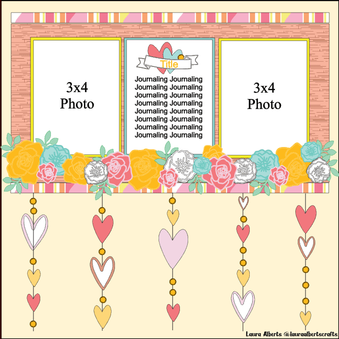
Hey y’all! Laura Alberts back again with a super silly 9×12 layout featuring non-holiday themed photos using the delightfully holiday themed Merry & Bright collection! I particularly adore the florals in this collection and really wanted to make them the shine on this page. With two black and white photos on a wood grain background, using the Season’s Greetings patterned paper, these photos automatically ‘pop’ on this background regardless of how much color I add on.
I clustered together a number of fussy cut florals to create a border along the bottom of the photos, adding in a couple of the puffy stars for a bit of non-paper texture. I loved the gold tones these added to the page and reached into my stash for some large gold sequins to add as well.
For the strands of hearts along the bottom, I drew lines with my white gel pen, then added an assortment of hearts and the outlines of hearts (that I cut from the punch-out packaging!). These outlines are then backed with pocket page cards and paper scraps. The hearts that didn’t have an outline were drawn one with my white gel pen. By alternating between sequins and hearts, with a little bit of Nuvo drops in between, this gives a lovely detail to the bottom of the page as well as tying in the gold from the stars.
I have included a sketch based on this layout to inspire you to give this design a try! I hope the sketch for this layout inspires you and this embellishment style encourages you to look at your collections a little differently! It’s fun to see how you can change things up. If you’d like to see the Sweet Memories layout come together, I have the entire process in the video below!
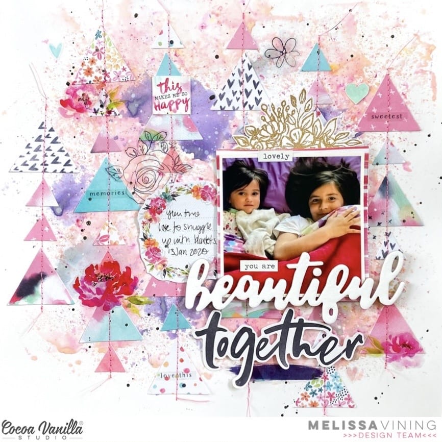
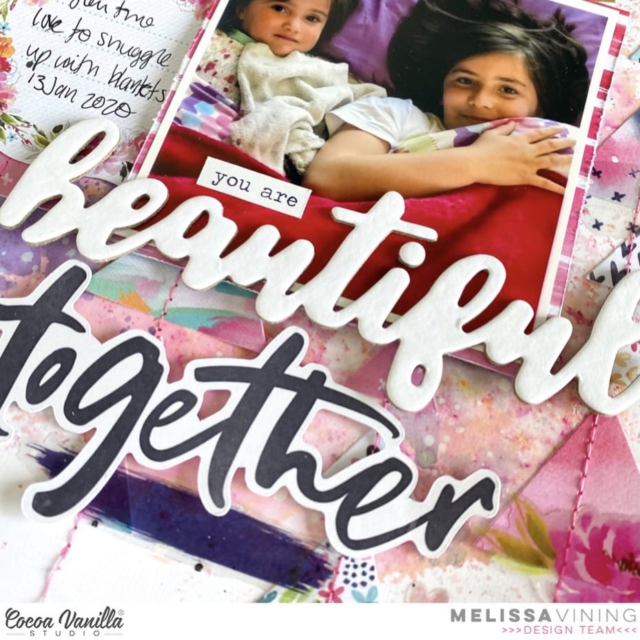
Hello everyone!! It’s Melissa here and I’m so happy to be here for Throwback Thursday. The first thing I always do for Throwback Thursday is pull out all of my Cocoa Vanilla collections and decide which one I’m going to use. I decided that for this layout, I’d let the members of our Facebook Group decide, so I made a poll with the following collection options: Happiness, More Than Words, Bohemian Dream and Midnight. Happiness won by a landslide, but a couple of people asked for a mashup, and several other others likes this suggestion. So I decided to make Happiness my main collection, and incorporate something from each of the other three collections!! Such a fun challenge to set myself!!
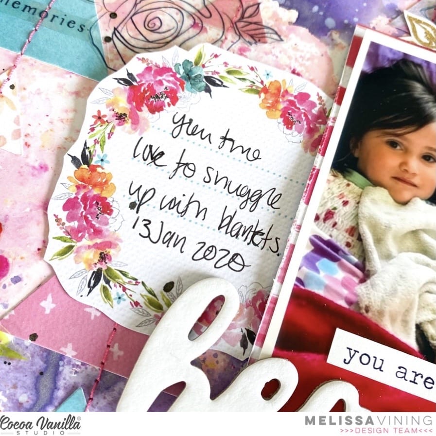
I chose a photo of oldest and youngest daughters, and my main reason for choosing it was for the pink and purple colours in it! It goes perfectly with Happiness.
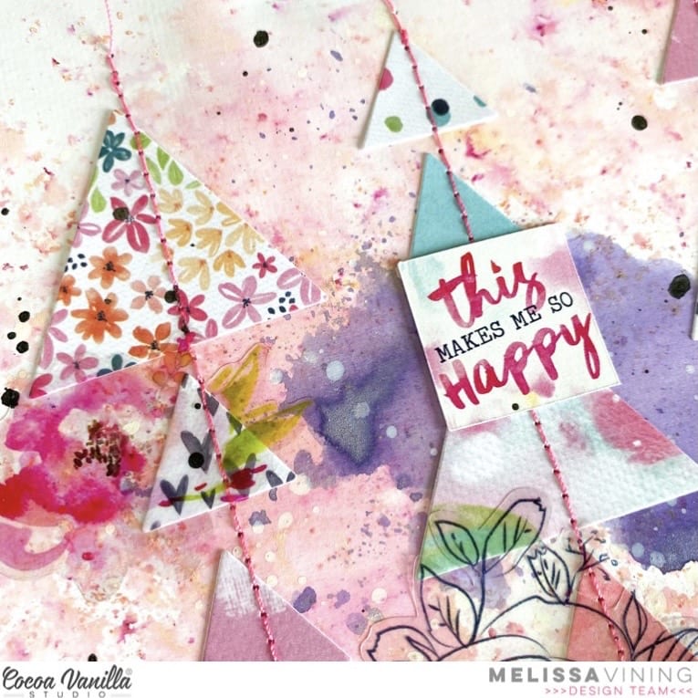
I created a mixed media background focussing on pink, purple, blue and gold. I also added subtle white splatters to tie it all in together. I mostly used the packaging technique, and also splattering. I used a manual die cut machine to cut two different sizes of triangles from the paper scraps I had leftover from Happiness. After I had adhered all of my triangles I machine stitched through them in bright pink thread for texture and interest.
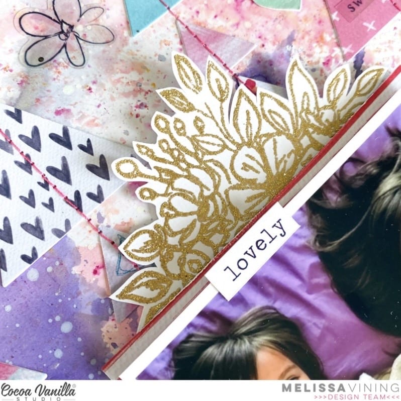
I heat embossed the large floral stamp from More Than Words with gold metallic embossing powder. I love how elegant it turned out!
The large chipboard “beautiful” is from Bohemian Dream, and I kept it white so it would pop against all of the other colours on my page. The “together” die cut title is from Midnight.
I also used Accessory Stickers and from Happiness and Midnight over the top of the triangles and stitching, and I love the whimsy that it adds!! I wrote my journalling on a cut apart piece that I fussy cut.
I made a process video, which you can watch below.
/p>
I hope I inspired you to pull out your older Cocoa Vanilla Studio collections, and to even mix them up a little!
Hello friends. Have you seen brand new “Sunkissed” line reveal? I am so excited about this collection. It’s like combination of all my favorite things in one: summer, rainbows, seaside and vivid colors. I still have to wait for few weeks to dive into it but it gives me more time to play with another gorgeous collection – “Daydream“. I still have plenty of papers and embellishments in my stash so I decided to make another page. This time I reached for quite old photos of tiny Maja ans scrapbooked them in sweet and cute way.
I mixed together two papers to make my background – solid “Happy place” pattern and “All flutter” cut into film strips. I made them using my edge punch, that I own for ages. I challenged myself to use more of my tools this year. I glued the strips only in the middle are so i was able to bend the edges and tuck some elements behind them.
Next step was to add photos and flower clusters around them. You can find plenty of pretty florals in ephemera pack. I focused in ones in pink, coral and yellow colors trying to keep my page quite monochromatic. I also fussy cut cute, little rainbows from “Up in the clouds” paper. They are just a perfect little embellishment!
I finished my composition adding few fabric, puffy hearts. They are so cute and give such a nice texture to the page. I also added little flair button. I am running low on them and tend to hoard them :) but I managed to overcome my parsimony. Last step was adding title using my stash of alpha stickers. Maja just learned how to send kisses with her hand and my hubby took photo in the right time, when she was doing that. Hence “Sending kisses” title. I so miss those days, when she was so tiny and cute.
I really like how this page turned out and I am glad I used my punch to make those strips. They create little anchors for all the embellishments so they do not float on the empty background.
Thank you so much for stopping by and see you soon in my other post <3
Hello Hello! It’s Michelle here with you today to share a new layout. I’ve used a couple of different collections for this layout as part of our current ‘Green and Gold’ theme. A mixture of Legendary and Boys Rule with a hint of Daydream and Unforgettable.
When I think of ‘Green & Gold’ I picture bright Aussie style colours – Green & Yellow. So thats exactly where this colour palette took me on this creative journey this week. There are so many wonderful green patterns within the extended Cocoa Vanilla Studio range, but the shade of green I’ve used for this layout is by far my most favourite of them all.
To begin I created a grid style layout featuring a couple of cute photos of Lelia and her beloved bunny from a few years back that I printed out in Black & White. I cut out 3.5″ frames from papers in the Legendary Collection for both the photos and title areas ( Wild One & Explorer ) and added a strip of dotted paper along the bottom (Straight & Narrow) from the Boys Rule Collection.
This kid is an absolute HOOT! Her imagination has been wild from the beginning. This day in particular was so fun, creating a ‘Box Coaster’ for them to ride around the galaxy haha
I kept the embellishing of each frame to a minimum by using word stickers ( Accessory Stickers sheet – Legendary ), sticker heart ( Accessory Stickers sheet – Daydream ), tiny fussy cut stars ( All Star – Legendary ) and an arrow ( Ephemera pack – Legendary ). Both frames adhered to the layout using a piece of foam sheet to give a slight hint of dimension.
The title area of the layout also acts as a tidy spot for some hidden journalling. The ‘Wild and Free’ card can be found on the Epic Tales cut apart paper in the Legendary Collection and the hidden journalling card and ‘Be Rad’ piece can be found on the ‘Boy Stuff’ cut apart paper in the Boys Rule Collection.
Heres a peek at the journalling ..
I cut the card down slightly, rounded the edges on the right and made a tag top including punched hole at the opposite end to add string and tie a bow.
In the top right frame I added a couple extra words that can be used as part of an extended title. The white alphas are by far my most used Cocoa Vanilla Studio embellishment by far, and those foam words from the Unforgettable Collection work so well with pretty much every collection there is.
I sewed the white alphas down so that they stay in place for years to come, but also to add a little extra design element to the layout. I added machine stitching around both of the yellow frames to keep the white X paper in place (Star Fall – Boys Rule). The ‘You are my Sunshine’ can be found on the Daydream Collection Accessory Sticker Sheet and the green tab is a sticker from the Legendary Collection Accessory Sticker Sheet.
Lastly I added a bunch of fussy cut starts in green and yellow to the bottom left and top right of the layout, scattered to give the grid style layout a slight ‘diagonal’ design feel. I also added my usual splattering of gold ink to finish it all off.
Well friends thats all from me today, thanks so much for stopping by! I hope you’ve enjoyed seeing my take on our current ‘Green & Gold’ theme, be sure to share yours with us in the Cocoa Vanilla Studio Community Facebook Group.
Until Next time, Happy Scrapping!
Michelle x
PS.. A little side note regarding the fabulous Boys Rule Collection…. Because all us crazy crafters LOVED it so so much when it was originally released, back in the day, sadly its no longer available.
Hey y’all! Laura Alberts back again with two bright, cheerful pocket pages featuring the stunning Happiness collection. I thought this collection worked beautifully with January’s Mood Board because it had many of the colors as well as a really stunning painted look. To join in on the mood board inspiration, be sure to join us in the Cocoa Vanilla Studio Facebook Group!
One of the many reasons that I adore Cocoa Vanilla Studio’s collections is that they are always super versatile and can be used on a variety of projects. These pocket pages use a lot of the cut aparts from the Little Things patterned paper, ephemera pieces, and scraps! This top left card is layers of scraps with a sticker tag and ephemera journaling spot.
For the title card, I fussy cut the wreath from the ephemera pack and layered the flower pot and some hearts and florals together. My favorite part of this card is the clear sticker paint swatch, it adds a little idea of depth because it’s layered behind the flower pot. A little bit of Nuvo drops finishes it off with the detailing that really makes it feel finished. On the card below the title, I added tiny, fussy cut florals to the heart cut apart pieces and a word phrase to personalize it!
On this bottom card, I created a 4×6 card from paper scraps and then layered the green paper as a mat under my photo. Two hearts tucked in together below a word phrase sticker with tiny, fussy cut florals for added detail. The butterfly is fussy cut from the Bright & Beautiful patterned paper in the 6×8 paper pad.
For the title card on the second page, I used clear stickers for the paint stripes and title with a few fussy cut florals and butterflies for a whimsical touch. I added little dots of Nuvo drops to create butterfly trails.
I kept the embellishing fairly simple on my photos so as not to draw attention away from them. This pocket page had a common theme of how snuggly my twins had become and featured so many sweet photos of them cuddled up with me and their siblings.
This bottom card is my favorite from the whole page! I used clear stickers, backed with white cardstock, to cluster behind the photo of my oldest and youngest girls. Layering a couple of cut aparts on the right side to add some journaling. I really enjoy how beautifully the patterned papers work for creating 3×4 and 4×6 cards for pocket pages!
I hope these pocket pages inspire you to look at your pattern papers a little differently! It’s fun to see how you can change things up and use scrapbooking collections for pocket pages or a variety of other projects.
Hi Creative friends, Gwen back on the blog today with a new share for Cocoa Vanilla Studio using the brand new ‘DayDream‘ collection. For today’s share, I’m working with this picture of me. Yes, I’m still on a bit of a mission to scrapbook more layouts featuring photos of myself. I tend to do a lot of my daughter so it’s been fun to create a couple recently of me.
The idea for the page definitely started with the photo for this one, and with it being black and white, I thought it might be fun to pop it onto a coloured background. I’ve gone with the grey and white spot pattern in the ‘Garden Variety‘ pattern paper. I’ve used both sides of this paper for my background, adding a frame around the edge of my layout using the floral side. I’ve added stitching in a pretty pink thread for an added detail.
Next up, I’ve backed my cut file. This one is from CUT to YOU and I’ve used more of the ‘Garden Variety‘ pattern paper to do this. I’ve also used ‘Sweet Serenity‘ and ‘All Aflutter‘ pattern papers as well.
I’ve used these same papers to mat my photo, opting for a double mat for this page.
For the embellishments, I’ve fussy cut elements from the ‘Happy Place‘ pattern paper including the sweet rainbows and cute tab elements. I’ve also used some fussy cut florals from the ‘Garden Variety‘ pattern paper. I’ve teamed these with pieces from the ‘Ephemera Pack‘ as well as a ‘Puffy Hearts‘ and ‘Flair Button‘.
To finish the page, I’ve fussy cut out three moths from the ‘All Aflutter‘ pattern paper and added to my page with foam tape.
I’ve also made a process video for this layout which you can watch here:
I hope you enjoyed seeing me make this page and that it inspires you to get creating with your Cocoa Vanilla Studio goodies.
Hi crafters! Danni here with a double pocket page layout featuring the gorgeous Merry and Bright collection. I have so many of the stunning pocket cards left that I just had to get some of them used up, and what better way than a couple of pocket pages?
I like to use pocket pages as a way to include lots of photos in my yearly albums, especially photos that aren’t the best quality, are of less interesting everyday moments, or when I have several similar photos that I can’t choose between. These pages are everyday Christmas season snapshots and some extras from our Christmas parade.
For my first page I chose the “Merry & Bright” pocket card and backed it on the candy stripe 12×12 patterned paper for a title card. I chose two pretty pocket cards – one to embellish with Santa from the die cut ephemera, the other as a perfect spot for my journaling. I like to cover ugly or distracting background details in my photos with pretty embellishments, so I also fussy cut the two hearts from one the pocket cards and used them to decorate a photo.
I added some clusters of florals fussy cut from floral 12×12 patterned paper to the corners of two of my photos, then used a combination of die cut ephemera and accessory stickers to fill in any empty spaces. The tiny heart die cuts came in handy for this project – I used lots of them to embellish my photos, outlining them in white gel pen to really make them ‘pop’.
For my second pocket page I decided to make a couple of decorative feature cards. First, I used the multicoloured polka spot paper from the A5 paper stack, some die cut baubles and some strip rhinestones to make a hanging bauble card, filling in the corners with layered fussy cut florals. For the second decorative card I layered tag and phrase stickers together on a green starry pocket card, adding baker’s twine to the tag and another heart die cut.
Many of these photos have not-so-nice things in the background (a rubbish bin for example) so the accessory stickers and smaller die cut ephemera worked perfectly to cover these up and add detail to the photos. I also used a combination of fussy cut and sticker labels to add small areas of journaling to highlight the important memories from these photos.
I inked the edges of many of the cards in a Christmassy green ink to help define the edges and added lots of tiny words from the accessory stickers to help tell my stories. Do you like to use pocket pages to record your stories? I hope this inspired you to try some new things! There is a process video on YouTube linked below. Happy scrapping!
Hello Friends. Welcome in New Year. Today I want to share with you my first page created in 2021. I was assigned to my favorite “Throwback Thursday” theme, where we revisit older CVS collections. You know I love doing that. It feels so good to put older stuff into good use (and make some room for the new one :) ). This time I was inspired by the photo of my daughter taking bath. She reminded me of little mermaid (minus ginger hair) so my thoughts wandered in this direction. Happy memories deserve happy colors so I added some rainbow too. It resulted in colorful project with mixed media background.
I started with white sheet of paper and scales stencil. I picked 6 colors of Distress Oxide Inks and blended them through the stencil in rainbow order using brushes. They help you create very soft look. Next step was to add photo and composition around it. There is one collection that matches such a colorful background perfectly. It’s called “Happiness” and I already made many rainbow projects using it.
I reached into my ephemera leftovers (I managed to use up almost 3!!! packages) and picked few flowers and tabs and placed them around the photo. I also found this cardboard frame from much older “Wild at heart” line and decorated picture with it. Using my dies and die cutting machine I cut out three rows of “waves” from paper called “Good vibes“. I also cut out two sizes of circles from the same paper. They were meant to look like air bubbles under the water.
I love using white cardstock as a base and alter it with some mixed media. Applying inks over the stencil is so easy and fun and final results are just stunning. For more “underwater” effect I could only focus on shades of blue but I couldn’t help myself to add magical rainbow. Scales pattern was inspired by the mermaid tale but you can also use circles that will “pretend” air bubbles. If you don’t have matching stencil, but you are a proud owner of digital die cutting machine, you can cut temporary stencil using the machine.
My title is a mix of foiled alpha stickers and white stickers from CVS “Colour me happy” line. It’s white with matte finish so you can color it any way you want. I also have a die of mermaid tale and I cut it using silver cardstock to add it to design. My daughter Maja loves all things shiny and fairytale so she will for sure approve it. Adding small hearts fussy cut from “Little things” paper was my final touch to this page.
I hope this rainbow page will be first one of many happy designs this year. Thank you so much for stopping by and see you in two weeks.
Hi everyone!! It’s Melissa here and I’m so happy to be back here with you sharing my first post of 20201!! And as its the beginning of the new year I thought it very appropriate to create a layout with my word for this year which is “Present”. One thing that lockdown taught me was that I need to spend more time with my children, and that even though I can be in the same room as them, I need to make an effort to put my phone down. I used the gorgeous ‘Daydream‘ collection, which I was very excited to return to after lots of Christmas scrapbooking!
For this layout I wanted a bold white title with my Silhouette Cameo, and I created this one by using the free fonts in the software. I cut the title letters 4 times and layered them up for added dimension. In order to make my title pop I used ‘Garden Variety’ for my background paper. I also used the A side of this paper and fussy cut both clusters and individual florals. I bent up the petals and used lots of dimensional adhesive to make them look realistic, and also added some glimmer paste on the open flowers.
I used the ‘6 x 8 Inch Paper Stack’ to create to mats around my photo. I chose two of the pink patterns and I love how they look against the grey of the background. I also used several ‘Die Cut Ephemera’ pieces for my embellishment.
I created clusters of flowers around the title, and also on top of my photo. It almost looks like a flower crown on my head!!
I cut apart ‘Happy Place’ for the heart and rainbow borders. I fussy cut around the tops of the rainbows for extra added interest, and I love that it creates a scallop border. The ‘Puffy Heart’ , tiny heart stickers (from the ‘Accessory Stickers’ and sequins from the ‘Sequins & Flowers’ provide sweet details. I was also proud of myself because I got one of the gorgeous ‘Flair Buttons’ onto my page too!
Here is a close up of my journalling, which explains more about how I will apply my word into my life this year.
I also made a process video which you can watch below. Also make sure you go to the Cocoa Vanilla YouTube channel and subscribe so you don’t miss out on all of the videos that we create for you!
Happy New Year CVS friends! At the beginning of each new year I choose one little word to try and guide what I am striving to achieve (a different version of a New Years resolution started by Ali Edwards). This year I chose the word Progression (not perfection), the anxiety and stress that perfection can cause is now replaced with progression. So here is my layout which is all about my new OLW.
I went back to the beautiful Daydream collection after a month of Christmas scrapping! I have used GardenVariety paper as my background paper because I really can’t get enough of these florals. I add a 10×10 inch white cardstock to the centre and then added some messy machine stitching using a blue thread to help frame it.
I used a cut file to layer on top of the white cardstock, I chose another piece of cardstock which coordinated with the pink hues in the florals. I created a polaroid frame using Sweet Serenity paper, before adhering to my page I created a floral cluster cascading out of the right side of frame using the florals from the die cut ephemera pack.
To finish off this embellishment cluster I added an accessory sticker to my frame, flair and lastly a puffy heart. Next I focused on my title. I cut my word progress using the blue side of Garden Variety paper (Word from Silhouette Design store). I typed ‘not perfection’.
To tie it to the rest of the elements I added a rainbow and flower from the die cut ephemera pack which I added with foam tape and then added the first of the moth die cuts which flows to the circle on my page.
I added moth die cuts around the circle to finish off my page. I also went back and added drops of NUVO jewel drops to the petals and leaves.
Well thats it from me today, thank you for stopping by and have a wonderful week!