Hey y’all! Laura back again with a large photo layout. This 5×7 inch photo of my darling child and her new nickname are an important story to share in her album and I think the Sunkissed collection was perfect to highlight it! I added a border to a piece of white cardstock and then weaved three strips of patterned paper vertically and horizontally to make a corner to place my photo.
I outlined each of the strips to give them a little extra pop and added a title along the right side of the photo with clear stickers to accent each of my clusters as well. A banner on the top left and top right of the layout gives it a fun feel. I even tucked a clear mixed media style sticker behind the journaling strips I cut from a journaling card.
This cluster of florals were fussy cut from the patterned paper and I layered it on top of a die cut rainbow with a word phrase sticker tucked alongside and two more on top! Little puffy hearts are spread all over the layout for my scattering bits! Nuvo drops and gold ink splatter finish off the white spaces!
I hope this layout inspires you to have some fun with the bold colors and patterns in the Sunkissed collection! To see how the “Call Me Charlie” layout came together, check out the process video below!
Hello everyone. It’s Anna here with fresh from the oven layout made with “Sunkissed” collection. I already told you how in love I am with this line – all those juicy colors and fun, summer motiffs is a dream come true to me. Making pages with this collection is so easy and I feel temptated to keep adding things to my design, because there are so many different product to choose from.
I finally broke into the papers (well… sort of) and created full of circles summer page.
I mostly focused on paper stack, that this time has some extra patterns to offer comparing to reguar 12*12 papers, which is amazing and help you spread your options. I used a circle punch and punched 25 circles from various papers, adding few from “Sunny days”, “Fun in the sun”, “Feelin’ fine” and “Bright side” papers. I wanted this page to be as colorful as possible.
I started with white cardstock for my background. I splashed it with yellow mist to add more interest to it. Next step was to glue down the circles. Each has a layer of cardboard underneath for more dimension. I tried to create five even rows but was too lazy to measure everything. My eyeballing is all I could manage (blame my lazyness). Alignment is not perfect but you still can see some order.
I also printed four photos remembering about the circle shape I was going to add to them. I placed them over some of the circles and I was ready for the fun part of layout making – embellishing!
Title is something I always add to my pages and this time I didn’t have to think too much as “Sunkissed” collection comes with set of beautiful, golden glitter foam phrases! I just picked the one that describes my mood when I look at those photos. I divided it into two circles and I was done!
I pull out ephemera pack, puffy stickers, woodies and transparent stickers and I added little something to almost all the circles. I used 3D squares to mount those elements (you know I am a dimension freak). Photos I scrapbooked were taken on the beach during our last year summer vacation so every single element from epehemeras and stickers would be just a perfect match here.
I ended up with colorful, full of joy and possitive memories, page and I love how easy it is with “Sunkissed” line. Simple shapes, like circles, can be really powerful in making pages.
Thank you so much for stopping by and see you all in two weeks <3
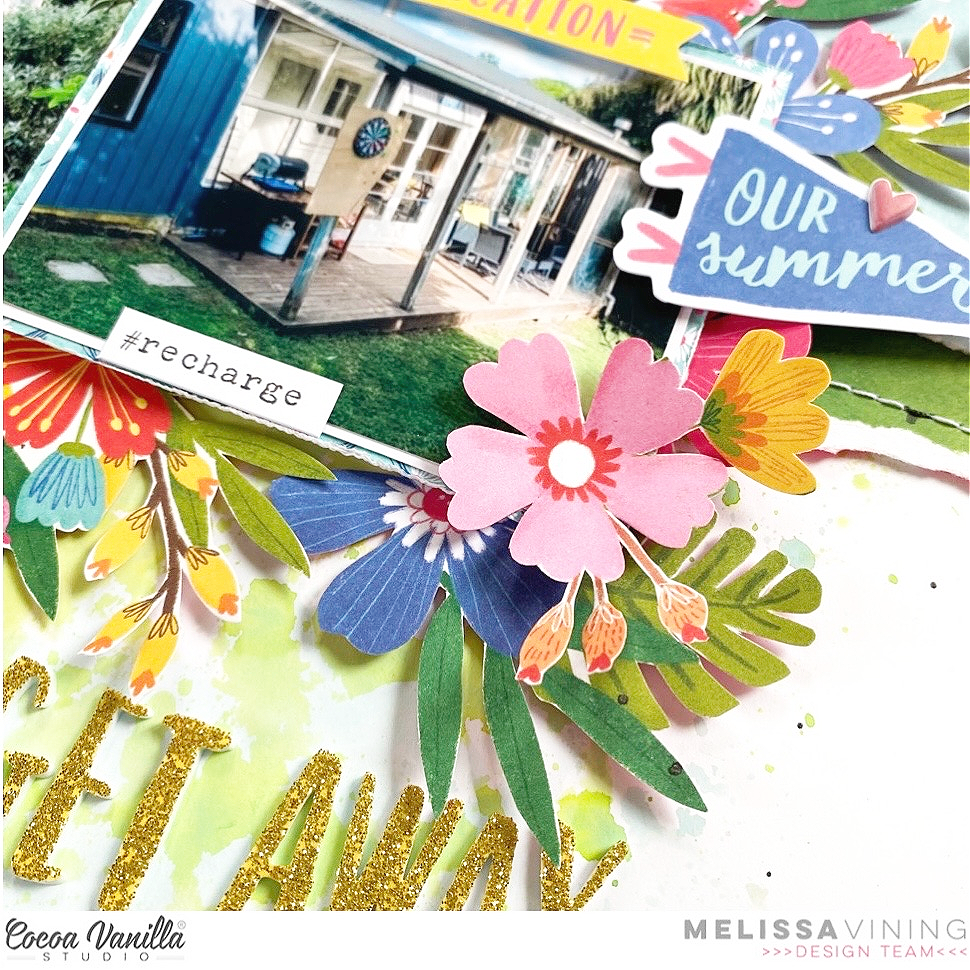
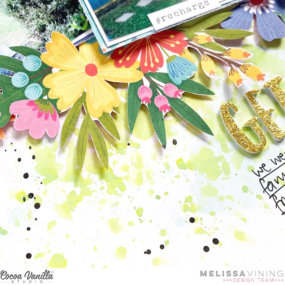
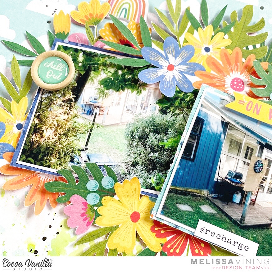
Hello everyone!! Its Melissa here and I’m so excited to be back with another layout created with the stunning Sunkissed collection!! I really can’t get enough of this collection and I’m using it exclusively to scrap our January 2021 beach holiday at Riverton over summer (I’m creating a 12×12 album). For this layout I decided to document the cute little beach house that we stayed in.
I decided to fussy cut almost a whole sheet of the gorgeous florals from the ‘Growing Wild’ patterned paper. I honestly find fussy cutting relaxing and I love the look of layered florals.
For my background I used distress oxide inks in green and blue to complement the blue skies of ‘Just Chillin” and the green of the leaves. I created the water colour effect by stamping the ink pad onto plastic, spritzing with water and then smooshing the plastic on to my card stock (the packaging technique). I didn’t use any gesso, and I also allowed my paper to dry naturally so to reduce the warping.
In order to pull out more of the blues and greens I used a torn strip of ‘Good Vibrations’, and machine stitched both pieces of paper. I then built my floral clusters around my two photos, and I love how it mimics the house that is located within bush.
Some of the flowers I placed over the photos, but most we tucked underneath. I just kept adding flowers until I felt the layout was balanced. I kept my embellishment very simple because the flowers and leaves did so much of the work for me. I just had to add the ‘Die Cut Ephemera’ sun, which I popped up on dimensional adhesive. I added some other die cuts too.
I used the banner ‘Our Vacation’, and even though its not a term we use in New Zealand I love it! I also had to use the ‘Our Summer’ flag, with a ‘Puffy Sticker’ heart layered over it.
I used two of the gold glitter ‘Foam Title Stickers’ for my title, and as aways I had to add my handwritten journalling. My final touch was to add some black splatters.
It’s Anna here with you, sharing my last layout as part of the Design Team. It has been an amazing year and I’ve enjoyed so much working with Cocoa Vanilla collections. I want to thank Zoe for giving me this opportunity. And I hope my projects have inspired you during this month. For today’s layout, I’ve used the beautiful Daydream collectionand a cut file from Cut to You.
I started with a watercolor sheet, using dye inks and the plastic technique to create my background. Then, using the same inks, I stamped typed words, because books are the subject of the layout.
The cut file has two books. I backed the one that is open with a paper from the Unforgettable Collection because it reminds me of the pages of a book. I backed the other one with papers from the Daydream 6×8 paper stack.
I placed my picture on top of the open book. My daughter is reading a book to her little cousin, that’s why I decided to use this cut file. I think it’s so sweet. For my title, I used the words “good moments” from the die cut titles.
Finally, I put die cut flowers all around the cut file and the picture. The flowers give a spring and magic look to the page. I also added a cute rainbow, a butterfly, and a little heart.
Thank you so much for stopping by today. I will miss sharing my projects here in the blog with you, but now I have to focus on my new job!
Hello CVS friends, today I want to share some quick and easy gift boxes and a card I have created using Daydream Collection. With Easter not far away (and I love easter creating way more than Christmas) Daydream was perfect with its beautiful muted colours to create Easter paper crafts.
You can find the milk carton cut file in the Silhouette Design Store. I cut the base of the milk cartons using Stepping Stones paper. I used papers from the 6×8 inch paper stack to cut the tops, using Garden Variety, Up in the Clouds and Sweet Serenity designs.
Next I cut three bunnies again using the 6×8 inch paper stack papers, I embossed the bunnies cut from plain paper but left the floral bunny as it was patterned. I added a small pom pom for the tails. Next I added word sentiments from the Accessory sticker sheet.
I cut three rosettes to attach my bunnies to, this really adds a wow factor. I then added some die cut ephemera to embellish. These will be filled with sweet treats and given as gifts.
I made this super cute Easter card which is so easy to put together and time friendly. I cut a 5×5 inch paper strip using the Garden Variety paper again. I then added Happy Place paper to back the circle wreath die cut piece. Before adding this to the centre of my card I added some sparkley ribbon. I cut another bunny (different style) resized it to fit my card and added off centre in the wreath. I added a pom pom tail and a phrase sentiment from the Accessory Sticker sheet.
I had so much fun making these Easter projects and who needs an Easter collection when you have Daydream collection. Thank you for stopping by today and I will be back soon with a layout using the new Sunkissed collection!
Gwen back on the blog today with a new share and all this week on the blog the design team have been creating in our ‘Signature Style’. I love being able to do this, it’s always so fun to just make a layout focusing on the way you love to create. I’ve created this page to document a sweet photo of my daughter taken recently and I thought it might be fun to go through 5 things I love to do on all my scrapbook layouts, things I do all the time when creating – 5 things that make up my signature style.
So, first up, let’s talk about photos. My style would have to be a single photo on my pages. Most of my pages have a single photo which is usually 4×4 size and generally only has one or two people in it, being my daughter and/or husband. I share a lot of photos on Instagram, so that’s why I have a lot of photos in 4×4 format. For this page, I’ve backed my photo using the ‘Stepping Stones‘ print but in the ‘6×8 Paper Stack’ so that the print is smaller.
Secondly, I like to use a lot of Cut Files on my pages. I’ve used one from CUT to YOU for this page. There are some lovely cut files in the Cocoa Vanilla shop as well, which you can see here. I’ve used the B side of the ‘Sweet Serenity‘ pattern paper and the 6×8 Paper Stack to back the cut file for this page and then just placed flat onto my background.
Thirdly, is pattern paper. I just love the stuff. I love using pattern paper in my backgrounds too rather than cardstock. For this page, I’ve used the A side of the ‘Sweet Serenity‘ pattern paper. This is one of my favouites in this collection, you definately need several sheets of this one! xo
Next up is clusters. We simply need to talk about clusters. For me, adding clusters is the most fun part of creating a page, I love mixing and matching elements in a collection to create pretty clusters on my layout. I’ve used elements from the ‘Die Cut Ephemera‘ pack, Accessory Stickers, a ‘Flair button‘ and fussy cut elements from the ‘Garden Variety‘ and ‘All a Flutter‘ pattern papers on my page. I’ve also added some sequins from the ‘Sequins and Flowers pack‘ as a finishing touch to my clusters.
and the last of the 5 things that make up my signature style is stitching. I stich on every page that I make. I just love the added detail it gives to a page, it really makes it special. I tend to sew on most of my photos and around the edge of my layouts, just with my machine, so it’s a sweet detail that doesn’t take very long to add.
I’ve also made a YouTube video which shows you the process for this page and I also talk more about the 5 things that make up my style. You can watch it here:
It’s Sophie on the blog today sharing a layout created with the gorgeous Daydream Collection.
Today’s theme is “My Signature Style” meaning creating a layout in my “usual” style. Here it is:
I don’t know exactly what is my style to tell you the truth, but I know that I love creating big floral clusters and usually can’t stop layering pieces to create them ! I also nearly always hand write my journaling directly on my background paper. So these are my focus on my page today… Clustering was quite easy to do with the gorgeous floral die cuts from the collection !
I used a thick white cardstock as my base and cut a background cut file made of snowflakes that is a Hip Kit Club cut file. I backed my cardstock with the GORGEOUS (clearly my favorite of the kit !) patterned paper named “Sweet Serinity”.
I took a photo of my little Sabrina playing in the snow (yes, this is my last wintery layout as I just CAN’T WAIT for spring to arrive…!!), backed it with tissue paper, adhesive foam and a few layers of patterned paper and adhered it on the right side of my page.
I used Die Cut words from the same collection for my title and applied a bit of Nuvo Iridescent Glitter Texture Paste on the words for a little extra shine !
I placed die cut houses, hearts and stickers on the left side of my photo and of course, created that big floral cluster next to the photo. I also added glitter paste to the roof of the houses and on some of the flowers. I added a cute Flair Button and, as usual, the last thing I did was to hand write my journaling !
Although this is not a winter collection, the Daydream collection is so versatile that it works perfectly with this winter photo !
Here are more close-ups:
I hope that you like this page and that it could inspire you in some way ! What is your signature style ??
Hi everyone, it’s Sue here today to share my latest design team project with you. Do you know what day it is today? It’s Throwback Thursday! And that means I am sharing a brand new layout using up some of my older Cocoa Vanilla stash. The purpose of this regular feature is to help inspire everyone to continue using up what they already have (so we can make room for all the new pretties, like the ‘Sunkissed’ collection).
For today’s project I decided to create a boy-themed layout, as I get lots of requests for boy pages, so I dug into my stash of both the ‘Legendary’ and ‘Boys Rule’ collections for an epic mash-up of the two. I love the way they combined for this layout, and I hope you do too!
I started my layout with the mandala-style print of the Explorer paper from the ‘Legendary’ collection as my page base. I then added a small amount of dark grey acrylic paint using a wide brush to help define the focal area of my page. My aim for this layout was to stick with a largely monochromatic palette of black / white / grey, with a pop of one colour, and I chose yellow. I love this colour combination for boys, as it’s a great change away from the traditional blues & greens that are often used for masculine pages.
I added a large piece of the Wild One patterned paper with the gorgeous yellow print in the centre of my page, which provided me with the big pop of colour I was looking for. I used a torn edge to add texture to the page and tucked a smaller piece of the Straight & Narrow striped paper from ‘Boys Rule’ under it. I double matted my photo using the Happy Go Lucky and Messed Up papers (also from ‘Boys Rule’) and added some scrap cardboard under it to pop it up from the page.
My title was the next element I tackled, as I knew I wanted it to fill the space beside my photo. I used a combination of the ‘Boys Rule’ Clear Stickers and ‘Legendary’ Die Cut Titles – because I love a good mixed font title!
For my embellishments, I created three clusters to form a visual triangle. The main cluster was at the bottom right corner of my photo, and consisted of a handmade star embellishment which I topped with one of the ‘Boys Rule’ Flair Buttons. I also added a die cut banner along the bottom edge of my photo and some gold twisted wire which I stapled to the page.
For my remaining embellishments I used a mix of ‘Legendary’ Die Cut Ephemera pieces; a few ‘Boys Rule’ Accessory Stickers and some of the ‘Legendary’ Enamel Dots. Then I finished off my page with some black ink splatters.
If you would like to see exactly how this layout came together, you can watch my process video here:
Thanks for stopping by today. Until next time, happy scrapping!
Hey y’all! Laura back again with a bright and happy layout featuring the new Sunkissed collection! The rainbow strip on the Good Vibrations patterned paper just called to me for these photos! By framing both sides with this brilliant mix of colors, I could keep the color scheme of the layout open ended and fun! I added a strip of Sunny Days to highlight the green tone in my daughter’s shirt.
I love to fussy cut, so the floral perfection of the Growing Wild paper just called to me! These clusters are stunning and make creating a long floral border super easy! I also added a small cluster from the A5 paper pad version at the beginning and end of the title. The wood buttons are so cute, I had to add one in the center of my photos for a different texture on the page.
I used clear stickers behind a few of the floral clusters and as accents around the title. These glitter foam words are amazing! Love pre-made titles and this one was perfect for my sassy girl’s car trip through the sunny backyard. To fill in some of the white space, I added some gold ink splatter and Nuvo drops.
I also created a sketch based on this layout to show how all of the layers fit together and make it easier for your to recreate the design if you’d like to!
I hope this layout inspires you to have some fun with the bold colors and patterns in the Sunkissed collection! To see how the “Fun in the Sun” layout came together, check out the process video below!
Hi scrappy friends! Danni here sharing a fun rainbow layout featuring lots of hand stitching texture and summery goodness. I am really just starting to dip my toes into the new Sunkissed collection and I am having so much fun with it! Like several of my fellow design team members and many of you amazing Cocoa Vanilla Studio community members, I was instantly inspired by the gorgeous rainbow on Bright Side 12×12 patterned paper.
My first step was carefully fussy cutting all the rainbow stripes from the paper. I knew I wanted to do a bunch of hand stitching, and in hindsight the stitching would have been much easier if I had stitched first THEN fussy cut, but hindsight is 20-20 and at least you can learn from my mistakes!
Next I chose embroidery floss in colours to match each of the stripes and pierced stitching holes in my paper with an awl to prepare for stitching. I began by doing a chain stitch in the red colour, loved how it looked but I wanted more variety and texture so I decided to switch it up and add a different stitch to each colour. I really love this result! For reference the stitches from top to bottom are chain-link, cross, diagonal, zig zag, blanket and chevron. This did take some time over several days, but I get comfy in front of the television and stitch away while I watch shows with my family and the time flies by.
I decided to use Just Chillin’ 12×12 patterned paper for my background because I have been dying to use that gorgeous woodgrain. I knew the colours would pop on the neutral base and I love the more masculine, natural element it brings in, especially as my photo is of my two boys. I jazzed up my background by splattering white and gold ink, then glued down my rainbow stripes.
I used the blue daisy pattern from A5 paper stack to create a simple photo mat and added my photo to the left of the layout; as the rainbow is slightly offset to the right, bringing weight to the left helps to balance the layout. I added some of the stunning glittery foam title stickers under the rainbow, slightly overlapping my photo.
I wanted to cover as little of the stitching as possible, so when embellishing I chose the floral ephemera and cut several of them in half before tucking them underneath the edges of the rainbow stripes. The smaller florals I popped up on foam before adding to the clusters. I also added one of the smallest wood epoxy buttons to each of the clusters; they are just too sweet!
The finishing touch was to add a scattering of hearts from the foam title stickers and die cut ephemera, as well as some of the adorable cross hatch patterns from the clear stickers randomly scattered about.
I hope you enjoyed this layout! There is a process video linked below if you would like to watch it come together. Thank you for joining me and happy scrapping!


 You can find the milk carton cut file in the Silhouette Design Store. I cut the base of the milk cartons using


