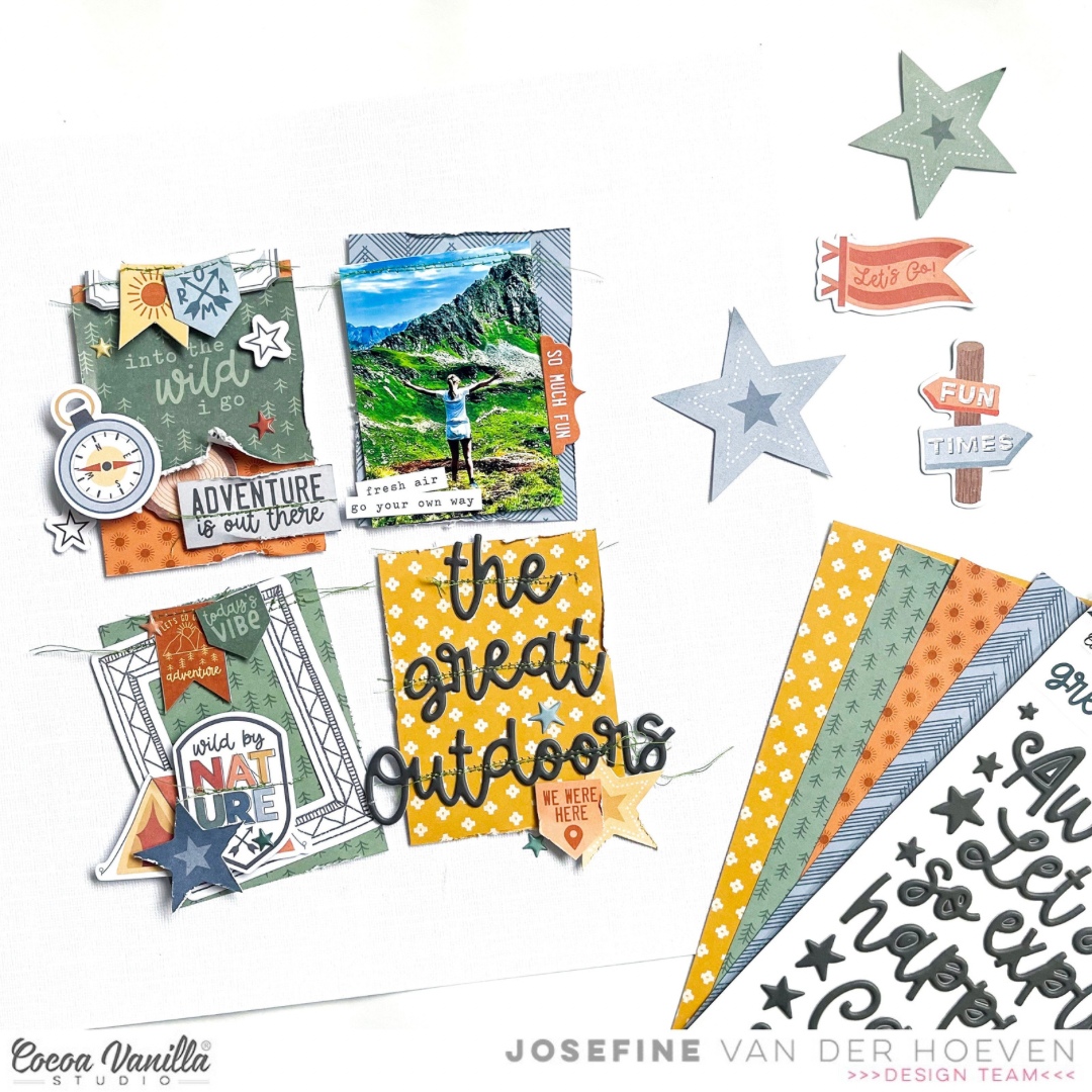
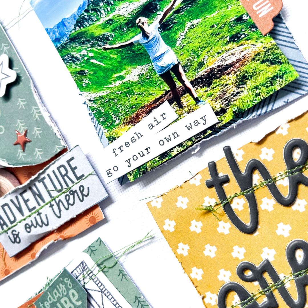
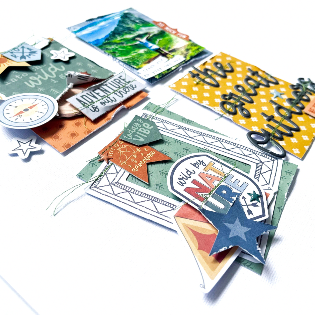
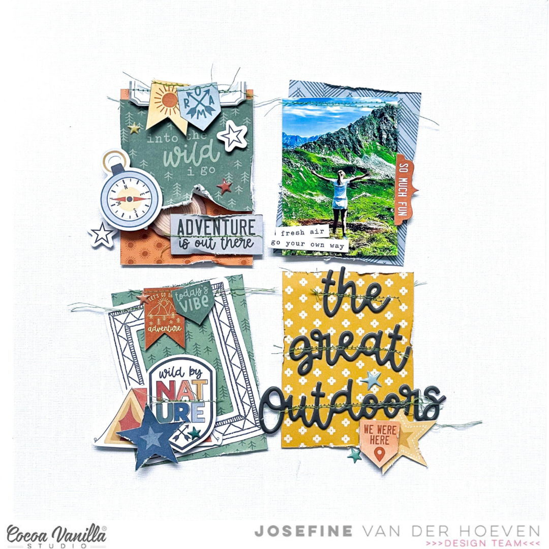
welcome to today’s scrapbook blog by Cocoa Vanilla Studio! It’s great to see you here seeking for new scrapbook inspiration. Today, I’m excited to share with you a fresh scrapbook layout featuring the fantastic new collection “Great Escape.” For this project, I’ve choose for a grid design as my inspiration. I cut various strips of paper to size and arranged them in a grid pattern on my white cardstock background.
To start, I selected some shape die-cuts and added them to the strips of paper, stitching them with green thread. I love the texture and effect that stitching adds to my scrapbook projects. On the right side, I created clusters with some beautiful and fun shape die-cuts. I also stitched green thread onto word strips and banners, giving them a nice placement on my layout.
The photo of my daughter high in the mountains of Austria complements the theme perfectly. The lovely swirl puffy titles from the collection fit wonderfully, so I placed them at the bottom left to create the title “The Great Outdoors,” stitching it with green thread as well. Placing the photo above the title, I added a few word strips as extra accents.
I’m really pleased with how the layout turned out, and I hope I’ve inspired you with this grid design. Wishing you all a wonderful day, and until next time on the blog. XoXo, Jo
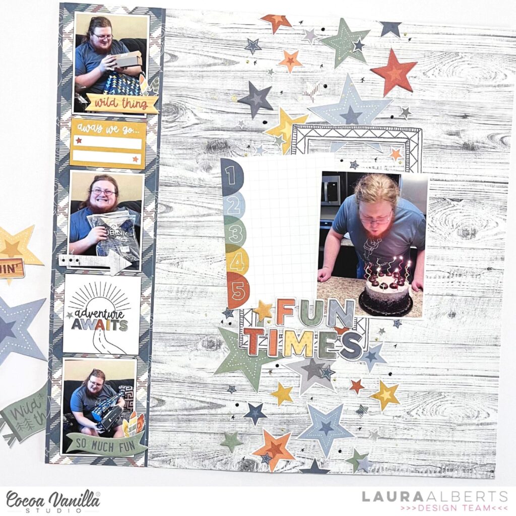
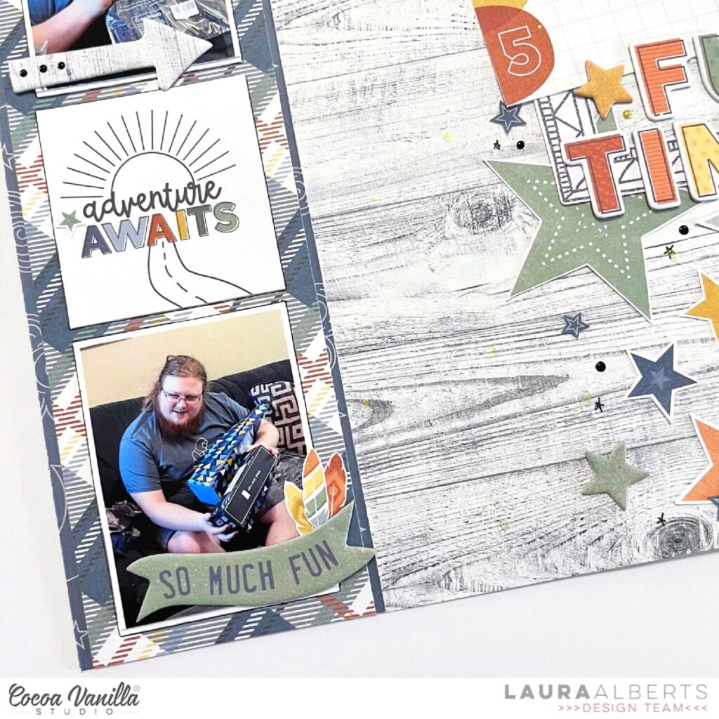
Hey y’all! Laura Alberts back again with another Great Escape layout, but this time it’s a birthday page. Four photos and a shower of stars is the recipe for creating a layout bursting with celebratory vibes! The colors were too perfect not to step outside the theme of this collection for a fun spin a column design.
I started with a strip of the stunning plaid on the Star Gazing patterned paper, layered it with thin strips of the navy, then attached it to the beautiful gray woodgrain of the Starry Night to build my background. I lined up my three smaller photos and a few cut aparts from the Wild Life paper to fill in my column.
On the right side, I scattered fussy cut stars from the Star Gazing patterned paper to create a second column, then added my 3×4 focal image and a journaling spot on top! The chipboard stickers were perfect to embellish both columns and add a title with a 3D pop!
I hope this layout inspires you to try stepping outside the theme! If you’d like to see how this layout came together, check out the process video below:
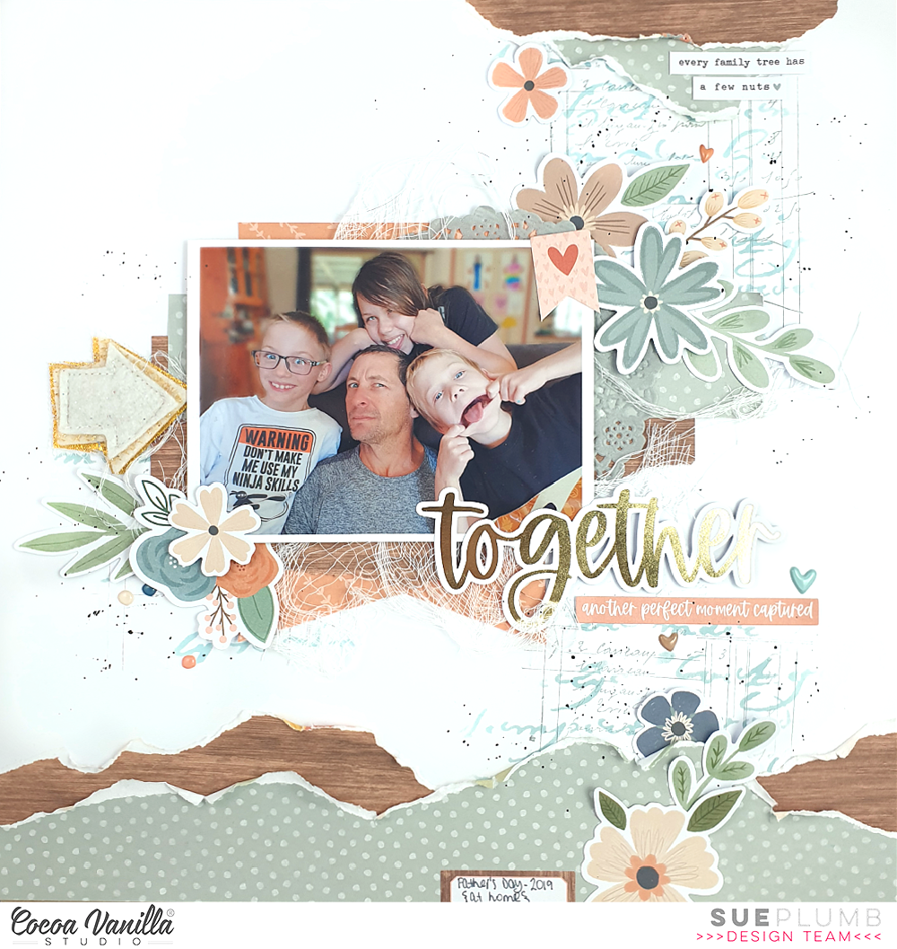
Hi everyone, it’s Sue Plumb here to share another design team project with you. Today I am sharing a mixed media family themed layout I created using the beautiful ‘Heart & Home’ collection. I decided to document this photo of my hubby and kids from Father’s Day a few years ago and feature the blue / green tones of the range.
I decided to keep this layout relatively clean and simple, so began with a white cardstock base and some mixed media. I first added some stencilling using a Distress Oxide and script stencil; then some light stamping over the top using a ledger stamp and grey ink. These three points formed my “visual triangle” to help define my placement for my photo.
I chose a mix of patterned papers to use for my page that included the B sides of the Bountiful, Harvest and Framed papers. I added torn pieces of the green and wood grain patterns along the bottom edge of my page, using my fingertip to ruffle the edges for extra texture. I then mirrored the same paper pieces on a smaller scale along the top edge of my page. The mixed media on the background helps to connect these pieces to the main area of the layout.
For the focal area of my design I used a mix of all three patterned papers and tucked a grey paper doily into the layers. I also added some frayed gauze for texture before mounting my photo on top, and then began adding my embellishments. I started with the sweet little heart banner in the corner of the photo from the Accessory Sticker sheet. I love adding embellishments directly onto my photos, as not only can you use this trick to cover unsightly things in the background or fill negative space, but I find it also helps to connect the photo to the rest of the elements on the page.
I wanted to build floral clusters on this page, so I rifled through the Floral Ephemera pack and pulled out pieces that worked with my colour scheme. Then it was simply a matter of shuffling the pieces around until I was happy with the arrangement. I made sure to tuck the pieces over and under each other, as well as other elements on the page, to help create depth. I also bent the edges up or used foam tape to add dimension to some of them. To the left of my photo I added a handmade felt arrow from my stash.
I chose the word together from the Gold Foil Titles pack as my page title, and then a few phrases from the Accessory Sticker sheet for some additional text. (I always try to ensure a balance between images / text and other elements on my page – it makes it more interesting for the viewer to have a mix of things to look at.) I finished off with some scattered dots and hearts from the Puffy Stickers pack and some tiny black ink splatters.
Thanks so much for joining me today, I hope I have inspired you. Why not pull out some of those stencils or stamps from your own stash to add some subtle mixed media to your next project? Remember – you don’t need to cover the whole page and sometimes a little can go a long way!
It’s Sophie with you today and I am excited to share my very first layout with the new Great Escape collection!
As soon as I saw it, I knew exactly which photo to document with it!!
I started with a white background and the Starry Night paper to place my photo and embellishments.
I mounted the photo on tissue paper, adhesive foam and a few layers of patterned papers from the A5 Paper Stack.
I placed the photo on the right side of the page, and added white gesso on the left side where I was about to build a little scenery.
I selected a few embellishments from the Die Cut Ephemera pack like the trees, signage and tent to support the theme of the layout, and scattered numerous stars around the photo and title (Foam Title Stickers).
I completed the page with a few stickers from the Accessory Stickers sheet, and handwrote my journaling directly on the white background.
Here are more close-ups:
Oh how I LOVE this collection!! It’s just perfect for outdoors memories!!!
Happy Valentine’s Day everyone! As my posts always appear on 14’th of each month, I have this luck to be a Valentine’s Day inspiration each year too! So I always try to make something in a love theme and it became sort of mini tradition that I make little gifts for my daughters each year. It’s usually two sets containing of card and a little box for some treats. This year will be no different as I made heart shaped cards and boxes using “Happy days” collection.
This line is very versatile and has no specific theme so it’s easy to customize it. In this case by customization I mean making shaped hears and boxes. What better screams “Valentine’s Day” than hearts? So I used my digital die cutting machine and I cut two heart shaped boxes and two heart shaped card bases.
Each box can hold chocolates or other small gifts. I hose chocolates of course as my girls really like treats. Plus it is meant to be a small gift, just to appreciate them and tell them how much I love them. Valentine’s Day is not only about the other half for me. It’s about love in every shape and form, also to our children.
I created two sets in two different colors combinations. First one is yellow and it’s filled with fruits you can find within the “Happy days” collection. I spend some time to cut out them from “Juicy fruit” paper and from similar pattern you can find in A5 Paper Stack. Box itself is made with “Feel good” and “Little blossom” papers. Inscription on the box was made with super versatile Mini Puffy Alpha Stickers.
Card matching the first box is also decorated with fruits. I also added few butterflies fussy cut from “Flutterby” paper. Title on the card was created with Chipboard Title Stickers. I just treated them as alpha stickers picking letters I need from different words. I knew I won’t be able to use up all of them for titles so it seems like a good idea.
This card, similarly to the box, features flowers. It also has a title made with Chipboard Title Stickers. I finished the design by adding few little dots from Puffy Heart Stickers.
That is all for today. I hope you like my Valentine’s Day gift ideas and you are already waiting for the ones I will make next year ;)
Hug your loved ones today. See you in two weeks with an inspiration made with brand new “Great escape” collection.
and welcome to the Cocoa Vanilla Studio blog! We’re happy to have you here looking for fresh scrapbook inspiration and curious to explore the fantastic new collection called “Great Escape.” My family and I are mountain lovers, always on the lookout for new adventures through long climbing hikes. This collection fits perfectly with our cherished memories from Austria and Switzerland. The photo featuring my daughter and me was taken in the picturesque town of Hallstatt, Austria.
To kick off this creative journey, I started by cutting a large circle out from white cardstock. Opting for a light blue patterned paper, I filled the circle and added a touch of detail by stitching the edges with green thread by using my Cricut cutting machine. I cut three different trees from green and gray cardstock. The cut files are from the Cricut store. The choice of green and gray provided a beautiful contrast that complements the colors of the new collection. To add depth and dimension, I attached the trees with 3D foam, for a lovely stand out.
Next, I sized the photo and added a dark blue border by cutting the pattern paper to fit and placing it behind the photo. I placed the photo with patterned paper halfway onto the trees. Creating a focal point on the right side of the photo, I selected die-cuts to make a large cluster. Adding a green stitching detail to some of the die-cuts.
Underneath the cluster, I finished with two word strips that complement the theme. For a playful touch, I scattered puffy stars across my layout as confetti, bringing joy to the overall design. Lastly, I created my title using the beautiful word titles. The font of these word titles is truly amazing, and I chose “Let’s go explore” as the title. To finish, I added splatters of white gesso and green and blue Distress Oxide using a brush.
I hope this outdoor layout has inspired you to embark on your own creative journey. I’m thoroughly enjoying working with this beautiful collection and can’t wait to create another layout. Until next time, happy crafting!
Hey y’all! Laura Alberts here again with another Great Escape layout featuring a ton of camping photos from our trip to Cumberland Falls! The waterfalls at this campground were stunning, so I wanted to squeeze as many photos on this layout as possible. In the end, there are two 3×4 inch photos and four 2×3 inch photos documenting the sights and my kids exploring the area.
I started with a few paper strips, two from the cut-apart Wild Life patterned paper and the others are off-cuts from Starry Night and Journey. In addition, I fussy cut a ton of stars from Star Gazing and the feathers from Direction. I love the patterned papers that have designs perfect for fussy cutting!
In addition to the vertical and horizontal strips that I used as a base for my design, I added an little shelf in the center to hold my main focal images. The fussy cut stars added a nice detail to the rainbows along the vertical strip, while the rainbow stripe reflected the same color scheme along the bottom and on the shelf, creating continuity between the three clusters of photos.
I hope this layout inspires you to expand your use of paper strips to think outside of the box! If you’d like to see “Explore” come together, check out this process video below:
I am so happy to be back on the blog today and sharing a mixed media layout with you using the brand new ‘Great Escape’ collection. To say I was excited when I opened this box is an understatement. As a mum of two active pre-teen boys, I can see many projects coming up with this one! I had this first layout completed within a couple of hours of first opening the box…
This layout documents a funny story about one of my boys, who is currently obsessed with all things military. I chose the compass print of the Direction paper to be my page background, and added some dark grey acrylic paint with a brayer to define the focal area.
I then added a wide strip of the B side of the Happy Camper paper horizontally across the page to serve as the anchor point for my design. This was topped with a narrow strip of the B side of the Horizon paper to further help draw the eye across the page. The larger of my two photos was matted with the darker green print from the Journey paper and I also added some frayed gauze for texture underneath it.
I then took the same Horizon and Journey papers again, and cut two tags from them, adding hole reinforcement stickers and bakers twine to each. The tags were then tucked alongside the smaller of the photos and I used the twine to join them together. This was to keep with the military theme, and were reminiscent of the dog tags worn by soldiers. I added a small phrase sticker from the Accessory Sticker sheet to one, and used the second to stick my typed journalling onto. (I’ll post a longer explanation of the back story of this page at the end of the post for those who are interested.)
To embellish the layout, I used a number of pieces from the Die Cut Ephemera pack, including the get outside and roam badge, which I mounted on some foam tape to pop it up from the page. I also loved the arrow signpost from the Chipboard Stickers sheet that I placed along the yellow horizontal strip too.
At this point I went back and added some white acrylic paint using a stencil and brush. The purpose of this was to bring a bit of added lightness to the page over the darkness of the grey paint and it also helps add depth to the design as well.
I finished off by adding the wild thing Chipboard Sticker along the bottom of my main photo for my title; a large yellow star from the Die Cut Ephemera pack near the top of the page; and then scattered smaller stars and circles from the Puffy Stickers pack.
I really love how this page turned out, and my son does too! The ‘Great Escape’ collection will be hitting the shelves of scrappy retailers very soon. Look out for a pre-order at your favourite store – you’re going to love it!!! Thanks for joining me today, I’ll be back with another project to share soon.
Now for anyone who has stuck around this far and wants to know the story of this page….
My son had dressed up in his dad’s old camos and had his big Nerf gun wrapped in plastic when he went for a stroll around the block. (Disclaimer: my son is not a big boy, and is clearly recognisable as being a kid.) Upon being spotted by someone on a street nearby, they called the police to report “a man with a gun”, and two police cars were immediately dispatched to the area. (One containing police in tactical response gear.) The police cars came rolling down our street, spotted my son and sounded the siren, who immediately panicked and ran. Luckily, my hubby had gone outside to see what was happening and he was able to speak with the police to explain. The officers all had a good laugh about it and were surprised they had been called as he “was clearly a kid”. It will definitely be a funny story for him to tell his own kids one day. Document your stories!
It’s Sophie with you today and a new layout to share!
I used an old favorite collection: More than Words!
I framed a 11×11 thick white cardstock by scoring the four edges and placed it on a beautiful black dot patterned paper from the collection.
I centered a sweet photo of my two dogs on the page, adding tissue paper and a few layers of patterned papers behind it.
I went for a big title with the black chipboard words from the collection, and decorated the page with fussy cut flowers, a beautiful fussy cut wreath and numerous butterflies from another patterned paper.
I added a few chipboard stickers as the finishing touch.
No journaling on this one, which is very rare for me!!
Here are more close-ups:
It’s crazy how just a few embellishments and a big dimensional title can easily create a delicate and beautiful page!
I hope that I could inspire you with this layout today, to maybe use up your older collections…even if you have just a little bit of them left!
Hey y’all! Laura Alberts back again with the brand new Great Escape collection! Love the camping/nature theme with this one! I have so many beautiful photos of my family on camp-outs and hikes to scrap, so this collection came at the perfect time. I started with the stunning Horizon patterned paper for my background.
I layered some simple cloud cut files with the rainbow strip paper from the A5 paper stack, then added fussy cut clouds and stars from the Starry Night patterned paper. A few lovely stickers from the 6×12 sticker sheet made the perfect cluster under the title and added a little extra detail to my photos.
I created a journaling spot in one of the clouds and used manufacturing strips to create an interesting asymmetrical base for my photos to sit on. Love how trimming these strips in half allowed me to tuck them behind my photos and stretch them to the full width of the page!
I hope this layout inspires you to try a busy background for yourself! If you’d like to see how “Campers Life” came together, be sure to check out the process video below:


 I created two sets in two different colors combinations. First one is yellow and it’s filled with fruits you can find within the “Happy days” collection. I spend some time to cut out them from


