Choose Happy | Happy Days | Kellie Moore
Hello Cocoa fans, welcome back to the blog.
Today I have a page to share that features ‘watercolour’…this was my DT assignment, and I wont lie by saying I felt confident with this task. If you know my work, you know I’m not a huge user of mixed media. I love the look of it, but Im not confident but I gave it my best shot. Here is my page..
![]()
What I decided to do was use watercolour in a controlled way. I started with watering down some distress oxides in co-ordinating colours to the ‘Happy Days‘ collection, then I pulled out some alpha stamps from my stash. I used a paintbrush to paint on the colour onto my ink pads then stamped out some words onto white cardstock. Here is what it looks like close up..
![]()
I love the look of the words, they add a really unique look to my page. I used the paper ‘Flutterby’ as my main paper and layed it on top of a full 12×12 of the ‘Rainbow Bright’ paper. Next, i ripped down from the middle of the ‘Flutterby’ paper and added some of the ‘Little Blossom paper to the inside of the paper to add contrast.
Next, I started on my photo. I added a white border to my photo, then added a layer of the ‘Little Blossom’ paper and a layer of the ‘Feel Good’ paper. I then used one of the frame die-cuts (from the ephemera pack) cut in half to add to each side of my photo, and a label tab above my photo. I added some dimensional foam behind my photo to add dimension.
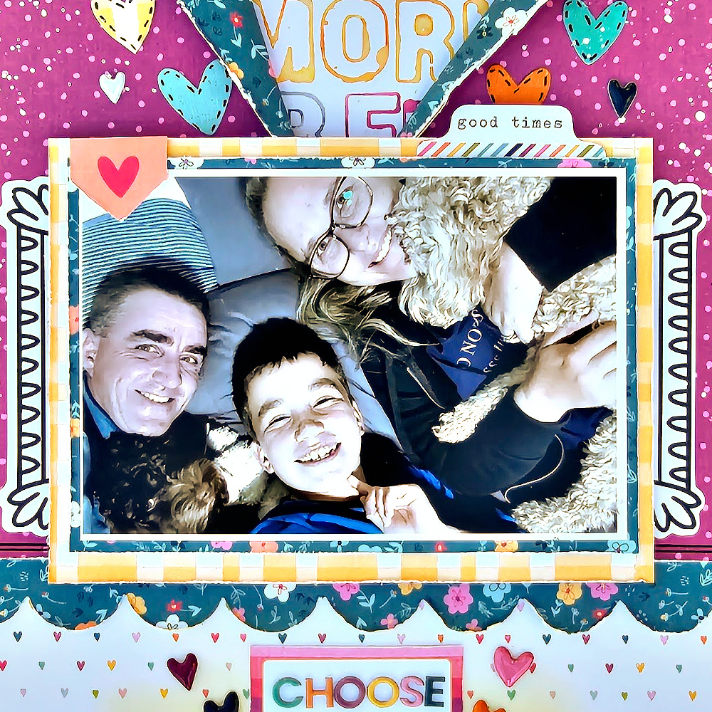
Now that I had my photo in place I decided to get my title in place. I used a label sticker from the ‘Accessory Sticker Sheet’ and some of the ‘Mini Puffy Alphabet’ stickers for the word ‘Choose’ then the word ‘Happy’ from the Die-Cut Ephemera. I added some yellow distress oxide under my title to make it pop and used some of the ‘Puffy Sticker’ hearts around it. At the bottom of the page I added some rainbows from the ‘Feel Good’ paper.
![]()
To finish off my page I added some more heart ‘Puffy Stickers’ above my photo and added some white ink splatters.
![]()
I hope you are inspired to create, and that you might try this watercolour technique or something similar …even if it is outside your comfort zone!
Thanks for stopping by today
Till next time
Kel
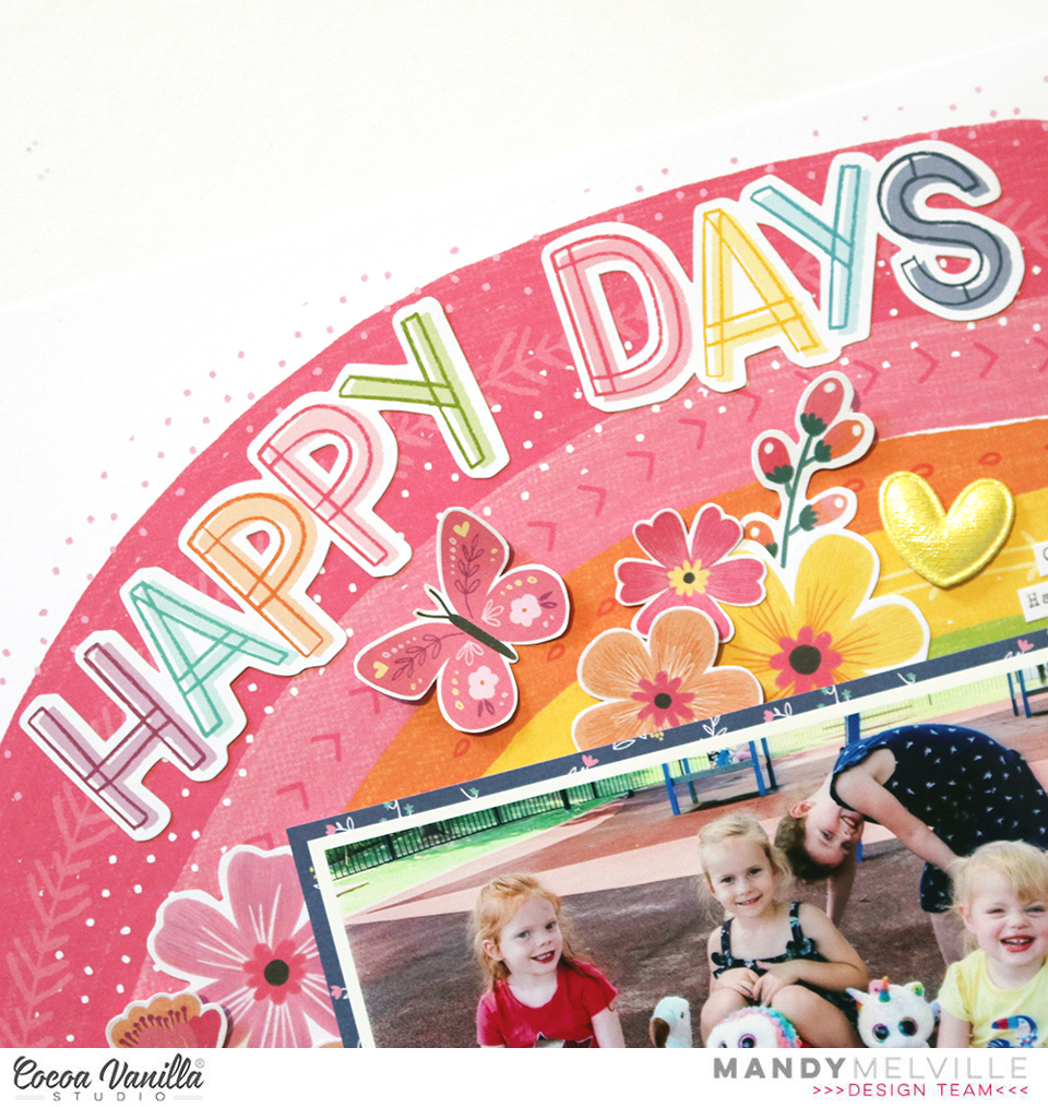
 The Rainbow Bright paper made such a gorgeous background for this photo and really brought the layout to life! Once I had decided on this paper, I then matted my photo with one of the papers from the A5 Paper Stack. I adhered it to the page using craft foam in order to give it some nice dimension and to help it stand out against all of the bright colours in the background.
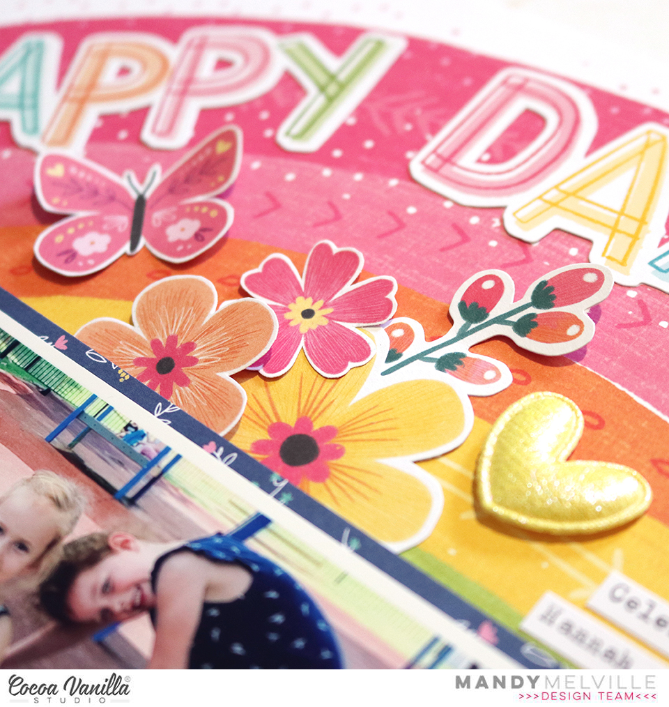
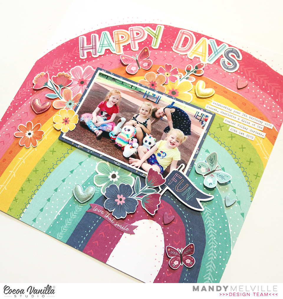 For my embellishing I decided to keep it mostly tone-on-tone. So on the pink section of the rainbow I added pink embellishments, on the yellow I added yellow embellishments, and so on. I started with a fun little cluster on the bottom right hand corner of the photo. As this was on the blue and purple section, those were the colours that I chose for this cluster. I included some florals from the Floral Ephemera pack, as well as some that I fussy cut out of the Lush Blooms paper. I also added a couple of Die Cuts to the cluster.
 Moving over to the left hand side of photo, I added another embellishment cluster using similar items that I used in the first. I tucked some of the flowers under the edge of the photo and some on top to give the cluster some dimension. How gorgeous are the Puffy Hearts?! I couldn’t resist adding one to each of my floral clusters!
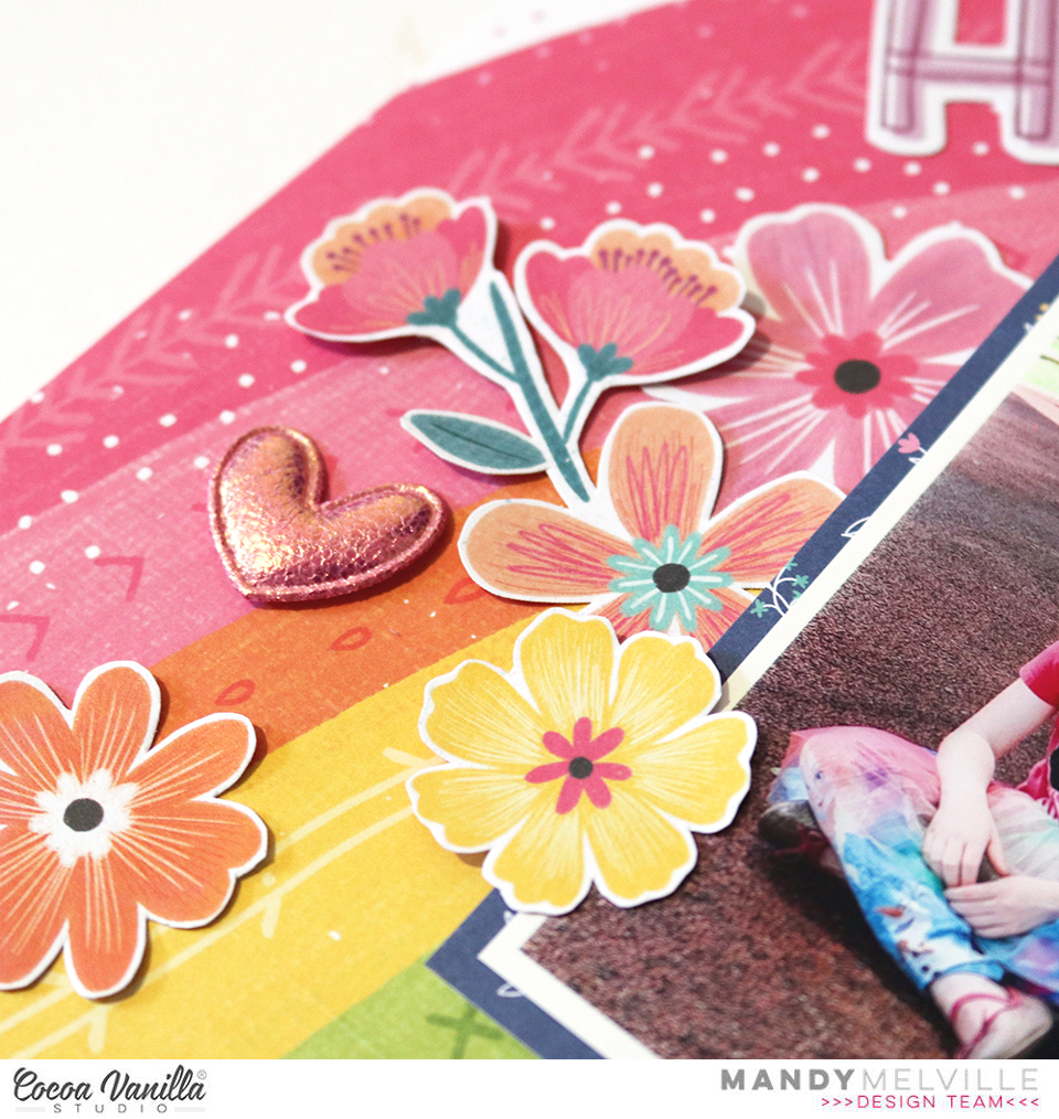
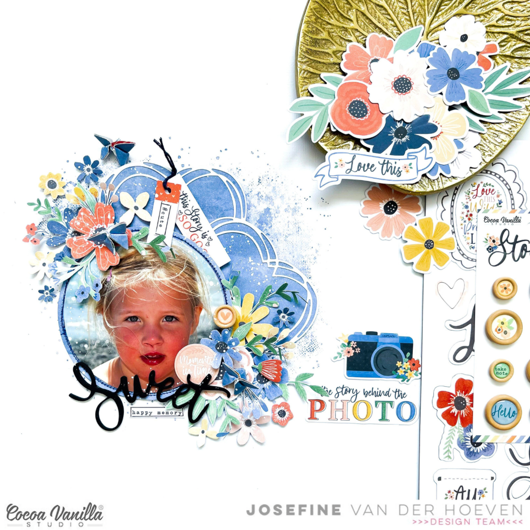
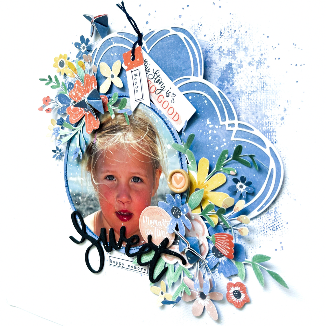 To set the foundation for my scrapbook layout, I decided to create a mixed media background using distress oxide ink. The color I use for this layout was “faded jeans.” With its subtle blue tones, it perfectly complemented the overall theme of my layout. The distressed effect added depth and texture to the background, setting the stage for the focal points of my design.
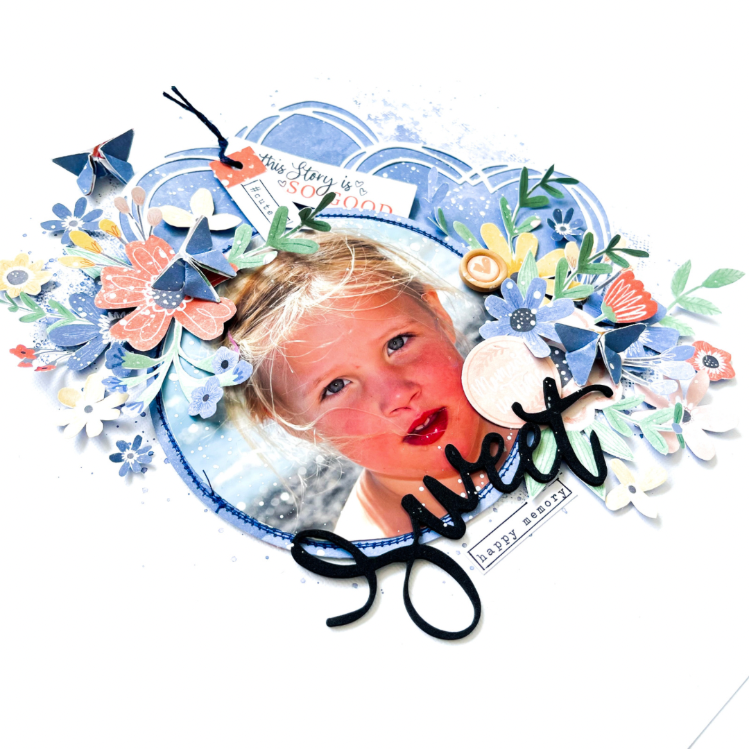


 I also printed my photo as a square and positioned it amongst the smaller squares on the page. I pieced it all together a little like a puzzle until I was happy with the placement of everything. The photo was adhered with craft foam in order to give it some extra dimension on the page.
 The fun part about creating a grid design layout is embellishing each of the sections in the grid. I added various die cuts and stickers to each of the squares in the grid, using foam tape to pop some up off the page. I tried to make sure that it looked well balanced by making sure that I didn’t have too much of one colour in any particular area.


