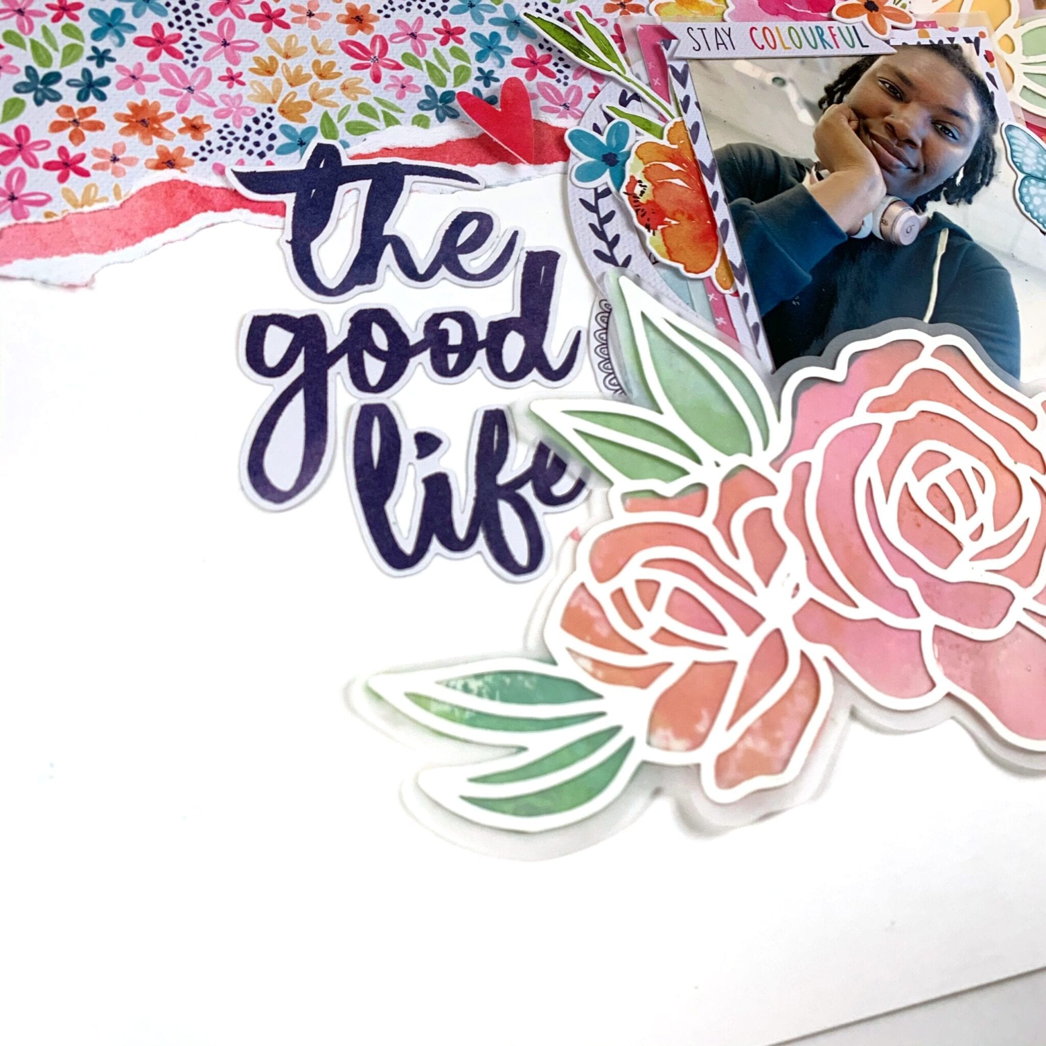
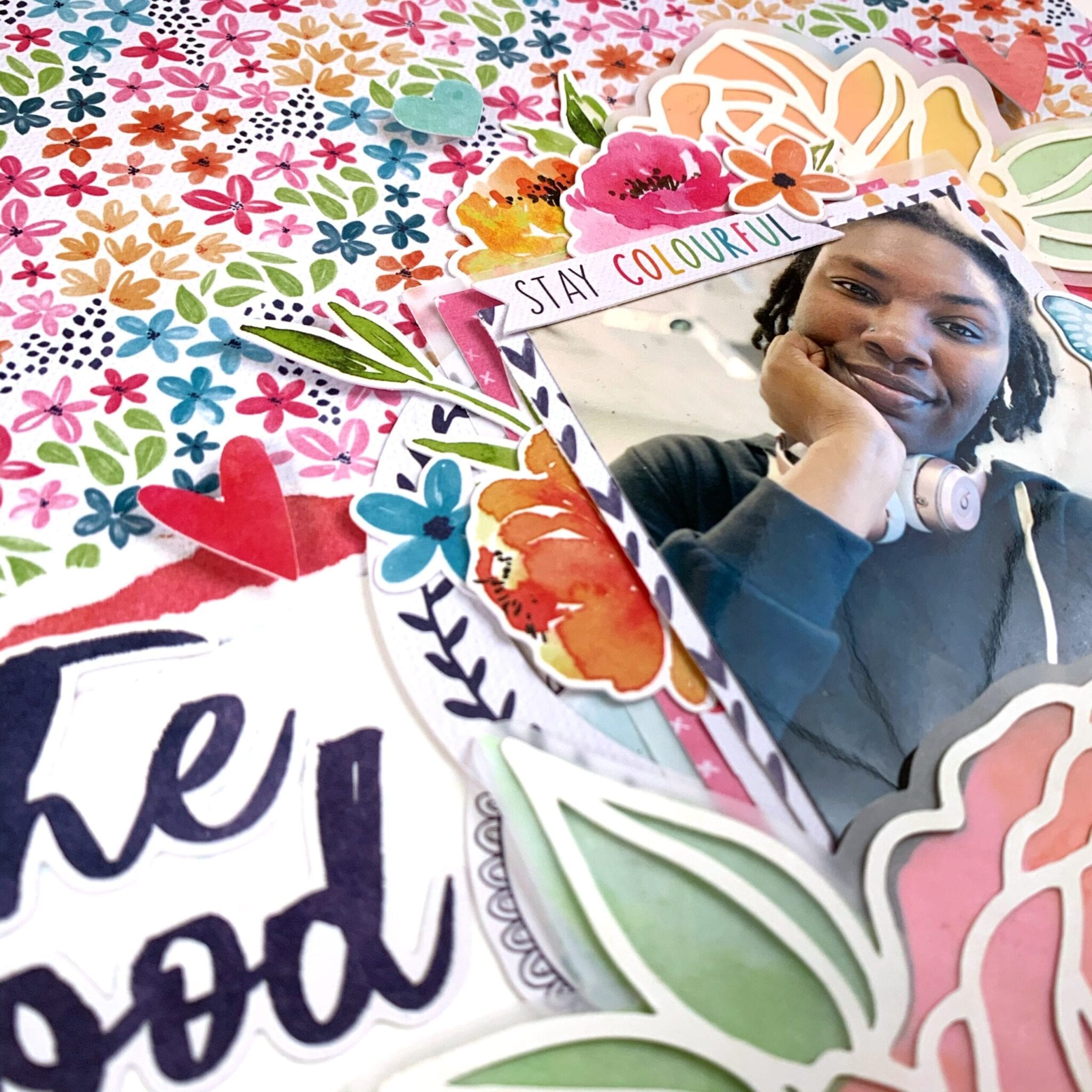
Hello Cocoa Vanilla friends, and welcome back to cutfile week! I am not a pro when it comes to using cut files but I have a few tips and supplies to make them a bit more accessible. I’m scrapping a selfie this week that I took on my 29th birthday and I’m using the Happiness collection as well as a cut file from the Cut To You shop for Cocoa Vanilla.
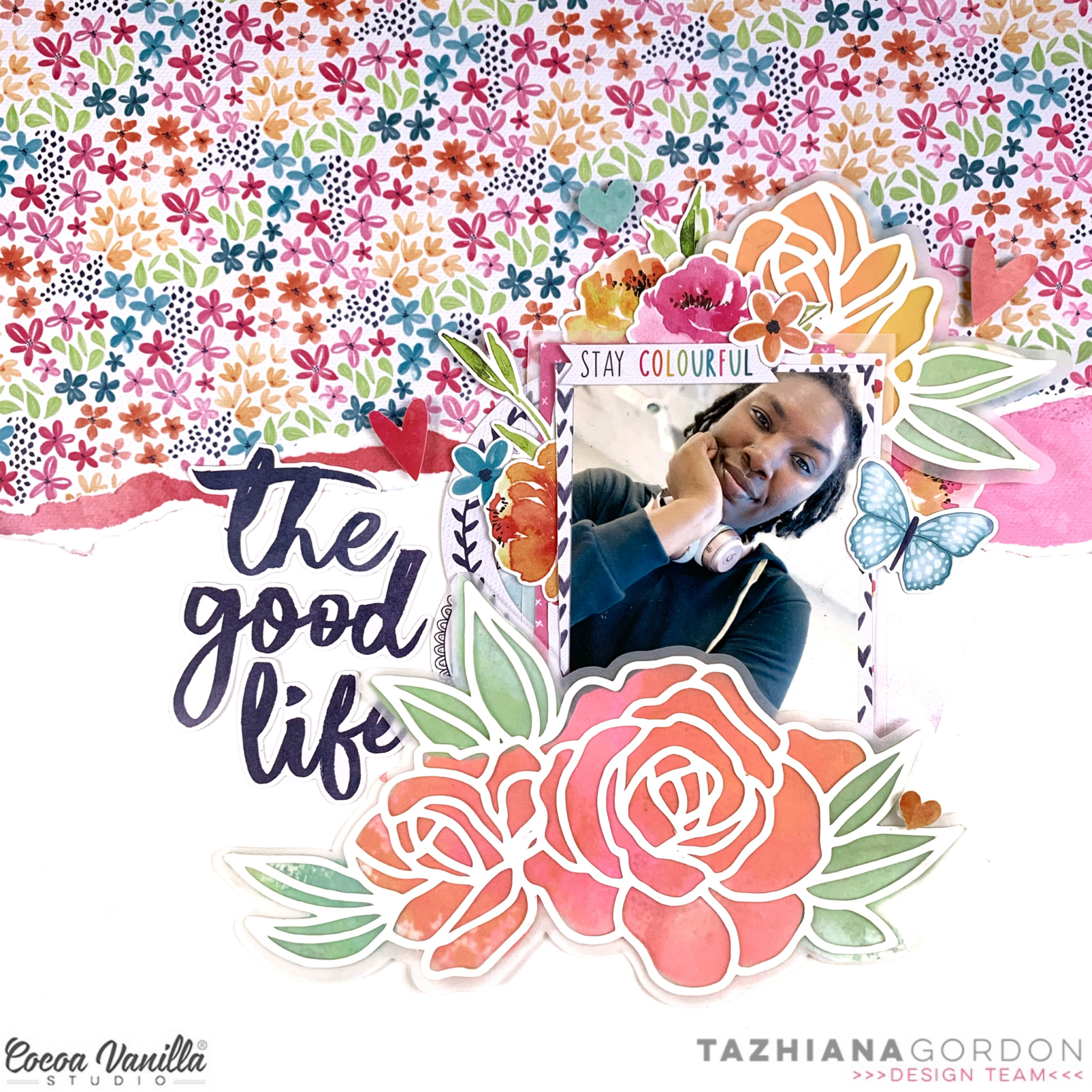
I started but cutting the florals on white cardstock and cutting an offset piece on vellum. I knew I wanted a more abstract look rather than perfect backing, and I knew I wanted to make my own backing paper using watercolor paper and Distress Oxides and the vellum would be perfect to mask any imperfections. I can’t take any credit for this idea – I borrowed it from my friend, Laura Wonsik. So for tip number 1: get to know your design software. I’ve had a Silhouette for years and I’m just learning all of its features like offsetting and print and cut. Watch some YouTube videos and give yourself time to play before you actually sit down to make your project.
After cutting my elements and making my watercolor backgrounds, I traced the floral pieces, roughly cut it and adhered it to my cut file. This brings me to tip number 2: gather supplies. For cutfiles, a sharp pencil for tracing, a fine tipped pair of scissors, a fine tipped glue bottle and some clear vellum safe adhesive will go a long way. My fussy cut scissors are from EK Tools and I keep my glue in an 18 gauge Fineline bottle.
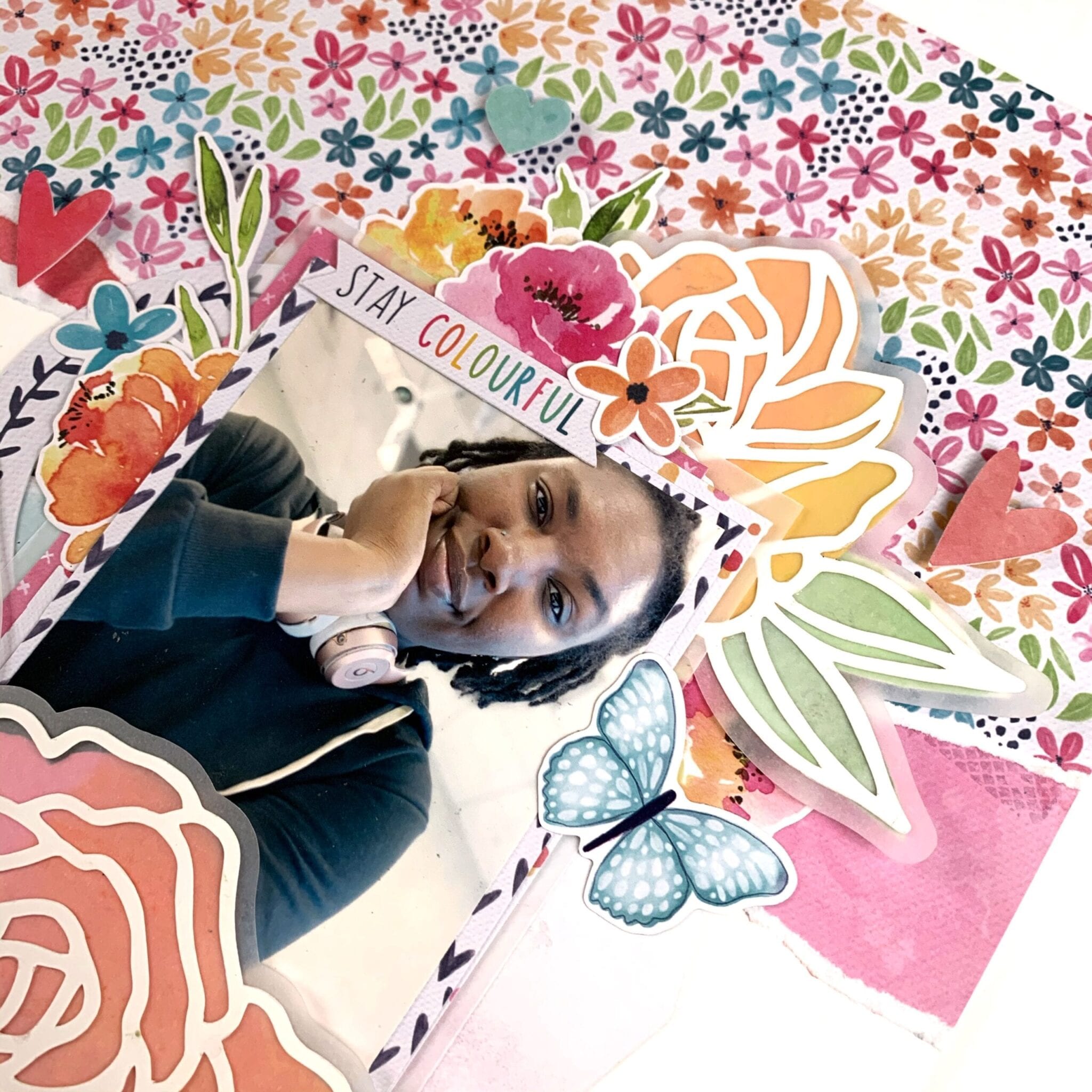
Once my cut file elements were ready, the rest of the layout was easy to assemble. I ripped off some patterned paper to add some interest to my background, matted my photo with some papers from the 6×8 paper pad, and embellished using the die cut ephemera and the cardstock stickers. My title came from the cardstock title pack and I popped a few elements up on foam to add some dimension to the page.
That’s it for me this week! I hope you found some inspiration here as well as some tips to demystify the cutting machine. Till next time, keep it crafty friends.
Hello CVS friends! It’s Anna here with my project created with no white background. It is a theme for this week – “White-out”. Each Cocoa Vanilla collection has plenty of amazing pattern papers to choose from so it was a real pleasure to play with them. I was going through my paper stack thinking of what line I should use this time and I was drawned to pretty colors of “Happiness”. You all know that I love colorful designs and ugly fall outside need some proper, colorful medicine to be scared away.
I started with cutting out my title using electronic diecutting machine. I did it twice in the same size using two different papers: “Good vibes” and “Botanical bliss“. I layered them creating kind of a shadow. I also added white false stitches around the top one using white pen. Pretty paper with navy hearts is perfect as a background paper. I added a thin layer of white acrylic paint to help my title pop a little bit more.
I placed my photo on one of the empty spots between the letters and embellished it with tickets and flowers from ephemera pack. I can never have enough of those amazing flowers added to this line. Pretty shape and watercolor look, combined with juicy colors are the perfect match.
Between the paper flowers I also mixed in some flowers from clear sticker sheet. Their colors are more intense and they look amazing on light background. Butterflies cut out from “Bright and beautiful” paper are great embellishment too. Fussy cutting is one of my favourite techniques. I finished embellishing by adding one of the flair buttons on top of the title. I needed some darker accent in this spot.
After I finished working with paper, I decided to add some more colors to the background. I know that usually we work in opposite order but I felt that this project is unfinished. I gently added some watercolor stains here and there with pink and green paint. It made my layout looking more cheerful and complete.
That is all for today. I love working with pattern paper as a base of my page as much as I like using white backgrounds. It’s a double joy :) Thank you for stopping by and see you in two weeks my friends.
Hey y’all! Guest Designer Laura Alberts back with a 9×12 layout using a patterned paper background!
I love this sweet cut file from my friend, Miranda Webber, and backed it with papers from the 6×8 paper pack. I tucked in tons of tiny flowers, clear heart stickers, and butterflies in a gentle cascade from top to bottom.
I wanted to keep the title small on this one so that it didn’t stand out too much on this already busy background, so I just focused on one phrase, “The best things in life are free,” which is certainly true and very applicable to this photo of my daughter enjoying her perch on our back patio. I loved her dreamy expression and decided to make this layout just as dreamy to match!
I hope you enjoy this layout and find inspiration! If you would like to see how I created this layout, you can watch my process video on YouTube here: https://youtu.be/-ocEnSkR_6U
Thank you, Cocoa Vanilla Studio for the amazing opportunity to design for you!
Hi CVS friends! I adored Bohemian Dream collection with its purple and blues, crisp white contrasts, florals and beautiful die cuts. I have created a super pretty girly layout featuring Bohemian Dream.
I have used a beautful balloon cut file from the Silhouette Design Store. I have used Dreamer paper, both sides and the fun polka dot blue paper. The purple side of Dreamer I used an embossing paper to create the polka dot effect on keeping with the navy dot paper (also the texture added is gorgeous).
Once I had paper pieced the balloons I decided to hand stitch some of the balloons and balloon string. As I do with most designs I use the rule of threes or odd numbers for visual balance (note I used three different papers for the balloons) I hand stitched three of the balloons in white thread and silver thread for the stings. It created a wonderful texture and ensures the balloons do not look flat.
I next added my 3×3 inch photo using the thin frame from the die cut pack and attaching with foam tape to add more dimension. I chose tiny floral bunches to embellish around my frame as I didn’t want the balloons covered too much which I tucked under my photo and frame. I also added several to the outer of three balloons.
I then chose word and phrase sentiments from the accessory sticker sheet in between the balloons, adding some purple sequins to draw your eye to them and break up the white.
To finish off I added my title, a sentiment banner from the die cut pack and two pretty butterflies (added with foam tape).The most time consuming part of this layout is the stitching but it really is worth the effort.
Thank you for stopping by and if you have any questions about my layout please leave in comments. Have a wonderful and creative week.
Mandy here today to share another layout using the gorgeous new Unforgettable collection! I’ve used a lot of the beautiful bright pink on my layouts so far using this collection, so this time I decided to focus on the coral and mint colours, along with that lovely woodgrain patterned paper. I love this colour combination, and I think it works perfectly with this selfie of Eleanor and I!
I started by trimming down the Natural Beauty woodgrain patterned paper to about 9 1/4 inches square, and adhering it to the middle of my white cardstock background. I then added some machine stitching around the edge, and distressed the edges a little as well to give it some additional texture.
Next I fussy cut a couple of the floral clusters out of the Glorious patterned paper and I arranged them vertically down the page to make one large floral cluster. I chose clusters that had more of the coral and mint colours in them, and then covered any of the pink flowers with floral die cuts that matched my colour scheme. To bulk out the cluster even more, I tucked some additional die cut leaves and flowers around it, and I also added some leaves that I cut on my Cameo using the Unforgettable Cut Files.
I matted my photo with the reverse side of the Natural Beauty patterned paper, and I also tucked a 3×4″ piece that I cut out of the Pretty Bits patterned paper under the left hand side. To add a little bit more interest to the left hand side of the photo I also added a little flag banner sticker under the side of the photo and I adhered a flair button on the edge.
For my title, I once again couldn’t go past using the awesome Foam Title Stickers. I love the contrast that they add, and the scripty font is so pretty! I also added a couple of the little foam black hearts around the layout to create a visual triangle with the black title. Above the title I adhered an aqua phrase sticker which I cut in half to make it two shorter pieces rather than one long one.
To finish the layout off, I added a couple of die cut butterflies, a sprinkling of white enamel dots, some gold ink splatters, and lastly, my typed journaling strips.
Thanks so much for joining me here today! I had so much creating this layout, and I hope that you’ve been inspired by it!
I took inspiration from the skull and cross bones design in the image and also the colours. I cut out a skull and cross bone design from black cardstock using my Silhouette Cameo and used is one of the main focal points on my layout. I popped up the skull using craft foam and adhered the cross bones flat to the page. In the eyes of the skull, I backed one of them with one of the paper s from the You Rock collection and added one of the woodies from the Totally Rad collection to the other eye. The Totally Rad collection has lots of pieces with the skull and crossbones so I pulled out what I had left and used them as embellishments. The large white and black skull and cross bones was fussy cut from the ‘Stuff’ paper from the Boys Rule collection The photo is of my eldest son dressed up for Halloween as a zombie a couple of years ago. I just had to add the ‘Admit One Crazy Town ticket and the unbelievable sticker’as they went perfectly with the theme of my layout. I added some of the wood veneer stars from the Flying High collection – I couldn’t believe I still had these! To finish off, I added the chippie crown in the chipboard pieces pack from the Boys Rule collection and added a few last bits and pieces like the arrows, the star flair, the date stamp and some splatters of black mist.
Hello Scrappy Friends! This is Laura Alberts, Guest Designer and huge fan of Cocoa Vanilla Studio! I’m sharing a 12×12 Layout using the Unforgettable collection, a large heart cut file from Cathartic Scrapper, and a photo with two of my daughters snuggled up together for a story.
By using the inside pieces of this cut file, which I normally might have tossed, I’ve created a geometric heart background! I hand-stitched a border all the way around to give it an outline and add texture to the page.
For my three clusters, I started with the Cut to You cut file with leafy fronds cut from the Garland paper and then backed the leaf outlines with vellum. Layering the large floral swag from the ephemera pack on top made for a lovely large cluster! I added a tag from the 6×12 sticker sheet as well as two tickets, tucked behind the left side of the photo, and a few word phrases on the right side. A tab and small cluster on the right of the photo as well as a few clear stickers created a tiny cluster there and a cluster of florals and leftover fronds on the top left of the heart finished it off! I added clear tiny heart stickers and enamel dots for the detail embellishing, then splattered with gold mist.
This layout wouldn’t be complete without using one of the striking titles from the Unforgettable collection and “Stories” was perfect! I’m absolutely in love with the font on these titles as well as the small foam hearts, that I sprinkled into my clusters to help tie in the black from the title.I had so much fun with this layout and I hope it inspires you!
Hello Crafty Friends! It’s Michelle back here today with a fresh new layout using the super sweet Unforgettable collection and some oh so adorable photos of Leila from a few years back. I went all out with loads of pink for our current Think Pink theme, in honour of Pink Ribbon day. There are so many variations of pink within this collection, and it was hard not to use it all.
I started the layout by cutting the loopy hearts cut file from CUT to YOU on the reverse of UNSCRIPTED paper. I also used the same pattern as the backing/border for the layout.
I chose 2 sweet photos of Leila and printed them in B&W and slightly different sizes, framed one using the photo frame from the Happiness Collection ephemera pack, and adhered them over the right side of the cut file piece using foam tape. I tucked all the floral elements and ephemera pieces (some are fussy cut from the 6×8 GLORIOUS paper) under the frame to the left of the layout using different forms of adhesive for loads of dimension. I also tucked in a heart from the heart wreath cut file I used on a previous layout that complimented the subtle hints of turquoise I’ve added in to break up all the pink. Don’t get me wrong I LOVE pink, but theres only so much one lover of pink can handle HAHA
Over on the right side of the photos I added an extra ephemera piece and some text pattern paper from the 6×8 paper stack, its the same design as the reverse of PRETTY BITS just in the smaller design. I altered a large floral ephemera piece to create a smaller cluster for the bottom of the photo.
Kept the title super simple using a foam title piece and accessory sticker, then a couple of enamel dots and a sweet butterfly to finish it off
Lastly up in the top left corner I’ve added a black foam heart, enamel dots and accessory sticker before splattering the layout with 2 different colours of pink inks.
Well thats all from me today, thanks so much for stopping by. Be sure to share all your beloved CVS creations within our Facebook community group HERE, and use the hashtag #cocoavanillastudio when sharing on Instagram or Pinterest
Hey friends! It’s Kylie back with you on the blog today, with a new layout to share! My theme for today’s project was ‘Think Pink’……..um yes please! So with that in mind I couldn’t go past creating with the beautiful ‘Unforgettable’ collection. There are so many pretty pink elements in this range as well as lots of flowers so I had no trouble bringing my completed work together.
I decided to work with a white background and used the UNSCRIPTED paper as a border piece. Using some paint from my stash I created a simple watercolour background by painting some stripes with a wide paint brush and finishing with some random splatters. Some machine stitching was added around the border for texture as well.
A special feature of my layout is the beautiful heart wreath cut file I used which was designed by Cut To You. You can find these freebie cut files in store HERE. I backed the frame with some of the STORY TELLER paper.
Since I had so much colour going on in my layout my photograph was printed in black and white. I added it to my background with foam tape so that it had some dimension and height. I then proceeded to add lots of the lovely floral die cut elements in and around the base of my layout.
Some die cuts were adhered flat to my background and others with foam tape, again for giving lots of dimension to the overall finished result.
Thanks so much for checking out my layout today! I hope you have enjoyed seeing it and it gives you some inspiration for your own creating.
Hey friends Rachel here. Do you ever create a layout and then your are not sure if you love it! Well I ended up creating two layouts this month because of this (it’s a Virgo thing lol!), anyway I will let you choose which version of my Girl Squad layout you like the most. So here is the first one I created. I wanted it to be soft and very girly and hence went for lots of white, pink and flowers.
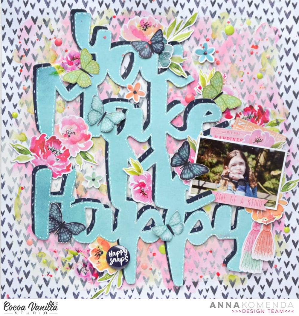
And here. is version two! I decided to go bold and bright, ensuring my lettering really stood out which I felt it got a little lost in the first version of the layout. The only drawback was I had to convert my photo to black and white, which I think lessens the beauty of the shot.On both layouts I have used Story Teller paper as my base so there was a slight contrast with the black dots instead of a flat white. My second version I have used a turquoise cardstock, cutting the Story Teller paper down to 11×11 inches. I also used the same cardstock to cut Girl Squad cut file. on my Silhouette Cameo, in my first layout I used white to cut the Girl Squad cut file.I used the beautiful Forget Me Not paper to paper piece the Girl Squad cut file, wanting a smaller print so I could use some of the larger floral die cuts without them getting ‘lost’.
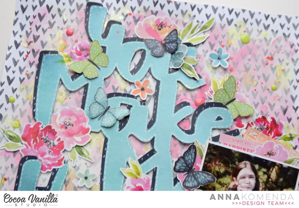
From the 6×8 inch paper pad I used the Lacewing paper and fussy cut numerous butterflies. I wanted smaller butterflies hence why I used the sheet in the 6×8 inch pad and not the 12×12 paper. I added these with foam tape to create a 3d effect.
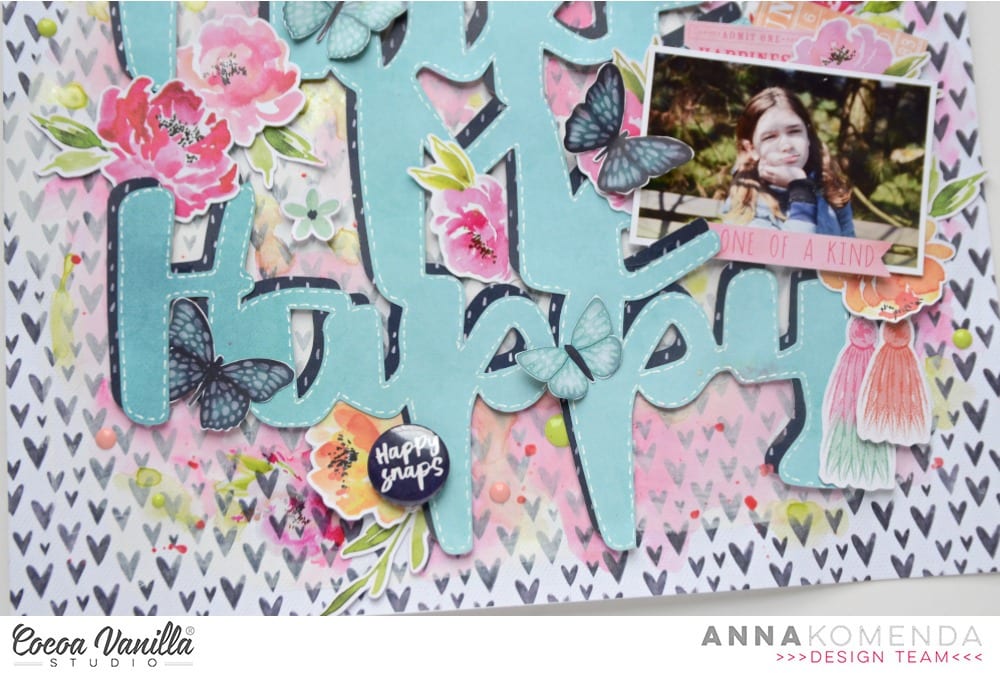
I chose the largest floral bunch from the die cut ephemera pack and added in a way you could still see the lettering. Again I did this with foam tape to add dimension. I added some of the pink and turquoise enamel dots to flowers and under some of the butterfly wings.
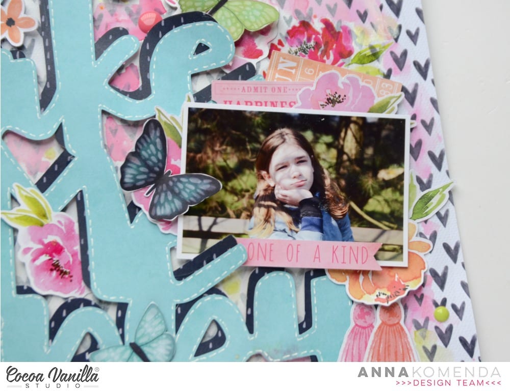
Before adding my photo I used some of the paint blotches from the Clear Sticker Sheet (I adore the clear stickers so much!) to ‘frame’ my photo and draw your eye to it. I used foam tape to attach my photo. I finished off adding some phrase stickers from the Accessory Sticker Sheet.
So there you have it, only one difference in papers used but the over all effect if quite different! Thank you for stopping by today and have a wonderful creative week.