It’s Sophie here and I have a new layout to share! I used the Storyteller collection for this autumnal page of my children and doggies going to the pumpkin patch!
I used a thick white cardstock for my background and teared a few different patterned papers to ground my photo. I printed the photo in black and white, mounted it on tissue paper and foam adhesive, and centered it on my page.
My title is from the beautiful Foam Title Stickers.
I created a little pumpkin with a few papers from the A5 paper stack and machine stitched on it for more texture.
I handwrote my journaling, embellished around the photo with fussy cut flowers and die cuts from the Floral Ephemera pack, placed a few stickers from the Accessory Stickers and added white Nuvo Drops as the finishing touch.
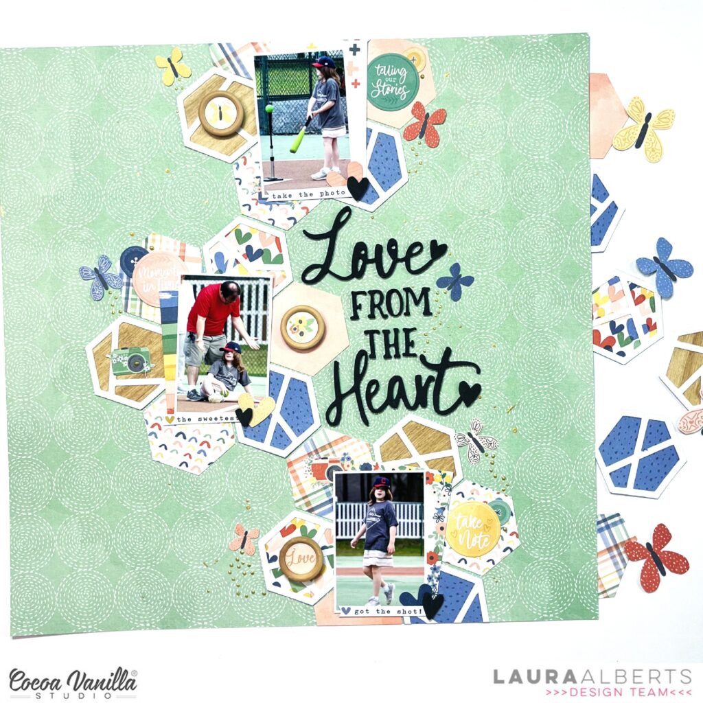
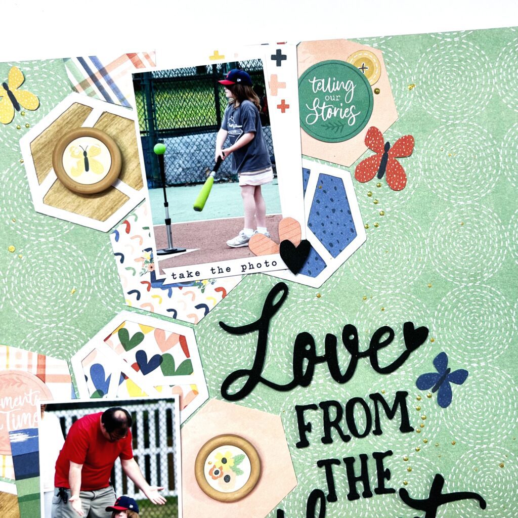
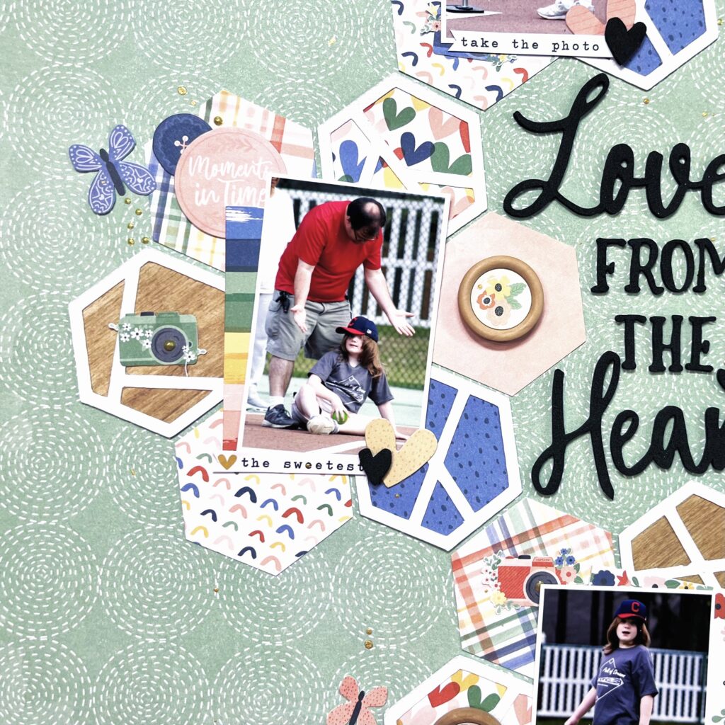
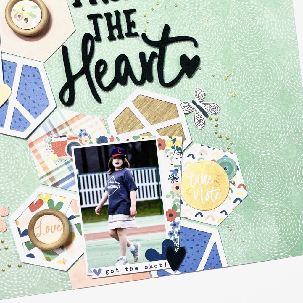
Hey y’all! Laura Alberts back again with baseball photos! Today’s prompt was spring or fall and I chose spring! Here in the United States spring is devoted to baseball, particularly spring training. I decided to up the ante with some floral hexagons to push that ‘spring’ feel even further. I have included some backed hexagon cut files from Liz Longest Designs and added some punched hexagons using the A5 paper stack. By puzzling them together, I created hexagon florals that trailed up my layout.
Each of my photos is show-cased inside of the these florals, which gives them an opportunity to shine! My photos are 3×2 inches and fit perfectly inside of these shapes. I love every chance to break out my punches and I find them to be the most versatile tool in my scraproom! Added to these hexagons are small embellishments like fussy cut cameras, wood buttons, and ephemera icons.
For my title, I tucked in a phrase from the foam titles set and added some of the little black foam hearts to the end of my title, as well as to each of the photos. This helps spread that darker color around the page, so that the title doesn’t stand out quite as much. I always prefer to have most of the focus on my photos. To finish this layout off, I added butterfly trails with gold Nuvo drops and then splattered around my cluster with gold ink spray.
I hope this layout inspires you to break out your punches and experiment with puzzling together the shapes into something new! If you’d like to see how ‘Love From the Heart’ came together, check out the process video below!
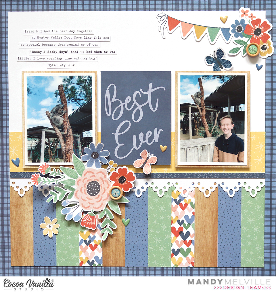
Mandy here today to share another layout featuring the gorgeous Storyteller collection! For this layout, I decided to scrapbook a couple of photos from a day that Isaac and I spent at the zoo a couple of years ago. It was such a great day, and I wanted to document how much I enjoyed spending the day with him. The Storyteller collection was perfect for this page, and I love the way that I was able to focus on more of the blues & greens in the collection for this layout. And I don’t mind using a floral cluster or two on a boy layout either!
To start the layout off, I trimmed a sheet of white cardstock down to 11 inches square and matted it on the blue Ditsy Daisy paper.
Next I chose a selection of papers from the A5 Paper Stack and cut them down to 1 inch x 4 inches and arranged them across the bottom of the white cardstock. As I mentioned, I tried to stick mostly to the blues, greens and woodgrain as I thought these would complement the photos nicely. I then added a piece of the yellow Little Love paper along the top edge of the strips, along with a border that I punched from white cardstock. This added some nice detail and also provided a ‘ledge’ for the photos to sit on.
I printed two 3 x 4″ photos and matted them on the woodgrain paper from the A5 Paper Stack. I also chose a 3 x 4″ card and positioned it between the two photos. This also became the title for my layout. I adhered the photos and card with craft foam to give them all some extra dimension.
Once my background was done and my photos were in place I was ready to embellish! Of course I couldn’t resist fussy cutting one of the gorgeous floral clusters out of the Spring Fling paper! I adhered this below the photos on the left hand side of the page. I also added one of the Wood Epoxy Buttons to the floral cluster to give some more texture to the page.
To balance out this floral cluster, I added another embellishment cluster in the top right hand corner of the layout. This gives the page a diagonal flow, drawing the viewers eye from the larger cluster, up through the photos, to the one at the top of the page. In this cluster I included some items from the Die Cut Ephemera pack, including a banner, a floral cluster and a butterfly. I also added another Wood Epoxy Button as I like to repeat similar elements in each of my clusters.
I finished the layout off with some typed journaling and a sprinkling of Puffy Stickers.
Thank you so much for joining me here on the blog today. I hope that you’ve found some inspiration!
Hello, hello! It’s Anna here again and today I have fun, travel themed inspiration for you. Good news – it has zero dogs involved :) This time I wanted to scrapbook a selfie photo of my family we took visiting London few years back (I can’t belive it was so long ago as it seems like yesterday). Photo was already printed and wandering around my desk for a while so I though it’s time to scrapbook it finally. As CVS doesn’t have any specific travel themed collection, I reached for the lines that have colors that would match the picture. It’s quite muted with a lot of earth tones so I focused on masculine lines. No pink this time!
I started with the newest one called “No limits” picking pattern papers for the background – wooden “Big bang” and grey “Universal“. With the second one I cut out the map background using digita die cutting machine. It reminded me of a busy city London is. Sfter all three basic layers were combined, it was time to add photo. It has white frame so I needed some contrastic colors under it to make the picture pop.
That’s why I added yellow and blue using A5 Paper stack. This is such a great product – it hold some extra patterns for even more fun with collection and you can use them for mini albums and cards too. You get 30 sheets in total – 2 of each designs and they are loose so there is no glue attaches to the one side, which is sometimes hard to remove. After the photo was glued down, I started building composition around it. It’s the moment I reached for some older CVS collections and my leftovers stash. You can find ephemera pieces and stickers from “Legendary”, “You rock” and “Boys rule”. This is the beauty of Cocoa Vanilla lines – you can easily mix and match them!
My title was also created with an old set of alpha stickers. they are not being added to the collections anymore but I still have my own stash and I love reaching out to it. Alpha stickers came in two different sizes – with bigger letters and some with smaller letters. I mixed two of them here. I also dug up my stash of wooden elements, that were a part of older collections. I loved them so much and I was saving them for the future (as many of us does with favorite items). It’s finally time to let them go. But worry not – I still have a little basket of them :) They will last me till the end of time.
This kind of layout is my favorite – where I can combine new and old, giving older stash a new life. If also helps me spread the collection even if I am running out of embellishemnts. Last step in making this page was adding some flair buttons (also from my dearly saved stash) and splashing everything with yellow and orange mists.
That is all for today my Friends! Thank you so much for stopping by and see you in two weeks.
Welcome and so happy to see you again on the Cocoa Vanilla blog today! It’s Josefine here and I’m sharing a new layout with you. For this girls pink layout I choose to work with the beautiful collection “Sunkissed. I really love the pink vibe on this happy page from me and my daughter.
I took a 12×12 watercolor paper and choose three pink colors of distress oxide to work with. The colors I used are, picked raspberry, kitch flamingo and spun sugar. I placed an ink pad on my white background and make a horizontal line. I do this with all the three different ink pads. Then I take a medium watercolor brush and blend the colors with each other by using a little bit of water. I splash some more with the colors by using my watercolor brush and then let the background dry by air. By splashing with water on your distress oxide and dabbing it dry with a piece of kitchen paper you create a super cool watercolor effect.
I used a cutfile by Paige Evans called “Beautiful” as part of my title. The title I choose for this layout calls “We look beautiful together on vacation” I really love the moments that I spend with my teenage daughter. These moments are very special and precious to me. I cut the cutfile with my Cricut Maker and backed it with yellow colored design paper. I color the alphas with the distress oxide “mustard seed” and then I stitch the alpha’s with light yellow sewing thread on my cutfile. The stitching details give my alpha’s more detail and dimensions.
I cut different pattern papers to size and placed it behind the photo from me and my daughter. I made a cluster on the right side of the photo with the gorgeous Die-cuts elements, stickers and figures from the Sunkissed collection. I select some more embellishments for extra decoration between the alpha’s.
I punched out a few butterflies from the lovely Sunkissed design papers and placed them in different places on my layout. Also I give my layout some white splatter with white gesso for a festive look.
I hope I was able to inspire you with this happy pink girls layout with the fresh and colorful Sunkissed collection and give you a creative idea for an easy mixed media background. Of course, I hope to see you next time on the blog with a new project! Can’t wait to see your beautiful projects on the Cocoa Vanilla FB groep! I wish you a very happy and crafty day friends!
It’s Tarrah McLean back here on the Cocoa Vanilla Studio blog with you and today I am sharing a new scrapbook layout featuring the stunning Storyteller collection.
I think this is now my 8th layout created using this gorgeous collection! Do you have this collection yet?
I am documenting 2x photos of myself with some of my fun girlfriends, choosing to create a grid style design.
I first pulled out all the horizontal pocket cards that would suit the way I wanted my photos placed, I mixed them up and layered some underneath others and also layered some of them under my photos too, Once I was happy with how they looked, I took a piece of plain white cardstock and adhered them all down staying with that grid style. I was so happy that the pocket card that reads ‘It’s A Good Day to Have a Good Day’ was a horizontal style one as I wanted to use the ‘Together’ word from the foam title stickers, it was perfect to place on that pocket card!
I could not leave the pocket cards blank so I added some embellishments to them all. On the title card, I added a chipboard heart from the Chipboard stickers, a puffy heart sticker from the puffy stickers and a journal sticker from the Accessory Sticker sheet, I stamped the date on the small journal sticker. The pocket card to the right of the title one I added a chipboard piece, 2x banner die-cuts and a puffy heart sticker to the banner piece, I also stapled the banner die-cuts using my tiny attacher.
On the pocket card below the title I added an accessory sticker and adhered a camera ephemera piece over the top using craft foam. I also tucked in a floral die-cut here from the floral ephemera pack. On top of the camera, I adhered one of the super cute wood epoxy buttons. The pocket card above the title I added a chipboard banner piece and a chipboard heart and created a small cluster of flowers and leaves from the floral ephemera pack, I popped up some of the flowers using craft foam and left some without, I like the different heights and dimension this gives my page.
It’s fun to treat each pocket card almost like its only little scrapbook layout! On the top photo one, I stapled a banner sticker from the Accessory Sticker sheet in the top right corner, using my tiny attacher. Doing this is a great way to disguise something you make not like in your photo, treat it as an embellishment opportunity and cover it up as I have in the corner of my photo! In the bottom photo, I added a phrase sticker from the Accessory Sticker sheet to the top of the photo and created another cluster of flowers using florals from the floral ephemera pack, this helps to balance with the cluster I created in top left corner.
Thank you so much for stopping by the Cocoa Vanilla blog today! I love how my layout turned out and I hope you enjoyed reading how I created it!
Make sure to keep an eye on the Cocoa Vanilla online store as the Storyteller collection should be in store really soon!
I selected 4 of my favorite patterned papers: Sun Shower, Daisy Days,Happy Place and Garden Variety. I applied Distress Oxide inks directly on my white background watercolor cardstock in four vertical lines. I added water and colored splatters as well, and let everything dry.
I cut four strips of my selected papers that are of different lenghts and about 2 inches wide. I curled the top and bottom of each paper and aligned them in a horizontal line. I inserted a grey ribbon inside the curled top of each strip and tied a bow on the right and left side of the four aligned papers.
I printed my photo in black and white. It adds a little retro feel to the page…!
I used the Daydream Die Cut Title words for my title, and added beautiful fussy cut and die cut flowers to embellish around my photo.
I cut a rectangle out of white cardstock to write down my journalign and placed it on the Sun Shower strip, on the left side of the photo.
Finally, I added a few Accessory Stickers, two die cut butterflies and a few scattered sequins as the finishing touch.
Here are some close-ups:
I will never get tired of using this gorgeous collection ! My design is very easy to scraplift, and it is a simple way to use many different patterned papers on a page.
Mandy here with you today to share a new layout featuring the stunning Storyteller collection. This month the design team will be sharing ‘seasonal’ projects inspired by either Spring or Fall. Here in Australia we’re starting to see hints of spring in the air, and the weather is beginning to warm up a little, which is so nice after the cooler winter months. The weather was so lovely last weekend so I decided to take my youngest two on a picnic to enjoy the sunshine. We took some selfies on the day, which were the perfect photos to scrapbook the start of Spring!
To start this layout off, I cut a wreath out of white cardstock using a cut file from the Silhouette Design Store. I decided on using the beautiful woodgrain Cross it Off paper for my background. I had already cut a circle out of the middle of that paper for a previous layout, and by no pre-planning on my part, the wreath cut file happened to fit perfectly around that circle. I love it when things work out like that! I backed the circle with white cardstock as I thought this would allow my photos, title and embellishments to pop.
Once I had adhered the wreath, I added my two photos, one in the top left and the other in the bottom right. I matted the top photo with the yellow Little Love paper and the bottom photo with the pink Oh My Heart paper. I also tucked a few embellishments around the photos using die cuts from the Ephemera pack.
I wanted to build on the wreath cut file with some gorgeous florals to accentuate the ‘Spring’ theme and to add lots of colour to the page. I did this by fussy cutting a couple of floral clusters out of the beautiful Spring Fling paper. I added one in the bottom left and the other in the top right. When I adhered them to the page I only added adhesive to the middle of the floral clusters so that the leaves and sprigs would lift off the page and create some nice dimension.
I added a button to the centre of the larger flower in each floral cluster, the yellow one from the Die Cut Ephemera pack and the red one from the Chipboard Stickers. I fussy cut a few extra little flowers to scatter around the floral clusters and I also added a couple of Puffy Sticker dots around each cluster. These little details help to add some extra interest and make a layout feel complete.
I decided on the phrase ‘Hello Spring’ as the title for this layout. I used the gorgeous Foam Title Stickers for the word ‘Hello’ and then cut the word ‘Spring’ from the green Fly Away paper using another cut file from the Silhouette Design Store. I love the way this title makes a statement without detracting from the photo.
I finished my layout off by adding a couple of butterflies that I fussy cut out of the Fly Away paper as well as some little hearts from the Foam Title Sticker pack.
I hope that you’ve been inspired by my Spring themed layout using the fabulous Storyteller collection, and that you’re enjoying the change of season in whatever part of the world you live in!
Hey y’all! Laura Alberts back again with a fun art sculpture inspired layout! Back in April, my son and I visited a beautiful sculpture garden in Twin Lakes, Minnesota, USA. It was such a fun, quirky place to explore art and experience sculpture in a new way. I decided to channel the quirky feel of the garden with this layout using the Storyteller collection! Using the Cross It Off patterned paper for my background, I built a diagonal layout with a really fun collage look. Loved squeezing four 3×4 inch photos on this one!
For my title, I used the Love This from the Chipboard stickers and then layered a journaling spot and hearts from the icon ephemera underneath. For the photos themselves, I kept the embellishing very simple, so that it didn’t become too busy! I set two photos in each of the cross-filled corners and layered them up with word phrases, a banner, and a label.
I really enjoyed playing with white space on this layout, leaving large areas to allow the eye to rest on the opposite corners and keeping a fairly tight cluster of embellishments in between my pairs of photos. This adds a lot of balance to the page and made for a clever place to add splatters as well!
I hope this layout inspires you to find ideas in the least likely of places! It’s such a fun design and captures the mood and feel of the garden really well! To see how ‘Love This’ came together, check out the process video below!
Hello Cocoa Vanilla fans. It’s Anna here with my newest page. I decided to put the new “Storyteller” collection away for a short while to use up my stash of older lines. They looked so sad and lonely in the box :) First, I need to add a disclosure and explain myself a bit. We got a new puppy over a year ago, and as my daughters are quite big and independent, I poured all my parental feelings into my poor dog. 99% of my phone photos are of my furry boy… Crazy pupparazzi – I know! So most of my pages are with my dog’s photos recently as those are almost the only pictures I get. Last time I shared with you his sleepy version mixed with “Storyteller” and today will be his needy version with a bit older “No limits” line. Masculine collection for a good boy!
Let me start with a back story of the photos. As I work from home, I have this big privilage to work from the cosy couch covered with soft blanket. My dog is always somewhere near as he is very social and coodependent (my fault…). He likes to be a star of the show, so when the attention is not on him, he is not the one who waits patiently. When my computer took his place, he decided it’s time to try to sneak into my laps. I snapped few photos of him checking which side would be the best to approach. He is very needy when it comes to attention hence the title of the page.
I had a little bit of trouble figuring out how I should scrapbook those photos. I didn’t want to repeat my usual patterns so insted of straight lines, I decided to add some funky waves. I picked three pattern papers: “Latitude“, “Spark” and “Nebula” and nested them together sketching a simple wave pattern, that would be wider on the one side and making thinner on the other. I started with the orange paper and drew and cut the wave. Then I glued it over the yellow paper, marked the lines with pencil and cut everything again. I repeat the same with the greenish one. My original idea was to put everything on “Stardust” paper as a background buy it was just too busy. I switched to white cardstock instead adding some mixed media layers.
I first marked when my paper layer will be, and then gently added some yellow ink using a brush, on the top and on the bottom. Then I used star stencil and lime green ink to add a layer of stars and finished everything with orange splatters. When everything was dry, I glued my wave on top and started embellishing. I picked some tickets and stars from ephemera pack and tucked them behind the photos and my wave. You can spot some stickers from 6*12 sheet too. Next step was to add a title using some Thickers from my stash, following the curve of the wave. Who said your titles have to be straight? Actually, I love keeping them messy and uneven!
Tiny enamel dots and stars were a perfect finishing touch along with wood epoxy button. I think this is the embellishment piece I use up the fastest in each CVS line. I just love them. The final result has a bit retro vibe I would say. Do you have similar feelings about it? I think I need to reach for wavy, handcut lines more often as they create very unique result.
That’s it for today! I really enjoyed making this layout and scrapbooking another photos of my puppy / son. He is my youngest baby, and you know how tempting it is to scrapbook baby photos, right? I can not promise my next page will be with people either…
Thank you so much for stopping by and see you in two weeks!


 I took a 12×12 watercolor paper and choose three pink colors of distress oxide to work with. The colors I used are, picked raspberry, kitch flamingo and spun sugar. I placed an ink pad on my white background and make a horizontal line. I do this with all the three different ink pads. Then I take a medium watercolor brush and blend the colors with each other by using a little bit of water. I splash some more with the colors by using my watercolor brush and then let the background dry by air. By splashing with water on your distress oxide and dabbing it dry with a piece of kitchen paper you create a super cool watercolor effect.


