Hi Scrappy friends its Michelle back today with a new layout share. This one features the beautiful Unforgettable collection, a cut file from CUT to YOU and a couple crazy photos of this little family of mine. Love how it turned out, and it all came together so quick!
To begin I resized the cut file in Silhouette studio, backed the seperate words using 2 pattern papers (both sides of Sprightly) from the 6×8 paper stack then adhered to the centre of the page using foam tape. Next I added the photos that were printed slightly smaller than 3×4 size and layered with a couple more pattern papers (reverse sides of Unscripted and Garland) from the 6×8 paper stack. I cut the main white cardstock backing down in size so that I could mount in onto the beautiful floral pattern paper Glorious for even more colour.
I used 1 large floral ephemera piece, that I cut in half, to create clusters of embellishments to the top left and bottom right of the cut file. I also added a couple extra florals and hearts from both the ephemera and clear sticker pack.
On each photo I’ve added a heart that was left over from a previous layout I created using the awesome wreath of hearts in our FREE Cut file set. Theres also a couple more ephemera pieces and stickers tucked into the layers beneath the photo.
Lastly I added a couple of enamel dots and a splattering of gold ink and called it done. A nice quick layout thanks to that massive cut file title.
Well thats all from me today, be sure to stop by the Community group on facebook to chat all things Cocoa Vanilla Studio. And don’t forget to use the hashtag #cocoavanillastudio when sharing your creations on instagram and Pinterest.
Thanks so much for stopping by! Until next time, happy scrapping..
It’s Tarrah McLean back with you on this Thursday! I hope all my fellow Aussie friends are all safe from these horrendous bush fires we are experiencing in our country at present?
Today I am sharing a layout for the Cut Files theme we have on all this week and being that its Thursday I was also given ‘Throwback Thursday’ where we create with an older collection. I decided to create a Christmas layout since it is fast approaching!I started my page by taking a sheet of white cardstock and adding a piece of vellum over the top to mute the white a little bit, as I had lots of the sequins left from the Tis The Season collection, I decided to add lots of them under the vellum to create a shaker pocket. Once I had added the sequins, I then machine stitched all the edges so that they wouldn’t fall out. I love how this turned out! I like that it adds another feature to my layout.
I took two of the 12 x 12 papers and cut some vertical strips from them and placed them down each side of the layout. then chose a gorgeous cut file title design by Cut To You and added some of the patterned papers behind each of the words. I added craft foam to the underneath and placed it in the centre of my page. I also popped up the photo of my sons on Christmas Day with craft foam so that it was at the same level as the title on my page. I love the shadows and dimension this creates on my page.
I then began to embellish my page using some of the accessory stickers (that are still available in the store) some of the die-cuts, wood veneers and of course a bitty bow and the tiny metal key! I only had 1 of the poinsettia flowers in the die-cut pack left so I added just the one to the very bottom of the title and layered the bow over the top. Lastly I added some of the enamel dots from the Tis The Season collection. Have you got any of the Tis The Season collection left? Pull it out and get creating with it! Its such a soft and gorgeous collection for Christmas photos.
Thank you so much for stopping by today! See you next time!
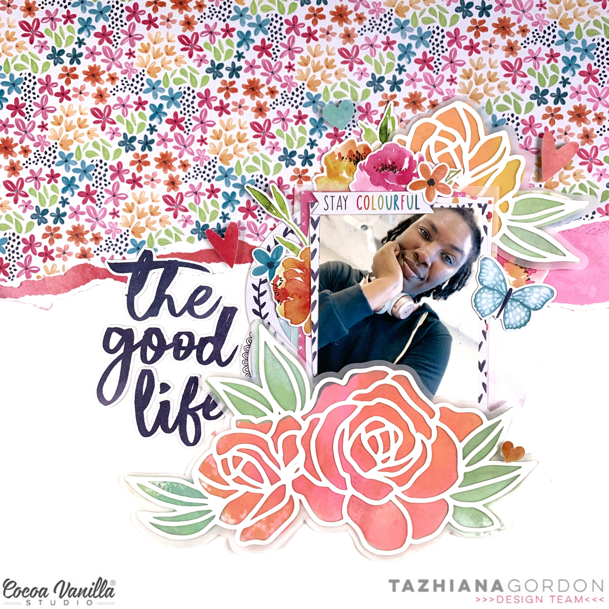
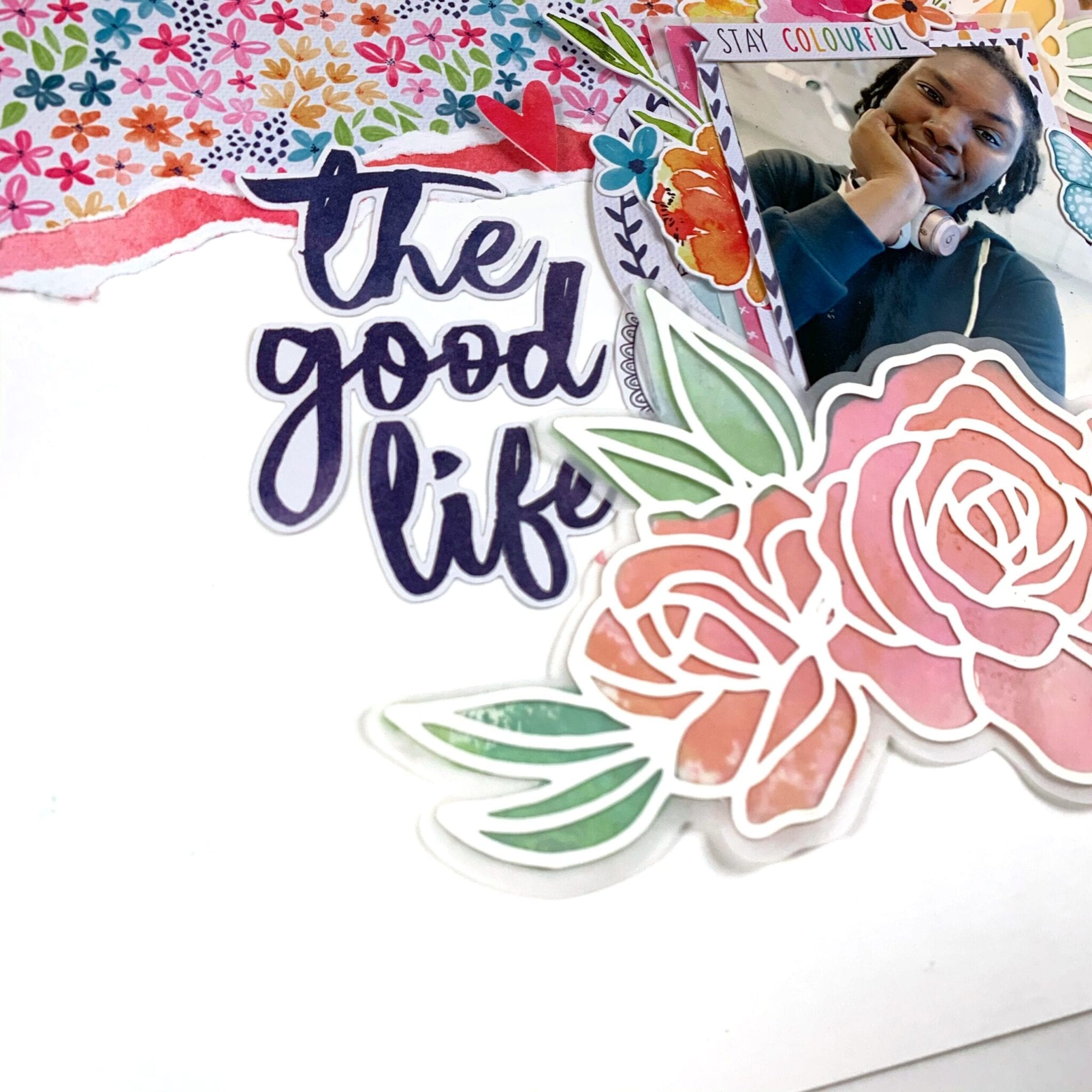
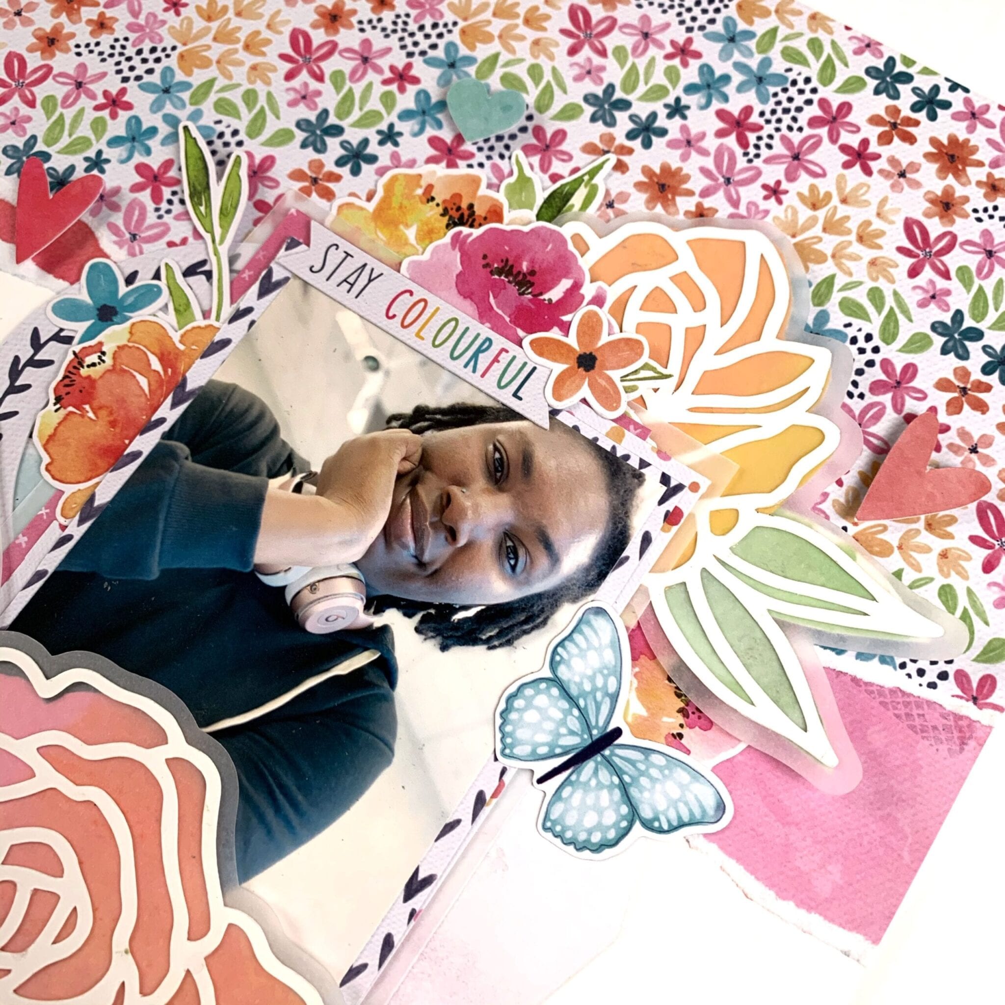
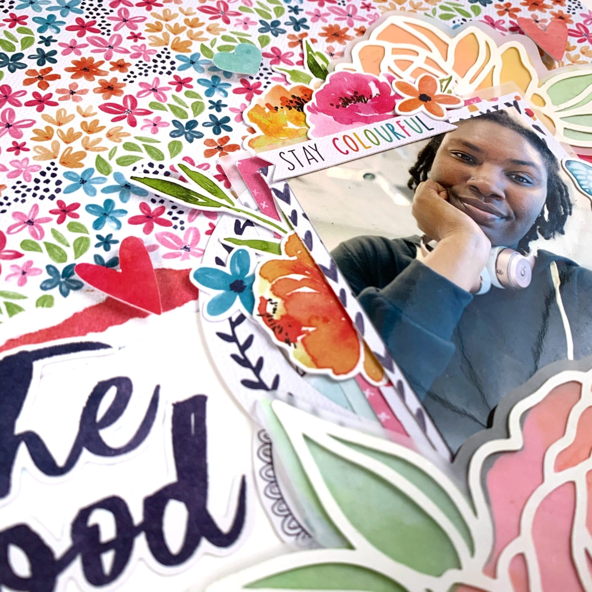
Hello Cocoa Vanilla friends, and welcome back to cutfile week! I am not a pro when it comes to using cut files but I have a few tips and supplies to make them a bit more accessible. I’m scrapping a selfie this week that I took on my 29th birthday and I’m using the Happiness collection as well as a cut file from the Cut To You shop for Cocoa Vanilla.
I started but cutting the florals on white cardstock and cutting an offset piece on vellum. I knew I wanted a more abstract look rather than perfect backing, and I knew I wanted to make my own backing paper using watercolor paper and Distress Oxides and the vellum would be perfect to mask any imperfections. I can’t take any credit for this idea – I borrowed it from my friend, Laura Wonsik. So for tip number 1: get to know your design software. I’ve had a Silhouette for years and I’m just learning all of its features like offsetting and print and cut. Watch some YouTube videos and give yourself time to play before you actually sit down to make your project.
After cutting my elements and making my watercolor backgrounds, I traced the floral pieces, roughly cut it and adhered it to my cut file. This brings me to tip number 2: gather supplies. For cutfiles, a sharp pencil for tracing, a fine tipped pair of scissors, a fine tipped glue bottle and some clear vellum safe adhesive will go a long way. My fussy cut scissors are from EK Tools and I keep my glue in an 18 gauge Fineline bottle.
Once my cut file elements were ready, the rest of the layout was easy to assemble. I ripped off some patterned paper to add some interest to my background, matted my photo with some papers from the 6×8 paper pad, and embellished using the die cut ephemera and the cardstock stickers. My title came from the cardstock title pack and I popped a few elements up on foam to add some dimension to the page.
That’s it for me this week! I hope you found some inspiration here as well as some tips to demystify the cutting machine. Till next time, keep it crafty friends.
Gwen with you on the blog today with a new share using the beautiful ‘Unforgettable’ collection. For this page, I’ve jumped out of my comfort zone again to scrap another picture of me, this one was taken on my birthday recently. I’m also sharing some extra tips and tricks for working with cut files!
Many of you will already know that I just love working with cut files on my pages. I love that they are super inexpensive and the designs really are limitless. It will be no surprise that once I had chosen a photo to work with for this page, I went to my extensive library. This file is from my cut file store CUT to YOU and I love that it helps me document this snapshot in time, my 43rd birthday. I’ve done a stack of journaling on the back talking about where I’m at right now in my life.
To begin the page, I started by backing the letters in the file. Tip #1 – If you have a limited supply of coordinating pattern papers, this is a fab way to use them up or make them stretch. You’d be surprised just how little you need to make a bold title like this one, AND you can mix and match all of your scraps amongst the letters for a really pretty look. Tip #2 – Pattern paper pads such as the one from this collection are perfect for backing cut files. The smaller print designs work so well with the small spaces within the files.
While we are talking about backing the letters… Tip #3 – I find it much easier when working with a small area in a cut file to glue the pattern paper to my cut file and then use fussy cutting scissors to cut it out. I find this way of backing the files the fastest for me, much faster than tracing each section and then cutting it out and then trying to position it back into the open space of the file.
Once my file was all backed and I was happy with it I went about backing my photo and thinking about the composition of my page. Tip #4 – It’s a good idea to use the software from your electronic die cutting machine to help you with the size and placement of the design on your page. I consider the layout of my page design when resizing the file so that once cut and you get to create it’s not too big or too small for your design idea.
I was now looking at the file and photo on my layout and it wasn’t quite popping off the page in a way I’d like so Tip #5 – I’ve added some foam tape to lift it off the page AND some soft watercolour behind the file to really help the white edges pop off the white background. I use both of these techniques a lot to help give the cut file definition on a white background.
It was now time to embellish the page, this bit is super easy and fun with the larger elements in place. For this, I’ve fussy cut out the large green butterfly element from the ‘Pretty Bits’ pattern paper and teamed it with two more smaller butterflies fussy cut from the ‘Lacewing’ pattern paper. I’ve also added in a pink butterfly from the ‘Ephemera Pack’.
To create a small cluster in the top right-hand corner of my page, I’ve combined elements from the ‘Accessory Sticker sheet’, enamel dots and a flair button. The larger floral die cut at the bottom of my photo is from the ‘Die Cut Ephemera’ pack. To finish the page off, I’ve added some typed sentiments from the ‘Accessory Sticker Sheet’ using more foam tape for dimension.
Thanks for popping by today to see my latest project, I hope you enjoyed the tips and tricks I’ve shared for working with cut files and that they inspire you to give working with them a go, they really are the best fun! If you haven’t checked out the latest collection ‘Unforgettable’ yet, you really must, it is DIVINE!
Hi everyone! It’s Sue Plumb here to share my latest design team project with you and it’s one that is pretty special to me.
Today is World Prematurity Day – a globally recognised day that is aimed at increasing awareness of preterm births, as well as highlighting some of the challenges that are often faced by these babies and their families. Each year approximately 1 in 10 babies are born prematurely, including all three of my children. My post today is for all those babies born too soon.
For my project I decided to create the first in a series of mini albums for my children to document the time following their births. (It has taken me over 7 years to get around to tackling the photos of my boys and all the memories that come with them, so please bear with me for the long post today.)
I began my mini album with the fabulous ‘Boys Rule’ collection and a small 6 ring planner that I purchased from Kmart. (These make perfect mini album covers once everything is removed from the inside.) After choosing the patterned papers I was going to work with, I cut them into a variety of sizes to form the pages of my album.
I used an adjustable 6 hole punch (purchased via eBay) to punch holes on each of the pages, and then used white hole reinforcement stickers (from my local newsagency) to help protect the holes from becoming damaged through handling.
On some of the pages I added extra interest by using border punches to create decorative edges. This, combined with the variety of different page sizes, placements and patterns throughout, is what gives the album so much character.
If you are planning on giving something like this a go, be sure to mix things up as much as you can! Don’t feel like all your pages have to run vertically – a horizontal page thrown in here and there not only adds extra interest but makes the album more interactive as it is turned to be read.
Depending on the theme of your album, you will find that some pages require no more than a photo and some simple embellishments; whilst others may have lots of journaling and very little room for embellishments.
For the sake of continuity across my album, I printed most of my photos in black and white with a few colour feature shots added in. I printed them in a variety of sizes and orientations as well.
Don’t be afraid to add embellishments such as stickers or journaling directly over part of your photos, or to include pages that have no photo at all and are simply decorative. You can even punch directly through photos and use them as a page in your album.
One of the other benefits of making your pages different sizes is being able to get a “sneak peek” at what is coming on the next page. This adds to to the anticipation as you leaf through the album.
To further enhance the cohesion across the album, I typed all my journaling on my computer. When putting each page together I began with photo/s and journaling placement first before deciding on embellishments.
For an extra bit of fun, add some interactive elements such as tip-ins, pockets, or pull out tags. You can see how I used one of the small cards from the Die Cut Ephemera pack with a couple of pieces of washi tape to form a tip-in (fold out flap) to include my journaling underneath.
One of my tips for putting together each page in an album is that whilst I approach each page individually, I am also mindful of what is on the facing page. You can see how I carried across the same colours in the spread below. (Working with the same collection throughout the album helps enormously.)
The only other embellishment I included in my album were a few stickers from the ‘Love Always’ Accessory Sticker sheet, as it had a few more love-filled and generic phrases that suited some of my photos.
Another way to mix things up with your photos is to create a collage or include a series of shots taken close together. (And let’s face it, who doesn’t take 20 shots when you are trying to get the perfect one?!)
I know I have included a LOT of photos in this post, but sometimes the best way to explain things is to show them, right?
My final tip if you are going to create something similar in a planner cover or album, is to not forget about the extra pockets that are built into the cover. I made some small tags to tuck into the front of my album and added some extra photos, and in the larger pocket I included a letter to my son with some of the details about his birth story.
If you are interested in seeing a few more details of my album I have filmed a flip through of the entire thing so you can see how it all looks together:
Thanks so much for sticking with me through my long post today. I do hope I have inspired you to try creating something like this yourself. It could make an ideal Christmas gift for a loved one, or just something for yourself to treasure.
Amanda here, joining you today with some super pretty UNFORGETTABLE inspiration! This week the Design Team have been asked to create scrapbook pages that feature pattern paper as the background – so no white cardstock! We’re aptly calling it ‘white out’ week! Here’s what I came up with…..
“The Sweet Life”
Sweet indeed! What a delightful page!
You’ll spy that I used the beautiful woodgrain paper, CV-UF008 NATURAL BEAUTY as my background paper. However, once I started looking at all those pretty papers I just couldn’t stop at one – so.much.gorgeousness! Naturally, there are lots of pretty pattern papers featured on my layout today! Let’s take a better look….
Isn’t this just gorgeous?!! And truly, life couldn’t be any sweeter with my two darlings!
To the top of my layout, I added a one inch strip of that divine floral, CV-UF001 GLORIOUS. This paper makes me swoon every single time I lay eyes on it! Such a stunning floral design! And speaking of florals, I used that coordinating floral swag DIE CUT EPHEMERA piece to embellish the GLORIOUS trim, and act as an anchor for my title and overall design.
My large title is a digital cut file courtesy of Cut To You, and I have backed it with a few of the 6 x 8 PAPER PAD papers. ‘The Sweet Life’ papers happen to be the smaller variation of the B-side designs to CV-UF003 GARLAND and CV-UF005 LACEWING. Love!!! The 6 x 8 PAPER PAD is the perfect choice for backing cut files with!
I embellished my larger title with a few carefully selected pieces, the first of which was my photo cluster. I tucked my photo just beneath the edge of my title and attached them together with the ‘treasured’ ACCESSORY STICKER. I used another sticker beneath my photo, as well as a DIE CUT EPHEMERA tab to support my photograph. Here’s a closer look for you…
The Cocoa Vanilla Studio FLAIR BUTTONS are always amazing, and I added that sweet camera one to complete the look.
To balance my black & white photo on such a colourful page, and create that second point of interest to the title, I foam mounted that sweet DIE CUT EPHEMERA camera embellishment. Subtle, simple but so effective!
In keeping with the rule of three, and the sweet camera embellishments, I also featured the pretty black camera ACCESSORY STICKER. So cute!
The final adornment to that big title is the fussy cut the florals from pattern paper, CV-UF003 GARLAND. I foam mounted them just below the title, and ensured that they reflected the swag at the top of the page too. This really added that wow factor to my overall design.
The CV-UF008 NATURAL BEAUTY paper is so stunning that I had to use both sides of it. The pretty B-side (that striking black & white foliage print) trims the base of my layout. I ensured that the GARLAND floral arrangement overlapped this trim & in turn, created a more cohesive design. For a polished look I added the ‘best things in life…’ sentiment ACCESSORY STICKER and a good sprinkle of ENAMEL DOTS.
And there you have it! Beautiful, classic creating that highlights our gorgeous UNFORGETTABLE pattern papers!
I hope I have inspired you to use more pattern papers in your projects this week!
Hey y’all! Guest Designer Laura Alberts back with a 9×12 layout using a patterned paper background!
I love this sweet cut file from my friend, Miranda Webber, and backed it with papers from the 6×8 paper pack. I tucked in tons of tiny flowers, clear heart stickers, and butterflies in a gentle cascade from top to bottom.
I wanted to keep the title small on this one so that it didn’t stand out too much on this already busy background, so I just focused on one phrase, “The best things in life are free,” which is certainly true and very applicable to this photo of my daughter enjoying her perch on our back patio. I loved her dreamy expression and decided to make this layout just as dreamy to match!
I hope you enjoy this layout and find inspiration! If you would like to see how I created this layout, you can watch my process video on YouTube here: https://youtu.be/-ocEnSkR_6U
Thank you, Cocoa Vanilla Studio for the amazing opportunity to design for you!
Hi CVS friends! I adored Bohemian Dream collection with its purple and blues, crisp white contrasts, florals and beautiful die cuts. I have created a super pretty girly layout featuring Bohemian Dream.
I have used a beautful balloon cut file from the Silhouette Design Store. I have used Dreamer paper, both sides and the fun polka dot blue paper. The purple side of Dreamer I used an embossing paper to create the polka dot effect on keeping with the navy dot paper (also the texture added is gorgeous).
Once I had paper pieced the balloons I decided to hand stitch some of the balloons and balloon string. As I do with most designs I use the rule of threes or odd numbers for visual balance (note I used three different papers for the balloons) I hand stitched three of the balloons in white thread and silver thread for the stings. It created a wonderful texture and ensures the balloons do not look flat.
I next added my 3×3 inch photo using the thin frame from the die cut pack and attaching with foam tape to add more dimension. I chose tiny floral bunches to embellish around my frame as I didn’t want the balloons covered too much which I tucked under my photo and frame. I also added several to the outer of three balloons.
I then chose word and phrase sentiments from the accessory sticker sheet in between the balloons, adding some purple sequins to draw your eye to them and break up the white.
To finish off I added my title, a sentiment banner from the die cut pack and two pretty butterflies (added with foam tape).The most time consuming part of this layout is the stitching but it really is worth the effort.
Thank you for stopping by and if you have any questions about my layout please leave in comments. Have a wonderful and creative week.
Hello Cocoa Vanilla family! I’m back with some MemoryDex inspiration for you! I’ve been bitten by the crafting small bug and my favorite part of this system is you get to use up products that you wouldn’t ordinarily use on a layout. If you have a bit of ephemera or a cardstock sticker that you have no idea what to do with, throw it on a memorydex card and instant gratification!
For this project, I decided to use Happiness and Midnight and to make two cards with each collection – one that is textured and dimensional and one that featured a shaker pocket.
To create my shaker pockets, I used my Fuse tool but you can sew the pockets shut or use vellum and good, old fashioned adhesive to create this effect. My sequin mix was quickly thrown together after drawing inspiration from the collections – a rainbow mix for Happiness, and a mix of blues, pinks and silver for Midnight. I actually don’t own the MemoryDex dies but I do have the punch, so I start all my cards with a 4×4 inch base and then punch the bottom to place it in my storage box. In the case of the shaker pockets, I took a 2×4 inch strip, scored it at 1 inch, folded it in half, adhered it to my shaker, and then punched it so the final result was a 4×4 inch card.
To embellish, I grabbed a mishmash of die cuts, cardstock stickers, and chipboard pieces from both collections and layered to my heart’s content.
I did make a tiny envelope for my Happiness piece, I thought it would be fun to add an interesting element and tuck the stickers inside of it so it looked like there were elements escaping.
For my dimensional pieces, I stacked and stacked pieces until my cards have pretty good height and heft.
For my Midnight card, I made a large paper rosette that I layered on top of two doilies. For my rosette, I started with a strip of 1.5×12 inch paper, scored it evert quarter inch, accordion folded it, and then sealed it and pressed it into a circle. I then layered some cardstock stickers and chipboard over the top for more height and dimension, and topped it off with a flair button. This card might be my favorite of the bunch.
For my Happiness card, I started by pleating some crepe paper and layering that under some pleated fabric trim that I had in my stash. I layered that over a tag that I cut from a scrap of paper, added some floral and leaf die cuts, added my title from the cardstock title pack, and then for even more dimension, propped up the label sticker on foam for added height. I then added some cardstock stickers for more interest.
I hope you enjoyed these cards! They were so much fun to make and it’s really easy to try a lot of techniques and embellishments on this smaller scale. I hope you found inspiration here and give scrapping small a try! Till next time, keep it crafty friends.
I hope you are all well! Gwen back on the Cocoa Vanilla blog today with a new share using the beautiful ‘Happiness‘ collection. This one is a little different for me because it features 5 photos! I usually create with only one or two photos per page so when my sister and I took this fun series of photos, I knew I had to come up with a plan to get them all on the one layout.
My initial thought for getting this many photos on my page was to print them small which I did first up. Then, I got to thinking about a grid design and pulled out this cut file by CUT to YOU. I had thought about placing the photos within the squares of the cut file, however I had printed them too small for that and didn’t want to waste the prints I had done… so, Plan C it was!
Unsure what to do about the photos, I put those aside and started working on the cut file. I’ve gone about backing some of the squares in the stunning blue of the ‘Good Vibes‘ paper. Then, in the heart shapes, I backed with the pink of the ‘Meadow‘ paper. To help the title stand out, I’ve backed that in the ‘Botanical Bliss‘ pattern paper. I love the deep navy with the fresh white of the cut file.
With the elements of the cutfile backed, I’ve then placed the entire design onto some white card from my stash. I have used foam tape in between the layers here for added dimension. I’ve then created a border by mounting this large piece onto the ‘Expressive‘ paper. I’ve made sure to take the centre of the pattern paper to save it for another project, this one is my favourite from this collection!
I’ve then mounted all of this onto a backing piece of the ‘Botanical Bliss‘ pattern paper. I will often use a contrasting border on my page and find it really does finish off the edges nicely.
Next, I’ve mounted my photos with a very fine border of the ‘Expressive‘ paper and then mounted onto foam tape. It was now a matter of playing with the design and layout to get it how I want. After a little trial and error, I decided to go along the same line as the cut file. You will notice the letters run from the top left the bottom right. I’ve positioned my photos in much the same way so that your eye runs across the layout top left to bottom right. Everything just flows across the page.
At this point, the page is nearly done but of course, I need some smaller elements to bring it all together! I’ve fussy cut some pretty butterflies from the ‘Bright and Beautiful‘ paper (just the pink and blue ones to match my pattern papers) as well as two of the flair from the ‘flair pack‘. I’ve also selected some stickers from the ‘Accessory Sticker Sheet‘ and a die-cut element from the ‘Die Cut Ephemera‘ pack.
I’ve added all of these elements running along the same line of my page, top left to bottom right, keeping with the flow of the photos and title of the page. It was at this stage that I changed the title to be ‘Love You’ by adding in the die cut word ‘you’ from the ‘Die Cut Titles‘ pack and it finishes the page up perfectly.
Thanks for popping by today to see my latest project, I hope it inspires you to get creating and using some of your ‘Happiness’ stash. If it does, I’d love to see what you make over on the Cocoa Vanilla Studio Facebook group. There is so much inspiration over there and worth checking out!


 I started my page by taking a sheet of white cardstock and adding a piece of vellum over the top to mute the white a little bit, as I had lots of the sequins left from the
  I took two of the 12 x 12 papers and cut some vertical strips from them and placed them down each side of the layout. then chose a gorgeous cut file title design by Cut To You and added some of the patterned papers behind each of the words. I added craft foam to the underneath and placed it in the centre of my page. I also popped up the photo of my sons on Christmas Day with craft foam so that it was at the same level as the title on my page. I love the shadows and dimension this creates on my page.
 I then began to embellish my page using some of the accessory stickers (that are still available in the store) some of the die-cuts, wood veneers and of course a bitty bow and the tiny metal key! I only had 1 of the poinsettia flowers in the die-cut pack left so I added just the one to the very bottom of the title and layered the bow over the top. Lastly I added some of the enamel dots from the Tis The Season collection.
  Have you got any of the