Hey y’all! Laura here again with a deep dive into my Cocoa Vanilla Studio stash for the oldest collection I own, Hello Sunshine! For this silly layout featuring selfies of my darling son and I being exceptionally silly, I decided to create a split-level layout design, with a simple photo display on the right and a grid layout on the left. By creating this split, I can use plenty of embellishments without overwhelming my photos.
Each of these 2×2 inch squares has a large embellishment, small embellishment and a dot of Nuvo in gold for accent. I then took my navy pen and outlined each of them in a messy faux-stitching style to reflect the stitched design on the denim-styled Chill Out pattern paper under my photos. The mix of patterns on the left side really add a pop to the overall layout and give those puffy stickers the time to shine!
By layering stickers and ephemera pieces together into clusters onto these squares, each piece of the grid feels unique, but the coordination of the colors helps them feel cohesive. The outline of each square really gives the appearance of depth on the left side of the layout, giving each a shadow that helps them pop off the page!
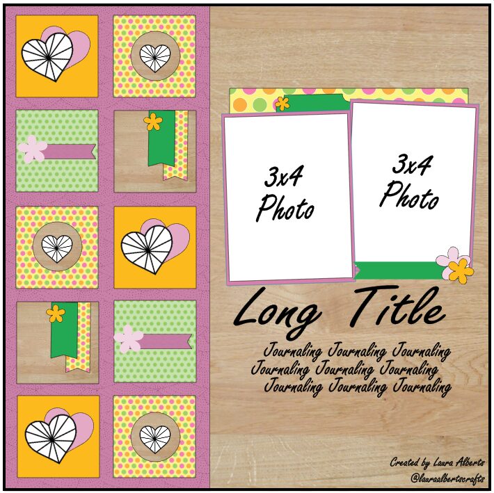
I was so excited by how this layout turned out, that I created a sketch based on it to share with all of you! I hope you enjoy using this sketch to inspire you to try a split-level layout too!
I hope this inspires you to look at your older Cocoa Vanilla Studio stash a little differently and incorporate them in a big way on your projects too! To see how “Hello Sunshine” came together, check out the process video below!
Hello, hello. How are doing, everyone? I hope you are ready for another dose of “These days” inspiration! This week we are focusing on puffy stickers and puffy hearts to show you how you can incorporate them in your projects. I must tell you I struggles a while for what I should do. I didn’t have any photo on my mind, or specific design so I came back ot basics by using tried and true grid design. To make things a little bit different than usual, I used heart dies and created my grid using them.
I went even further and used the die to cut the photos too. You can’t do this with every photo as you loose a lot of background. I managed to find few pictures with my daughter standing a little far, so I only lost part of her hands but you can still see what was the main focus of the photo. All my hearts are cut out from “Good life” paper, with lovely and cute pattern. They look great on warm wooden texture from “Pretty posies” paper.
After I glued down all the hearts and photos, it was time to decorate everything. I reached for ephemera and flower packs. This such a fun and quick to use product. I love fussy cutting but it takes a precious time and with pre cut elements you can create much faster. I glued down flowers and other elements using 3D foam, adding dimension to my page. Each heart got it’s own mini composition.
When it comes to puffy stickers and hearts – I added one golden heart on each element on the grid. They add a little bit of blink and sparkle to my layout. I love using puffy stickers as they are great tiny accent and perfect for finishing touches. I especially love those mini hearts – I could have a whole sheet of them only in all colors of the rainbow.
Last step in making this page was to add a title. I wasn’t vey inventive here and I used Foam titles, that are part of “These days” collection. I needed someting short so I chose THIS LIFE phrase. It’s very generic and in this case it tell about idyllic childhood of my kids. They get a chance to spend time in the countryside, run bare foot, play in the big pile of sand, spend time with the farm animals, bath in puddles and be as dirty as they want.
That is all for today. Thank you so much for stopping by and see you in September. It will be time for some fall page, right?
It’s Tarrah back with you today to share a new scrapbook layout featuring the gorgeous NEW These Days collection. I have chosen to scrapbook a family photo of myself, my hubby and our 2 sons.
I decided to start by cutting out a title cut file design from CUT to YOU from white cardstock. I then was able to take different patterned papers from the A5 paper stack and backed the words with a different paper. I chose to only back two of the larger hearts with a pink A5 paper also. It takes a little time to back a cut file like this so I normally do this while watching a movie with the family.
Once the cut file was all backed, I adhered it down onto another sheet of white cardstock, trimming down the cardstock to back the entire layout onto the ‘B’ side of the Wall of Fame paper. Once adhered I then machine stitched a border around the edge, I love the added touch of texture this adds to my page.
The best place to add my photo was to the right of the title, I did have to cover some of the hearts in the cut file but I would rather that than cover the title. I layered one of the 3′ x 4′ journal cards underneath my photo and adhered the Together die-cut word from the ephemera pack right on top of the photo, this helped to disguise and cover an unattractive part of the photo. Next it was time for my favourite part – embellishing!! I added embellishments including die-cuts, puffy stickers, a wood epoxy bead, accessory stickers, a gold puffy heart and clear stickers.
Thanks so much for stopping by the Cocoa Vanilla Studio blog today! I hope you enjoyed my layout as much as I enjoyed creating it!?
Make sure to stalk the Cocoa Vanilla online storeas the These Days collection will be hitting the store soon! So if you don’t already have this gorgeous collection, you can get it straight from the website soon!
Gwen with you on the blog today sharing a new layout using the ‘These Days’ collection. We are doing a bit of a Scrap-lift on the blog this week and I’m super excited to be inspired by a layout created by Laura Alberts. I’ve included an image below of her layout so you can see all the inspiration I’ve had for my page.
There is so much about Laura’s page that inspires me. I was first drawn to the frames in her background and their grid like format. Then I was drawn to her black and white portrait image finished off with a striking black border on her layout. For my layout, I simply started with those three elements and went from there. I’ve pulled from my stash the same black and white pattern paper she has used for her outside edge (More than Words Collection – Gossamer) and then teamed it with the latest ‘These Days’ collection. I’ve also found a black and white portrait photo to use, just as she has. This one is a photo of me and I thought, why not use it, I don’t scrapbook myself nearly enough :) I know I’m also going to use some butterfly embellishments just as she has in her page.
For the background of the layout, I’m using the ‘Home Grown’ pattern paper. I love using pattern paper rather than card stock for my page backgrounds, this one is a pretty shade of yellow. I’ve then pulled out a cut file from CUT to YOU, this one is a lovely mix of floral and frames. I wanted to replicate the frames on Laura’s layout here. I have gone ahead and backed the cut file using the A5 paper pad and then left the frames all open so that my lovely yellow background will show through.
Next, I’ve backed my photo and then fussy cut out a few of the pretty frames from the ‘Wall of Frame’ pattern paper. I’m going to use these to layer into the frames in my cut file for something different. This is a great way to give a bit of a backed look to the cut file, without the hard work. The frames in this pattern paper are super quick to fussy cut out. I’m using both of these elements taking inspiration from the frames in the background of Laura’s page.
I have positioned my photo to the left of the page so that you can see most of the floral elements in my cut file on the right. From there, I’ve created three embellishment clusters using lots of elements from the collection.
I’ve featured elements from the ‘Die Cut Ephemera pack’ as well as florals from the ‘Floral Ephemera’ pack. For the title of my page, I’m going with a sticker that says ‘Bloom where you are planted’ from the ‘Accessory Sticker Sheet’. I’ve also used the typed sentiment stickers on the bottom of that sheet adding them to my page with foam tape for dimension.
To finish up the page, I’ve added in 3 of the ‘Wooden Buttons’ and they really help draw the eye around the layout as well as adding some lovely texture to the page.
I’ve also made a YouTube process video which you can watch here:
Thanks for popping by today, I hope you enjoyed seeing the details in my layout and that it has inspired you in some way :)
Hey y’all! Laura back again with a fun scraplift of Gwen Wruck! I absolutely loved Gwen’s fabulously frame-filled layout, so I just had to recreate it with the new These Days collection! Some of the things I loved most about Gwen’s layout were the variety of frame/photo sizes, the way her embellishments overlapped the frames, and the large title at the bottom. So, these are the elements I focused on when creating my version of her fun design.
First and foremost, I needed to create some frames! I used the A5 black and white floral to create frames for my 4×4 inch, 2 – 3×3 inch, and 2×2 inch photos. Then, I fussy cut several of the smaller frames from the patterned papers as well. The combination of the two work beautifully to contrast the bold and colorful Family Ties patterned paper that I used for a background to mimic Gwen’s painted one. I filled each of the frames with either a photo or an embellishment and puzzled them together as closely as I could to Gwen’s design.
Adding in a variety of textures to this page was so much fun! Between the fabric hearts, puffy stickers, wood veneer buttons, and Nuvo drops, this page is filled with texture! My personal favorite was the tiny houses, which were perfect for photos showcasing backyard fun at our home. I added gold Nuvo Drops as controlled splatter before going wild and crazy with gold ink spray around the perimeter of the frames (as is my usual style!).
To finish this page off, I added a bold title similar to Gwen’s below my frame collage and then fit my journaling into the small frame beside it. I love the way these frames really focused in on my photos and allowed me to fit so many onto one page without it feeling overwhelming!
I hope this layout encourages you to try your hand at making your own frames or fussy cutting them out for your next project! If you’d like to see how “Always Together” was created, check out the process video below!
Mandy here with you today to share a layout featuring the beautiful new These Days collection. I’m absolutely loving creating with the soft colour palettes and pretty florals in this collection! I knew that it would be perfect for documenting this beautiful photo of my eldest daughter Abi, taken when we went out for brekky together on the morning of her Year 10 formal.
I started my layout off by trimming down a sheet of white cardstock to approximately 11.5 inches square and matting it on the reverse side of the Family Ties patterned paper. Next I adhered a 9 inch square piece of the yellow gingham Home Grown paper to the middle of the page. I added machine stitching around both the white cardstock and the patterned paper to give the page some additional texture. I then adhered a 4 inch wide strip of the Pretty Posies patterned paper, slightly off centre, towards the left hand side of the page. I used a border punch along with the orange Wall of Fame paper to create a pretty scalloped border to tuck under each side of the Pretty Posies paper.
I matted my photo with the wood grain side of the Pretty Posies patterned paper and adhered it overlapping the right hand side of the patterned paper strip. I then added the little ‘Hello’ banner from the Accessory Sticker sheet on the top left hand corner of the photo.
There are so many gorgeous embellishments to choose from in this collection! To create the embellishment cluster to the right of the photo, I started with one of the Double Sided 3″ x 4″ cards, and I fussy cut the ‘Little Moments of Joy’ banner piece out of it to use as both an embellishment as well as the title for my layout. I then chose an assortment of flowers and leaves from the Floral Ephemera pack to build on the cluster. I used foam tape to adhere some embellishments to give the cluster lots of dimension and interest. I also added a lovely little Wood Epoxy Button to the centre of one of the flowers.
To balance out the main embellishment cluster on the right hand side of the page, I created a smaller one in the top left hand corner. I repeated similar elements in this cluster that I’d used in the first one to keep it looking nicely balanced and cohesive. Those sweet little butterflies were fussy cut out of one of the papers in the A5 Paper Stack. I also tucked the die cut word ‘Happy’ into this cluster.
I finished my layout off with a few of the lovely Puffy Stickers, as well as some tiny little flowers that I fussy cut out of the Home Grown patterned paper.
Thanks so much for stopping by the blog today! I hope that you found some inspiration from my layout.
Hello, hello! It’s Anna here wnd I come to you with another layout. After so many years me being on this Team, you probably already know I love colorful collections and scrapbooking summer and vacation. That’s why you may be a little surprised today as I scrapbooked summer, beach photo but I used very soft “These days” collection, that has nothing in common with sea. I know I could cut into fantastic “Sunkissed” line, and to be honest, I even had it on my desk, but photo I picked turned out so dreamy and light that I just couldn’t fit it into so many colors. It’s full of sandy beiges and washed blues – colors that appear in “These days” line. So I challenged myself to use it with this particular photo.
“These days” collection is filled with fantastic motifs but none of them matches my beach photo. That’s why I focused on simple and versatile patterns and used dies to cut out shells and starfishes. I mixed papers from A5 Paper Stack and few 12*12 sheets like “Good life” and “Family ties”. Next step was to make myself very soft background. I quickly painted few blue stripes on white watercolor paper. I added a lot of water to the color because I wanted to achieve a very light shade.
After the background was dry, I glued my square photo in the middle and surrounded it with my die cuts mixing colors and shapes. Some of the shells are glued directly to the base and some are raised with one layer of foam squares. Thanks to that my composition is more dimensional and full of texture. For my title I reached for gold glitter foam titles from “Sunkissed” line. It has perfect words and color. Black words from “These days” would be too dark.
I went through the ephemera pack and picked few versatile shapes, like banner, to add them to my composition. I also found few matching stickers with generic words on them. My light background was perfect for displaying clear stickers so I picked few hearts and small crosses and scattered them between the die cuts.
My favorite wooden epoxy buttons are perfect for any type of project and they add fantastic texture. I added three of them here and there and finished everything with few small hearts from puffy stickers sheet. Few blue and gold splatters connected everything together perfectly.
I just love using scrapbooking collections in unusual ways and spreading my stash and this is a perfect example. I hope it will inspire you to look at your papers in a new, fresh way. Thank you so much for stopping by and see you in two weeks.
Hey Everyone Its Michelle back here today with a new layout to share with you all. I’ve scrapped a funny moment with Leila using the new These Days collection, ensuring the silly photos also get documented in our albums. It cant always be about the sunshine and rainbows… or can it?
I started by adhering a strip along the bottom of some white cardstock. This rainbow printed strip can be found on the bottom of the ‘Good Life‘ cut apart paper. Next I printed a set of photos in black and white slightly smaller than 3x4inch size and adhered both to different complimenting pattern papers (one of which is a pocket page card). I also cut a 3rd piece from another patter the same size to create a base for my large cluster, plus a trip of another complimentary pattern to tuck underneath. All 3 ‘cards’ were adhered to the cardstock using foam for a little dimension off the page. I tried flat scrapping this layout, and it just isn’t me. Give me ALL the dimension without bulking up the albums too much.
The photos I’ve used aren’t spectacular, but they’re certainly something funny to document. I think Leila and I sat this way for over an hour, her watching something on the iPad and me the tv. Yep we’re oh so weird in this household!
Next up I worked on the main cluster using some of the beautiful florals from the ‘Home Grown‘ paper that I had pre-cut on the couch a few nights prior. I wrapped them around the cute little ephemera piece that I thought worked perfectly for a mum & child layout. I used a couple of different forms of adhesive for this cluster to give the florals layered dimension.
The title was one that came together really quickly using our fancy new foam title pack plus a cut apart piece and word sticker from the accessory sheet.
Under the title I added another floral cluster, similar to the first one I created. Again using different forms of adhesive for layered dimension.
Heres another peek at the top cluster where I’ve used word strips from the a5 size cut apart sheet, and a cute gold glitter heart.
Lastly a 3rd mini cluster of florals was made at the top corner to balance out the entire layout but creating a visual triangle. Sometimes I don’t stick to this rule as it depends on the orientation of the layout, but most of the time I feel that it really gives a layout a more finished cohesive look. Oh and I also added a splattering of gold ink, cant forget that finishing touch either!
Well folks, thats all from me today. Thanks so much for stopping by to see my newest creation using our BRAND NEW collection – These Days. I cant wait to see what you all create with it once it reaches your crafting spaces! Please share with us in our Facebook Community group and via Instagram too using the hashtag #cocoavanillastudio
Hi everyone, it’s Sue Plumb here to share my latest design team project with you.
For this layout I was working with the gorgeous new ‘These Days’ collection. As this range has such a lovely home / family theme I decided to document one of my favourite ever family photos. This photo of the five of us was taken not long after we had finally brought our boys home. After being born prematurely, we spent over 10 weeks (which at the time felt like forever) in hospital and just looking at this photo reminds me of the elation I felt when we were finally able to be a family at home.
I knew I wanted to use a patterned paper background for my page, but I started with a sheet of white cardstock as the base. I chose 3 papers – the tiny heart print Good Life; the adorable house print Neighbourhood and the spotty green Family Ties. Starting from the left edge, I added various sized vertical strips of paper, slightly distressing the overlapping edge as I went.
For my photo, I added two layers of patterned paper to mat it – the black and white floral and the wood grain print, both from the A5 Paper Stack. On top of those paper layers I also added some frayed gauze for texture before adding some cardboard and then my photo on top.
I then turned my attention to my embellishments, beginning with the Wall of Fame patterned paper with all the doodled frames on it. I fussy cut three of the frames, and then tucked them in around my photo to create the bases for my embellishment clusters.
For the cluster in the top right corner of my photo I used the home sweet home sticker from the Accessory Sticker sheet, which I placed inside the frame I had tucked there. I then chose several floral pieces from both the Die Cut Ephemera pack and the Floral Ephemera pack and tucked them in around the frame. I then added a small heart and small butterfly – both from the Puffy Stickers sheet; a small Wood Button; and a couple of leafy branches from the Foam Title Stickers pack. I also added a die cut butterfly to the corner of my photo.
To keep my design cohesive, I used the same types of embellishments in the cluster on the bottom left corner of my photo – Die Cut Ephemera, Floral Ephemera, Wood Buttons, Puffy Stickers and Foam Title Stickers. I topped this cluster with the oh happy day! sticker from the Accessory Sticker Sheet. I arranged this cluster so that it trailed towards the bottom left corner of my page, which helped give my layout design a horizontal flow through the photo from top right to bottom left.
My title was the focus of my final cluster, along the bottom edge of my photo. I used the fussy cut frame I had placed there as the spot for the first word of my title, finally, which I created using the Mini Puffy Alphas. (These alphas are so gorgeous, and one of my very favourite things from this collection.) For the second word of my title, I used the word together from the Foam Title Stickers pack. These stickers are a beautiful script font, and a lovely charcoal colour. I love mixed font titles, and I think the combination of these two styles look great together. Below my title I added a brush stroke sticker and a small cluster of crosses from the Clear Stickers sheet.
Along the left edge of my layout, I added a couple of sweet phrase stickers from the Accessory Sticker sheet so that they ran vertically in line with the layered paper strips. And that was my layout done!
I am loving working with this collection so far; it’s one of those ones that is just so easy to work with, and I love how many embellishments there are to choose from! If you haven’t gotten your hands on it yet, ask your favourite scrappy retailer, or check with a stockist from the stockist list HERE
It’s Sophie on the blog today and I am SO EXCITED to be sharing my very first layout with the amazing These Days collection !!!
Ahhh where to start when everything from the collection is so gorgeous ?!
I decided to go with a simple page and wanted to use plenty of different patterned papers.
I cut strips of different width and length of many patterned papers from the collection as well as a few colored cardstock from my stash and curled one end of each strip, turning them around a brush. I aligned them in a horizontal line on the lower third of the page to “ground” the rest of the design.
I stitched one or two French Knots with matching embroidery floss on each strip.
I used a square photo of Sabrina hugging our dog Fiona (what’s new ?!!). I printed it in color and I think it matches perfectly with the color scheme of the collection. I backed it with tissue paper and adhesive foam and placed it on the right side of the layout.
For my title, I used a beautiful frame from the Die Cut Ephemera pack, added adhesive foam and the B side of the “Home Grown” patterned papers. I used the Mini Puffy Alpha Stickers for “Just So” and the Foam Title Stickers for “Sweet”. I placed it on the upper left side of the photo and added a die cut banner and a few die cut hearts scattered around the title frame.
I handwrote my journaling directly on the background cardstock and placed a cute typewrite just next to it.
Finally, I added a few floral embellishments and clear stickers and that’s a wrap !
Here are more close-ups:
I hope you like my page today and feel inspired to use this gorgeous collection !