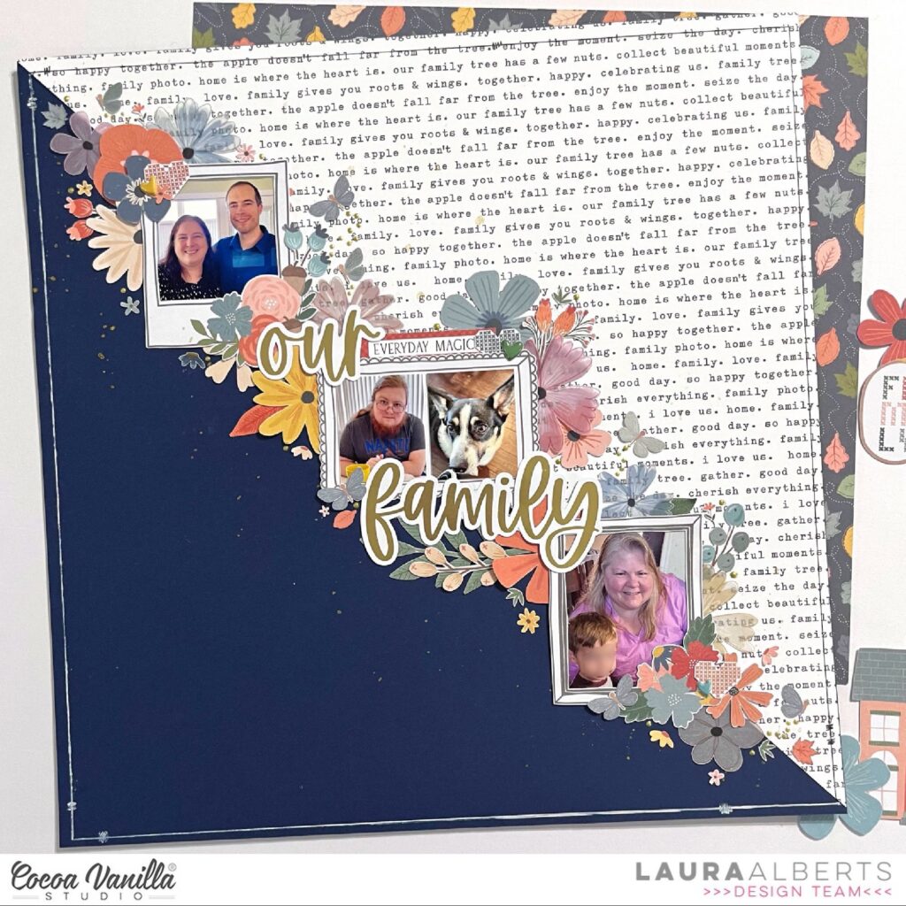
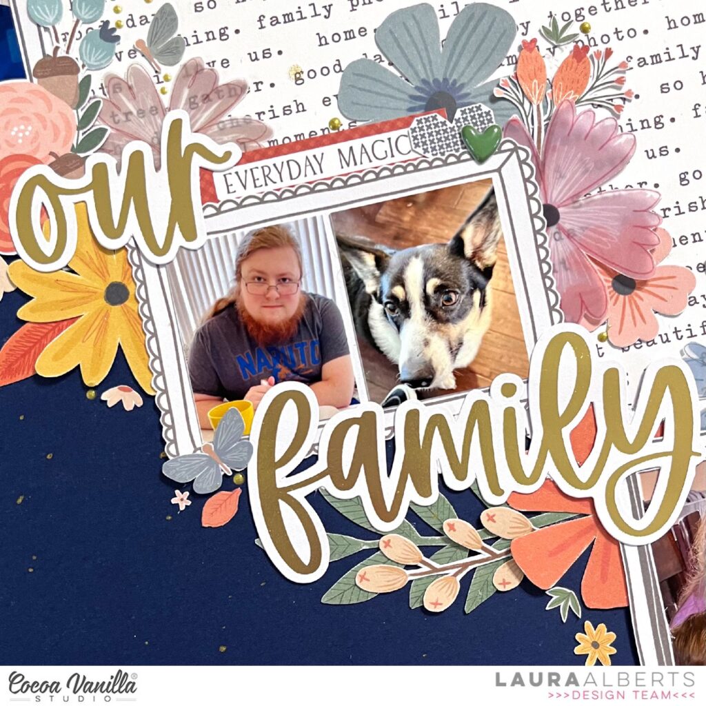
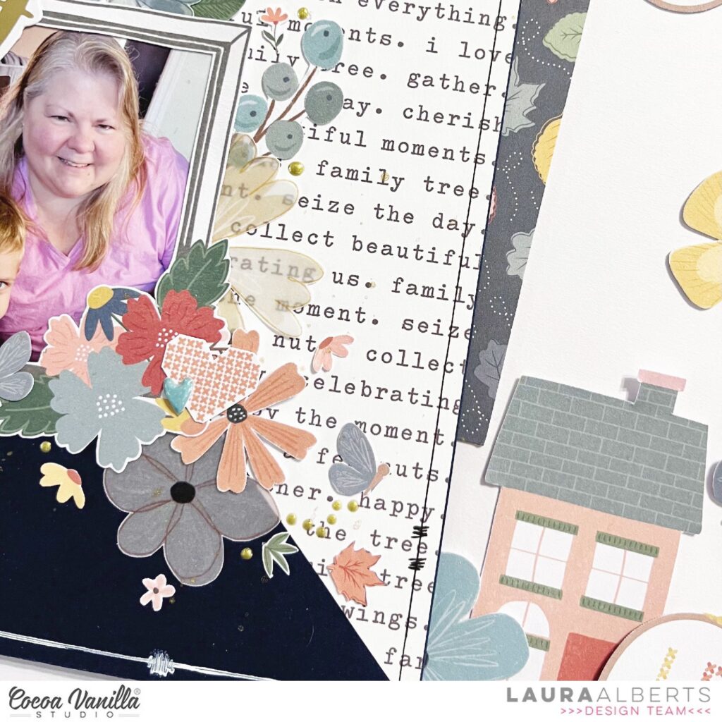
Hey y’all! Laura Alberts here with a diagonal design using the stunning Heart & Home collection. I adored these frames and was excited to use them for my Thanksgiving photos with extended family. I started with a Bazzill navy cardstock and cut this lovely text patterned paper from corner to corner to layer on top.
Along the seam of the two papers, I stair-stepped my framed photos with the title ephemera in between to connect them. To fill the open corners, I added a combination of vellum and card stock ephemera flowers. Tiny, fussy cut flowers are sprinkled around the edges, along with Nuvo drops.
I added in a few bits from the cut-apart sheet and finished the layout off with these adorable puffy heart stickers and a sketchy border all the way around.
To see how “Our Family” came together, be sure to check out the process video below:
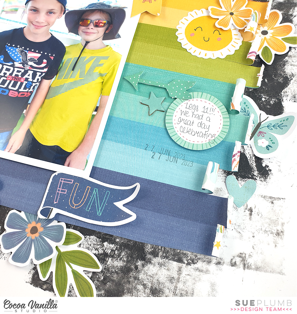
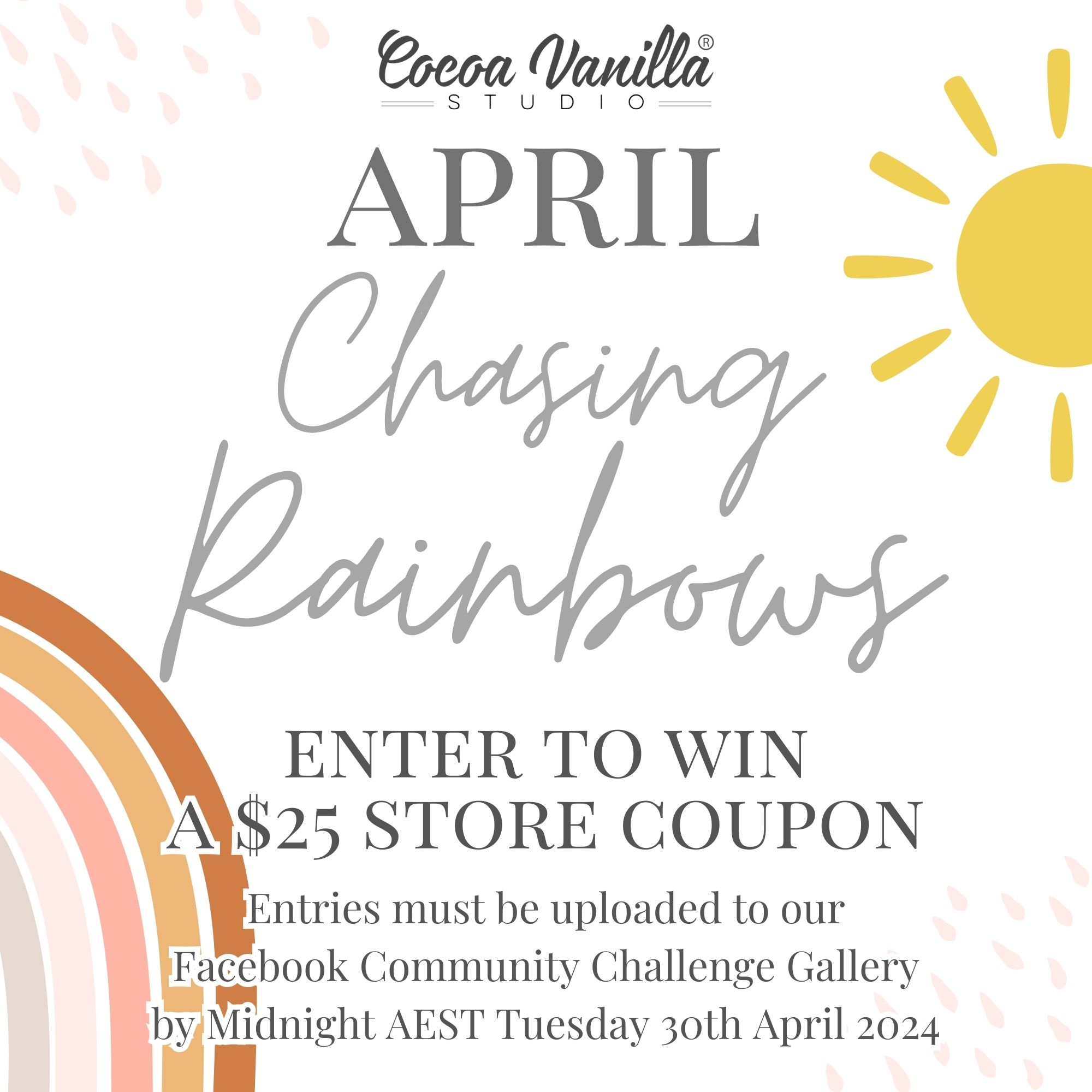
Hi everyone, it’s Sue Plumb here to share another design team project with you. Today I am sharing a layout that has been inspired by our April “Chasing Rainbows” challenge. This month the criteria is to use a BIG rainbow as the main design element of your layout. Now if you know anything about me, you already know I am not great at following rules, which is why anytime I try to follow a sketch I end up somewhere completely different. So it should be no surprise to you that my interpretation of this challenge is a little loose. Here’s what I came up with…
I was determined to create a boy page for this challenge, so how do you create a boy rainbow? Simple! You just cut the pink and purple off! I really loved this striped Sunshine Lollipops paper from the ‘Happy Days’ collection so decided to use it as my big feature. I really wanted the colours to pop, so I first added some dark grey acrylic paint to my cardstock for my background. I wanted to keep the paper intact for my main feature, but add some extra interest, so I snipped a little along the line between each colour and used a narrow wooden skewer to help roll the ends up (some I curled a little more than others).
The photo of my boys was taken whilst we were out celebrating their 11th birthday, so using bright colours was perfect for the occasion. As the rainbow was to be the main feature of my page, I didn’t want to mess it up by muddling the colours at all, so I decided to use the tone-on-tone technique for my embellishments.
I used a mix of pieces from the Die Cut Ephemera and Floral Ephemera packs (yes, you CAN have flowers on a boy page!) as well as Accessory Stickers. I placed the embellishments on top of (or as close to) the corresponding colours on the paper and used foam tape to add dimension to some of them.
I really love the effect that using this technique gives, and it makes it super simple to decide where to place things, so putting this page together was a breeze! I finished off the page by adding the Chipboard Title across the top (I ADORE these chipboard titles – the font is so awesome!)
Thanks so much for stopping by today so I could share this with you. I hope I have inspired you to tackle this month’s challenge (who doesn’t love rainbows?!) You can load your entry over in the Cocoa Vanilla Studio Community group to be in with a chance to win. I can’t wait to see all those rainbows!
Hello Crafty friends, it’s Michelle here today with a new layout share for you all. Shock horror as its not a layout dedicated to our furry kids this week, I chose a recent photo of Leila on her first day of High School. New level of life adventures has begun. Woo Hoo!
Using the A5paperstack from the Great Escape Collection I’ve whipped up a grid design for the base of my layout design. I cut the squares in the middle row in a 3 inch size and the top and bottom rows in a 2.5inch size, then sewed around the entire edges of each using my machine. Each piece was then secured to the cardstock base using foam for a little dimension.
The photo (shared with permission from this spicy child of mine cause we all know how teens are these days) was printed in a 4x3inch size and packed using another pattern from within the A5paperstack. I stapled both pieces together using tiny staples and adhered to the layout using a little more foam sheeting to pop it off the layout.
You can see above how the little bit of dimension brings the layout to life
I created a couple of larger clusters diagonally in the top and bottom corners using left over stars fussy cut from the StarGazingpaper that I used on my last layout, with a mix of enamelshapes, accessorywordstickers and puffystars from the foamtitlespack
Next up I added the mixed product title using a word from the ephemerapack, letters from the chipboardstickerspack and words from the FoamTitlestickers pack. If you’re wondering where the W came from – never fear, its just the M from the word TIMES in the pack that I’ve turned upside down.
I added a little journal spot from the AccessoryStickerssheet to the bottom of this square to note what the photo is all about, and theres also a date label tucked into the photo too that was added towards the end.
I added the usual sprinkle of gold ink from the bottle I have that seems to be a never ending supply, just like Mary Poppins bag, but I’m sure its going to dry up at any minute
Here’s a final look at the layout as a whole…
Well friends, thats all that I have for you today.
Thank you so very much for stopping by and seeing this beloved creation that I’ve made.
Hello everyone. It’s Anna here with another project made with brand new “The great escape” collection. This time I don’t have layout for you. Instead I wanted to share three simple, masculine cards. I don’t know how about you, but I always have problems making cards for men and I never have enough in my stash to give them away with gifts. I have plenty of pink and floral ones though… You all know I am not a master in making masculine projects at all so I like to keep thing as simple as possible. Simplicity is a key to success when you struggle!
Let’s start with the basics. To avoid looking for a matching card base, I like to make them with single sheets from A5 Paper Stack. I just fold them in half and it’s done! The best part is that pages are single sided so inside of the card is white and ready for your message. It’s not the first time that I am using this trick.
First card was inspired by one of the papers in A5 Paper Stack with a sort of a simple landscape. I trimmed it to the card size and added stitching around it. Next, I reached for my stash of old CVS Alpha Stickers from variety of collections and created a title “Sky is the limit”, which works great with the landscape. The last step was adding trees from Die Cut Ephemera pack on the bottom and clous fussy cut from one of the papers. Super cute and tine Puffy Stickers and the perfect finishing touch.
Second card was inspired by the navy paper with night sky. I trimmed it to the proper size, added stitching around it and created a card title using Puffy Alpha Stickers from a bit older “Heart & Home” collection. “Reach fo the stars” needed to be surrounded by stars of course. So I cut them out from one of the papers from A5 Paper Stack. I also picked few from Die Cut Ephemera pack. I finished my composition with tiny stars from Puffy Stickers sheet.
Inspiration for my third card came from this pocket card with numbers, cut out from “Wild life” paper. It looks like a bucket list, so I added incouraging words from 6*12 Accessory Stickers. I backed the card with a piece of “Happy camper” paper and embellished everything with bits and pieces from Die Cut Ephemera and Chipboard Stickers. Can you guess the final step? Yep. Super cute Puffy Stickers.
That is all for today my Friends. Do you also struggle with masculine projects or it’s a piece of cake for you?
Thank you so much for staying with me and see you in two weeks.
Hey y’all! Laura Alberts back again with a lovely layout using the Heart & Home collection to scrap these photos documenting my newest obsession, crochet! The colors in this collection worked beautifully with the yarn that I used in the very first project I made. This blanket is a bit of a mess, but I learned so much!
I used a simple shelf design for this layout with two 6 inch strips of wood grain patterned paper for each base. This was a great design for using up scraps and hiding the rough edges behind my photos. All of the layers made this simple background interesting and fun! In addition, I used the vellum flowers that I fussy cut from the Heart & Home specialty paper to create clusters behind my photos.
The details of these clusters really help my layout shine! I especially love the tiny florals that I scattered around my clusters and titles. These are all fussy cut from the stunning patterned papers in this collection. I also outlined each of the paper layers with a black gel pen to give them a hint of shadow for a 3D look!
To see how “With Love” came together, check out the process video below:
It’s Tarrah back with you and today I am sharing a new layout inspired by the new April challenge to include a big rainbow as the main element on your layout. I decided to go with a non-traditional rainbow and created my own using various papers from the Boys Rule collection.
The new monthly challenge for April is to include a BIG rainbow as the main design element on your layout.
To help create the arches of the rainbow, I used various sized dinner plates and traced around the tops of them on the different patterned papers I chose from the Boys Rule collection. I chose these following papers from the Boys Rule collection: ‘Fun and Games’, ‘Straight and Narrow’, ‘Entitled’, ‘Expressionist’ and ‘Star Fall’. I then arranged them on a plain white cardstock background and adhered them down. I trimmed the white cardstock down to measure roughly 11′ x 11′ and adhered it to the ‘Boys Stuff’ patterned paper. I then machine-stitched each individual colour in the rainbow with matching thread.
At the base of the rainbow, I adhered a strip of the ‘Straight and Narrow’ paper horizontally to add another layer to my layout. I added craft foam underneath my photo and placed it over on the right side of my page, I layered the frame and journal spot from the ephemera pack tucked in on the left hand side of the photo, on top of the photo I added one of the banner stickers from the Accessory Sticker sheet. My title is from the chipboard pack, I love these words! I added the ‘You’ and ‘Are’ words at the top of the rainbow and the ‘Awesome’ word under the photo. Either side of the ‘Awesome’ word, I added the scalloped border sticker from the Clear Sticker sheet. Above the photo, I added one of the banner stickers from the Accessory Sticker sheet. I punched out some stars from the ‘Happy Go Lucky’ paperand then layered some of the star stickers over the top. I placed a few of these around my page.
Once I was happy with how the larger elements were placed on my layout, I started adding some smaller embellishments including more clear stickers, more accessory stickers and some more ephemera also. One of my signature features on my layouts is to stamp the date of when the photo was taken and this layout is no exception, I stamped the date stamp using some black ink.
I don’t often journal on my pages so I love the phrase and word stickers from the accessory sticker sheet. I add them to all of my Cocoa Vanilla layouts, where I can, to help tell the story. Boy layouts are one of my favourite projects to create and this one was so much fun to create! I really love how it turned out too. Make sure you create a layout and add a big rainbow element as your main design feature and share it with us by uploading it to the Cocoa Vanilla Studio Community Facebook page.
Thank you so much for stopping by the Cocoa Vanilla blog today! I hope you enjoyed reading about how I created my layout as much as I enjoyed creating it!
Hi everyone, it’s Sue Plumb here to share my latest design team project with you. Today I am sharing another layout using the fabulous ‘Great Escape’ collection that documents a photo of Zoe and I on our trip to the USA back in 2019. This pic was taken the day we went to the Grand Canyon, and it definitely rates as one of my favourite days EVER – I am so happy we got to share it together.
I started this page with a sheet of white cardstock and added some ‘Naples Yellow’ acrylic paint to it using a brayer. I chose this colour because of it was a lovely earthy yellow, and I knew it would work well with the other colours of the collection. I then chose a selection of patterned papers for my papery layers, including the green compass print from the Direction paper; the mustard yellow crosses from the A5 Paper Stack; and the orange chevron pattern from the Happy Camper paper. I distressed the edges of the green one to add some texture, before layering the other two on top.
Once the papers were in place I then added some frayed gauze before placing my photo on top of the layers. You can see how I cut the orange chevron print into an arrow shape to run behind my photo from left to right, which helps draw the viewer’s eye in and across the panoramic photo.
For my embellishments, I started by adding three main pieces around my photo – the compass on the left edge from the Die Cut Ephemera pack; the get outside and roam badge (also from the same pack) at the top; and the group of trees from the Chipboard Sticker sheet in the bottom right corner. These three pieces created my visual triangle around my photo and gave me anchor points to work from for the remainder of my embellishments. The other reason I started with these embellishments is because they were all larger pieces and it is always easier to get the biggest things on a page first.
The next piece I added was the ADVENTURE title from the Chipboard Sticker sheet. I knew I wanted to run this piece along the bottom edge of the photo because it is quite a long title and it mirrored the shape of my photo. With all those large elements in place it was then easy to go back and add a few extra embellishments to finish it off. I used the so much fun banner piece and a few stars from the Chipboard Sticker sheet, along with some tiny words and a label from the Accessory Sticker sheet.
I was determined not to over-embellish this page and detract from the photo, so I finished it off with only a few tiny black ink splatters and my handwritten journalling on the label.
I am loving creating with this collection so much, and I have another project with it in the works at the moment that I can’t wait to share! I’ll be back in two weeks with some more inspiration for you.
Hey Hey, It’s Michelle back here to kick off another week of creative shares from the Cocoa Vanilla Studio Design Team. This week I’ve used the awesome GreatEscapeCollection to create this star filled explosion of colour to document our sweet little furry kids after a fresh haircut.
To begin I cut into the HappyCamper paper between two of the zigzag lines and adhered them to some white cardstock with a gap between to add all the stars. I cut up an entire sheet of the StarGazing paper to get the right mix of colours and shapes to fill all that white space. I used both tacky glue and glue dots to adhere them to the layout for different heights of texture.
These 2 little fuzz balls are so hilarious when they have a haircut, its so much fun to look back each time.
I used a piece of the cool woodgrain paper from the A5paperstack to pop the photo off the layout amongst all the colour.
Love Love Love me some stars, just about as much as I love fussy cut florals, and even though cutting up all that one sheet took so very long, I really love the texture it gives the layout
Theres a couple of accessorywordstickers placed around the layout, and a mini cluster of beautiful stars at the bottom of the layout to balance it all out.
I created a mixed font title on the layout using the Foamtitlestickers along with chipboardsticker words. Perfect mix of textures to bring it all together.
I did add the usual splatter of gold ink to finish it all off.
Here’s a final look for you all…
Well friends, thats all from me today. Super short and sweet, just the way I like it.
Hey y’all! Laura Alberts back again with the new Great Escape collection! These photos of my youngest son at the Delta State Fair were the perfect mix of colors for this collection, even though it steps well outside the nature/camping theme of Great Escape. The versatility of Cocoa Vanilla collections is one of the reasons it’s my favorite!
I started with a 10 inch circle using a chipboard template I made from a large bowl in my house. Using that as a guide, I stacked up tons of fussy cut stars around the circle. This gives the layout a celebratory feel that I think fits the State Fair!
I grouped my photos into two small clusters at the top left and bottom right, then built a larger focal image in the middle. For my 3×4 inch photo in the center, I built up a shelf using scraps and manufacturing strips. This gives visual support to my focal image.
If you would like to see how “Play” came together, check out the process video below:
It’s Tarrah back with you and today I am here to share a new scrapbook layout featuring the awesome Great Escape collection! I don’t know about you but I love travelling and I love documenting those travels too! Recently my partner and I took a trip to gorgeous Tasmania, it was wonderful, these photos are from beautiful Cradle Mountain and this collection has been perfect to document our travels.
I started by cutting out a cut file from CUT to YOU from white cardstock and then backed the different words and frames with papers from the Great Escape A5 paper stack.
I added 2 photos in the frames of the cut file as well and I had to be strategic with what photo I added in the top frame due to the frame below covering up part of the photo. I chose the ‘Direction’ patterned paper as my background, I then cut the navy blue strip from the ‘Wild Life’ patterned paper and adhered it to the left hand side of the paper. Once the cut file was all backed, I adhered it to the same background paper. Usually I adhere my cut files using craft foam to pop them up, however for this layout I knew I wanted to pop up the mountains and other die-cut embellishments in the middle. I added the mountains, the Fun Times sign, the wood piece and the Adventure word all from the ephemera pack.
I also placed the compass die-cut to the middle of the ‘O’ of the word ‘Our’ in the cut file, I used craft foam for this piece also to pop it up off the page. Down next to the ‘Yet’ word, I placed the super cute camper die-cut and layered some phrase stickers from the Accessory Sticker sheet on top from the ephemera pack. Once the larger elements were added to my page, I then added a few smaller embellishments including puffy enamel shapes and some more stickers from the Accessory sticker sheet, including the arrow sticker and the journal spot above the word ‘Our’. I love how the puffy enamel shapes add a touch of colour and dimension and I love how the phrase stickers help to tell the story if you don’t feel like journaling!
Lastly I stamped the date stamp and journaled where the photos were taken. I love how this cut file helped to make the design and placement decisions on my layout and the Great Escape collection really does make it so easy to create great memories!
Thanks so much for stopping by the Cocoa Vanilla blog today! I hope you enjoyed reading about how I created my layout as much as I enjoyed creating it! Make sure you get your hands on the awesome Great Escape collection!