You’re The Best | No Limits collection | Tarrah McLean
Hi creative friends!
It’s Tarrah back with you to share a new layout featuring the No Limits A5 paper stack and the No Limits 3′ x 4′ pocket cards! These products are such a great part of the No Limits collection! They are perfect for layering, punching shapes from and backing cut files too. This collection is so versatile and its perfect for not only boy projects but travel and even girly projects too!
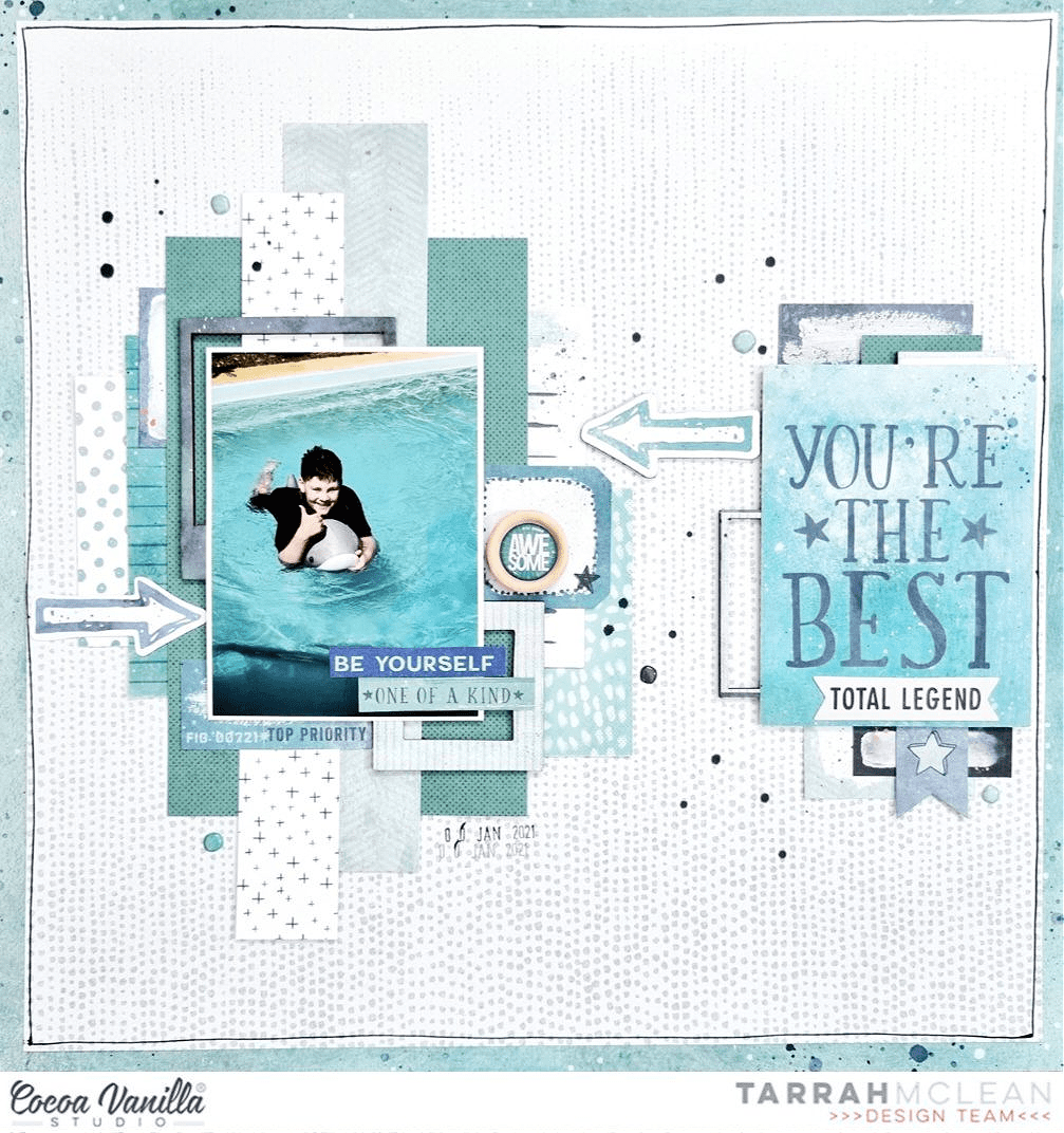
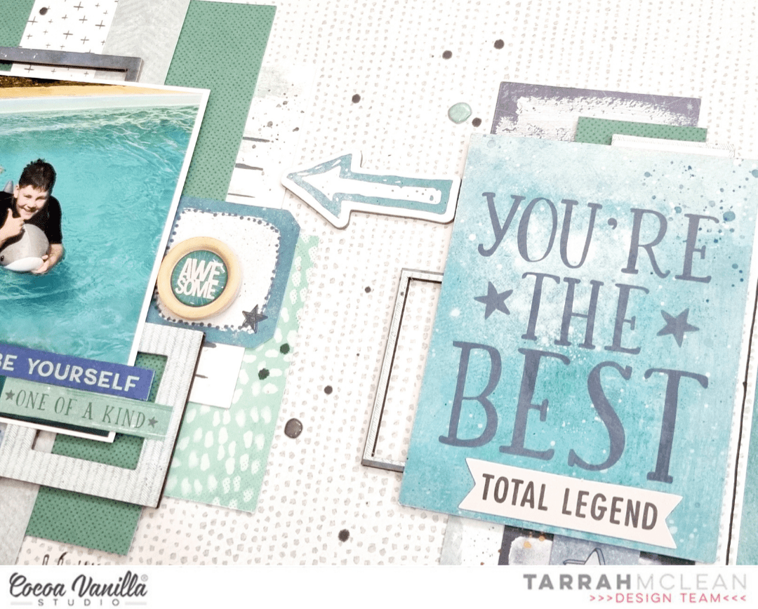
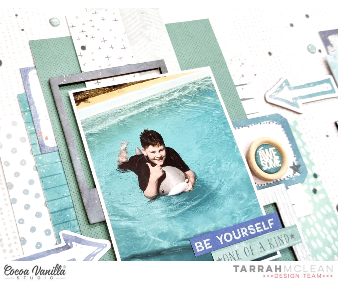
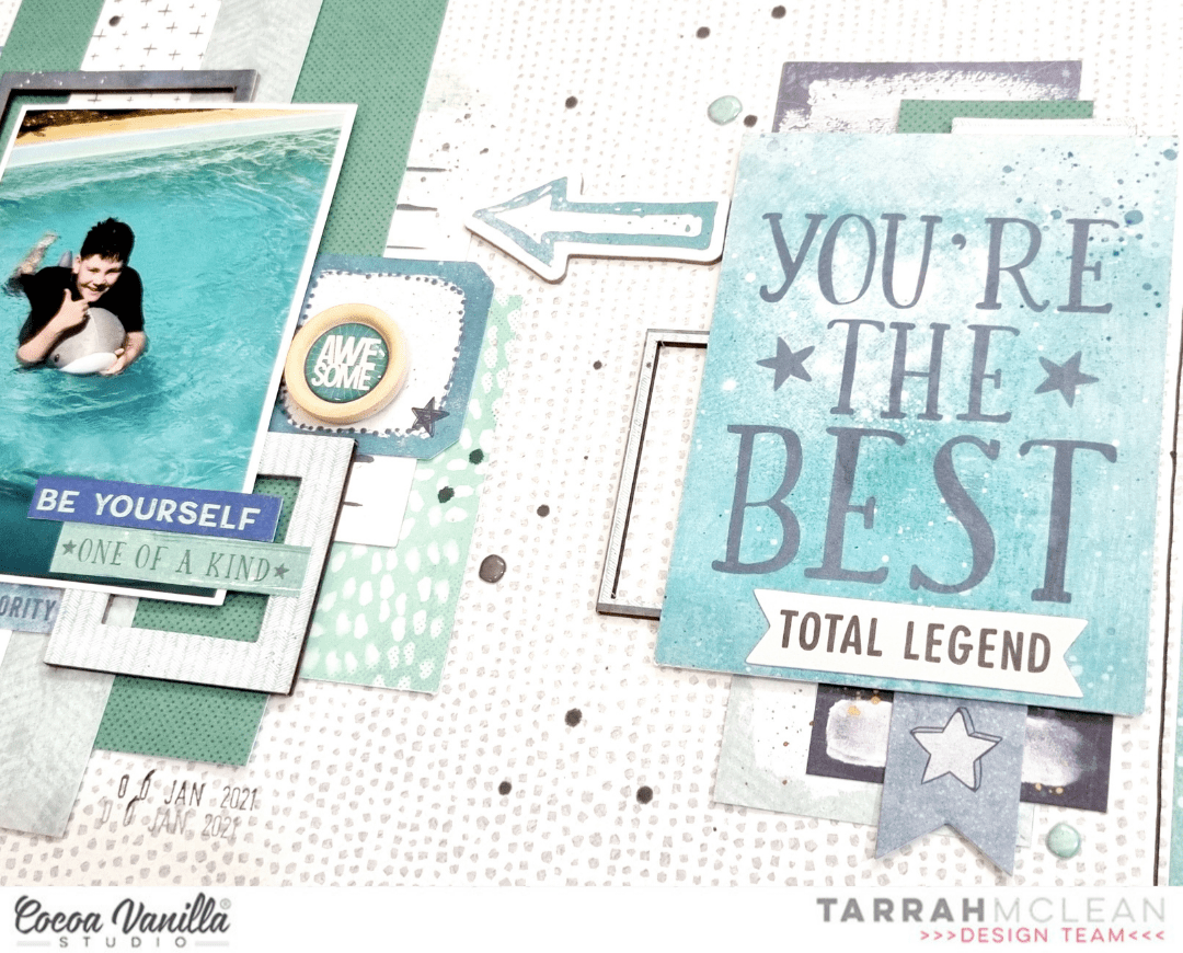
I decided on a monochromatic colour scheme for this layout as so many of the elements in the No Limits collection went perfectly with the photo of my son having fun in the pool. I chose the Universal paper as the background paper as it reminded me of bubbles and was perfect to go with the photo of my son in the pool. I trimmed this paper down slightly and backed it onto the ‘B’ side of the Stardust paper. I took my black journal pen and freehand drew a border around the outside. I cut out some different sized strips from the A5 paper stack and layered them in a vertical manner to the left, I also took 5 of the 3′ x 4′ journal cards layering them under the paper strips, I added the ‘You’re The Best’ one to the right hand side of the layout, this card became the title of the layout.
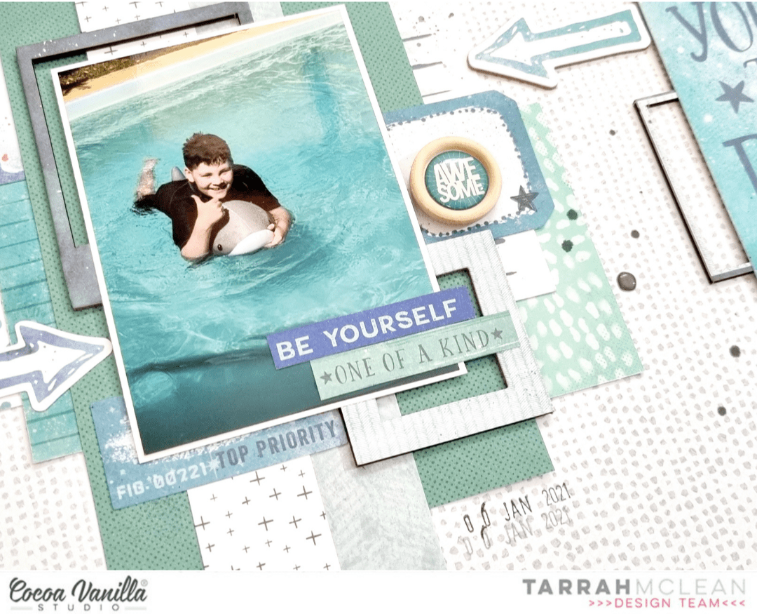
I adhered my photo on the left using foam tape to add some dimension to the layout and took some of the chipboard frames and also layered these under the photo. I cut out 2 phrases and adhered these to the photo. I also layered one of the thin chipboard frames under the title card on the right. When I create layouts I always start with the larger elements on my page first like the papers, title and photo. I then add smaller layers and embellishments and finish with the smallest things at the end. Once the chipboard was placed, I then took some ephemera and accessory stickers also in the monochromatic colour scheme and added these as layers under the photo and paper layers.
As my photo and most of the detail is on the left of the layout, I wanted to balance the layout by adding similar elements on the right of the layout. I was able to replicate the photo by adding the 3′ x 4′ journal card and I tucked in some layers just the same as I did on the right. I didn’t tuck any papers on this side so that it did not look too overdone. I tucked in mainly ephemera and accessory stickers.
Some of the smallest embellishments I added last were the chipboard arrows, by placing these opposite to each other, they give a sense of movement on the layout. I also took some of the super cute puffy stickers, choosing some of the blue and grey ones and added some around my layout. I like how these also help replicate bubbles and go perfectly with the theme of my layout. Lastly I stamped the date stamp and sprinkled a little bit of black mist on my page.
Thank you so much for stopping by the Cocoa Vanilla blog today! I hope you enjoyed my layout as much as I enjoyed creating it?! Make sure you keep an eye out for the awesome No Limits collection in your local scrapbook store and it should also be hitting the Cocoa Vanilla online store soon as well.
Happy creating!
Tarrah x

