Best Ever | Storyteller collection | Mandy Melville
Hello everyone!
Mandy here today to share another layout featuring the gorgeous Storyteller collection! For this layout, I decided to scrapbook a couple of photos from a day that Isaac and I spent at the zoo a couple of years ago. It was such a great day, and I wanted to document how much I enjoyed spending the day with him. The Storyteller collection was perfect for this page, and I love the way that I was able to focus on more of the blues & greens in the collection for this layout. And I don’t mind using a floral cluster or two on a boy layout either!
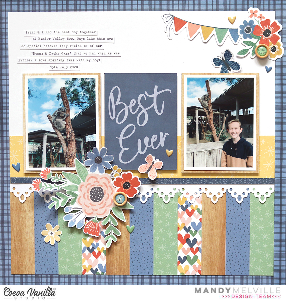
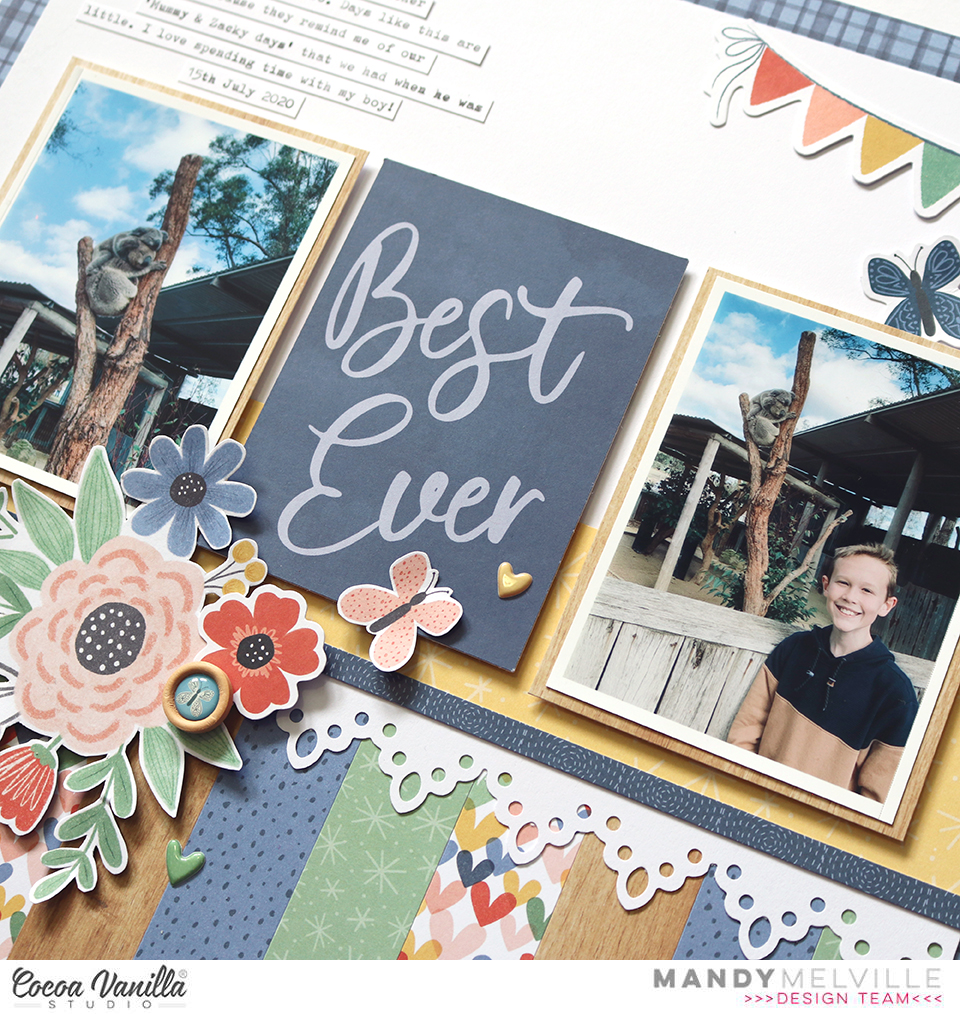
To start the layout off, I trimmed a sheet of white cardstock down to 11 inches square and matted it on the blue Ditsy Daisy paper.
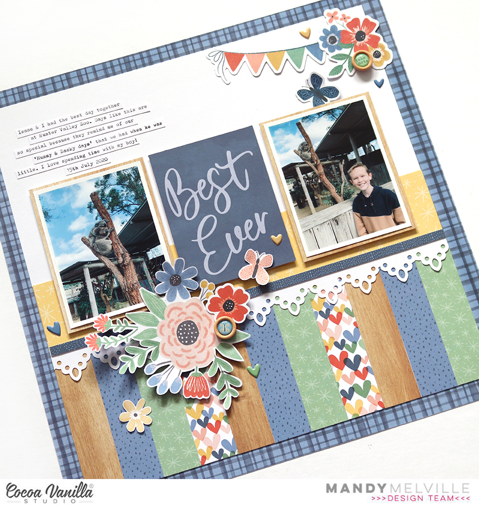
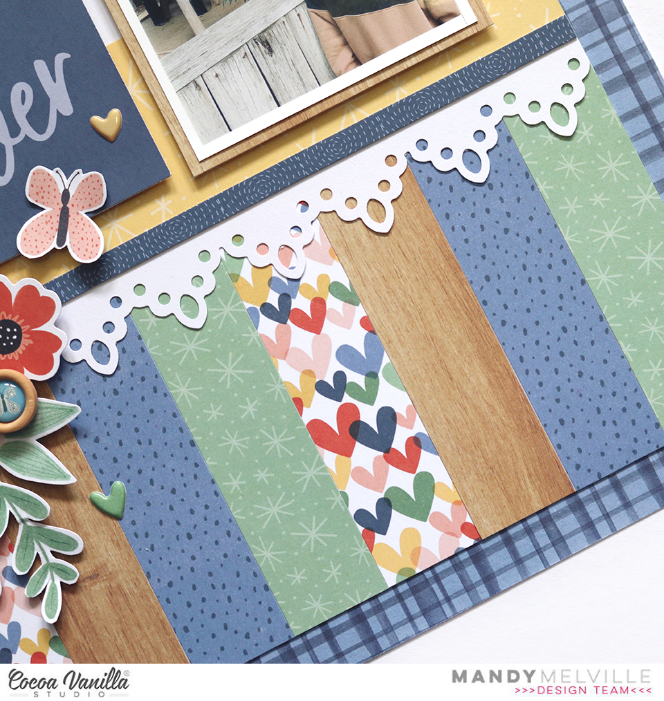
Next I chose a selection of papers from the A5 Paper Stack and cut them down to 1 inch x 4 inches and arranged them across the bottom of the white cardstock. As I mentioned, I tried to stick mostly to the blues, greens and woodgrain as I thought these would complement the photos nicely. I then added a piece of the yellow Little Love paper along the top edge of the strips, along with a border that I punched from white cardstock. This added some nice detail and also provided a ‘ledge’ for the photos to sit on.
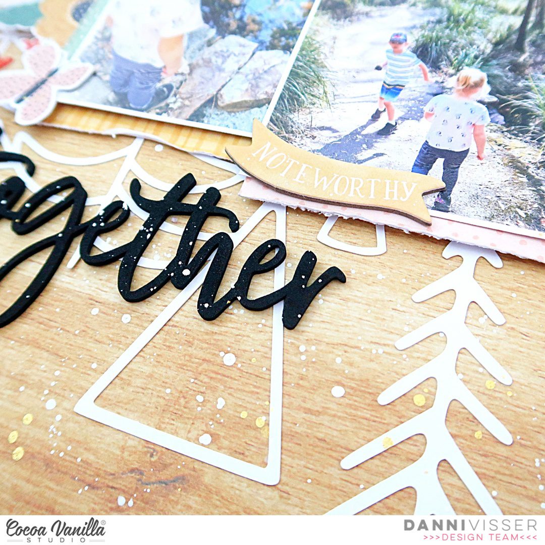
I printed two 3 x 4″ photos and matted them on the woodgrain paper from the A5 Paper Stack. I also chose a 3 x 4″ card and positioned it between the two photos. This also became the title for my layout. I adhered the photos and card with craft foam to give them all some extra dimension.
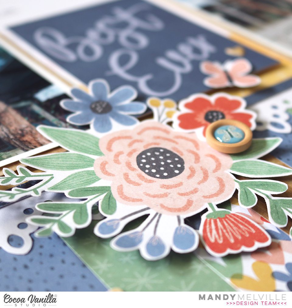
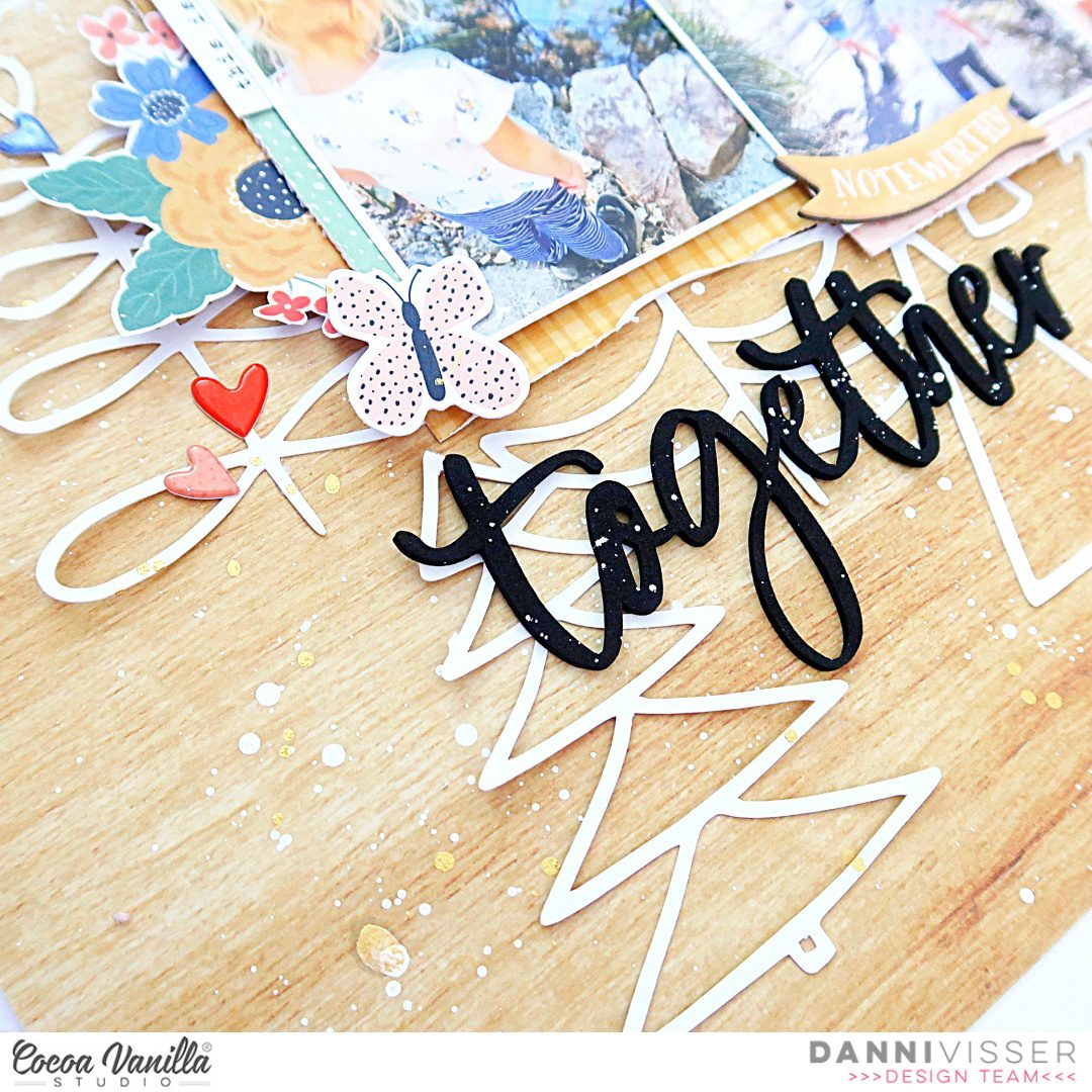
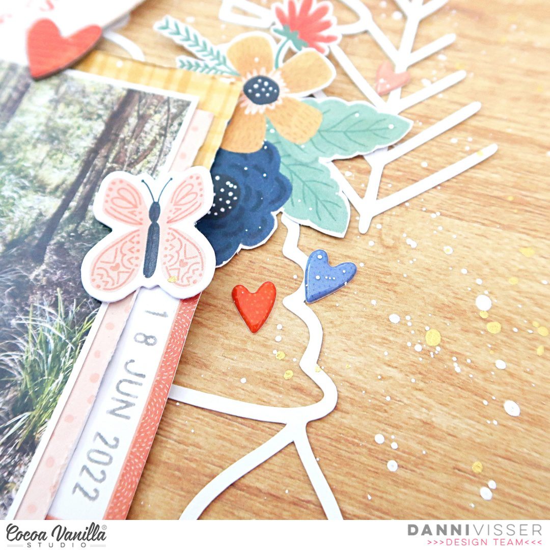
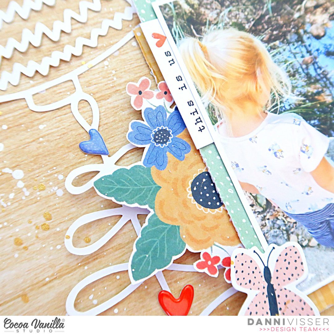
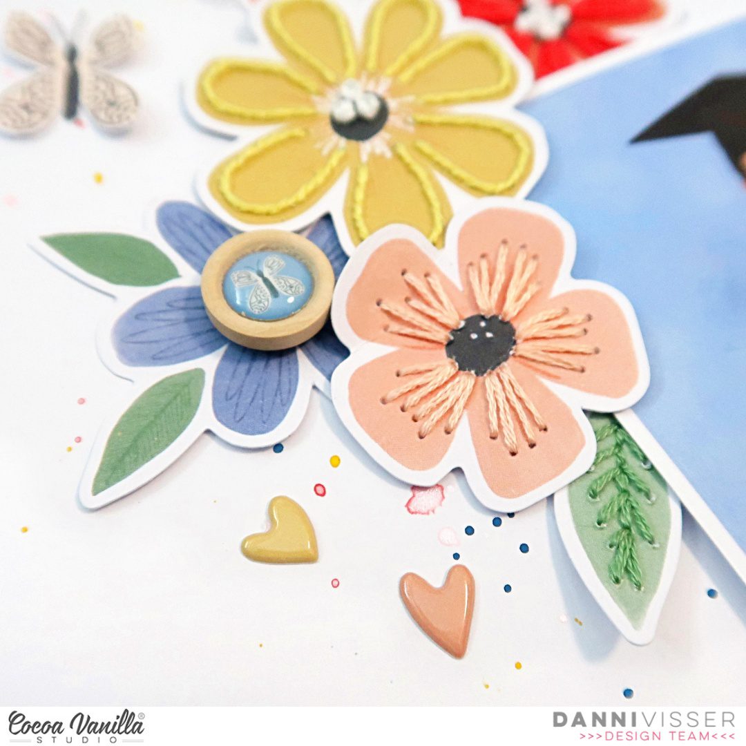
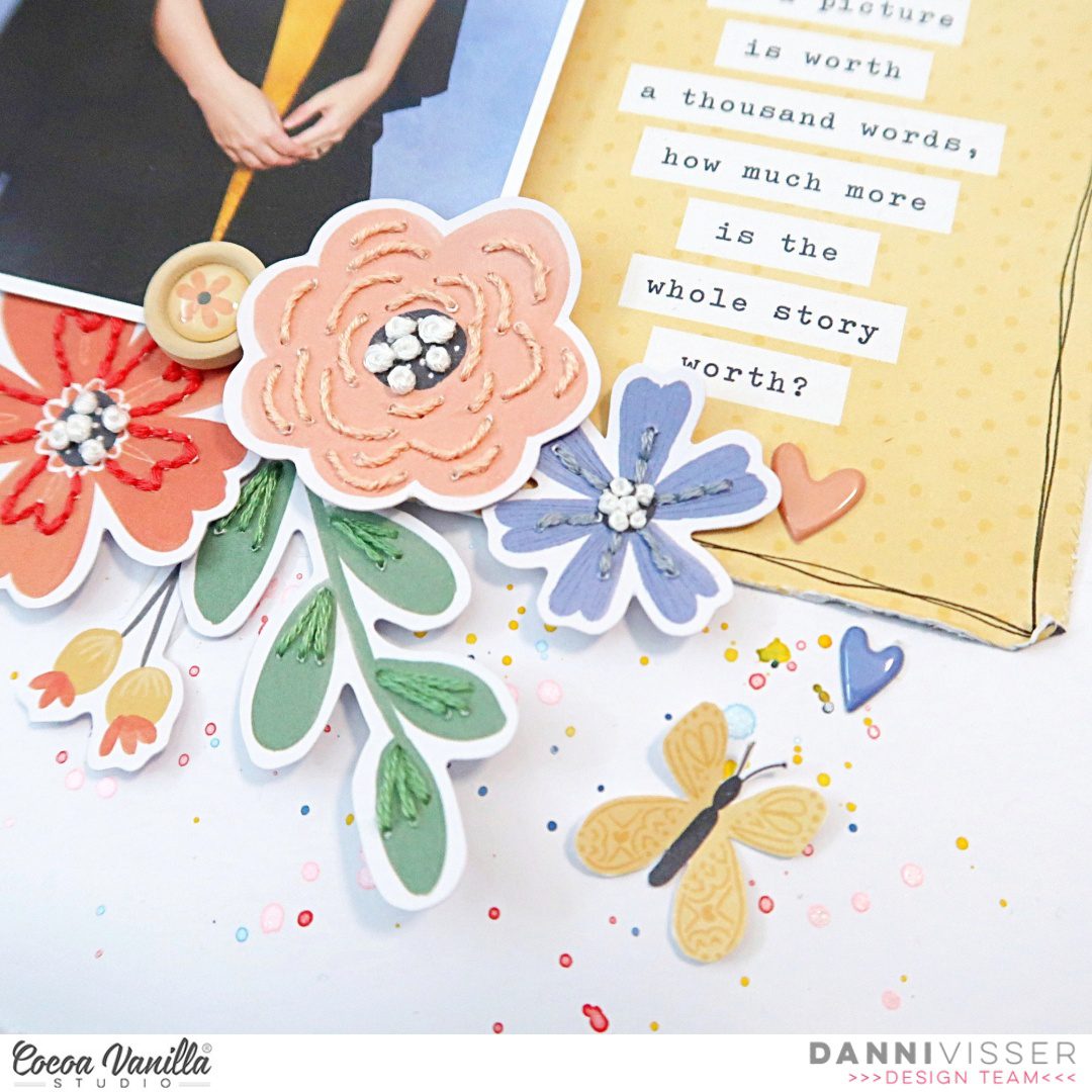
Once my background was done and my photos were in place I was ready to embellish! Of course I couldn’t resist fussy cutting one of the gorgeous floral clusters out of the Spring Fling paper! I adhered this below the photos on the left hand side of the page. I also added one of the Wood Epoxy Buttons to the floral cluster to give some more texture to the page.
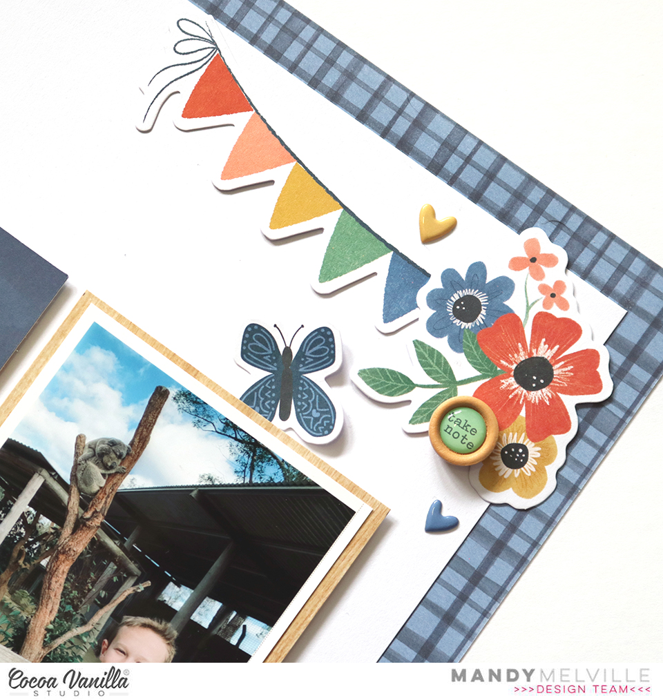
To balance out this floral cluster, I added another embellishment cluster in the top right hand corner of the layout. This gives the page a diagonal flow, drawing the viewers eye from the larger cluster, up through the photos, to the one at the top of the page. In this cluster I included some items from the Die Cut Ephemera pack, including a banner, a floral cluster and a butterfly. I also added another Wood Epoxy Button as I like to repeat similar elements in each of my clusters.
I finished the layout off with some typed journaling and a sprinkling of Puffy Stickers.
Thank you so much for joining me here on the blog today. I hope that you’ve found some inspiration!
Mandy x

