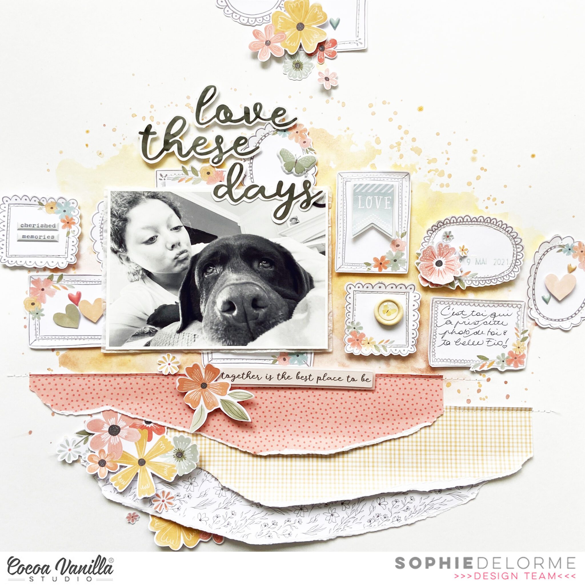
Sophie with you on the blog today sharing this new layout created with the beautiful “These Days” collection.
My focus today was to use the A5 Paper Stack. Ohh this was fun !!!
Here is a look at my process;
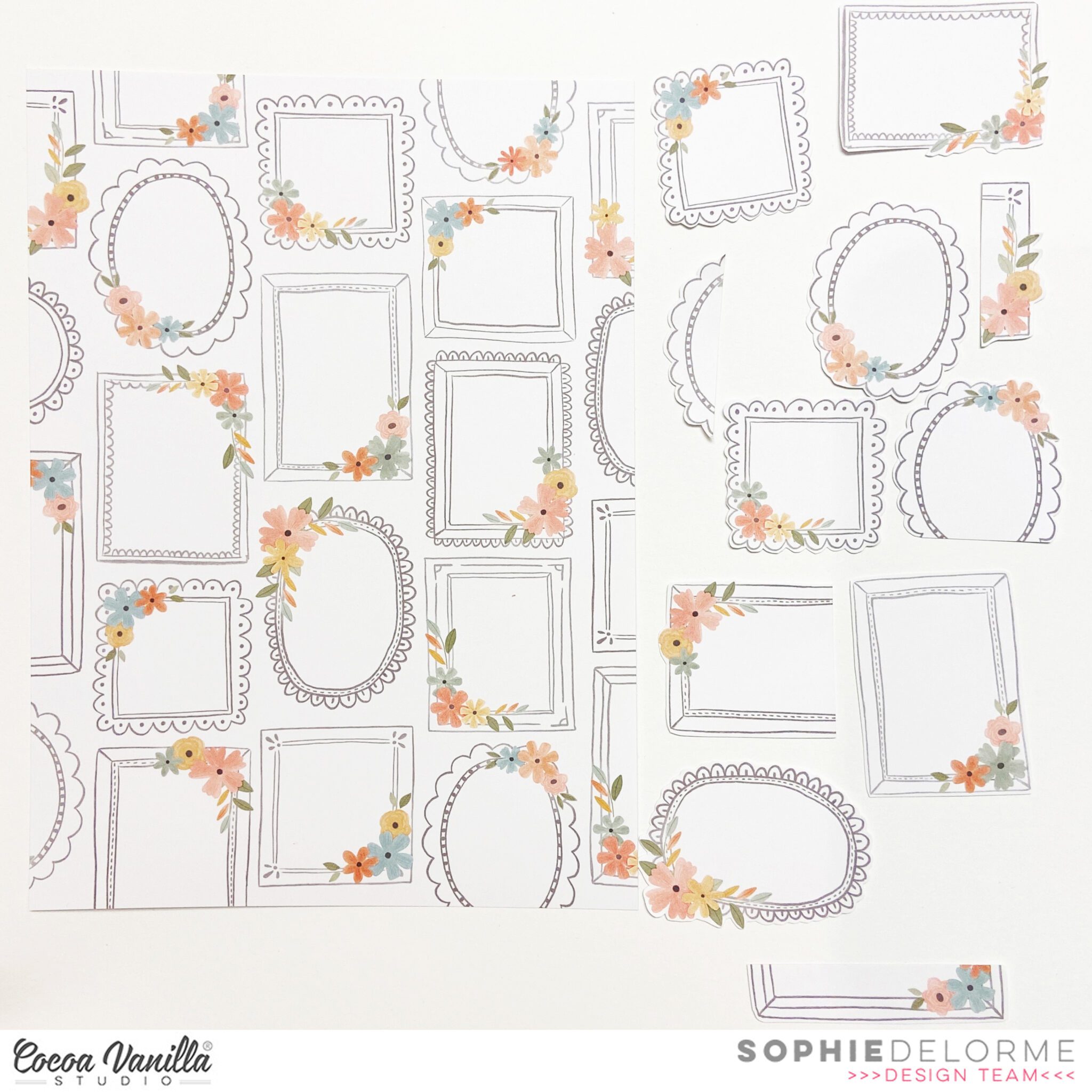
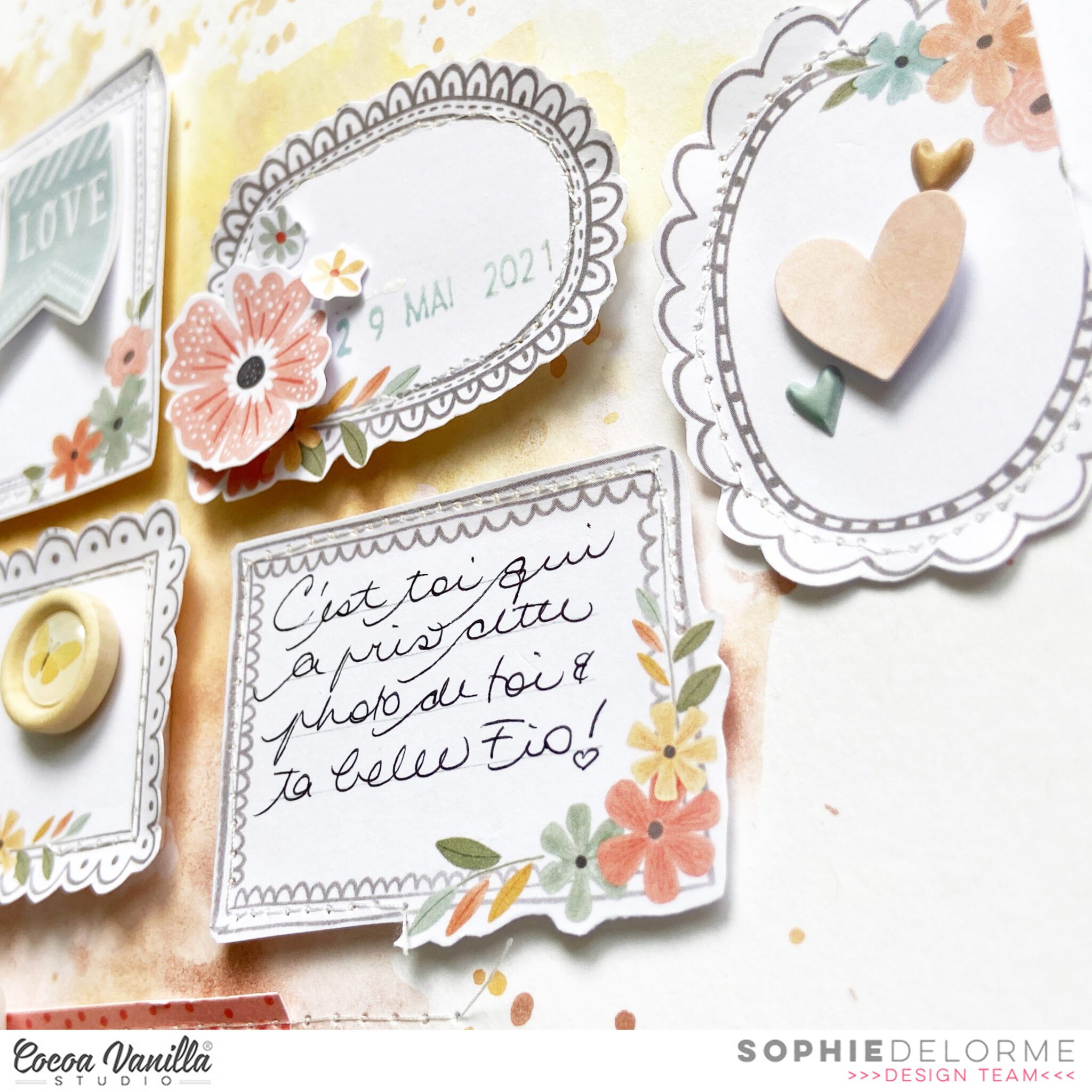
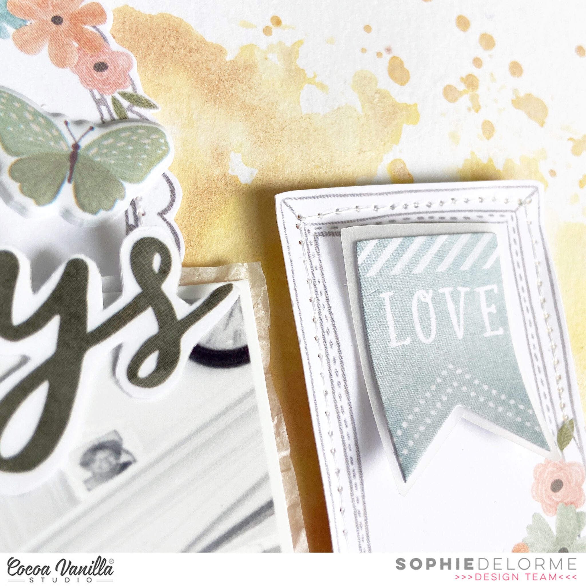
This frame paper is really what got me started. I fussy cut plenty of those cute little frames and I knew that I wanted to incorporate them on my page.
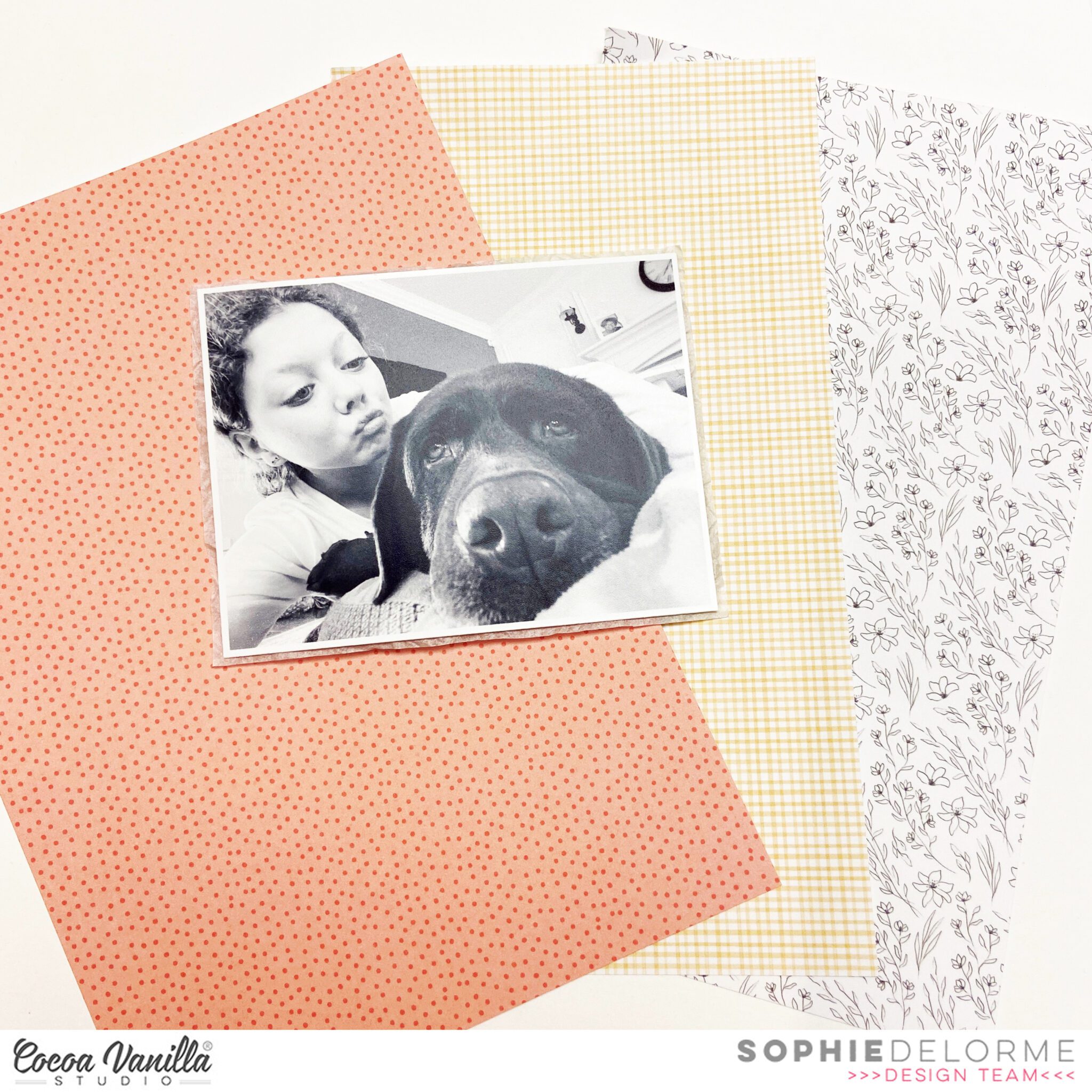
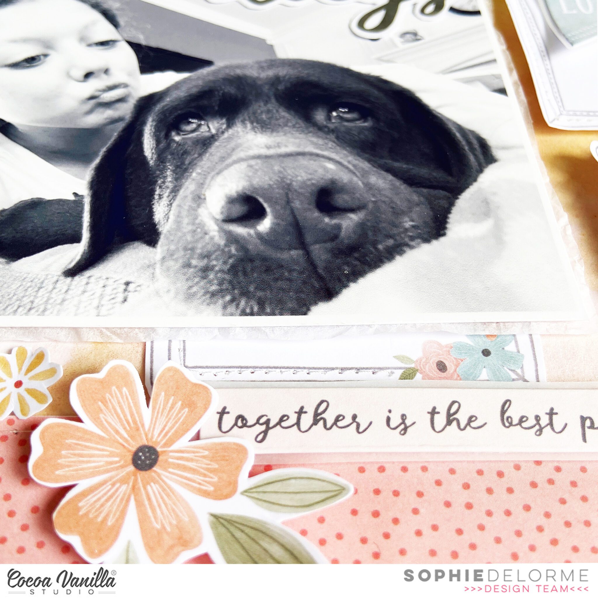
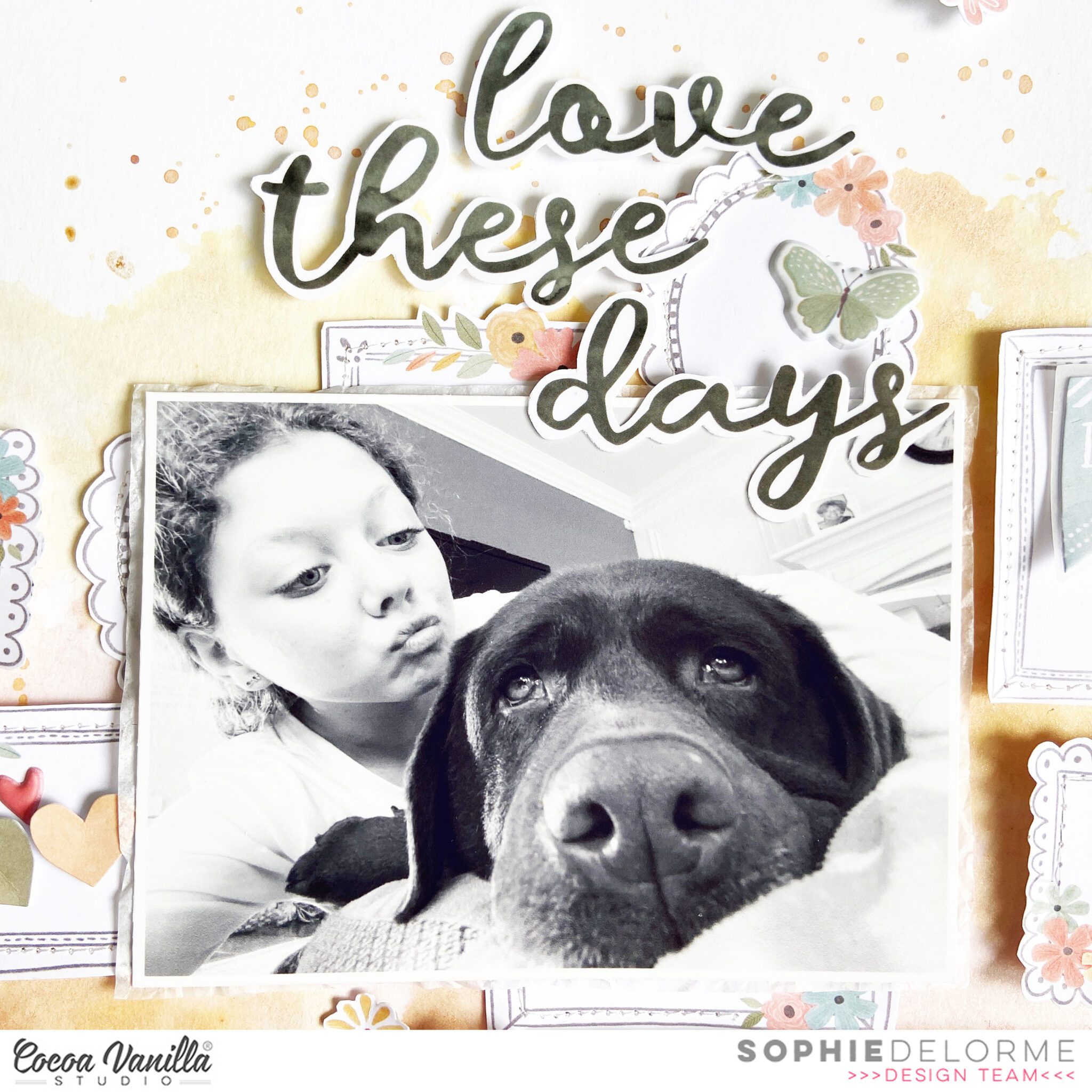
I selected 3 other A5 patterned papers and printed my photo in black and white. It’s actually a selfie that Sabrina took while trying to cuddle our dog !
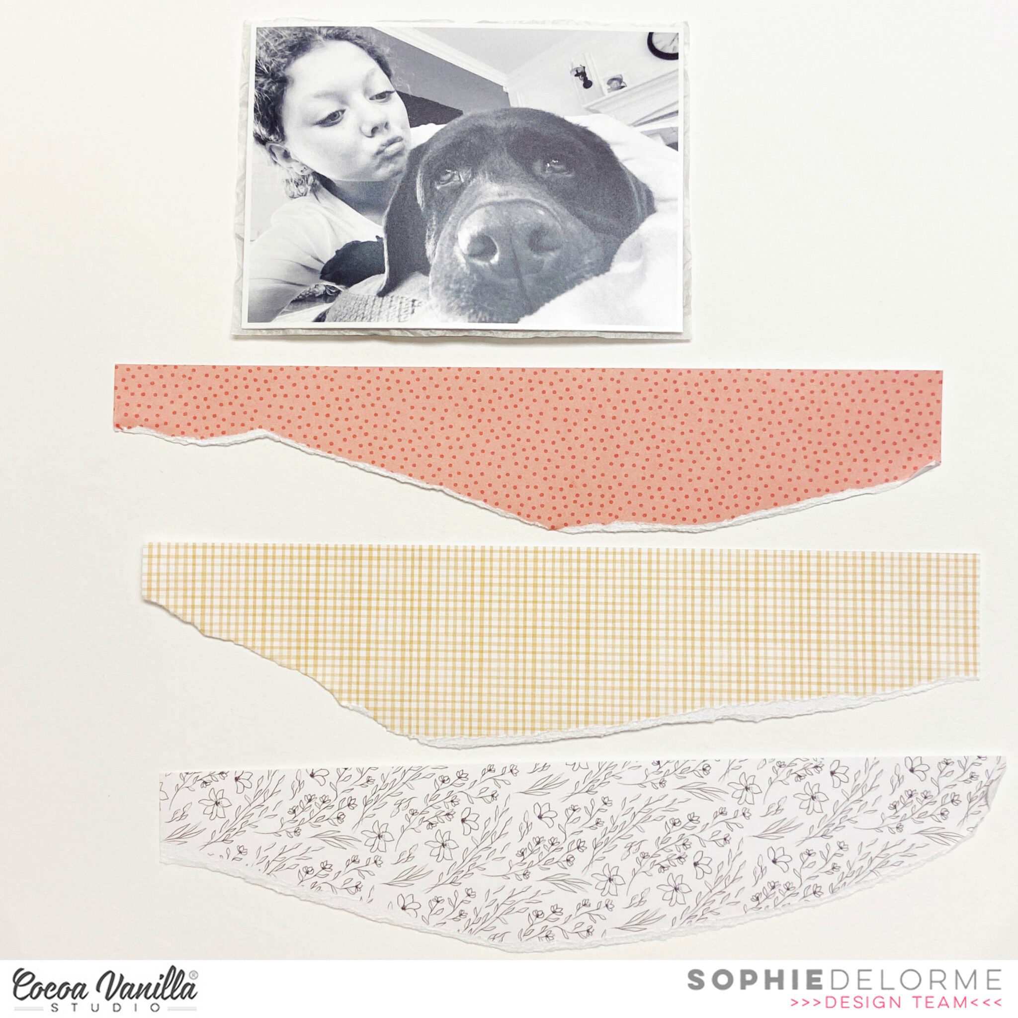
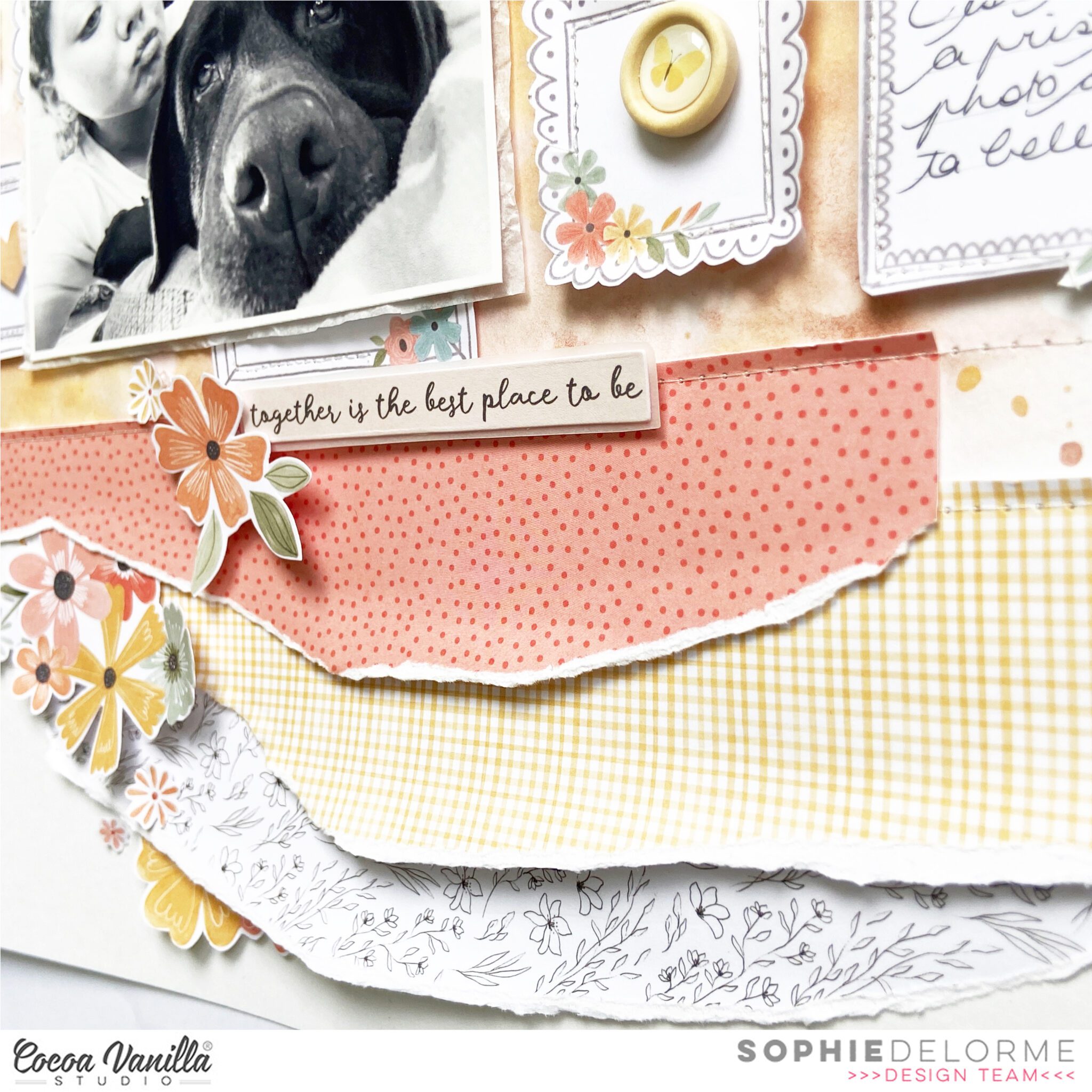
I teared the 3 patterned papers and planned to align them on the bottom of my layout.
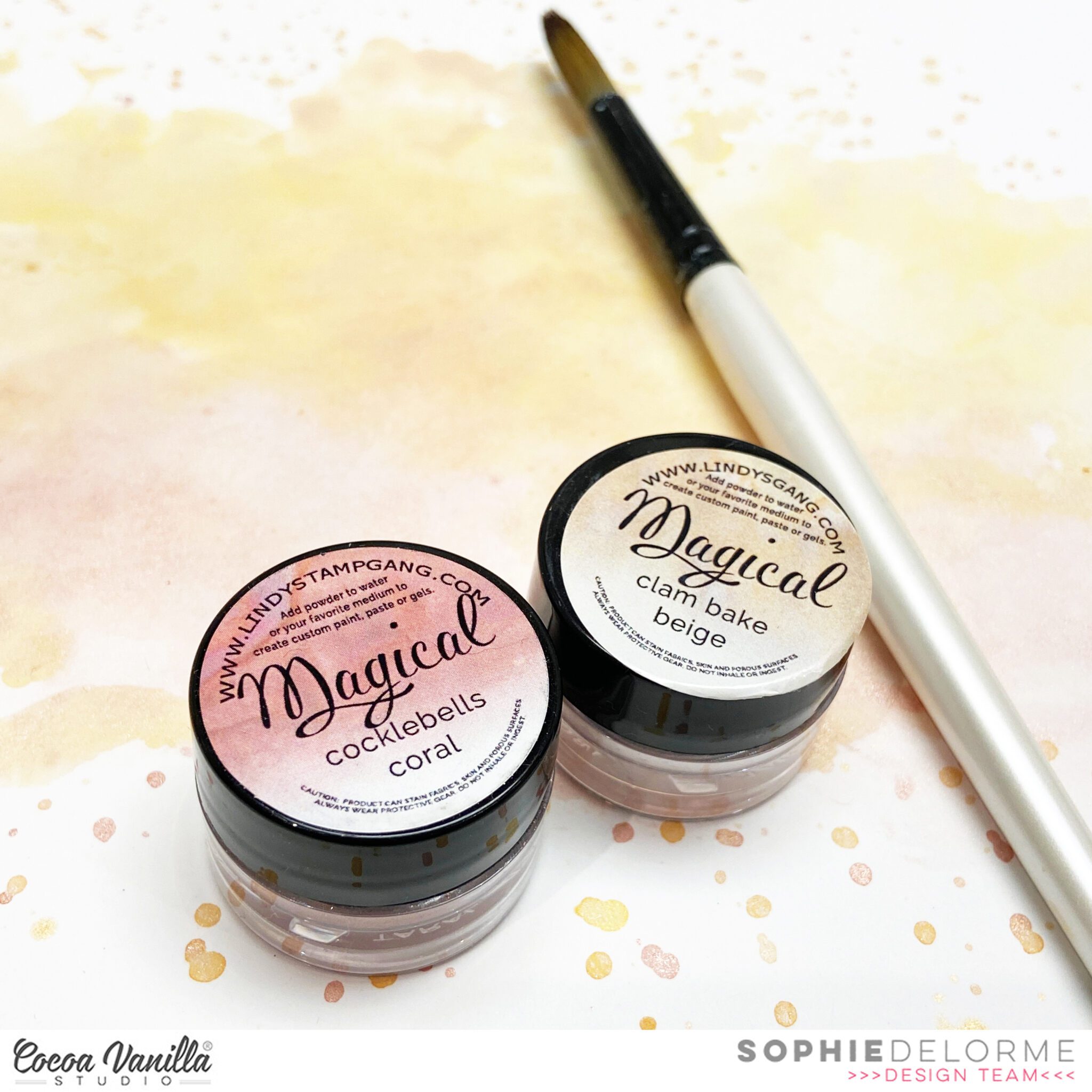
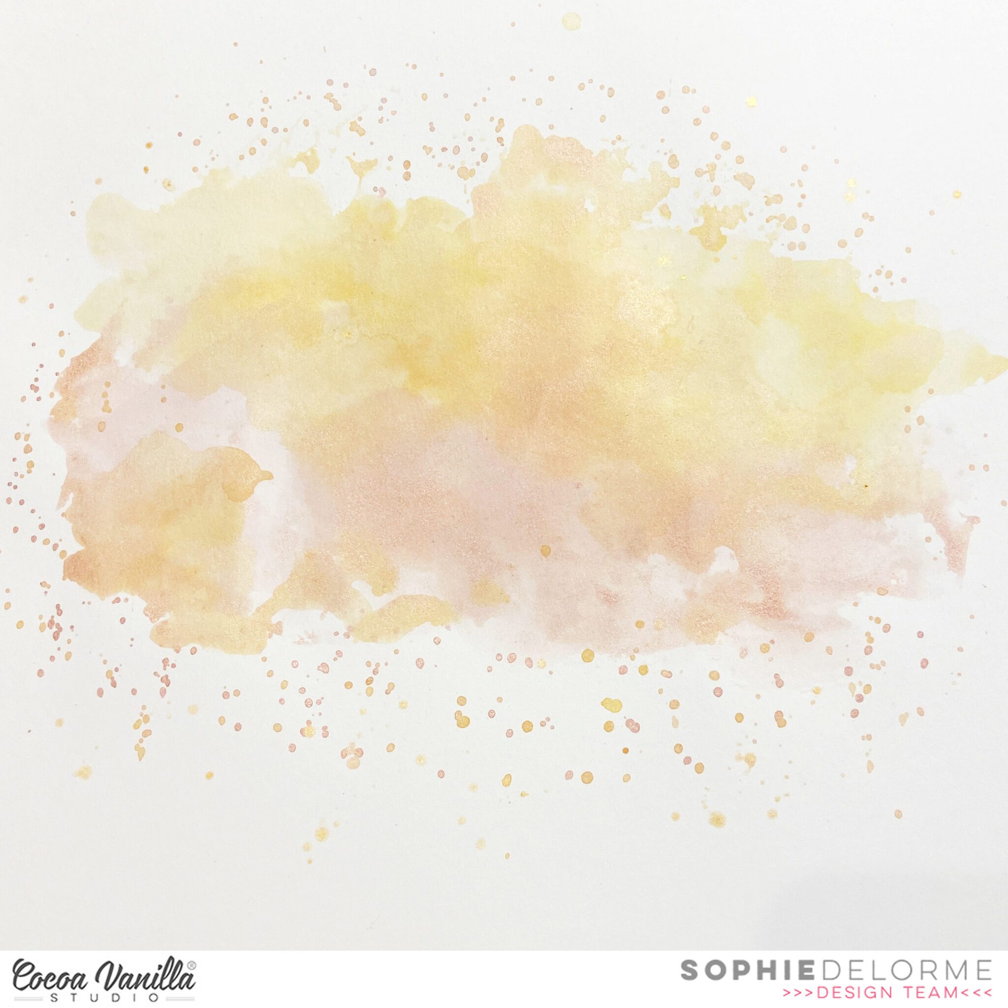
I also played with some Lindy’s Stamp Gang magical powders to create a soft mixed media background on a thick white cardstock as shown here:
Then, I tied everything together. I added tissue paper and adhesive foam behind my photo. I layered the 3 pieces of patterned papers, stitched them down and curled them a little bit for more dimension.
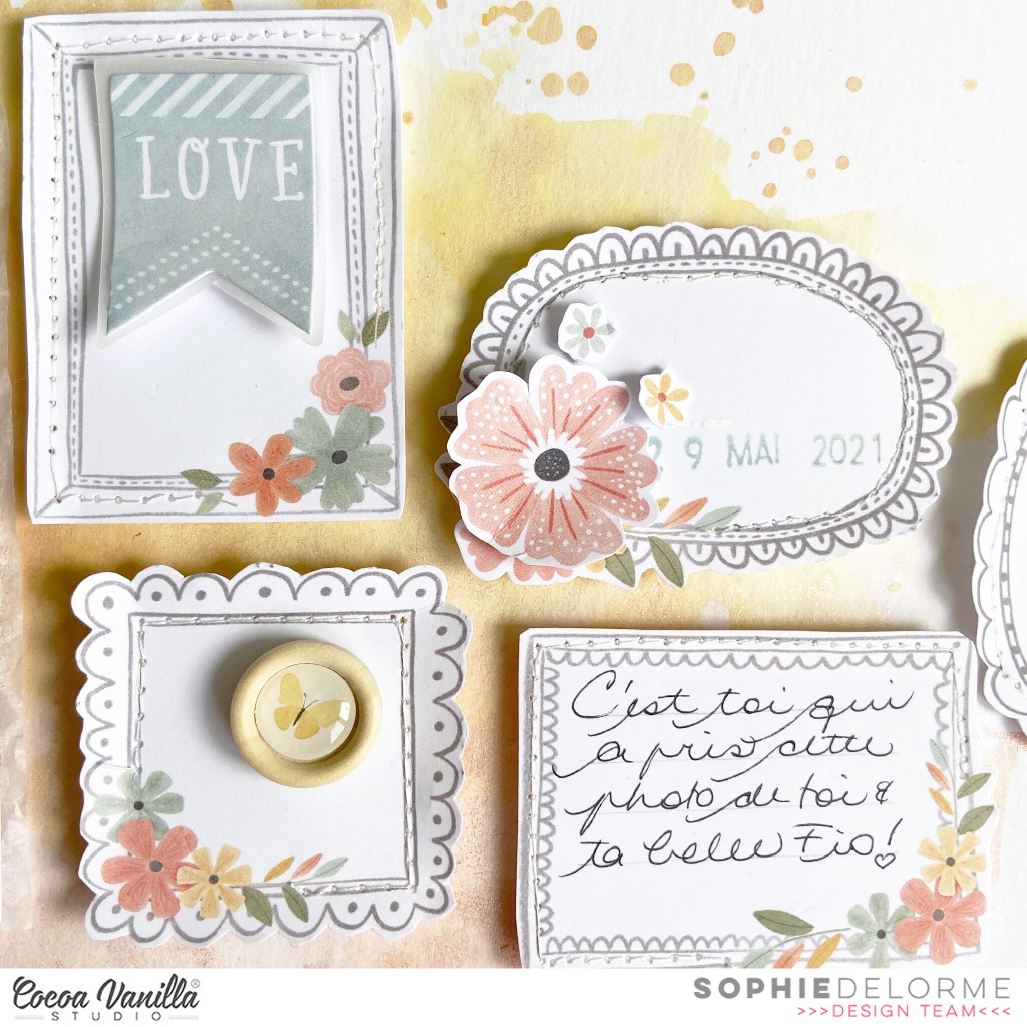
I mounted most of the frames on adhesive foam and placed them in a horizontal design around my photo.
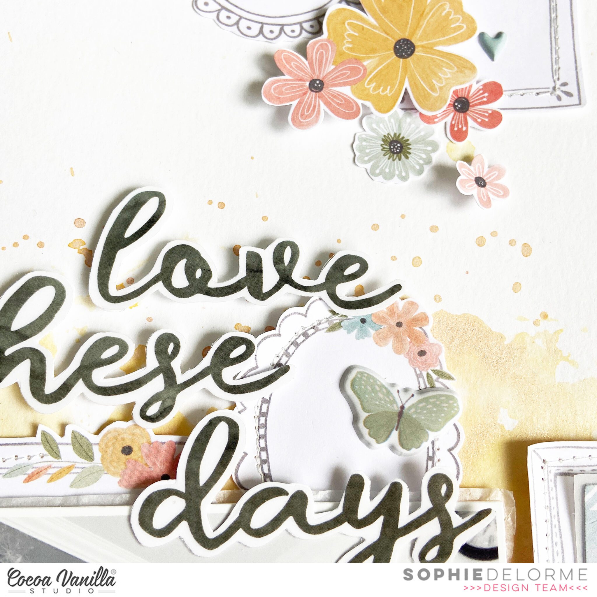
I decorated each of them with different elements from the collection; Accessory Stickers, Die Cut Ephemeras, Floral Ephemeras, Wood Epoxy buttons and Puffy Stickers. My title is from the Clear Stickers that I first sticked to white paper and fussy cut.
Here are more close-ups:
I am so happy with the result ! I really can’t stop creating with this gorgeous collection !
I hope you felt inspired today, thank you for stopping by and have a great crafty day !
Gwen with you on the blog today sharing a new layout using the ‘These Days’ collection. For this layout, I’m documenting a fun photo of my daughter recently taken on a Farm Stay mini holiday. This collection is super sweet and so fun to use for wonderful little moments like this one. I’m feeling a little bit country-vibes for this layout.
To begin my page, I have chosen a cut file from CUT to YOU, and then used the ‘A5 Paper Stack’ to back it. I’ve started with the banner piece of the cut file. The design was a little longer than A5 so I’ve added paper behind the left and right sides of the banner leaving a gap in the centre, this works out fine as this is where my photo will be placed. I’ve then used the pretty peach exclusive pattern to back my flowers and a pretty green leaf print for the leaves. I used this same green pattern paper to back my photo.
**TIP – The prints in the A5 paper stack are perfect for backing cut files and creating thin photo mats as the prints are smaller than those on the 12 x 12 pattern papers. This smaller print allows you to see the design even when using them in small pieces.
To create my background I’ve used the ‘Pretty Posies’ pattern paper for my layout edge and the ‘Neighbourhood’ pattern paper for my background. The black and white print was a little busy for underneath my cut file, so I’ve added a layer of vellum from my stash to soften it. I love the look of vellum, it’s such a soft element to add to a page. I love too how the print of the pattern paper still shows through; very dreamy.
It’s now time to embellish. I’ve gone with a large cluster (including my title) to the left of the photo and then two supporting clusters, one on the top left of my photo and the other on the bottom right of my photo. I’ve used pieces from the ‘Die Cut Floral Ephemera’ as well as the ‘Die Cut Ephemera’ pieces to create the layers in my clusters and title. The die cut piece that says ‘Picture Perfect Moments’ was perfect for my page.
For dimension and texture, I’ve added in elements from the ‘Puffy Stickers’ and three ‘Wood Buttons’. I’ve finished off the page with several of the sentiment stickers from the ‘Accessory Sticker Sheet’ added with 3D foam adhesive.
I’ve also made a YouTube video of my process which you can watch here:
Thanks for popping by today. I hope my page has inspired you in some way and you enjoyed my scrapbooking process.
Hey y’all! Laura here again with a deep dive into my Cocoa Vanilla Studio stash for the oldest collection I own, Hello Sunshine! For this silly layout featuring selfies of my darling son and I being exceptionally silly, I decided to create a split-level layout design, with a simple photo display on the right and a grid layout on the left. By creating this split, I can use plenty of embellishments without overwhelming my photos.
Each of these 2×2 inch squares has a large embellishment, small embellishment and a dot of Nuvo in gold for accent. I then took my navy pen and outlined each of them in a messy faux-stitching style to reflect the stitched design on the denim-styled Chill Out pattern paper under my photos. The mix of patterns on the left side really add a pop to the overall layout and give those puffy stickers the time to shine!
By layering stickers and ephemera pieces together into clusters onto these squares, each piece of the grid feels unique, but the coordination of the colors helps them feel cohesive. The outline of each square really gives the appearance of depth on the left side of the layout, giving each a shadow that helps them pop off the page!
I was so excited by how this layout turned out, that I created a sketch based on it to share with all of you! I hope you enjoy using this sketch to inspire you to try a split-level layout too!
I hope this inspires you to look at your older Cocoa Vanilla Studio stash a little differently and incorporate them in a big way on your projects too! To see how “Hello Sunshine” came together, check out the process video below!
Everything you see on this page comes from the digital kit that I printed at home with my Ink Jet printer. Let’s guide you through my process:
I started with a thick white cardstock as my base and created a simple mixed media background with some Lindy’s Stamp Gang magical powders diluted with water. I also added splatters of color with my brush.
I used a cut file from the JustNick Studio store and backed it with some Hello Lovely patterned papers. I also added a little bit of watercolor paint on the leaves and flowers to give them more depth and interest.
I mounted the cut file on adhesive foam and placed it on the lower half of the page.
I printed a beautiful photo of my little Sabrina in black and white, added tissue paper and arranged it a bit crooked above the cut file.
I fussy cut the title, banner and ephemeras from the printed digital collection and made sure to pop them with adhesive foam for more dimension before placing them on my layout.
I also added fussy cut beautiful florals that I added on top of the cut file.
I teared a big chunk of the polka dot paper to place on the bottom of the page, adding to it a fussy cut scalloped border, different words and a label on which I stamped the date.
Finally, I handwrote my journaling with a fine tip black pen directly on my background and scattered a few white Nuvo Drops as the finishing touch.
Here are more close-ups:
I hope that you like my page today and feel inspire to use some older digital kits ! They are beautiful, very inexpensive and easy and fun to work with.
Please don’t forget how copy rights are important though in not sharing these files if you buy them.
Hey y’all! Laura back again with a fun scraplift of Gwen Wruck! I absolutely loved Gwen’s fabulously frame-filled layout, so I just had to recreate it with the new These Days collection! Some of the things I loved most about Gwen’s layout were the variety of frame/photo sizes, the way her embellishments overlapped the frames, and the large title at the bottom. So, these are the elements I focused on when creating my version of her fun design.
First and foremost, I needed to create some frames! I used the A5 black and white floral to create frames for my 4×4 inch, 2 – 3×3 inch, and 2×2 inch photos. Then, I fussy cut several of the smaller frames from the patterned papers as well. The combination of the two work beautifully to contrast the bold and colorful Family Ties patterned paper that I used for a background to mimic Gwen’s painted one. I filled each of the frames with either a photo or an embellishment and puzzled them together as closely as I could to Gwen’s design.
Adding in a variety of textures to this page was so much fun! Between the fabric hearts, puffy stickers, wood veneer buttons, and Nuvo drops, this page is filled with texture! My personal favorite was the tiny houses, which were perfect for photos showcasing backyard fun at our home. I added gold Nuvo Drops as controlled splatter before going wild and crazy with gold ink spray around the perimeter of the frames (as is my usual style!).
To finish this page off, I added a bold title similar to Gwen’s below my frame collage and then fit my journaling into the small frame beside it. I love the way these frames really focused in on my photos and allowed me to fit so many onto one page without it feeling overwhelming!
I hope this layout encourages you to try your hand at making your own frames or fussy cutting them out for your next project! If you’d like to see how “Always Together” was created, check out the process video below!
Hello, hello! It’s Anna here wnd I come to you with another layout. After so many years me being on this Team, you probably already know I love colorful collections and scrapbooking summer and vacation. That’s why you may be a little surprised today as I scrapbooked summer, beach photo but I used very soft “These days” collection, that has nothing in common with sea. I know I could cut into fantastic “Sunkissed” line, and to be honest, I even had it on my desk, but photo I picked turned out so dreamy and light that I just couldn’t fit it into so many colors. It’s full of sandy beiges and washed blues – colors that appear in “These days” line. So I challenged myself to use it with this particular photo.
“These days” collection is filled with fantastic motifs but none of them matches my beach photo. That’s why I focused on simple and versatile patterns and used dies to cut out shells and starfishes. I mixed papers from A5 Paper Stack and few 12*12 sheets like “Good life” and “Family ties”. Next step was to make myself very soft background. I quickly painted few blue stripes on white watercolor paper. I added a lot of water to the color because I wanted to achieve a very light shade.
After the background was dry, I glued my square photo in the middle and surrounded it with my die cuts mixing colors and shapes. Some of the shells are glued directly to the base and some are raised with one layer of foam squares. Thanks to that my composition is more dimensional and full of texture. For my title I reached for gold glitter foam titles from “Sunkissed” line. It has perfect words and color. Black words from “These days” would be too dark.
I went through the ephemera pack and picked few versatile shapes, like banner, to add them to my composition. I also found few matching stickers with generic words on them. My light background was perfect for displaying clear stickers so I picked few hearts and small crosses and scattered them between the die cuts.
My favorite wooden epoxy buttons are perfect for any type of project and they add fantastic texture. I added three of them here and there and finished everything with few small hearts from puffy stickers sheet. Few blue and gold splatters connected everything together perfectly.
I just love using scrapbooking collections in unusual ways and spreading my stash and this is a perfect example. I hope it will inspire you to look at your papers in a new, fresh way. Thank you so much for stopping by and see you in two weeks.
Hey Everyone Its Michelle back here today with a new layout to share with you all. I’ve scrapped a funny moment with Leila using the new These Days collection, ensuring the silly photos also get documented in our albums. It cant always be about the sunshine and rainbows… or can it?
I started by adhering a strip along the bottom of some white cardstock. This rainbow printed strip can be found on the bottom of the ‘Good Life‘ cut apart paper. Next I printed a set of photos in black and white slightly smaller than 3x4inch size and adhered both to different complimenting pattern papers (one of which is a pocket page card). I also cut a 3rd piece from another patter the same size to create a base for my large cluster, plus a trip of another complimentary pattern to tuck underneath. All 3 ‘cards’ were adhered to the cardstock using foam for a little dimension off the page. I tried flat scrapping this layout, and it just isn’t me. Give me ALL the dimension without bulking up the albums too much.
The photos I’ve used aren’t spectacular, but they’re certainly something funny to document. I think Leila and I sat this way for over an hour, her watching something on the iPad and me the tv. Yep we’re oh so weird in this household!
Next up I worked on the main cluster using some of the beautiful florals from the ‘Home Grown‘ paper that I had pre-cut on the couch a few nights prior. I wrapped them around the cute little ephemera piece that I thought worked perfectly for a mum & child layout. I used a couple of different forms of adhesive for this cluster to give the florals layered dimension.
The title was one that came together really quickly using our fancy new foam title pack plus a cut apart piece and word sticker from the accessory sheet.
Under the title I added another floral cluster, similar to the first one I created. Again using different forms of adhesive for layered dimension.
Heres another peek at the top cluster where I’ve used word strips from the a5 size cut apart sheet, and a cute gold glitter heart.
Lastly a 3rd mini cluster of florals was made at the top corner to balance out the entire layout but creating a visual triangle. Sometimes I don’t stick to this rule as it depends on the orientation of the layout, but most of the time I feel that it really gives a layout a more finished cohesive look. Oh and I also added a splattering of gold ink, cant forget that finishing touch either!
Well folks, thats all from me today. Thanks so much for stopping by to see my newest creation using our BRAND NEW collection – These Days. I cant wait to see what you all create with it once it reaches your crafting spaces! Please share with us in our Facebook Community group and via Instagram too using the hashtag #cocoavanillastudio
It’s Tarrah back with you today to share a new layout featuring the stunning new These Days collection!
I am documenting a sweet photo of my sister and her family and this week we are focusing on the gorgeous puffy alphabet stickers and the black foam title stickers from the collection.
I decided to go with a circular design to showcase the gorgeous puffy alphabet stickers, I traced a circle using a dinner plate and pencil, I then spelt out some family/together themed words placing these around the circle. I then took the stunning gold puffy hearts and adhered these between each word. I rubbed out the pencil marks with an eraser.
I layered some of the 3′ x 4′ cards under my photo and adhered these slightly to the right and the top of the circle design. On the right of the photo I created a small cluster of embellishments including some floral ephemera pieces, puffy stickers, an epoxy wood bead and a clear sticker. To showcase the foam title stickers I chose the word ‘Together’ for my title and adhered this word below my photo, overlapping the photo slightly. I took a few of the phrase stickers from the Accessory sticker sheet and placed these under my photo to help tell the story.
On the left of my photo I created a slightly larger cluster here as there was a little more room for placement. I tucked in quite a few floral ephemera pieces and the super cute typewriter die-cut. To add some more of the foam title stickers I added a few of the small leaf foam pieces tucking them into various places, I really like the pop of black this adds to my page.
Above my photo I added the sticker that says, ‘Together is the Best Place To Be’ as it was perfect for the theme of my page and it also fitted perfectly above my photo.
Lastly I stamped the date stamp and finished off by adding a few last small heart puffy stickers.
Thanks so much for stopping by the Cocoa Vanilla blog today! I hope you enjoyed my layout as much as I enjoyed creating it.
Hi everyone, it’s Sue Plumb here to share my latest design team project with you.
For this layout I was working with the gorgeous new ‘These Days’ collection. As this range has such a lovely home / family theme I decided to document one of my favourite ever family photos. This photo of the five of us was taken not long after we had finally brought our boys home. After being born prematurely, we spent over 10 weeks (which at the time felt like forever) in hospital and just looking at this photo reminds me of the elation I felt when we were finally able to be a family at home.
I knew I wanted to use a patterned paper background for my page, but I started with a sheet of white cardstock as the base. I chose 3 papers – the tiny heart print Good Life; the adorable house print Neighbourhood and the spotty green Family Ties. Starting from the left edge, I added various sized vertical strips of paper, slightly distressing the overlapping edge as I went.
For my photo, I added two layers of patterned paper to mat it – the black and white floral and the wood grain print, both from the A5 Paper Stack. On top of those paper layers I also added some frayed gauze for texture before adding some cardboard and then my photo on top.
I then turned my attention to my embellishments, beginning with the Wall of Fame patterned paper with all the doodled frames on it. I fussy cut three of the frames, and then tucked them in around my photo to create the bases for my embellishment clusters.
For the cluster in the top right corner of my photo I used the home sweet home sticker from the Accessory Sticker sheet, which I placed inside the frame I had tucked there. I then chose several floral pieces from both the Die Cut Ephemera pack and the Floral Ephemera pack and tucked them in around the frame. I then added a small heart and small butterfly – both from the Puffy Stickers sheet; a small Wood Button; and a couple of leafy branches from the Foam Title Stickers pack. I also added a die cut butterfly to the corner of my photo.
To keep my design cohesive, I used the same types of embellishments in the cluster on the bottom left corner of my photo – Die Cut Ephemera, Floral Ephemera, Wood Buttons, Puffy Stickers and Foam Title Stickers. I topped this cluster with the oh happy day! sticker from the Accessory Sticker Sheet. I arranged this cluster so that it trailed towards the bottom left corner of my page, which helped give my layout design a horizontal flow through the photo from top right to bottom left.
My title was the focus of my final cluster, along the bottom edge of my photo. I used the fussy cut frame I had placed there as the spot for the first word of my title, finally, which I created using the Mini Puffy Alphas. (These alphas are so gorgeous, and one of my very favourite things from this collection.) For the second word of my title, I used the word together from the Foam Title Stickers pack. These stickers are a beautiful script font, and a lovely charcoal colour. I love mixed font titles, and I think the combination of these two styles look great together. Below my title I added a brush stroke sticker and a small cluster of crosses from the Clear Stickers sheet.
Along the left edge of my layout, I added a couple of sweet phrase stickers from the Accessory Sticker sheet so that they ran vertically in line with the layered paper strips. And that was my layout done!
I am loving working with this collection so far; it’s one of those ones that is just so easy to work with, and I love how many embellishments there are to choose from! If you haven’t gotten your hands on it yet, ask your favourite scrappy retailer, or check with a stockist from the stockist list HERE
Hey everyone. Happy Thursday! It’s Throwback Thursday here on the Cocoa Vanilla blog. I decided to throw it all the way back to ‘Bohemian Dreams’ one of my fave collections ever. Purple is one of my fave colours lately so this collection was certainly calling my name.
Here is the layout that I created:
This subject of this layout is myself and my bridesmaids at my Wedding. The image was taken by our photographer and one I just adore. The photo being black and white allowed me to bring in a lot of colours into the designing of the page. Normally I love to feature cut files on my layout but for this layout I wanted to focus more heavily on the papers and patterns within the collection.
I decided to make the ‘Beautiful Mess’ patterned paper a feature of this layout by cutting the individual 4×6″ and 3×4″ pieces. I layered these pieces below my matted photo in a somewhat vertical design, trying to distribute colours as best as I could. These were adhered together to form one piece and then adhered to my layout with a foam adhesive.
To the right of the photo I added a large photo cluster comprising of many pieces of ephemera and other embellishments. The title ‘so happy’ was also used from one of the accessory stickers.To achieve dimension on the clusters – elements are adhered to the page in varying depths using a combination of glue dots, double sided tape and foam adhesives.
Instead of journaling on this page I used the tiny word sticker sentiments from the accessory sticker sheet. These were able to tell my story, just in fewer words.
I think my favourite part of this collection, well actually most CVS collections are the florals. I have to hold myself back from adding more when I am embellishing.
One of my favourite staples in the ephemera packs is the small file tabs. They are one piece that I will add to most pages – usually to the top left corner of my photos.
As you can see from the image below the layout features a lot of dimension, particularly from the embellishments.
I hope that you have been inspired by my layout today for this Throwback Thursday. Thank you so much for stopping by the CVS blog to check it out.