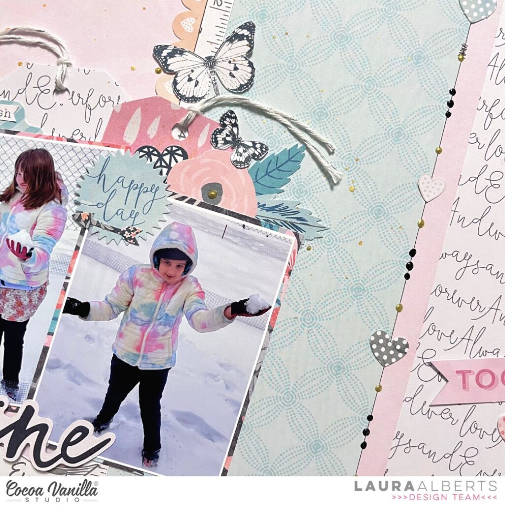
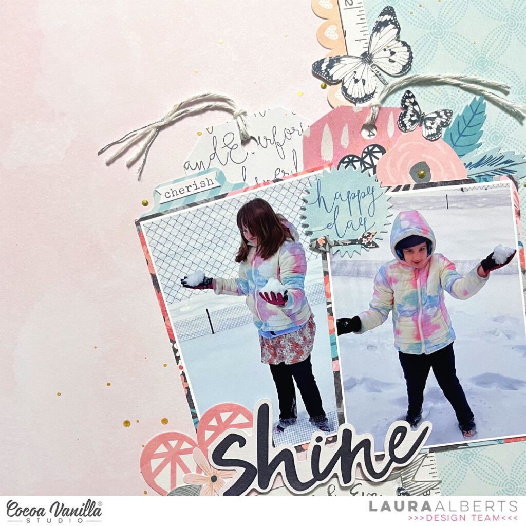
Hey y’all! Laura Alberts back again and I’m dipping into an OLD collection from 2016! After organizing my craft space, I found this collection and just had to dive in! It’s such a stunning mix of pastels and gray tones that were perfect for these first snow pictures. The title ephemera is from Midnight, but the rest is all from Love Always.
I started with this beautiful mixed media-style background paper, a strip of teal, then used ephemera pieces to create a border in between. The Nuvo drops and ephemera hearts along the right side gave this layout a fun pop of interest that it needed.
I cut out two tags from the patterned paper and layered them behind my photos, then built up two clusters that run diagonally through the photos. The cluster on the top leans to the right and the one on the bottom leans to the left. This guides the eye through the layout, and added to the butterflies, creates a sense of movement on the page.
If you’d like to see how “Shine” came together, be sure to check out the process video below!
It’s Tarrah back with you and today I am sharing a new layout created using the awesome Great Escape collection! I can not get enough of this collection! I think this is my 6th layout using this awesome collection and I still have heaps of ideas flowing! Talk about value for money! I pulled out a super cute photo of my youngest son from when he was about 3 going for a ride in the car, I just love the thumbs up gesture- so cute!
I chose to work with a darker background paper choosing the ‘Journey’ patterned paper for this layout. I knew I was going to be adding the white cut file title and I really wanted that to pop off the page. The cut file I chose is from CUT to YOU, I cut out the title in white and cut out the road in black and backed it with some white cardstock to make it resemble a road as close as possible! For the large open letters in the cut file I took the A5 paper stack and choose various papers to add in the open holes. Once the cut file was all backed, I adhered the road down first using regular adhesive and then for the title, I added craft foam and then adhered it down in the centre of the page, I love adding craft foam so that it creates some dimension on my layout, this also allows me to tuck in bits and pieces where I want to if I feel some places need extra detail.
I added my photo on the right side, tucking it in behind the ‘D’ in Road I would normally layer a paper or a die-cut underneath my photo but this time I left it free of these. Once I was happy with the photo placement and the title it was time for my favourite part and that is embellishing! Below the photo I added a chipboard piece and I also added the flag chipboard piece overlapping the road and coming out of the ‘A’ in Road. The So Much Fun chipboardpiece I added on top of the cut file and also added some of the phrase stickers from the Accessory sticker sheet to help tell my story.
I took a few die-cuts from the ephemera pack and also added these around my page too, I love finding the perfect piece that is the perfect shape or perfect colour to fit in spots! One of the many things I love to do when I create! I like to balance my pages and describe my style is very clean but colourful too!
Some of the smaller embellishments like the puffy shapes were some of the last things I added to my page, along with stamping the date stamp which is one of my go to things on every page! Do you have something you like to include on every project? Kind of like a signature? Lastly I trimmed down the ‘Journey’ patterned paper to roughly 11′ x 11′ and matted the entire layout on white cardstock. I then machine-stitched a border using black thread around the entire edge of the layout.
Thanks so much for stopping by the Cocoa Vanilla blog today! I hope you are inspired to use your Great Escape collection and create some adventure layouts!
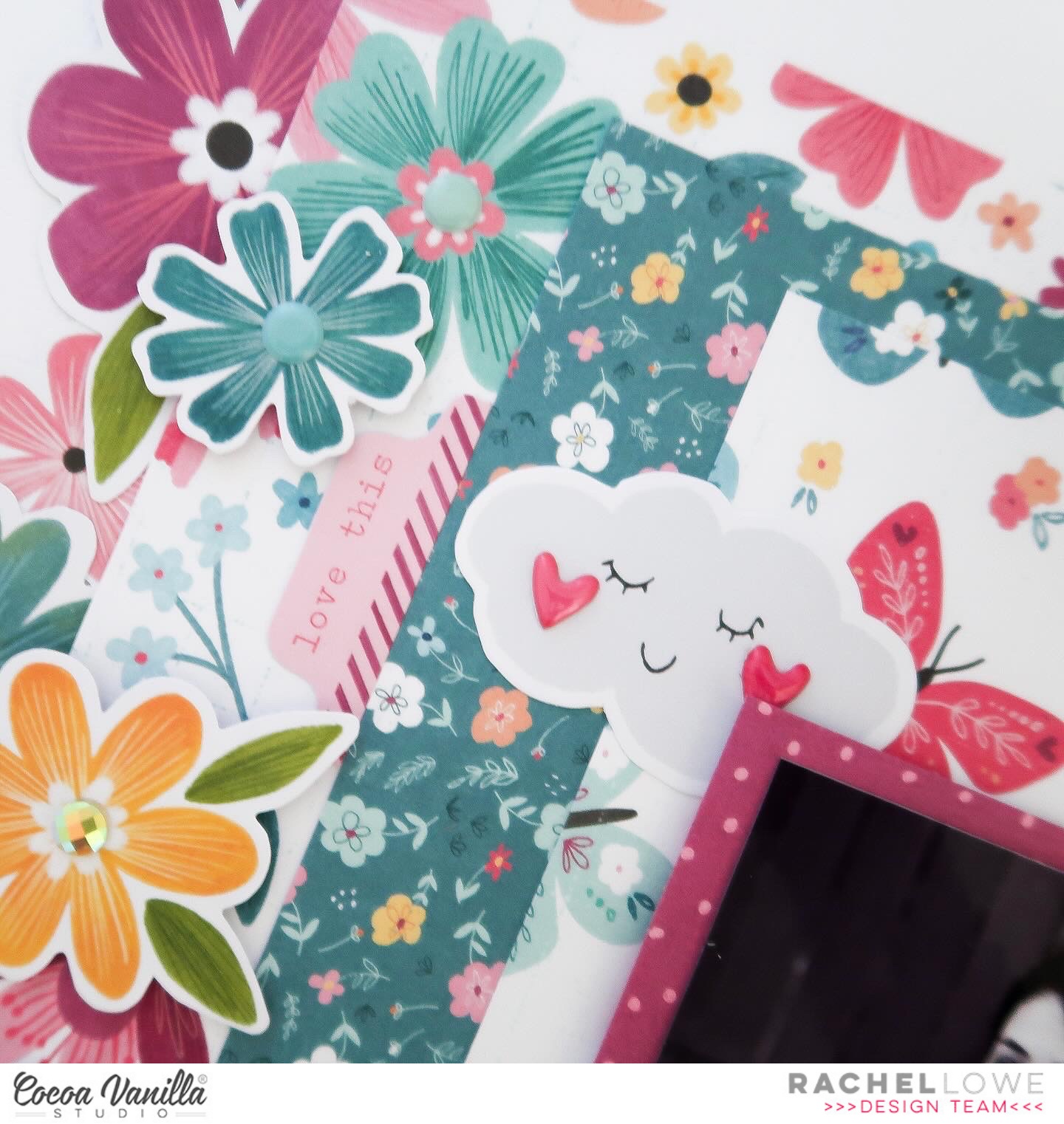
Hello everyone! I thought I would join in the May challenge fun by creating a layout using the Floral Frenzy theme. I have used Happy Days collection which I love so much.
I don’t do ‘busy’ layouts generally but I wanted my flowers to be the focus and went all in! I chose three papers to layer with the larger floral on the outer so I could layer my florals on it. I used Little Blossom, Lush Blooms and Flutterby papers.
I then took my floral ephemera and started layering under and over the Lush Blooms paper strip. I used foam tape of some of the florals to create dimension. I added enamel dots from my stash to some of the centres. Lastly I added some leaves from the floral ephemera
I used the reverse of the Flutterbuy to mat my 6×4 inch photo, I went with a black and white photo my daughter as there is so many colours and patterns in this layout, I didn’t want my photo to get ‘lost’.
I created three embellishment clusters around my photo using the die cut ephemera, adding the super cute cloud (which I added heart puffy stickers) , the bike and a phrase sentiment added over it with foam tape and another floral bunch, finished off with a butterfly and phrase sentiment from the Accessory Stickers.
Lastly I created my title using the chipboard titles and a super cute strawberry die cut to tie it all together.
And there you have it, one super girly layout! I look forward to seeing what you create with the floral frenzy challenge.
It’s Sophie with you today and I am thrilled to share my layout inspired by the May challenge!
The challenge this month is called “Flower Frenzy”: Using flowers as the main design element of a layout… The more the better…!
I used the Sunkissed collection for this colorful page and went with big floral clusters all around my black and white photo.
I drew a few flowers on three A5 patterned papers, cut them out and hand stitched on each petal. They served as a background for the flowers and leaves that are from the Sunkissed floral ephemera pack.It adds texture and depth to the clusters, and even though it’s very bold and colorful, it doesn’t compete with the black and white photo, that still stays the star of the page.
I teared a big chunk of the “Feelin’ Fine” paper and placed it on the upper part of the layout. I fussy cut a few clouds out of the “Just Chillin’” paper and used some Clear Stickers for my title.
Here are more close-ups:
It’s a very simple page with only beautiful florals as embellishments, and I love it!!
I hope you do too!!
You have the whole month of May to participate in this floral challenge. You can use any Cocoa Vanilla Studio collection, as they all have a huge amount of gorgeous flowers that can be used.
Welcome everyone. It’s Anna here with another page made with newest Cocoa Vanilla collection called “The great escape”. To be honest, I am more beach girl and trails, tents and campfires are not my first choice when it comes to spending free time. I do not have many photos from the wild to scrapbook with this line but it doesn’t stop me! Having fun has many shades. This time I picked two photos taken during one of the rides in theme park. Colors on them match “The great escape” perfectly.
For this page I created a little scene with a guidepost. I was inspired by one of the ephemera pieces to make one. I started with splashing white cardstock with light blue mist. Next step was to create a ground for my sighpost using two papers with green patterns: “Journey” and “Direction“.
Wooden pattern on the sighpost is from the older “No limits” collection. Yellow one is a piece of “Horizon” paper and orange one is “Happy camper” paper. Words on the sigh are made with alpha die and “Starry night” pattern. White “sky” felt very empty so I added few whimsical clouds hand cut from “Adventurer” paper.
It was time to add photos. I backed each of them with a piece of blue pattern paper from A5 Paper Stack. As usual, I embelished the area around the photos using bits and pieces from Ephemera Pack, elements cut out from “Wild life” paper and stickers from Accessory Stickers sheet.
As always I finished my pages adding tiny Puffy Stickers. They are my favourite final accent.
How do you like my idea for a simple, handmade scene? You can change things up by adding more words to the pole, changing theme from landscape to beach or a city. It’s a really versatile type of design.
That is all for today. Thank you so much for spending your time with mee and see you in May!
Welcome to Cocoa Vanilla Studio’s blog, and how wonderful that you’re looking for new scrapbook inspiration. Today, I’ve created a new scrapbook layout using the amazing and colorful “Happy Days” collection designed by Cocoa Vanilla Studio. These vibrant colors really give your layout that summery feel. I love to use this photo of my daughter on the Beverly Hills boulevard and chose to use a cut file from the Cricut store, I absolutely love this Destination Icon. I thought it was quite fitting the theme.
I cut the file from the beautiful yellow patterned paper of the “Happy Days” collection and placed the photo in the open center. I stitched the edges with white thread, using my sewing machine. I positioned the Destination Icon in the center of the 12×12 white cardstock sheet, which I’m using as my base.
I created flower clusters on the bottom left and top right corners. I used the die-cut flower shapes but also fussy-cut some flowers from the matching patterned paper of the “Happy Days” collection. I also cut out some butterflies and placed them around the flower clusters. I selected some fun die-cut shapes like the flag and the camera and giving them a place among the flowers.
For the title, I used the elegant puffy titles from the “Great Escape” collection. The title I’ve chosen for this scrapbook layout is “Road trip to LA. I added some splatters with white gesso, which I mixed with water, and also splattered some of my yellow distress ink “Fossilized Amber.” around the flower clusters.
I hope I’ve been able to inspire you with this layout and look forward to seeing you again on the Cocoa Vanilla Studio blog next time. Have a wonderful and creative day.
Hey y’all! Laura Alberts here with a diagonal design using the stunning Heart & Home collection. I adored these frames and was excited to use them for my Thanksgiving photos with extended family. I started with a Bazzill navy cardstock and cut this lovely text patterned paper from corner to corner to layer on top.
Along the seam of the two papers, I stair-stepped my framed photos with the title ephemera in between to connect them. To fill the open corners, I added a combination of vellum and card stock ephemera flowers. Tiny, fussy cut flowers are sprinkled around the edges, along with Nuvo drops.
I added in a few bits from the cut-apart sheet and finished the layout off with these adorable puffy heart stickers and a sketchy border all the way around.
To see how “Our Family” came together, be sure to check out the process video below:
It’s Sophie on the blog today with a new layout to share! This time I used the beautiful Happy Days collection!
I focused on the aqua, blue and purple tones of the collection and selected my three favorite patterned papers from the A5 paper pack. I drew and cut three scalloped borders, uneven, out of those papers, and aligned them horizontal on a 12×12 white cardstock.
I placed my photo on the right side of the layout, and used two beautiful frames from the ephemera pack, the rectangular one for my journaling and the oval one for a beautiful piece of rainbow that matched my color scheme.
I used the Chipboard Titles for my title and added a little touch of blue on each letter with watercolor paint.
I created a floral cluster on the right lower part of my photo and fussy cut a few butterflies that I scattered on the page.
I attached some twine on the first scalloped border as the finishing touch!
Here are more close-ups:
How I love that page, and the Happy Days collection!!
Hello Crafty friends, it’s Michelle here today with a new layout share for you all. Shock horror as its not a layout dedicated to our furry kids this week, I chose a recent photo of Leila on her first day of High School. New level of life adventures has begun. Woo Hoo!
Using the A5paperstack from the Great Escape Collection I’ve whipped up a grid design for the base of my layout design. I cut the squares in the middle row in a 3 inch size and the top and bottom rows in a 2.5inch size, then sewed around the entire edges of each using my machine. Each piece was then secured to the cardstock base using foam for a little dimension.
The photo (shared with permission from this spicy child of mine cause we all know how teens are these days) was printed in a 4x3inch size and packed using another pattern from within the A5paperstack. I stapled both pieces together using tiny staples and adhered to the layout using a little more foam sheeting to pop it off the layout.
You can see above how the little bit of dimension brings the layout to life
I created a couple of larger clusters diagonally in the top and bottom corners using left over stars fussy cut from the StarGazingpaper that I used on my last layout, with a mix of enamelshapes, accessorywordstickers and puffystars from the foamtitlespack
Next up I added the mixed product title using a word from the ephemerapack, letters from the chipboardstickerspack and words from the FoamTitlestickers pack. If you’re wondering where the W came from – never fear, its just the M from the word TIMES in the pack that I’ve turned upside down.
I added a little journal spot from the AccessoryStickerssheet to the bottom of this square to note what the photo is all about, and theres also a date label tucked into the photo too that was added towards the end.
I added the usual sprinkle of gold ink from the bottle I have that seems to be a never ending supply, just like Mary Poppins bag, but I’m sure its going to dry up at any minute
Here’s a final look at the layout as a whole…
Well friends, thats all that I have for you today.
Thank you so very much for stopping by and seeing this beloved creation that I’ve made.
Welcome to Cocoa Vanilla Studio’s blog, and I’m thrilled to have you here for some new scrapbook inspiration featuring the amazing “Great Escape” collection.
In a few weeks, we’ll be jetting off to New York City! Yay… I can hardly wait to create beautiful family memories together in this iconic city. My canvas for today is a 12×12 white cardstock. I’ve used blue distress ink to create watercolor circles. Using a breakfast plate, I inked the edges with the blue distress ink and water. Then, flipping the plate over, I made various prints on the 12×12 white cardstock. The shade of blue distress ink I used is “faded jeans”.
Now, it’s time for some fussy cutting. I’ve selected a patterned paper with stars and cut out several stars from it. I layer three stars on top of each other and sew them together using a sewing machine, then individually place them in a circle on my layout. In the center of the stars, I place a puffy sticker.
The photo capturing the breathtaking view of New York City is placed in the center and embellished with a cardstock circle die-cut and a word sticker. For the title, I’ve used the beautiful black ornate word titles and created the title “Let’s Explore”, which is exactly what we’ll be doing in New York!
I add some blue splatters with the distress ink and also create white splatters using white gesso, applying them with a watercolor brush. I scatter a few small stars in different places among the larger stars for a playful effect.
I hope I’ve inspired you with this Scrapbook Layout and look forward to seeing you next time. Have a wonderful and creative day today!