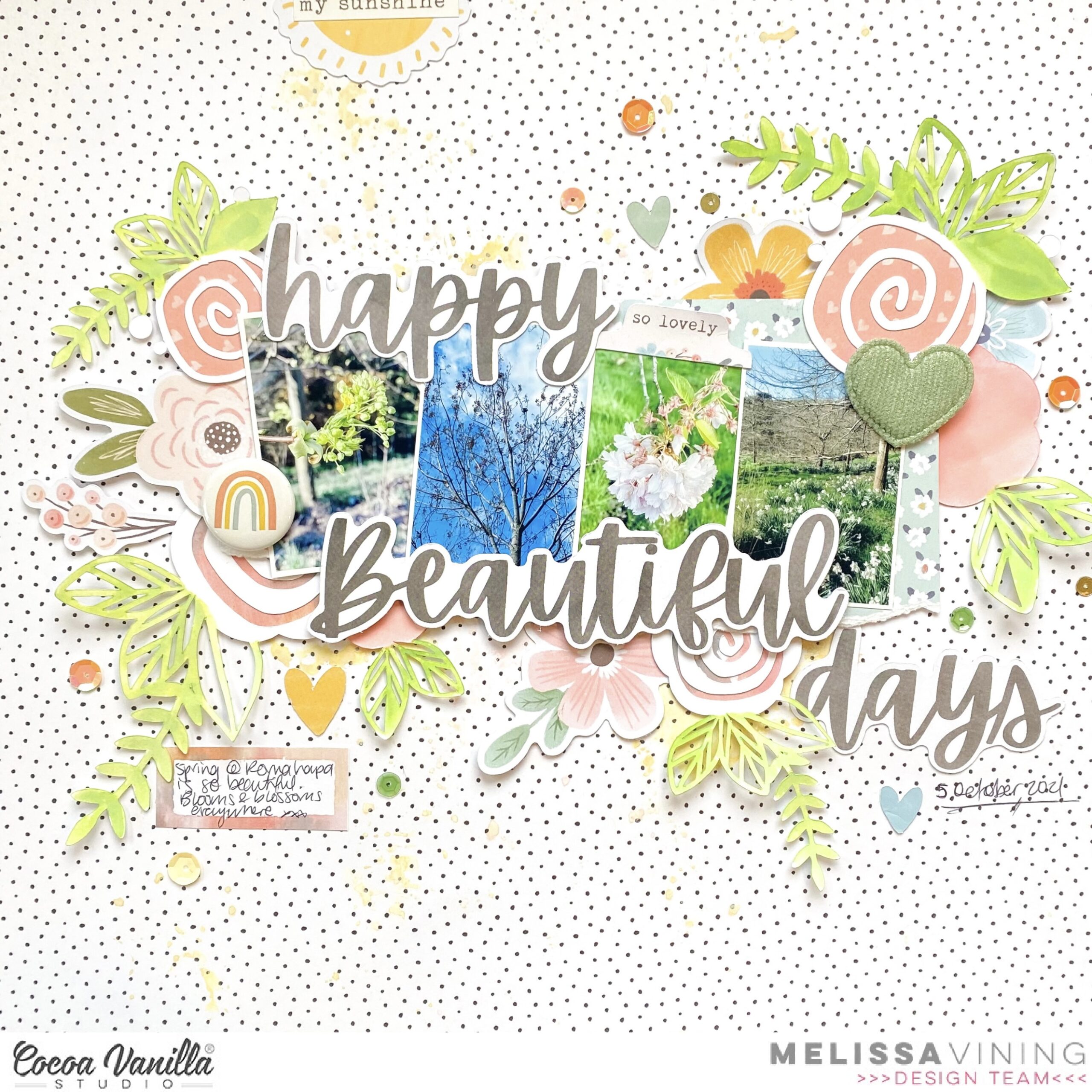
Hi everyone, it’s Melissa here and in my part of the world its Spring!! This month the Design Team is creating projects that are either Spring or Autumn themed. I was really keen to scrapbook spring photos from last year, and I decided to use beautiful Daydream. This time last year we were renting a house on a farm and the spring blooms and growth were stunning.
I used a floral cut file from Just Nick Studio. I coloured it with watercolours and backed it with papers from the collection. I’m not normally a scrapbooker who matches photos with embellishments, but because only one of my photos is a close up of blossoms it works.
I used Sweet Serenity for my background paper, and then applied ink with the packaging technique. Its a very subtle effect behind my photos. I used a torn piece of Daisy Days for my photo matt, and then layered the cut file flowers and Die Cut Ephemera in several places around the photos.
I used three of the Die Cut Title words for my title, and I love how it looks above and below my photos. I also used one of the gorgeous Puffy Hearts and a Flair Button.
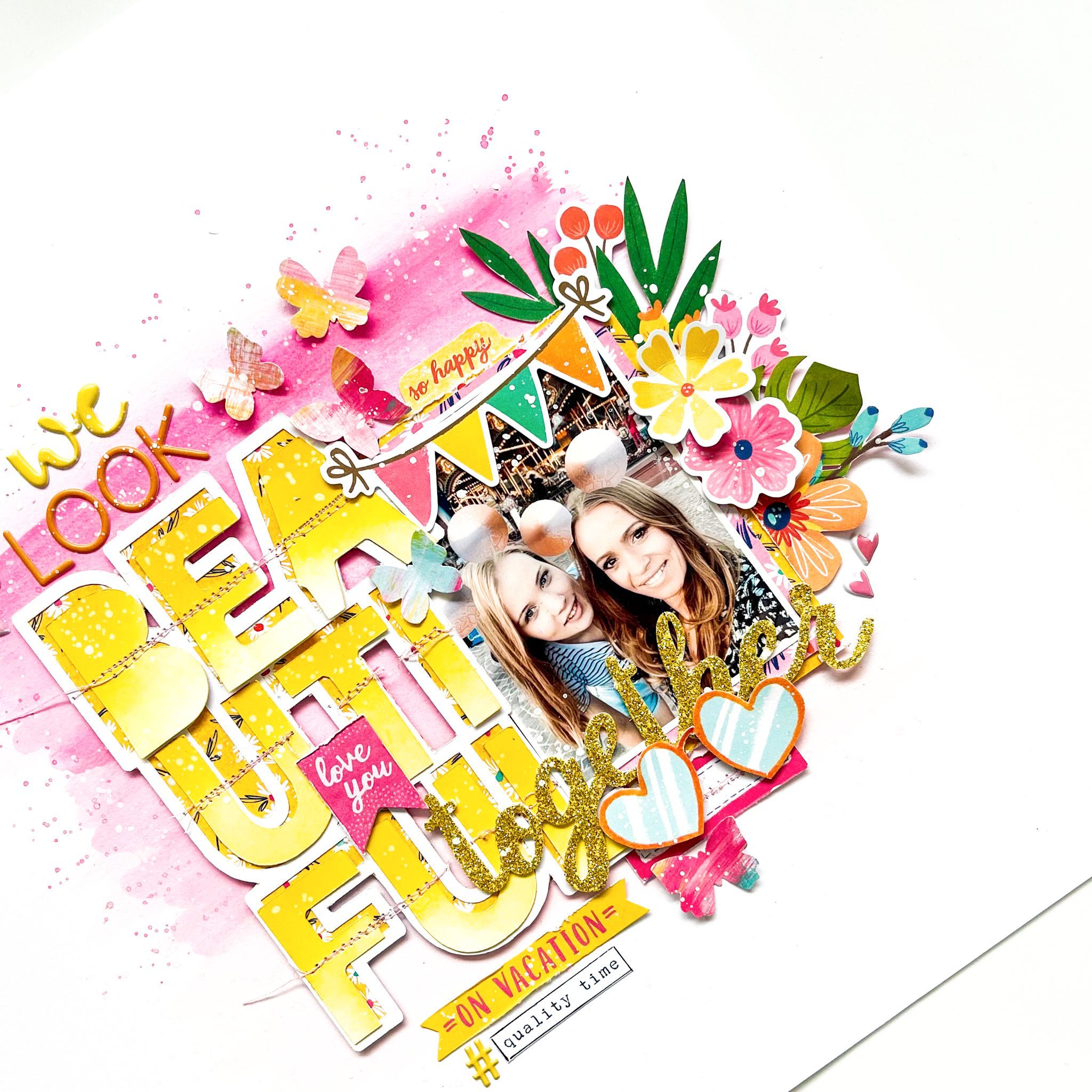
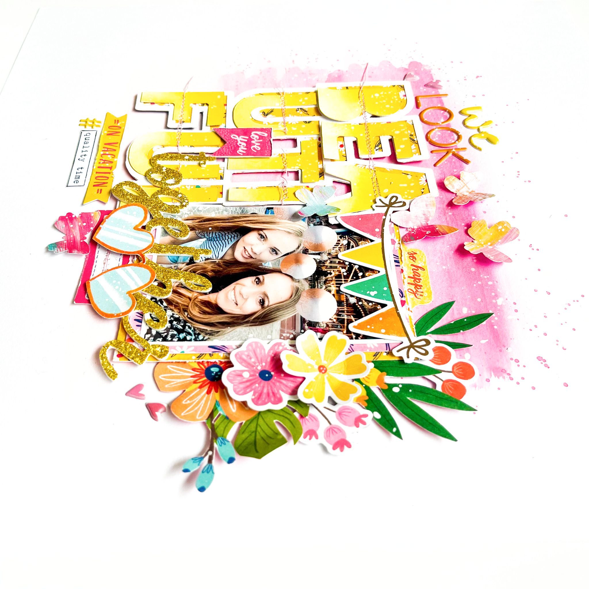
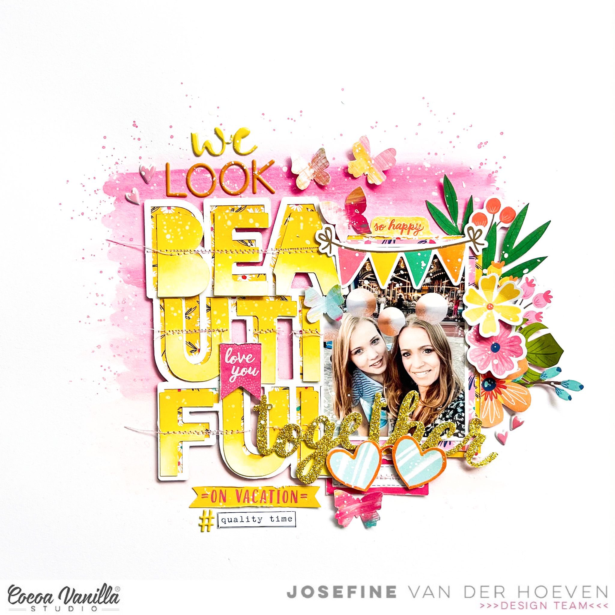
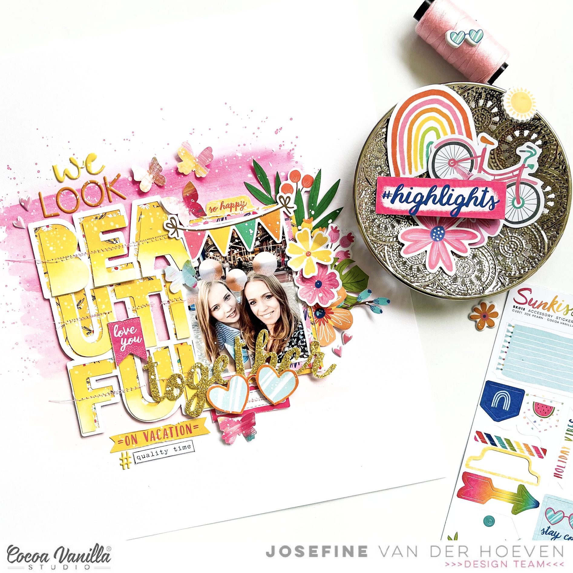
Welcome and so happy to see you again on the Cocoa Vanilla blog today! It’s Josefine here and I’m sharing a new layout with you. For this girls pink layout I choose to work with the beautiful collection “Sunkissed. I really love the pink vibe on this happy page from me and my daughter.
I took a 12×12 watercolor paper and choose three pink colors of distress oxide to work with. The colors I used are, picked raspberry, kitch flamingo and spun sugar. I placed an ink pad on my white background and make a horizontal line. I do this with all the three different ink pads. Then I take a medium watercolor brush and blend the colors with each other by using a little bit of water. I splash some more with the colors by using my watercolor brush and then let the background dry by air. By splashing with water on your distress oxide and dabbing it dry with a piece of kitchen paper you create a super cool watercolor effect.
I used a cutfile by Paige Evans called “Beautiful” as part of my title. The title I choose for this layout calls “We look beautiful together on vacation” I really love the moments that I spend with my teenage daughter. These moments are very special and precious to me. I cut the cutfile with my Cricut Maker and backed it with yellow colored design paper. I color the alphas with the distress oxide “mustard seed” and then I stitch the alpha’s with light yellow sewing thread on my cutfile. The stitching details give my alpha’s more detail and dimensions.
I cut different pattern papers to size and placed it behind the photo from me and my daughter. I made a cluster on the right side of the photo with the gorgeous Die-cuts elements, stickers and figures from the Sunkissed collection. I select some more embellishments for extra decoration between the alpha’s.
I punched out a few butterflies from the lovely Sunkissed design papers and placed them in different places on my layout. Also I give my layout some white splatter with white gesso for a festive look.
I hope I was able to inspire you with this happy pink girls layout with the fresh and colorful Sunkissed collection and give you a creative idea for an easy mixed media background. Of course, I hope to see you next time on the blog with a new project! Can’t wait to see your beautiful projects on the Cocoa Vanilla FB groep! I wish you a very happy and crafty day friends!
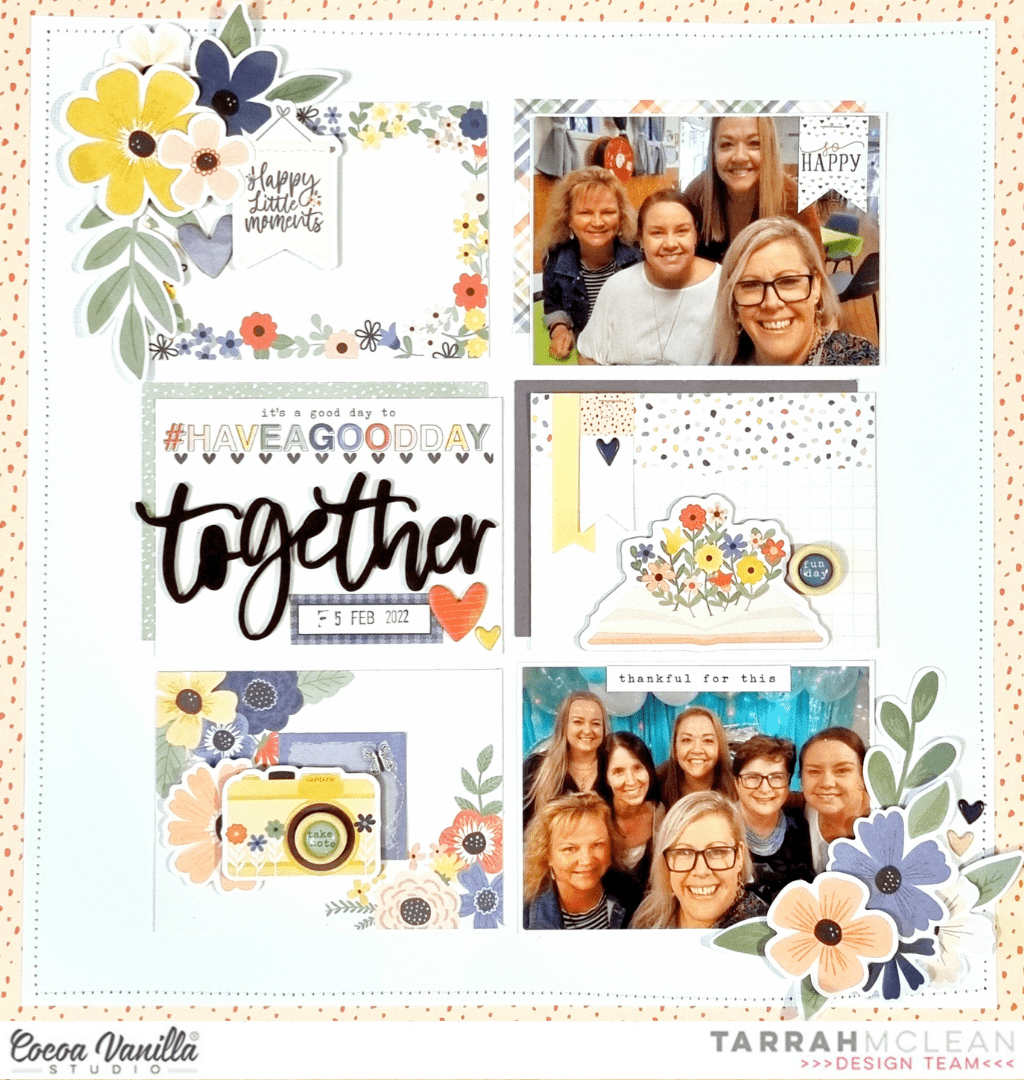
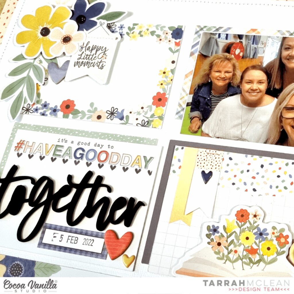
It’s Tarrah McLean back here on the Cocoa Vanilla Studio blog with you and today I am sharing a new scrapbook layout featuring the stunning Storyteller collection.
I think this is now my 8th layout created using this gorgeous collection! Do you have this collection yet?
I am documenting 2x photos of myself with some of my fun girlfriends, choosing to create a grid style design.
I first pulled out all the horizontal pocket cards that would suit the way I wanted my photos placed, I mixed them up and layered some underneath others and also layered some of them under my photos too, Once I was happy with how they looked, I took a piece of plain white cardstock and adhered them all down staying with that grid style. I was so happy that the pocket card that reads ‘It’s A Good Day to Have a Good Day’ was a horizontal style one as I wanted to use the ‘Together’ word from the foam title stickers, it was perfect to place on that pocket card!
I could not leave the pocket cards blank so I added some embellishments to them all. On the title card, I added a chipboard heart from the Chipboard stickers, a puffy heart sticker from the puffy stickers and a journal sticker from the Accessory Sticker sheet, I stamped the date on the small journal sticker. The pocket card to the right of the title one I added a chipboard piece, 2x banner die-cuts and a puffy heart sticker to the banner piece, I also stapled the banner die-cuts using my tiny attacher.
On the pocket card below the title I added an accessory sticker and adhered a camera ephemera piece over the top using craft foam. I also tucked in a floral die-cut here from the floral ephemera pack. On top of the camera, I adhered one of the super cute wood epoxy buttons. The pocket card above the title I added a chipboard banner piece and a chipboard heart and created a small cluster of flowers and leaves from the floral ephemera pack, I popped up some of the flowers using craft foam and left some without, I like the different heights and dimension this gives my page.
It’s fun to treat each pocket card almost like its only little scrapbook layout! On the top photo one, I stapled a banner sticker from the Accessory Sticker sheet in the top right corner, using my tiny attacher. Doing this is a great way to disguise something you make not like in your photo, treat it as an embellishment opportunity and cover it up as I have in the corner of my photo! In the bottom photo, I added a phrase sticker from the Accessory Sticker sheet to the top of the photo and created another cluster of flowers using florals from the floral ephemera pack, this helps to balance with the cluster I created in top left corner.
Thank you so much for stopping by the Cocoa Vanilla blog today! I love how my layout turned out and I hope you enjoyed reading how I created it!
Make sure to keep an eye on the Cocoa Vanilla online store as the Storyteller collection should be in store really soon!
Hello crafty friends today I am celebrating all things Spring (well if you live in the Southern Hemisphere anyway!), flowers, sun, bare feet and yellow!!! Storyteller is a perfect collection for spring themed layouts.
I firstly created a water colour background effect on my white card stock, using yellow as it reminds me of spring, I then found a cute vase cut file from the silhouette design store. I used Oh My Heart paper to create my vase.
Now for the fun part, I created flowers for my vase using the Floral die cut ephemera pack. I added them with foam tape to add dimension and then tucked in extra leaves and sprigs.
I add a phrase sentiment banner from the die cut ephemera pack on the vase. I chose a wood grain paper from the A5 paper pad to mat my photo.
Next I created my title using a cut file which I cut using Ditsy Daisy paper. I added a camera die cut and added a wood epoxy button to the lens of the camera.
To finish my layout off I went back and added some die cut butterflies and puffy stickers in amongst the flowers and under the butterfly wings.
A simple layout technique wise but visually beautiful with the colour choices and lots of flowers!
Thank you for stopping by today and I will be back later in the month with some more inspiration.
I selected 4 of my favorite patterned papers: Sun Shower, Daisy Days,Happy Place and Garden Variety. I applied Distress Oxide inks directly on my white background watercolor cardstock in four vertical lines. I added water and colored splatters as well, and let everything dry.
I cut four strips of my selected papers that are of different lenghts and about 2 inches wide. I curled the top and bottom of each paper and aligned them in a horizontal line. I inserted a grey ribbon inside the curled top of each strip and tied a bow on the right and left side of the four aligned papers.
I printed my photo in black and white. It adds a little retro feel to the page…!
I used the Daydream Die Cut Title words for my title, and added beautiful fussy cut and die cut flowers to embellish around my photo.
I cut a rectangle out of white cardstock to write down my journalign and placed it on the Sun Shower strip, on the left side of the photo.
Finally, I added a few Accessory Stickers, two die cut butterflies and a few scattered sequins as the finishing touch.
Here are some close-ups:
I will never get tired of using this gorgeous collection ! My design is very easy to scraplift, and it is a simple way to use many different patterned papers on a page.
Good Day Friends,
Lina here on the blog today with an Autumnal layout I created using the fun Sunkissed collection and a photo of my eldest daughter, from this past weekend. I know Sunkissed is a summer themed collection, but I couldn’t resist it’s rich tones of yellow, orange, and pink. I think by looking at my layout, you’d never guess that the collection was geared towards summer. And, that’s the beauty of CVS collections, they’re just so full of fun and colour and that makes them versatile.
I began with a white piece of 12×12 cardstock and created a blended ink background in yellow, coral, and pink. I used water to then add droplets which then I dabbed off to create a reverse splatter as the water removes the ink where it’s placed.
I created the cutfile in Silhouette Studio using two different fonts, layering them and then cutting the background from white cardstock and the rest from papers from the A5 Paper Stack. The Paper stack is perfect for smaller tasks such as cut files or even matting of a photo. I popped up the cut file with dimensional foam and then placed it on my now dry background.
The photo is printed in colour and I feel like the shades and tones in the photo play nicely with the colour scheme I’ve used and do not “get lost” amongst all the colour I have already laid down. I matted my photo with papers form the A5 Paper Stack adding in the same pink, yellow and green.
Time for my favourite part…. the embellishing of the layout. I created a few clusters, one main, large one within the cutfile, a second cluster, mid sized to the left of the photo and lastly a smaller third one, to the right of the photo. I used florals from the Floral Ephemera and a few banners from the Die Cut Ephemera packages. Because I wanted this layout to have more of an autumnal vibe to it, I stayed away from the teal and blue that is included in this collection using soley the shades of orange, yellow, and pink with a pop of green. I also used some gold thread to create a nest for a small Wood Button to sit within. In doing this, I feel like I give the button a home. :P
Lastly, I used some gold ink spray and splattered paint in and around my layout. As always, this finishes off my layout and ties it all together. in my eyes, it similar to adding sprinkles on a cupcake… it’s just that little bit extra that completes your layout.
Thank you for joining me today on the blog and I hope you have a wonderful rest of your day!
xoLina
Hey y’all! Laura Alberts back again with a fun art sculpture inspired layout! Back in April, my son and I visited a beautiful sculpture garden in Twin Lakes, Minnesota, USA. It was such a fun, quirky place to explore art and experience sculpture in a new way. I decided to channel the quirky feel of the garden with this layout using the Storyteller collection! Using the Cross It Off patterned paper for my background, I built a diagonal layout with a really fun collage look. Loved squeezing four 3×4 inch photos on this one!
For my title, I used the Love This from the Chipboard stickers and then layered a journaling spot and hearts from the icon ephemera underneath. For the photos themselves, I kept the embellishing very simple, so that it didn’t become too busy! I set two photos in each of the cross-filled corners and layered them up with word phrases, a banner, and a label.
I really enjoyed playing with white space on this layout, leaving large areas to allow the eye to rest on the opposite corners and keeping a fairly tight cluster of embellishments in between my pairs of photos. This adds a lot of balance to the page and made for a clever place to add splatters as well!
I hope this layout inspires you to find ideas in the least likely of places! It’s such a fun design and captures the mood and feel of the garden really well! To see how ‘Love This’ came together, check out the process video below!
Hello Cocoa Vanilla fans. It’s Anna here with my newest page. I decided to put the new “Storyteller” collection away for a short while to use up my stash of older lines. They looked so sad and lonely in the box :) First, I need to add a disclosure and explain myself a bit. We got a new puppy over a year ago, and as my daughters are quite big and independent, I poured all my parental feelings into my poor dog. 99% of my phone photos are of my furry boy… Crazy pupparazzi – I know! So most of my pages are with my dog’s photos recently as those are almost the only pictures I get. Last time I shared with you his sleepy version mixed with “Storyteller” and today will be his needy version with a bit older “No limits” line. Masculine collection for a good boy!
Let me start with a back story of the photos. As I work from home, I have this big privilage to work from the cosy couch covered with soft blanket. My dog is always somewhere near as he is very social and coodependent (my fault…). He likes to be a star of the show, so when the attention is not on him, he is not the one who waits patiently. When my computer took his place, he decided it’s time to try to sneak into my laps. I snapped few photos of him checking which side would be the best to approach. He is very needy when it comes to attention hence the title of the page.
I had a little bit of trouble figuring out how I should scrapbook those photos. I didn’t want to repeat my usual patterns so insted of straight lines, I decided to add some funky waves. I picked three pattern papers: “Latitude“, “Spark” and “Nebula” and nested them together sketching a simple wave pattern, that would be wider on the one side and making thinner on the other. I started with the orange paper and drew and cut the wave. Then I glued it over the yellow paper, marked the lines with pencil and cut everything again. I repeat the same with the greenish one. My original idea was to put everything on “Stardust” paper as a background buy it was just too busy. I switched to white cardstock instead adding some mixed media layers.
I first marked when my paper layer will be, and then gently added some yellow ink using a brush, on the top and on the bottom. Then I used star stencil and lime green ink to add a layer of stars and finished everything with orange splatters. When everything was dry, I glued my wave on top and started embellishing. I picked some tickets and stars from ephemera pack and tucked them behind the photos and my wave. You can spot some stickers from 6*12 sheet too. Next step was to add a title using some Thickers from my stash, following the curve of the wave. Who said your titles have to be straight? Actually, I love keeping them messy and uneven!
Tiny enamel dots and stars were a perfect finishing touch along with wood epoxy button. I think this is the embellishment piece I use up the fastest in each CVS line. I just love them. The final result has a bit retro vibe I would say. Do you have similar feelings about it? I think I need to reach for wavy, handcut lines more often as they create very unique result.
That’s it for today! I really enjoyed making this layout and scrapbooking another photos of my puppy / son. He is my youngest baby, and you know how tempting it is to scrapbook baby photos, right? I can not promise my next page will be with people either…
Thank you so much for stopping by and see you in two weeks!
Hi everyone, its Melissa here and I’m so happy to be back again with you. This month we are creating with sketches, which is something I love to do! I know some people find it hard to create from a sketch, but I find it a great way to kick start my creative flow. Last week I put a poll up on the Facebook Group asking for people to vote for which collection I should use. Storyteller was the winner, and because of this I decided to choose a sketch by co-creator Traci Reed (of Traci Reed Designs). Here is my layout:
And here is Traci’s super fun sketch:
I decided to use Fly Away for my background torn paper strips. I just love the green colour and the subtle circular patterns. I also fussy cut several butterflies from the other side of the paper to use as embellishments.
I fussy the Love this Life heart from one of the Pocket Life Cards and used it as embellishment. Then I used lots of florals for the pinwheel shapes on the sketch. I love how they look through the central white card stock background. I also embellished with more fussy cut butterflies and Puffy Hearts.
I love using the Foam Title Stickers to make an easy title. I used the word “Together” which was perfect to document Brielle and Ava dressing up and eating watermelon.
I had fun making this layout, and you can watch the video below.
Hello everyone, it’s Kylie back with you all! Over the past few weeks on the blog the design team has been creating layouts following a sketch. A scrapbooking sketch provides a guide for the placement of photos, a title, journaling and embellishments for your layout. But it doesn’t mean that it’s set in stone. Based on your photos and scrapbook supplies, you may alter the sketch to fit your needs. There are lots of websites that can provide some wonderful sketches, however for my layout today I have created my own sketch for you. Whenever I find a sketch I want to create from, I usually like to print it out and place in a binder folder. That way I can create and recreate using the same sketch as many times as I like.
Sketches don’t necessarily provide measurements, however for my design I did provide the size I trimmed my photo. Sometimes that’s all you need to be able to bring all the other elements together into place. As I mentioned previously creating with a sketch plan doesn’t have to be followed ‘exactly’ – but in this case I did with my own layout. I thought the new ‘Storyteller’ collection would be perfect since I have a strong feature on blooms!
When scrapbooking, I like to co-ordinate the colours in my photo memories with the papers etc that I use. In this case I knew I wanted to include some lovely blue and yellow tones. I chose the reverse side of the SPRING FLING paper. It has a lovely watercolour effect to it in the most perfect shade of blue. From there I followed my sketch and layered several contrasting papers to include the fun LITTLE LOVE paper. For once I did not adhere any of the papers or my photo with foam squares. I kept everything flush except for the floral die cuts. These were layered with foam adhesive squares to really ‘pop’ and stand out from the page.For texture and pure cuteness I also added some of the wooden flairs.
What would a layout be without a big title?? This was secured snuggly next to my photo using the foam title stickers. My photo was trimmed down to a 5″ x 4″ size- mostly because I had a lot of open negative spacing I felt I could trim away. Once completed I also think this sketch would allow journal space too if you like.
I hope you will have some fun too creating with my sketch!


 I took a 12×12 watercolor paper and choose three pink colors of distress oxide to work with. The colors I used are, picked raspberry, kitch flamingo and spun sugar. I placed an ink pad on my white background and make a horizontal line. I do this with all the three different ink pads. Then I take a medium watercolor brush and blend the colors with each other by using a little bit of water. I splash some more with the colors by using my watercolor brush and then let the background dry by air. By splashing with water on your distress oxide and dabbing it dry with a piece of kitchen paper you create a super cool watercolor effect.