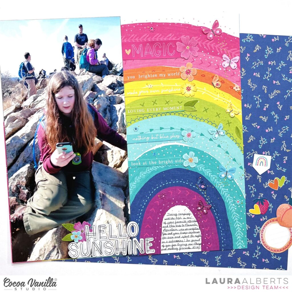
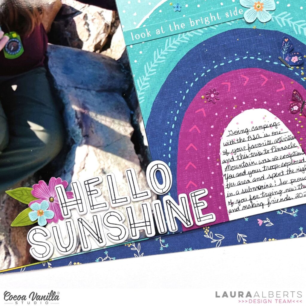
Hey y’all! Laura Alberts here with a fun large photo layout! I love scrapping large photos like this 6×12 layout that I had printed of my second oldest on a camping trip. Love the way I can incorporate the gorgeous rainbow design on this patterned paper from the Happy Days collection. Using a tone on tone embellishing style helped this layout feel fun without overwhelming or overshadowing the photo.
On each stripe of the rainbow, I added a coordinating word phrase from the 12×12 cut-apart patterned paper and a few fussy cut elements that were close matches. I particularly loved all of the stitching details on this paper and tried not to cover them up! The trail of butterflies on the right side was a great way to add movement and whimsy to the page.
With a simple chipboard title at the bottom and journaling added in the center of the rainbow, this layout came together fairly quickly, but turned out beautiful! All of the little details make it such a memory beautifully preserved. My favorite part is the tiny, fussy cut florals on each stripe of the rainbow.
I hope this layout inspires you to try larger photos or tone on tone embellishing in your next design! If you’d like to see how this layout came together, check out the process video below:
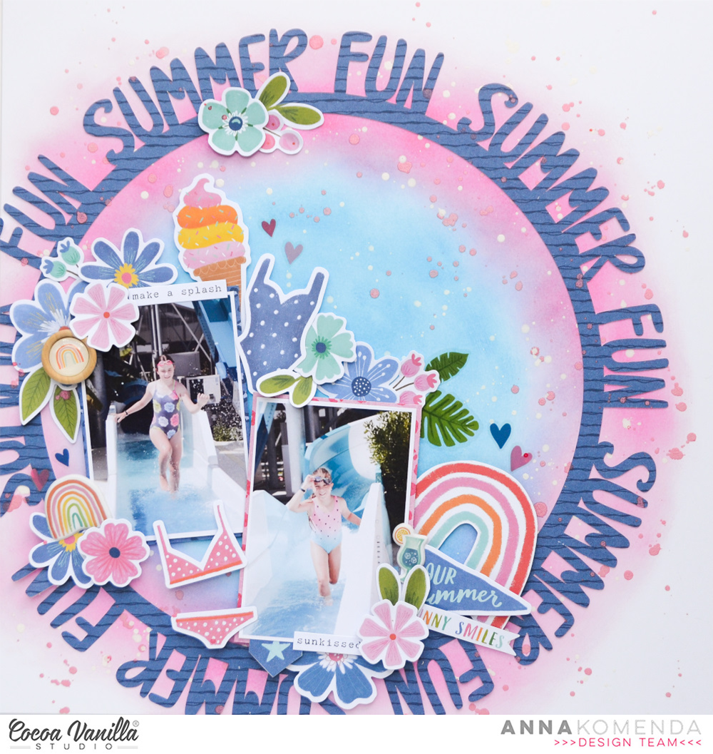
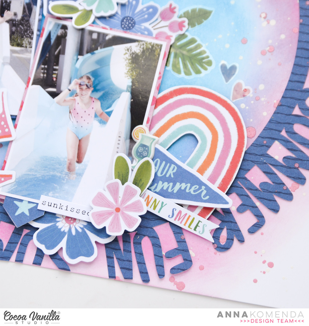
Hello everyone! Summer is in full swing in Europe and we are having a lot of sun and warmth. Sometimes even too much for my liking. However, it’s still better than being constantly cold, right? We have a perfect theme for this week over CVS blog and it’s FUN IN THE SUN. And you know I love all the colorful, summer collections and projects! I reached for an older “Sunkissed” collection as it seemed perfect for this job. I still have plenty of papers and some embellishments and I need to squeeze it as much as possible. I think I will have to make a “leftover album” too to finish it of.
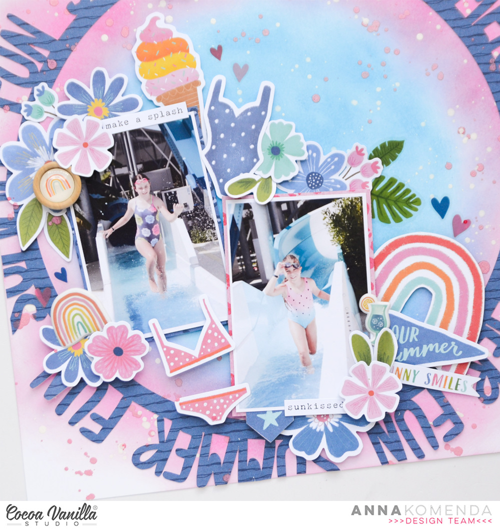
I picked a navy paper called “Bright side” and cut a decorative circle with words using my digital die cutting machine. It says “summer fun” all around! I was looking for a perfect background paper but all the ones I got left didn’t match so I took a white cardstock and two Distress Oxide inks: Picked raspberry and Salty ocean and created ombre, circlular effect. My inspiration for the colors came from a swimsuit of my daughter. I didn’t place the circle direclty in the middle, setting it off to one of the corners.
I scrapbooked joyful photos of my daughters riding a waterslide during one of our summer holidays. They were running up and down to slide as many times as possible. They even held a competition who will slide faster. And I was there with the camera as good mamarazzi! My Ephemera Pack is already half empty but I still managed to find two swimsuits in matching colors! Lucky me! I also searched for flowers in pink and blue in my Floral Ephemera Pack.
I also have few Puffy Stickers left so I added them around the photos. The same with Wood Epoxy Button!
This collection also includes beautiful Clear Stickers and I used few of them to embellish the background. You need to be careful with using them of colorful backgrounds as they may change the color, influenced by the one dehind them.
I had so much fun making this page and I love this navy, pink and blue color palette! I must reach for it more often.
That is all for today. I hope you will find some inspiration in my page for all your “fun in the sun” projects!. Thank you so much for sticking out with me and see you in August!
Welcome to Cocoa Vanilla Studio’s blog; how lovely to have you here today! I’m Josefine, and I’m happy to share with you a new scrapbook layout filled with summer fun. For this project, I’ve chosen the amazing “Happy Days” collection. This bright summer colors bring my memories to life on paper, and I couldn’t be more excited to dive into this creative journey.
To start off, I’ve used a white sheet of cardstock as my base. The design paper with its vibrant rainbow pattern caught my eye, and I carefully cut each colored strip separately. Adding a touch of light blue stitching along the edges by using my sewing machine. So I create a lovely touch to the strips.
With the strips I begin to arrange them into a triangle design. For some of the strips, I fold them slightly to create more depth and dimension, adding a playful touch to the overall layout. Now, it’s time to incorporate my summer fun photo, almost in the center on top of the colorful strips. I also select various shape die-cuts and flower die-cuts to create clusters around the photo. To add more charm, I cut out butterflies from the patterned paper and place them strategically between the clusters. A smaller cluster in the upper right corner helps to balance the layout.
For the title, I go for a combination of different alphabet sets. “Sweet Summer Days” perfectly captures the essence of this layout, and I love how the mix of these two different alphabet sets adds a playful touch. A little colored tab beneath the photo and a few cardstock word strips complete my layout. And there you have it, a finished a summer fun scrapbook layout!
I hope this layout sparks some creative ideas for you, and I wish you a fantastic and artistic day. Until next time on the Cocoa Vanilla Blog.
It’s Tarrah back with you and today I am here to share a new scrapbook layout featuring the older but still GORGEOUS Happiness collection! The Happiness collection would have to be one of my absolute favourites by Cocoa Vanilla Studio! I love it sooo much!
The Happiness collection was the perfect collection to document a photo of my son, my Mum and I out exploring recently. We love getting outside and exploring my parents farm together!
I cut out a large cut file from CUT to YOU using white cardstock, I then chose lots of different papers from the A5 paper stack and backed all of the words with a different paper. This does take some time to get everything all backed however I love the end result and all that time it takes is worth it. I adhered the cut file to another sheet of plain white cardstock using regular adhesive, I often use craft foam underneath cut files but this time I didn’t. I trimmed down the cardstock to about 11′ x 11′ and adhered it to the Little Things 12′ x 12′ paper. I then machine stitched a border around the outside edge to create some texture.
Tip: If you only have a small amount of a collection left (mainly papers) and you want to use it up, cutting out a large cut file is a great way to use up some excess papers, you don’t need too many embellishments by doing this either.
I placed my photo over on the right hand side of the layout, I did have to cover up some of the cut file but I knew that and I am ok with that. I layered a paper underneath the photo and one of the round die-cuts from the ephemera pack and also tucked in some of the gorgeous florals in the top right and bottom left corners. The florals in this collection are stunning don’t you agree?!
To help draw the eye towards the photo some more, I added a die-cut heart in the bottom right corner of the photo, a banner sticker to the top right corner and a tab on the left of the photo. On the right hand side, I tucked in one of the circle stickers, above the photo, I placed some phrase stickers and stamped the date stamp. Creating layers gives the layout depth and lots of interest and really draws the eye into the subject of the layout.
To help the readers eye travel around the layout, I added more phrase stickers from the Accessory Sticker Sheet reading from the top of the page to the bottom of the page. These phrase stickers help to tell the story of the photo and are great to use instead of journalling. I don’t like my handwriting at all so these stickers are perfect for me to use for this purpose. I took some of the gorgeous butterfly die-cuts from the Ephemera pack and placed them tone on tone on the layout. I bent up their wings to add dimension and texture.
Thank you so much for stopping by the Cocoa Vanilla blog today! I hope you enjoyed reading about how I created my layout as much as I enjoyed creating it!
It’s Sophie on the blog today for Throwback Thursday and I am bringing back the stunning « Legendary » collection !
I thought this collection was absolutely perfect to document a recent visit to our new cottage in the woods !
I teared a few patterned papers from the collection and placed them in a horizontal line on a thick white cardstock.
I mounted my photo on tissue paper, adhesive foam and a few layers of patterned papers and placed it on the right side of the layout. I cut a piece of the Epic Tales paper to write down my journaling and added my title (I used the Die Cut Titles pack) just above it.
I cut a few leaves with metal dies from my stash and created two leaf clusters to decorate the page. I also added many die cuts in different shapes , labels and stickers from the Legendary Sticker sheet, as well as a few enamel dots to complete the page.
Here are more close-ups:
I love the color scheme of this page, exactly what I envisioned for my photo.
Do you still have elements from this beautiful and unique collection ??
Thank you for stopping by, I wish you a wonderful day !
Welcome back to the blog CVS fans, it’s Kel here today to share a page with you.
For today’s share, I wanted to create a ‘boy’ page and get some mixed media out so I decided to pull out my ‘No Limits’ collection. I still love this collection as much as I did when it was released so here is a look …
To create my background I started with some Distress Oxides in Faded Jeans, Fossilised Amber and Evergreen Bough. I added the ink onto some packaging, spritzed some water and ‘smooshed’ it onto my page. To the left of my page I used a stencil with some grey ink to add some more pattern, then used a black marker to add some detail.
I decided I wanted to have stars as a main shape on my page so I also added some green texture paste through a star stencil…they give the page a lot of texture!
To create some fun and to focus in on the photo of my son, I cut the silhouette of him out of my photo…this takes out the background noise in my picture.
Next, I cut out some circles to add a grounding element to my page and to lay out embellishments. From the ‘Universal’ paper I cut out the green ‘Always be your Awesome Self’ cut apart and decided to use this as my title. I cut the words apart and added them to the top left and bottom right of my photo…added with foam for the dimension and to make them ‘pop.’
To ground my photo to the page I added a tag, arrow and hand icon from the Ephemera pack…
Next, I bought in some of the stars from the Ephemera packand the star Puffy Stickers to carry on with the star theme.
To finish of my page,I added some more stamping in black to make the colours on my page pop…love this look.
Thanks for stopping by today, I hope I have inspired you today.
Hey y’all! Laura Alberts back again with a fun column design using the new Happy Days collection from Cocoa Vanilla Studio! Using the manufacturing strips to create these fun, super slim columns allowed me to add four 3×4 inch photos on this page.
On each of the columns, I added a ton of cut-apart pieces from both the 12×12 and A5 paper stack versions. Plus, a couple of cute gold foiled accents from the specialty paper. Finishing it off with hearts, florals, and butterflies that are fussy cut from the patterned papers in Happy Days for whimsy and fun!
The little dots of Nuvo and puffy stickers that I added on at the end really help this layout pop! I love how much the tiny details can make such a bit difference. These butterfly trails give the columns a softer look overall.
I hope this layout inspires you to dive into your cut-apart sheets and have a play with the column design! If you’d like to see how this layout came together, check out the process video below:
Welcome to the Cocoa Vanilla Blog today. It’s Josefine here with a new scrapbook layout. For this layout, I used the fantastic and colorful “Happy Days” collection. I chose to highlight the gold frames today. The beautiful gold frames perfectly match the colors of the patterned paper.
I started by cutting out various gold frames and then selected different patterned papers and placed them behind the different frames. The vibrant colors of the paper create a beautiful contrast with the frames and the white background. I arranged the frames in a grid pattern on my layout and used 3D foam for a lifting effect.
There are plenty of beautiful embellishments that I can use in this gorgeous collection. I picked out various die-cut shapes, flower die-cuts, and word stickers to create small clusters on top of the gold frames. I specifically used a black and white photo to make the colors of this amazing collection stand out even more. The black and white frame from the die-cut ephemera highlights the photo beautifully.
I placed the title at the bottom of the layout, called “Good Times.” This amazing cardstock alphabet set fits perfectly. I accentuated the small word stickers with a thin black line to give them a little extra attention in the overall design. If you like, you can also give this alphabet set different colors yourself using ink, paint, or markers. You can let your creativity run wild and have fun.
I hope I have inspired you with this scrapbook layout and I hope to see you again on the blog next time. Wishing you a creative day!
It’s Tarrah back with you and today I am sharing a new scrapbook layout featuring the gorgeous Happy Days collection!
For this assignment I was tasked with creating a project inspired by the July 2023 mood board.
July 2023 Mood Board
I was inspired by the colours in the mood board, the postage stamps and the windmill. I chose to add the pinwheel from the Happy Days collection to replicate the windmill from the mood board and also the postage stamps that look similar to the small pictures in the bottom centre photo in the mood board. I chose the ‘B’ side of the Juicy Fruit paperas the background paper to work on.
I picked 3 photos from a recent trip to Ayers Rock and printed them in a filmstrip style, I was inspired to this from the Japanese temple photo in the top left corner of the mood board. I adhered the photos using craft foam to create some dimension, I layered some of the papers from the A5 paper stack under the photo to add some interest and colour.
On the left of the photo strip, I placed the Amazing prize winner die-cutand on the right hand side I adhered the postage stamp die-cuts. Above the postage stamps I adhered the pinwheel die-cut and placed a puffy enamel dot in the centre of the pinwheel. I added a few phrase stickers from the Accessory sticker sheet around the photo to help tell the story of the photos. On the left of the photos I placed a yellow puffy heart and some more enamel shapes.
My title was made up of the chipboard alphabet words, I placed one word above the photos and the other one below the photos. I added a few more small embellishments like die-cut hearts, enamel shapes and accessory stickers to finish the layout and lastly I stamped the date stamp using black ink.
Today I am sharing a page for Throwback Thursday and I pulled out the Midnight collection which I still have a nice stash of…not surprising as I have hoarded a lot of Cocoa Vanilla products!
Here is a look at my page..
To start my page I used a stitching cutfile from Paige Evans of a branch which I stitched using a chain stitch in a soft pink which creates some nice dimension. This serves as the landing space for my photo..
Next, I pulled out lots of florals, hearts and butterflies from the ephemera pack and accessory sticker sheet to fill out the stitched branch and add lots of interest and dimension.
I also added some stickers to the top of my photo to add more interest..
For my title I used the word ‘Happy’ from the Chipboard pieces to complete my title, then I used one of the clear stickers under the word Happy to ground it to my page..
Under my title I used a banner from the chipboard pieces..
To finish my page I popped a few more of the clear stickers around my page to fill in some of the open spots…I love how this this turned out and finished off my page.
Thanks for popping by today, I hope you found some inspiration to maybe pull out some of your older CVS stash to get crafty!