Hey CVS friends, I loved this challenge and have chosen a fab layout created by Natalie King for the Grab 5 INSD 2020 challenge. And here is her gorgeous layout.
And here is my scrap lift of her layout.
I have used a mix of Bohemian Dream and Wild At Heart collections. I first cut a doily on my Silhouette instead of Natalie’s circle at 8 inches. I cut my white cardstock down to 10×10 inches. I used the vibrant Flower Child paper as my border page (creating a stark contrast for visual impact). I then used two polaroid die cut frames (these photos are 2.5×3 and 2×2 inches) and added with smaller photo with foam tape.
I next created the 3 embellishments clusters as Natalie did. I used the Bohemian Dream Ephemera die cuts, layering under and over the photos and a smaller one under the doily.
I have used enamel dots and some clear stickers to add a little mixed media feel and add more dimension.
You will see here that I have not glued the outer part of my doily cut file, only adhering the centre, this ensure it does not look ‘flat’ and helps create another layer on the layout.
I finished off my layout adding a clear sticker brush stroke on the edge of the white cardstock and added a sentiment banner over the top
I had such fun scrap lifting this layout! I also love going back and revisiting older collections and falling in love with them all over again! Thanks for stopping by and see you again soon.
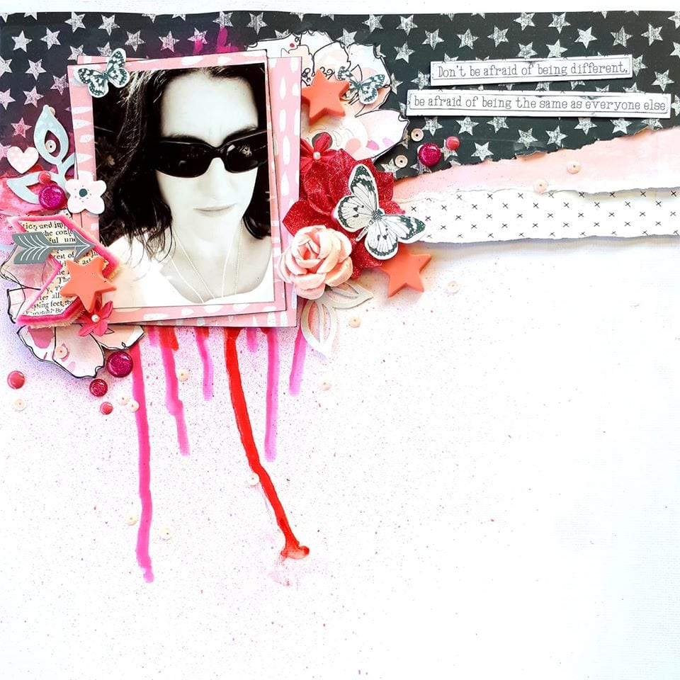
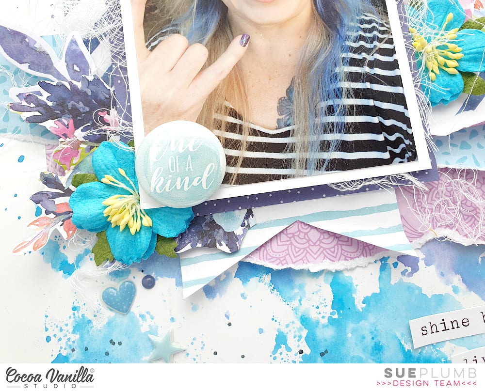
It’s Sue Plumb here to share my take on the current scraplift theme that the entire team have been working on. For this theme we were all challenged to choose a layout that inspired us from the International Scrapbook Day challenge entries and create our own version. There were so many amazing layouts I found it really hard to choose, but I kept coming back to this super cool page by Rachel Dutko…
There were so many elements I just loved about this page – the textures of the torn, layered papers; the eclectic mix of embellishments; the use of white space; and the touch of mixed media – it just drew me in. For my scraplift, I really wanted to capture some of Rachel’s main design features, whilst still creating a layout that was my own style. I even decided to re-visit one of my all-time favourite collections, ‘Bohemian Dream’.
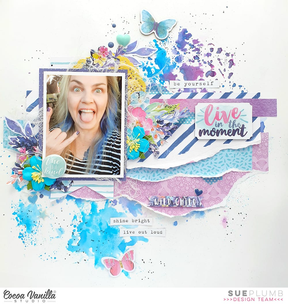
Here is my layout (I hope you think I did yours justice Rachel!)…
I decided to create my page with a similar theme to Rachel’s, by documenting a selfie and focusing on the message of being yourself and unique. (This pic probably accurately represents me…haha) I then grabbed some white cardstock and added a splash of colour, just as Rachel had on hers. I used blue and purple inks, which I mixed with a little water and then applied to my cardstock to achieve an abstract watercolour background.
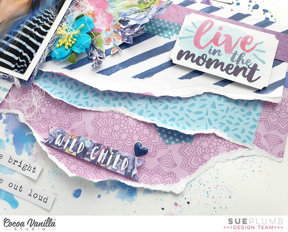
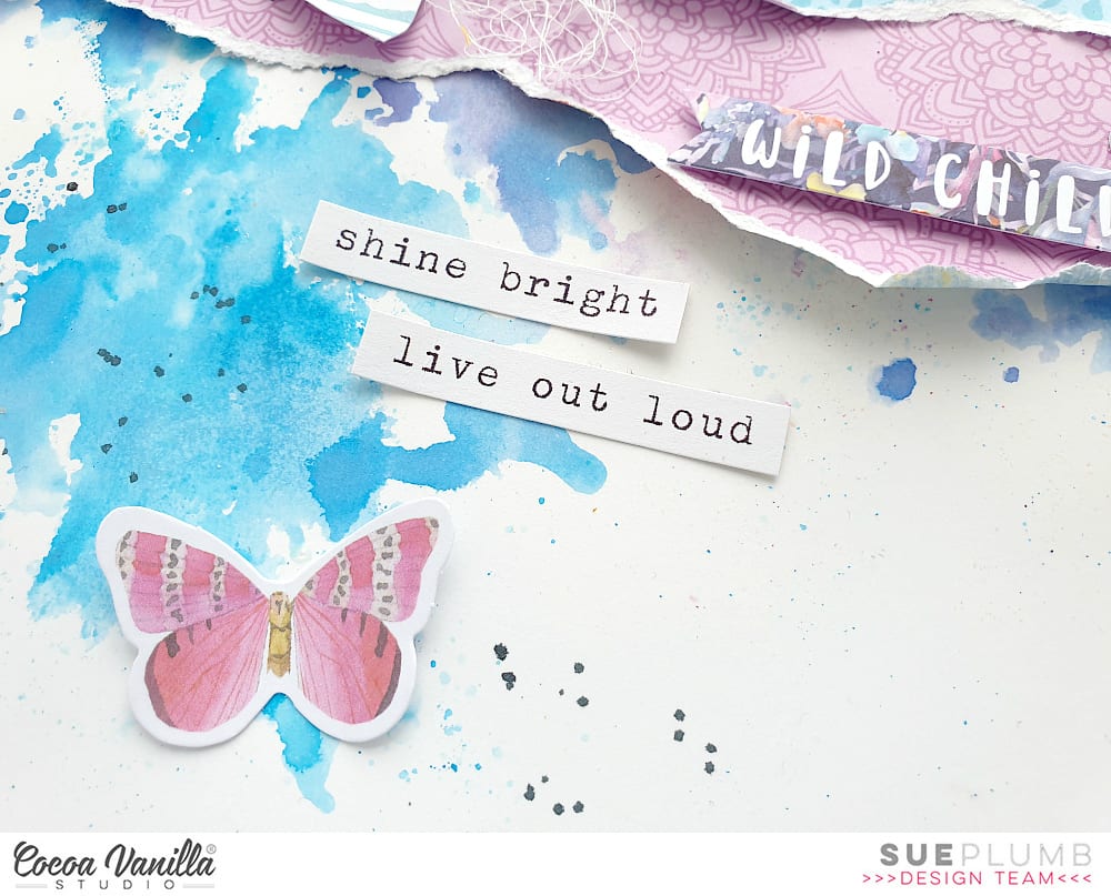
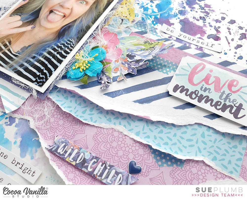
Next, I chose three patterned papers, which I tore and layered across my page. The papers I used were Dreamer; Gypsy Heart; and Abstract. I also added a few torn pieces of a washi tape sticker from the ‘You Rock’ collection and an extra paper strip cut from the reverse of the Dreamer paper.
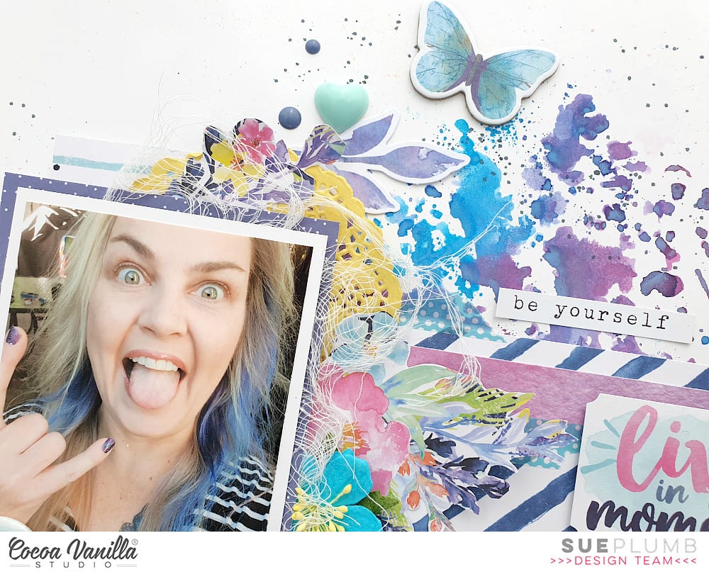
Just as Rachel did, I used two layers of paper to mat my photo (these were from the ‘Bohemian Dream’ 6×6″ paper pad); along with a small yellow paper doily and some frayed gauze for texture. I then began working on the embellishments to cluster around my photo.
I had a sheet of the gorgeous floral print Abundant paper that I had already cut into previously, so I fussy cut three floral pieces to tuck into the layers around my photo, adding a couple of extra little leafy branches from the Die Cut Ephemera pack.
Then it was time for a little stash-busting treasure hunt as I looked through my stash of Cocoa Vanilla embellishments for some extra bits and pieces. I found a couple of gorgeous blue paper flowers I had left over from the ‘Hello Sunshine’ collection that matched with my blue ink perfectly, so I added those to my clusters, tucking the edges under my photo. I also found some cute little blue puffy stickers from the same collection, so onto the page they went too.
The one of a kindFlair Button that I added to the corner of my photo was from the ‘Bohemian Dream’ pack, and was perfect for my page theme! The small mint acrylic heart was left-over from the ‘Free Spirit’ collection; and I also used some blue enamel dots from ‘Life is Beautiful’.
Rachel had some pretty little butterflies on her page, so I had to include some on mine too. (I know, since when do I need an excuse for butterflies, right?!) I added a blue one from the ‘Bohemian Dream’ chipboard near the top of the page; then a smaller pink one from the Die Cut Ephemera pack near to the bottom.
To finish off, I added the live in the moment sticker for my page title (popped up on a little foam tape), and a few small phrases from the Accessory Sticker sheet. A little splatter of some navy mist and I was done.
A big thanks to Rachel for inspiring me with her fabulous layout, I am really happy with how mine came out. (Even though I am clearly incapable of showing the same level of restraint that I so admired about Rachel’s page…haha)
Hey everyone, it’s Raquel here today sharing a layout inspired by one of our Cocoa Vanilla Facebook community members and from our recent cyber crop Keighley Brennan. I absolutely adored the vertical design of this layout, the circle elements and also the scattering of stars that featured on the page.
Here is Keighley’s layout:
I also used the Legendary collection for my layout too. Here it is.
The subject of my layout is the subject of most of my layouts when I am using a masculine collection, my little man this particular photo was one taken a few years ago that I found in my photo stash – it was such a nice surprise to find it as it had always been a picture that I had wanted to document but just had not done so yet. When I look back at old photos I find it hard to recall when the kids were so little, I’m so thankful for my craft and scrapbooking for documenting all these little moments in our lives.
I used my Sizzix Big Shot and circle dies to create the circular elements for the page. I do of course love my electronic die cutter but the big shot makes it easy to cut elements like shapes so quick and easy if I have a suitable die set to use. Originally I was going to use the same style colour palette with the blues however once I started creating I was drawn to the green diagonal stripe and the rest of the layout progressed from there.
The title is made up of the fussy cut letters spelling EPIC from the cut apart sheet of paper. I loved the font design and thought they made a nice statement title. The colours in the font actually inspired the rest of the colours that I used on the page. I added tiny word stickers as a sub heading to help support the EPIC title.
The flag ephemera piece was a nice way to add detail to the top of the layout. I finished this cluster area with some fussy cut stars from patterned papers, enamel dots and another tiny word sticker.
I did not have the right die size to create a perfect circle mat around my photo using the orange paper so I did my best to keep the circle even using my scissors. The entire layout was backed in the green diagonal stripe paper. I love how this looks.
I hope you have enjoyed stopping my the blog today and found inspiration.
Hey Creatives! I hope you are all well. Gwen on the blog today sharing for Cocoa Vanilla Studio. This week we are having a bunch of fun sharing Scraplifts from challenge entries in the recent International Scrapbooking Day celebrations. There were so so many wonderful entries, so it was super hard for me to choose one to Scraplift; so so much inspiration. In the end, I decided on this one by Kim Arnold.
What drew me to her page was the landscape design with room for multiple photos (which I sometimes struggle with) and her sweet floral clusters. I also loved how she added that frame and I have a stack of these in my stash so thought this was a nice opportunity to use one up. I also love that pop of black in her title, the butterfly and in her photo mats so I’ve drawn inspiration from that as well. Here is my page….
Even though I had her ‘scrap-lift’ to work with, I wanted to make the page my own, so to start, I pulled out a delicate cut file from my stash. This one is from CUT to YOU. I will admit, I totally cheated here and used it as the base for my page design, instead of adding the mixed media that Kim used. Whist I love it on her page, I’m not super confident with getting messy so I stuck to what I know and love.
I went with the ‘Garland‘ pattern paper for my background for my page as I wanted something that my white cut file could be layered over and still stand out. Next up, I went about backing my photos, for this, I’ve used the ‘Unscripted‘ pattern paper, I’ve also used this to back just the centre flowers of my cut file.
Working with her design, I’ve pulled out a frame from the ‘Bohemian Dream’ collection. I’ve positioned my cut file base, photos and the chipboard frame in keeping with her layout composition.
It was now time to work on the embellishment clusters. For this, I’ve simply pulled out a stack of elements from the collection including this round element from the ‘Ephemera Pack‘ as well as fussy cutting some butterflies from the ‘Lacewing‘ paper.
I’ve also included florals from the ‘Ephemera Pack‘, stickers from the ‘Accessory Sticker Sheet‘, a bow, AND a flair button from the ‘Flair Pack‘. For my title, I’ve gone with the ‘Hello’ sentiment from the ‘Foam Title Stickers Pack‘. This part of the page was the easiest and most fun. I simply kept her main design elements in mind and positioned similar things in similar positions.
To finish the page, I felt like it needed a hint more of that pop of black, so I’ve gone with the ‘Natural Beauty‘ pattern paper to frame my page. To finish everything off, I pulled some of the gold ‘Sparkle Enamel dots‘ from the ‘Wild At Heart‘ collection. I just love these ones, so pretty and sparkly!
Thanks for popping by today and a special thank you to Kim Arnold for the inspiration for this page and everyone who played along with the challenges over the INSD weekend. It really was so fun to see everyone’s creations!
Hi there crafty friends, Anita here sharing a layout for this months scraplift challenge where we pick a layout from the international cocoa vanilla studio scrapbook day challenges for my layout I chose Debra Beers layout from challenge 6 …
And my layout…
I started off with white cardstock and adding 4 strips from inspired and sophisticated down the right side I layered then just over lapping so I could machine stitch each strip. Then I matted my photo on papers from the 6×8 paper pad and tucked a doily into the layers.
Using the flowers from the ephemera, accessory stickers I layered them in 2 of the corners
And added my chipboard title that I painted pink and flicked white paint over it. I add it to the bottom of my photo.
Then using the clear stickers I added hearts ,leaves and flowers tucked and around the main floral pieces and finished it off with a few pearl drops.
Hi there! Danni here with a scraplift of Michelle Robertson’s gorgeous black and white layout for the International Scrapbooking Day monochromatic challenge. As soon as I saw this stunning layout, I knew I had to have a go at creating my own version!
I first went through all my Cocoa Vanilla collections and pulled out all the black and white elements I thought could work for this. I decided to flip Michelle’s layout horizontally to work better with my photo, and I reversed the order of the light/dark elements on the page by choosing a lighter background (Sophisticated floral 12×12 paper from Midnight collection) and a darker main photo mat (Happy Go Lucky paper from Boys Rule collection). I added some soft layers with various monochrome papers from More Than Words collection as well.
I watered down some black acrylic paint and made lots of black paint splatters on my background paper before adding down my main photo mat. To echo the tissue paper strip on Michelle’s layout, I cut a strip of vellum, ruffled it up, added a strip of lace trim and ran it through my sewing machine with white thread. I kept the thread tails long for added texture.
Next I took some fussy cut butterflies from More Than Words and added a layer of darker paper beneath with some foam squares to create layered butterfly embellishments. I also included some leaf die cuts, fussy cut elements, vellum ephemera and stickers from More Than Words and Unforgettable to create a cluster either side of my photo and at the top left of the page. I included a doily and some messy thread for more soft textural elements.
To help some of the elements stand out I used a white gel pen and a grey felt tip pen to outline and ink the edges of the paper layers. For a title I used the die cut titles from Midnight and some dark grey alpha stickers from my stash. To finish off I added a sprinkling of enamel dots from More Than Words and Unforgettable, choosing the grey and white tones.
Although this is a scraplift, I think they ended up looking quite different! I’m really pleased with the result and so happy I gave this a try. Have you had a go at scraplifting someone recently? It’s a great way to get outside your comfort zone. There is a process video for this layout linked below if you would like to see how I added all the little details.
It’s Anna and I’m back to the blog today with a new layout inspired by one of the projects from the International Scrapbook Day challenges. I scraplifted this page by Giorgia Rossini because that beautiful butterfly really caught my eye! I used the gorgeous Unforgettable collection, which is full of butterflies too.
I started cutting a butterfly shape, designed by Paige Evans, on white card stock. To add more texture and dimension I made a chain hand stitching all around it with a white threat. Then, I took the B side of the Forget me not paper and used a stencil and silver glaze to give it some interest and shine. Then I backed the butterfly shape with this paper.
I placed my photo on the lower right wing of the butterfly, matted it with the Natural Beauty paper and stacked some flowers from the die cut ephemera. I raised them with foam dots. For my title, I took a clear sticker from the collection and stacked it on white card stock, and then I fussy cut it. To complete this cluster, I added a flair button and one phrase from the accessory stickers.
I wanted to balance the design, so I decided to create another little cluster on the upper left wing, also using die cuts from the ephemera pack. I raised all of them with foam dots.
I placed two more flowers, leaves, and a heart above the photo, so this way there are three clusters diagonally aligned on my page. Finally, I trimmed two strips from the Sprightly paper, distressed the edges, and glued them up and down the page.
As you can see, you can do a lot with just your ephemera pack and two papers! I loved to create this scraplift and I hope that Giorgia Rossini likes it too! Thank you so much for stopping by!
Hello Hello! It’s Michelle here today with a new layout share as part of our current ‘Scrap-lift the followers’ theme. This was such a fun theme to play along with, but narrowing down the choices on who to lift was a tough one! All our followers had such amazing layouts created for the interNational Scrapbooking Day/Weekend, but I finally narrowed it down to one. Here’s what I created using the Happiness collection
The layout I chose was one of a few that had caught my eye from the time it was loaded into the ISD Challenge group. The triangular elements were something that I really wanted to try on a layout and what better time than a scrap-lift!
This super sweet creation was made by Belinda Griffin for Gwen’s Grab 5 challenge using some of her favourite CVS papers.
I drew inspiration from multiple elements on Belinda’s layout including using 2 cute kids in a photo. I wanted to step back in time and scrap a photo of Leila and my cute little nephew from a couple years ago along with a fun title based on a catchphrase their Grandad tells them every time he sees them – ‘You’re the best’
I used recreated the triangle shapes top and bottom of the layout using most of my favourite colours and patterns from the Happiness collection and sewed them all down randomly and roughed up other edges. The papers used are SPRINKLES, GOOD VIBES, FRAME OF MIND and MEADOW.
I adhered the photo to a piece of BRIGHT & BEAUTIFUL and adhered it left of centre to leave space for the title that I’ve made using DIE CUT TITLES and some handwriting.
I fussy cut some of the floral clusters from the SO FRESH wreath paper, one of my most used papers recently, and adhered them diagonally across from each other using foam tape for a little pop of dimension.
I also added a couple of butterflies, mini hearts and phrases from the ACCESSORY STICKER SHEET to finish it all off.
Lastly I added a sprinkling of gold ink and called it done. I really enjoyed this Scrap-lift theme, and hope you like what I’ve made based on Belinda’s layout. Be sure to check in each day to see what the rest of the team has created based on our wonderful followers inspiration.
That’s all from me today, thanks so much for stopping by.
Hello lovely friends! It is Kylie back with you all to share a new layout I have completed featuring the super fun ‘Legendary’ collection. This week the Design Team are creating layouts inspired by YOU. Recently for InterNational Scrapbook Day Cocoa Vanilla hosted a fun filled weekend full of scrapbooking challenges. So, for my layout today I have looked through the many wonderful page designs and chosen one I wanted to scrap-lift. This sweet multi photo layout by Lisa Johnston really caught my eye. I loved the overlapping pieces of paper to form each side border.Here is a look at Lisa’s page, as well as my take on her design.
I began my layout by trimming down various strips pf paper at slightly different widths for my edges. Once I began layering these over each other I realised this is a perfect page design for using up all those small scraps of paper which is a big tick for me.Once I liked the aesthetics of my borders I used double sided tape to adhere it and following Lisa’s design I also added some machine stitching for texture.
Sometimes I struggle with multiple photos in a layout, but this design made it super easy! (Thanks again Lisa!) I’ve layered lots of different paper designs in and around my photos creating a nice balance.Since I can’t get enough of the star die cuts in this range I adhered some underneath and around the photo cluster.
Have you tried the clear stickers? I have used them to create my title and love how they blend seamlessly into the page, almost as though I hand wrote them. Having a white background really helps the title stand out.
Once completed I was super happy with how my page turned out. Thanks again Lisa for the inspiration.
Thanks so much for stopping by the blog today. I hope you have enjoyed seeing my latest creation!
Hi everyone! It’s Tarrah McLean back with you today to share a layout I created inspired by one of our fellow Cocoa Vanilla fans layouts!
All this week the design team are choosing a fellow Cocoa Vanilla fan’s layout to scraplift from the International Scrapbooking Day challenges. I chose Gayle Selman’s awesome layout from Anna’s monochromatic challenge below…
To replicate Gayle’s layout, I started out by adding some blue distress oxide ink to white cardstock. I then added some black splatters of mist. Once dry, I then got a few stamps with some black ink and stamped them just like Gayle did. I don’t do mixed media all that often so when I get the opportunity to add a little bit!
I then added some paper strips from the Boys Rule 6′ x 8′ paper pad and also punched some stars with a few star punches. Underneath my photo, I layered one of the chipboard frames and used craft foam to pop up my photo. My photo is of my boys goofing around for the camera!
I added a small cluster of embellishments in the top right corner including a chipboard phrase, a rubber charm, and some stars. My title is one of the chipboard titles, I added one of the flairs above the title and lastly I added some phrase and clear stickers.
I love how my layout turned out and I hope you think it does Gayle’s layout justice!

 I have used a mix of Bohemian Dream and Wild At Heart collections. I first cut a doily on my Silhouette instead of Natalie’s circle at 8 inches. I cut my white cardstock down to 10×10 inches. I used the vibrant Flower Child paper as my border page (creating a stark contrast for visual impact). I then used two polaroid die cut frames (these photos are 2.5×3 and 2×2 inches) and added with smaller photo with foam tape.
 I next created the 3 embellishments clusters as Natalie did. I used the Bohemian Dream Ephemera die cuts, layering under and over the photos and a smaller one under the doily.
 I have used enamel dots and some clear stickers to add a little mixed media feel and add more dimension.


 The subject of my layout is the subject of most of my layouts when I am using a masculine collection, my little man this particular photo was one taken a few years ago that I found in my photo stash – it was such a nice surprise to find it as it had always been a picture that I had wanted to document but just had not done so yet. When I look back at old photos I find it hard to recall when the kids were so little, I’m so thankful for my craft and scrapbooking for documenting all these little moments in our lives.


