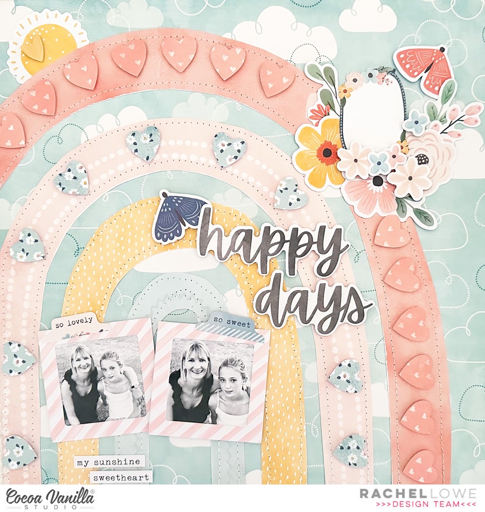
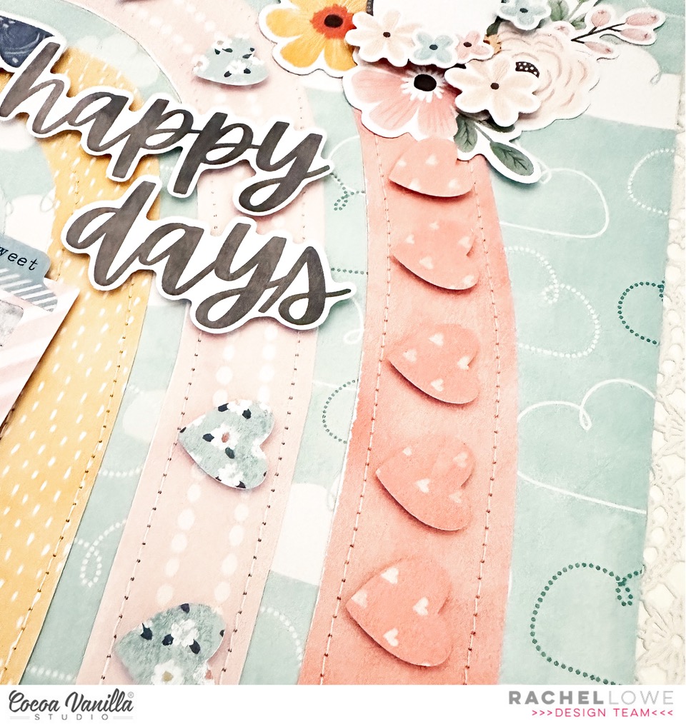
Hello CVS crafty friends, if its Thursday then its a throwback layout today! I have used Daydream to create my layout and just couldn’t go past the rainbow paper no matter how hard I tried lol!
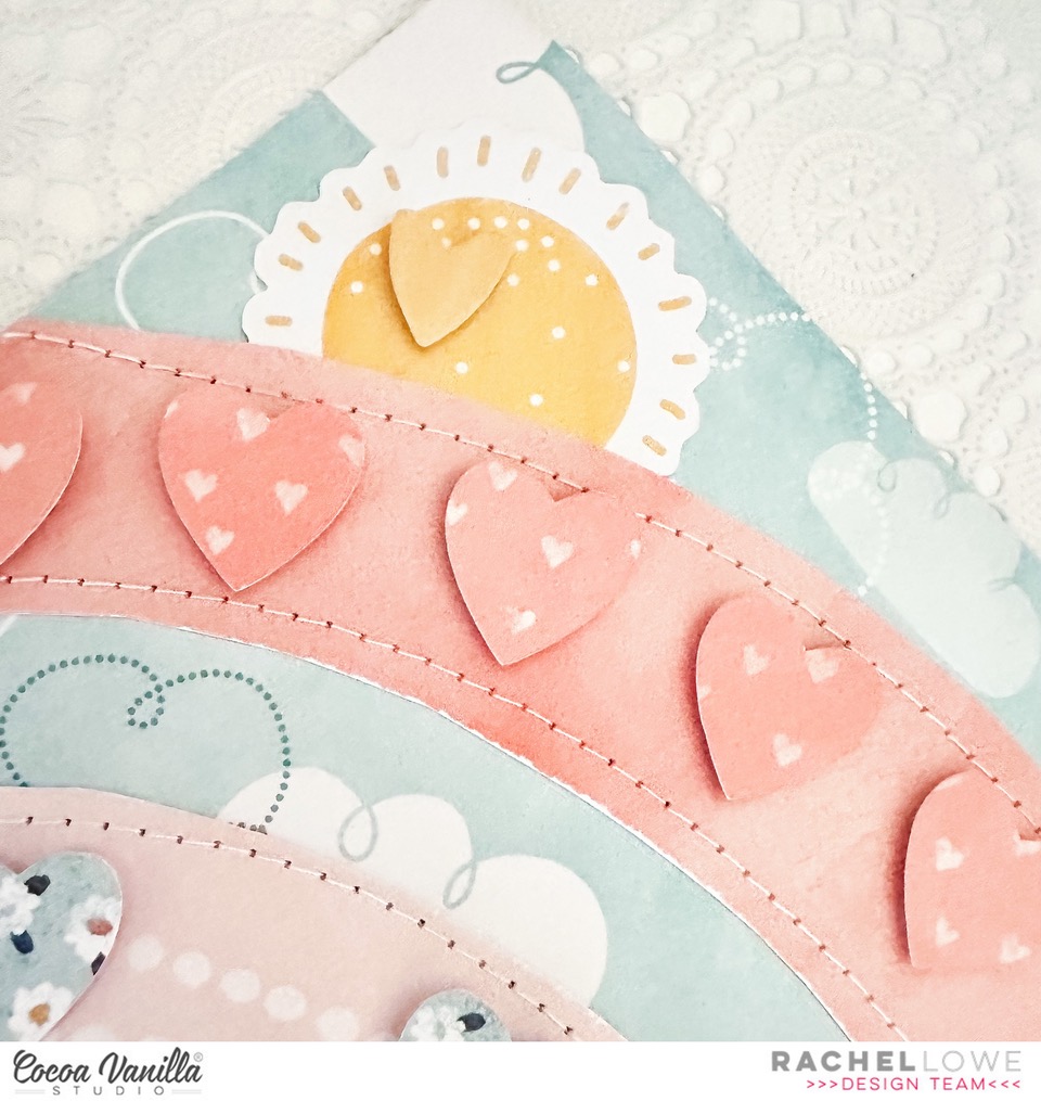
I fussy cut the rainbow strips and machine stitched each one. I dug deep to find the cloud paper from the Sugar and Spice collection (now that is going back a long way!!!), how perfect does the rainbow go on this paper. I punched some hearts in a coordinating colour for the two large rainbow strips and then added them with foam tape to create a 3D effect.
I tucked a sun die cut behind the rainbow and finished this off with a die cut heart. I next added a journal blog and prettied it up with lots of florals. I will go back later and add some journalling.
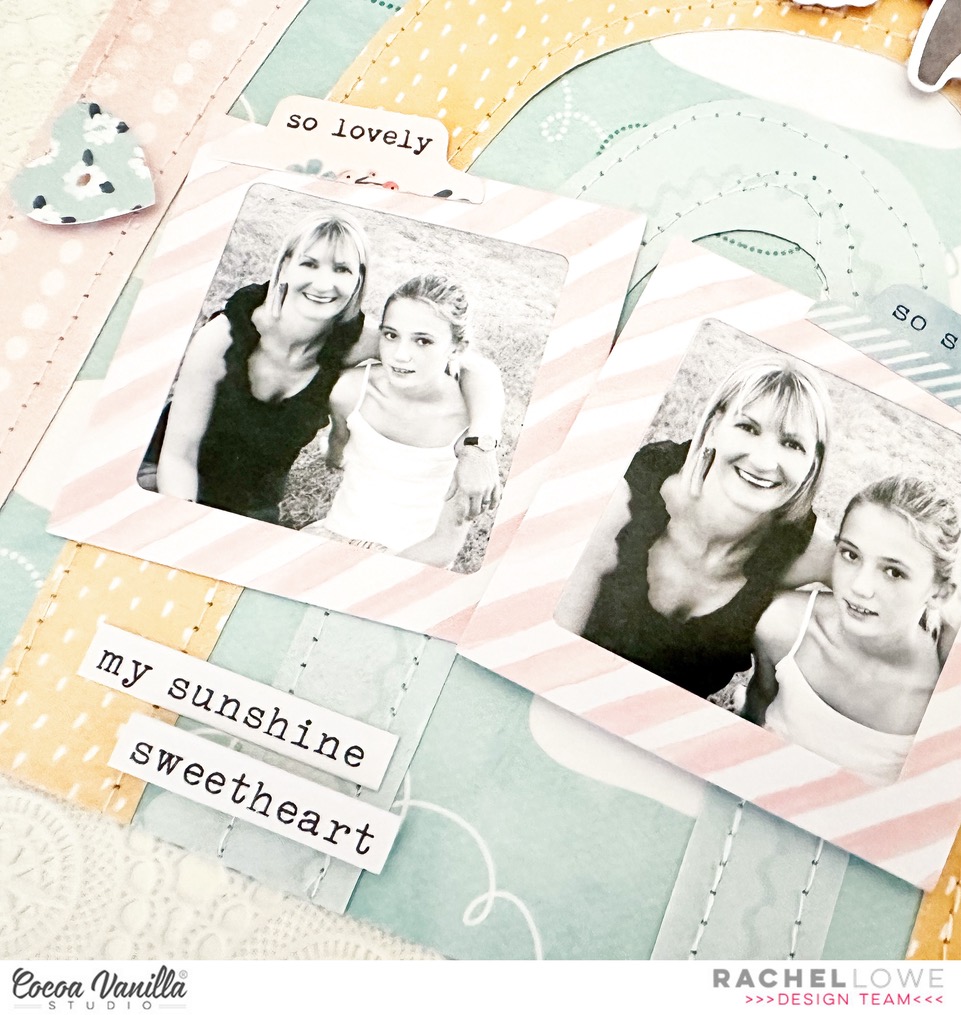
I used two frames from the die cuts to highlight my photos. I used the same photo twice but cropped the second photo focusing on our faces. I love using the phrase sentiment tabs from the accessory sticker sheet on my photos to stop them looking too plain but not overly distracting from the actual photo. I added two phrase sentiment stickers under my photo.
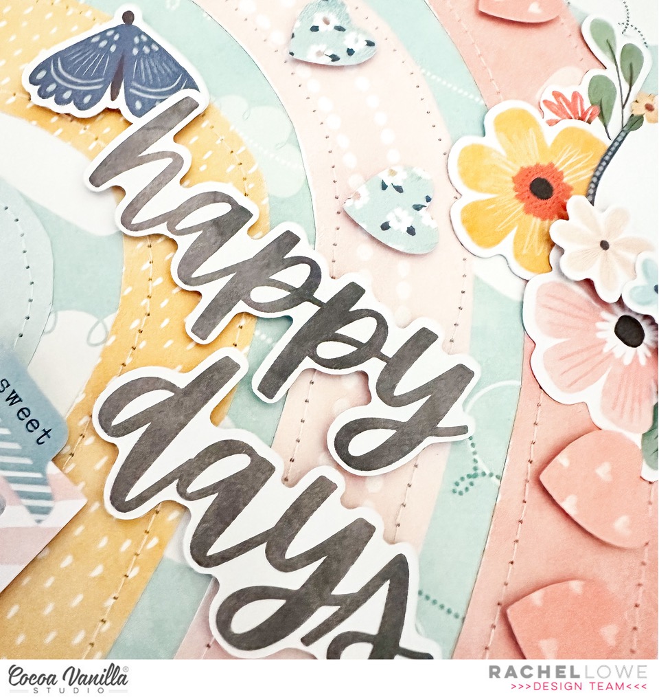
Lastly I added my title using the die cut titles, Happy days which I added with foam tape to create more dimension and finished off by adding some die cut butterflies also added with foam tape.
I love how this turned out! I think it is always good to revisit older collections as you tend to see and use them differently second time around. Thank you for stopping by and see you again soon!
It’s Sophie on the blog today with a new layout to share! I used the lovely new collection Happy Days again!
I cut three rectangles from the A5 Paper pack and stitched them down on white cardstock. I added a little scalloped border on their upper edge, and a zigzag stitch between them.
I printed a colorful photo of Sabrina and mounted it on tissue paper and foam adhesive. My title comes from a JustNickStudio alphabet cut file. I placed a smaller velum rectangle on the yellow one to soften it up so that my title stands out a bit more.
I added a beautiful bicycle die cut from the Ephemera pack and created a ground with watercolors from my stash. I fussy cut tiny little flowers that I scattered on the ground around the bicycle and wrote down my journaling on a sticker from the sticker sheet.
Here are more close-ups:
It’s a very Springy page and I LOVE the bright color scheme!
Today I have a page to share that features ‘watercolour’…this was my DT assignment, and I wont lie by saying I felt confident with this task. If you know my work, you know I’m not a huge user of mixed media. I love the look of it, but Im not confident but I gave it my best shot. Here is my page..
What I decided to do was use watercolour in a controlled way. I started with watering down some distress oxides in co-ordinating colours to the ‘Happy Days‘ collection, then I pulled out some alpha stamps from my stash. I used a paintbrush to paint on the colour onto my ink pads then stamped out some words onto white cardstock. Here is what it looks like close up..
I love the look of the words, they add a really unique look to my page. I used the paper ‘Flutterby’as my main paper and layed it on top of a full 12×12 of the ‘Rainbow Bright’paper. Next, i ripped down from the middle of the ‘Flutterby’ paper and added some of the ‘Little Blossompaper to the inside of the paper to add contrast.
Next, I started on my photo. I added a white border to my photo, then added a layer of the ‘Little Blossom’paper and a layer of the ‘Feel Good’ paper. I then used one of the frame die-cuts (from the ephemera pack) cut in half to add to each side of my photo, and a label tab above my photo. I added some dimensional foam behind my photo to add dimension.
Now that I had my photo in place I decided to get my title in place. I used a label sticker from the ‘Accessory Sticker Sheet’ and some of the ‘Mini Puffy Alphabet’ stickers for the word ‘Choose’ then the word ‘Happy’ from the Die-Cut Ephemera. I added some yellow distress oxide under my title to make it pop and used some of the ‘Puffy Sticker’ hearts around it. At the bottom of the page I added some rainbows from the ‘Feel Good’ paper.
To finish off my page I added some more heart ‘Puffy Stickers’above my photo and added some white ink splatters.
I hope you are inspired to create, and that you might try this watercolour technique or something similar …even if it is outside your comfort zone!
Mandy here today to share a new layout using the beautiful new Happy Days collection! I absolutely love all of the gorgeous bright colours in this collection and for this layout I wanted to create a fun and happy layout featuring all of the colours! What better paper to use for this than the Rainbow Bright paper! I knew that this would be perfect for documenting a photo of my youngest daughter with her besties on her 5th birthday.
The Rainbow Bright paper made such a gorgeous background for this photo and really brought the layout to life! Once I had decided on this paper, I then matted my photo with one of the papers from the A5 Paper Stack. I adhered it to the page using craft foam in order to give it some nice dimension and to help it stand out against all of the bright colours in the background.
For my embellishing I decided to keep it mostly tone-on-tone. So on the pink section of the rainbow I added pink embellishments, on the yellow I added yellow embellishments, and so on. I started with a fun little cluster on the bottom right hand corner of the photo. As this was on the blue and purple section, those were the colours that I chose for this cluster. I included some florals from the Floral Ephemera pack, as well as some that I fussy cut out of the Lush Blooms paper. I also added a couple of DieCuts to the cluster.
Moving over to the left hand side of photo, I added another embellishment cluster using similar items that I used in the first. I tucked some of the flowers under the edge of the photo and some on top to give the cluster some dimension. How gorgeous are the Puffy Hearts?! I couldn’t resist adding one to each of my floral clusters!
I added a third cluster above the photo, creating a visual triangle to draw the viewer’s eye around the page. To keep the clusters looking balanced I again included similar items to the first two. You can also see that I fussy cut a few butterflies out of the Flutterby paper and I scattered these around the page, again keeping them tone-on-tone.
For my title I decided on using the ‘Happy Days’ words from the Die Cut Ephemera pack. I positioned the words so that they curved around the arc of the rainbow. It was the perfect title for this happy photo!
I finished the page off with some typed journalling strips and a few little hearts from the Chipboard Titles pack.
Thanks so much for joining me here on the blog today! I hope that you’re able to create some bright and fun layouts with this collection too!
Hey y’all! Laura Alberts back again with a lovely shelf design featuring the new Happy Days collection. I absolutely adore the bold rainbow patterned paper in this collection and decided to use it with some white cardstock to create these lovely, detailed shelves for my photos to rest on.
Next to each of my photos, I’ve paired it with a cut-apart piece from the A5 paper stack. Love these smaller cut-aparts! This gave me an opportunity to add a journaling spot to the layout. Layering embellishments into large horizontal clusters was a great way to keep the attention on the photos by limiting the attention drawn to each of the individual ephemera pieces.
I used a chipboard title “Love” on one of the smaller shelves. I purposely left plenty of white space and limited my embellishing to my shelves to give my eye a place to rest on the layout. Each set of these shelves is balanced by using similar sized clusters.
I hope this layout inspires you to use your punches in a slightly different way! If you’d like to see how “Love” came together, check out the process video below.
Hello everyone! It’s Anna here with my second page in May. As you can suspect, I am ears deep into brand new “Happy days” collection. It’s so colorful and fun and ideas keep flooding my head. This time I want to share with you layout inspired by all the fruits from “Juicy fruit” paper. I love this pattern so much. We do not have exotic fruits in Poland growing on trees but I remembered about few older photos of Maja eating fruits straigh from the bushes in my mom’s garden. I decided to scrapbooking this memory with all the fruits I could find within “Happy days” collection making a TUTTI FRUTTI page!
To make page even more “fruity” I started my creative process by adding some pineapples into the white background using the only fruity stencil I own. I went crazy with all the fruits on this layout. I used yellow and green Distress Oxide inks and green and yellow mist to add some splatters.
Each of my four photos is backed with a different pattern paper from A5 Paper Stack. It’s a very colorful page so I went with yellow, pink, blue and navy. I also took some time to fussy cut some fruits from “Juicy fruit” paper.
With the photos glued down I could add my lemons, oranges and peaches around them. Some of them went under the photos and some of them on top creating multiply layers. I also found two strawberries in Ephemera Pack and added them too!
This page didn’t need much of embellishing, so I only added few flags, tickets and camera from the Ephemera Pack. It may seem a little bit different as I cut off the white outline to make them blend better into the composition. My title TUTTI FRUTTI is made with pattern papers and some alpha dies. This way I could be sure I will not run out of T letters as they appear in a large quantity in those two words. I tried to add some white inline into each letter but my white pen wasn’t cooperating well.
I finish the composition by adding few tiny, puffy hearts here and there. They are so, so cute!
And that’s all folks! For today :) I will be back in two weeks with a brand new project made with wonderful “Happy days” collection. Sending you all lots of hugs.
Today, I share with you a scrapbook layout I recently created using the beautiful “Storyteller” collection, designed by Cocoa Vanilla Studio. In this blog post, I will walk you through the process of creating a unique background using distress oxide in color of “faded jeans.” Additionally, I’ll show you three different ways to use a single patterned paper, along with a few embellishments, to complete this layout.
To set the foundation for my scrapbook layout, I decided to create a mixed media background using distress oxide ink. The color I use for this layout was “faded jeans.” With its subtle blue tones, it perfectly complemented the overall theme of my layout. The distressed effect added depth and texture to the background, setting the stage for the focal points of my design.
One of the highlights of the “Storyteller” collection is the stunning array of patterned papers it offers. The challenge for today is “one paper, three ways”
Die-Cut Hearts with Blue Patterned Paper: To begin, I adorned the die-cut hearts with a beautiful blue patterned paper from the collection. The heart designs and soft hues added a touch of elegance to the layout. Placing the hearts strategically in the center of the layout.
Next, I carefully hand-cut some flowers from the reverse side of the same patterned paper. The vibrant blooms provided a striking contrast against the blue mixed media background. I made two clusters of flowers on both side of the picture that I cut into a circle.
The third way I employed involved transforming the patterned paper into origami butterflies. This technique showcased the versatility of the paper and added an interactive element to the layout. By skillfully folding the paper, I created charming butterflies that seemed to flutter above the flowers, adding a whimsical touch to the overall design.
In addition to the patterned paper, I enhanced the layout further by incorporating a few embellishments. Wooden buttons, foam title stickers, and die-cut labels. These small details helped to tie everything together.
I would thank you for visiting the Cocoa Vanilla Studio blog today and I hope that I have inspired you in some way through this exploration of the “Storyteller” collection and its limitless creative possibilities. Remember, each scrapbook layout is an opportunity to preserve and share your cherished memories. Embrace your own creativity and enjoy your journey in the world of paper crafting. Have a wonderfully creative day!
Hey Hey! IT’s Michelle here today with a new layout share featuring our AMAZING new collection – Happy Days. I am absolutely LOVING this collection and all its assortment of rainbow goodness, which helps when todays theme is to share my take on using 1 paper – 3 different ways. The paper in question – Sunshine Lollipops. SO much fun to create, lets take a look…
This layout was so much fun to create using this bright happy paper Sunshine Lollipops. I used both sides of the paper to create the rainbow burst edges of the heart, fussy cut rainbows for the embellishments and hand cut letters for Leila’s name using off cuts from the starburst ends.
Here’s a closer look at the gorgeous paper, its oh so pretty!
Theres a lot of colour on this page, so I made sure to balance it out with a lot of white space, and not additional pattern papers
To create the rainbow heart burst I first cut a large heart design on a piece of white cardstock to the right of centre so it would overlap the right edge of the layout. I then added machine stitching around the edge and adhered it in place using foam in only the very centre of the heart. I needed to be able to tuck the strips under this before adhering it completely.
Next I took an entire piece of the Sunshine Lollipops paper and scored lines in the middle of each coloured strip using the scoring blade of my trimmer, then I went along and cut each strip of colour out, then cut each strip in half (6 inches pieces) so that they were easier to manage. I folded each coloured strip along the score line for a little dimension and slightly distressed some of the edges before adhering under the giant white heart in rainbow order.
Once I had all the pieces spaced out evenly I adhered them 1 by 1 using roller adhesive tape, layering in different directions as I went. I trimmed each piece down, and flagged some of the ends for a little added detail.
Next up I sorted out the photos, adhered straight to the white heart without a layered paper stack to distract from the rest of the layout. A cute little moment of ‘Leila the Magical’ riding her trike and making her pinwheel spin
I colour co-ordinated all the embellishments around the layout using a perfect mix of fussy cut flowers from the Lush Blooms paper, some ephemera pieces, stickers and cute little rainbows, mini hearts and stars from the SunshineLollipops paper.
Love a good assortment of rainbow florals
I added the LOVE it piece from the FeelGood cut apart paper, along with the date tag
To create the magical title I fussy cut letters of Leila’s name from the left over SunshineLollipops coloured strips, added the word Magical cut from the Definitive paper, added some handwriting and cute little PuffyAlphaStickers. So cute!
Here’s a final look at the entire layout.. What do you think ? I quite enjoy the fun heart burst effect those rainbow strips created.
Well friends thats all from me today, thank you so much for stopping by. Be sure to share with us in the Facebook Communitygroup if you play along with this same theme, and create something magical with 1 paper – 3 ways.
It’s Tarrah back with you and today I am sharing a new layout featuring the gorgeous, new Happy Days collection!
For this week’s project, I was given the fun task of including the Sunshine and Lollipops paper on my project. There are a total of 3 designers including this paper in their projects this week, so be sure to check out their gorgeous work too!
I have had this lovely photo of my niece printed for ages, don’t you think it goes perfectly with the Sunshine and Lollipops paper?!
I love it when my photos go with my craft supplies!
I chose a plain white cardstock background (as I mostly do) so that those gorgeous colours in the collection can really pop!
I then decided to cut up the Sunshine and Lollipops paper into strips, you can see I cut them so there was a lighter and darker version of each colour together.
I then pulled out my scoreboard and bone scoring tool and scored at every inch. Once this was done, I then just folded the creases in a concertina fashion to create the zig zag/chevron effect on the paper strips. I had to think about how I was going to get the strips to adhere to the plain white cardstock background. I ended up choosing double sided tape, running a piece down the centres of each one and adhering them on the cardstock. I did pull some of the folds out so that some were longer and shorter than others, I love how this turned out.
I adhered my photo at the bottom of the layout, overlapping onto the yellow and green paper strips. I added the ‘Good Times’ die-cut tab from the ephemera pack to the right side of the photo and also adhered my title above the photo. I chose the gorgeous Happy Days cardstock titles also from the ephemera pack for my title and also added a few phrase stickers from the Accessory Sticker sheet to add to the title.
To embellish my layout I chose a tone on tone look. What this means is that you place same or similar colour elements against each other. For instance on the yellow paper strip, I have placed a yellow puffy heart and a yellow flower top and bottom of the paper strip. I repeated the same tone on tone look for each of the paper strips, choosing lots of fun embellishments from the ephemera pack, the puffy hearts pack, the puffy shape stickers and accessory stickers.
I love how the folded paper strips create lots of dimension and shadows on my layout! Some other ways you might recreate this layout is by adhering the paper strips horizontally instead of vertically. Or you could even try weaving them for a really effective look as well! The possibilities are endless! The Sunshine and Lollipops paper would have to be one of my favourite papers in the Happy Days collection! What is your favourite? Lastly I added the heart paper strip to the very bottom of the layout and I stamped the date stamp of when the photo was taken.
Thank you for stopping by the Cocoa Vanilla blog today! I hope you are inspired by my layout and enjoyed reading about how I created it. You are always welcome to recreate this layout if you wish using your Happy Days collection! I would love to see what you come up with!
I love all the different colours and patterns in the Happy Days collection! I just had to create a layout using the gorgeous Juicy Fruit paper and coordinating embellishments, these colours remind me of summer! I have scrapped two photos of me and my youngest which are some of my fav photos of us.
I used the two gingham papers from the A5 paper stack, and so I only had to use one of the 12×12 papers I cut the large circle in the middle so I could use the rest as a border against the white cardstock. My circles measure 7×7 inches, 4×4 inches and 3×3 inches.
I created my title and sub titles using the puffy alphas, using varying colours of the blues on the sheet. I next added the journal block ‘just peachy’ from the A5 paper stack with foam tape to the top circle.
I used this sticker from the Accessory Sticker Sheet so later I could go back and add my own hand writing and date. I don’t usually add a lot of journal spaces or add large titles but this circle design allowed for it to be easily added and look good at the same time.
I next added my photos which I matted using a yellow and aqua colour papers and adhered with foam tape. I created a small floral cluster to the left of the first photo using the Floral Ephemera. I next created another, larger embellishment cluster the right of my second photo, adding the lemon and peach die cuts from the Die Cut Ephemera and more floral blooms. I layered them and some I used foam tape to add dimension.
To finish off my layout I add a phrase sentiment die cut to my photos, a yellow puffy heart and added a butterfly with phrase sticker, who can resist adding a butterfly somewhere on a layout right!!
This is a ‘busy’ page for me but I loved how this came together! Colour choices can make or break a busy layout, so keeping it to three colours allows you to add lots to your layout without it looking too overwhelming or busy.
As always thank you for stopping by and I hope this has inspired you in some way today!


 The Rainbow Bright paper made such a gorgeous background for this photo and really brought the layout to life! Once I had decided on this paper, I then matted my photo with one of the papers from the A5 Paper Stack. I adhered it to the page using craft foam in order to give it some nice dimension and to help it stand out against all of the bright colours in the background.
 For my embellishing I decided to keep it mostly tone-on-tone. So on the pink section of the rainbow I added pink embellishments, on the yellow I added yellow embellishments, and so on. I started with a fun little cluster on the bottom right hand corner of the photo. As this was on the blue and purple section, those were the colours that I chose for this cluster. I included some florals from the Floral Ephemera pack, as well as some that I fussy cut out of the Lush Blooms paper. I also added a couple of Die Cuts to the cluster.
 Moving over to the left hand side of photo, I added another embellishment cluster using similar items that I used in the first. I tucked some of the flowers under the edge of the photo and some on top to give the cluster some dimension. How gorgeous are the Puffy Hearts?! I couldn’t resist adding one to each of my floral clusters!


 To set the foundation for my scrapbook layout, I decided to create a mixed media background using distress oxide ink. The color I use for this layout was “faded jeans.” With its subtle blue tones, it perfectly complemented the overall theme of my layout. The distressed effect added depth and texture to the background, setting the stage for the focal points of my design.


