It’s Tarrah back with you and today I am sharing a new layout using the gorgeous Free Spirit collection. Today my inspiration comes from the awesome sketch from Page Maps some of the design team were given to work with for this week.
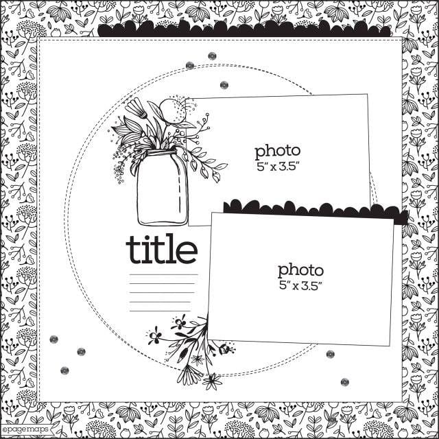
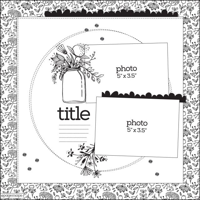
Here is the awesome Page Maps sketch we were given for inspiration. It can be found under the October 2018 archives here
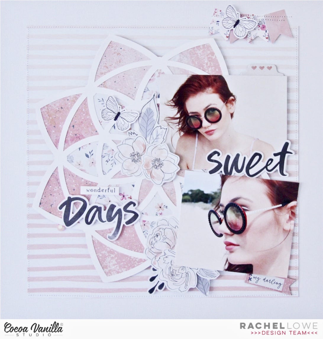
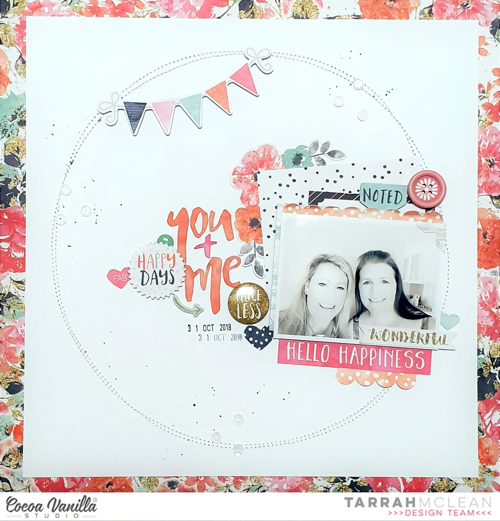
I still have a few bits from some of the older CVS collections so I decided to pull out the pretty Free Spirit collection and work with that. I stuck to the sketch design pretty closely, even adding the same elements the sketch suggested. I changed it slightly to balance the page and also replaced a suggested photo for paper instead. I started off by trimming some white cardstock down and then machine stitching 2 circles. I then adhered the white cardstock to one of the gorgeous floral papers. 
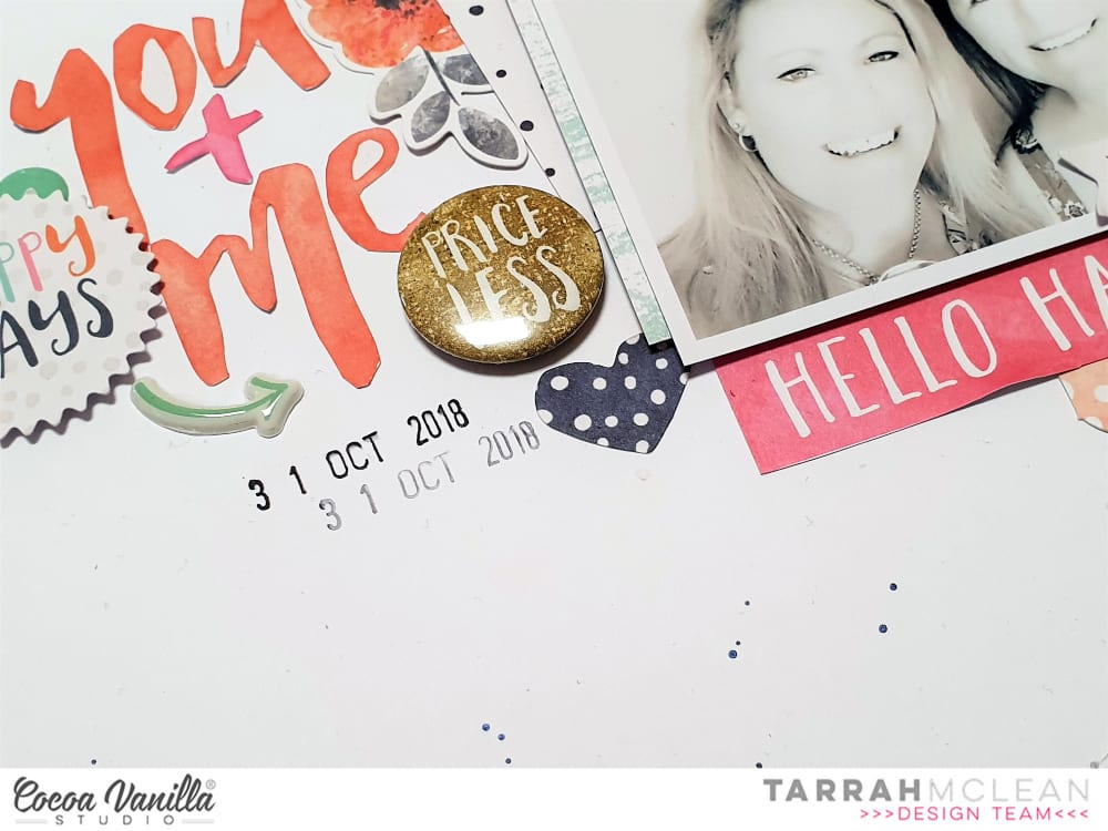
I matted my photo with one of the papers from the Free Spirit collection and also layered another one above to replace the 2nd photo as I mentioned earlier. I also added some of the journal spots as a layering piece. I added one of the scalloped border stickers above the photo of my sister and I also added a few embellishments to this area also. I fussy cut the ‘You and Me’ title from one of the journal cards included on one of the papers from the Free Spirit collection and positioned it where the sketch suggested. 
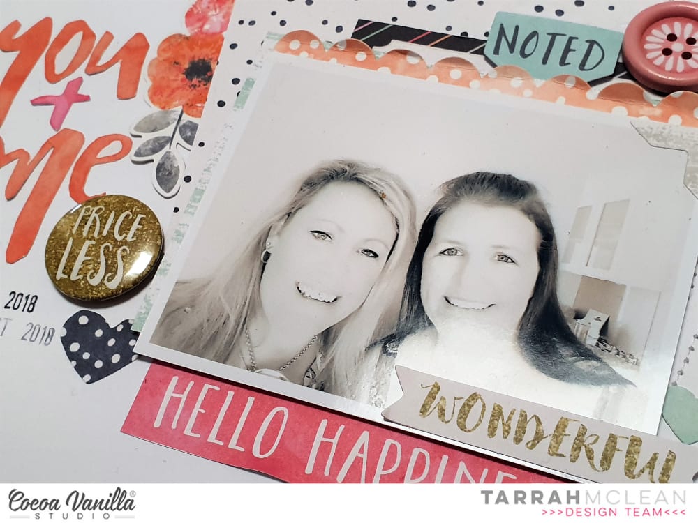
I cut out the pink phrase ‘Hello Happiness’ and added that tucked in under my photo and also layered the ‘Wonderful’ die-cut phrases over the photo also. One of the cute flair buttons and a die-cut heart were added to the left of the photo. On the sketch, the suggestion is to place a large embellishment like a jar of flowers, I added one of the floral stickers from the accessory sticker sheet here instead and I really like how it looks. 
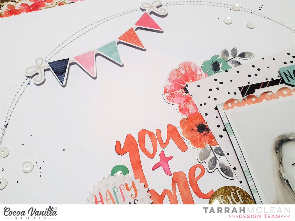
Lastly I added the die cut banner popped up using pop dots to the top left corner touching the machine stitching, I also sprinkled some white sequins around and some navy Heidi shine mist. The date stamp was the very last thing added and that completes my layout.
Be sure to check out Page Maps for inspiration, there are so many designs over there to kick start your creativity.
Check them out and get creating with your favourite Cocoa Vanilla collection!
Hi everyone Rachel here and today I have a sketch inspired layout using the beautiful Midnight collection.
I love sketches, they really help get your mojo going! This sketch is from Page Maps.
I had not used the beautiful large die cut from the collection but this sketch totally inspired me to use it. Instead of leaving it as a circle, I altered it by cutting it into a flower shape, including the paper background.
I cut down the gorgeous pink and white striped paper, leaving my white cardstock as my border. I machine stitched to add definition around the pink and white striped paper.
I next added my two photos which are 5×4 inches with foam tape so I could embellishments later. I created two floral clusters next to each photo.
I clustered one floral bunch over and on my photo, but on the other photo I layered my flowers under my photo. This creates more visual interest and although you are repeating the same concept it will look different.
I added my titles with foam tape so they stood out.
Then it was adding little finishing touches! I added a banner embellishment at the top of my page, adding some machine stitching a butterfly which I added with foam tape.
I added some more sticker butterflies from the accessory sticker sheet and also added a tab behind the top photo. I added some extra leaves and sprigs in my floral bunches from the die cut ephemera pack
I love how this turned out and the sketch really pushed me, like using two larger photos for me was a challenge lol! I also love how many layers there are to this layout.
Well that’s it from me today, make sure if you try this sketch post on the CVS FB page so we can all see your take! See you again soon.
Hello there! It’s Kylie back on the blog today and I’m sharing a brand new layout I have just completed featuring the “Happiness” collection. Sometimes I get Scrappers block when it comes to working and bringing a layout together. I think it happens to all of us at some point. That’s where using a sketch design becomes so helpful.For my layout today I am using a sketch design by Page Maps. You can find a whole bunch of page sketches via their website.The one I am using today is from the archives, October 2018.
I must admit, when using a page sketch I am sometimes a little bit of a rebel. I like to mix it up a little, bringing elements of the sketch into my layout and add my own touches.
I decided to use a white background for my layout and trimmed 3 cm off each edge before adhering to the lovely MEADOW paper. Instead of white thread, I machine stitched my circle and border in a light pink cotton.This made it stand out a little more from the background. A small plate was used to trace around to give me a template for my circle. I then stitched around it 3 or 4 times so it had a lovely thick edge.
I really loved the scalloped border used in the sketch so I cut 2 from a cut file from the Silhouette Design Store and added them to the top and underside of my page.
My photo was printed a little smaller so that it fitted nicely for my circle. I printed it twice and have layered both together, backed with some tissue paper from my craft stash. The floral die cuts from the Happiness collection are so gorgeous and I have layered them around my photos keeping them well balanced.
In keeping with the sketch theme I borrowed a mason jar die cut from the ‘Midnight’ collection to add into my layout. It too was centred with floral blooms for balance. I’ve layered some with foam tape so that it gives the overall appearance balance.The adhesive sticker sheet was perfect for adding in some of the typed sentiments as a sub title.
To complete my layout I added some watercolour splatters and a large title with the phrase die cuts. I was nearly finished at this stage but decided to add some punched flowers.These are quite small but I scattered them randomly around my layout.
Thanks for stopping by the blog today. I hope you enjoyed seeing my latest layout.
Hello Cocoa Vanilla family, and welcome back to the blog! This week, my assignment was to play with a sketch from Page Maps and it was an interesting assignment because sketches and I generally do not get along. I think sketches are a double edged sword – they are literally the very definition of bittersweet. For a newer scrapbooker or even if you just need a bit of inspiration, they are a godsend, especially if you don’t know where to start. However, I always feel like I’m struggling to get all of the things on the page and the layout feels constrained instead of a free expression of creativity like scrapbooking normally is for me. So what I decided to do for this layout was pick a few elements from the sketch that I liked and work them into my overall design.
Here is the Page Maps sketch from October 2018 that we were working with.
I love paper layers, so I kept that aspect, as well as the big circle element, and to challenge myself, I decided to work with horizontal photos, which is something I never do. With all of the my bits and pieces sorted out, I pulled out the Happiness collection and decided to scrap a photo of my sister and her husband at their baby shower this summer.
Before I did anything else, I distressed the edges of the sheets and layered my papers for my background so I had an idea of how much white space I had to play with. I then used some watercolor paints to paint a series of concentric circle like shapes. They are definitely more oval than circular, but I painted them in shades of blue and green. Next, I matted my photos – I printed them in 3×2 so considerably smaller than the sketch was calling for – using papers from the 6×8 patterned paper pad.
After arranging my photos on my background, I worked on embellishing. This week, I used the ephemera pack, as well as a flair button, the cardstock stickers and the clear sticker packs. I aimed for a more monochromatic layout, which was challenging in itself because my layouts tend to be very pink and floral and this was my first time attempting a more “masculine” layout and I restricted myself to blues, greens, and butterflies. While I was creating the clusters around the photos, I also created the cluster in the top left corner as the sketch had a bit of paper layered in the upper corner and this is very much my speed.
Next, I went to work on my title. I knew I wanted a bigger, more whimsical font to spell out the baby’s name, and since the shower colors were blue and gold, I used this old pack of gold thickers that I had in my stash. To finish my title, I added the word “hello” from the cardstock title pack, and embellished with a combination of stickers and ephemera hearts. The gold looked a bit out of place since there was nothing else metallic on the layout so I pulled out my trusty color shine in gold and added some splatter to add some sparkle and shine to the layout.
That’s all I have for you today, guys! It was a bit of an experience making this sketch my own but once I got into the groove of things, it became much smoother to hit the ground running and to do things that made this layout my own. I hope you found inspiration here and you try to create something using this sketch today. Till next time, keep it crafty friends.
I hope you are having a wonderful day, thanks for popping by the blog! Gwen here today sharing a new layout featuring my favourite CVS collection of all time ‘Bohemian Dream‘. It’s crazy to me that I call it that, as I’m not normally a lover of purple, but this collection just nails it for me! I’ve paired it with a CUT to YOU cut file, to document a sweet photo of my little miss.
I didn’t really have a story to document with this photo, it was taken on a random day, but these are actually my favourite kinds of photos to scrap. I use them in my albums to share with my daughter just how loved she is. I love that when she flips the pages she can see lovely messages about living her dream, shining bright and that she is so loved and this collection for me is perfect for doing that!
Ok, so onto the layout! I started by backing my cut file. I’ve used a combination of the ‘Abstract‘ paper and the ‘Abundant‘ paper to add stripes to my butterflies. Yes, this took a while, but I think the end result is worth it. Once that was done, I’ve used some watercolours to add patches of watercolour over some of the flowers on the cut file. I’ve also left some of the flowers plain white.
Next, I’ve matted my photo, I’ve used more of the ‘Abstract‘ paper for this and stitched around the edge as I do with most of my layouts. It was now time to think about the background of my page. For this, I’ve grabbed a plain white piece of cardstock and added more of the same watercolours that I used on the cut file. I think this helps the page come together with a consistent look. Once happy with the watercolour background, I’ve mounted the entire sheet onto more of the ‘Abundant‘ paper and stitched around the edge.
With the background looking good, and the cut file done, it was now time to bring everything together. I’ve mounted the cut file piece onto some foam tape and added to my background. I’ve then added in my photo, mounting it as well for extra dimension.
Now for the fun bit! I’ve gone through all of the wonderful bits and pieces from the collection to see what I could add to my page. I’ve started with the ‘Ephemera Pack‘ as well as the ‘Flair Buttons‘. I’ve grabbed my title from the chipboard embellishment pack and also added some stickers from the ‘Accessory Stickers‘ sheet.
I’ve just pulled out anything I think would fit and then auditioned them in various spots all over my page. I must say, I am totally crushing on the watercolour flowers in this collection, they really suit this layout with the other watercolour elements I’ve added. I’ve finished off the page with some enamel dots and a plain white button from my stash.
Thanks for popping by today to see my latest project. I really enjoyed putting this one together, even though it did take a little while with the details of the cut file! If you don’t have any of the Bohemian Dream collection yet I urge you to go and grab some while you still can, it really is a beautiful collection!
Mandy here with you today to share a layout featuring the awesome Boys Rulecollection! I love all of the colours and patterns in this collection, and I knew that it would be perfect for scrapbooking these photos of Isaac dressed up for book week earlier this year. They had to come dressed up as someone who inspires them, and seeing as Isaac takes after his Dad with his love of the cinema, he decided to go as Steven Spielberg.
I started my layout off with the reverse side of the Messed Up patterned paper as my background, which I trimmed down and matted on the reverse side of the Happy Go Lucky paper. I also added a doodled border around the edge of the page which helps to frame the layout and adds some extra detail. Next I adhered a 6 inch strip of white cardstock to the background towards the right hand side of the page. I tucked a strip of the green side of the Straight & Narrow patterned paper underneath the white cardstock to add a pop of colour.
I created two separate photo clusters on the layout, and I positioned them in a way that it draws your eye diagonally down the page. The first is in the top right hand corner, where I added two photos. I printed my photos slightly smaller than 3×4 inches with a thin white border around them, and then I used the Fun & Games cut apart sheet to mat each of the photos. I created an embellishment cluster to the right of of the photos using a camera, which I fussy cut out of the Boy Stuff patterned paper, a flair button, a star from the accessory sticker sheet, and a wood veneer arrow from the You Rock collection.
The third photo I positioned at the bottom of the page, and I layered embellishments under and around the photo to give it lots of interest and to draw the viewer’s eye towards it. I used a couple of chipboard pieces, as well as a wood veneer star, all from the You Rock collection, and I also layered a die cut frame from the Boys Rule Miscellany pack behind the photo.
For my title, I cut out one of the pieces from the Boy Stuff patterned paper, and I combined it with the Totally Rad Alphabet Stickers, to create the phrase ‘Always be Yourself Unless you can be a Director’. I love how this turned out and I think it adds a bit of fun to the page. I wrote my journaling underneath the title, and then I finished the layout off with a few more stars from the accessory sticker sheet.
Thanks so much for joining me here on the blog today. I hope you enjoyed taking a look at how I created my layout. I’ll be back next month with some more inspiration to share with you.
Today i’m sharing a fun colourful layout using the midnight collection..for our Throwback Thursday.
So when I sit down to create a layout I always go through all the patterned papers to get a sense of what I want to create and the flowers on the sophisticated patterned paper just seemed to pop out at me and I had a idea how I would use them.
So I started with choosing 3 patterned papers… bloom and grow B side for my background border behind my white cardstock; Inky depths B side for my anchor cut file from the Silhouette Design store ID 186949; and sophisticated to fussy cut those beautiful flowers. And before adhered my anchor to my cardstock I decided to add some mixed media through a script stencil over the top to add a bit more texture to it
Then next using the midnight 6×8 paper pad I chose a few papers to matt my photo on before adhering on to of the anchor. Then I fussy cut a bunch of the flowers out from the sophisticated patterned paper then decided they would look great with some watercolour. And what’s great about the patterned papers are that they are thick enough that they can take a bit of water before the paper starts balling up.
Then after I coloured then I started adding then and clustering then around the photo and anchor tucking them underneath the photo and adding some on double sided foam tape. I added a few leaves from the ephemera pack around and tucking them in the flower clusters. For my title I decided on a sticker from the accessory sticker sheet and I placed it in the middle of one of the flowers.
Then using the clear stickers I added the little crosses around the anchor just tucking them underneath the edges. To add more colour and texture to the background then I couldn’t resist add a little bit of bling with some rhinestones in the center of a few little fussy cut flowers added around the top and bottom of the anchor.
I’ve also created a process video of how I created this layout
I hope you have a enjoyed my inspiration for today
Hello Friends! It’s Anna here with my project created for “Put a ring on it” theme week on the CVS blog. The new, amazing line has been revealed recently and I decided I need to make some space in my stash for new, pretty papers. I reached for the older lines and “Free spirit” one caught my eye. I was inspired by the color scheme and I decided to use it on my page. This collection is no longer avialable but you can easily replace it with some other, older but still pretty items from CVS. And you know what? You have a perfect opportunity to stock up on them becase there is a big sale happening on CVS site now!!! You have to check it out because what’s gone, it’s gone forever.
Because the theme of this week is all about circles, I decided to use a lof of them to build up my composition. I mixed several pattern papers in blue, pink and orange colors to cut my circles in different sizes. Before I glued them down, I used watercolor paints and painted circles on my white background paper. They are slightly bigger than the ones made of paper.
After my circles were done, I fussy cut some comic bubbles with words and hearts from one of the pattern papers and used them in my composition. I also added few bits and pieces from epherema pack. Wooden buttons are one of my favourite embellishments and I always tend to save them for later. I added few on them on the page too.
I finished my composition adding few enamel dots from various sets. I love how airy and delicate this page turned out. I must tell you I really love rediscovering older lines. I still want all the new stuff right after it appears in the shop but It feel so good to reach for older lines too. They all deserve to be loved.
Thank you for stopping by and see you in two weeks.
Amanda here, and today I am sharing my take on this week’s design team theme post using the divine MIDNIGHT collection. The theme this week is….
creations that “put a ring on it”.
Think rings, wreaths, circles, dots – basically include any round element! Such a fun theme!
Here’s what I came up with….
“Love This”
Oh.my.heart!!! So dreamy & divine!
The MIDNIGHT collection is so elegant & beautiful! It’s the perfect collection for documenting stories of my sweet girl!
Here’s a closer look for you….
So incredibly beautiful!
I start this layout with pattern paper, CV-MN007 INKY DEPTHS – it’s the perfect base! Such a stunning background paper & I just love how it reminds me of the night sky and clouds. To this paper, I trace a circle shape to create a guideline for my wreath (ring) design.
To form the wreath, I fussy cut pattern paper CV-MN001 BLOOM &GROW. I arrange these larger blooms over the traced circle, and adhere with a mix of double sided tape and foam mounting tape. This adds a sense of dimension, soft texture, and brings interest to the design.
I also fussy cut the wreath icon from the CV-MN006 ALL THE THINGS pattern paper, and adhere it to the opening of my ring design (top right corner). Here’s a close up for you…
SO pretty!!!
Next, I pull out my gel pens, and draw a mix of sketchy leaves that are not dissimilar to that of the BLOOM & GROW pattern paper. The white gel pen is super striking on the INKY DEPTHS paper!
The scribbled leaves serve two purposes – they add a new design element (& visual stimulus) to the layout, plus they also ‘build up’ the wreath so that it looks full and attractive. In keeping with the whimsical feeling of the page, I add lots of tiny dots in both white, pink & blue pen.
I just LOVE how effective the gel pen looks!
Design Tip: If you like this look, but are nervous about drawing on your layouts, you could always achieve the same look using stamps and white embossing powder.
Next, I tuck my photo into the left hand side of the wreath and decorate around it with a few ACCESSORY STICKERS. I also embellish with that fabulous FLAIR BUTTON (which also features a pretty wreath on it!). Lots of rings and wreaths and pretties on this sweet page!
With the ACCESSORY STICKERS handy, I also add some butterflies to the wreath and add a subtitle to the bottom right corner, Love you so….
Hello Scrappy friends It’s Michelle back today with a new layout share! This is definitely one to be added to the favourites using the Happiness collection and a pretty awesome cut file from fellow DT member Gwen.
The sweet photo I’ve chosen to document is of Leila taken back on Mothers Day with her ‘new’ friend Kermit – best op shop find ever! She truly is an awesome kid, and this cut file from CUT to YOU was the perfect accompaniment for this collection. I managed to pull all of this together with just scraps of papers used on previous creations and 1 full piece of pattern paper for the background edging.
I backed all the pieces of the cut file using the scraps I mentioned before then adhered to the white cardstock using some foam tape for dimension. I layered the cardstock with a full piece of my favourite MEADOW paper for even more colour, and sewed around the edging using white thread.
I added some more of my favourite paper colours to the photo stack. These are the smaller designs you can find in the 6×8 paper pad.
At the top of the photo and bottom of the cut file I added some floral ephemera pieces to give the slight hint of a diagonal design element. I also used the negative star pieces left over from the cut file and some enamel dots (which are making a come back with our upcoming collection and goodness I am excited about it)
Lastly I added a sprinkling of gold colour shine, some handwritten journalling and a date stamp to complete the page.
Well thats all for today. Be sure to pop by the CVS Community group on facebook to share all your scrappy goodness using all things COCOA VANILLA STUDIO