Favorite Days | Day Dream | Anita Bownds
Hi crafty friends,
Anita here with you today sharing my first layout of the new year using day dream collection
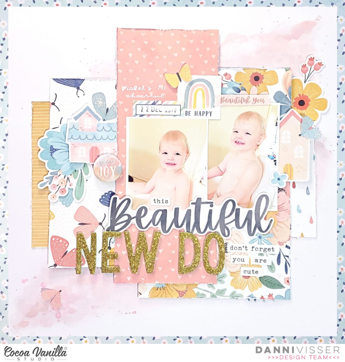
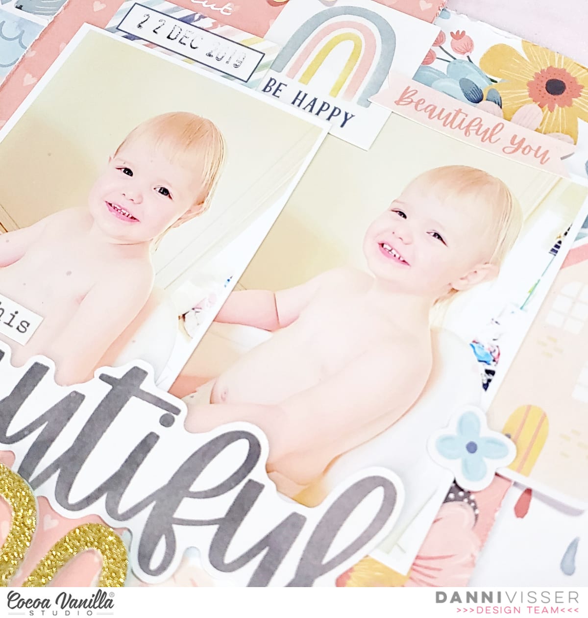
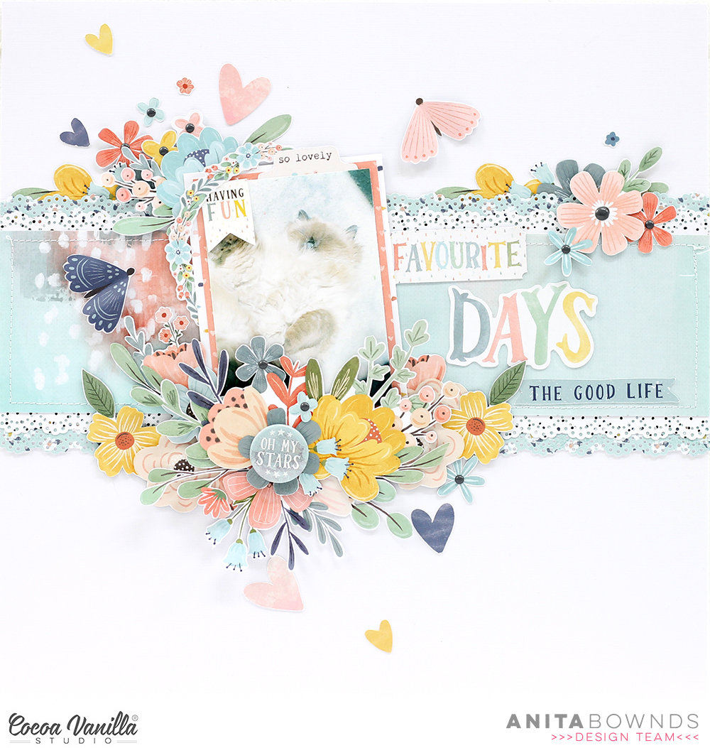
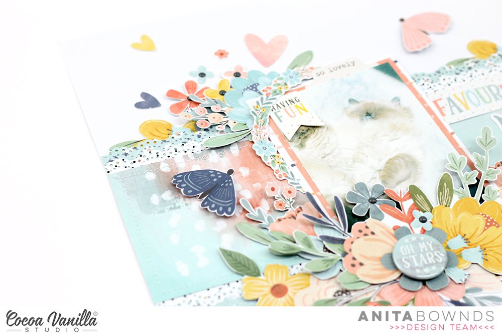
My photo is of my kitty enjoying the morning sun in front of the window this was before we decided that all that fluff needed to be shaved off … and yep he wasn’t happy about losing his fluff!!
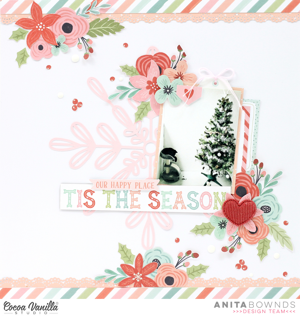
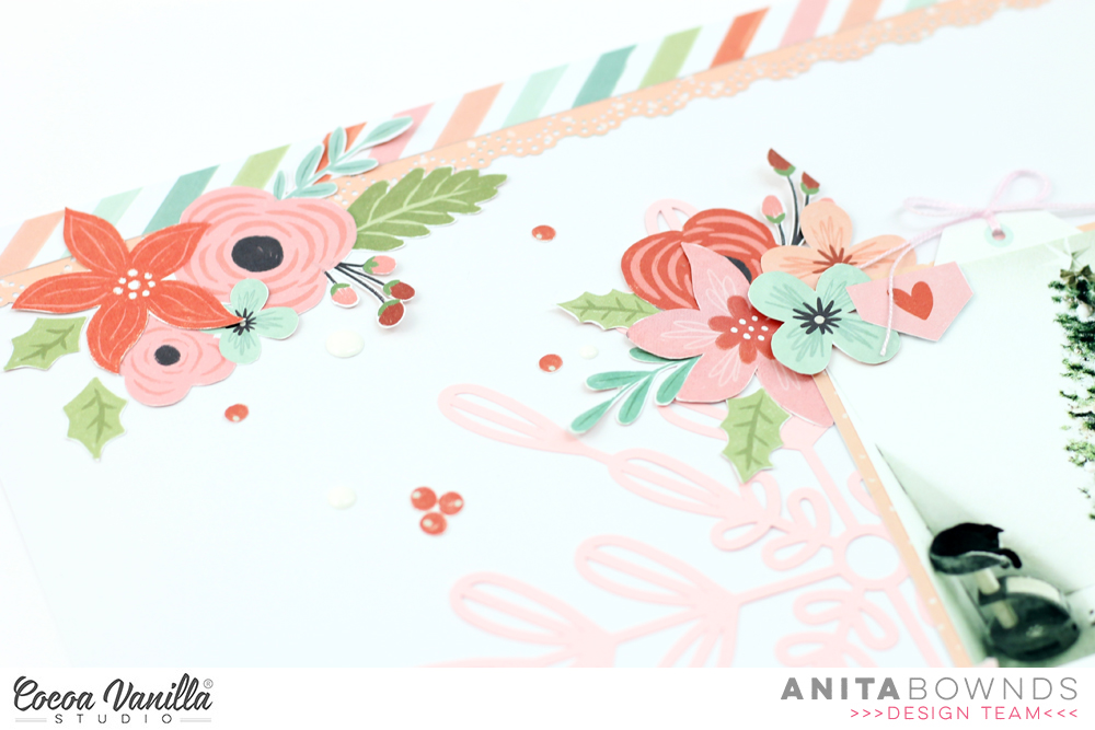
I started off by trimming a 12×12 by 5 inch strip from sweet serenity and machine stitching around the edges then I cut 2 more little strips 1 inch by 12×12 from sweet serenity then using daisy days I cut 2 more strips 12×12 by inch and then with all the little strips I punched a border on each of them

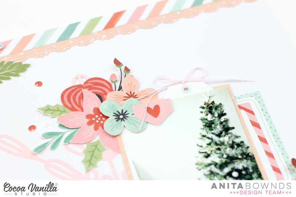
Then I matted my photo on papers from the 6×8 paper pad ( you can substitute the 6×8 for the 12×12 using all aflutter and sun shower ) I then tucked a the circle ephemera piece behind the photo that I fussy cut around the edges.
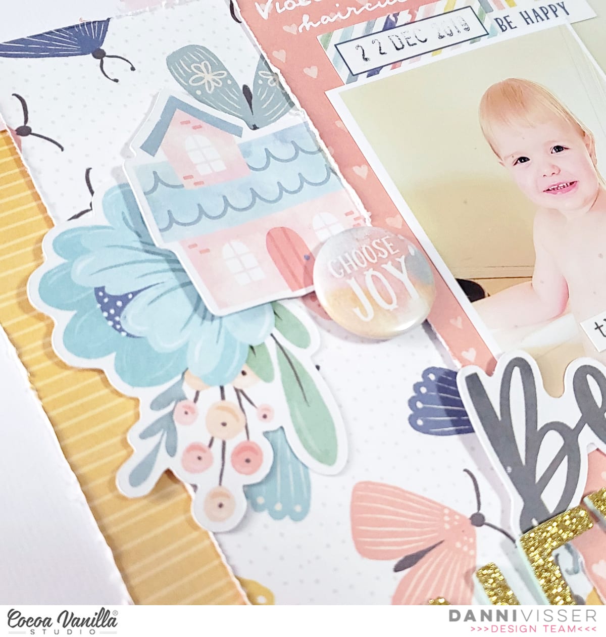
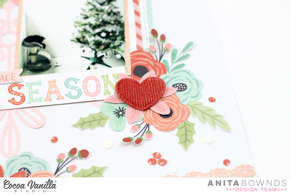
Using garden variety pattern paper I fussy cut out a bunch of flowers and started adding flowers around the bottom of my photo along with flowers from the ephemera pack that I fussy cut around to match the rest of the fussy cut flowers
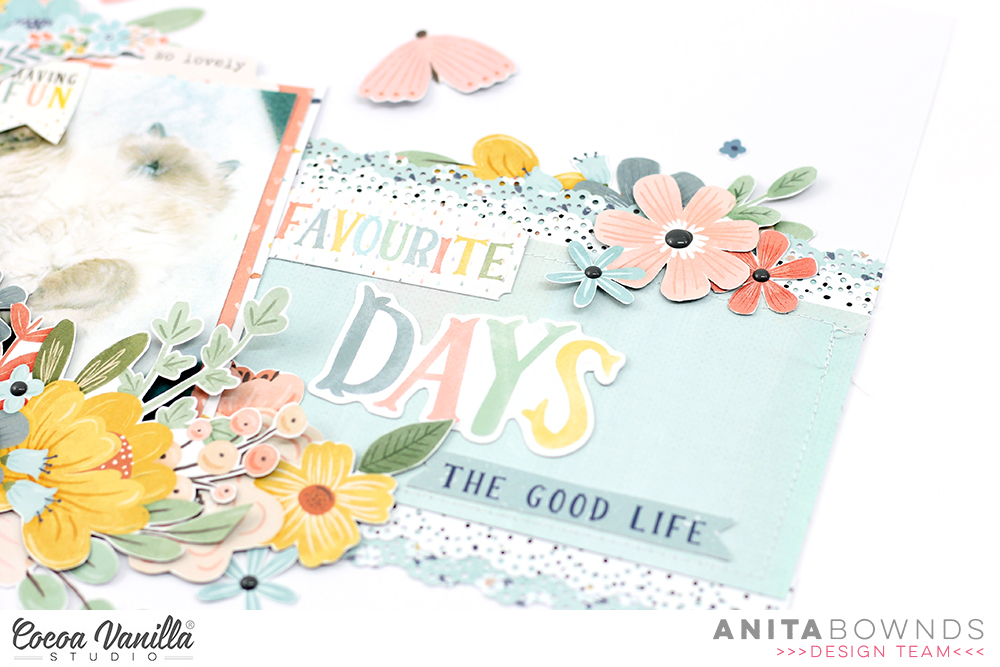
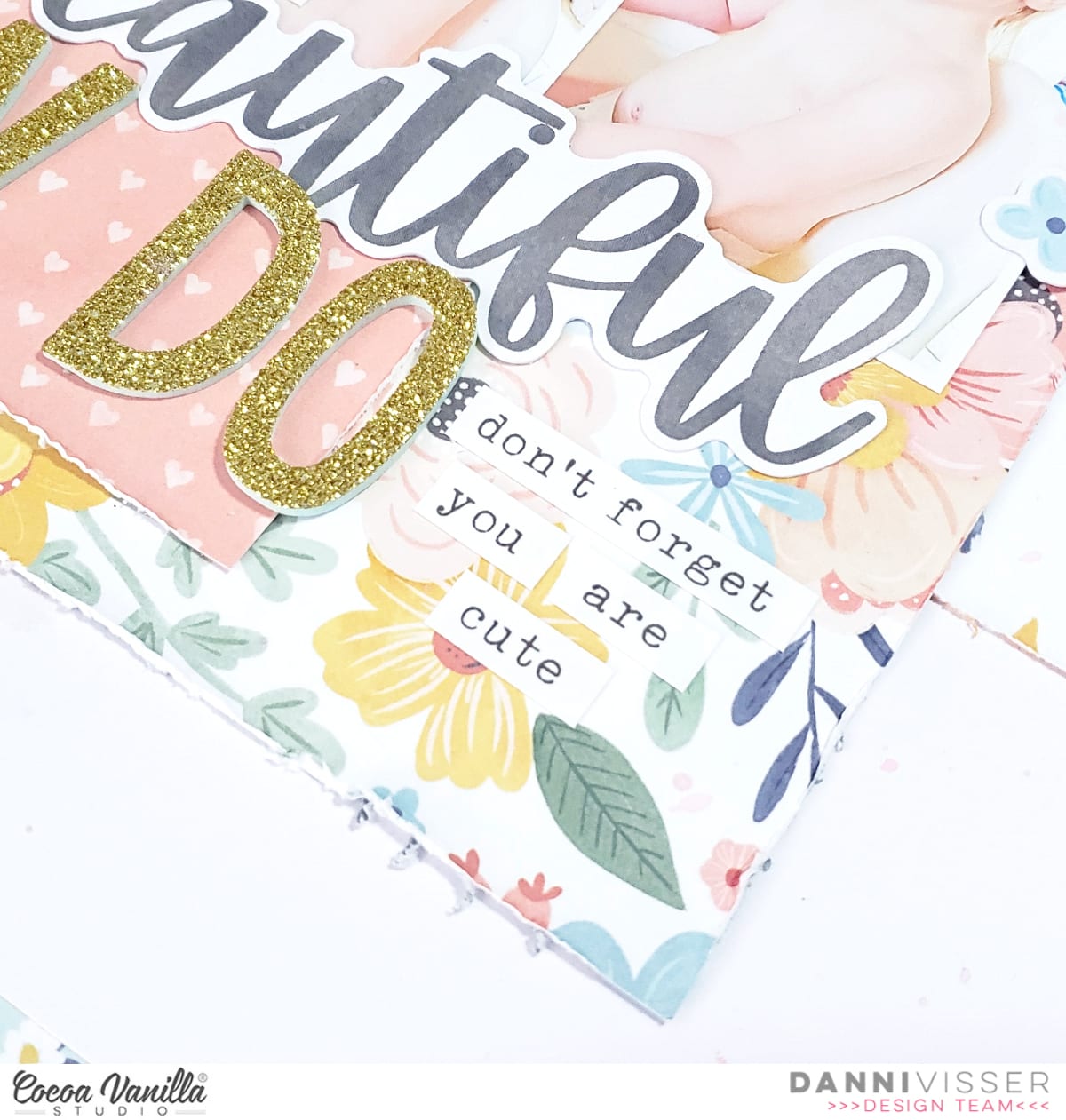
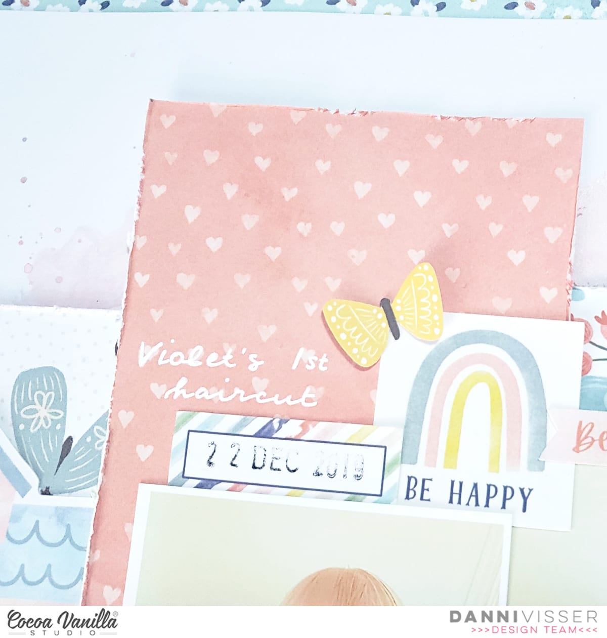
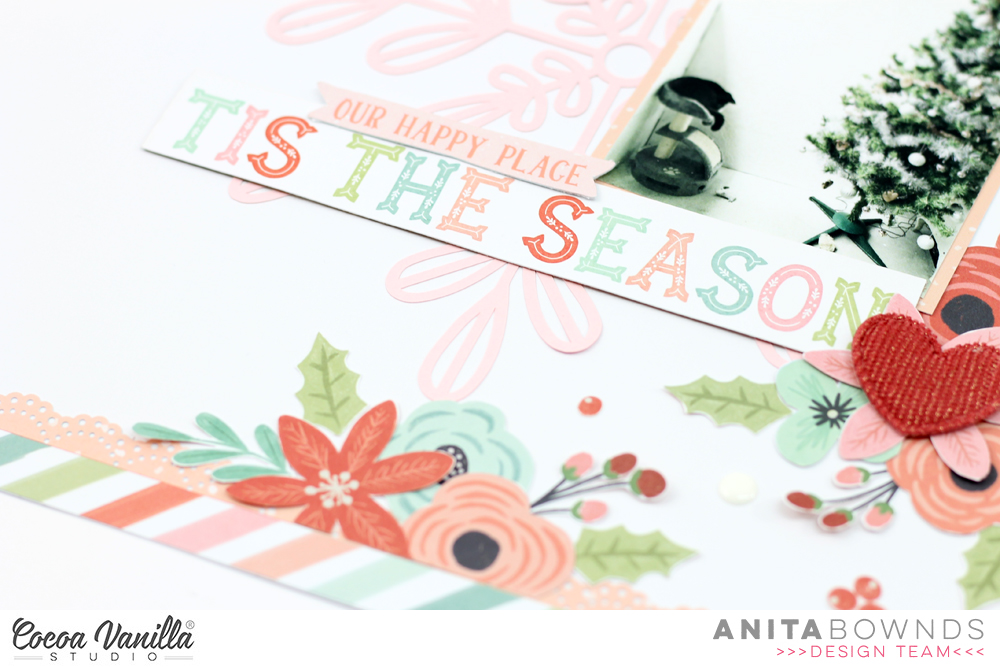
I added ephemera around my photo and more clusters of flowers around the photo and to the right side of the layout I also added some other bits from the ephemera, butterflies and my title then finished off with hearts around the flower clusters and enamel dots in the center’s of the fussy cut flowers..

pop on over to the cocoa vanilla YouTube and watch my process video

I hope you have enjoyed my floral inspiration today
Happy crafting..