Christmas Family Traditions | Merry and Bright Collection | Danni Visser
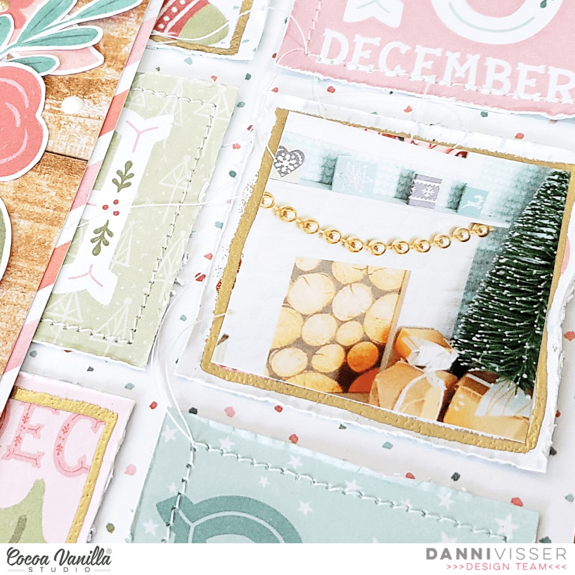
Hi there scrappers! Danni here with another 12×12 layout. I am well and truly gearing up for the festive season and getting creative with the gorgeous Merry and Bright collection. I was inspired this time by the amazing Countdown 12×12 patterned paper with the gorgeous advent calendar-style squares, which I decided were perfect to document the advent calendar I made a few years ago.
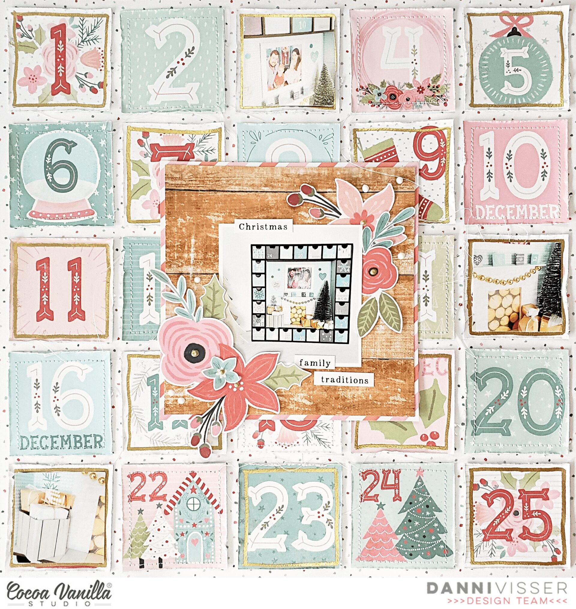
To begin with I chopped straight into the paper and cut all the numbered squares apart. To add texture, I first distressed all the edges, then went through and stitched around the border of half the squares with my sewing machine and white thread. I left all the loose ends free to add even more soft textural elements to the layout. For the remaining squares, I used a heat embossing ink pen, gold embossing powder and a heating tool to add a shiny gold border. I just love gold for the festive season!
Once all my squares were ready, I laid them out on top of the Happy Holidays 12×12 patterned paper. I really love that the background is mostly white, but you can just see a sprinkling of the teeny tiny polka dots peeking out from between the squares.
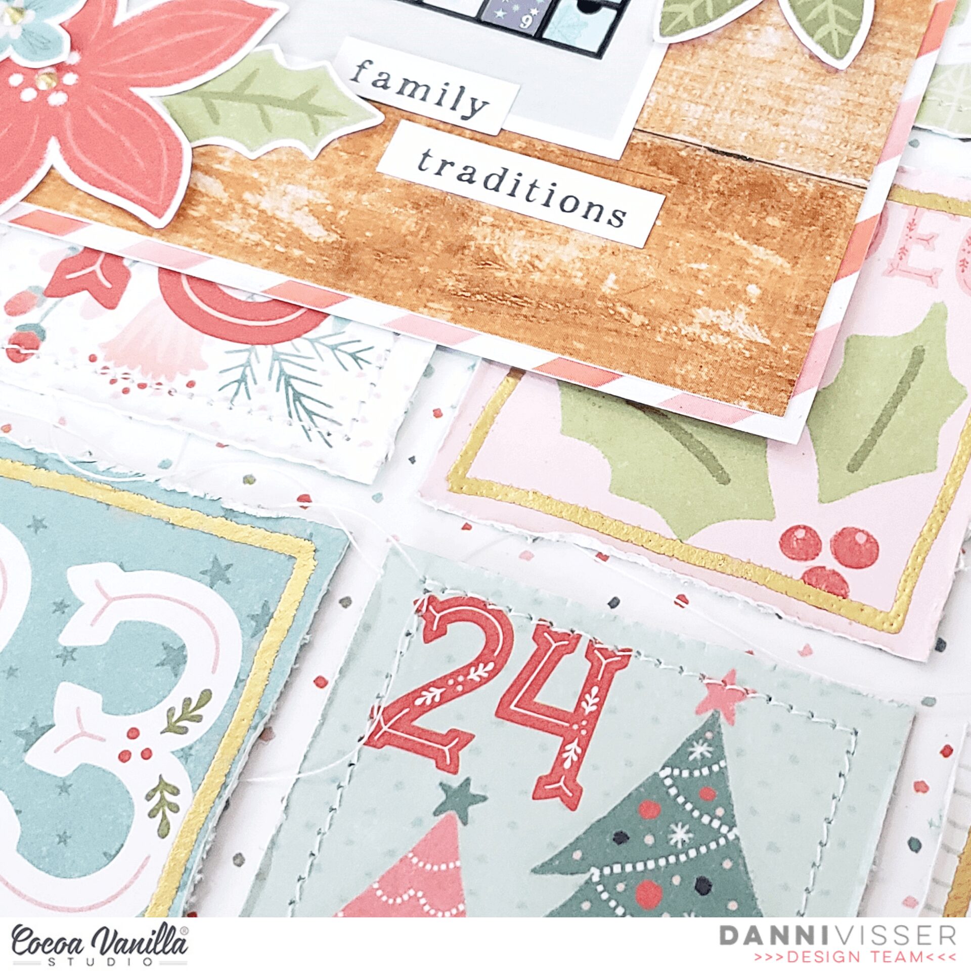
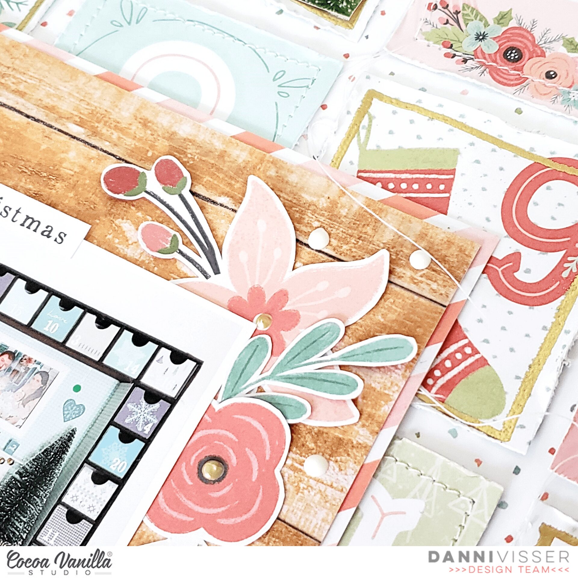
Using the woodgrain and candy stripe papers from the A5 paper stack I made a square photo mat in the centre of my layout. I had originally printed a collage photo for this, but I didn’t love how it looked so I cut it apart into individual photos, keeping the main one in the centre and placing the rest randomly on top of some of the numbers.
With such a busy background, I wanted to keep embellishment minimal so as not to overwhelm the page. I took some of the stunning floral clusters that I had fussy cut from Joy to the World 12×12 patterned paper and created two clusters on opposite corners of my centre photo, layering one over the top and tucking the other underneath my photo. I made use of some of the tiny leaves and flowers to add detail.
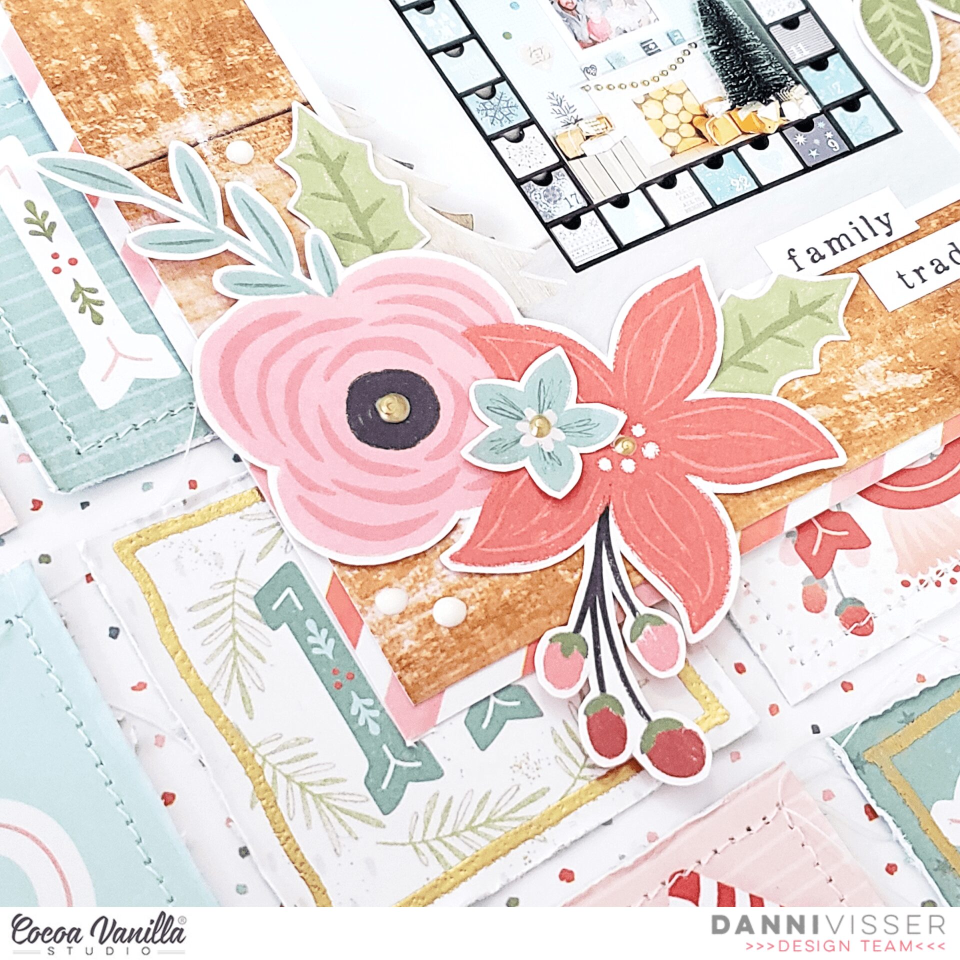
Because I did not have much space left on the layout, I decided to simply use three of the tiny word phrases from the accessory stickers to serve as my title, framing them around my centre photo. As a finishing touch I added some gold dimensional drops to the centre of all my flowers, then added some white drops around my floral clusters.

I love how this layout turned out and I really hope you enjoyed joining me today. There is a video linked below where you can watch the whole layout come together. Thank you so much and happy scrapping!
Danni x