August 2020
Hello You layout | Happiness collection | Kylie Kingham.
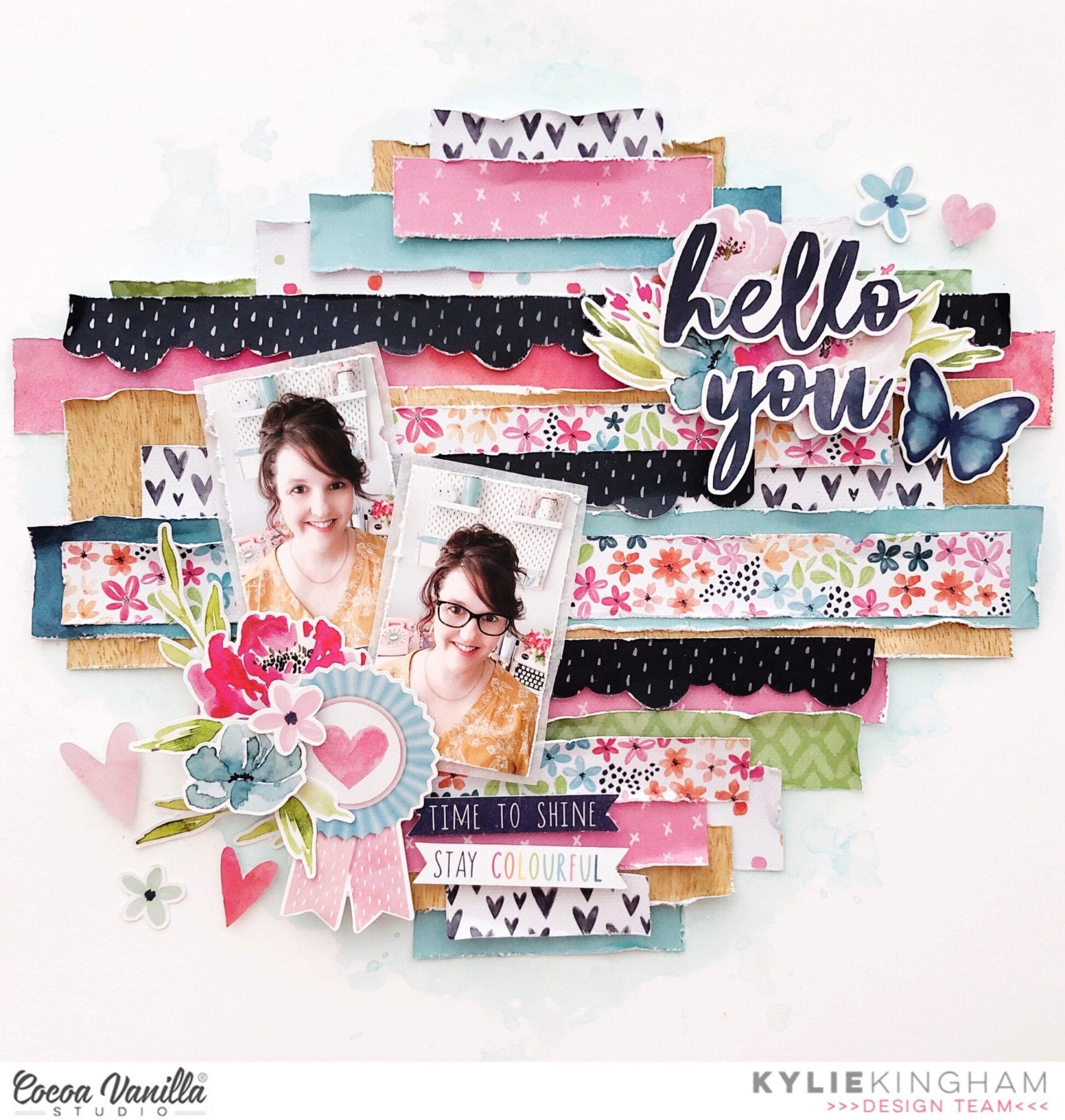
Hey friends! Thanks for stopping by the blog today. It’s Kylie back with you all with a new layout to share. My assignment for todays’ theme was to include texture! Texture can be added to a page layout in many ways, however I have chosen to keep things simple and use layered,distressed paper to build dimension and texture as a back drop to my photos. I chose the ‘HAPPINESS” collection as it has such a pretty colour palette of light and dark hues.
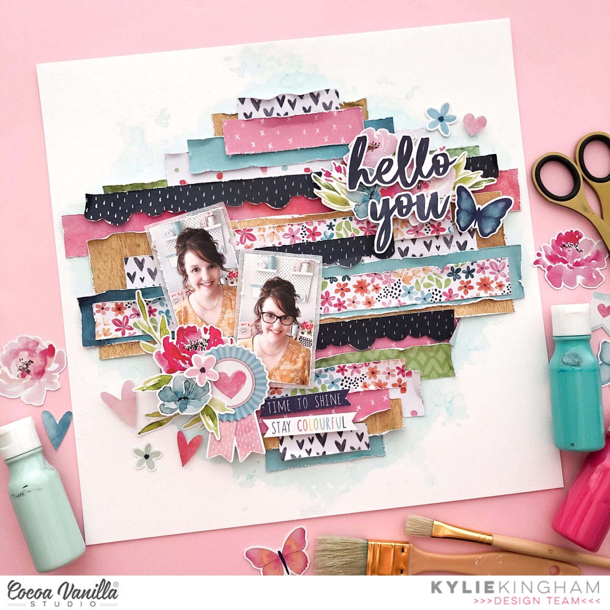
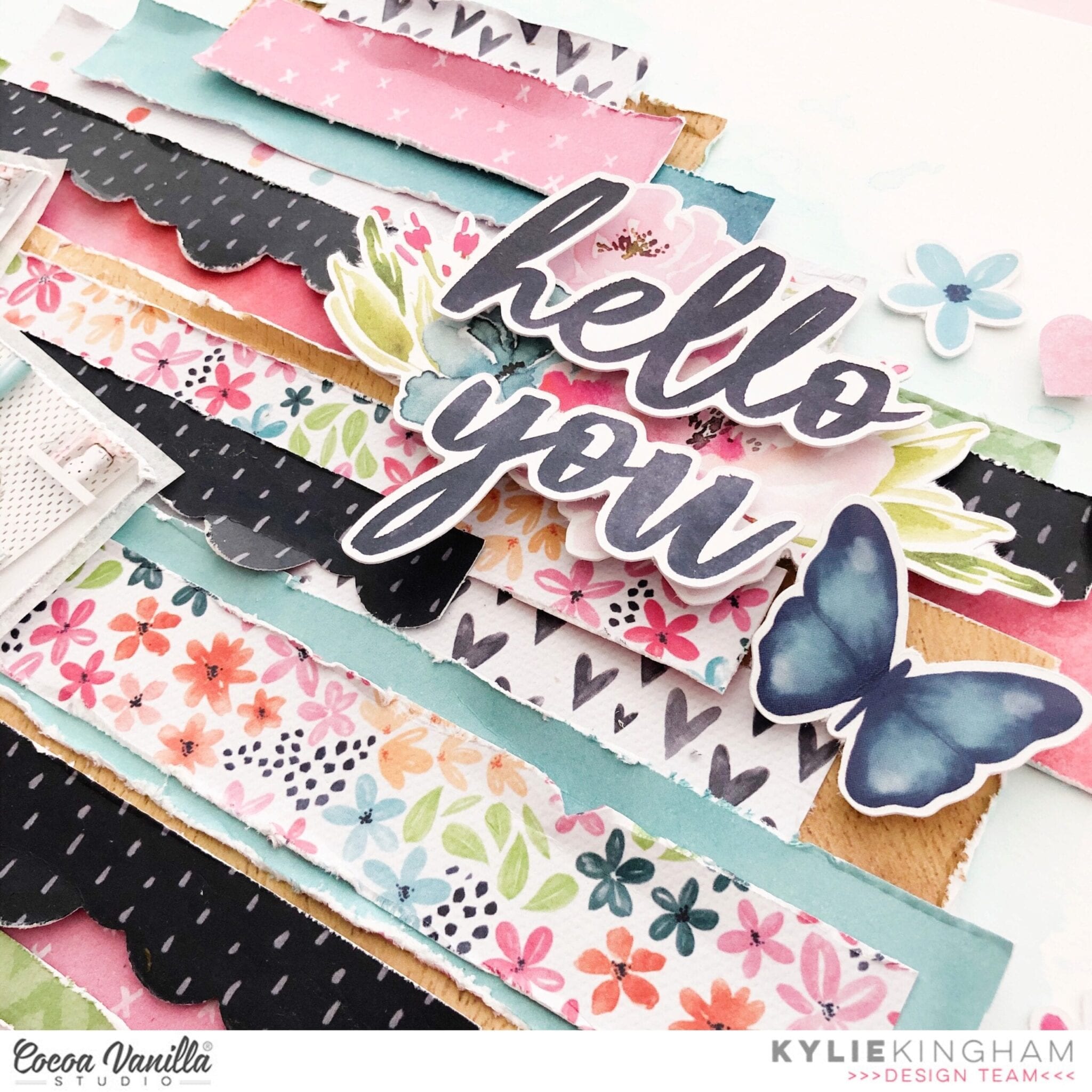
I chose a white background for my layout, and whilst the finished result shows a little water-colouring in the background, I didn’t actually add this until my page was finished.I trimmed down various papers to different widths and lengths, this was done by eye and no need for accuracy or measuring.I heavily distressed each edge of paper with my distress tool but if you don’t have a distress tool the blade of your scissors will achieve the same result.In places, some of the paper tore a little and this is OK! It all adds to the textured effect. After this step I began placement of each strip horizontally on the page. Some were tucked underneath some were layered over the top of others, I also added a few scalloped edges which I created with a craft punch.The longest strips of paper were placed throughout the centre of my page.
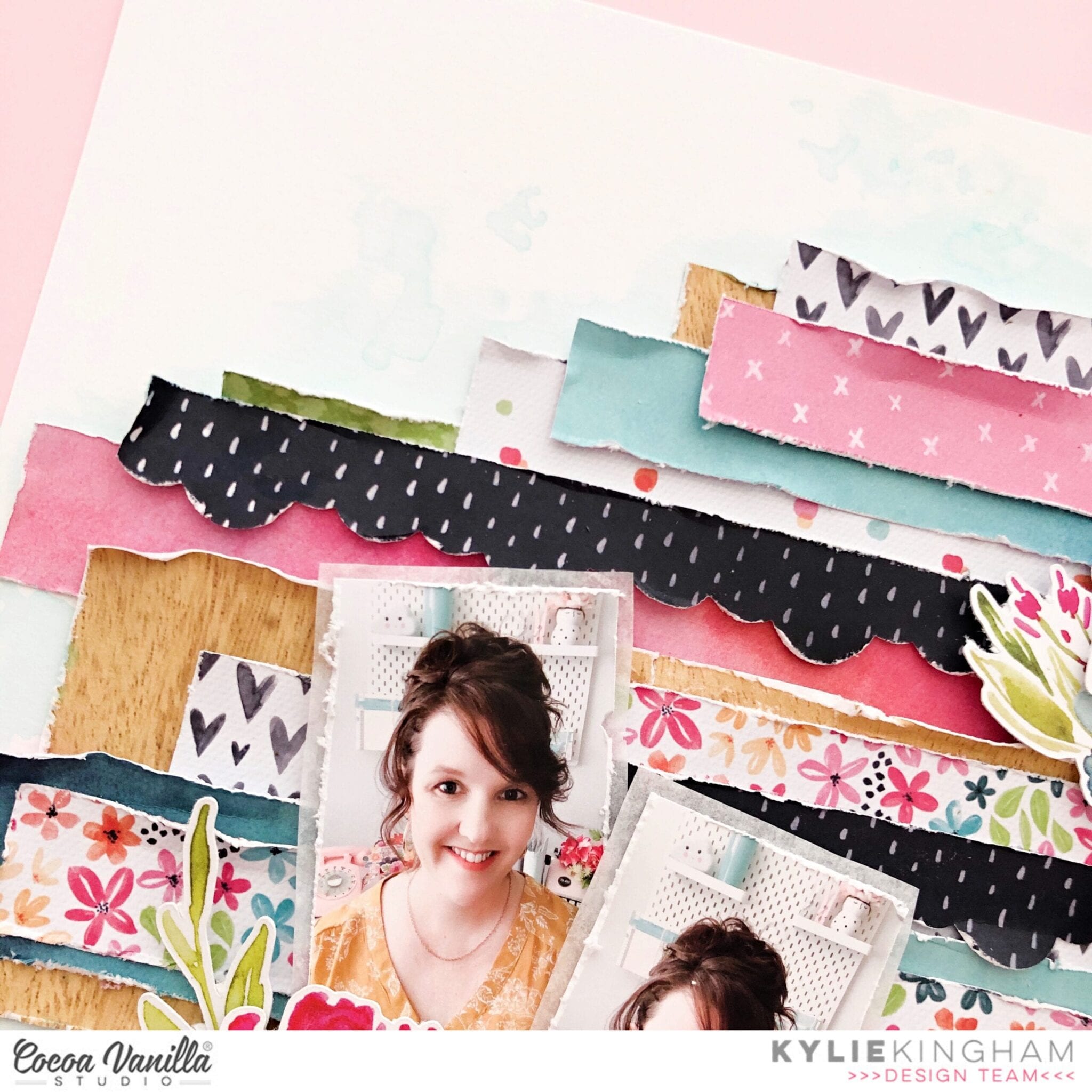
My photos were adhered to the page with some foam adhesive but first I backed them with some white tissue paper from my stash.Using some of the floral themed elements from the die cut pack I layered several around the photos for balance and a little more colour.Once these were all in place I took the time to curl the edges of the strips of paper a little more which you can see shows of that textural effect.
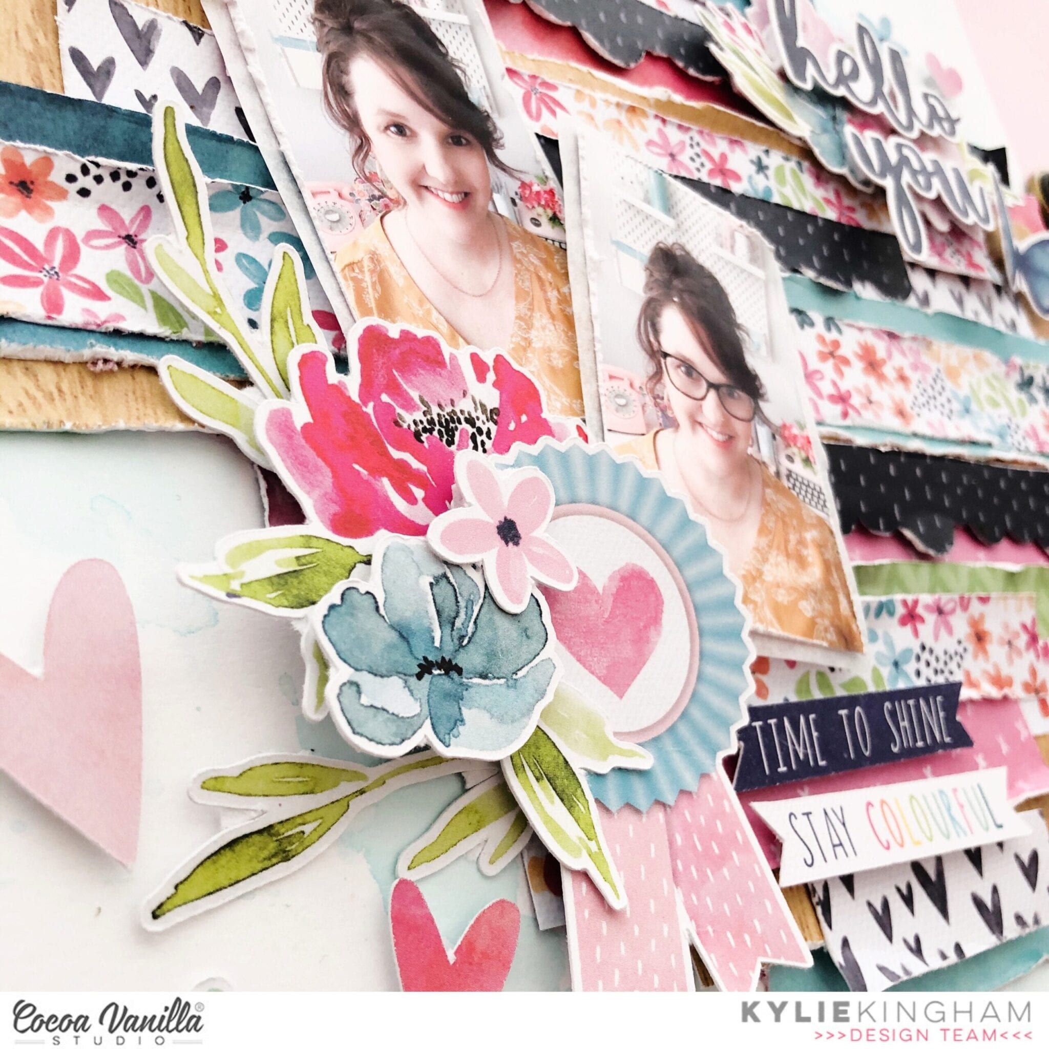
As I love large titles I chose a suitable few pieces from the word sentiments and added over another floral cluster, diagonally opposite my photos. By working with diagonal placement for your layout will help keep a level of balance.
Once my layout was complete I felt it needed a subtle amount of shading with water-colour. I delicately added some aqua toned diluted ink around my layout.Any excess was mopped up before it could dry too dark. Although this effect was subtle I felt it gave a nice finish to my page design.
Thanks so much for checking out my layout today. I hope you have enjoyed seeing this ‘textured’ technique and you give it a go too. This method is also a great way for using up any of those little paper strips and scraps you may have.
Until next time,
Kylie.
Is it over yet? | Life is Beautiful Collection | Rachel Lowe
Hello CVS friends today I have a layout that although the subject matter is of a more serious matter it doesn’t mean it can’t be pretty! I have used Life is Beautiful (Digital collection available) collection, which remains one of my fav CVS collections.
 Let’s talk about texture. If you are not a fan or experienced in mixed media how do you add texture to a layout? I focused on texture when creating this layout. Paper tearing is one way to add texture, and paper tearing also allows you to add elements under and over the tears which also adds more visual impact.

 Another way of adding texture is to sew on your layout, either by hand or using a sewing machine. I always add machine stitching to my layouts. Another technique with stitching is sewing over a strip of paper and then tearing the paper away from the stitching.
 Paper layers, dimension (ie foam tape to attach some elements and enamel dots) and a light spray of paint (here I have used black) all add texture to a layout.
 Recently I have dusted off my embossing folders and started to add texture to papers and elements using various embossing folders. So my 2020 did not look ‘flat’ I embossed with a polka dot folder and added dimension fluid dots which I also added over my title also.

 I really enjoyed putting this layout together focusing on textures! I also wanted to scrap a part of the Covid 19 journey that I am involved in, because memory keepers is what we are.
Thank you for stopping by today and keep safe and well!
Rachel X
Super Totally Rad | Totally Rad collection | Sue Plumb
Hi everyone, it’s Sue Plumb here to share my latest design team project with you. As we all excitedly await the gorgeous new ‘Daydream’ collection, I have been inspired by some of my fellow team members who have been getting ready by doing some stash-busting. So I decided to have a dig into my own stash and see what I could find to use up. I finally settled on the ‘Totally Rad’ collection. For those of you who have been Cocoa Vanilla fans for a long time, you might have some of this hiding in your stash too; and for everyone who missed this range the first time around, you can now purchase it as a digital collection HERE
Here is my layout “Super Totally Rad”…

When it came to the background, I was limited with paper choices so I chose to use the sun burst style pattern on the “Good Times” paper from the ‘Boys Rule’ collection instead. I had a couple of photos from my boys recent 8th birthday, and I thought the colours of the cake would make it a fun subject to pair with the colourful ‘Totally Rad’ collection.

Based on the limited paper I had left to work with, I decided to go with a vertical design using a piece of the cute camera print “Happy Snaps” paper for the focal area of my page. Alongside that, I added a strip of the yellow chevron print which was the reverse side of the cameras. I also added a second strip of the chevrons along he right edge of my page. Because the photos I was working with were different orientations, I wanted to keep them contained on the vertical strip of paper and then fill around them.

The key to keeping this busy design cohesive, was to ensure that all the different elements I planned to use needed to be touching each other. This cascading arrangement meant that the viewer’s eye was automatically drawn down through the design. I used a mix of die cut ephemera pieces, as well as pieces that I had fussy cut from the “Mix Tape” cut apart sheet. I also used a flair button and some enamel shapes.

I am not a huge fan of symmetry in my work, so to balance out how heavy my design was along the central line of the page, I added a small embellishment cluster in the bottom right corner of my page, along with my hand written journalling.

I finished off with some black ink splatters and by stamping the phrase happy birthday to you a few times around the page. I am really happy with the clean simplicity of this page, but also with the fact I got to bust some stash and re-visit a collection that I loved.
I will be back again with another share in a couple of weeks time…and expect a certain new collection to be the star of the show! Until then, happy scrapping!
HAPPY TIME | LIFE IS BEAUTIFUL COLLECTION | SOPHIE DELORME
Hello everyone ! It’s Sophie here and I am sharing a sweet layout with you today.
For today’s layout, I used a digital Cocoa Vanilla kit ! It’s the “Life is Beautiful collection“. I fell in love with the color scheme of the collection and all the gorgeous patterned papers and embellishments ! I printed them with my very old printer on good quality paper, and it gave beautiful results !

I started with an easy mixed media background. I call it the “reverse packaging technique”…
I put a few splatters of ink on a 12 x 12 plastic package, add a little bit of water and press my thick white cardstock on it. It always gives interesting results, and it was my starting point for the design of my page.
I teared a part of the beautiful coral-pink patterned paper to put on the left side of the page and did a little bit of stitching with matching thread.

I backed my photo with tissue paper, adhesive foam and a few layers of patterned paper for dimension and interest, and fussy cut plenty of beautiful embellishments from the same collection that I scattered around my photo.

I put a banner and the fussy cut word “Happy” for my title and a few butterflies for which I only glued the center to make their wings pop.

I wrote down my journaling and added the date, as well as a few Nuvo Crystal Drops.
Here are more close-ups:


I hope you felt inspired by my page today ! Digital products are a great alternative for collections that are no longer accessible and you can get them right away on your computer ! But don’t forget that they are all for personal use only !
Thank you so much for passing by the blog today, and happy creating !
Sophie xx
Captured | Unforgettable Collection | Raquel Bowman
Hey everyone, it’s Raquel here with you today sharing a layout featuring the Unforgettable collection. This collection is one of my absolute faves from CVS; the colour palette is just so stunning.
Here is the layout I have to share with you today – 
This layout is documenting a very special moment for my two kiddies and our family. This photo was taken at my brothers wedding and these two kiddies had a special role in that wedding, my son was the ring bearer and daughter a flower girl. They just looked so adorable and this collection is just perfect for documenting it.
The title of this layout was created using the foam title stickers. I love the contrast of black against the white of the layout and the colours in the collection.
This 4×6” colour photo was printed with a white border the white border allows me to use a busy pattern to mat the photo with – I used the beautiful Unscripted paper to do this.

I am the biggest fan of the CVS woodgrain designs and the Natural Beauty paper in this collection possibly tops the list. I love creating layouts with a vertical strip of patterned paper and embellishing around that.
The floral embellishments I have used on this layout have formed a somewhat ‘laurel wreath’ behind the 4×6” photo of my kiddies. For this floral design I have mainly used the ephemera pack.

To the top left of the photo and layout I have added a small cluster that is made up of a butterfly, a small flower and some hearts from the clear stickers and also the ephemera pack.

As well as clusters to the left and right of the photo – I created one to the bottom right of the page. This gave my layout the balance that it needed. To create this I have used a variety of ephemera, accessory stickers, clear stickers and one of the bows too. The tiny word stickers in the accessory sticker sheets are perfect for acting as journaling on a layout to supply more detail to the title.
I hope you have been inspired by my layout today. Thanks so much for stopping by the CVS blog.
Stay safe, Raquel x
HELLO LOVE | MORE THAN WORDS | GWEN WRUCK
Hi Creative friends, Gwen back on the blog today with a new share. I’m really having a bit of a stash bust at the moment with my CVS products, while I wait for the latest collection to arrive and I’m really enjoying seeing these older products on pages. This project features the ‘More Than Words‘ collection and a sweet photo of my daughter and I, taken a few years back.

For this page, I actually started with the idea to use up some of my stash in this collection and noticed that I had quite a few orange/yellow elements left. I’ve made a stack of layouts with this collection and most of those featured the pretty pinks and greens… so I thought it would be fun to use up some of the darker prints and that pretty peach/orange tone.

Some of you will also know that I’m on a bit of a coloured background kick at the moment so thought I’d start with the ‘Sketch Book’ pattern paper as my background. I’ve then framed it with the ‘Gossamer‘ pattern paper to create a solid border around the edge. I’ve also used this pattern paper to mount my photo along with a small piece of the ‘Effervescent’ pattern paper I had left in my stash. I’m going for a design that runs across the centre of the page so was sure to keep the lines of my background paper running left to right (not top to bottom).

Next, I wanted to build the photo mat and base elements of my page. To break up the peach in the background, I’ve pulled out a cut file, this one from CUT to YOU and cut two out in white Card Stock. I’ve layered these across the middle section of my page to act as a base for my photo and embellishments.

I’ve then positioned my photo on the left-hand side of the page and began thinking about my title and other design elements. I’ve gone with the title ‘Hello Love’ from the ‘Chipboard Titles‘ in the collection. These are super sticky and great quality and really add a lovely touch to your page. I’ve positioned it to the lower right of my photo.

With the largest elements of my design locked it, it’s time to embellish! I’ve started with some floral and leaf die cuts from the ‘Die Cut Ephemera‘ pack. I’ve just made sure to keep to my warm soft Apricot/Peach tones and Black and White.

I’ve also fussy cut out some butterflies, some from the ‘Collage‘ pattern paper and some from the ‘Gossamer‘ paper I have used earlier. I’ve also filled in the design with some Die Cut title elements and stickers from the ‘Accessory Sticker Sheet’.

Lastly, I’ve rounded out the page with some Enamel dots and a deep dive into my stash to find some ‘Endless Summer’ Woodies. I love the warmth of the wood grain here, perfect for this page.

Thanks for popping by the blog today, I hope you enjoyed seeing this page come together and that it might inspire you to do a little stash busting yourself! If you do, be sure to share it with me in the Cocoa Vanilla Studio Facebook group :)
Until next time,
Gwen
xo
Happy Times | Happiness Collection | Laura Alberts

Hey y’all! Laura back again and this time to spread some Happiness! When I saw these two photos, the first thing that popped in my mind was to make a quilt pattern. Inspired by my lovely grandma, I cut several of the papers from the 6×8 paper pad with a 1 inch hexagon punch and then puzzled the pieces together to create a quilted flower effect. Such a fun design and so easy to make!

Once I punched all of the hexagons, I cut out small 1 inch square papers to use as a base and then taped each individual hexagon piece into a simple flower design. It doesn’t really matter which piece starts in the center, I changed up each of mine a little bit from the others. It’s a lot of fun to play with quilted designs!

To add a bit of movement along the page, I added fussy cut butterflies all throughout the quilted flowers and even created little Nuvo gold trails behind them, this gives the appearance of movement! Plus, I added clear stickers underneath clusters and butterflies to give it the appearance of depth. This works because the butterflies’ wings are popped up just a bit.

I hope this quilted floral layout inspired you to look at your patterned papers a little differently! It’s fun to see how you can use every little piece up in a new way. If you’d like to see the Happy Times layout come together, I have the entire process in the video below!
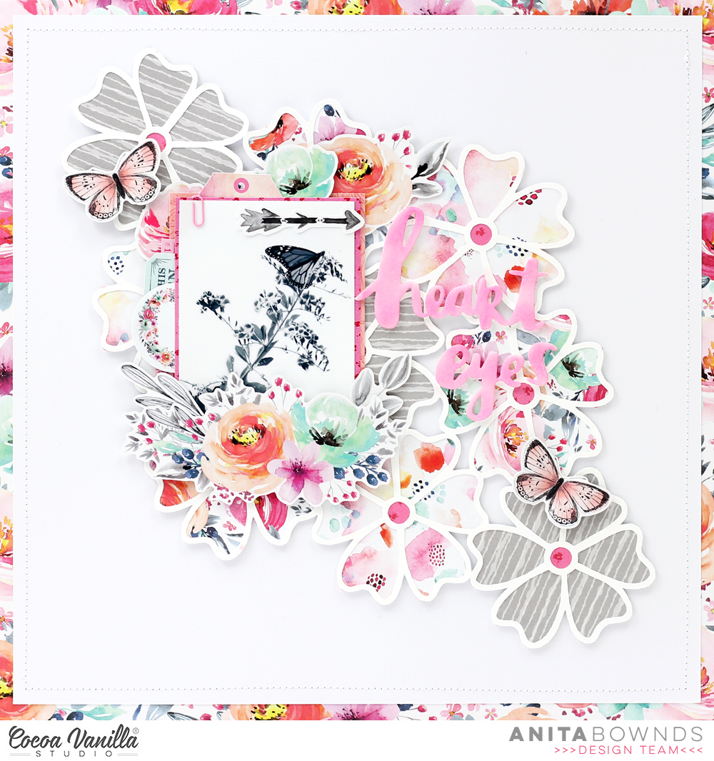
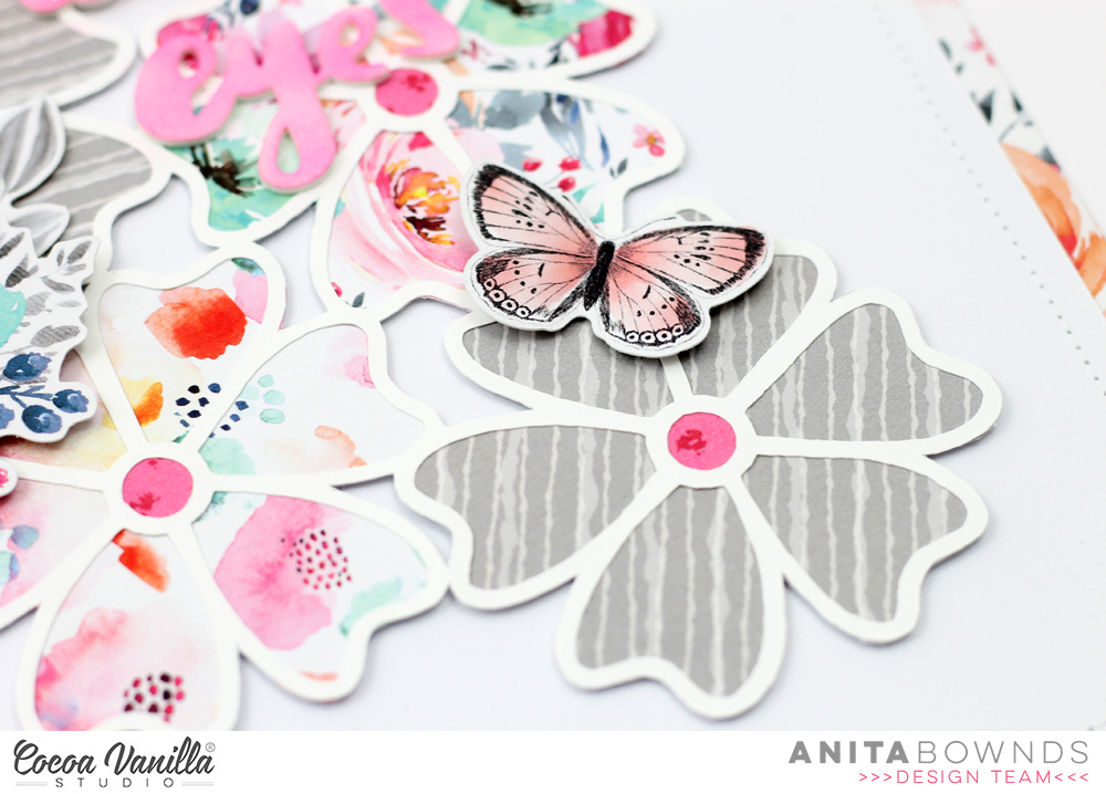
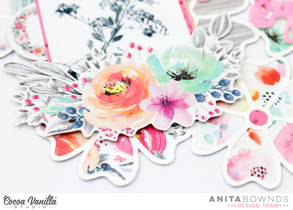
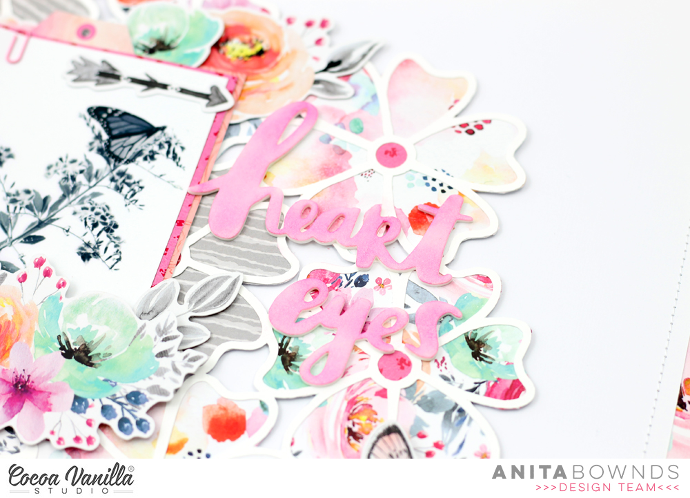
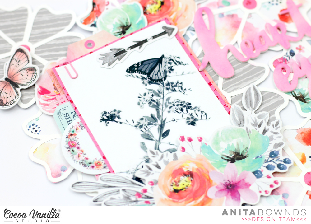
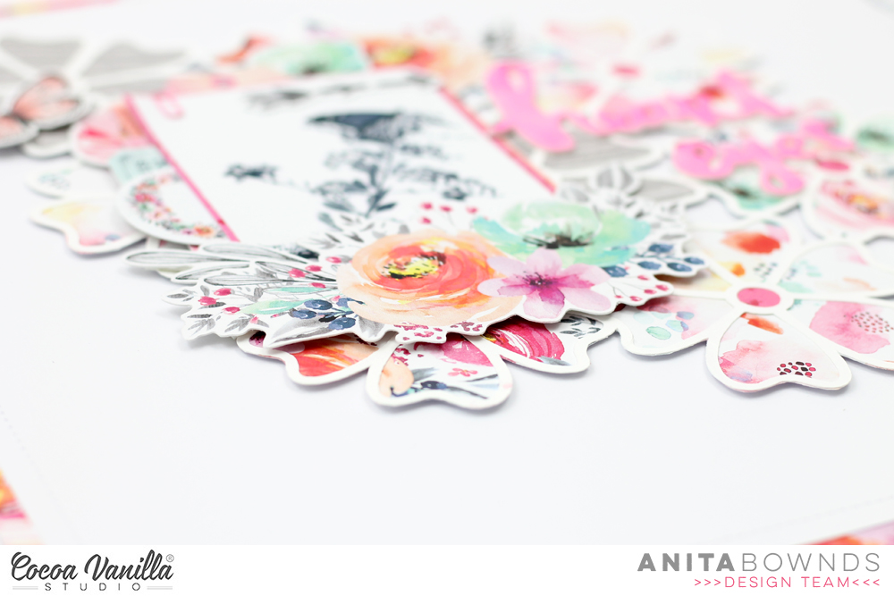
Heart Eyes | Unforgettable | Anita Bownds