Hello Beautiful | Happiness collection | Sue Plumb
Hi everyone, it’s Sue Plumb here to share another design team project with you. For today’s post I was tasked with scraplifting the amazingly talented Sophie Delorme, which was simultaneously exciting, but terrifying. It’s no secret I have a huge scrappy crush on Sophie’s work, so to be asked to scraplift one of her layouts was no easy feat. How would I ever choose? Or do it justice? In the end, I chose a stunning autumnal themed layout that she created a few months ago using the ‘These Days’ collection.
Here is Sophie’s layout…
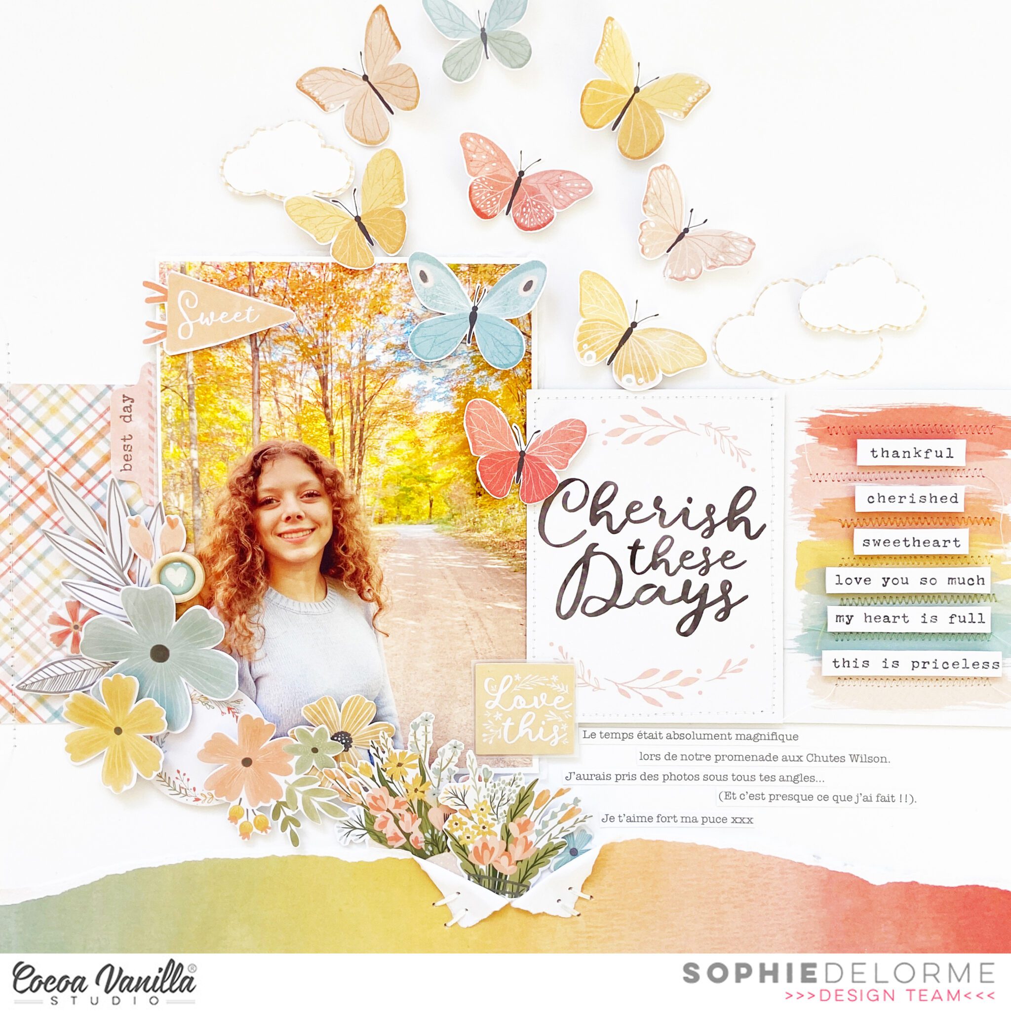
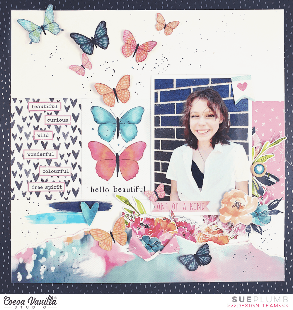
And here is my take on it using the ‘Happiness’ collection…
I have to admit, the clincher that made me choose this particular layout of Sophie’s was the butterflies. And I couldn’t help but reach for the collection with my all-time favourite Cocoa Vanilla butterflies – ‘Happiness’. I think I will actually cry the day I use my last scraps of this collection.
Sophie and I have daughters that are very close in age, so just like Sophie did for her layout, I wanted to document a photo of my gorgeous girl too. Due to her position, where she was facing towards the left side of the photo I chose to mirror the design so I could position my photo closer to the left edge of the page and having her facing inwards. (Tip: always position your photos so the main subject is facing towards the larger space on your page.)
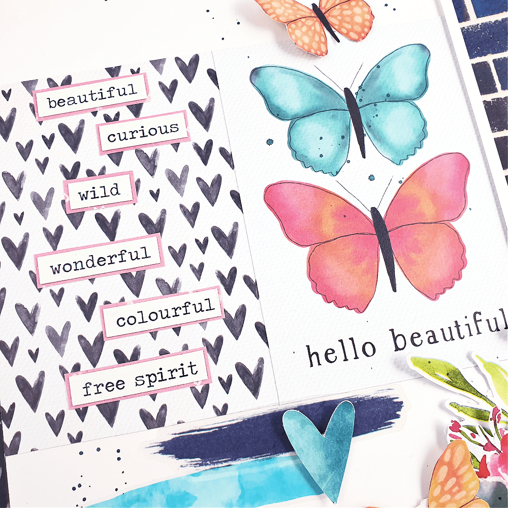
Just like Sophie’s original, I added torn paper along the bottom edge of the page; and instead of the Pocket Cards that she had used across the middle, I used pieces of patterned paper cut to size. I chose the piece with the two large butterflies and hello beautiful on it to act as my title card, which was cut from the cut apart paper. On top of the the heart paper I added some of the phrase stickers from the Accessory Sticker sheet, which I had mounted onto some pink paper to give them a little definition against the background.
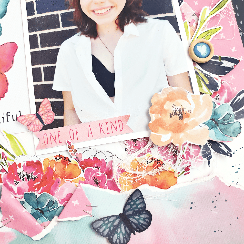
From the torn paper along the bottom edge, I added fussy cut flowers spilling out and winding their way up along the right edge of the photo. these were layered to give them depth and I used foam tape under the one on the corner of the photo for even more dimension. I couldn’t help but add a little frayed gauze for some texture too.
The only item I used on my page that wasn’t from the ‘Happiness’ collection, was the small wood button that was actually from the ‘Sunkissed’ collection. ‘Happiness’ did not have wood buttons, and as Sophie had used one on her page I wanted to include one too. I also wanted to add a couple of embellishments to my photo, so I chose a small heart flag and a phrase banner from the Die Cut Ephemera pack.
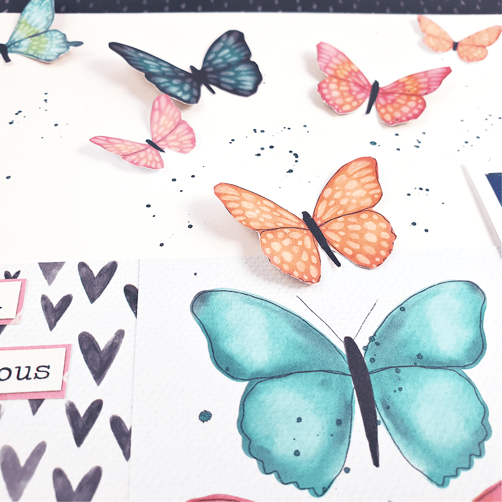
I substituted the journalling from Sophie’s layout with a couple of paint swatch stickers from the Clear Sticker sheet and I like the mixed media touch they gave the page. The star of the embellishment show however, was the glorious burst of fussy cut butterflies spilling upwards from the title card. I bent their wings up from the page to give them dimension and a sense of movement. The final touch was some small splatters of navy mist (because I couldn’t have my layout too clean, could I?)
If you would like to see how I put it all together, you can watch my process video here:
Thanks for stopping by today, I’ll be back with another project again soon. Until then, happy scrapping!

