Good Times | Laura Alberts | Daydream & More Than Words Collections

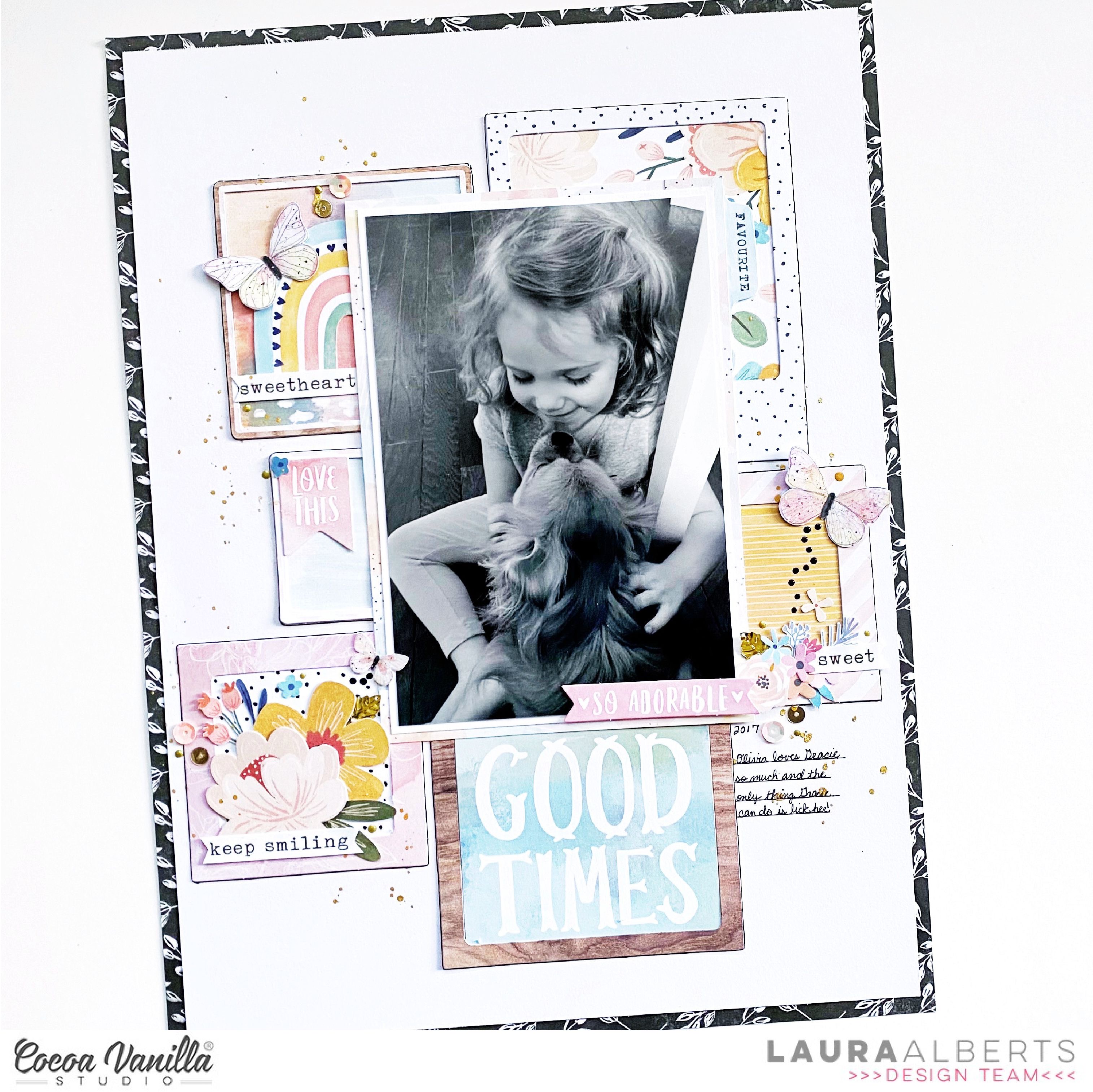
Hey y’all! Laura Alberts here today to share a darling 9×12 layout with you that shows just how versatile Cocoa Vanilla Studio collections really are, they mix and match so beautifully together! This layout has both Daydream and More than Words meshed together. Using frames from both collections and backing them with cut-aparts and patterned paper to create the background, then layering my photo on top, makes for a sweet linear design that creates pockets perfect for embellishment clusters! Up in the top left, I added a rainbow and word phrase from Daydream, with a butterfly from More than Words!
I traced a border around all of the frames with my pen to give them a little extra depth and dimension (without adding bulk!) and created butterfly trails with Nuvo Drops to create the impression of movement. The stark black border is a paper from More than Words called Gossamer, and the back side of it is covered in more of these gorgeous butterflies! In the center cluster, the florals are a mix of the two collections, and I added small sequins for a bit of sparkle as well!
This bottom cluster is my absolute favorite! It features florals from Daydream, a bit of sequins, and a tiny butterfly cut from the More than Words 6×8 paper pack. I love how this cluster bridges the gap between the photo and the title, adding just a nice pop of color where it’s needed most! By using a black and white version of the 4×6 photo, I’ve given myself plenty of opportunity to play with a variety of colors and the contrast between black and white! Love how it turned out!
I hope the varied clusters on this layout inspires you to look at your embellishments a little differently! It’s fun to see how you can change things up. If you’d like to see the Good Times layout come together, I have the entire process in the video below!


