Together | Heart & Home collection | Sue Plumb
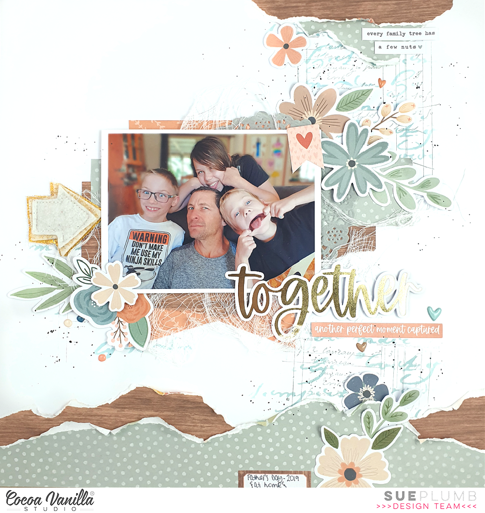
Hi everyone, it’s Sue Plumb here to share another design team project with you. Today I am sharing a mixed media family themed layout I created using the beautiful ‘Heart & Home’ collection. I decided to document this photo of my hubby and kids from Father’s Day a few years ago and feature the blue / green tones of the range.

I decided to keep this layout relatively clean and simple, so began with a white cardstock base and some mixed media. I first added some stencilling using a Distress Oxide and script stencil; then some light stamping over the top using a ledger stamp and grey ink. These three points formed my “visual triangle” to help define my placement for my photo.
I chose a mix of patterned papers to use for my page that included the B sides of the Bountiful, Harvest and Framed papers. I added torn pieces of the green and wood grain patterns along the bottom edge of my page, using my fingertip to ruffle the edges for extra texture. I then mirrored the same paper pieces on a smaller scale along the top edge of my page. The mixed media on the background helps to connect these pieces to the main area of the layout.
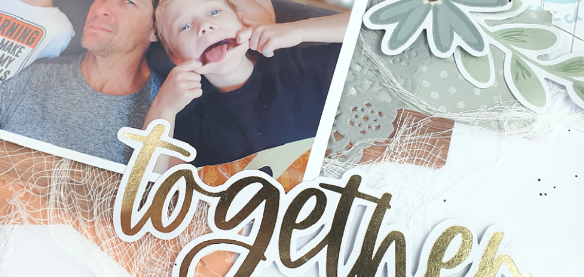
For the focal area of my design I used a mix of all three patterned papers and tucked a grey paper doily into the layers. I also added some frayed gauze for texture before mounting my photo on top, and then began adding my embellishments. I started with the sweet little heart banner in the corner of the photo from the Accessory Sticker sheet. I love adding embellishments directly onto my photos, as not only can you use this trick to cover unsightly things in the background or fill negative space, but I find it also helps to connect the photo to the rest of the elements on the page.
I wanted to build floral clusters on this page, so I rifled through the Floral Ephemera pack and pulled out pieces that worked with my colour scheme. Then it was simply a matter of shuffling the pieces around until I was happy with the arrangement. I made sure to tuck the pieces over and under each other, as well as other elements on the page, to help create depth. I also bent the edges up or used foam tape to add dimension to some of them. To the left of my photo I added a handmade felt arrow from my stash.
I chose the word together from the Gold Foil Titles pack as my page title, and then a few phrases from the Accessory Sticker sheet for some additional text. (I always try to ensure a balance between images / text and other elements on my page – it makes it more interesting for the viewer to have a mix of things to look at.) I finished off with some scattered dots and hearts from the Puffy Stickers pack and some tiny black ink splatters.
Thanks so much for joining me today, I hope I have inspired you. Why not pull out some of those stencils or stamps from your own stash to add some subtle mixed media to your next project? Remember – you don’t need to cover the whole page and sometimes a little can go a long way!
Until next time, happy scrapping!


