Daydream Design Team Inspiration 12x12" accessory stickers Cocoa Vanilla Studio cut files Daydream collection design team die cut ephemera fussy cutting layout mixed media patterned paper scrapbooking Sue Plumb
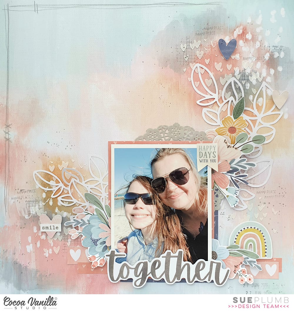


Together | Daydream collection | Sue Plumb
Hi everyone,
It’s Sue Plumb here to share my latest design team project with you. Today we are kicking off a new theme here on the blog simply called “1 paper, 3 ways”. Over the next few days three of our team members (myself included) will each share a layout that uses the same patterned paper as our page background. The purpose of this theme is to showcase different ways to use the same paper, and hopefully give you some inspiration to create a page of your own. The paper we were all tasked to use was the gorgeous mixed media style Sweet Serenity from the new ‘Daydream’ collection.
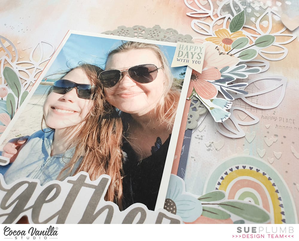
Here’s the layout I created, entitled “Together”…

For this page, I chose to document a recent photo of my daughter and I that was taken during a day at the beach. (And yes, it’s a selfie! I often find that if I don’t stop and take a selfie with my kids, I am rarely in any photos with them.)
So my layout began with the stunning Sweet Serenity paper, which I decided to add a little more subtle detail and texture to. I first used a criss-cross patterned stamp along with some grey ink to add some stamping; then used a scattered hearts stencil with modelling paste to add some small white hearts.
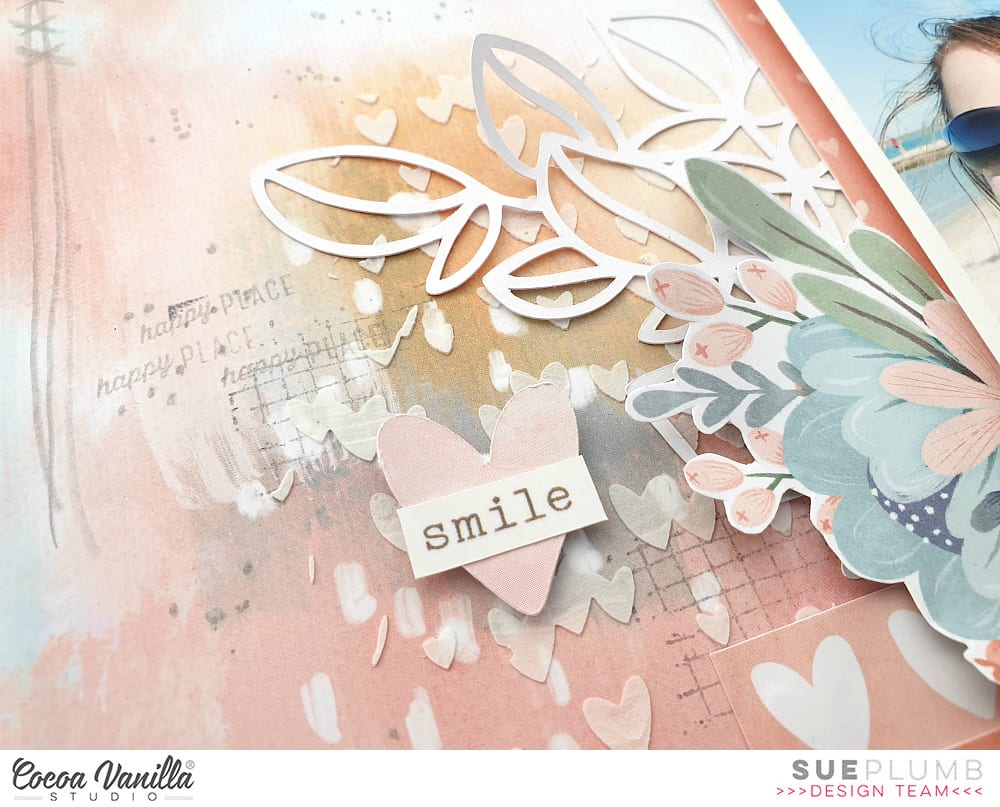
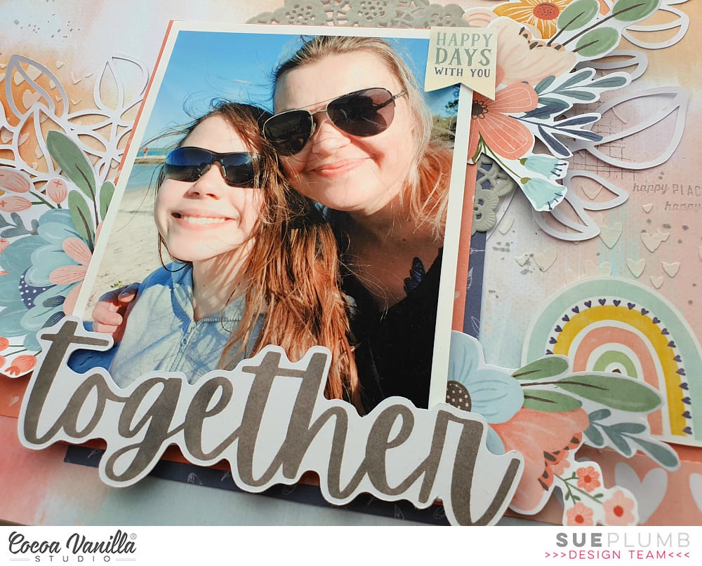
I then set it aside to dry while I began work on the papery portion of my page. First, I gathered some pieces of patterned paper to create a layered mat under my photo. The papers I used were All Aflutter; Up in the Clouds; and Happy Place and I used both vertical and horizontal pieces to help ground the photo to the page. I also added a grey paper doily from my stash.
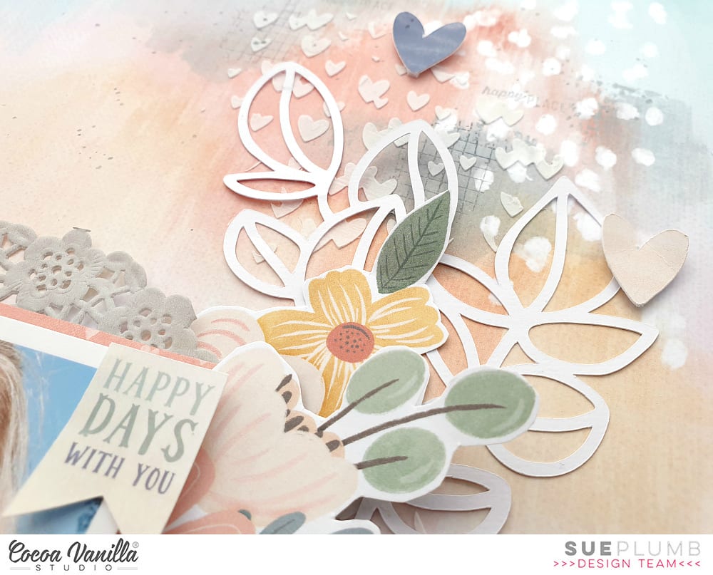
Now it was time for some pretty embellishments! I have to admit, I am totally obsessed with the floral print Garden Variety paper from this collection. I love it so much I just want to fussy cut the flowers from it and stick them on every page I create. I cut a few pieces from it and tucked them in around my photo to help frame it.
My next goal was to extend out my embellishment clusters from the focal point to reach the two main mixed media areas on the page, as I didn’t want them to appear to be “floating” out on their own. I did this by using some cardstock leaves I had cut on my Silhouette with a cut file from Cut To You. This enabled me to ensure that all the stencilled areas on the page were connected to the focal point.

For my page title, I chose to use the word together from the Die Cut Titles pack, which I adhered along the bottom edge of my photo using some foam tape to pop it up a bit. On the top right corner of my photo I added the small happy days with you banner sticker from the Accessory Sticker sheet. To the right of my photo I added a sweet die cut rainbow from the Die Cut Ephemera pack, and then scattered a few hearts from the same pack.
I finished off my layout by adding a doodled pencil border, some soft grey ink splatters and a few stamped phrases.
Thanks so much for joining me today so I could share this with you. Stay tuned over the next couple of days to see what else the team has in store to inspire you using the Sweet Serenity paper.
Until next time, happy scrapping!
