Rad Robot | Legendary collection | Sue Plumb
Hi everyone!
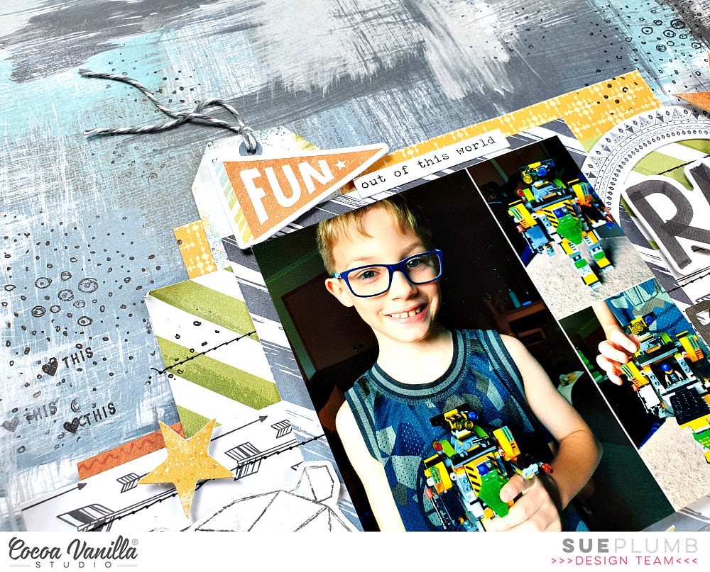
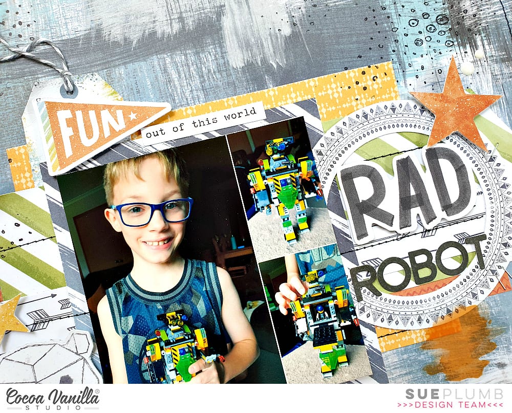
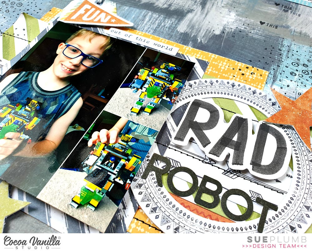
Sue Plumb here to share another design team project using the brand new ‘Legendary’ collection with you. Today I am sharing a 12×12″ layout I created to document some photos of one of my boys and the awesome Lego robot he made with his dad. Building Lego is one of the activities they really enjoy doing together and I love seeing what they come up with. I couldn’t resist snapping some shots of this robot, it was very impressive!
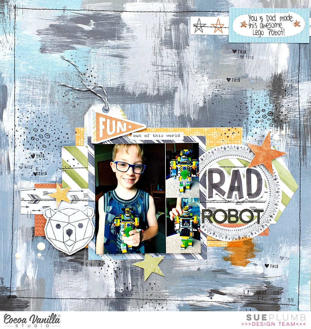
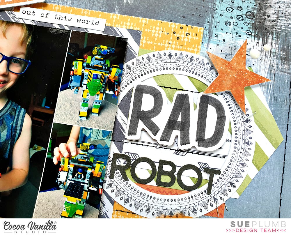
I began my layout with the reverse side of the Brave Heart paper which features a fabulous painty style pattern. I then stacked a variety of pieces taken from the Wild One; One Way; and Explorer papers to define the focal area of my page and form a mat for my photo. These were topped with the strip featuring black and white arrows that was cut from the Total Legend cut apart paper.
Once the papers were in place, I added some lines of black machine stitching to help define the horizontal structure of the stack and also add some extra visual interest. I also added a rough stitched border around the outer edge of the page to help connect the background with the foreground, before adding my photo on top of the paper stack.
Now it was time to turn up the fun factor by adding some embellishments. (I usually have trouble deciding which pieces to use when I receive a new collection, as there are always so many to choose from.)
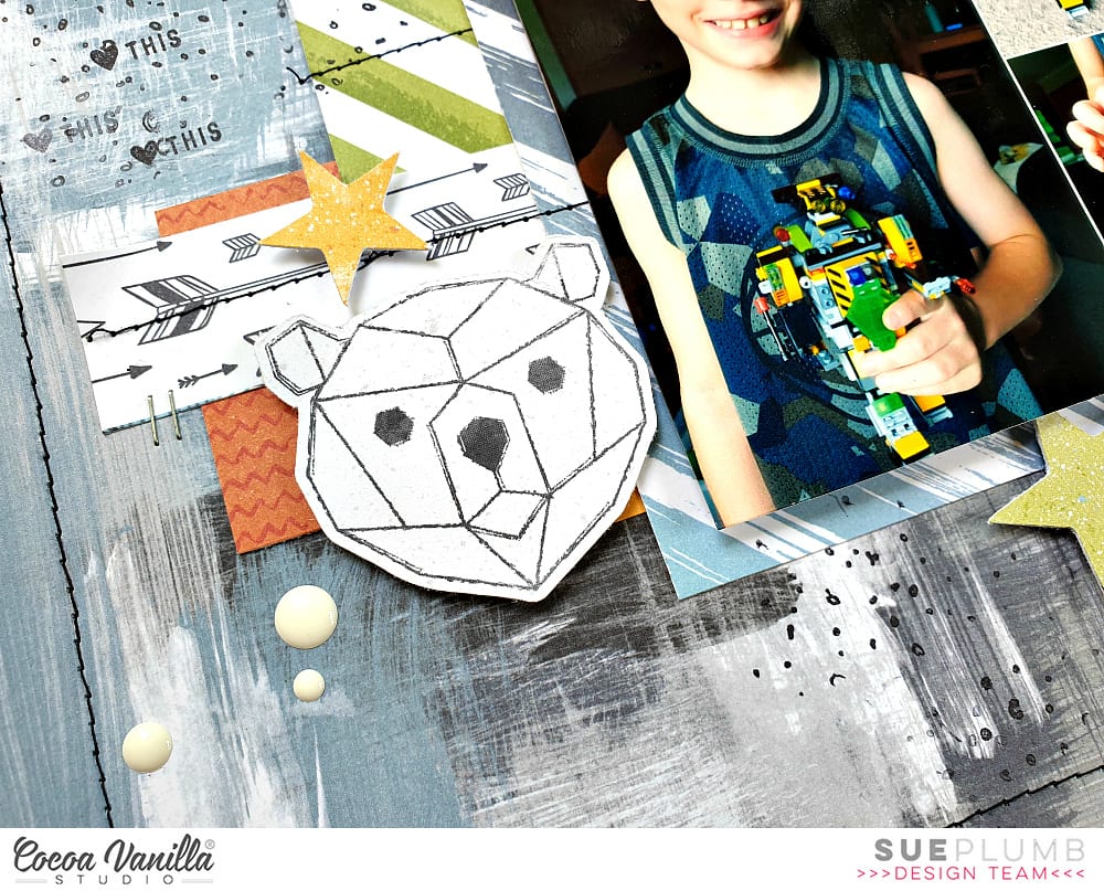
I began to the left of my photo, creating a small cluster using the die cut geo bear and a star from the Die Cut Ephemera pack, as well as a few Enamel Dots.
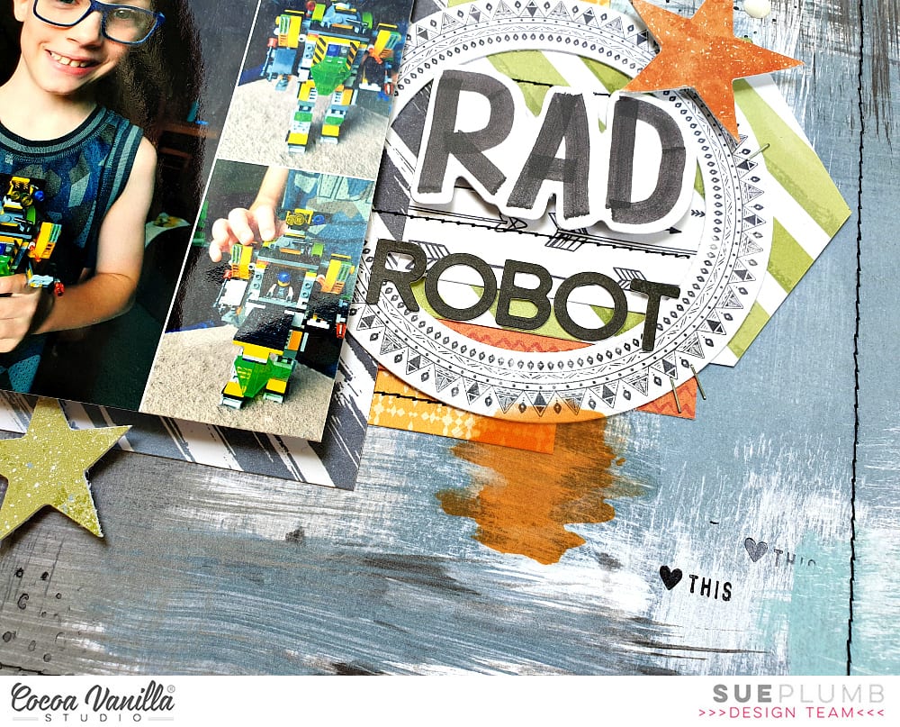
To the right of my photo I created my title cluster using the round frame and another star from the ephemera pack; the word RAD from the Die Cut Titles; a few enamel dots; and some small alphabet stickers I had left from the Made of Awesome collection. For an little extra pop of colour I also added the orange paint splat from the Clear Sticker set.
I created a third small cluster (because – visual triangle and rule of threes!) above my photo using the tag and phrase stickers from the Accessory Sticker sheet; with the small die cut flag layered over the top. I brought further balance to my page (and my mind) by adding an extra die cut star below my photo, which completed my secondary visual triangle.
I also created a small cluster for my journalling at the top of the page to counteract the fact that my page was so “bottom heavy”. The label and the strip of stars both came from the Epic Tales cut apart paper. I then finished off my layout with some black stamping using texture and phrase stamps and a few well placed tiny staples.
Thanks for stopping by today so I could share this with you. I am so enjoying creating with this new collection and I hope I have inspired you to get creative too.
Until next time, happy scrapping!

