Hello Sunshine | Hello Sunshine Collection | Laura Alberts

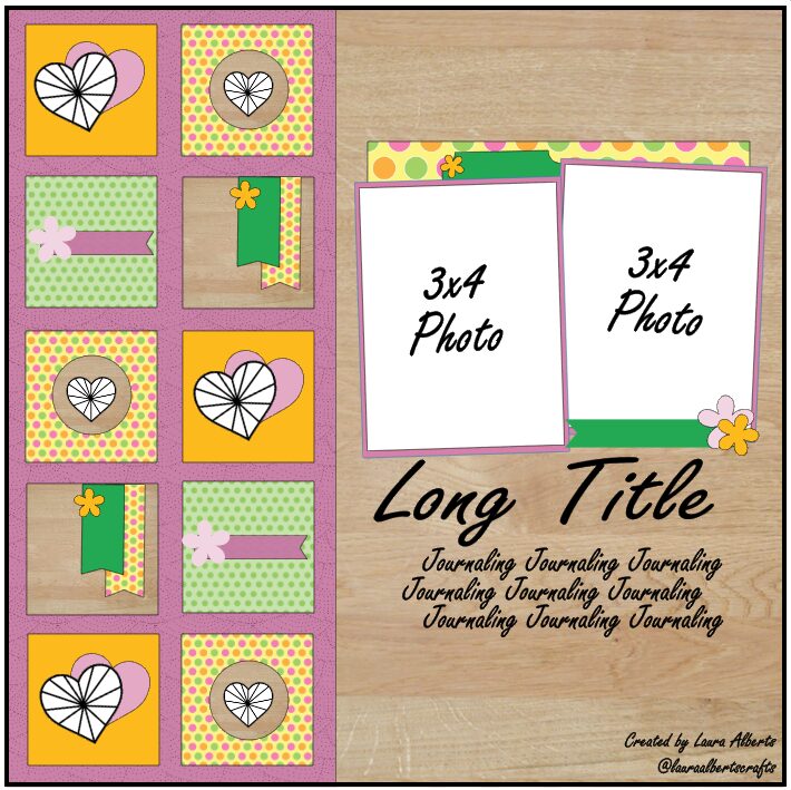
Hey y’all! Laura here again with a deep dive into my Cocoa Vanilla Studio stash for the oldest collection I own, Hello Sunshine! For this silly layout featuring selfies of my darling son and I being exceptionally silly, I decided to create a split-level layout design, with a simple photo display on the right and a grid layout on the left. By creating this split, I can use plenty of embellishments without overwhelming my photos.
Each of these 2×2 inch squares has a large embellishment, small embellishment and a dot of Nuvo in gold for accent. I then took my navy pen and outlined each of them in a messy faux-stitching style to reflect the stitched design on the denim-styled Chill Out pattern paper under my photos. The mix of patterns on the left side really add a pop to the overall layout and give those puffy stickers the time to shine!
By layering stickers and ephemera pieces together into clusters onto these squares, each piece of the grid feels unique, but the coordination of the colors helps them feel cohesive. The outline of each square really gives the appearance of depth on the left side of the layout, giving each a shadow that helps them pop off the page!
I was so excited by how this layout turned out, that I created a sketch based on it to share with all of you! I hope you enjoy using this sketch to inspire you to try a split-level layout too!
I hope this inspires you to look at your older Cocoa Vanilla Studio stash a little differently and incorporate them in a big way on your projects too! To see how “Hello Sunshine” came together, check out the process video below!


