Hello Cocoa Vanilla family, and welcome back to the blog! This week, my assignment was to play with a sketch from Page Maps and it was an interesting assignment because sketches and I generally do not get along. I think sketches are a double edged sword – they are literally the very definition of bittersweet. For a newer scrapbooker or even if you just need a bit of inspiration, they are a godsend, especially if you don’t know where to start. However, I always feel like I’m struggling to get all of the things on the page and the layout feels constrained instead of a free expression of creativity like scrapbooking normally is for me. So what I decided to do for this layout was pick a few elements from the sketch that I liked and work them into my overall design.
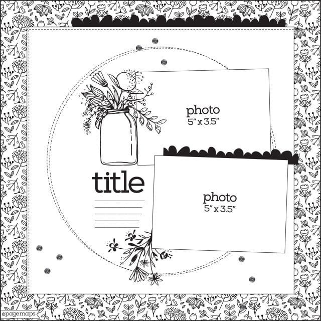
Here is the Page Maps sketch from October 2018 that we were working with.
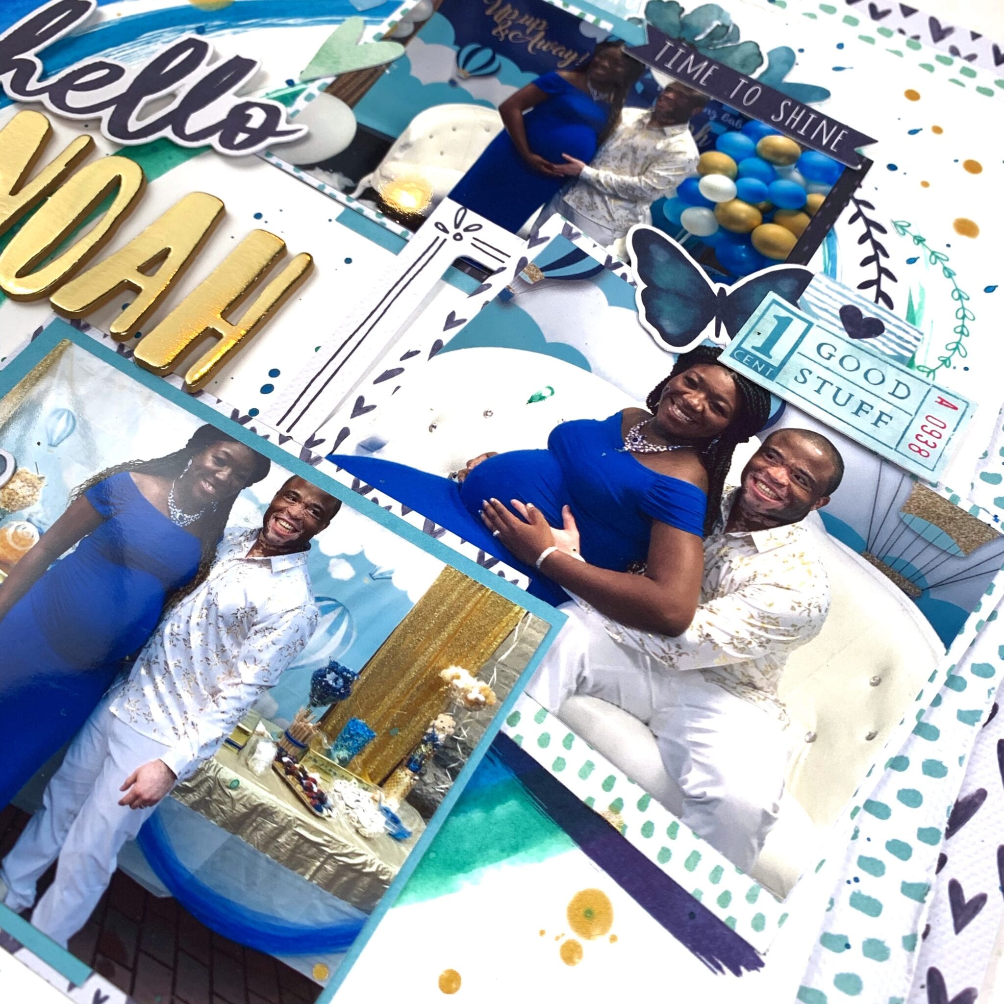
I love paper layers, so I kept that aspect, as well as the big circle element, and to challenge myself, I decided to work with horizontal photos, which is something I never do. With all of the my bits and pieces sorted out, I pulled out the Happiness collection and decided to scrap a photo of my sister and her husband at their baby shower this summer.
Before I did anything else, I distressed the edges of the sheets and layered my papers for my background so I had an idea of how much white space I had to play with. I then used some watercolor paints to paint a series of concentric circle like shapes. They are definitely more oval than circular, but I painted them in shades of blue and green. Next, I matted my photos – I printed them in 3×2 so considerably smaller than the sketch was calling for – using papers from the 6×8 patterned paper pad.
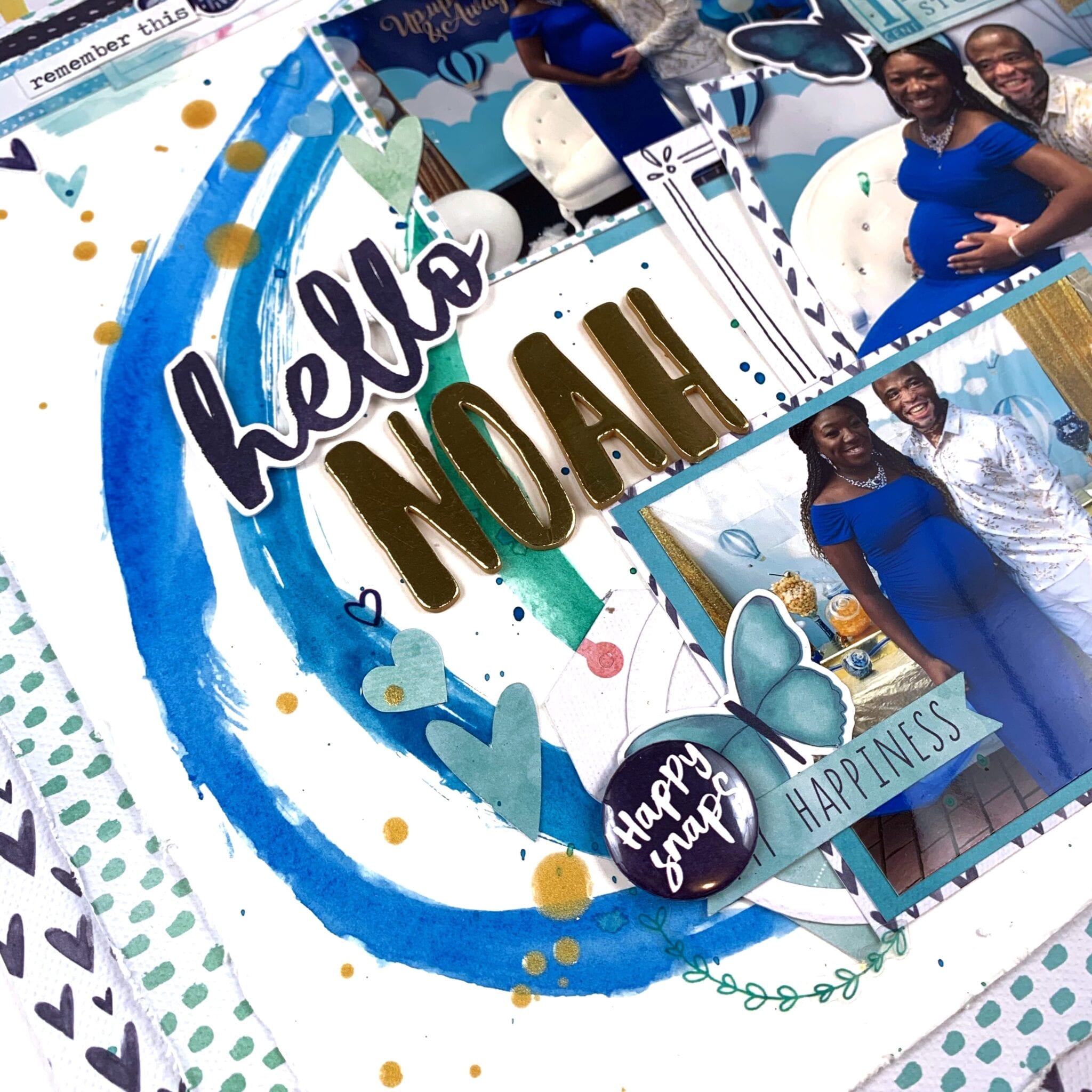
After arranging my photos on my background, I worked on embellishing. This week, I used the ephemera pack, as well as a flair button, the cardstock stickers and the clear sticker packs. I aimed for a more monochromatic layout, which was challenging in itself because my layouts tend to be very pink and floral and this was my first time attempting a more “masculine” layout and I restricted myself to blues, greens, and butterflies. While I was creating the clusters around the photos, I also created the cluster in the top left corner as the sketch had a bit of paper layered in the upper corner and this is very much my speed.
Next, I went to work on my title. I knew I wanted a bigger, more whimsical font to spell out the baby’s name, and since the shower colors were blue and gold, I used this old pack of gold thickers that I had in my stash. To finish my title, I added the word “hello” from the cardstock title pack, and embellished with a combination of stickers and ephemera hearts. The gold looked a bit out of place since there was nothing else metallic on the layout so I pulled out my trusty color shine in gold and added some splatter to add some sparkle and shine to the layout.
That’s all I have for you today, guys! It was a bit of an experience making this sketch my own but once I got into the groove of things, it became much smoother to hit the ground running and to do things that made this layout my own. I hope you found inspiration here and you try to create something using this sketch today. Till next time, keep it crafty friends.