Happy Snaps | Happiness | Gwen Wruck
Hi Creative friends,
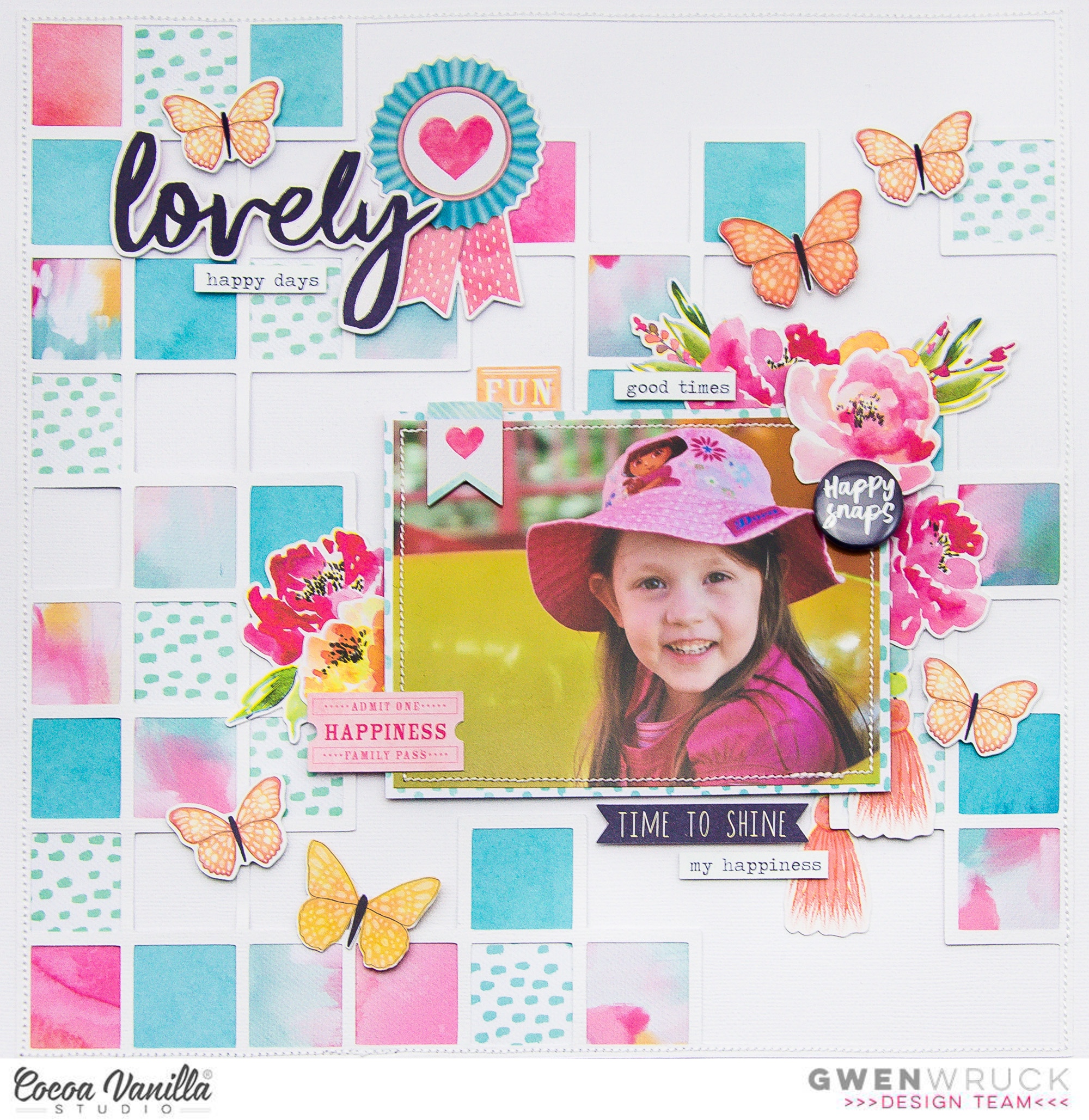
Gwen back on the blog today with a new share featuring the ‘Happiness’ collection. On the blog this week, the design team have been playing along with the theme “circles or squares” and I’ve got to say, I really struggle with circle elements so I absolutely took the easy way out and created a page featuring squares. This photo is one I took of my daughter quite a few years ago while we were at a theme park and I’ve come up with a fun way to use up a bunch of pattern paper scraps on my layout within the Squares theme I’m working with.

To begin my page, I’ve started with a white Cardstock background from my stash and a cut file from CUT to YOU. I’ve then pulled out a bunch of pattern paper scraps in the collection and backed the squares in the design. You could also do something similar to this with a basic square punch. Backing the file went quite quickly actually because the square is a very simple shape to cut out. I didn’t think too hard about the colour placement of the pattern paper, I was just a little bit careful not to put two of the same colours side by side. I even left some of the squares in the design open for interest.
Next, I’ve positioned the backed cut file onto the centre of my background and added stitching around the edge. From there, I’ve backed my photo with the ‘Little Things‘ pattern paper, added some stitching and then mounted with 3D foam.
My daughter is positioned towards the right hand side of the photo so I want to position my photo towards the right hand side of my page, I like to have the subjects in my photos looking towards the centre of the page rather than off to the side of the page. It’s not a rule, just the way that I prefer to do it. I just find it easier for me to embellish when I do it this way.
I can now begin to work on my embellishment clusters. I’ve pulled elements from the ‘Die Cut Ephemera’ pack starting with the pretty floral elements and that sweet prize ribbon die cut. I’m going to create an embellishment cluster along the right hand side of my photo and then balance that out with a separate cluster in the top left hand corner of the page. As always, I’ll position the largest pieces first and then work towards the smaller elements.
I’ve also added in a couple of the cute tassels from the ‘Die Cut Ephemera’ pack and a couple of stickers from the ‘Accessory Sticker Sheet’. For the stickers, I often like to add them with 3D foam tape for dimension. It’s nice to have layers within your clusters and try to nestle everything in close together.
I’ve also pulled a flair button from the ‘Flair Buttons’ pack and added that to the top right hand corner of my page. The title for the layout has come from the ‘Die Cut Pack’ as well. To finish everything off I have fussy cut out a couple of the stunning butterflies from the ‘Bright and Beautiful’ pattern paper and added them onto my background.
I’ve also made a YouTube video of my process which you can watch here:
I hope my page has inspired you to work with some squares on your next layout or to use up some of your stash of the ‘Happiness’ collection.
Thanks for popping by,
Until next time,
Gwen
xo


